
Training courses
Adam Frost and Tobias Sturt of Add Two offer bespoke internal data visualisation training to suit all needs. Our core offer, based on our long-running Guardian Masterclass, provides a general introduction to all aspects of modern information design. It can be delivered as both an in-person seminar or as a webinar.
An intro to data storytelling
Based on our long-running one-day Guardian bootcamp
Covers the process of creating data stories - Find, Design, Make, Refine
Offers an overview of good practice for both static and interactive stories
Tricks and tips for how to introduce immediate changes in your own work

Data storytelling in Powerpoint
Course can be between one and four days
Focuses on how to structure stories in a single slide and across a whole deck
Explores how to use the native Powerpoint charting engine to tell more effective data stories
Longer courses examine copywriting for titles and subtitles, how to create more sophisticated charts and maps, and how to use PowerPoint as an animation tool
Infographics
How to wireframe more complex static graphics
How to use free tools like Canva or Venngage to create charts that tell a single, simple story
How to ensure your graphics are modular, so that each element can also be chunked up for social media.
Guidance on iconography, illustration and chart choices
Can be a half-day or full-day module
Interactive infographics
The principles of interactive storytelling - finding and structuring your data stories
Wireframing and building ‘scrollyteling’ sites using free tools such as Canva, Raw, Flourish and Datawrapper
Choosing the right kind of chart for each section of the story, and deciding when and where interactivity is appropriate
An overview of interface elements and how they can enhance user experience
Can be a half-day, 1 day or 2 day module
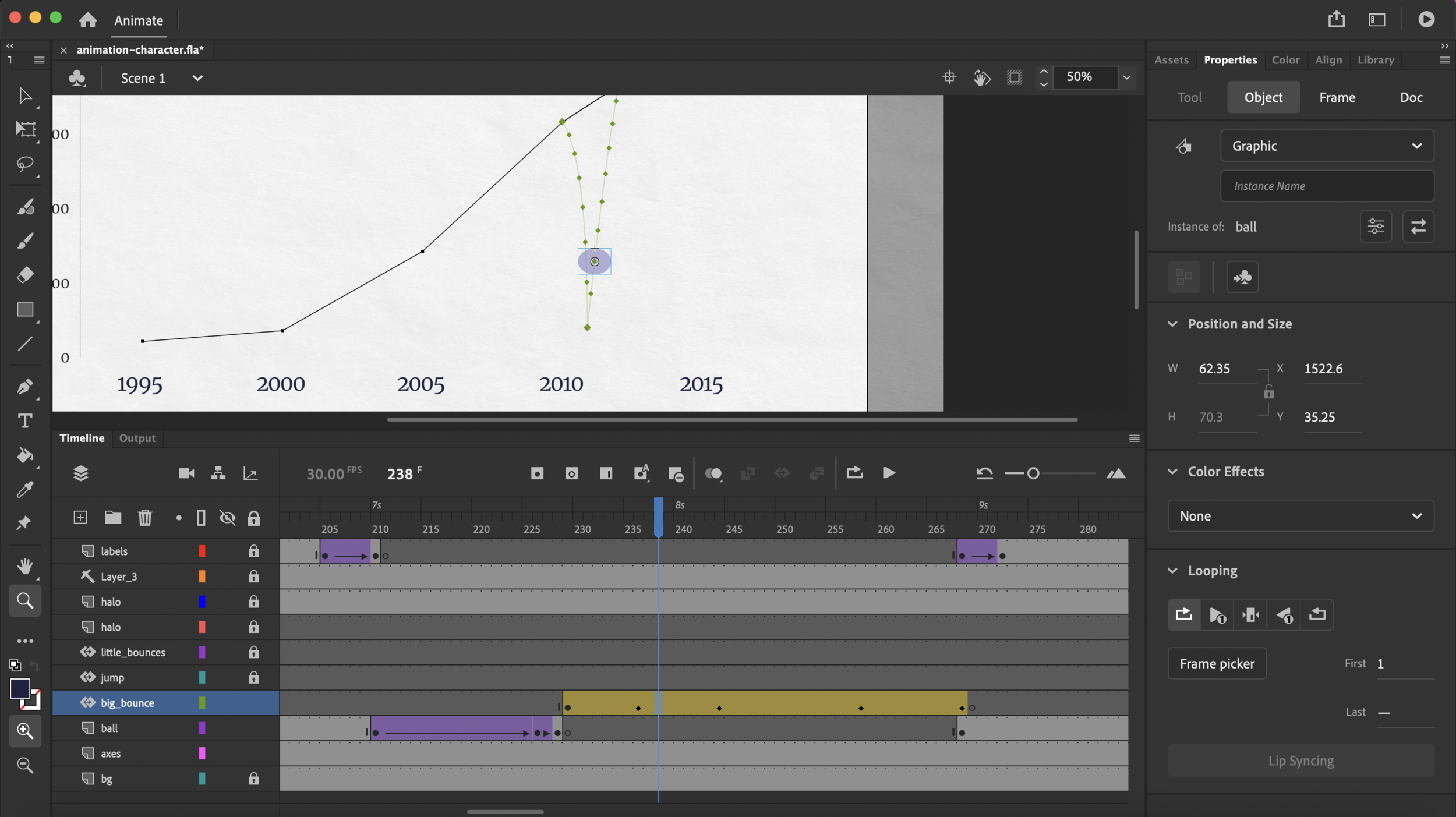
Motion graphics and animations
How to script, storyboard and build short animated data stories for social media or live events
Free tools (PowerPoint and Canva) are used for this course, although After Effects (a paid tool) is also discussed
Key animation methods (fades, zooms, wipes) are discussed, particularly as they apply to the presentation of charts
Can be a half-day or longer (up to 2 day) module
Copywriting in data visualisation
Understanding the foundational nature of text in all visualisation work (building from sentences up)
Ensuring that your text compliments your visuals
Creating effective titles, subtitles and annotations
Working with style guides, and the importance of Plain English
A half-day or full day module
Qualitative data visualisation
How to tell effective data stories when you are working with qualitative data: interviews, hierarchies, processes or concepts
How to make aesthetic decisions that improve clarity, legibility and impact
Effective use of illustration, iconography and photography
Best practice examples and templates are shared for all of the key qual story types
Can be a half-day or full day module
Accessibility and testing
Ensuring that UX principles and accessibility standards are adhered to, drawing on W3C guidelines
A deep dive into the POUR framework (perceivable, operable, understandable, robust) as it applies to charts
Understanding where the rules need to be interpreted more creatively in order to ensure a rich experience for all users
A walkthrough of key online resources and accessibility tools
A half-day module

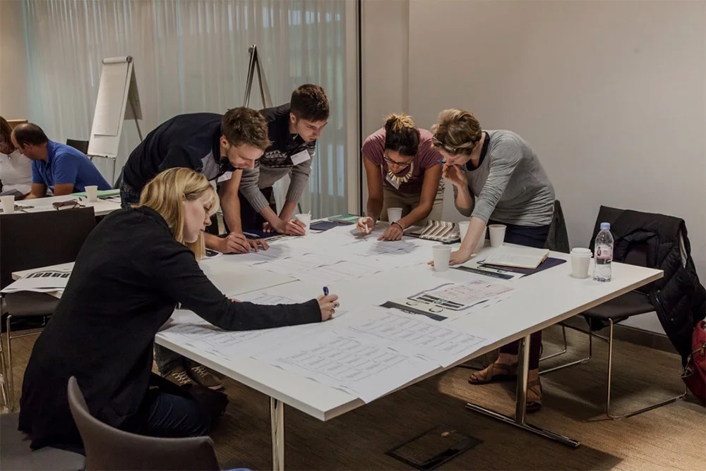
Running a data visualisation project
How to create a brief, run a brainstorm, define an audience, and project manage the creation of a data storytelling product
Ideally a live client project is used for all workshop tasks
Perfect for those who are already running data viz projects, but want to work more effectively as a team or to create projects with more measurable impact
Can be a short intro module (half-day) or a longer (two-day) session