

Add Two digtal
A specialist information design agency that offers training in visualisation and data storytelling
Data visualisation courses
We offer a wide range of courses, from an introduction to storytelling with data visualisation to targeted courses in subjects like animation, social media and presentations.

Get in touch
If you want to book a course, get an estimate of price or just find out more, you can email us at info@addtwodigital.com or use the form below:
The course content
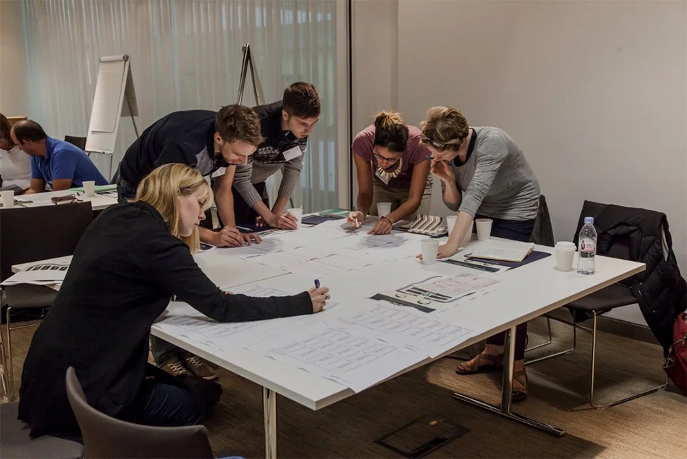
Adam Frost and Tobias Sturt of Add Two offer bespoke data visualisation training to suit all needs. Our core offer, based on our long-running Guardian Masterclass, provides a general introduction to all aspects of modern information design. It can be delivered as both an in-person seminar or as a webinar.
Moving through the four stages of our data viz process (Find, Design, Make, Refine), we suggest best practice examples and share tried-and-tested advice on how to make your data stories meaningful and engaging. We cover both static graphics and interactive dashboards. Each course includes two hands-on workshop sessions, based on client data wherever possible.
We also offer a range of other courses and modules. These modules focus on specific software such as PowerPoint or Flourish, or on important aspects of visualisation practice such as accessibility and user testing. Alternatively, we can create entirely bespoke courses, based on specific client challenges.
For all of our courses, we recommend using client data for all workshop exercises so the outputs are as practical as possible.
“The workshop was enjoyable and inspiring. It was clear that Adam and Tobias were very knowledgeable and passionate about the subject”
“The course was enlightening and it gave us many ideas for the future. All our colleagues were very impressed”
“Extremely useful and insightful. I would highly recommend working with Add Two Digital”
Clients
Some of the clients we’ve delivered training courses for


We teach what we know
Add Two is also a working information design agency. Our courses are based on over a decade’s experience of telling data stories.
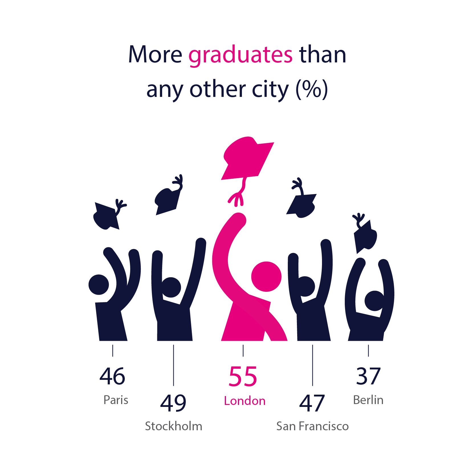
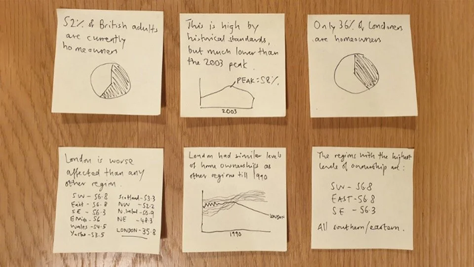
Next-Level Cities
An interactive infographic made for Kone as sponsored content for the Financial Times
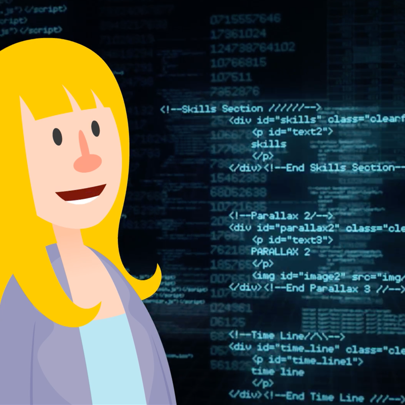
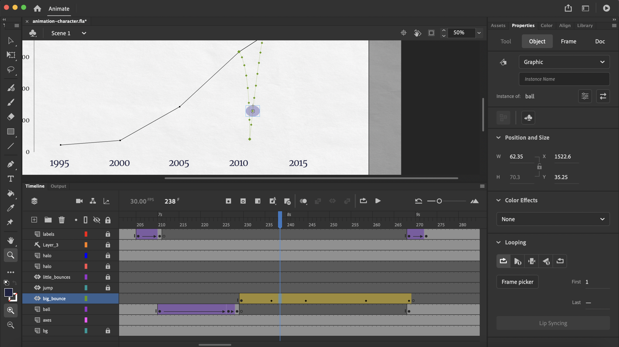
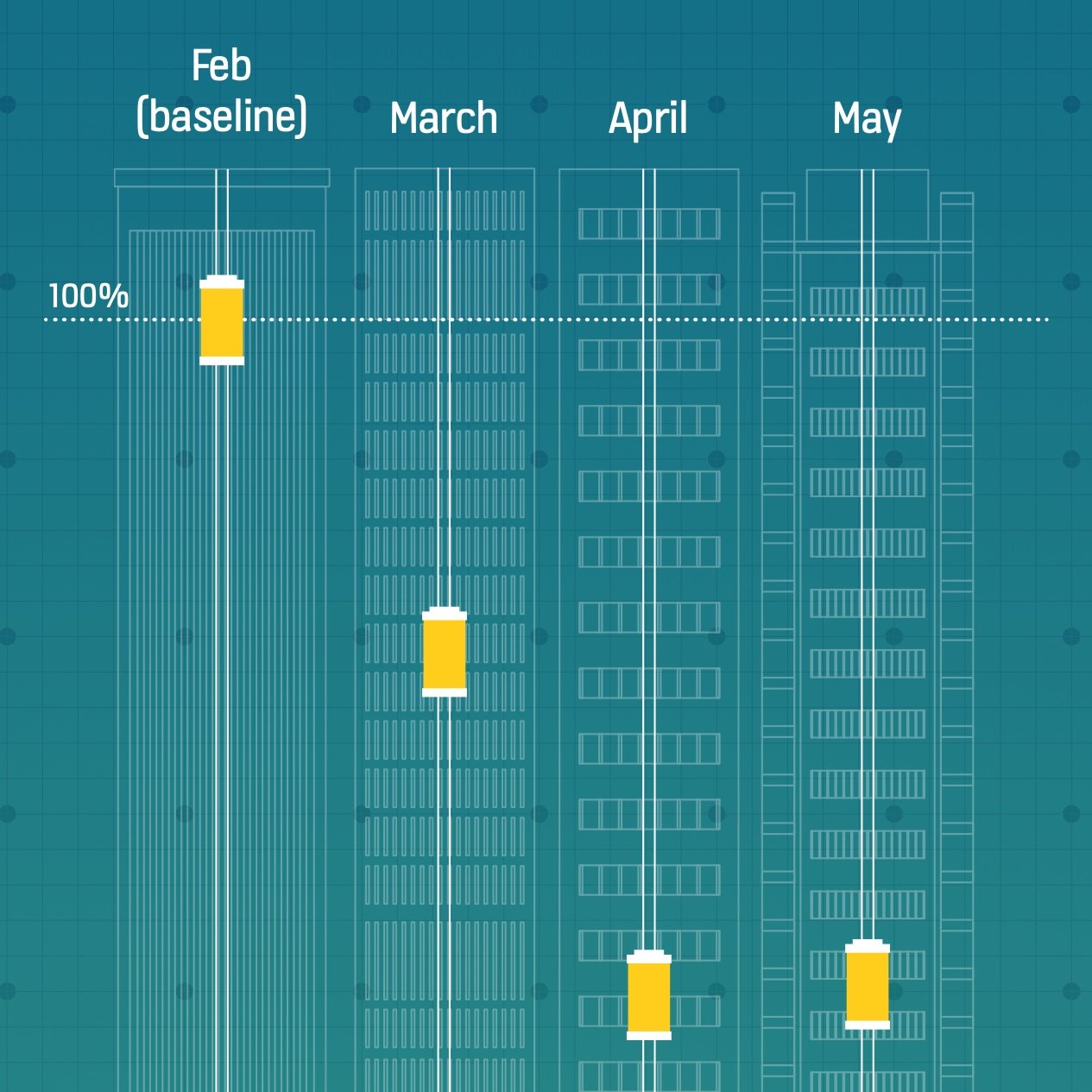
Machine Learning
An animation explaining Machine Learning made for the Royal Society

INGO Tracker
A PowerPoint template with custom visualisations made for a research company
Resources
There is a wide range of resources to accompany our training courses, including our book.

Communicating with Data Visualisation
Based on our long-running Guardian masterclass, our book provides an accessible, nuts-and-bolts exploration of how to turn a spreadsheet into a clear and beautiful visual.

99 DATA VIZ RULES - & WHY IT’S OK TO BREAK THEM
Adam Frost sense checks every data viz rule he can find to see if it holds up under pressure and tries to suggest best practice when they don’t.

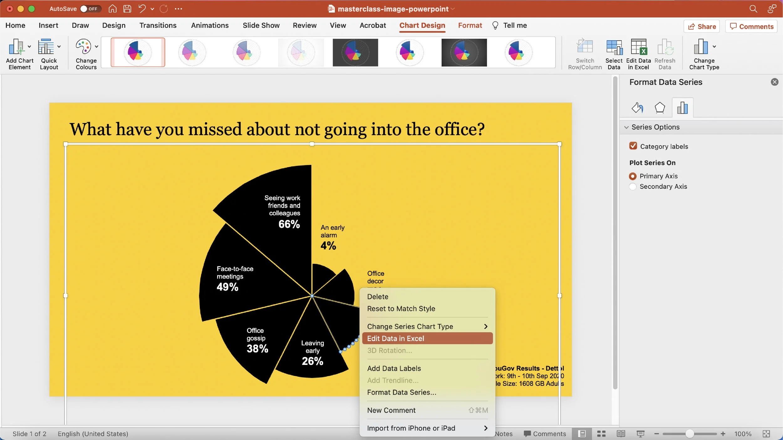
HOW DO I MAKE IT IN POWERPOINT?
Tobias Sturt walks through a series of tutorials on how to manipulate the Microsoft Office charting engine to make bespoke, non-standard charts.