• Home
  • Work
  • Training
  • Resources
  • About
  • Contact
Menu

AddTwo

Information design, data visualisation and training.
  • Home
  • Work
  • Training
  • Resources
  • About
  • Contact

How do I make it in PowerPoint?

Guides to doing interesting things with the PowerPoint charting engine

Featured
Small multiple lines
Read More →
Bars with change arrows
Read More →
Sized arrows
Sized arrows
Read More →
Thistledown
Thistledown
Read More →
Bar bells
Bar bells
Read More →
Screenshot 2023-08-07 at 09.12.26.png
Waffle charts with icons
Read More →
Screenshot 2023-08-08 at 13.02.51.png
Waffle charts (multiple series)
Read More →
How to make a waffle 1.png
Waffle charts (single series)
Read More →
Screenshot 2021-02-08 at 15.54.54.png
Split circles
Read More →
Screenshot 2022-07-28 at 16.30.25.png
Slope charts
Read More →
Screenshot 2022-07-26 at 13.45.06.png
Quadrants
Read More →
Screenshot 2022-08-01 at 11.30.47.png
Pyramid chart
Read More →
Proportional pyramids
Read More →
Screenshot 2022-07-25 at 14.36.40.png
Polar Area
Read More →
Screenshot 2022-08-05 at 11.58.23.png
Pictograms
Read More →
Overlaid columns
Overlaid columns
Read More →
Screenshot 2022-07-22 at 15.08.54.png
Lollipop charts
Read More →
Bullet chart
Bullet chart
Read More →
Abacus chart
Abacus chart

Using a scatter plot to make a beads on a string effect

Read More →
Bubble table
Bubble table

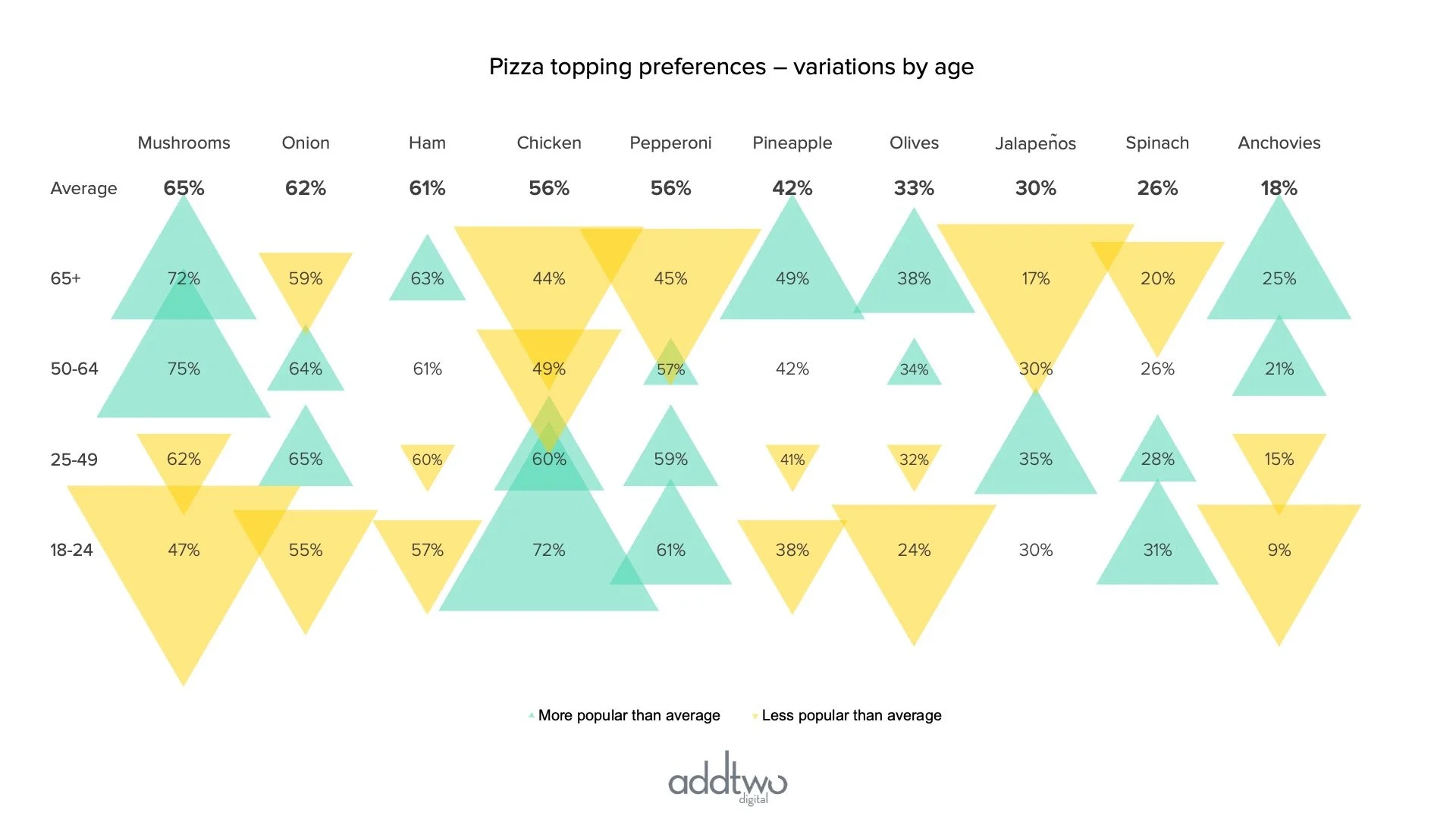
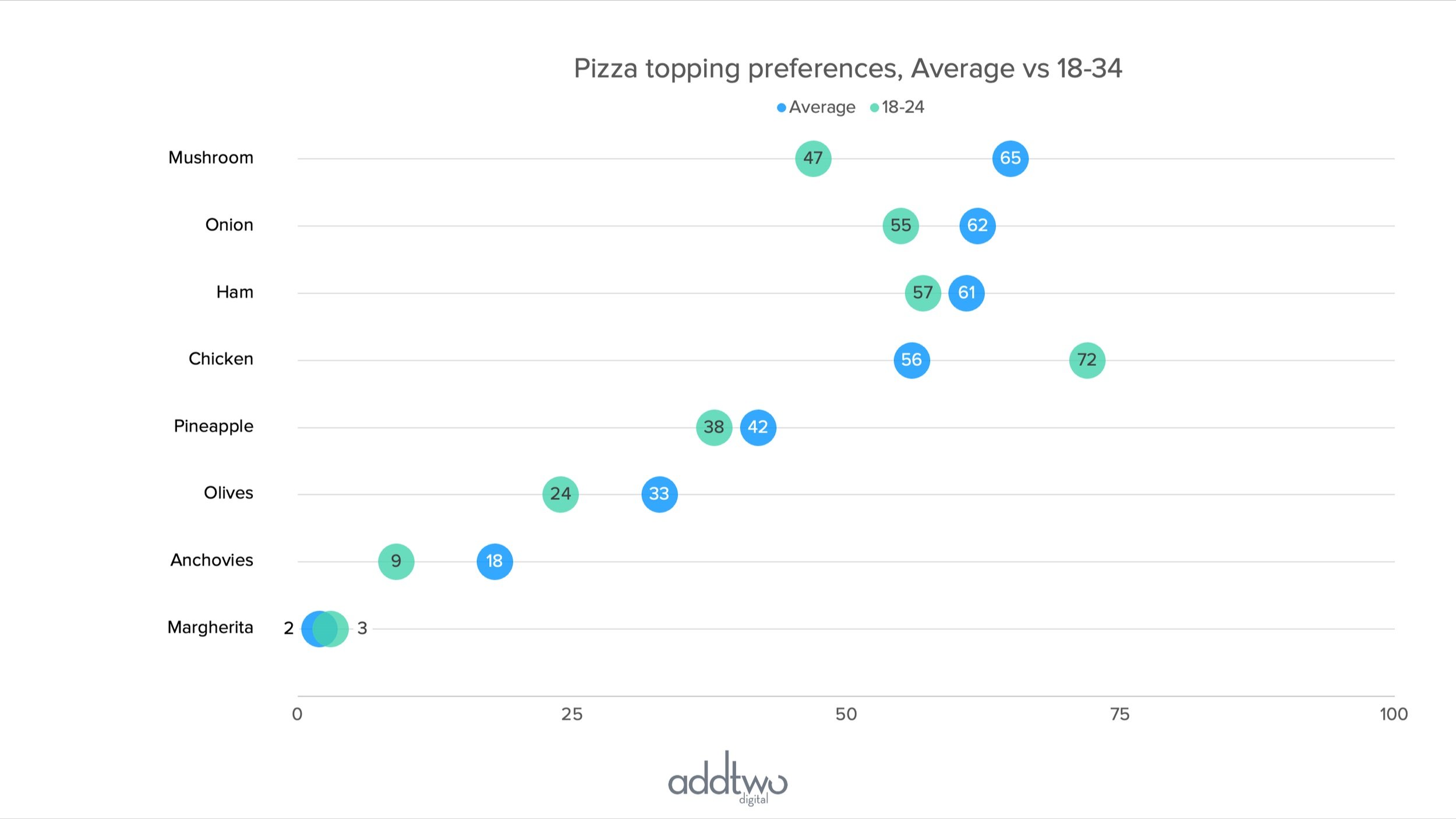
Making a Bubble table using a Bubble scatter with x and y coordinates used to line up rows and columns

Read More →
How do I make a chart in PowerPoint?

A introduction to the fundamentals of the PowerPoint charting engine

Read More →


AddTwoDigital | info@addtwodigital.com | @addtwodigital