
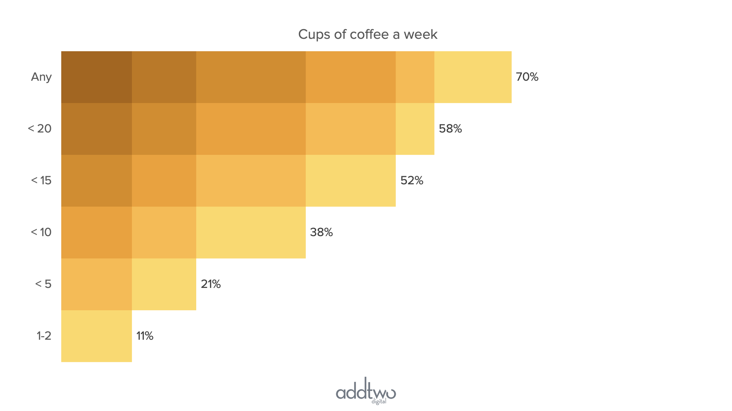
Proportional pyramids are highly specialised charts. They are used to break down populations where each subsequent element is a part of the previous one. Hm. That didn’t make much sense, did it? Basically they’re used a lot by market research companies when you want to break down brand preference from people who have heard of a product down to people who choose it every time. The latter are part of the former, but it’s also useful to see them as a separate measurement.
Basically, if you don’t know what I’m talking about, I don’t believe you’ll need this chart, but if you do, you do, so here we go.
So, how do we make this in PowerPoint?
In this how-to, we’ll be using the default sample data PowerPoint gives you, so you can follow along without needing to download anything, but if you want to, you can find the dataset we used to make the example at the top, and a PowerPoint deck with that slide in, and other examples, here: https://docs.google.com/presentation/d/1m7ZojiwcFllKBb3UgLKi73KXk12qfaEh?rtpof=true&usp=drive_fs
What you’ll need
A stacked bar chart
Data tweaking
Custom labels
How you do it
Essentially what we’re doing is making a series of stacked bars that break down each of the different levels of our data. We then use shading to suggest that each bar is extracted from the bar before it.
The details
Insert the chart
Add a stacked bar to the slide (you can find them under column charts in the chart library).

PowerPoint will add in an example chart and open Excel to show you the data behind it in a spreadsheet.

We’re going to need as many rows of data as we have columns, so we can delete that last row in the example data.
What we then want is diminishing stacks, but we want the data series to match up by level, rather than value.
In the second row we’re going to repeat Series 1 & 2 in the columns for Series 2 & 3.
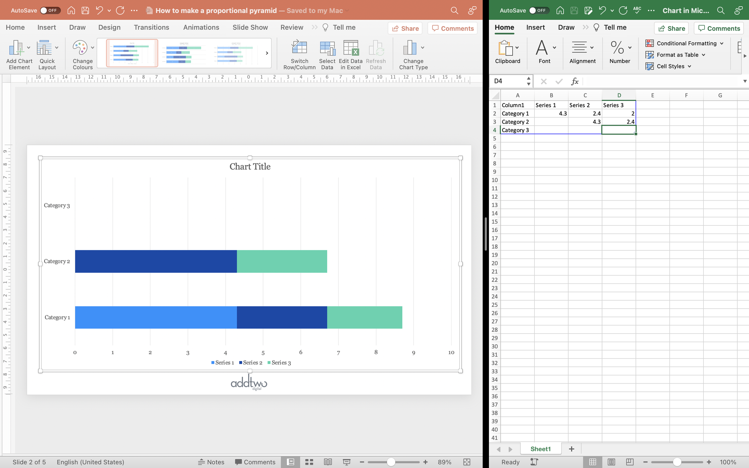
Then in Row 3, we’ll put that data point from Series 2 into Series 3.

That’s all the data for the chart, however we also need to generate data for the labels. This is going to require some Excel formulas.
In a column outside of the blue frame that delineates which data PowerPoint is visualising, add a cell that adds up all the values in the first row of data (=SUM(B2:D2) in our case).

We then want to repeat that addition for all the rows.

Now we can close the spreadsheet and concentrate on the charting.
Layout the chart
First, let’s get rid of the things we don’t need. We can remove the Legend, Horizontal axis and the Gridlines. We can do this by deselecting them in the Add Chart Element menu.

Then we’ll fix the axis, since PowerPoint has done its usual trick of charting the spreadsheet in reverse, with the first row of data at the bottom of the chart. Open the Axis Format tools (you can right-click and select ‘Format Axis).
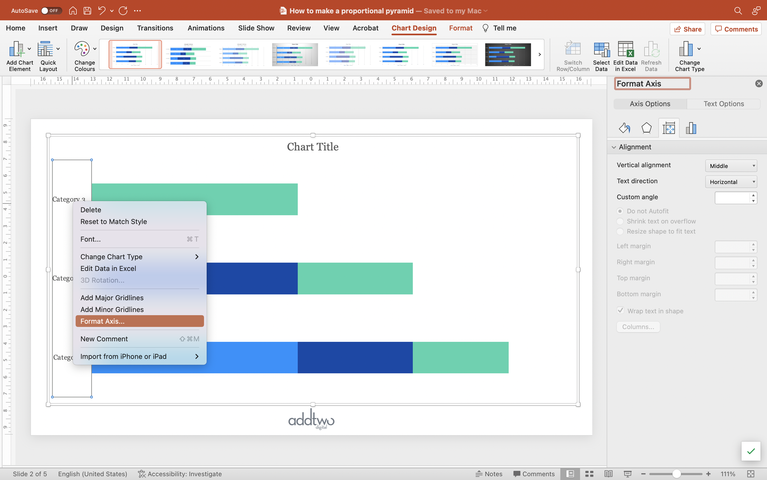
Then, under the Axis Options, select ‘Categories in reverse order’ to reverse the reverse order, which is perverse.

While we’re here let’s get rid of the Axis line, because we won’t need it. Go into the Fill & Line tools and select No Line.
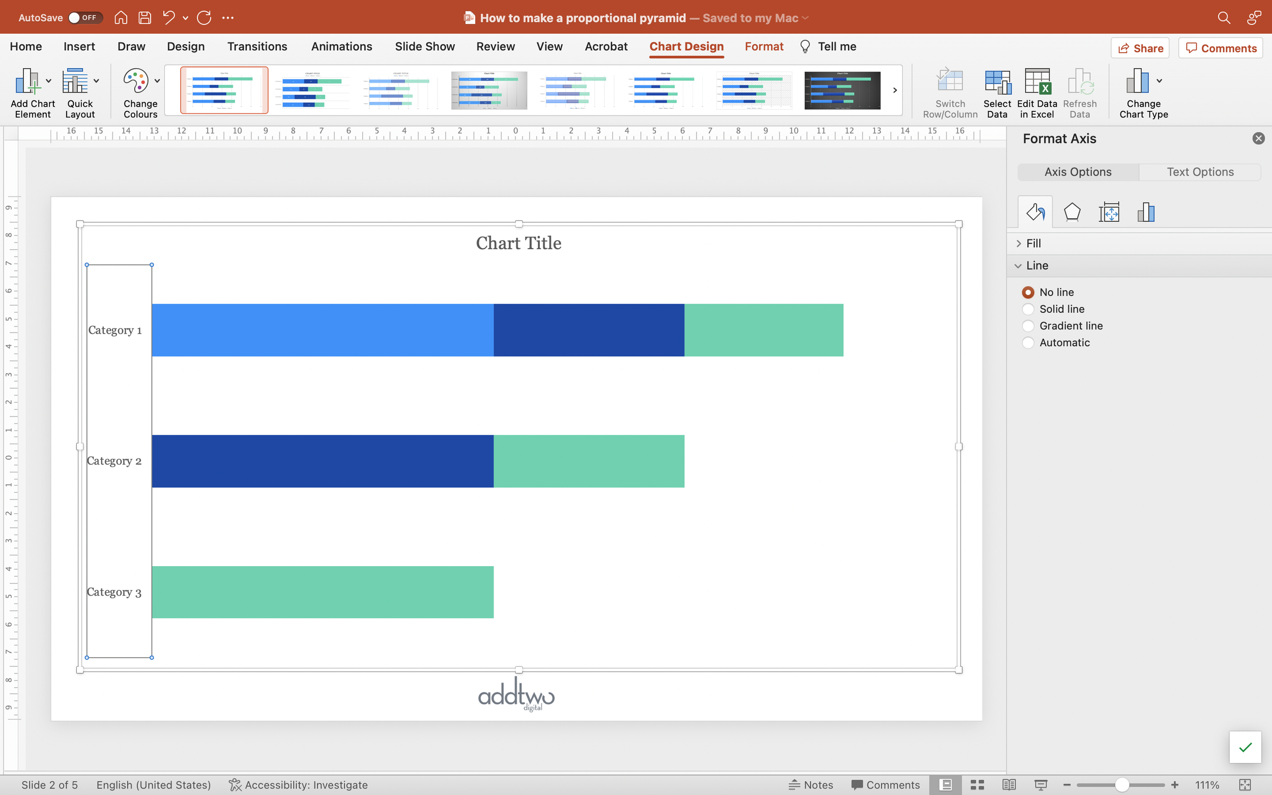
Now we’ll adjust the chart itself. Select the first series and open the formatting tools (you can just right-click and select Format Data Series).

Under the Series Options set the Gap Width to 0%.

With the first series still selected, open the Fill and Line tools (or just use the Shape Fill in the Format tab on the ribbon) and set the fill colour of that first series to the darkest shade of your chosen fill colour.

Select the next series and fill with a lighter shade.

And so on through the data series. This progressive lighter colour gives the sense of data series overlapping, emphasising how each column is an extract of the previous.

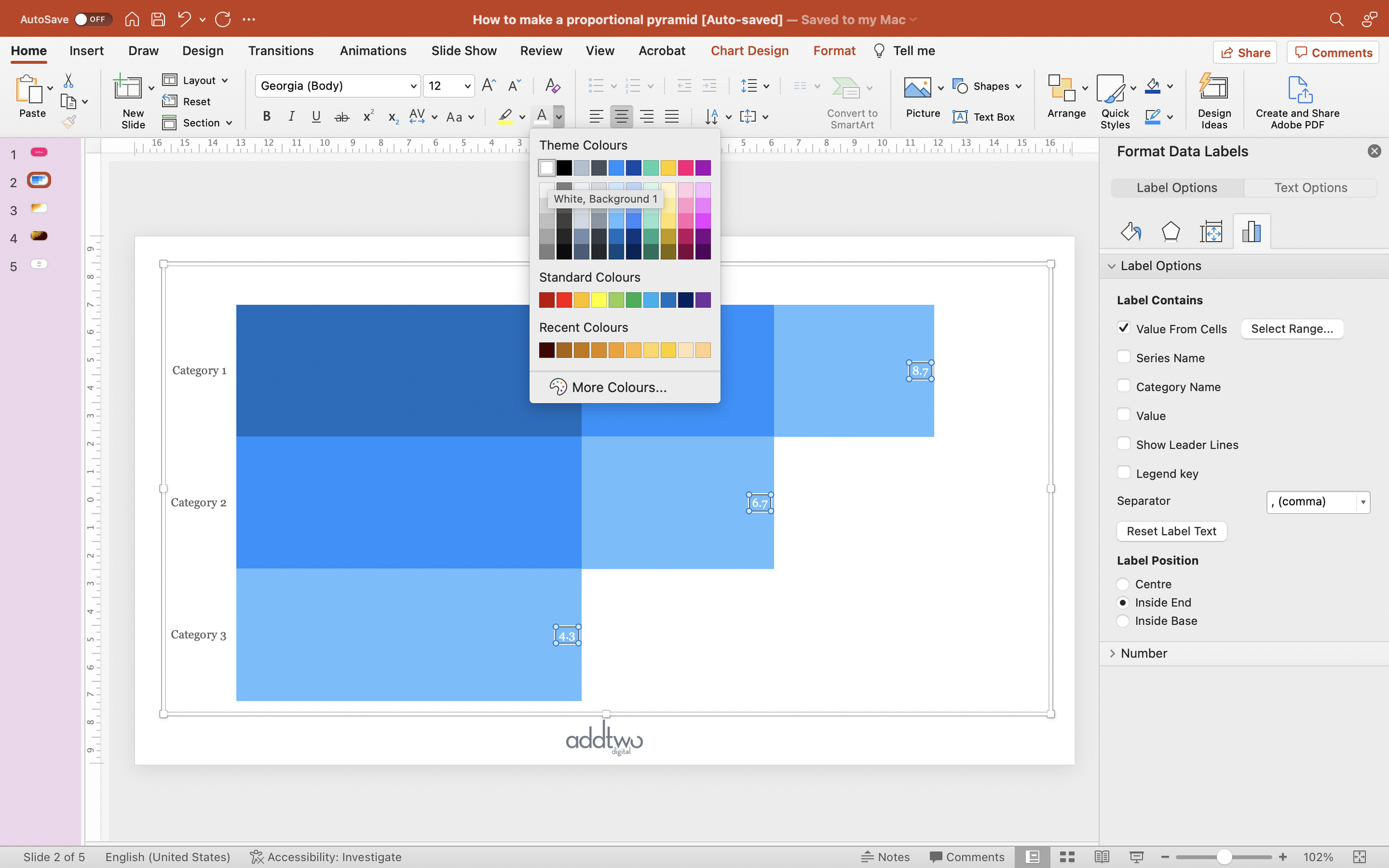
Custom labelling
Now we need to label each of those columns with their total.
Fortunately, PowerPoint now allows us to pull labels from any set of data we like, so we can use those totals we calculated earlier.
Select the final data series and, using the Add Chart Element, add Data Labels and set them to Inside End.

Select the labels and open the formatting tools (you can right-click and select Format Data Labels).

Under the Label Contains options, tick Value From Cells and select the column of totals you created.

Untick any other options and you should now have the labels set to those totals.
Make sure the label colour contrasts sufficiently with the series fill.
So that’s how we make that in PowerPoint
These preference pyramids are a very specific kind of chart for a very specific purpose and not everyone will need one, but for those that do, they often have to be shown in PowerPoint and its useful to have a way to make them.
One note - these are usually more pyramid shaped. I think these left aligned bars are easier to read, but you can use similar techniques to make something more triangular.
