

Bubble Tables are particularly useful as, you guessed it, tables, when you want the viewer to be able to read in columns and rows, but you want to be able to communicate with the immediacy of a chart and in a more interesting way than is achievable with just a data table.
[This tutorial assumes you’re reasonably au fait with PowerPoint and how it makes charts. If you feel you need a more indepth introduction, click here to find out more about the basics of the PowerPoint charting engine]
So, how do we make this in PowerPoint?
In this how-to, we’ll be using the default sample data PowerPoint gives you, so you can follow along without needing to download anything, but if you want to, click here to find the dataset we used to make the example at the top, and a PowerPoint deck with that slide in.
What you’ll need
X Y (Scatter) - Bubble
Data manipulation
How you do it
Short version: we’re going to use a standard Excel bubble scatter but use the x & y coördinates to arrange the bubbles into a table. By giving the bubbles evenly spaced x and y values, we can line them up into rows and columns so they can be read as a table.
The details
Insert the chart
Open a blank PowerPoint slide.
Under Insert/Chart select 'X Y (Scatter)' and then 'Bubble' (no, NOT '3D Bubble'. What is *wrong* with you?)

PowerPoint will drop in a Bubble Chart and open an Excel spreadsheet with sample data in it


Edit the data
This usually has a row of headers and then three rows and three columns of data
These rows and columns are then outlined with a blue frame
This frame shows us the data that PowerPoint is visualising in the chart
Have a look at the structure of that sample data
Each row is a separate entry, with the columns giving the different dimensions
The first column in the position on the x-axis, the second the position on the y-axis and the last, the size of the bubble
We're just going to be using the size to represent data
We're going to use the x and y positions to create a table
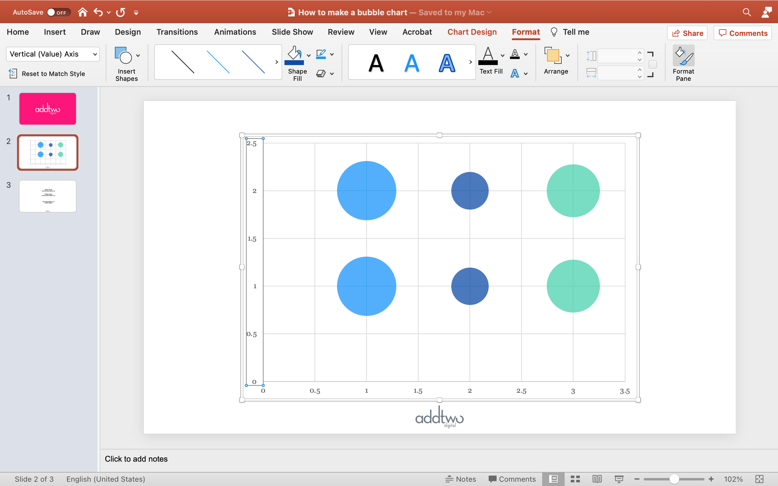
Make all the Y-Values (Column B) the same value: 2
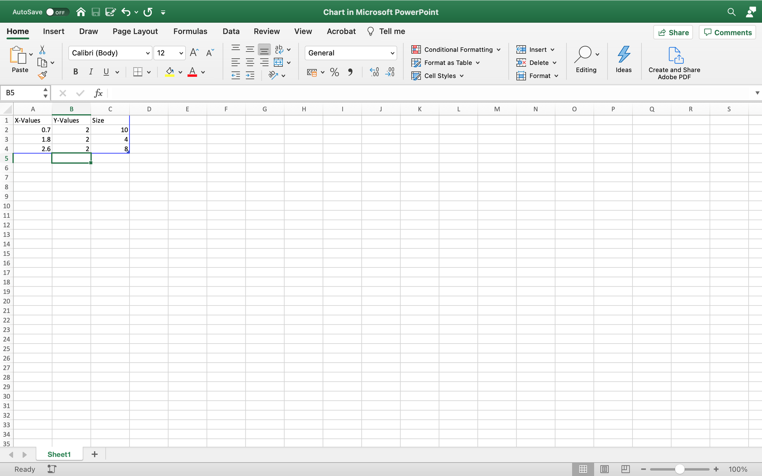
If you look at the PowerPoint, you'll see that this lines all the bubbles up in a row

Then we can evenly space them by making the X-Values evenly spaced
Update the X-Values (Column A) to be 1, 2, 3

And now the bubbles in the PowerPoint chart will be lined up and evenly spaced

So we can use those X and Y values to make a neat, easy to read table
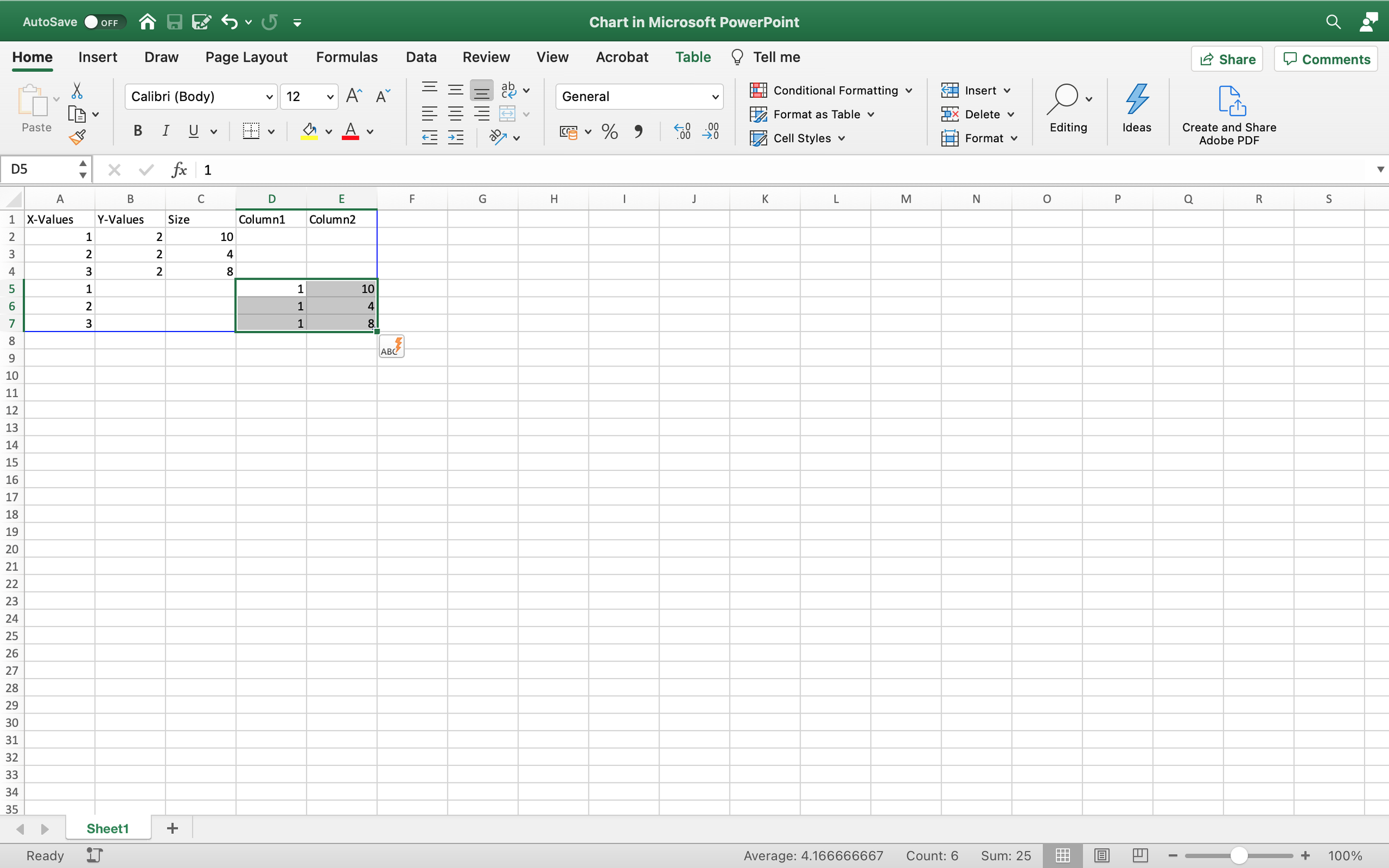
Go back to Excel
Copy the three rows of data (Rows 2, 3 & 4 in the Sheet) and paste them below the current data (so into Rows 5, 6 and 7)

The blue frame should automatically update to include this new data in the chart
If it doesn't, grab hold of the thicker blue border at the bottom right corner of the frame and drag it out to include all the data
NOTE
Due to some unguessed at trauma, PowerPoint does not like Bubble charts and will do its best to forget how they work
Especially if you copy and paste a Bubble chart from somewhere else and then try and add data
Frequently PowerPoint will simple refuse to acknowledge new data or new cells
If this happens to you, try adjust the blue frame
But frequently you will have to resort to more powerful tools
Under the 'Chart Design' tab in the ribbon is a 'Select Data' button
This will open up a dialogue box in Excel that will enable you to tell PowerPoint precisely which cells to look for data in
It can be a beastly thing to deal with, but there are plenty of how-to guides online
END NOTE
Now change the Y-Values for the new data (so cells B5, B6 & B7) to 1

If you look back at the PowerPoint chart you will see that we now have a new row in our table

Obviously feel free to change the size values to different data to how the table might work in practice as a piece of visualisation
Make data series
At the moment PowerPoint is displaying everything in one colour
This is because everything is currently one data series
Often we are going to want to use our table to show different series in different columns or rows
Of course, we could just do this by colouring the bubbles differently using PowerPoint's Format tools
But it's better to represent those series in the data structure
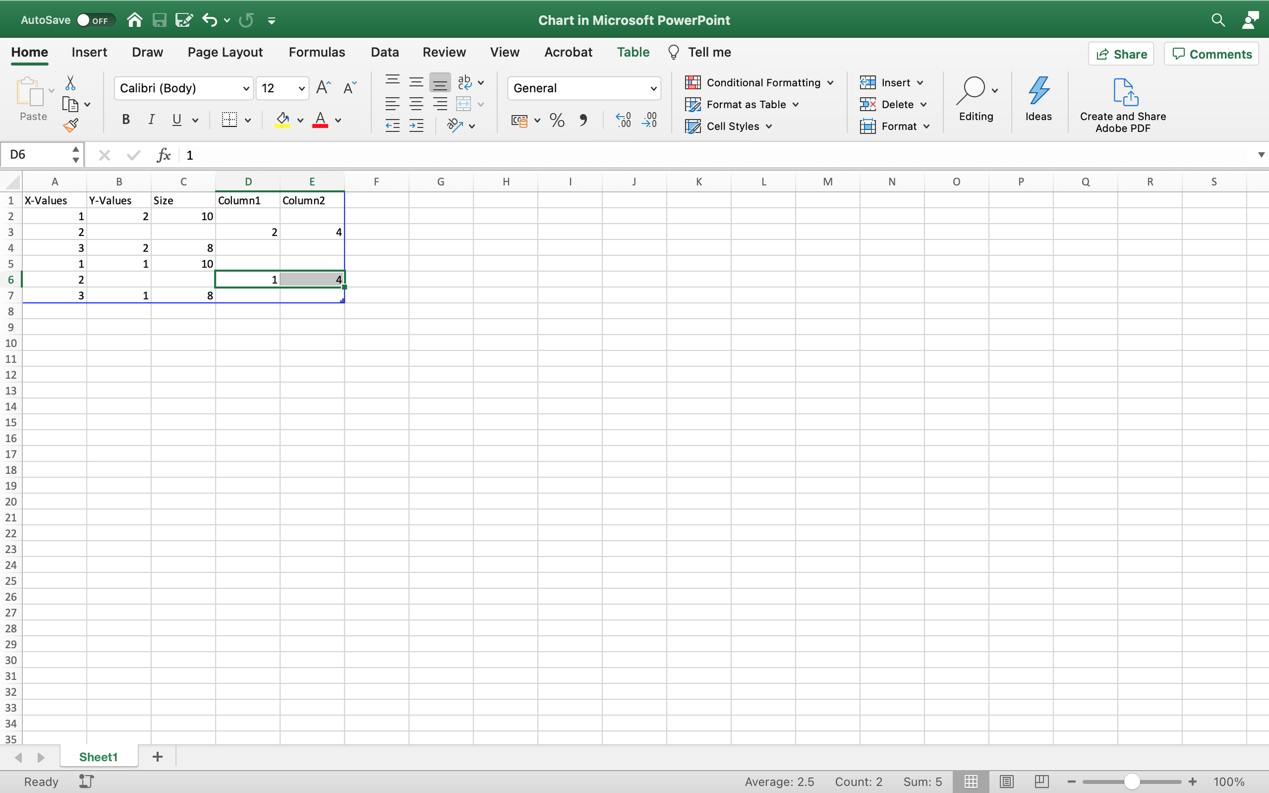
Go back to the Excel
PowerPoint usually uses the Y-Values to represent a data series
By creating new columns of Y-Values we can delineate new series in the data set
With a bubble chart this means creating new columns of Y-Values and Sizes
Highlight the Y-Values and Size in the new data we just added to the Sheet (so cells B5 to C7)
Pull that data across to the right, until its in two columns on its own (so into columns D & E, so it now occupies cells D5 to E7)
Flick back to the PowerPoint and you'll see that all that has changed in our table is that the bottom row is now a different colour

PowerPoint will automatically colour data series differently
As usual it will do this by just taking the next colour in the slide template colour palette
We can pick our own colours later
Making the columns into separate series is slightly more complex but follows the same system
Go back to the Excel and undo that last change so that we're back with just three columns of data
Now grab the Y-Value and Size cells where the X-Value is 2 (so cells B3 & C3) and drag them across to fresh columns (so into cells D3 and E3)
And repeat this for the other X-Value of 2 (pulling cells B6 and C6 into D6 and E6)
If you have a look at the PowerPoint now, you'll see that the middle column (X-Value of 2) has changed colour

Let's make the third column a whole series of its own too
Grab the Y-Value and Size where the X-Value is 3 and drag them right into whole new columns (so dragging B4 & C4 to F4 & G4)
Do this for both entries in the third column (so also dragging B7 & C7 to F7 & G7)
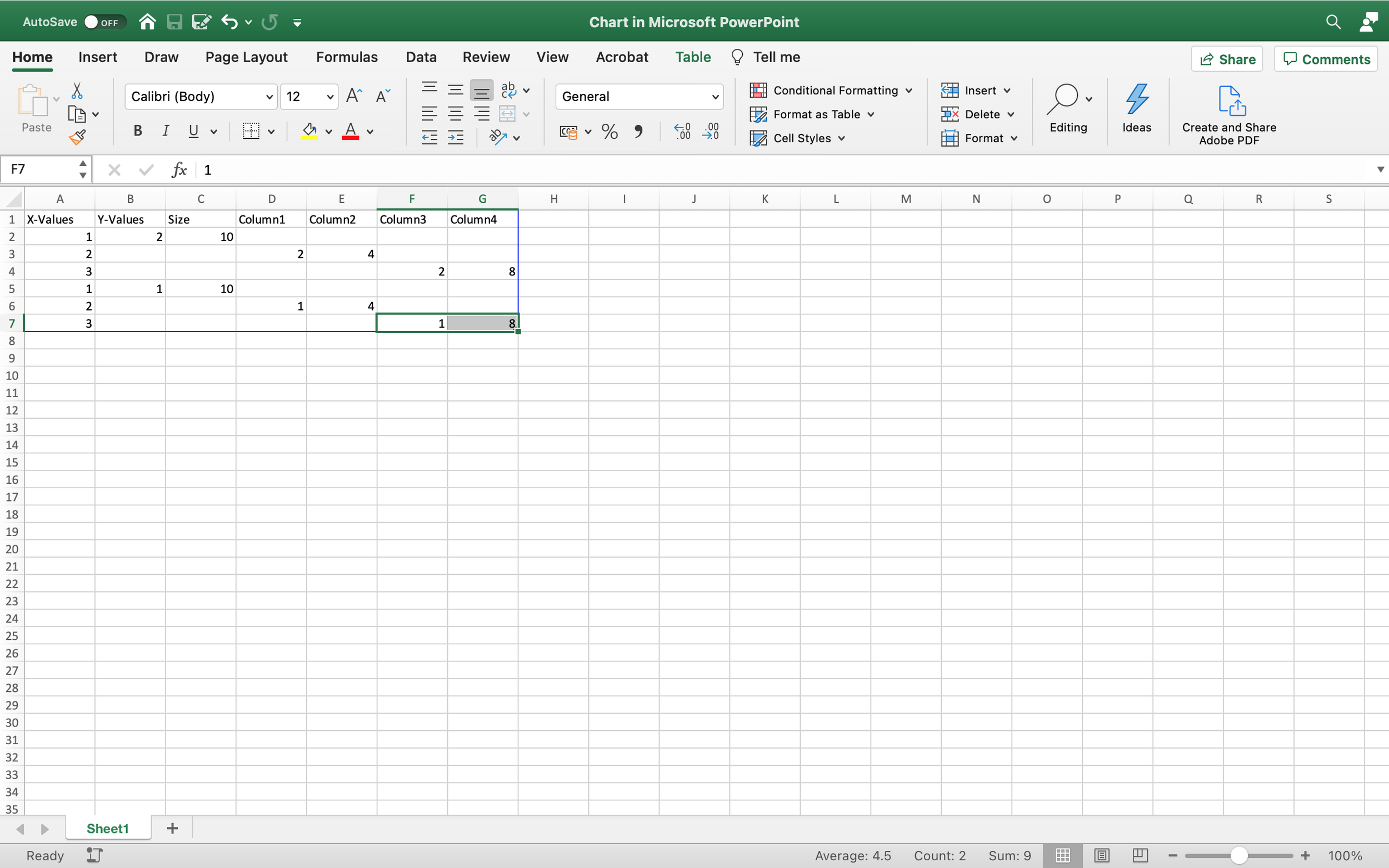
Flick back to PowerPoint and you'll see that we now have three columns, all different colours

One thing to note is that PowerPoint, by default, uses the titles of the Y-Values columns to name the series if we use a Legend in our chart
The advantage of an auto generated Legend is that it will match whatever changes we make to colour or data structure
So to rename the series, update the titles for the Y-Value columns (cells B1, D1 and F1 in our example)

So this is how we can make bubble tables of any size
Adding X-Values to create new columns and adding Y-Values to make new rows
And then using different columns of Y-Values and Size to make new series within the table
Let's close Excel for the moment and concentrate on tidying up in PowerPoint
Adjust the chart
First of all, let's even up the appearance of the table
We'll do this by setting the minimum and maximum values for the axes
We often use these settings to manipulate the appearance of charts, so it's useful to familiarise yourself with them
Select the y axis labels in the chart and open the Format Pane
The easiest way to do this is simply by double clicking on the axis
Or you can select it, right-click and select 'Format Axis...' from the menu
Or you can select it, go to the Format tab and select 'Format Pane'
There are probably other ways
As a side note, this kind of redundancy in interface is a good idea
You never know how a user likes to work or what habits they might have picked up elsewhere
Give them as many ways to do what they want to do and they'll find one of them, at least
Anyway

Click on the Axis Options tab if it's not already open
It's the one with the little chart icon
In the Axis Options pane you'll see two text boxes under the heading Bounds, one for minimum, one for maximum
For example, we're going to set the minimum to 0 and the maximum to 3

This will centre the bubbles vertically in the table
PowerPoint will make its own guesses at the most legible minimum and maximum for the data in the sheet
But these aren't always the most neat, so setting them here will keep everything lined up
We usually use whole numbers as Y-Values to make our table rows
Simply because it's usually easier to think of them as row 1, row 2, etc and number them accordingly in the Excel sheet
So the centre them you want a minimum one digit below the lowest row
And a maximum one digit above the highest
But it all depends on how you're using the Y-Values to designate rows
Having set that, we can just delete the y-axis
You can just select it and hit delete
Or go to the Chart Design tab and under 'Add Chart Element' select 'Axes' and untick (by selecting) the 'Vertical Axis' option
PowerPoint will maintain the settings for the minimum and maximum
It just won't show the axis
Now we do the same for the x-axis
Select it, open up the Axis Options pane and set the minimum and maximum Bounds
In this case we'll set them respectively to 0 and 4, one less and one more than the X-Values for our columns

And then we can delete the x-axis too

In fact, lets delete everything
Select the vertical gridlines and delete them, likewise the horizontal gridlines
You can also switch them off in the 'Add Chart Element' menu, as you can with everything else
Or you can use that menu add things, of course - like a Legend

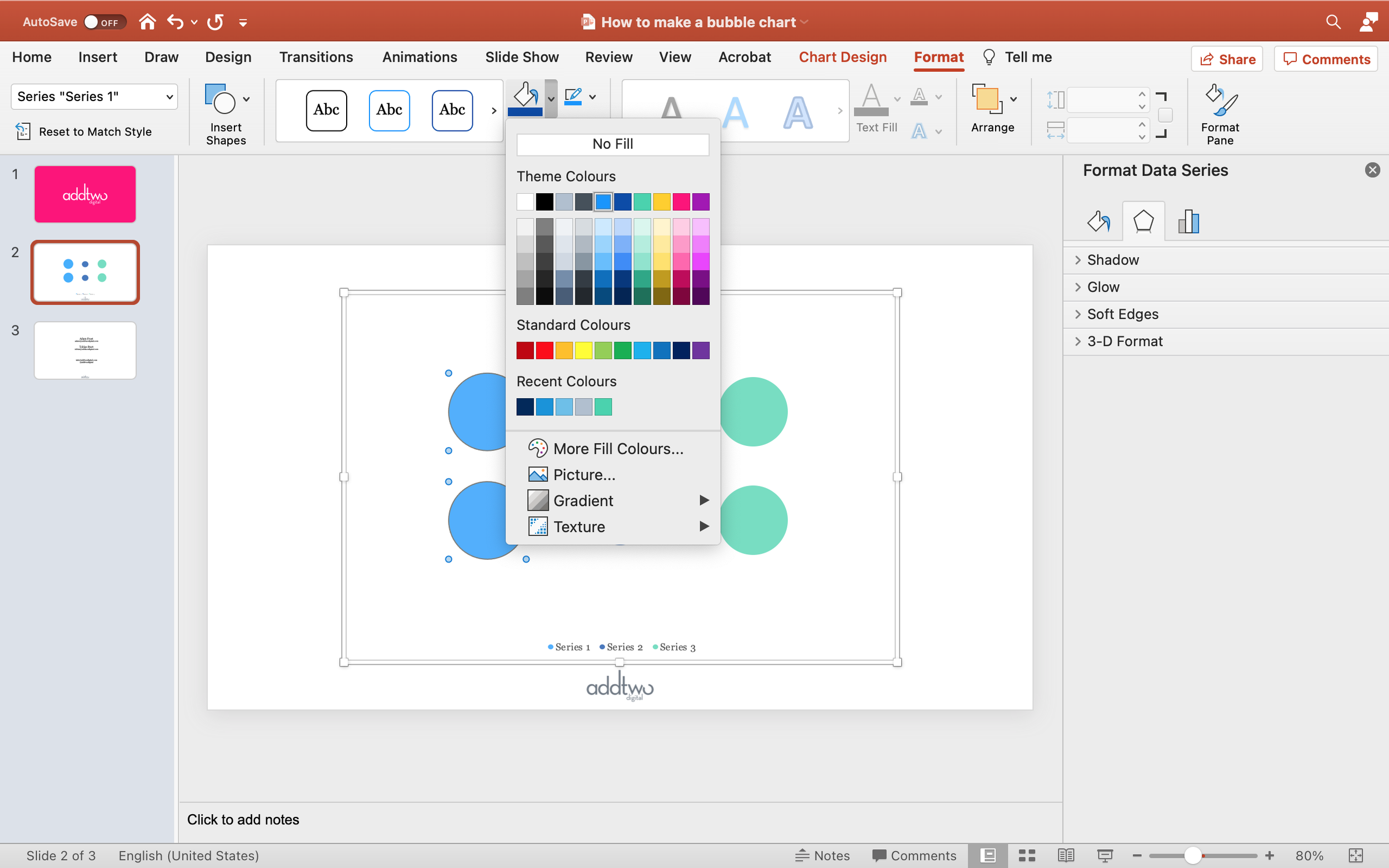
We can also recolour the columns
Just click on one of the bubbles in a series and PowerPoint will auto-select the whole series
Then, under the Format tab, we can just select a new Shape Fill
Or select the 'Fill and Line' tab in the Format Pane
Open the 'Fill' pane, which should show 'Automatic' selected by default, and select 'Solid fill'
We can then select a colour using the Colour dropdown
You can find out more about colour palettes in PowerPoint by clicking here
Add Labels
We should also add some labels to our bubbles
Select the whole chart, rather than a single series and then, under the 'Add Chart Element' menu select Data Labels and put them in the Centre
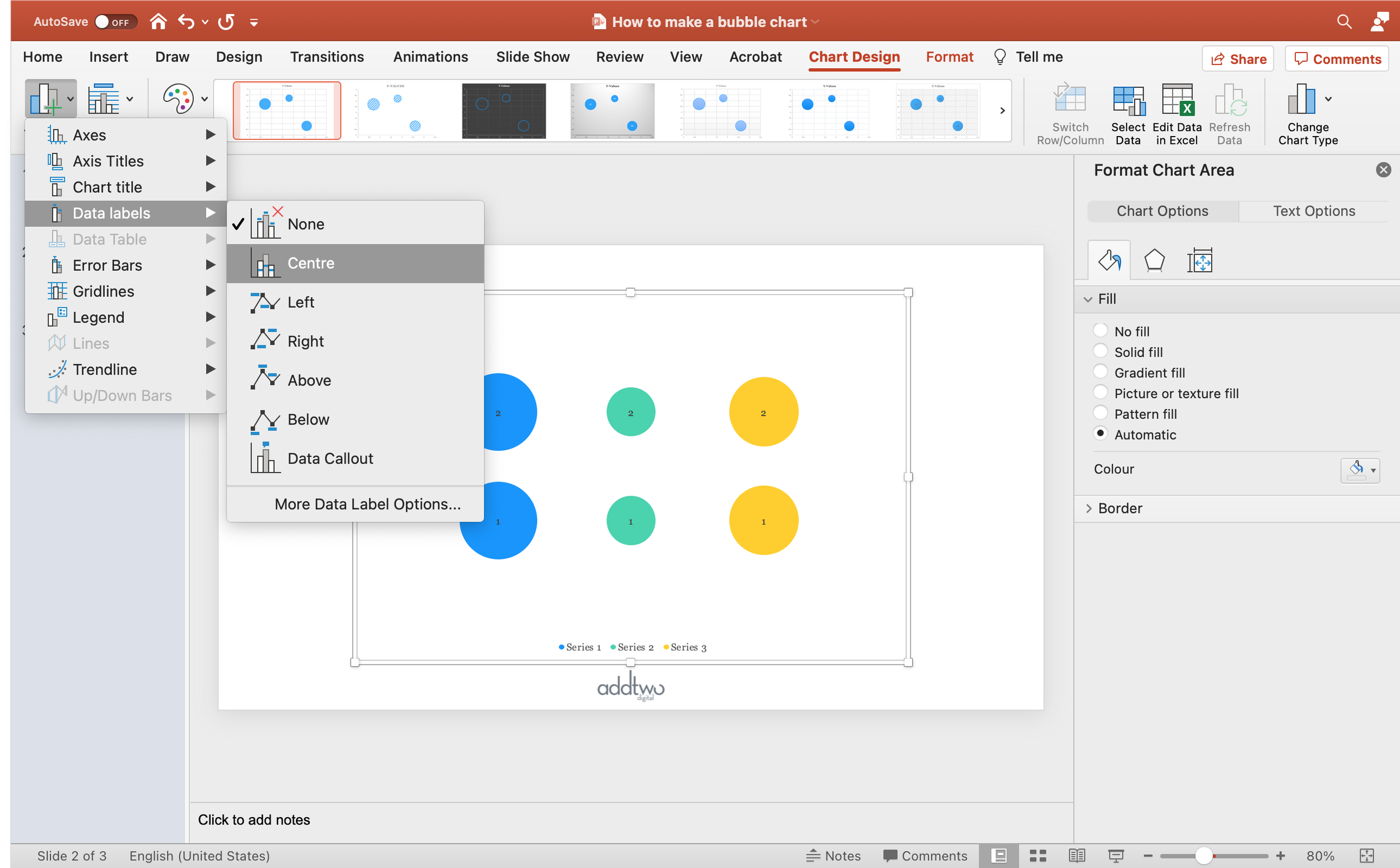
You will see that PowerPoint, by default, labels them with the Y-Value, not the size
This means we're going to have to change that, since the relevant data is in the Size columns
Unfortunately, if we have multiple series, we can only change one series at a time because.... <waves hand at Redmond>
Click on the labels in the first column and open the Format Pane
Under the 'Label Options' tab, there is a 'Label Options' pane
In the 'Label Contains' options there, deselect 'Y Value' (and 'Show Leader Lines', while you're at it)
Select 'Bubble Size' - the labels should update

While we're here, we might as well update the text colour, if we need to depending on our bubble fill colour
You can do this in the Format Pane, in the Text Options view, under the Text Fill and Line tab
Or just use the Text Fill option under the Format tab in the ribbon as you might with any piece of text

Now repeat that for all the series
This labels the bubbles, but not the rows and columns
Because we're manipulating a chart to do something its not prepared for, we'll have to make these labels ourselves
The easiest thing to do, to make sure everything lines up, is to use tables
This will help ensure that everything is evenly spaced and aligned
We'll start with labelling the columns
Go the to Insert tab on the ribbon and click the 'Table' button
Then, in the layout dialogue, select 1 row and 3 columns, to make the 3 columns in our table

This will give us a long thin table

PowerPoint will open up the 'Table Design' options in the ribbon
Deselect 'Header Row' and 'Banded Rows' as options
Then, under 'Shading' select 'No Fill' and under 'Borders' select 'No Border'
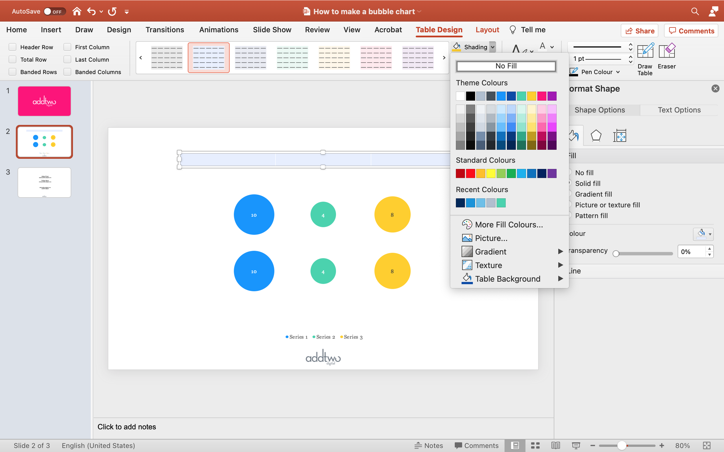

Now type the column headings into the table cells
Select the row and centre the text

Now drag the table into the centre above the chart and pull the ends in (or out) to line up the cells with the columns of bubbles

Then we can label the rows in the same way
Make a table 1 column wide and 2 rows deep

Switch off all the headers, banding, backgrounds and borders
Pop the labels into the rows and right align them
Also vertically centre the text with the cell, which will make alignment with the rows easier

Then align the table with the left hand side of the chart and stretch its height so the labels line up with the rows
And there we are: a bubble table, all ready for someone to complain that area isn't the best way to represent this data
If there's anything worse than PowerPoint, it's people
