

Slope charts are essentially line charts that emphasise the difference between just two points in time. This makes them particularly useful for stories about change, especially dramatic changes.
So, how do we make this in PowerPoint?
In this how-to, we’ll be using the default sample data PowerPoint gives you, so you can follow along without needing to download anything, but if you want to, you can find the dataset we used to make the example at the top, and a PowerPoint deck with that slide in, and other examples, here: https://docs.google.com/presentation/d/1mFTrQFm8lQq3SAtXi-ODXIFGQ3L88usU/edit?usp=drive_link&ouid=112240584160970239353&rtpof=true&sd=true
What you’ll need
Line chart
Chart layout tweaks
How you do it
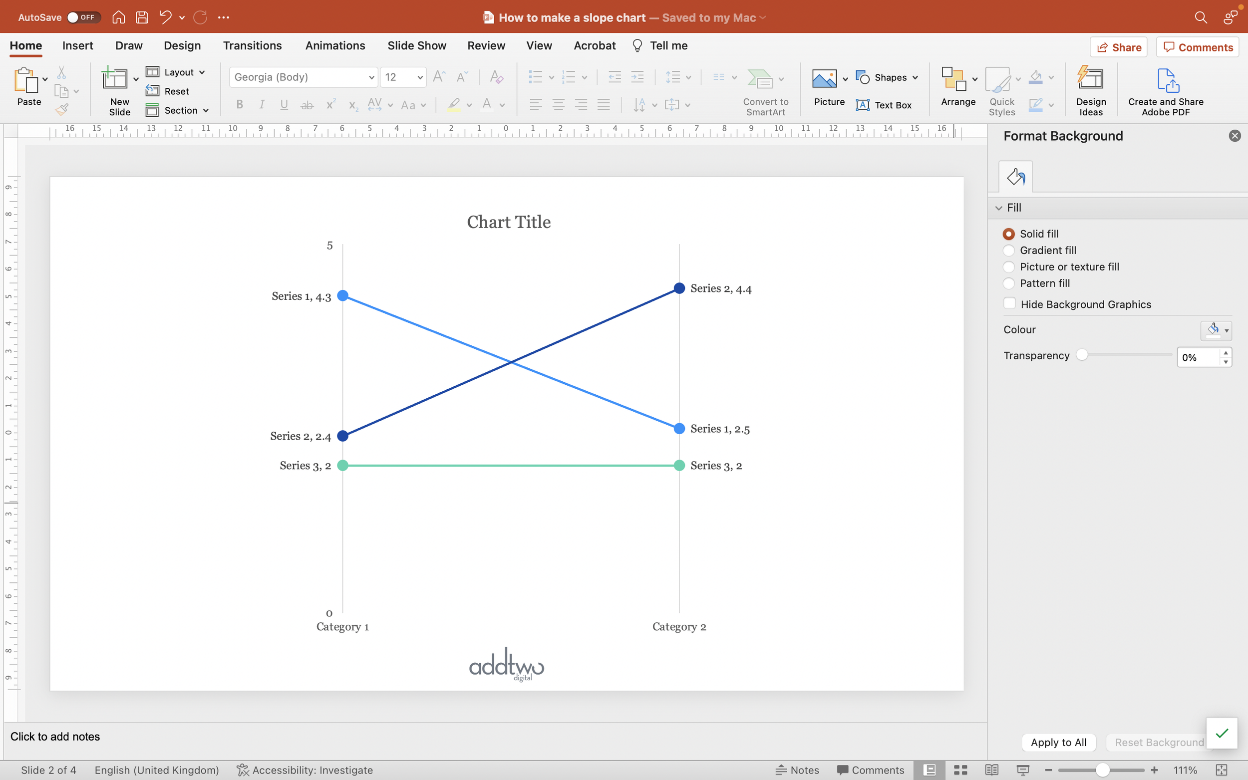
Really, a slope chart is just a line chart with just two points on the x-axis for two points in time, so most of the work lies in choosing those two points, rather than in the charting. We’ll just be using a standard line chart, although we often need to make some chart layout tweaks to make everything neat.
The details
Insert chart
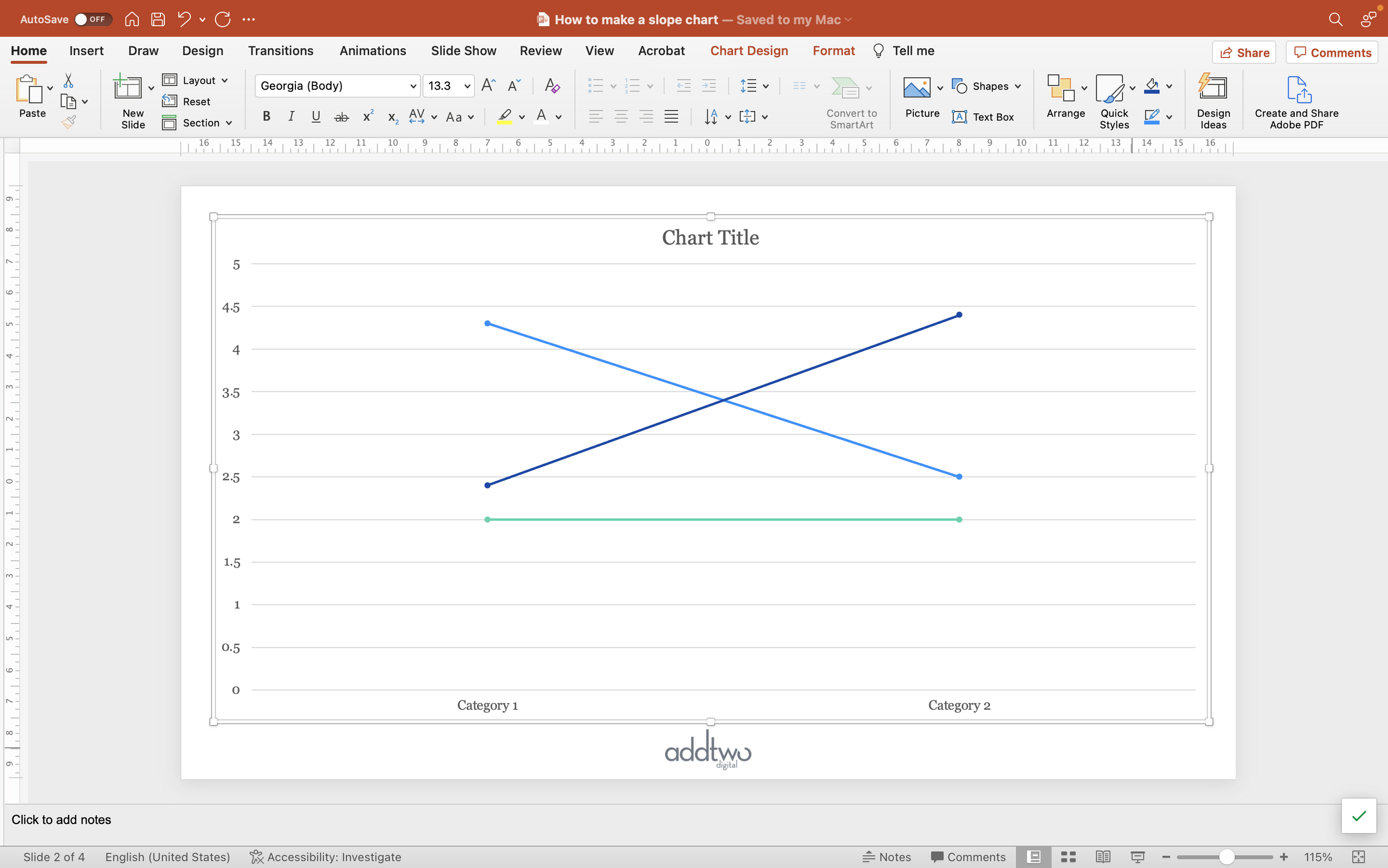
We’ll insert a Line Chart. We could just use a standard line, but typically in slope charts you want to emphasise the ends of the lines, since we only have two data points on each line, so we’ll use a Line with Markers (you can find that under 2-D Lines in the PowerPoint chart tool).

As ever PowerPoint will create an example chart and open Excel to show us the example data behind it.

For a slope chart, we only want two points on the x-axis, a beginning and ending, so let’s delete the bottom two rows of data in the spreadsheet.
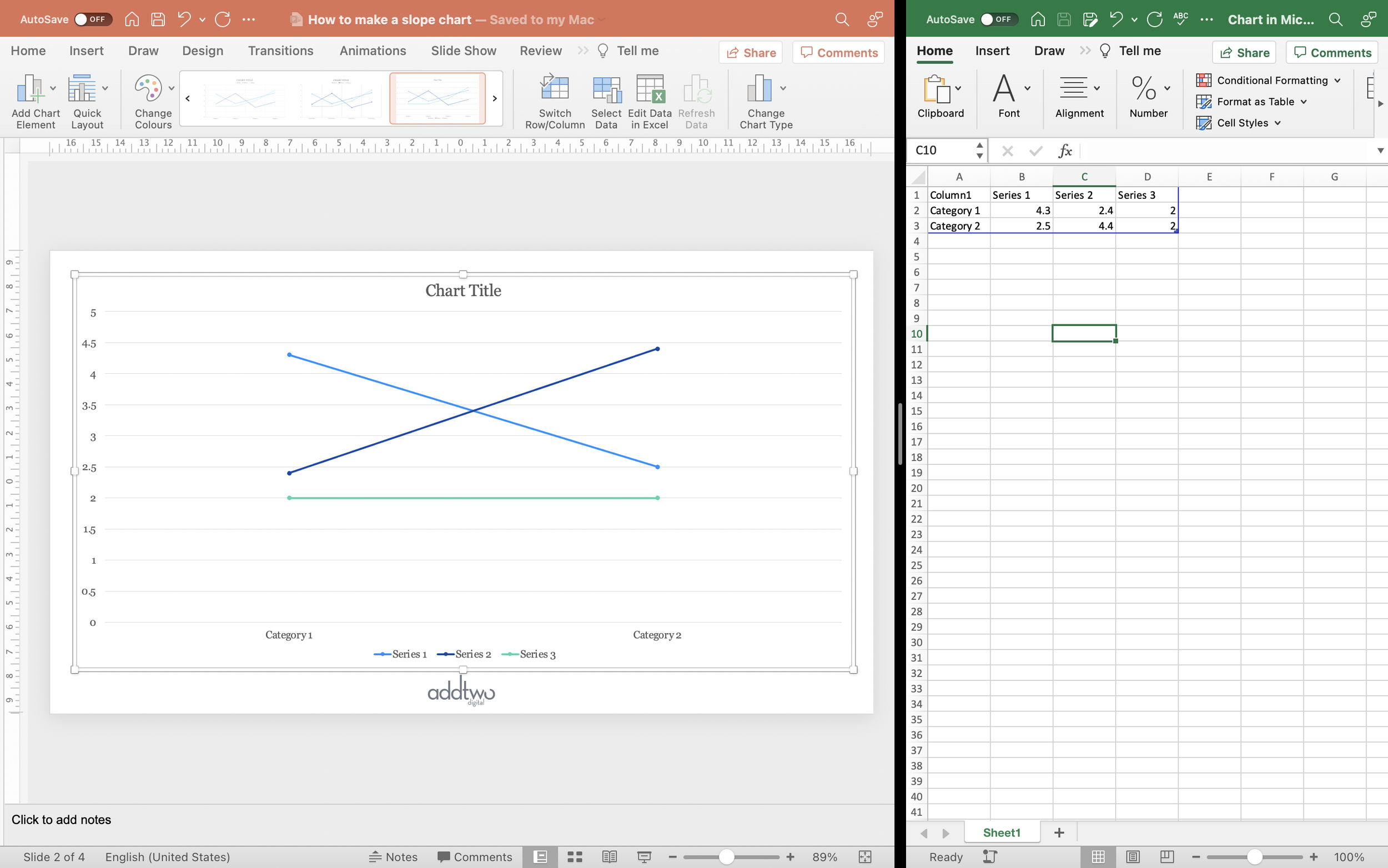
We don’t need to do anything else to the data, so we can close the spreadsheet now.
Tweak the chart layout
First of all, lets get rid of the elements we don’t need. We’re going to be labelling the markers directly, so we can delete the Legend (you can just select it and hit delete).
Now let’s format the x-axis. Open the Axis Options in the Format Pane (you can do this by double-clicking on the axis, or right clicking and selecting Format Axis).

Under Axis position, select ‘On tick marks’ to use the whole axis.

We’re also going to remove the baseline from the axis, so under Fill & Line (the paint pot icon) set the Line to ‘No line’.

Next we’ll tweak the Gridlines. Under Add Chart Element, select Primary Major Vertical to set the sides of the chart. But we don’t want the horizontal gridlines, so, under the same menu, untick those.

Finally lets tweak that vertical, y-axis labelling. Select the axis and, under the Format Axis options, set the Major Units to be the same as the maximum value of the axis. This will give us just minimum and maximum labels on that axis.

Now to set the real attribute of slope charts, their narrow width. Within the chart object, click behind the lines to select the plot background.

Drag in the sides of the plot till it becomes narrower, but still centred within the Chart Object.

Doing this also makes sure that we have space within the chart for our data labels.
Style the chart
Select one of the lines in the chart. Open the Format Pane and the Fill & Line tools (you can right-click on the line and select Format Data Series, then choose the paint pot icon).

Check you’re happy with the line colour and width.
To style the markers, click on the Marker button and open the Marker Options. Set the Marker to ‘Built-In’ and a circle. Make it big enough to be clearly visible.

Check the fill colour matches the line and remove any border by selecting ‘No line’.
Now add data labels. Under the Add Chart Element options select Data labels and set them to Left.
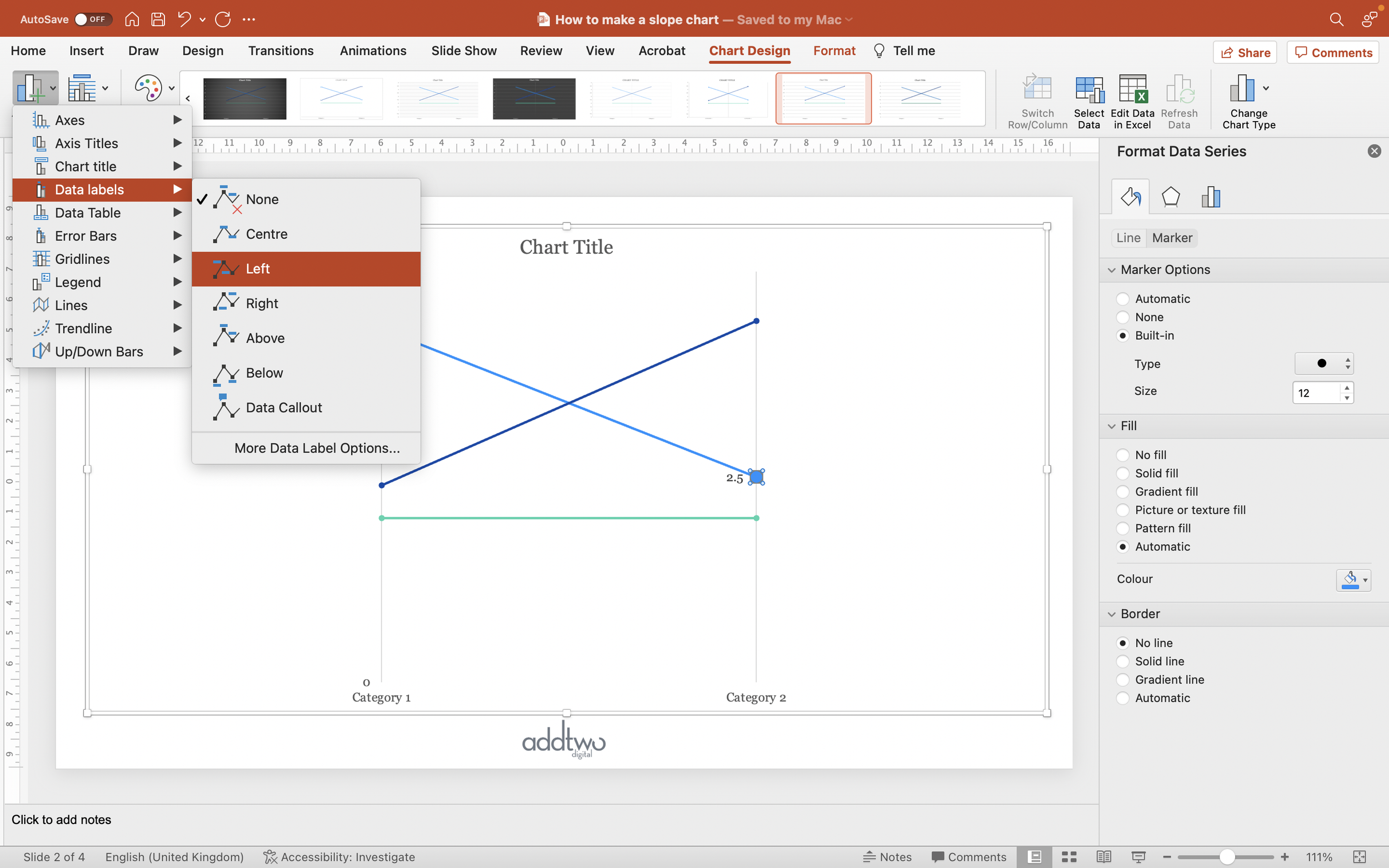
Select the labels and open the Label Options in the Format Pane (you can right-click and select ‘Format Data Labels’).
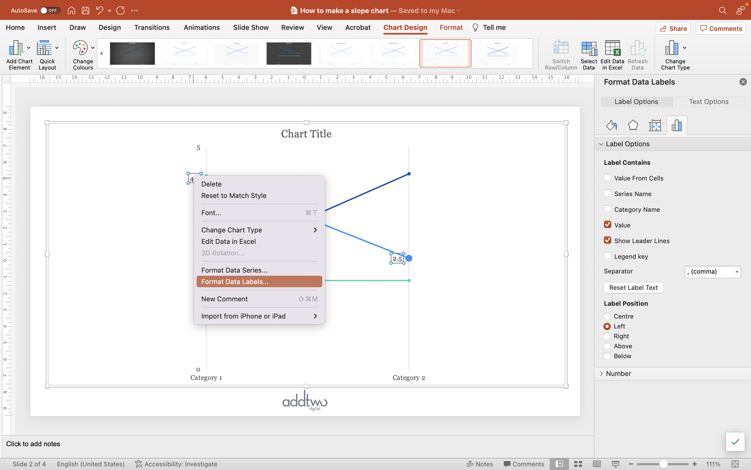
Select the Series Name as well as the Value, so that each point is clearly labelled.

Now select the right hand label (you can just click on it) and set the Label Position to ‘Right’.

Because each line is a separate data series, we’re going to have to repeat that process for all of them.
So that’s how we make that in PowerPoint
A slope chart is a really effective way of showing change, but they only really work if we lean into the simplicity and make them as clear and direct as possible.
But then how else would we chart anything, eh? EH?
