
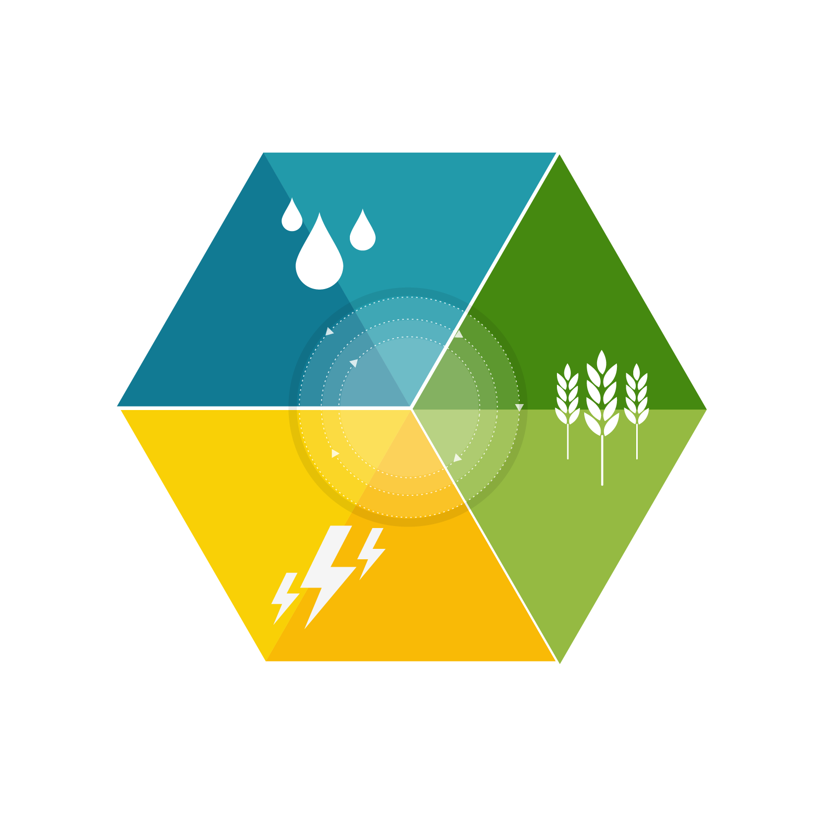
Nexus is one of the first animations we did for SAB Miller in response to an open brief to help their Chief Executive to make an impact when he spoke at the World Economic Forum in Davos. The animation was created from a pile of research material and a day’s briefing from academic experts. The animation was a tremendous success across social media, outperformed other SAB Miller video content and was then used by the UN for their UN Water Week website
Kantar Public challenged us to bring their social and political research data to life in a new and interesting way. After working with Kantar Public to create a storyboard, then checking the rigour of the data and the narratives featured, we created this short animation that is now featured on uk.kantar.com.
To support the Royal Society's year-long Machine Learning programme, we created a series of animations focusing on 'Machine learning in everyday life'. The objective was to make a complex technical subject engaging and relevant to the widest possible audience. To do this, we visualised key facts and statistics in a style that mixed live-action and motion graphics. The animation has been used online, on social media and at a range of live events.
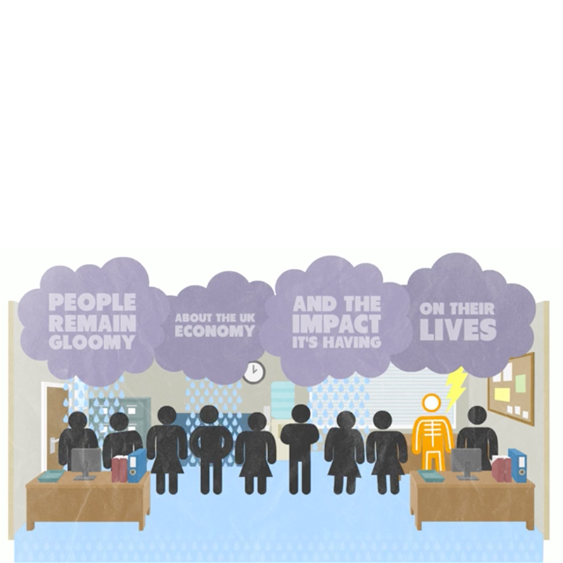
Zurich Insurance approached us with some research they had carried out detailing how people make life’s big decisions (getting married, buying a home or having children) without first fully understanding all of the facts. Zurich required a central hub for the content, something to entice people in and thematic content to inform the audience once they were there. We took a multi-channel approach in order to accomplish the variety of interactions Zurich required. We created a fun animation to reach out beyond the content hub on social media and draw people to the site. Regularly published infographics ensured that people returned to the site to read the new information and the content navigator enabled users to get answers to specific questions and acted as a central hub for supporting articles and information.

As part of The Guardian’s Sustainability 24 campaign we helped produce a series of infographics sponsored by Accenture, along with this animation. Accenture were particularly keen to stress the possibilities and advantages in a new circular economy. The animation needed to use the visual language of the static infographics while making it move without distracting or confusing from the complex, data driven points being made.
Add Two worked with Christie’s Education to produce a number of animations to accompany their lecture series on Art Market Economics. The course covers the development and structure of the art markets in key regions; critical economic theory for understanding the market; art finance; regulation; and the economic impact of the art market. Add Two worked closely with Dr Clare McAndrew, the lecturer, and with the Christie’s Education team to ensure that the animations helped illuminate and explain the intricacies and fascinating subtleties of the Art market.
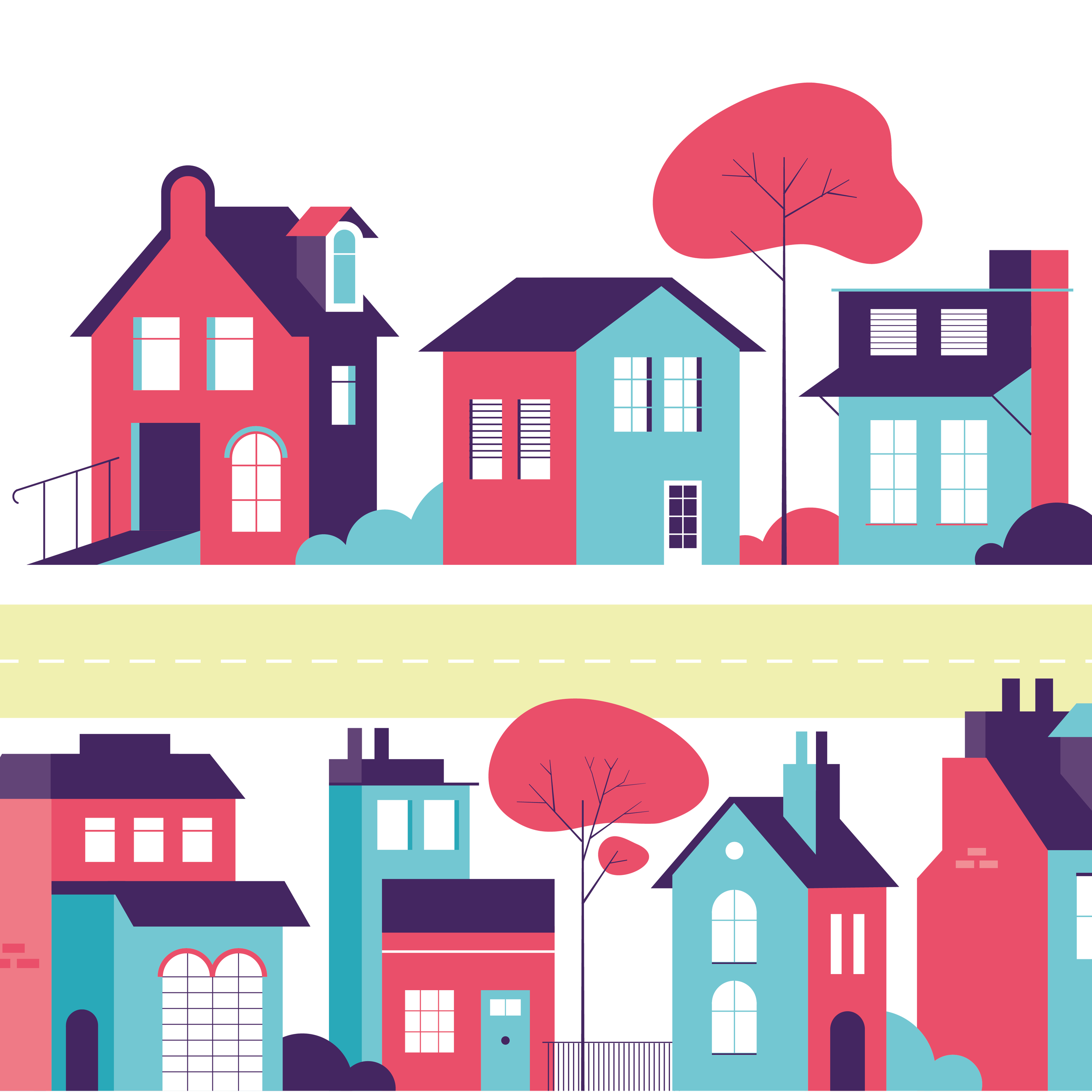
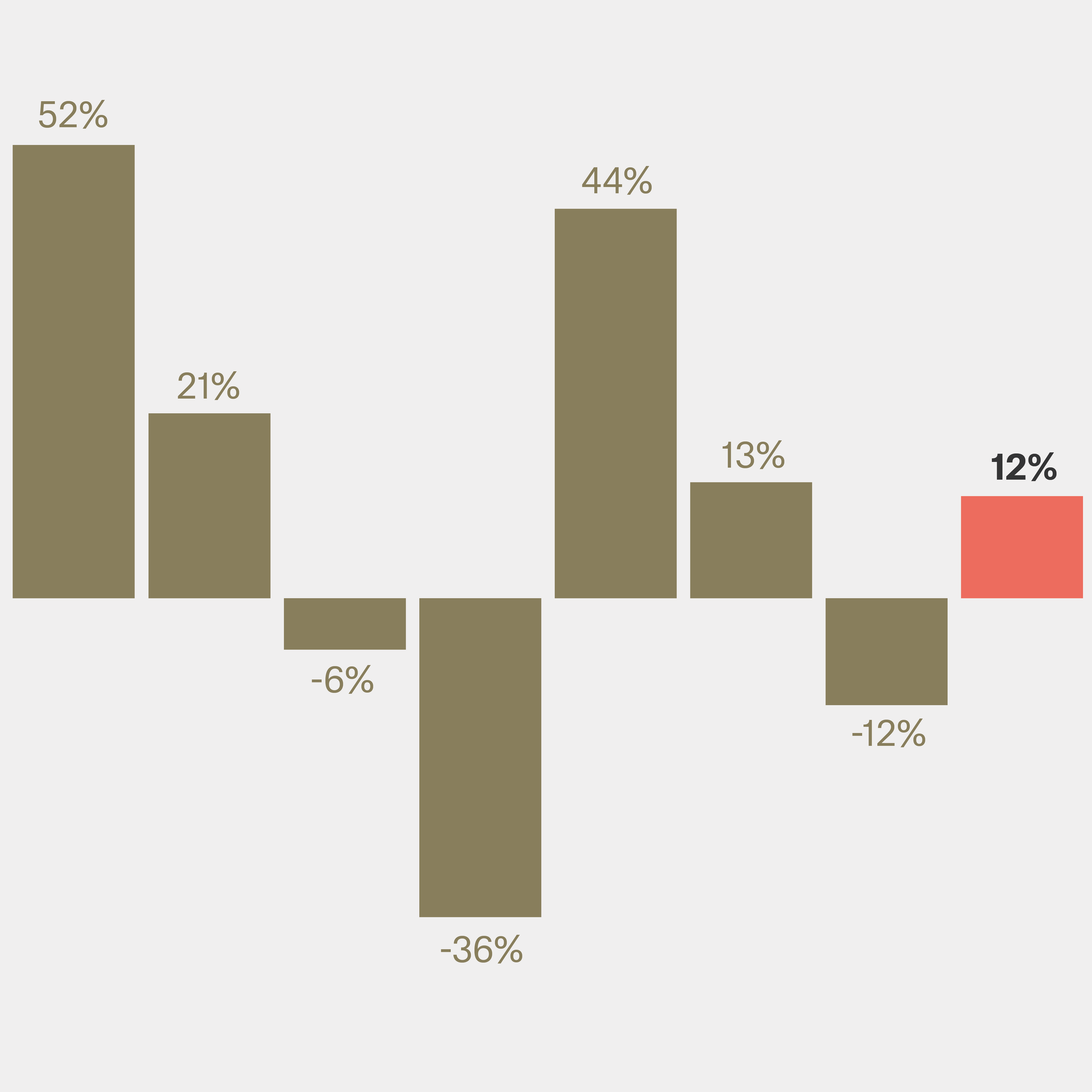
We produced this animation as social media content for the Centre for Ageing Better as part of their campaign around housing for older people. We needed to represent the data in an clear and engaging way, to draw attention to this important challenge facing our society but also making clear that there are solutions to these issues.
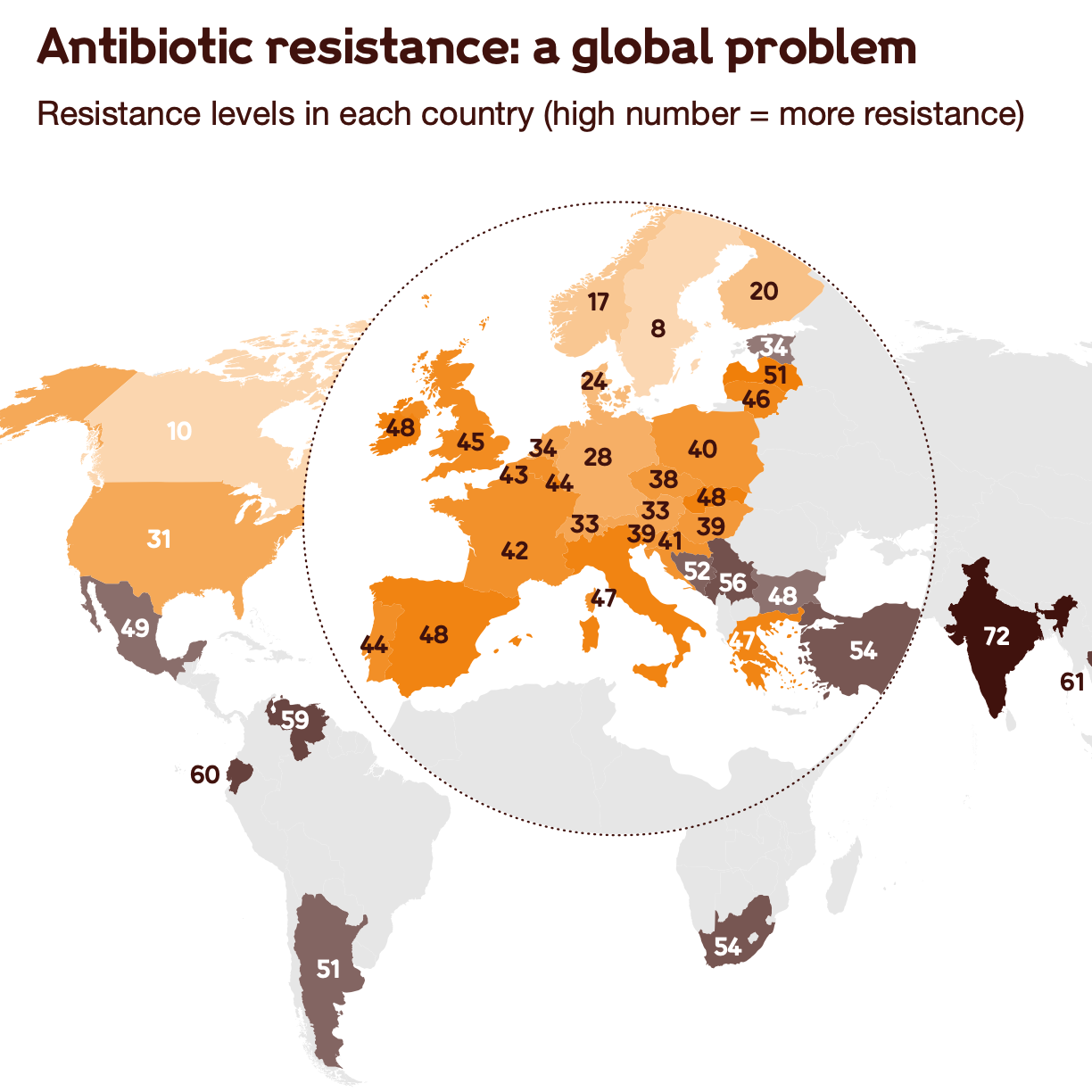
The growth in antibiotic resistant infections is a major challenge to modern medicine and global health. We worked with the Wellcome Trust to develop a series of data visualisations and infographics to accompany a major new campaign about encouraging greater investment in antibiotic development.
The graphics were also repurposed for a social media campaign and also animated for greater impact.
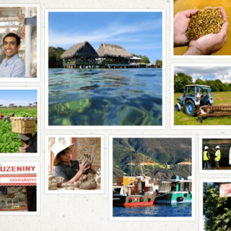
SABMiller wanted to showcase the work that they do to help entrepreneurs around the world. We created a series of appealing animations using thoughtfully selected video clips, voiceovers and photographs that demonstrated the different ways that SABMiller have worked with local businesses and the people that benefit.