
10 things i wish i’d known about using
illustrator for data visualisation
This material supports Chapter 4 of our book: ‘Communicating with Data Visualisation’ (Sage, 2021).
1. Use the pie chart tool to make a bubble chart
A classic. You probably did this by accident the first time you made a pie chart using the Illustrator charting tool. Basically, if you click to make a pie chart, and just enter numbers intuitively, in the same column, you end up with three bubbles, not three pie chart wedges. But this is great, right? Accurately-sized circles. This single software glitch is responsible for three-quarters of the Guardian’s design output between 2005 and 2015.

Image credit: The Guardian. Thanks Illustrator, pie chart tool!
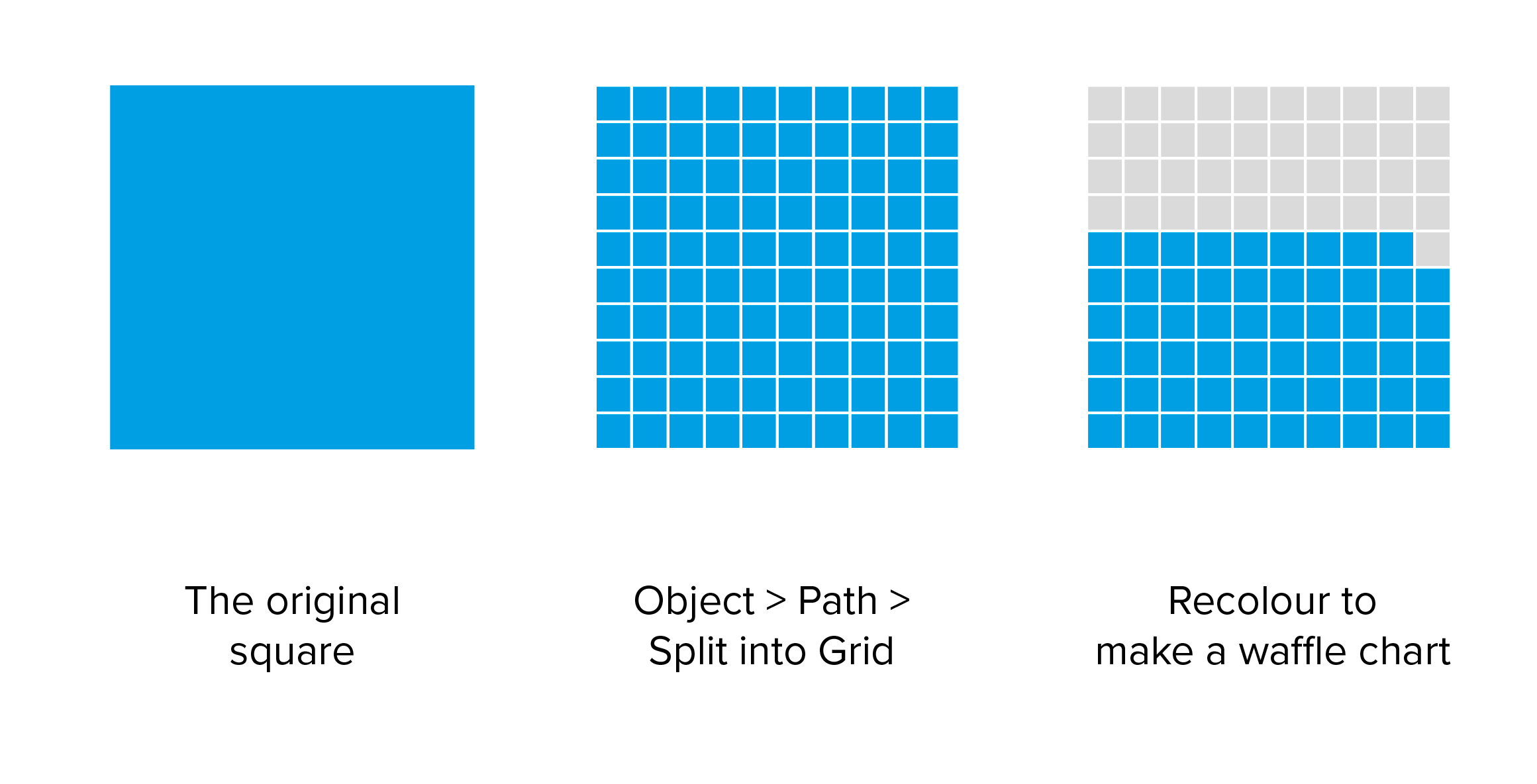
2. Use Split into Grid to make a waffle chart
Draw a square. (In case you don’t know, you can hold down shift to force the rectangle tool to draw a perfect square).
Select the square, go to Object > Split into Grid, choose the number of rows and columns you need (try 10 by 10). Add a stroke to the cells. Recolour the relevant number of cells accordingly.
3. Use Alt and Align & Distribute for easy icon charts
In data viz, we often want to create (or buy) an icon then repeat it. Maybe 50 people represents 50% or something. Illustrator makes this extremely easy.
First place the icon on your artboard. Then click on it, and hold down Alt. Drag for an identical icon. Keep holding alt, and drag again for a second, a third, a fourth, and so on. Hold Shift and then Alt if you want the icon to remain locked in the same place horizontally.
To be honest, I just put the icons anywhere, and then use Align and Distribute to even things out. I position the first and last icon in the right place. Then select all of them and use base or center align to line the icons up. (If you want them to align to a specific icon, you can click on that icon after you’ve selected everything). Then use Horizontally (and/or Vertically) Distribute Center to space them out evenly.
An alternative to this is Object > Repeat > Grid. Draw your shape and then click on Object, and choose Grid under ‘Repeat’. Pull the handles out depending on how many rows or columns you want.

You can then amend the gaps in ‘Repeat options’, setting how wide the gaps between the shapes/icons should be.

However, if you want to edit just one of these shapes, you’ll need to expand your new grid. Expand basically means turning an object into its individual attributes. Choose Object > Expand. And then tick Object not Fill. Finally you can remove any masks (if Illustrator has applied one) and Ungroup to access individual shapes or icons.
4. Use Object > Blend to make keys
Draw a small orange square. Now draw a blue square 100 pixels away. Remove any stroke on both. Select them, choose Object > Blend > Make, and watch the first shape bleed into the other. Try with different shapes and effects, and with different blend options (e.g with a specified number of steps).

Object > Blend > Expand frees up the shapes, and then Ungroup allows you to manipulate the individual shapes.
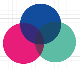
Blending colours is useful in other ways too. For example, if you’re creating a Venn diagram. Once your circles are sitting on top of each other, they are likely to look like this.

However, with a circle selected, in its Properties panel, click on Opacity to bring up the blend options.

Experiment with the Blending drop down until the circles look right. For example, this is Overlay.
5. Use Transform Each to keep charts fixed in place
Object > Transform > Transform Each is invaluable. It makes sure a group of individual shapes all gets resized by the same percentage, relative to their own reference point. If you just select a group of shapes and go Object > Transform > Scale - 150%, this scales the shapes by 150% but also scales the space between the shapes by 150%, pushing them apart and sometimes causing inaccuracies. If you use Object > Transform > Transform Each, the shapes - and just the shapes - get 150% bigger, and they stay where they are.

I use this feature every day. I’ve mentioned scale here, but you can use it for rotating, reflecting and moving too.

6. You can change all the colours in about two seconds
An incredibly frequent client request is to change a specific colour - ‘I really don’t like that blue’. So click on the offending blue object, then choose either Select > Same > Appearance or Select > Same > Fill Color (it’s worth trying both). Change the fill colour - usually by eyedroppering on to a shape with the correct colour. Everything changes to the colour the client wants. And you’re done! Experiment with all the different Select > Same options, they’ll all come in handy.

If several colours are offending the client’s sensitivities, then go for Edit > Edit Colors > Recolor Artwork. I tend to select Advanced Options because I find this interface easier to handle. Then away you go. The existing colour is on the left-hand side (the ‘Current colours’ column). Use the drop downs to choose lots of new colours at once.

7. You can use Eyedropper on text.
Myriad Pro begone! Eyedroppering on text also copies any line spacing, alignment or other text effects. It is utterly brilliant and I miss it so much when I’m using software (*cough cough* Powerpoint) that doesn’t have it.
8. Object > Compound Path
Talking of text, let me introduce you to the wonder of Object > Compound path. Say you want a gradient (or some other effect) to fill your infographic title rather than each separate letter. Start by typing your title into Illustrator. Now we want to turn this text into a shape, so select your title and choose Type > Create Outlines. This turns that text into a group of shapes (a very handy feature in itself).
Now if you were to apply a gradient to these shapes, the fill would treat each letter like a distinct shape, applying the gradient to each (option 1 below). Looks a bit lame, doesn’t it? However, now select all the letters and click Object > Compound Path > Make. This turns those different letters into one compound object, which means that when you apply your gradient, you will get option 2 below. Much nicer.

Talking of paths and compound paths, it’s a good idea to familiarise yourself with the Pathfinder panel. (Window > Pathfinder). Some of the options there are obvious (Crop, for example). Others you might want to try out. But they are all useful.

9. Never throw away the original chart
The Illustrator charting tool is pretty good for the basic stuff - lines, bars, pies, bubbles. But often you’ll ungroup the chart to make cosmetic changes, and this breaks the link to the data, meaning that when all the numbers change or get updated, you have to start again from scratch. So always make your chart, and then duplicate it, and keep a version off to the side of your artboard that is linked to the original data. It means that when you inevitably find out that one of the datapoints is incorrect, you’ll have the original, accurate chart right there as a reference point.
10. Use Illustrator alongside other tools
A lot of data scientists are underwhelmed by Illustrator when they first encounter it because, as I mentioned in point 9, it only really has basic charts and it’s hard to easily add or change chart elements. E.g. if you want your axis to have a title, you’ll have to add it manually.
So instead, think of Illustrator as best-suited for more illustrative graphics. For more chart-based pieces, think of it as the last link in the chain. It certainly isn’t something that can handle all stages of the data visualisation process.
Most commonly, you’ll make a chart in a different tool, then import an svg into Illustrator for a final polish. There are a range of tools that can create more complex or visually engaging charts, particularly Raw and Flourish, or if you’re more of a data scientist, R/ggplot2. All of them can output charts as svgs. (I mean, even PowerPoint exports svgs these days).

Image credit: Flourish. Just a small selection of the (free) charts Flourish offers. Raw is another excellent tool.
Once you’ve got the chart in Illustrator, you’ll often have to ungroup it, and delete lots of unnecessary layers and invisible lines, but at least the shapes will be accurate, and you can now use Illustrator for what it’s good at: illustrating.
Bonus tip: If it works for you, then it’s fine
There are about nine different ways of doing any task in Illustrator. Even something as simple as drawing a straight line - you can use the Line tool, you can use the Pen tool, you can even use the Pencil tool if you’re that way inclined.
So when it comes to something more ambitious, there are going to be dozens of ways of achieving your goal. It’s common to feel that your way is the long way round, and everyone else has got some secret, super-efficient alternative. They probably haven’t, though. Like you, they’ll use their favourite tools, or the ones they learnt first, or the ones they’re used to, and just plug away with those.
As long as you end up with a design that looks roughly the way you wanted it to look, it doesn’t really matter how you got there.