
ApPENDIX A: The value of Refinement
This appendix is designed to supplement material in our book, ‘Communicating with Data Visualisation’.
by Adam Frost
Sometimes we are given a project when the client wants purely cosmetic changes. In other words, we cannot change any of the content or the information structure. In essence, we are asked to skip our Find, Design and Make stages, break all of our own rules, and just refine someone else’s work. This will be a familiar brief to many designers, colloquially known as ‘polishing a turd’. However I would argue that even refining sub-standard work is worth doing in some instances, if only because it can lead to a less arduous experience for your audience.
In the example outlined here, I’m going to focus on one slide of a Powerpoint presentation that we were asked to ‘beautify’, with the content modified so that its source is not identifiable. However the layout, information density, colours and font choices are identical to the original table.
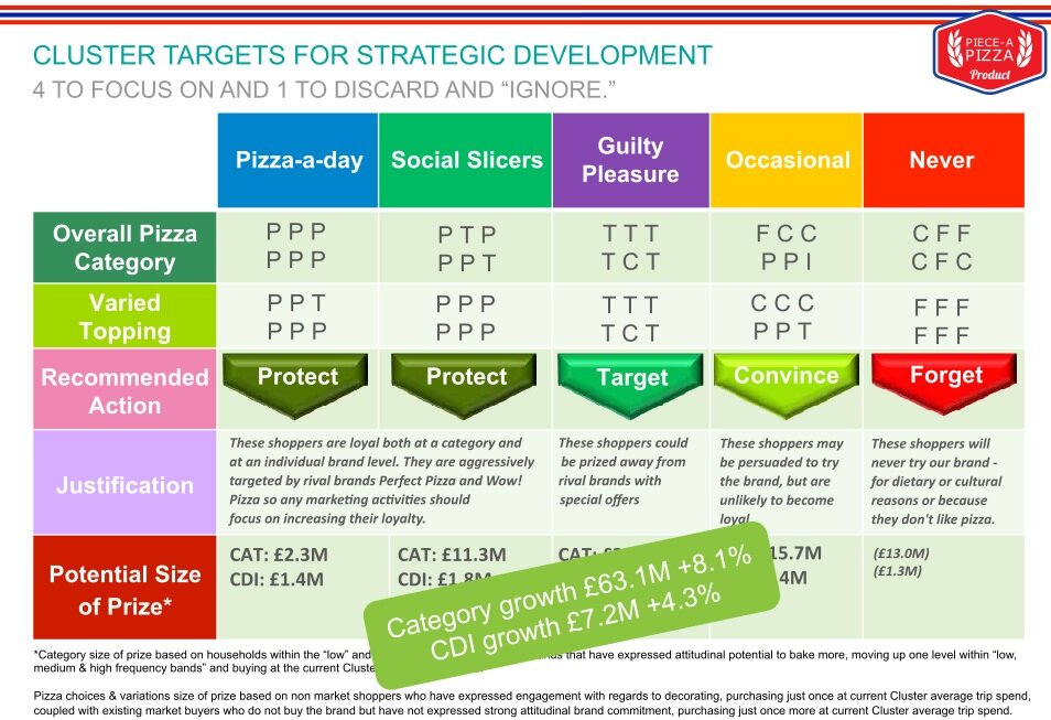
The client never fully explained what the slide meant, except to tell us that we could not change any of the text or layout. However, we intuited that it was essentially grouping consumers into five categories, based on how often they were likely to use the brand - here fictionalised as a pizza company. The company’s marketing strategy would be different for each of these groups: for example, they would ‘protect’ the ‘Pizza-a-day’ consumers (their most loyal), ‘target’ the ‘Guilty pleasure’ consumers but ‘forget’ the people that never ate pizza. The ‘size of the prize’ is specified, both for the overall pizza category and the subcategory of pizza toppings. However, I suspect its original audience won’t have noticed any of this, they would have been too busy thinking: Stop making me look at this. There are so many clashing colours (I count at least nine shades of green), clashing shapes (some flat, some bevelled) and clashing fonts (sizes, styles and typefaces) that all the usual cues we look out for to indicate importance, read order and meaning are obscured.
Let’s quickly move through the steps our designer took to calm this slide down and give the content a fighting chance. Starting with the most obvious: colour.

Given that the focus of the slide is meant to be those action words (‘protect’, ‘target’, ‘forget’ etc), he uses colour to call those out. Everywhere else, he uses only black, white or grey. The next most obvious issue: font. It’s too large and, in that left-hand column, it’s in bold for no good reason.

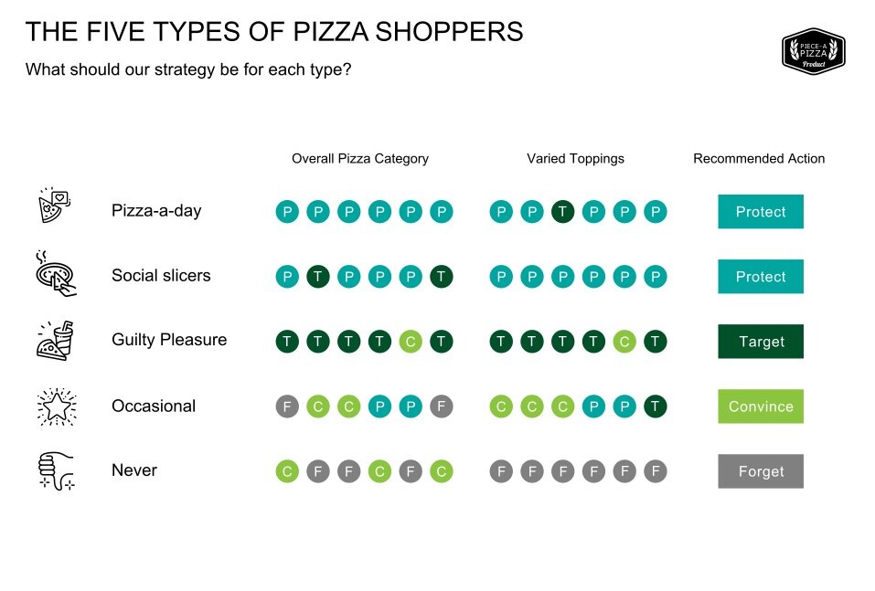
You can see that he has also fixed the title and subtitle. The title is no longer set in that hard-to-read green and the subtitle is no longer pale grey and it’s become smaller and in sentence case to clearly distinguish it from the title. The designer has also used a monotype font (Courier) for rows 2 and 3. This means that each letter takes up the same amount of horizontal space. These are not usually the most graceful fonts, but here it is the ideal choice, as now those jumbled rows of letters (look at ‘F C C P P I’ under ‘Occasional’ in the slide before this) are much neater and entirely suit the mathematical way in which they are used. Lots of Ps = Protect, Lots of Ts = Target.
The next most broken thing: shape and spacing. Those arrow shapes seem like overkill and the text at the bottom of the slide is squashed up against the footer.

Now there’s a visual rhyme between the categories and the associated action: they are both squares - Pizza-a-day and ‘protect’, Guilty Pleasure and ‘target’ and so on. We are also beginning to see the first signs of actual white space around our content; at last it has a (very small) amount of space to breathe.
But there is still a huge problem, isn’t there? I’m not entirely sure why so many brands insist on putting their logo on every slide of their Powerpoint presentations. (Especially when, as is the case here, it was for an internal presentation so you’d hope the audience would remember the name of their employer). A logo like this is visually distracting, it wastes space, and the chances of it harmonising with the style and shape of your content are minimal. But we knew they wouldn’t let us delete it, so we went for the next best thing.

For Powerpoint slides, always use a monochrome version of the main client logo whenever possible. Every major company will have one of these. In this instance, you can see that it also means we lose that blue and red stripe across the top of the slide and gain even more white space and a distinct section for the title and subtitle.
Now that the logo had become black and white, we decided that those black boxes at the top were overkill and were overshadowing our action words. So we took them out and decided to use colour to further emphasise (what we thought was) the meaning of the slide.

If the slide was about deciding on a strategy for each of these ‘clusters’, then let’s show that process. Lots of blue Ps meant protect; lots of grey Fs meant forget. The copy could surely work a little harder too. ‘Cluster targets for strategic development’ didn’t make a lot of sense - was cluster an adjective (were we looking at ‘cluster targets’) or was it a verb (should we, the audience, be ‘clustering targets’) - plus the whole thing had an unpleasantly military tone. So we suggested a simpler title and subtitle which hopefully would mean people wouldn’t get confused before they even got to the table: The Five Types of Pizza Shoppers. What should our strategy be for each type?
After we submitted this slide to the client, we managed to secure a small victory - they let us have two slides. Which meant that we could even risk a few icons.

It’s still not a great story. But at least looking at these slides is no longer painful. There is visual harmony, white space, a strategic use of colour.*
I’m including these slides in this book because I know that, for a lot of our clients, there is no way of teasing an interesting story or even an interesting chart out of the material they have. They are working within the fixed parameters of a monthly report or a specific corporate message. I’d say that, even in those circumstances, it is still worth using design techniques to refine what you have. If you go through the process outlined above: fixing each element one at a time - colour, font, shape, alignment, spacing, logo, copy - working through them in order of most broken to least broken, then you should ultimately get to a place where an audience will at least give you a fair hearing.
But the story in these slides is still dull, right? What’s the point?
Because these stories are an important part of our working lives. They may not be rivetting, but they contain key information. These slides outline the marketing strategy for a major brand. The daily activities of thousands of employees will change if the recommendations made in these slides are implemented. People could be promoted or fired based on the success of this strategy. At least if you spend time refining your story, your audience might glimpse its relevance to their own lives, even if it’s never going to be a story that anyone will tell their friends outside of the office.
Certainly the answer is never to do what the original author did and turn all the colours, shapes and text elements up to 11. The end product is always absurd: a mismatch between the attention-seeking visuals and the matter-of-fact story. Instead, when you have a simple story, you should tell it simply. That way, people that need the information now have it, and people that don’t, haven’t had too much of their time wasted.
*There is an argument for keeping all the content ‘within the eyespan’ (to use an Edward Tufte phrase) wherever possible. In other words, keeping this whole story on one slide, so that the audience doesn’t have to keep flipping between the two slides we have here. But in this case, the only way of achieving this would be to drastically cut back the content, which we weren’t allowed to do. So, to paraphase Joseph Conrad, we had a ‘choice of nightmares’ and two slides felt like the least bad option. (To extend the Conrad quote, once you have made your decision, you must be ‘loyal to the nightmare of your choice’ and make it work.)