ApPENDIX C: HYPOTHESIS TESTING AND MORE
This appendix is designed to supplement material in our book, ‘Communicating with Data Visualisation’.
by Adam Frost
When you find something unusual in your dataset - whether it’s the whole population or a sample - the next question is usually the same. Why? What caused this? The question ‘Why?’ sits at the heart of every academic field and unites students across the sciences and the humanities. In his book, Behave, Robert Sapolsky gives a neat summary of how any attempt to understand causation has to be ‘multi-factorial’ and not limited to ‘disciplinary buckets’. Maybe you're trying to figure out why someone pulled the trigger of a gun or saved a stranger from drowning. In the seconds before they did it, it is neuroscience that can explain the synaptic transmissions in our brain. Minutes before the act, it is endocrinology that can explain how hormones regulate mood and perception. Days before, we may need economics or sociology to understand why the individual felt compelled to act in the way they did. In the years before the act, psychology might help to explain how childhood experience shaped the individual; literature or media studies might provide cultural context for why certain actions are deemed heroic or villainous. Even after studying all of this, the reasons for the person’s behaviour will often remain obscure. Yet we are compelled to try: humans are ‘explanation-seeking animals’.
Statistics has its own version of this process. It is called hypothesis testing. There is an unusual datapoint or trend in your dataset and you, or your boss, wants answers. What caused it? Could it have been anything else? As with the situation outlined above, the answer is often elusive, and statisticians are particularly attuned to this, always talking about probabilities rather than committing to a single explanation. However, that doesn’t prevent the desire to carry out the exercise.
The good news is: you don’t need to understand the precise mathematics of hypothesis testing. Our students tell us that this is usually handled by data scientists or that it has already happened by the time they are given the data to explore. If you do want to read more about it, please do, but be warned that it can be hard going for non-statisticians. For example, statisticians don’t talk about proving a hypothesis but disproving or rejecting a null hypothesis. So you are not trying to prove that cigarettes cause cancer, but to disprove that there is no difference in cancer rates between smokers and non-smokers. Even if the null hypothesis is rejected, there can be false positives or false negatives, which can baffle non-statisticians to an even greater degree. If I fail to reject my null hypothesis that there is no difference in cancer rates between smokers and non-smokers when there actually is a difference, then this is a false negative.
There are very good reasons for using all of this terminology, but it is not linguistically intuitive and it takes patience to learn it. Likewise, the mathematics - which is a more complex version of the mathematics behind standard deviation and standard error in Chapter 3 - also takes time to work through. I’d recommend learning about hypothesis testing if you need to (perhaps if you work with scientific data or for a market research company) but otherwise you can probably get by with a basic understanding. So that is what I’ll outline here: a very simple overview.
For our test case, we will start in the headquarters of a multinational coffee business where the manager believes that baristas with red hair are more productive than everyone else. Historical data suggests that the average number of coffees served by a single worker in a day is 100, with a standard deviation of 15. (Remember we learnt in Chapter 3 that this means that in 68% of cases, the number of coffees served by an average worker will be between 85 and 115. In 95% of cases, it will be between 70 and 130).
The manager would define her null hypothesis - which would always be the status quo. So in this case, the null hypothesis would be that there is no difference between the number of coffees served by red-headed people and everyone else. To work out whether she can reject this hypothesis, she takes a sample of 225 red-headed workers and discovers that they serve an average of 102.5 coffees. So we’ve got our answer, right? Red-headed people are more productive (the average for everyone is 100).
Except now we need to find out if this difference is statistically significant. Perhaps it’s not that extreme a difference; perhaps if we took another sample, the number would be lower. As you will recall, this is the trouble with random samples: those 225 redheads could - by chance - be the most productive redheads in the whole company. Or the least.
To establish whether the 102.5 coffees is significant, we first have to establish a significance level. This is a measure of how strong you want your evidence to be. We can’t get a definitive answer to our productivity question without measuring all redheads and all non-redheads, so if we are using samples, then we are always going to have to decide what level of certainty is acceptable.
Statistically speaking, the significance level is the probability of us rejecting a null hypothesis when we shouldn’t, i.e. saying that redheads are more productive when they actually aren’t. In most cases, this level is set at .05, although sometimes it is set at .01. This last level (0.1) is used when we want our estimate to be extremely robust. If we go down the normal route, and set our level at .05, this means that to reject our null hypothesis, we would have to obtain a sample average (redheads served 102.5 coffees a day) that is so extreme that it could only happen by chance 5% of the time or less. If we are unable to say this, we must conclude that our null hypothesis is true.
This takes us back to standard error (see Appendix B). You might remember that to work it out, we imagined lots of random samples, which gave us an average of lots of different sample averages. We saw that these sample averages all clustered together (see the figure below). In fact, we are able to say more than this. Thanks to a concept called the Central Limit Theorem, we know that the average of all these sample averages is the same as our population average. This means that we can say that we would expect the average of our sample averages to also be 100 coffees served.

So now we can go back to our sample. We know that our 225 redheads served an average of 102.5 coffees. To work out whether this is significant, we take our significance level (.05) and do the following. We work out where this mean of 102.5 coffees would fall in a distribution of sample means. The calculations behind this are similar to those we used to determine our confidence level of 95% in Appendix B. The difference is: a confidence level of 95% involved working out how much a sample average would vary from the true population average in 95 out of 100 repeat experiments. Our confidence bars represented this range of possible values. Here we are looking for the opposite. To reject our null hypothesis, we have to get a sample average that could not happen in 95% of cases; it would only happen by chance 5% of the time. We are taking our normal distribution and looking for a result at the outside edges, where few of our sample averages sit, rather than the large bell curve in the centre. Statisticians call this the critical region or sometimes the rejection region (see the figure below).
So is 102.5 coffees unusual? This involves some mathematics which we will only cover superficially here.
we take all of our numbers. Our historical average of 100 coffees a day, our standard deviation of 15, and our sample size of 225.
in Appendix B, we saw that the standard error of the mean is always considerably narrower than the population standard deviation. In fact, to work it out, you divide the standard deviation of your population (15 coffees) by the square root of your sample size (the square root of 225= 15). So our standard error is 15 divided by 15 = 1 coffee.
next we go back to our population mean (100 coffees) and the mean for our sample redheads (102.5 coffees). We can see that the redheads in our sample served 2.5 more coffees a day. That’s 2.5 standard error units. (Our standard error is 1 coffee).
our significance level is .05. You might remember from Chapter 3 that, to get a confidence level of 95%, we placed our error bars 1.96 standard error units either side of the mean. Here we are trying to work out if our result falls outside of this range.
To do this, we take our result - 2.5 standard error units above the mean - and compare it to the result expected in 95% of cases - 1.96 standard error units above or below the mean.
Our result falls outside of this range. We can reject our null hypothesis. Redheads are more productive (I knew it!)
We are also able to say that our findings are statistically significant. The reason that I’m emphasising this is because this word (‘significant’) gets used a lot in data visualisation and sometimes it is used as a synonym for ‘interesting’ or ‘important’. It is critical to note that, when you are working with data, it has a specific mathematical meaning and should only be used if the findings are indeed statistically significant.
It is also worth appending the significance level in any chart of results. After all, if we had used a significance level of .01 in the experiment above, we could not say that redheads are more productive. A .01 significance level means that our result has to fall outside of 2.58 standard errors either side of the mean. Redheads served an average of 102.5 coffees, which is only 2.5 standard errors above the mean. We could not reject the null hypothesis at this more stringent significance level (see the figure below). It would therefore be important to state in a footnote that: ‘We reject the null hypothesis at the .05 level of significance.’ This makes the limits of our knowledge clear.

At this point, we might decide to take another sample. After all, perhaps we obtained a false positive or Type 1 error. This means that, by chance, our sample fell outside of 1.96 standard errors of the mean when it would normally have sat inside it. We rejected our null hypothesis by mistake. If we had set the significance level at .01 and accepted our null hypothesis, this could have been a false negative or Type 2 error. In other words, our sample average sat within 2.58 standard errors of the mean, but in almost all other cases, it would have sat outside of it. We accepted our null hypothesis by mistake. This is why, after an experiment with a statistically significant result, statisticians often repeat it, and sometimes with a larger sample.
There are many more aspects of hypothesis testing to explore - this is just one very basic example. The mathematics gets more involved if you are working with two independent samples or more than two samples. There is also the matter of calculating a p-value, which is the probability of achieving the result that you obtained assuming that the null hypothesis is correct. (The lower the p-value, the more evidence there is to reject your null hypothesis. Typically, a p-value that’s lower than or equal to 0.05 is considered strong enough evidence).
As I said above, it is not obligatory to learn all of this. However, it is sensible to get used to the terminology and the kinds of outputs that hypothesis testing produces. Because you will almost certainly be obliged to interpret the findings of hypothesis tests; indeed, you may have done so already without realising it.
A hypothesis test sits behind most strategy documents, policy proposals and marketing plans. Does customer type A spend more than customer type B? Do we sell more products when it rains? Are old people more likely to vote than young people? Do children from particular social backgrounds perform better at school?
Most of these questions will have involved designing experiments, comparing a number of sample groups, calculating a test statistic (e.g. the means of these samples), comparing that statistic to a critical value where the null hypothesis can be accepted or rejected, and then asserting a conclusion. There may have been a series of controlled experiments and/or the datasets might have been subject to correlation analysis (working out how closely two variables are associated) or regression analysis (making predictions as to how one variable will influence another).
I’ve listed some of the most common outputs of these kinds of tests below, just in case you have to use them as a basis for your own work.
i) Statistical significance
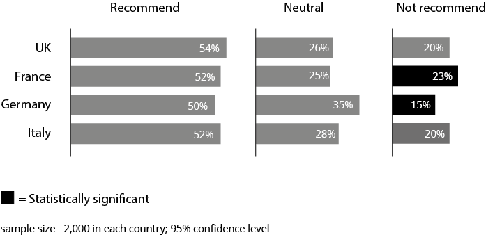
Sometimes you will be told which datapoints in your dataset are statistically significant, or you will be asked to emphasise elements of a chart which show a statistically significant difference. This can be important because what the researcher is telling you is that those differences could not have happened by chance. Everything else in your dataset could have been the result of sampling error - in other words, a sample that doesn’t reflect the wider population. For example, say you’ve been given the results of a consumer survey. A total of 6,000 people have been interviewed in three countries and asked whether they would recommend a particular product. It shows that consumers in the UK feel more positively about a particular product than consumers in France, Germany and Italy. However, although this seems like the most important story, the differences in the percentage of positive recommendations are not statistically significant. Another random sample could have put France first and the UK fourth. What is significant is the fact that the number of consumers who would not recommend the brand is high in France and low in Germany. You could repeat the experiment and, in 95% of cases, you would get the same result: a disapproval figure that is a lot higher or lower than expected. This is something you can confidently visualise - because it is not just a fluke, there is a high probability that the entire population of France and Germany shares these negative feelings. In these cases, you would usually emphasise these datapoints in any chart (see the figure below), or omit datapoints that are not significant.
ii) Base size
You might be given data to visualise that has a low base. For example, let’s go back to the consumer survey mentioned above. Perhaps there has been a deep dive into the French consumers who would not recommend the product. Remember that our sample is 2,000 people and we are talking about the 23% who would not recommend the product. So this is just 460 people. If we start breaking these people down by age or social class or region, then we hit a problem. Suddenly our representative sample gets a lot smaller. Maybe we only have a handful of people under 21, or six people in social class C1. It then becomes impossible to draw any firm conclusions about what specific demographic groups think. Researchers often flag this up in the data, indicating that certain values have a low base. It is usually best to indicate this in any visual too, particularly in interactive dashboards, where people are accustomed to use filters to zoom into very specific subgroups and as a result can easily forget that they are basing their assumptions on shaky foundations. (An alternative is to add error bars of course, and they would become progressively longer as the sample got smaller).
iii) Correlation
Correlation analysis and regression analysis are two of the most common techniques used in exploratory statistics. The terms are often used interchangeably, although technically correlation analysis is used to measure the strength of the association between two variables, whereas regression analysis is used to predict the unknown value of one variable based on the known value of another. The output of correlation analysis is usually a scatter chart and the output of regression analysis is usually a scatter chart with a regression line through it (known as a ‘line of best fit’). If you are really unlucky, you will be given two line charts overlaid on top of each other, with two Y axes, one representing each variable, which are not only hard to read, but tend to distort or exaggerate any correlation. Whatever you are given though, it is important to understand that what you are being shown is usually quite straightforward, once you understand how to decipher it.
The first thing to establish is what the variables are and what kind of association is being posited. Usually there is an independent variable and a dependent variable. The independent variable is whatever is acting on or influencing the dependent variable. So the independent variable might be temperature and the dependent variable might be sales of swimming costumes. Or the independent variable might be age and the dependent variable might be political affiliation. On a standard bar chart, your independent variable is usually on the x axis (i.e. the cause) and the dependent variable is on the y axis (i.e the effect) - see the figure below for one example from a recent UK election.

But sometimes the two variables don’t have this obvious master-servant relationship - for example, an economic downturn can cause young people to migrate to other countries, but young people migrating to other countries can also cause an economic downtown. In these cases, it is best to just focus on how closely the two variables are linked, rather than disentangling possible cause and effect.
The next aspect to decode will be the direction of correlation.
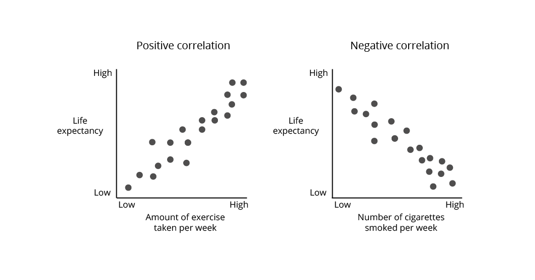
If two variables move in the same direction (up or down), they are positively correlated: for example, exercise rates and life expectancy.
If one variable moves up while the other moves down, they are negatively correlated: for example, smoking rates and life expectancy. (See the figure below).
After this, you will want to establish the strength of any correlation (known as the correlation coefficient r).
Perfect positive correlation is represented as +1.
Perfect negative correlation is represented as -1.
This kind of perfect correlation rarely happens with real data, but anything over 0.6 or under -0.6 is seen as strong and anything over 0.8 or under -0.8 is seen as very strong.
What I’ve described here is a very simple example, and it is of course possible that you might be given a much more complicated chart where correlation analysis has been carried out on three or more variables. If this happens frequently, then it’s probably best to study the subject in more detail. However, even in these cases, the underlying narrative is usually the same. Someone is trying to demonstrate the direction and strength of association between two or more variables. For example:
As more fossil fuels are burnt, the observed land-ocean temperature goes up.
As levels of inequality go up, levels of personal happiness go down.
Once you have understood the constituent parts of the dataset, you will be in a good position to decide which elements of it your audience needs to see. For an expert audience, you may be able to keep the data in a scatter chart and make small cosmetic adjustments (e.g. making the labels easier to read, making any categories or groupings clear). For a less expert audience, you might want to juxtapose rather than superimpose your variables so that there is less ambivalence about what the shapes stand for (see the figure below).

If you are given the output of a regression analysis, there will usually be a ‘line of best fit’ that best expresses the relationship between the datapoints in the scatter plot. The power of any regression line is that it allows you to make predictions. Maybe you have established a correlation between eating carrots and improved eyesight. Let's also assume this is linear: the more carrots, the sharper the vision. This means that in your new role as dietician to the stars, you can confidently tell Celebrity A that if they eat 19 carrots a day, their vision will improve by around 50%. (As will their number of trips to the lavatory).
Predictions like this are increasingly becoming part of daily life, especially as machine learning becomes embedded in our retail, travel and relationship choices. It is that 'line of best fit' (in a much more complex incarnation) that sits behind many of these predictive technologies, as you and your preferences are correlated with similar users, a 'nearest neighbour' match is generated, and appropriate recommendations are made. Furthermore, when you swipe left or right, or find a faster route, or rate a movie as one star, all that feedback gets relayed back to the system, the statistical model is adjusted, and that line of best fit gets even better.
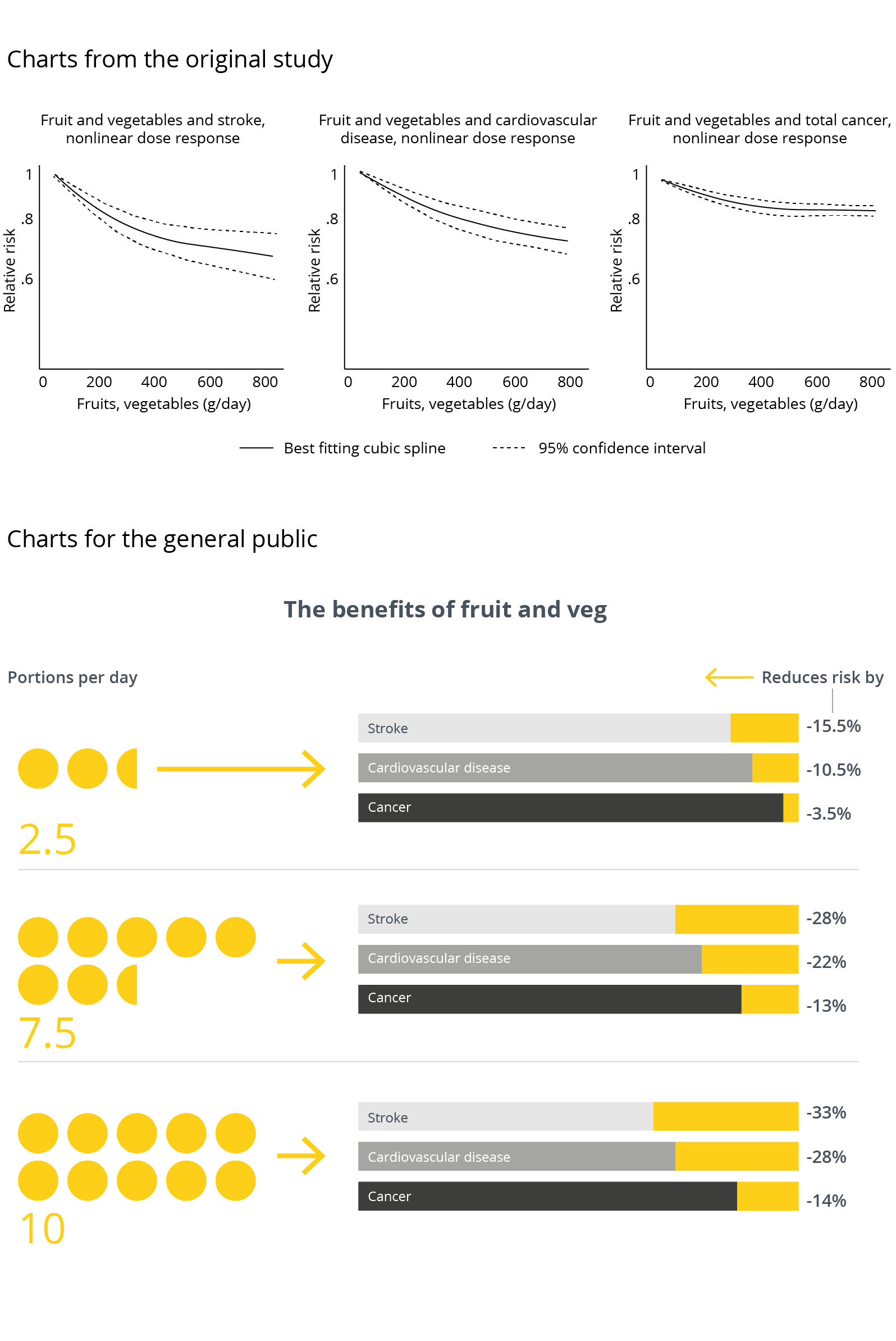
As with correlation analysis, the main driver when you are given the output of a regression test is working out what it is showing and for what purpose. In the majority of cases, the audience is looking for you to boil down the message to its essence. To take two recent news stories: former professional footballers are five times more likely to suffer from Alzheimer's disease, or eating 10 portions of fruit and vegetables a day reduces your risk of a stroke by 33%. Often this can be done with copy alone - a visual is not required.
However, if it is decided that visuals will help, then these should ideally stress the human factor: we often use iconography or isotype charts and simple, non-scientific language to convey the most important conclusions (see the figure below). After all, what motivated the original analysis is often a very simple question (‘Are fruit and vegetables good for you?’) and it is best to give a simple answer, keeping any p-values, significance levels and other related equations off the chart and in a separate link or footnote where expert readers can find them.