
APPENDIX D: MISCONCEPTIONS AND MISUNDERSTANDINGS
by Adam Frost
1. Unit of analysis
A story can look very different when you change the way you measure it. As well as being mindful of this yourself, it's always worth checking the unit of analysis in any dataset you are given. Which is the richest country in the world? China, the US, Qatar, Norway? It depends on what you mean by wealth.
Or how about the safest form of transport? If you measure it by number of deaths per passenger mile travelled, then according to a 2013 study, it's the aeroplane. There are 0.07 deaths per passenger mile for aeroplanes whereas there are 0.43 for trains, 7.3 deaths for cars and 213 deaths for motorbikes. Per mile travelled, you are over 3,000 times more likely to die on a motorbike than on a plane.
If you want to use a different unit of analysis - overall number of deaths - then again it's air travel that is safest and road travel that is least safe. In fact, road accidents are the 9th most common way to die, causing 1.34 million deaths globally in 2016, more than tuberculosis, HIV/AIDS and malaria.
But doesn't safety cover more than simply getting to our destination alive? if we factor pollution and carbon emissions into our definition of safe, then aeroplanes are the worst and cycling and walking are the best. Furthermore, if we do use death rates as our metric, then perhaps we should use a Bayesian approach, as participation rates dramatically change the relative safety of transportation methods. If half of us decided to cycle to work tomorrow, it would - overnight - become a significantly safer way to travel, as Matt Seaton argued in a recent article in the Guardian.
The same applies to walking. In the UK at least, it is less safe than cycling. In 2015, 30.9 cyclists were killed for every billion miles travelled, compared to 35.8 pedestrians who were killed. But these pedestrians were not killed by falling pianos or open manholes, most were killed by vehicles. As with cycling, it is cars and lorries that make walking less 'safe' than getting on a plane. My (completely untested) hypothesis is that if you omitted all the incidents where pedestrians were hit by cars, then walking would be the safest form of transport by far.
There are often contrasting systems of measurement, particularly when you are discussing abstract concepts like safety, productivity, happiness or health. Even for something like life expectancy - which you would think was a pretty unambiguous measure - there are related metrics like healthy life expectancy, which many NGOs prefer, because it is less absolute and gives a better sense of quality of life, and activity levels. For example, in 2018 life expectancy was 81 years for women living in Nottingham, UK, but healthy life expectancy was 54 years. (Compare this to Wokingham, UK, where life expectancy for women was 85 and healthy life expectancy 72). If you were planning public services in Nottingham, the fact that the average woman spends the last 27 years of her life in poor health would arguably be more valuable information than knowing her overall life expectancy. But even here you would need to ask: how is poor health being measured? Does every country measure it the same way?
When you are given a dataset, it’s sensible to find out what the unit of analysis is and check that it's not being used to favour a particular agenda. However, every form of measurement has limitations, so often it's a question of choosing the 'least bad' option or contrasting two or more alternative measures.
2. Percentages
We encounter little resistance to the use of percentages when we are simply stating single values taken at a single point in time. In 2019, 13% of Americans said they believed vampires were real. In 2014, 16% of British people said that they had had a sexual experience with someone of the same gender. We encounter more problems where we are asking people to calculate percentages. What is 21% of 92? Did you know that it's the same as 92% of 21? What is 14% of 1.7 billion?
Even more challenging is percentage change. If a government department with a £20 billion budget gets a 2.5% increase and another department with a £20 million budget gets a 2,000% increase, who has been given the most extra money? (Answer: the first department).
If a department’s budget goes down 20% in one year, then up 20% the next, then down 20%, then up 20%, then down 20%, then up 20% - does it have the same amount of money it started with after six years?
Many people think yes. But if the department had a £100 million budget, then a 20% cut takes it to £80 million. A 20% increase of £80 million takes it up to £96 million (20% of 80 is 16). After six years, this £100 million starting point will end up as £88 million. Be careful of government announcements of 'budget rises' after periods of cost-cutting: they often resort to this trickery.
In fact, tricks abound. Another problematic area is when percentage rises and falls are placed side by side. Call centre A took 500% more calls this month, but Call centre B took 20% fewer. Is this a fair comparison? Perhaps Call centre A started from a low base and went from 2 calls to 12, whereas Call centre B went from 1 million to 800,000.
Furthermore, a percentage rise is potentially infinite. For example between 10⁻³⁶ and 10⁻³² seconds after the Big Bang, the volume of the universe expanded by over a vigintillion percent. (This is equivalent to something 1 nanometre long expanding to something 10.6 light years long in less than a millisecond). However, if the opposite had happened, we would say that the universe contracted by 99.9% recurring. Because this is the most anything can reduce by. So we have over a vigintillion percent in one direction (1 with 63 zeroes) but 99.9% in the other - to describe an equal rise and fall.
Sometimes data scientists use 'a factor of' to get round this. 'Increasing by a factor of 5' and 'decreasing by a factor of 5' at least describe the same exponential rise and fall. One multiplies by 5; the other divides by 5. But we have found this terminology to be poorly understood, particularly as it relates to 'decreasing by a factor of…'.
Problematic for the same reason is 'a something-fold change', as in a fortyfold increase or a tenfold decrease. Again, the increase is more readily understood than the decrease and even then the terminology feels archaic and unhelpful. How often do you say a fivefold or sixfold increase in your daily life? You might say 'doubled' or 'tripled' or (at a push) 'quadrupled' but more than this? Likewise 'halved', 'reduced by a third' or 'reduced by a quarter'. But I would guess no further - 'reduced by two-seventeeths?'.
All of this is an important sign: common usage gives you a clue as to how far people are able to think mathematically. These cognitive limits are baked into our language. If you want to communicate effectively, it's a good idea to respect these limits.
For now, let's go back to our main problem: percentage change and its discontents. Rather than worry about terminology, I'd focus more on meaning. When you are told about a particular rise or fall, go back to the numbers and work out if a story is being skewed. Sometimes it's simply easier to translate everything back into numbers. Last year, the Department of Health had its £10 billion budget cut by £2 billion. This year, its budget was increased by from £8 billion to £9 billion. Everyone can see the shortfall and no percentages are required.
There's one final example of communication breakdown between data scientists and everyone else, and that's when you talk about percentage change of a percentage. For example, perhaps Labour's voting share moved from 20% to 30%, an increase of 10%.
No! cry the statisticians, that is not an increase of 10%. It's an increase of 50%. 10% is half of 20%. It might be an increase of 10 percentage points but not 10%.
Oh dear God. The troubles we've had with this one. You can try it out for yourself: tell anyone who isn't a mathematician that Labour's vote was 20% but it's just increased by 50% and they'll all assume that the party's vote share is now 70%. I guarantee it. 110%.
The number of presentations we've sat through where an increase in market share from, say, 10% to 12% has been characterised as a 20% increase, only for the presenter to immediately qualify it ('I mean, it's a 2 percentage point rise') lest the senior management in the room all get overexcited and start handing out extravagant bonuses to each other.
Even in corporate environments, it's often best to avoid falling into this trap. Forget the fussy insistence on 'percentage points' or the obsession with dramatic percentage rises. As we suggested above, it's best to look at the original numbers and then express the change in terms that best convey the truth of the story and in language that your audience will most readily comprehend. Plus - remember the power of your visuals. One of the reasons you chart your data is so people can see whether things have changed and by how much, without the need to spell out the maths. If the change is clearly shown, then your audience are free to interpret this however they wish: it has doubled, increased twofold, risen by 100% or it has gone up by 10 percentage points - depending on the terminology they are happiest with.
3. Nominal or real values
You will often hear statements to this effect: 'This has been the company's best year ever!' 'That film just smashed all box-office records!' or 'That's the most expensive painting ever sold!' In almost all of these cases, the nominal value has been used - the price as it exists at the time. It's as if inflation doesn't exist.
Wherever possible, it's a good idea to use real values - or at least, to work them out - and there are lots of handy online calculators that will help you do this. Real values are adjusted for inflation so they give you some sense of whether 'the highest book advance ever' (which we totally got for our book) or the 'the biggest business deal ever made' is really anything of the sort.
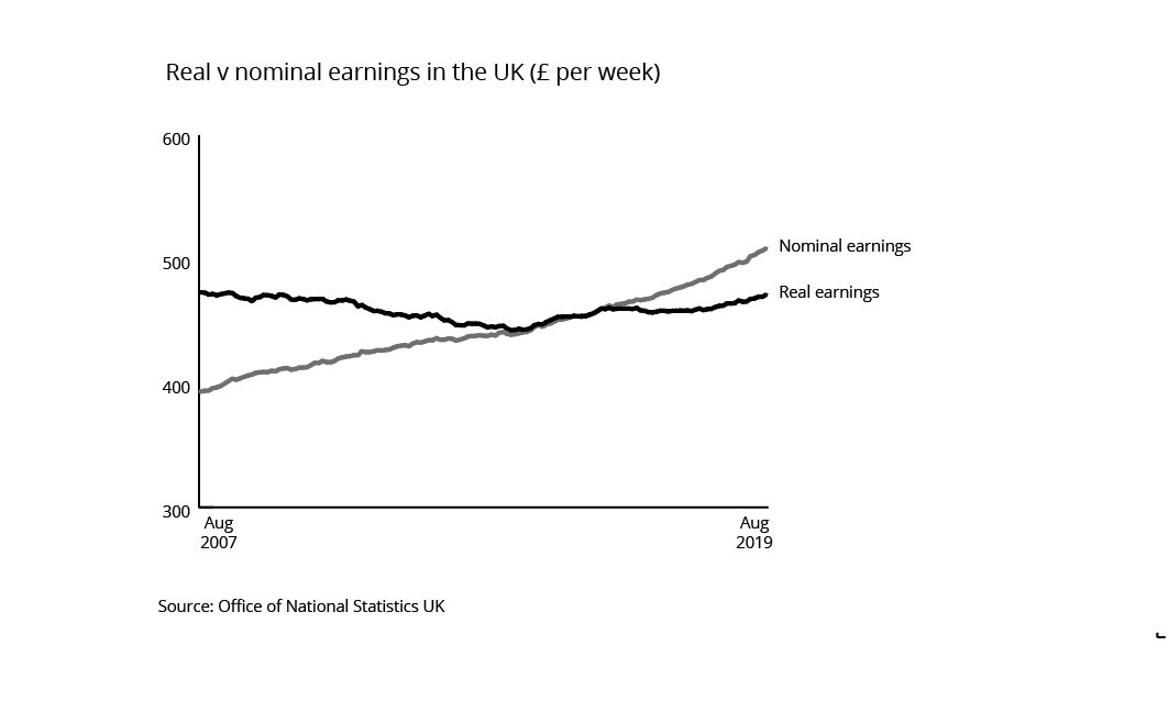
It’s particularly important to use it for ‘change over time’ data or for recent data. There’s still a case for using it for much older datasets, but at the same time, there is less risk of anyone believing that, say, George Eliot’s record-breaking advance for her novel Romola in 1862 (£7,000) would still be worth £7,000 today. (For the record, it’s about £410,000 or $520,000 in 2020 prices). There is considerably more risk of someone seeing the steady rise in nominal weekly earnings in the UK between 2007 and 2019 and thinking that the country weathered the economic storm of 2008 fairly well. However using real values, with 2015 prices as our index, we can see that earnings have actually dropped slightly in that 12-year period and that the British economy as a whole stagnated.
4. Percentiles
Percentiles are another concept that has enjoyed very limited take-up in the general population. The same applies to quartiles, quintiles and deciles. Unless you're talking to people with a statistical, financial or market research background, it’s safest to avoid using them in your work. It's partly because people seem to get percentiles confused with percentages and partly because they get percentiles confused with ordinal scales where 1st, 2nd and 3rd are good things. This means that getting a test score in the 3rd percentile sounds like great news and being in the 99th percentile sounds terrible. In fact, if you're in the 99th percentile, it means that you did better than 99% of the other candidates. You're in the top 1%. For obvious reasons, we'd recommend using this kind of language - 'the top 1%' or 'the bottom 1%' - rather than the 99th or 1st percentile. Most audiences will grasp your meaning faster.
Having an understanding of percentiles is still useful though, because although you may not use the language often, they remain a useful tool when you are analysing data and you will often be given data that has been divided up in this way. It is never a bad thing to understand where you or a specific datapoint sits in relation to the rest of the dataset. Of course standard deviation can tell you where you sit in relation to the mean (see Appendix B) - you may be 1 or 1.5 standard deviations above or below the mean, for example. But this is sometimes hard to process or picture. Just as the median can be a more useful measure for the average than the mean, so percentiles can be a more useful way of understanding how far your data is spread out. It often feels more intuitive to position a particular datapoint along a line where all the values have been arranged from biggest to smallest. Measuring test scores is one common application, but it's also used to categorise salaries, children's height, response times for ambulance crews, home broadband speeds and a wealth of other common performance metrics.
Percentiles divide everyone or everything in your dataset into 100 equally sized groups. Deciles divides everything into 10, quintiles into five and quartiles into four. If you use quartiles, then the 'interquartile range' sits either side of the median and shows you where 50% of your dataset sits.
Even if you don’t talk about quartiles or percentiles specifically, this kind of information can be useful when you chart your data for an audience. For example, perhaps you want to compare the average graduate salary earned in the UK five years after graduating by University discipline. You could download the latest figures for the UK’s Department for Education, chart the median income for each academic discipline and just leave it at that (see the figure below). You would see that Medicine graduates earn the most five years after graduating and Art and Design graduates earn the least.

But there is an important second question for anyone considering a degree (especially a long or expensive one). How likely am I to earn that income? If that’s the median, then half of the people in this dataset are earning less than this - so how much less? The next chart answers this.

The chart above shows the interquartile range: remember that’s the middle 50% of your dataset, omitting the top and bottom 25%.
Now you can see that not only do medical graduates earn more, but they all seem to earn about the same. Half of graduates earn within £2,000 of the median. Compare that to the unstable world of economics and business. The interquartile range for Economics graduates ranges from £28,000 to £42,500 - the widest of any subject. If you include the minimum and maximum salaries, then the stories become even more dramatic, as the chart below shows.

Now you can see everyone’s salary.
Again, medicine has a narrow spread - all employed graduates earn between (roughly) £42,500 and £51,000. Not only is that a high income, but it feels like a guaranteed high income. Contrast this with the salaries for Business graduates, which range from £16,750 to £75,000. The rewards are potentially the highest of any subject, but you could earn less than the lowest-earning Philosophy, HIstory or Sports Science graduate.
And look down the bottom too, at the lowly Art and Design students. Even the highest achiever isn’t earning more than £28,000, five years after graduating.
For some audiences, the boxplots will be distracting, but for others - for example, a student deciding which degree to take - the extra detail could change their life.