
APPENDIX E: DATA VISUALISATION And storytelling
by Adam Frost
Part 1: wHY THINK OF dATA vISUALISATION AS storytelling?
Why is it useful to think of data visualisation as a form of storytelling? To answer this, we need to think more generally about how our brains customarily turn data into information.
In the twenty-first century, most humans live in permanent dwellings, usually in towns and cities, with regular routines and relatively secure access to resources.
But, as any anthropology textbook will tell you, this is an incredibly recent development in our history. For the vast majority of the (roughly) 200,000 years in which homo sapiens have existed, we lived precarious, nomadic lives in small, close-knit groups. And although cultural evolution is fast, biological evolution is slow, so our brains are still fundamentally those of hunter-gatherers. (I say our brains, but it’s everything. Our skeletons are made for climbing trees to pick fruit and for hunting animals - not for farming, factory and office work).
This means that we still scan the world like nomads, expecting our environments to change regularly, making continual, quick judgements about whether our surroundings are safe or risky. As hunter-gatherers, we are hardwired for scarcity, so many of our daily decisions are unconsciously rooted in whether a particular task or undertaking is worth the necessary expenditure of calories. (See Jared Diamond for more on the importance of ‘effort-allocation decisions’ in Guns, Germs and Steel (Norton, 1999), p107).
Because we are used to living in groups, we pass on facts about our environments to others, as any risks or opportunities will be shared. Because these social groups are small, we are predisposed to favour face-to-face communication with people we know and trust.
So next time you’re getting exasperated in a conference room full of 200 people, where you have had to sit still for two hours, listening to a Powerpoint presentation from an executive you’ve never met before, full of text slides that have little relevance to your own life, now you know that it is your hunter-gatherer brain that is angrily reacting to the unnatural way you are being addressed and the monumental waste of your severely-limited energy.
All of this means that we have not adapted to scan all of our environment or to scan it accurately, but to select useful or important aspects, to overreact to these important aspects and to share this skewed but coherent view of our immediate reality with others in order to inform, warn, amuse or reassure.
In other words, we have survived this long by telling stories.
In fact, this necessary fictionalising of reality sits at the heart of everything we say or do. To even function as human beings, we need to believe in the illusion of a stable, knowable self, capable of making rational decisions and responding to situations in consistent ways. To put it another way, even who we are is a story, before we have even got into what we see and what we say. But then this invented character (you) enters the world and turns everything else into a narrative too.
This works on several levels.
First, we monitor our environment for opportunities, threats and other significant elements. I am going to focus on visuals here, but of course all of our senses are involved in this information-gathering exercise.
The three main ways our eyes observe our surroundings are via:
saccades (quickly darting from object to object)
smooth-pursuit (locking on to an object and tracking it)
vergence shifts (watching objects getting further away or closer)
Saccades are the most common, and more importantly, they are what we use when we are interrogating text, tables and charts. (The main exception to this is in interactive or animated data visualisations where we might be tracking a particular visual as it moves). The key things to remember about saccades are:
they are one of the fastest movements our bodies perform (up to 500 degrees per second, each one lasting less than 100 milliseconds).
you alternate between saccades and moments of focus, taking quick two-dimensional snapshots of scenes. These moments of focus are called ‘fixations’.
your eyes are never fully at rest. Even when you have fixated on an object, they are still making tiny scanning movements.
What we choose to fixate on is complicated, influenced by what we are already interested in and by how interesting the scene is. We will look more about how design can hijack this process and force an audience to scan information in a particular order elsewhere in the book. But right now, I want to emphasise quite how imperfect this system is as a means of obtaining reliable data. Our brain has to stitch these two-dimensional images together and turn them into a three-dimensional model of the outside world.
Inevitably, there are gaps in this model, which means the brain has to fill it with guesses and approximations, based on similar scenes it has witnessed, imagined or unconsciously absorbed from a variety of cultural sources. It is also prone to misjudge what it has seen, misinterpreting size, distance and speed of movement, and falling prey to a variety of optical illusions.
When we read, there are textual illusions too. (We have shown some favourites in the figure below).
Colin Ware’s words are an understatement: ‘The world that we perceive is not at all what is imaged on the retina.’ (Information Visualization: Perception for Design, 2nd ed (2004), p40). We have evolved to observe, process and react at speed, which means that our brains invent large parts of what we see, and enhance the rest.
In fact, one of the most celebrated descriptions of how our vision works comes from the neuroscientist David Marr: ‘Vision is a process that produces from images of the external world a description that is useful to the viewer and not cluttered with irrelevant information.’ What we see is not the object but a description of it. For example, we customarily observe objects in the world as irregular shapes: perspective and movement distort rectangular road signs and round footballs into trapezoids and blobs. But they are not described this way: our mind understands them as rectangles and circles even if this is not what hits our retina.

Answer to Count the Fs: Most people only count 3 Fs, although there are actually six. This is because we are used to reading only the ‘o’ in ‘of’, and skipping over the last letter. We simply do not see it unless we somehow force ourselves not to see the words as words.
The same applies to things we hear. In conversations, for example, we frequently mishear or misunderstand what people are saying and don’t always ask for clarification. When we do hear a speaker’s words correctly, we conjecture what they might have meant; we can never know for sure, as many words have multiple meanings and these meanings change over time. The speaker may also not mean what they say: they might be lying, joking or using a word incorrectly.
So this is the first issue: what we see and hear is rarely the whole truth; multiple witnesses to the same event will rarely agree on what they saw and heard.
The second issue relates to what happens in our brains next. There are various theories about how our brains turn the disparate things we experience into coherent thoughts or ideas. At a basic level, there seems to be a system of pattern matching going on that enables us to see, for example, a dog-type shape sitting under a tree-sized object, match those entities up to our previous encounters with dogs and trees, and then formulate the thought: ‘That dog is sitting under a tree.’ If the pattern is anomalous in some way, if this is not how we typically encounter dogs in our area, we might go on to wonder: ‘Where’s its owner?’ This experience - in a tiny way - will affect our mental model of dogs, owners, trees and our neighbourhood from that point onwards.
However, usually what we are seeing is more complicated than a dog sitting under a tree. One of the most fascinating theories about how we give what we see meaning was formulated by George Lakoff and Mark Johnson in their seminal book, Metaphors We Live By (1980). They argue that humans are essentially incapable of thinking or acting without adding a made-up or metaphorical layer to what they experience.
Let’s take a simple example. Imagine you are at a wedding - your old friend Bob is marrying his long-term partner Sam, they have exchanged vows, and it’s time for the post-ceremony kiss. (Let us also imagine that you are seeing this reasonably clearly, without any of the optical illusions or perceptual errors mentioned above).
At this point, you are unlikely to be thinking about the bald reality of two humans embracing while others watch, you will probably be contemplating love, relationships, happiness and the future. It turns out that, like most phenomena, we cannot think about any of these things without relating them to something else.
There are, in fact, a range of well-worn and ready-made metaphors that we use to understand love.
The journey
Bob and Sam are on the start of their journey together. They’ve been through so much already. I’m so glad their paths crossed. Bob’s last relationship was a car crash. It wasn’t going anywhere. I’m glad he moved on to Sam.
Illness (mental or physical)
Sam is crazy about Bob. Bob is nuts about Sam. Sam is always raving about Bob. Bob drives Sam wild. Bob pines away when Sam isn’t there. Bob was lovesick.
Sorcery
Sam looks bewitching. Bob is entranced. Sam is so charming. Sam is hypnotized. Bob cast a spell on Sam. When they met, there was magic in the air.
Science
They are attracted to each other. Sparks flew when they met. They have a real chemistry (or there’s electricity). Bob’s life revolves around Sam. Sam has such magnetism.
Battle
Bob pursued Sam for months. Sam initially rejected Bob’s advances. Bob won Sam’s hand. I think Bob let his guard down. His defences are usually up. Sam is Bob’s latest conquest. Sam tried to resist, but was overpowered by Bob’s charm.
None of these things are literally happening - there is no journey or battle, no scientific experiment or magic show - your brain has added all of this. Furthermore, this is ‘unavoidable, ubiquitous and mostly unconscious.’ (Metaphors We Live By (University of Chicago Press, 2003), p273). You are just reacting in an ordinary way. If you shared any of these thoughts with the person next to you at the wedding, they would not accuse you of being pretentious or delusional. Their minds would be doing the same thing.
Likewise, if you described yourself as being happy for Sam and Bob, you might use a direction metaphor: happy is up, sad is down. ‘I’m on such a high’, ‘I’m on top of the world’, ‘This has given me such a lift’, ‘I feel buoyant, lighter than air, over the moon’. You won't have got any higher or lower, but perhaps because of our biology, we associating standing up, rising, climbing as positive and falling, lying, descending as negative (as in ‘I’m feeling down’, ‘I fell ill’, ‘I’m sunk.’)
In fact, for the whole wedding day, you would barely be able to formulate a single coherent thought or word without using a metaphor. At the reception, you might talk about:
sport (‘My team faces an uphill battle’, ‘My team was thrashed on Monday’)
holidays (‘France was a nightmare this year’, ‘I need to recharge my batteries’)
politics (‘The government is out of its depth’, ‘The Prime Minister is going to invade Belgium’)
These metaphors are not literally true: the government is not floundering in a body of water, nor do Prime Ministers tend to invade countries all by themselves. But it's impossible to create or convey a true picture without these figures of speech. Even the wedding reception itself would be understood as a metaphor: a container or box. It would not be a group of people standing awkwardly in a series of rooms, we would put boundaries around it and fill it with meaning. People could arrive or leave, take pictures of it, be at the heart of it or on the fringes, sneak into it without an invitation or be thrown out of it. The provisional, porous nature of the event would be given a clear shape by everyone attending so it could be properly experienced.
So we embellish the images we receive on our retina, and the sounds we hear in our ears, and then we use metaphors to make sense of this unreliable information.
But there is yet more fictional activity to explore. We were present at Bob and Sam’s wedding, but how much of it will we remember? And will what we remember be accurate?
Think about a recent wedding you attended, or your own wedding if you’re married. What’s the first memory that comes to mind?
Why has your mind thrown up that memory first? Is the first time you remembered it since it happened? If not, do you think you recalled it the same way each time you recalled it? Do you still remember what actually happened or has the memory replaced the reality? Has the memory been shaped by photos or video footage, or by other people’s memories of the same event? If you were going to describe it to someone else, would you describe what you remembered, or would you change it again to make it (and you) more interesting? Would you then preserve both memories: what your remembered, and the way you usually tell it?
The issue is not a trivial one. Memory is core to who we are: it is the basis of everything we think and everything we know. On one level, it appears to be a catastrophically flawed system. But on another, as we shall see, it is precision engineering. All those gaps and omissions and false memories are not accidents; they are our brain’s way of keeping us sane and safe (see John Medina’s Brain Rules for more on this).
Let us start with the first part of the remembering process: working memory. Imagine that your memory is a giant warehouse full of labelled boxes with memories in them. Some of these boxes are full of declarative memories: these are either semantic (facts and ideas) or episodic (events and experiences). They are called declarative memories because we can actually locate them and say them out loud. For example: What’s the capital of the United States? or What was your first day of school like?
Some of our memory boxes are unconscious or procedural memories: like how to use a can opener, or ride a bike.
These boxes are organised into sections - cognitive load theorists call them schemas - so if we need to drive a car, or speak a foreign language, or draw a picture of a desert island, all the relevant memories are close together.
Picture your working memory as the person responsible for looking after this vast information store. They are just one person and they are a stickler for the rules. If you want them to store a new box, it has to be correctly labelled and below a certain weight. Otherwise it gets turned away at the gate. The items in your long-term memory are there for a reason - they have helped you survive this far - and your working memory is not about to let you trash the place.
How light do these new boxes have to be? The founder of cognitive psychology, George A. Miller, argues that they can contain around seven items (sometimes called ‘The Rule of Seven’): in other words, we can only hold about seven new things in our working memories at a time. Recent research suggests that it is more like four. The exact number doesn’t matter - because so much depends on age, mood, context, personal interest in the information and how well it is structured. However, the important thing to remember is, it is phenomenally low, particularly for a species that likes to think of itself as the world’s smartest (we are apparently homo sapiens - ‘the wise man’).
Let us take a simple example: imagine someone tells you their phone number. It is a string of perhaps 11 digits. The usual response is not to store those 11 digits automatically in your long-term memory. In fact, you couldn’t even if you wanted to. You need the number repeated, then repeated again, then you will say it back to the other speaker. Even then, this is rarely so you can remember the number, it is so you can write it down, or enter it into your phone, or use some other way of delegating the arduous process of remembering 11 digits to an external information store.
11 digits!
If you did have to remember a particular phone number, the only way you to persuade your working memory to store it, is by insisting over and over again that you actually need it. You have to say it to yourself constantly. Furthermore, you have to abide by working memory’s stringent weight and quality restrictions. Those 11 random digits will have to be chunked up into smaller units (usually three groups of three or four digits - in Maths, think of how we separate long numbers with commas, another indication of how hard we find numbers to process).
Next, this chunked-up phone number is given a rhetorical pattern of pauses and emphases so it sounds like it means something.
Even then, working memory is suspicious and you will have to use the number a few days later, or it will get quietly thrown out.
I have used a random list as an example here as it is the hardest thing for our working memories to handle. With this kind of information, we usually have to trick our working memories by turning the list into a pattern or song: think the ‘ABC’ song to remember the random order of the alphabet’s letters or ‘30 days have September’ to recall the arbitrary number of days in a month. I regularly hear adults murmuring these songs to help them recall information that they have had decades to learn.
However, even interesting, well-structured information will not stick unless it is chunked up into small units and repeated. Say you’ve got a new job in a foreign country and you want to learn the language. Can you just show up and absorb the language by eavesdropping on random conversations? No, you will have to go on a mediated course of some kind that will divide learning the language up into top-level themes and sub-themes: asking for directions, ordering a meal and so on. But that is still not enough. Even in ideal learning conditions, it will take you years to become proficient in the new language. Your working memory will fight you every step of the way. Why are you asking me to remember this? Is it absolutely essential? Can you repeat that, please?
So you see the problem. Even when we want to store a more accurate picture of reality, to really know or remember something, there are cognitive limits to what and how much we can take in. Our working memory refuses to carry more than a few things at once, and it wants those things to have an inner logic (so they make sense), proper labelling (so they can be correctly filed with similar information) and a clear intellectual or emotional justification (because they are aspiring to displace important existing memories). Few facts or events have all of these properties, so they are either dumped, or they are edited and re-shaped until they abide by the rules. There is usually some version of an alphabet song when we choose to remember something.
Later on, we will see how you can exploit this aspect of the human mind to improve your storytelling. But for now, I just want to emphasise that the conditions that your working memory sets on the formation of new memories appear to transform your understanding of reality into something else. This is not quite fiction - we know we are at Bob and Sam’s wedding, not watching Four Weddings and a Funeral - but your working memory cuts and deletes and reworks events until Bob and Sam’s big day becomes a bit like a movie that is ‘based on a true story’ or ‘inspired by real events’.
The next part of the memory formation process involves long-term memory and, for this, we need to go back to our warehouse metaphor. If your working-memory is a grouchy supervisor, who refuses to do any overtime even when there’s a huge delivery of potentially life-changing information, there is one upside. If the box of information makes it into the warehouse, and you want it back out again, the supervisor has delegated this task to a high-speed state-of-the-art robotic retrieval system. This means that memories that took years to form such as mastering the French language or driving a car do not take you years to extract, you can access them at lightning speed. In fact, you can drive a car while singing along to a French song while remembering the office Christmas party without expending any conscious effort at all. This is why your working memory is so officious: it wants to protect the efficiency of this information-retrieval system.
But even here, it’s important to emphasise that the process of forming and retrieving long-term memories is about usefulness rather than truth. Although there is disagreement among scientists about the exact distinction between working and long-term memory, there is general consensus that there is an interim stage called consolidation where a memory gets slowly turned from its original form into its more permanent long-term shape. This usually takes a few months.
However, here is the catch: the details of that memory are malleable. Every time you remember it, it gets winched back into working memory and you decide whether or not to ‘reconsolidate’ it. If you do, it gets altered slightly, usually to make it clearer, or more interesting, or more personally flattering. Psychologists call this the ‘self-serving’ nature of memory formation.
Particularly intense long-term memories are the most likely to be reengineered. One study that looked at people's memories of 9/11 found huge inconsistencies arising as the years passed, with 42% of the edits changing basic details like time, place and their behaviour at the time. Yet all the participants ‘saw’ their memories vividly and swore their recollections were accurate. The same effect was seen in a study of people’s memories of the Challenger shuttle disaster.
This means that even if you see something without misinterpreting or distorting it, even if your working memory keeps it in one piece, and agrees to store it, the process of continually accessing the memory changes it without you realising.
The final issue to consider is these semi-fictional memories frequently set the conditions for the formation of new memories. If I tell you a story featuring a supervisor in a warehouse (as I did above) but I don’t specify their age, gender, ethnicity or any other defining characteristics (as I didn’t), then to even follow the story, you will have to flesh this character out for yourself. What did your memory serve up as a typical ‘supervisor’ figure? Students in our seminars have typically pictured a straight white non-disabled male, usually middle-aged, some give him props like glasses or a moustache or a clipboard. Even the man’s characteristics seem to have a set order in memory: grammar dictates that he is a straight, white, non-disabled male, not a non-disabled, white, straight male. This is ostensibly a new memory, but nothing about it feels original or spontaneous. Rules and biases and previous experiences and cultural clutter limit what this new memory is allowed to be.
Of course when I say we misinterpret reality, I am exaggerating a little. We are not all walking around, bumping into lamp posts or mistaking one friend for another, or remembering Bob’s wedding as his funeral. We are also pretty good at setting down accurate information and passing this on correctly to others. Transport systems and medical institutions and financial bodies and all the other complex organisational structures of the modern world function effectively most of the time. However, they work because skilled teachers and communicators have edited and repackaged key information in a way that their audiences can understand, remember and pass on.
In the Find stage of the data visualisation process, you will have tried hard to resist your innate tendency to manipulate and embellish what you see. In fact, you will have greeted neat, ready-made stories in your data with suspicion. But in the Design stage, your objective is no longer to serve the data, it is to act as an intermediary between your data and your audience. It is to show them what the data means. And the only way of doing this is to respect the way the brain usually handles new information: rejecting it by default unless it has been turned into a clear, interesting, well-structured narrative, forgetting it quickly unless there is a clear emotional or intellectual reason for keeping it.
This is difficult because it often means accepting a lot of the simplifications and generalisations that you questioned in the Find stage.
For example, let’s imagine you are working on this dataset. I’ve just included the first few rows but it would contain all of the UK’s tech businesses.
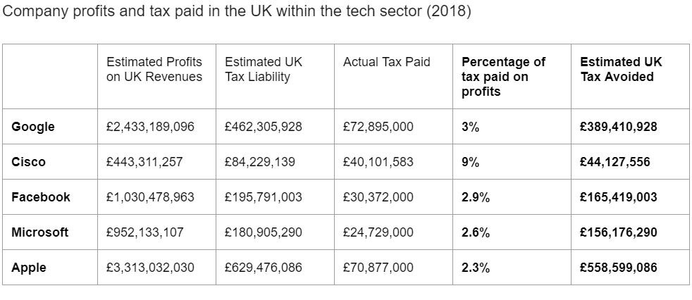
First of all, it is worth restating that the fact that you understand this table at all is down to the excellent work of your storytelling brain. Earlier in this section, I used a fairly simple example - a friend’s wedding - to show how you select and transform aspects of reality so that you can store it, and then transform it further each time you access it. This table shows the extent to which we use this same process to organise almost everything in our environments.
Everything in this table is a human fabrication, utterly divorced from the physical world of rocks and trees and clouds, completely baffling to the entire animal kingdom and any human being alive before the modern era. You had to learn all of the concepts in this dataset using the process outlined above: selecting, simplifying, repeating, reshaping.
I don’t just mean the companies: the millions of people in thousands of buildings in hundreds of countries doing complex jobs with differing degrees of skill that we have turned into brands with ‘personalities’ like Apple and Microsoft.
I don’t just mean the provisional administrative fiction that is the UK which, if you don’t live in the UK, you probably mistakenly think of as Great Britain, the British Isles, England or something vaguely connected to the Royal Family.
I mean the even more basic fictional constructs that underpin your understanding of this dataset:
the idea of work, that some activities are work and some aren’t, and that the work that people do can be organised into sectors like ‘tech’ and ‘retail’
the year 2018 and all the other artificial units (months, weeks, days etc) that we use to organise time
the concept of money, and different countries having different currencies
the cultural constructs that are government, a legal system, taxation and society, and how these are interrelated
your political or religious beliefs (left-wing, right-wing, Christian, Muslim) and how they might shape your interpretation of this dataset (is the behaviour of these companies ‘good’, ‘bad’, ‘greedy’, ‘smart’?)
the way we give our complex emotional responses simple and distinct labels. Does this information provoke anger? Envy? Admiration? Awe?
In his book Sapiens, Yuval Noah Harari provides a more detailed assessment of the pervasiveness of human fictions and how they have both helped and handicapped us. But here, I just want to pay tribute once more to how at home we feel in this world. Work, countries, money, religion, time, love - they might be inventions, but they feel extremely real to us. They suit the way we like information, they are easier for our brain to remember, and, as a result, they are very easy to retrieve when we need them. I itemised some of the fictions that underpin this dataset above, but you were aware of none of them as you first scanned the numbers. The concepts - Google, UK, 2018, profit, tax - jumped into your working memory, recombined, and instantly made sense. This information might be simplified - even falsified - but it is ‘good enough’ and, most critically, can be used more rapidly and easily in this rough-and-ready form.
During the Find stage, things would have been less simple. If you had been pulling this dataset together for Taxwatch UK, you would have been probing and deconstructing some of these fictions. You would have had to define what the tech sector meant and which of the thousands of potential tech companies active in the UK to include. (E.g. Amazon calls itself ‘Retail’ not ‘Tech’). Once you had got a manageable list, you would have discovered that some bigger tech companies are not a monolithic entity but rather a complex network of subsidiaries. To find out how much tax these companies owed, you would have had to look beyond their official published accounts and find other sources. Some sources might have been reliable, others would have involved more uncertainty. You would have had to understand the UK tax system too, not just corporation tax, but all the other taxes that companies pay. You might even have investigated why companies behave in this way: their customers demand low-cost (or free) products, their competitors all take advantage of tax loopholes, which leaves them (they claim) little option but to do the same. Rectifying this situation would require the law to change which, in a democracy at least, is down to all of us. As a good researcher, you would have explored and questioned everything.
But now it’s time to design a story for an audience. For most audiences, the main story in this dataset is: ‘Tech companies don’t pay their fair share of tax.’ If you are creating a chart to accompany a written report, you might be able to include additional nuance in the text. However, in the visual, or if you are creating a visual without supporting text, you need to remember how the brain likes information to be packaged up, particularly in visuals, and how hard it finds it to retain information that doesn’t fit into existing schemas. You are already giving your audience new information - about tech companies and the tax they pay - so it is best not to also ask them to create new schemas for UK business, tech companies and tax. ‘Actually, you can’t really compare Apple to Facebook’ or ‘I need to explain how Alphabet relates to Google’ or ‘Some sectors have more types of business tax to pay than others’. These are separate stories, requiring charts of their own.
Instead focus ruthlessly on your main story, constructing it in such a way that the storytelling brain cannot ignore or forget it.
Isolate the most emotionally resonant aspect. Your audience will (probably) all pay their taxes, but big tech companies don’t.
Remember your brain thinks in metaphors. If there is an obvious visual metaphor, consider using it: perhaps the distance between what companies should pay and what they do.
Respect the limits of cognitive load (the ‘Rule of Seven’). Turn the hundreds of names on your spreadsheet into a handful of the most recognisable names or the biggest offenders (in this case, they are the same).
Relate it to the audience’s own lives. They need a clear reason to store the information. How does this lost tax revenue affect their own communities?
Release the information progressively and in a logical order. Explain the problem first, then the consequences and then (if there is one) a solution.
Tell your story confidently. Leave any uncertainty in footnotes or in subtle visual markers. Clear, vivid stories become consolidated into memories more easily.
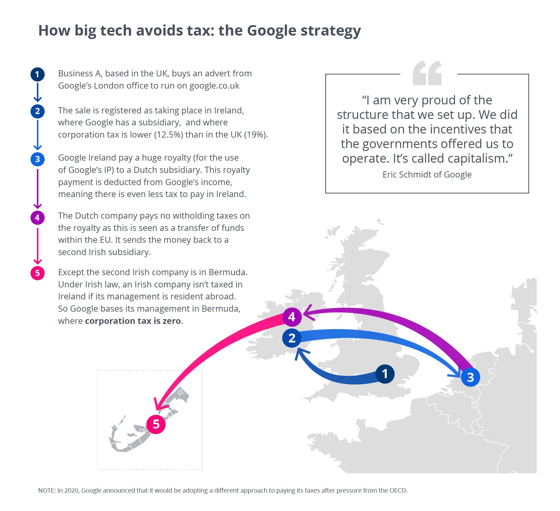
We have put one possible solution below.

If this chart gets your audience’s attention, and stimulates their interest, then you might be able to introduce a second chart, and a third, walking them into a more detailed story, helping them to see that it’s more complicated than it might at first look (see the graphic below). But each chart you make should follow the same compositional process as the first chart, acknowledging the human brain’s aversion to too much reality, and accepting the way stories are told, and have always been told.*
PART 2: THE TOOLS OF THE TRADE
In Part 1, we talked about how the brain is wired to take in information and formulate it as a narrative. This section builds on these ideas, looking at the tools that are used to structure factual stories and how they each add a different dimension to data visualisation projects.
The primary ways we take in information are by hearing, reading or seeing (touch, smell and taste are less important). This information is conveyed in three main ways: speech, text and visuals. If you are giving a lesson or a business presentation or making a motion graphic, you will be using all three. Using these tools in a coherent way increases the chances of your audience retaining the information, as Richard E. Mayer and many others have established. Nathan Yau puts it this way: ‘Think of text and graphics as a single unit instead of separate parts’ (Data Points, Wiley, 2013, p264). This accords with how we structure the data in our brains, as efficiently-stored units of composite information. Some is verbal, some is numeric, some is visual, but usually it is a combination of all of these, depending on the optimal way of making the material stick.
Doing data visualisation well relies on you understanding the strengths and weaknesses of these multiple ‘colleagues in explanation’. When charts fail to convince an audience, it is usually because what the speaker is saying, what the text states, and what the visuals show are either contradicting each other or saying the same thing three times - both courses of action cause confusion. The first chart below reiterates its point as a title, subtitle and in the chart. It is then repeated again by the speaker. Although you would think that this would ensure the speaker’s point gets across, it usually achieves the opposite, because of what cognitive load theorists call the redundancy effect. Saying the same thing in many different ways slows the mind down, as it has to figure out if the similar-sounding pieces of information are in fact the same, and then it has to work out which of the identical pieces to discard. Secondarily, this approach can make the audience lose trust in the speaker, as it implies that he or she does not have any confidence in the power of their words, text or visuals to convey reasonably simple messages. The second chart below shows one solution, where text, visuals and speech each play to their respective strengths, complementing rather than duplicating each other. When the title has delivered its message, it hands over to the chart; when the chart is understood, the speaker adds context. Each element moves the story forwards, and the chance of forming a lasting, coherent memory in the audience’s head is increased.

Let us look at speech, text and visuals now, and attempt to isolate what each of them does well.
We should start with speech just because it is easy to take it for granted as a medium of communication. In fact, its ubiquitous, everyday quality is its key strength. All the other tools you use - the printed word, numbers, charts, maps - can only be understood if your audience has been taught how to read them. This is not the case with spoken language, which as writers from Noam Chomsky to Steven Pinker have argued, we seem to be born with an ability to use. Of course, this innate facility is what has given us 6,500 living languages (and thousands more dead ones). But although the existence of such breathtaking diversity can sometimes complicate matters when you are presenting to an international audience, remember that it is further evidence of language’s unique power as a binding agent. When two speakers of the same language meet and talk face to face, over 100,000 years of evolutionary history are conspiring to make them feel safer and more secure, as they are part of the same group. The shared language represents shared family, resources, traditions.
(The seminal work on orality and its characteristics is Walter J Ong’s Orality and Literacy (2nd edition, Taylor and Francis, 2005). It remains an extraordinary survey of how foundational spoken language is to the way societies have evolved. I have drawn heavily on it in this section.)
I’m lumping all spoken language together here but in reality it is used very differently in different contexts. To simplify, there is the informal language of conversation and the formal language of official communications.
Informal language is alive and spontaneous, full of hesitations and repetitions as we try to gauge whether the other person understands what we are saying. Correct grammar and Standard English are frequently discarded in favour of abbreviations and slang. We change pitch and volume continually, we use plenty of eye contact and body language, and what we are saying is often trivial or forgettable, as it is often more about consolidating the relationship between speaker and listener than communicating a specific message. In spite of this, or perhaps because of it, conversation is uniquely compelling - if someone talks to you directly, an immediate response is required, whereas this tends not to be the case in a more formal context. Likewise, a lesson or sermon can be ignored, but if a conversation is going on behind us, we find it hard not to eavesdrop.
Formal language is the language of preachers, lecturers, politicians, lawyers and so on. It has been carefully composed and rehearsed. Unlike the half-sentences and non-sequiturs of conversation, rhetorical techniques are used to structure arguments and hold the audience’s attention. Body language tends to be deliberate and motivated. Formal speech is more obviously manipulative and implies the passing of information from a privileged speaker to a non-expert audience.
When presenting your data, the way you speak will probably fall somewhere between these two extremes. You will have rehearsed your key points, but perhaps not off by heart, as you will usually want to leave some room for improvisation based on questions, interruptions and your audience’s general reaction. You will want to keep the tone authoritative but friendly, half way between an expert and an equal.
What I want to emphasise is that, irrespective of whether you prefer more formal or conversational methods, any kind of spoken word communication possesses distinct qualities and you can use them to enhance your data storytelling. In particular, think about the way that spoken language excels at the following:
Giving explanations. Often text and visuals are commended for the speed at which they convey information. Listening to someone say it all takes longer. But sometimes you want to make people slow down, to check they have processed point 1 before you move on to point 2, to adapt your tone and content based on an audience’s level of understanding. Saying all this is a better option than covering your slides with annotations.
Conveying emotion. Speech is unparalleled at conveying and evoking emotions. If something dramatic has happened to you, you will often ‘save it up’ until you see a friend, so you can tell them in person, rather than sending them a written version. Of course text and visuals can convey emotion too, but it is inevitably a more distant experience. This is one reason why skilled presenters often use personal anecdotes to introduce or emphasise key points. (If you are speaking to a large group, this emotion can also bring people together, whereas reading the same information as text sends everyone into a private world, experiencing different emotions at different speeds).
Building trust. It is the primal form of communication and still our default option for connecting with anyone we care about. When you text or email friends or colleagues, it is often to organise a meeting where you can actually talk. At Add Two Digital, we do a lot of work with brands where they assess the most trusted media for information about the product. It is always word of mouth. (e.g. in this example, 92% of consumers believe word of mouth over all other forms of marketing).
The image below shows a couple of examples of where we used text and visuals to establish the basics of what, where and when, but used the presenter’s words to add emotional resonance, clarity and broader context (the ‘So what?’). This book does not cover the best ways of delivering these words - there are plenty of books on presentation skills that can help you out there - but we do absolutely want to emphasise how many data presentations in a business context rely on an assured use of the spoken word, how this has been true for gatherings of humans for millennia, and how making a set of compelling charts is often a waste of effort if the presenter’s words and delivery aren’t also compelling.

Of course these slides also show the downside of spoken language. To show you what we said during these presentations, I have had to write it down. You weren’t there. If you missed it, and no one recorded it, those words are gone forever. Writing offers us a way of communicating with people we will never meet. It allows us to spend time crafting what we want to say, and creating a permanent record of it. This is ultimately why, in spite of the intimacy and power of speech, it is writing that has taken over the world - changing how we think and act, and transforming art, science, government, commerce, the law and every other sphere of human activity.
As well as benefits for the person writing, there are also obvious benefits for the audience. Reading is extremely efficient. Anyone who has been forced to listen to an answerphone message rather than simply reading the same information in an email will understand what I mean. Reading is speedy (around 250 words a minute for most people) and you can skim too, identifying the gist of a paragraph in a few seconds. Conversely you can slow down, re-read, make notes and go back later.
It is how we prefer to take in information about abstract ideas. This is perhaps because, as Walter J Ong argues, it is the printed word that created these abstract ideas in the first place, allowing us to trade the more restricted conceptual framework of oral culture for the ‘consciousness-raising’ theories and narratives enabled by books. When you discuss unemployment or the economy or life expectancy or human rights, it is the printed word that has made these ideas possible. In our experience, even when we are giving spoken presentations on these kinds of topics, audiences always ask for a written-up version afterwards, or consult other online or print sources to help them understand the context and nuance of the argument. After all, if I were to ask you what pops into your head when you read ‘unemployment’ or ‘the economy’, is it even a picture? They primarily exist as abstract concepts.
But text is not just good at abstract ideas. The success of the novel since its first appearance in the early seventeenth-century hints at another key strength of the printed word. Novels are perhaps the most powerful and flexible storytelling tool yet created. If you think about the narratives that have come down to us from oral cultures, for example The Epic of Gilgamesh, The Iliad or Beowulf, they are frequently fascinating, but are often strange to modern ears, with their stereotypical characters, their formulaic language, their focus on external events and their lack of an authorial personality. But since Don Quixote was published in 1605, the novel has transformed our understanding of what a story can be, to the extent to which we have become, in Nabokov’s words ‘absurdly accustomed to the miracle of a few written signs being able to contain immortal imagery, involutions of thought, new worlds with live people, speaking, weeping, laughing.’ True, cinema has become more dominant since its invention in 1895 but it seems to have mostly cannibalised theatre audiences rather than readers and, besides, behind every movie, there is a carefully-written script.
The key words for me in Nabokov’s description are ‘new worlds with live people.’ Spoken words can create this sense too, but print gets you into these worlds faster and (because the author is not present) the reader has more control over how they hear and picture the story. Think about sentences like ‘It was a bright cold day in April and the clocks were striking thirteen’, ‘In a hole in the ground, there lived a hobbit’ or Nabokov’s own ‘My very photogenic mother died in a freak accident (picnic, lightning) when I was three.’ They conjure up images instantly and they are yours and yours alone. Visuals can limit the imagination and are often no match for the visuals that you can instantly create in your own head after reading a few well-chosen words.
This is why text is such a vital tool when you are creating data visualisations. It is not just because of its ability to express abstract ideas; it is because of its ability to build a living, breathing world around your data. You will often only have space for one key visual, but if you use text well, you can create hundreds more, and you can usually do this in less space than your chart takes up. You can bring the people that sit behind the data back to life (with reportage, interviews, case studies) and you can slot your story into larger international or historical narratives. Yes, text lacks the immediacy of the spoken word (or a picture), but it more than makes up for this in richness, depth, speed of comprehension and permanence. In reports and interactive infographics it is obviously essential, but it is also critical in dashboard design too. In fact, using text in an intelligent way is just as important for data storytelling as using interesting numbers.
Talking of numbers, they are pretty vital too. I’ve focussed on words up till now, but of course text includes numbers as well. The first number systems were created in around 3,400 BC - before the first writing systems - but they were both invented by the Ancient Sumerians for the same purpose: to make it easier to administer an increasingly large geographical area. These numbers, later helped out by text labels, kept track of goods sold, taxes paid and units of time. This has led Levi-Strauss to remark that the primary function of written communication is ‘to facilitate the enslavement of other human beings.’ Certainly one of the things that the Ancient Sumerians recorded was how many slaves they owned. But even though numbers may have been invented to cement the authority of the first Sumerian dynasties, they quickly turned into something very different. Just as language evolved into poetry, history books, legal systems and more, so humans transformed these first number systems into mathematics: the ability to count, measure and label almost anything, a process that also gave birth to natural science, engineering, medicine, finance and eventually statistics.
In Chapter 3 of the book, I discuss how important mathematics is to data visualisation. Most data visualisation tasks start with a table of numbers. These numbers determine the size and position of the visuals you use and the descriptive sentences you compose. A few of these numbers will survive in their native form as labels and annotations. So to say that numbers are a critical tool is an understatement. The power of numbers to organise, explain and refashion the world around us is the reason you are able to make maps and charts in the first place.
However, numbers are important for more than this. I also want to emphasise how mathematics and the human need to quantify and sort experience influences the Design and Make part of any project too. When you build a story, there is often an implied numerical framework. Whether it is the chapters of a book, the five acts of a play or the 'three act structure' that apparently underlies any Hollywood blockbuster, it is standard practice to carve up your narrative into numbered units. Often these structuring principles become embodied in the plot - the Genie's three wishes, Scrooge's three ghosts, the Seven Horcruxes, the Twelve Labours of Hercules - with each numbered element signifying a ratcheting up of tension. But sometimes numbers are just used for characterisation - like the Seven Dwarves or the Seven Samurai - and don't directly affect the action. It’s more about helping you remember character traits and roles. This is a common approach in data visualisation too: giving both your structure and content a numerical basis. It might be the 10 slides of your presentation, the five sections of your infographic, the 20 panels in your motion graphic storyboard.
Inside each of these slides or sections or panels, the content will often be divided up too. Three causes of the current issue. Our seven key markets. Five action points. Notice, by the way, the recurrence of numbers such as three, five and seven in the stories I mentioned above. It is hard to say why, but authors often use odd rather than even numbers - as if the imbalance creates more emotional interest. In the same way, a dramatic countdown tends to always be 3-2-1 or 5-4-3-2-1, never from four or six. Of course the numbers 10 and 12 also feature in stories as well - because of our base-10 number system and the base-12 system that we inherited from the Sumerians and which gives us 12 hours in a day and 360 degrees in a circle. You will probably find yourself using these numbers instinctively too; it's how stories and characters seem to naturally arrange themselves.
But maths doesn’t just affect the content of your story, it affects how it looks too. When you come to visualise, you will find that many common design techniques have a mathematical basis. From simple tools like symmetry and reflection, through to compositional heuristics like the rule of thirds (which divides a landscape painting or photograph into nine equally-sized rectangles) or the golden ratio (which has apparently given us both the Mona Lisa and the Apple logo), there are an abundance of invisible numbers sitting behind the most ‘natural’-looking compositions. There are the grids - often 12-column - that shape interactive visualisations and the 24 frames per second that structure an animation. This is all without mentioning the numbers that designers type into their applications every day - setting canvas sizes, changing point sizes, scaling shapes by set percentages - or the algorithms that developers use to build online charts. These kinds of ideas will be discussed more in the ‘Make’ chapter, but for now, I just want to emphasise how foundational numbers are to every part of the data visualisation process. They are obviously your primary tool during the analysis stage, but they have a vital role to play when you design and make your story too.
So if words and numbers are so great, why do we need to visualise anything? One of the key messages of this book is that you often don’t. It is sometimes said that ‘A picture paints a thousand words’ But try painting a picture that represents that idea. What would even be in it? How long would it take you to create it? And yet just four words and a number gets the message across.
For this reason, it is worth re-emphasising the message of Chapter 3. Whenever you are telling data stories, start with words and numbers, and keep using them unless there is a damn good reason not to. As Colin Ware has put it, language is ‘the most elaborate, complete, and widely shared system of symbols that we have’ and so ‘it is only when there is a clear advantage that visual techniques are preferred’ (Information Visualization, second edition, (Morgan Kaufan, 2004), p303).
When visual techniques are preferred, it is usually because words and numbers are struggling to keep pace with your audience’s need to understand something. Because, yes, text is ‘elaborate, complete and widely shared’, but it is also man-made, artificial, something that takes us years to learn, and for certain types of story, its elaborateness becomes a cognitive barrier.
Thinking about text specifically - written words and numbers - there is no question that it is less than intuitive. If you take our alphabet, there is no connection at all between those marks and the sounds they represent (except possibly ‘O’). It has evolved this way out of efficiency. Compared to the pictographs which formed the basis of the earliest languages (where each thing had its own symbol), we now need just 26 letters to describe anything we want.
It sounds simple, but it is of course fiendishly complex.
For a start, those 26 letters are supposed to represent sounds, but they don’t - quite. In English, there are 26 letters but 44 phonemes, which means that some letters have to share phonemes, and some phonemes share letters, and this has been further complicated by quirks of historical usage and pronunciation.
For example, say we want to write the long ‘ee’ sound. We could use the letter ‘e’ as in ‘me’ and ‘we’. But we could also write the sound ‘ee’ as in ‘seed’, ‘ea’ as in ‘dream’, ‘ie’ as in ‘belief’, ‘ei’ as in ‘ceiling’, ‘y’ as in ‘happy’ and ‘e-e’ as in ‘theme’ or ‘concrete’. That one sound can be written down in multiple ways.
Conversely, a single group of letters can represent many different sounds. The letters ‘ough’ can be pronounced at least six different ways: bough (ow), though (ow), through (oo), thought (aw), enough (uh-ff) and cough (ah-ff). It’s true that English spelling is particularly eccentric, but most languages have similar anomalies.
All of this is challenging enough, particularly if you are one of the estimated 10% of the population with some degree of dyslexia. But we don’t just have to learn letters that represent sounds. We also have to learn a variety of logograms that stand for words or groups of words: &, $, @ / and so on. The most well-known logograms are numbers, where those arithmetic squiggles can stand for one, two, three and so on, but also the symbol ‘1’ can mean one hundred if it sits at the beginning of 125 or one thousand in the case of 1,320 or one billion in the case of 1,234,984,293. There are other mathematical symbols that stand for percent, plus, minus, greater than or equal to, or in the case of π, 3.14159265359 and so on into infinity.
Some symbols cross both worlds. The letter x is used in mathematics to mean multiplied by, and also an unknown quantity. In Roman numerals, it is ten. As the 24th letter of the Latin alphabet, it can be pronounced ks as in box, gs as in exactly or z as in xylophone. It can mean Christ as in Xmas. For the same reason, it has become a symbol for a kiss (in the medieval period, a cross at the end of a letter signified sincerity and faith). It is used in maps to signify where something important is located. It can mean No or Stop or Close. So whenever we see x, we have to quickly judge by its context which meaning is intended, and suppress all the others
Every day of our lives, we are squinting at these tiny runes and quickly trying to figure out which sounds, words, phrases, numbers or mathematical operations they stand for.
In the case of numbers, we have an added complication, in that we don’t always understand what the symbols truly represent. If I tell you then there is a hen farm in Galles, France that contains 185,000 hens (which there is), the words all make sense, but what does 185,000 hens mean? How much space do they take up? If I had told you the farm kept 195,000 hens or 95,000 hens, would the picture in your head be any different?
The words hen or farm can be interpreted quickly, France is a little bit harder (do you picture it on the map? Or just imagine a farm in a generic field?). But even the concept of France is simple compared to decoding numbers. Multiple experiments have shown that people find even fairly simple calculations difficult.
Try these ones out:
What is half of 358?
What is 17 x 18?
If a million seconds is 11½ days, roughly how long is a billion seconds?
If I gave you one cent and doubled it every day, how long would it take you to become a billionaire?
Is 23% of 37 more or less than 37% of 23?
The answers are:
1. 179
2. 306
3. About 32 years. To put it another way, to obtain $1 billion, you could have been given $1,000 every day since the birth of Jesus and you’d still be about $250 million short.
4. A month. In 41 days, you’d be a trillionaire
5. They are the same. It’s a trick you can use whenever you have to work out a percentage. Swap the numbers around and see if it’s an easier sum. E.g. 23% of 50 is harder to work out than 50% of 23, but it will give you the same answer.
Most mathematics is what Daniel Kahneman would call System 2 thinking. In Kahneman’s formulation, we think in two speeds: quick, instinctive, error-prone System 1, which is where we spend most of our lives, and slow, effortful, analytical System 2, which we will only engage if we have to, if we think the extra expenditure of calories will lead to a tangible benefit. (See Chapter 4 for more on Kahneman’s theories). Most of the time, maths is too much pain for too little gain, especially when there is the option to use a calculator or Excel instead.
Given that the raw material of our story is usually a table of numbers, this leaves us with something of a problem. How do we get our audience to understand how these numbers compare or relate to one another?
The simplest way is: we turn them into pictures.
This process is sometimes called encoding. Data is turned into a graphical shape such as a line, bar, wedge, point or icon. The attributes of this shape — usually its position, size, or color — are ways of encoding the original numbers. The reasoning often follows that some shapes and attributes (e.g. bar charts, line charts) are easier for your audience to ‘decode’ and you should therefore use these options wherever possible.
I find this way of thinking about data visualisation spectacularly unhelpful. I’d suggest that, when you make a chart, you should not think of yourself as ‘encoding’ anything. The data is the code. That's where objects or people or places have been turned into numbers to make them easier to aggregate and analyse. When you make a chart, you are not encoding these numbers any further, you are starting to decode. You are turning those numbers back into recognisable real-world objects: metaphors for the original object or person or place. True, a column in a column chart is not 1,003 tomatoes but it looks a lot closer to a mound of tomatoes than that number sitting in a spreadsheet. (An isotype chart - where one tomato icon represents, say, 100 tomatoes - is even more obviously restorative, investing those abstract numbers with some semblance of their former life). Similarly, a 30,000 row spreadsheet containing data for longitude and latitude and a temperature reading is patently less like ‘code’ when you turn it into a weather map.
So I’d avoid thinking about encoding, unless you are collecting data, turning tangible things into rows of numbers. If you are making charts for an audience, think of yourself as a decoder or a translator. You are taking dull or difficult or abstract numbers and turning them into a picture, using a language that involves little decoding on your audience’s part, helping them to see the human stories that generated the numbers in the first place.
So this is your third tool: visuals.
They are no more or less important than numbers and words but they are more powerful and, perhaps because of this, they are harder to handle.
The importance of visuals as a means of interpreting reality is well-established. The scientific consensus seems to be that around half of the brain is devoted to visual processing - directly or indirectly. Multiple experiments have established that when we see a picture, it tends to go in faster and stay there longer than the same information as text. Colin Ware describes an experiment from 1970 that showed that when it comes to recognising something we have seen before (as distinct from recall), the primacy of visuals is unrivalled: ‘Standing et al. (1970) presented subjects with a list of 2,560 pictures at a rate of one every 10 seconds. This was like the family slideshow from hell, it took them more than seven hours spread over a four-day period. Amazingly, when subsequently tested, subjects were able to distinguish pictures from others not previously seen, with better than 90% accuracy’ (Information Visualization, second edition, (Morgan Kaufman, 2004), p228).
It means that, when we look at the figure below, we cannot help but find the shapes easier to process and more memorable than the same information as a table.

In fact, from the chart, we get more in less time - a sense of largest and smallest, and how much larger the largest value is. We get whole paragraphs of meaning in a few seconds. In 1997, the cognitive scientist Alan F Blackwell carried out a series of experiments which showed that, on average, a simple chart or diagram is ‘worth 84.1 words’ (In C. Kann (Ed.), Proceedings First ESP Student Workshop (1997), pp. 15-2). Of course much is dependent on how clear and engaging the chart is, but Blackwell’s central finding - our intense receptivity to visuals and the speed at which we can draw meanings from them - will not be surprising to anyone who regularly visualises data.
In Part 1, we talked about how our receptivity to narrative is rooted in how the brain likes to organise information. The same might be said of visuals. Charles Minard, the father of information graphics, spoke of the ‘general impulse of the mind towards graphic representations.’ In other words, we are more receptive to visuals because this feels closer to the natural language of our brains. For example, when we read a sentence in a novel, the author has pictured something in their minds - characters, scenes, events - and turned all of this into words. We then read the words and turn them back into a picture that (hopefully) approximates what the author had in their head. Visuals are able to bypass this: the picture in the creator’s head becomes the picture in ours.
Left to our own devices, when we think or remember or dream, the process is primarily visual. Yes, this internal movie often has audio or subtitles, but it is unquestionably a movie. It recalls Steven Pinker’s theory of ‘mentalese’ - the silent language of the mind that exists before and outside of language. If I say ‘tree’, Pinker suggests that mentalese creates the image that pops into your head. You don’t think of this as the word ‘tree’, because you know that this thing can be an arbre or a baum or a дерево in other languages. If you think: ‘That tomato is too green, I’m not buying that’, your thought will not be that sentence, but mentalese. Of course many researchers disagree with Pinker, and believe that our thoughts are primarily determined and shaped by language. However, even these writers do not argue that these linguistically-generated ideas remain verbal. In the words of the neuroscientist Antonio Damasio, images ‘are probably the main content of our thoughts, regardless of the sensory modality in which they are generated and regardless of whether they are about a thing or a process involving things, or about words or other symbols’ (Descartes' Error: Emotion, Reason, and the Human Brain, Putnam Publishing, 1994, p107).
We discussed metaphors in Part 1 and it is worth returning to them briefly here, just to emphasise how vision is our primary metaphor for any kind of interaction - either with the wider world or with the contents of our own heads.
You will go and see a film or a play or a football match. You will even go and see a band play live (not listen, see).
It’s important to see your friends, not just email or phone. I haven’t seen you in ages. When can I see you? When did we last see each other?
Then there is romance. You’re seeing someone. Or you’ve stopped seeing them. (What did you see in them, anyway?)
As with events or people, so with ideas. I see what you mean. I see your point. I can see that my old idea was wrong.
If you have a specific opinion, it’s a point of view, a perspective (although others may see things differently).
Even who you are seems to have a strong visual component. Do you see yourself as a good person? Do you have a healthy self-image?
The language we use is revealing: our brain’s first language seems to be pictures.
So if visuals have such extraordinary power, why do we bother with words and numbers? Why not just visualise everything?
Starting with the practicalities, creating powerful visuals takes longer and is much more difficult than speaking or writing a sentence or making a data table. It is easy to forget that most people lack any artistic ability, at least in its modern sense.
Technology can help you to make accurate charts, but it cannot give you an eye for good design. In the wrong hands, an icon of a house or a tree can be worse than simply writing the word.
Secondly, visuals are better when you are visualising ‘common, concrete things versus abstract things.’ So comparing the number of bananas sold in the top banana-producing countries will probably be more memorable as a visual. But the concept of fairly-traded bananas or protectionism or a banana farmers’ trade union would be harder to visualise.
Similarly, visuals are better when the information is reasonably simple. More complex narratives or explanations are difficult to convey, even for a skilled graphic novelist. Explaining how bananas became the world’s favourite fruit or telling the (true) story of Dane Nash, a frutarian from the UK, who eats 100 bananas a week would be much easier with text.
Finally, visuals work best when ‘people are casually exposed to information and the exposure time is limited’ (Lidwell, Holden & Butler, Universal Principles of Design, (Rockport, 2010), p184). This is why they can be effective in corporate presentations or news websites, when people are moved through a story fairly swiftly. Research suggests that the pictures will keep the story in the audience’s head for longer and will aid recall at a later point - compared to the same information without pictures (ibid). However, when people are hunting out information, when they want detail, and they have longer to spend exploring this detail, then the case for using text is stronger. It conveys much more information in much less space.
So where does this leave us? All of our tools have obvious advantages and disadvantages, as the table below shows.

It is clear then that a deft combination of words, numbers and visuals, supported by speech where practical, is the key to producing memorable data visualisation. They need to each do different things because if they all do the same thing, then at least one of them is doing something it shouldn’t. Each has evolved for different purposes, and it is only when you use numbers to explain or words to do maths or pictures to convey abstract ideas that the audience gets confused, because you are essentially holding your tools by the wrong end.
The best data visualisation practitioners understand this intuitively and you can see it clearly in their work. There is an elegant dance of numbers, words and visuals, each doing what it has evolved to do. I have included a couple of my favourites below, but there are more examples in Chapter 4 of the book.

The title ‘Cosmic journeys’ gives a succinct textual summary of what the graphic is about - human space exploration - so we can move quickly to the visuals. The first tier of the story is clearly signposted: we have visited the moon and the planets closest to us first. Then we notice that the lines are different colours, so our eyes go to the key (text) and we see that each colour represents a different country. Then a timeline key (text again) on the Moon, Venus and Mars shows us that the innermost circles are the first missions, the outer lines are the most recent. From this, we can deduce that the inner orange and red circles around the moon represent the US and the Soviets taking turns to launch moon missions during the height of the Cold War, the light-blue and green rings towards the outside are more recent missions organised by China and India. Notice how superbly well-integrated the words, numbers and visuals are; we experience all of this as one coherent body of information.
Additional reader questions are anticipated and again the right medium is chosen to answer them.
Can’t count all those lines around the moon? A text label explains there have been 72 missions.
What about missions outside the solar system? That’ll be a visual, a narrow strip at the bottom, showing Voyager 1 and 2 on their way to interstellar space.
Need more historical detail? That’d be text again, the subtitles and annotations, explaining for example that the Soviets technically reached the moon first, crashing Luna 2 into the surface in 1959.
So much information, so beautifully distilled.
Other brilliant decisions include using the right visual metaphor - lines for journeys, turning into circles as they orbit the planets - which maps to how we instinctively represent movement through space. The planets are photorealistic but the data is lines and dots - which means we recognise the planets and understand the numbers.
The designers also know when to stop: visualising the 17 missions to asteroids would make the design look cluttered so there are no lines for these, just an illustration and text.
They also know when to cheat: the solar system is not remotely to scale, the mind-boggling distances covered are not accurately shown (this would destroy the main story - which is about the mind-boggling number and variety of journeys). Venus appears to be closer to Earth than the Moon (it is over 200 times further away). Using concentric rings means that the missions represented by the outer rings look longer and more prominent than the inner rings. A huge amount of information has been misrepresented or left out. And that’s why it works so brilliantly. The text and visuals not only share out the story between them, but they are given space to do so, and the designers know how much weight each element can bear.
At no point does any of the text duplicate what can be easily obtained from the visuals, or vice versa. There is no way text could have so efficiently shown Pioneer 11’s journey out from Earth, around Jupiter and Saturn, and out past Neptune. But then only text could have explained that, on its way, Pioneer 11 discovered a ring of Saturn that we never knew existed.
I doubt any of the designers ever consciously looked at the raw data and divided it up as image, number, text. They would have sketched, tried things out, tried again, until each piece of information found its ideal shape.
Here’s another example, this time from Adolfo Arranz, produced for the South China Morning Post. Arranz is a superb infographic artist and this is just one of dozens that I could have chosen that show his masterful handling of text and visuals.

First the title: ‘City of Anarchy.’ Like National Geographic’s ‘Cosmic Journeys’, it perfectly introduces the subject. It is not too literal - just as National Geographic didn’t call theirs ‘All the journeys humans have taken into space since 1950’, so Arranz’s isn’t called: ‘A cross-section of Kowloon Walled City in the 1970s.’ In both cases, the designers understand that the title of a graphic is more like the title of a book or a film: it should be evocative rather than simply descriptive.
So ‘City of Anarchy’ it is, and then we take in the glorious illustration. We see inside all of those apartments in Hong Kong, watching people eating, relaxing and bringing up children; we see schools and workshops, and we also see the criminals that sold drugs, ran brothels and set up opium dens inside the walled city’s largely ungoverned borders. Textual annotations pull out features of interest - the unlicensed dentists and doctors on the ground floor, the fact that there was no rubbish collection so garbage was carried up to the roof and left there.
Around the central illustration, there are diagrams, maps and charts that give more of the geographical and historical context. Again, notice how Arranz visualises everything that he possibly can, but when the graphic is ambiguous, text is used to clarify.
In the top-left, we see a sketch of the whole city, a red box and arrow making it clear that what we are seeing is just a small section. Top-right, we see that the city’s size and its proximity to the airport meant that planes had to turn 45 degrees to land. Towards the bottom-right, we see a bubble chart, showing that the city’s population density was two million people per square kilometre (Hong Kong’s was 6,700).
Right down the bottom, another evocative title: ‘From fortress to park’ and a perfect blend of all three kinds of information. Text gives us a timeline from 1898 to 1990. A black-and-white strip plot visualises the number of inhabitants over time - each dot is a person. The five illustrations below this show exactly what the Walled City looked like at each of the key moments in its history, starting as a Chinese fort in the nineteenth century, and ending as a city park after it was bulldozed by the authorities.
Along the way, key numbers are pulled out in a larger font (there is no need to visualise these): there were 500 buildings, people had an average of 40 square feet of space, rent was HK$35.
It is easy to look at a piece of work like this and marvel at the design. But I’d encourage you to marvel at the text too, and notice how it is the equal partner of the visuals. Without the text, what does any of it mean? What are we even looking at? With text and visuals sharing the work between them, the story never stalls. Our eye is caught by cables hanging from the side of the building and text explains why: ‘Electric wires were placed outside to prevent fires.’ We notice people holding umbrellas as they enter and the text tells us they are ‘shielding themselves from constantly dripping water pipes.’ Notice too how the text gets to the point fast - discreetly giving an explanation and then leaving, so the visuals are given the space they need to shine.
———————————
* It’s also worth saying that we seem to have a predilection for bad news, alarming information, scary stories. After all, take a look at the news headlines today - it will mostly be bad news. Scientists like Hans Rosling and Steven Pinker often bewail this and have argued that journalists and other commentators should focus more on 'good news', as current practices encourage a biased and negative view of the world, and means that people ignore huge strides in things like life expectancy, income and quality of life. But I think they mistake effect for cause. Of course journalists are drawn to bad news - because people are. Fictional stories are all about threats, disruption and conflict- there is no story without them. Happiness writes white, as the saying goes.
This is deeply rooted in our psychology. Thinkers like Daniel Kahneman and Amos Tversky have shown that we are hugely loss averse. We do not feel the gain of £10 as keenly as we feel the loss of £10. That loss is far worse - in fact it feels about twice as bad, possibly more, according to Kahneman. This makes sense from an evolutionary point of view, as a threat can potentially end our life - that instant - whereas an opportunity might help us to live for a day or a week but, except in times of extreme scarcity, is less of a life-or-death situation. We are the descendants of creatures who have overreacted to even the tiniest threat.
So naturally the headline: 'Floods about to hit your town' is more noticeable than 'Sunshine on the way'. In fact, good news has to be astonishingly good to hit the headlines. 'Couple wins £100 million in the lottery' or 'We have a vaccine!' Can we quantify how good? Well, Kahneman says over twice as good, so think of it this way. 'Life expectancy in your country drops by a year' is a front-page headline in a way that 'Life expectancy rises by a year' is not. How about 'Life expectancy rises by two years'? That’s more like it. And 'Life expectancy rises by three years' - that’s definitely news.
Asking the media to stop reporting bad news is unfair I think - nothing is going to change how are minds are wired. In fact, a media that focused on good news would feel artificial to most people, and not at all scientific - like something out of North Korea, always saying everything was great, crops were abundant and the Supreme Leader was going to live forever. Likewise, fiction. Would we really want movies to be full of nothing but good luck and blissfully contented characters?
If you are a scientist complaining that nobody is interested in your good news, I would spend less time railing against the media or Facebook and spend more time thinking about how to frame your story, how to introduce an interesting angle, or notes of tension, so that the audience doesn't glance past it and read the story about the earthquake instead.