
LeARNING MATERIALS - CHAPTER 4
This is the Venngage exercise referred to in Chapter 4 of our book, ‘Communicating with Data Visualisation’ (Sage, 2021).
There are many good infographic templating tools out there. Canva, in particular, is easy-to-use and has a good range of templates. Likewise, Infogram.
However, I'm going to use Venngage for this example, just because at the time of writing it has more charting options and is more data-viz friendly as a result. One chart Venngage doesn’t do - oddly - is Venns. But it does do a lot of others - scatters, icon grids, word clouds, bubbles, treemaps, plus the ones you’d expect, bars, lines etc. Note that these instructions apply to the version of Venngage online on December 2020.
https://infograph.venngage.com/infographics
Another thing to point out before we get started: there are limits to what you can do with what you produce with all these tools. For example, with Venngage, you can publish your graphic on Venngage's community page and link to it for free, but if you want to download a PDF or png, you have to upgrade your account (i.e pay money). This rarely costs very much (Venngage was about $19 a month at the time of writing), but it's not free.
So if you need your graphic as a pdf or image, then it's something to bear in mind before proceeding. Infogram does the same (share for free, pay to download). Canva does allow you to download for free (pdf or png), so if you want that level of flexibility, and don’t mind having fewer charts to choose from, start with Canva. What I will say is that the functionality is similar across all these tools, so if you go through my Venngage walkthrough here, you should find it reasonably easy to switch to Canva or Infogram at a later point.
1. OK, time to engage with Venngage (sorry). Once you've set up a Venngage account, and you're ready to go, click on the templates button up at the top. If there's a template that suits your wireframe, select that. I'd always recommend starting with a template. You can just use a blank one (just search 'blank canvas'). But to be honest, if what you want is a blank canvas, you're better off learning Inkscape or Illustrator - and getting the full range of design options that these tools offer. I'd use something like Venngage (or Canva or Infogram) to give you a 'quick and basic' graphic. Hence me recommending repurposing one of their templates rather than starting from scratch.

Templates for list infographics
2. I want to make an infographic on baby names - in keeping with the exercises we’ve been going through in the book so far. If you want to follow along, my wireframe is in this folder. (I’ve included an AI file, plus a png, and a google doc with just the text and numbers in case that’s the easier way of you grabbing the text). I was looking for a template that approximated this wireframe most closely. On the right, you can see the graphic I ended up with. I’ve kept this pretty basic and simple - you’ll almost certainly be able to improve on it. Now, let’s see how I got there.

If you're looking for a template for your own wireframe, I'd recommend filtering by Infographics > Statistical or Infographics > List as a starting point. Infographics > Geographic can be useful too. Another thing to note: choose the Free tickbox in Plan type next to the search box - it will stop paid-for templates appearing in your search results. (Unless you decide to join up for a paid subscription, of course).
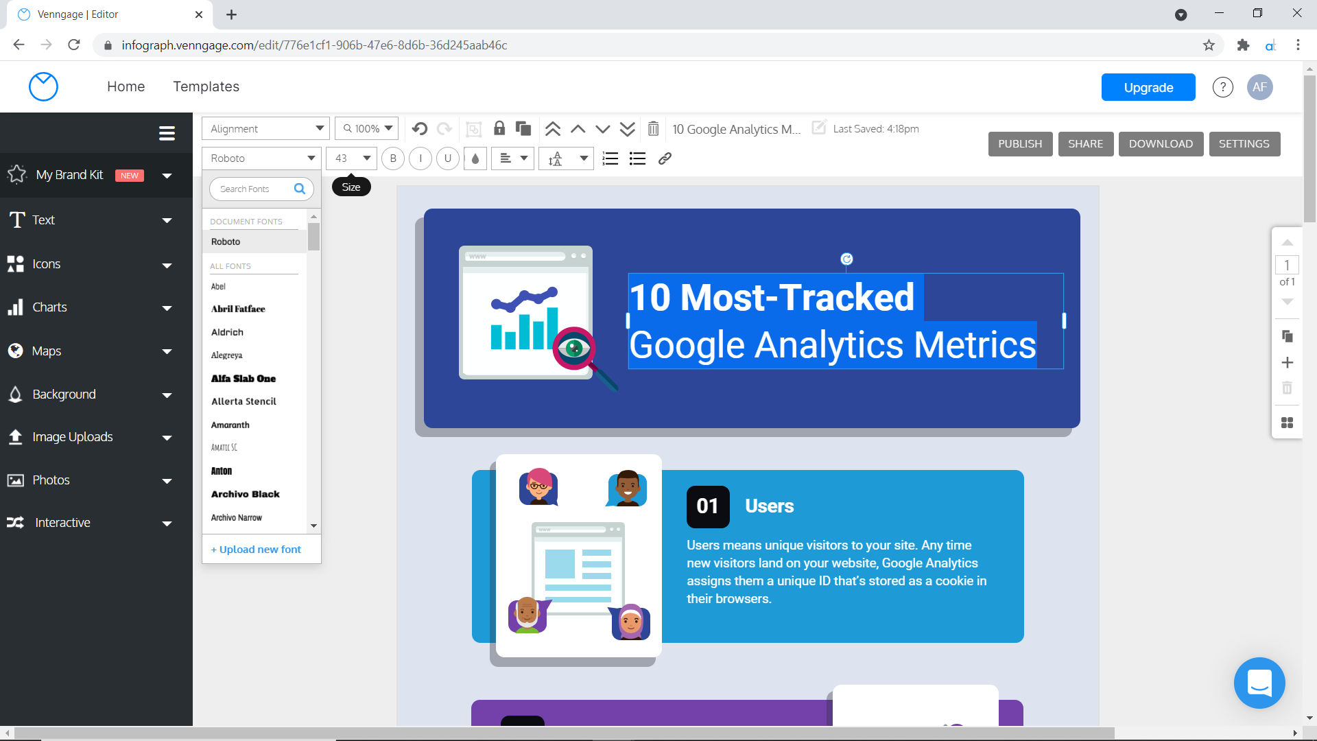
In my case, the template that I thought fitted my wireframe most closely was called '10 Most Tracked Google Analytics Metrics'. (If you search '10 Google Analytics' it should come up - unless Venngage have now removed it). It was a basic listicle template which was what I needed. I was going to add more charts, and some different icons, and I had 5 points to make - not 10 - but it was a decent enough starting point. Mouse over the chosen template and click Create.

3. Once the template was loaded up, I changed the title in the title box at the top.
The title box is on the right-hand side of the top nav. Type directly into it to overwrite the template title. I went for ‘The right baby name’.
Then I set up my colour swatches. I used Add Two brand colours which are these:
pink #ff0079
purple #a300b5
navy blue #0549aa
light blue #0092ff
yellow #ffcf03
green #43d3ae
grey #46515b
But if you are making this graphic for your own organisation, you will have brand colours that you are using. Setting them up as swatches makes them easy to access later. Click on an element (any shape or text box), then select the colour dropper icon in the top toolbar. Choose a colour - the quickest way is usually by pasting the hex value (e.g. #ff0079) in the hex box and hitting enter - and then click the plus button under Swatch colours (a tooltip will say 'Add color' when you roll over it). Add the main colours you'll be using in your graphic. If you run out of space on the swatches panel, just delete one of the default colours that are there.
Note: If you use a paid Venngage account, then this functionality (and more) is accessible via My Brand Kit in the left-hand nav.

4. Now I start with my title box. I clicked on the text that was there and the first thing I did was choose a nicer font. I went with Open Sans - an elegant sans-serif- but you might have a brand font you have to use. If your font is not on the list, you can usually find one that comes close. (What the font! from myfonts can help you narrow it down). You might also want to change the font-size, alignment, weight (bold, regular, italic) - the controls are similar to Word, Excel or other common software. You click dropdowns and choose the option you want from a long alphabetical list.
5. After that, I changed the size and colour of the title box. Now, in the template I chose, this was locked. Locking elements is a really good way of stopping things moving and allowing you to move and edit the things you are most likely to want to change (text, icons, charts etc). There's a little padlock icon in the top toolbar. In this instance, it was red - locked - so I had to click to unlock it. Then I could manipulate the title box freely.
Once I'd changed the size and colour of the title box, I locked it again. Whenever you make background elements, I'd always recommend locking them when you’ve got them how you want them. In my graphic, each box also had a grey drop shadow box, so when I unlocked and changed the size of each box, I had to unlock, change and re-lock the size of each drop shadow box too. It's reasonably painless once you know how. Once my box was the right-size, I shifted my title text up a bit so it sat in the middle. (Then I realised I didn’t like drop shadows so deleted the grey box and just kept my main blue one).
6. Next I wanted to change the strange title icon (the two charts and the eye of Sauron). I deleted them and then clicked Icons in the left-hand nav. I typed 'baby' into the icon search. I put some icons on either side of my title. Changed their colour to white, and made sure I chose icons that were all the same style (line rather than filled). A bit crude and simplistic, but I just wanted a quick and simple infographic that I could make in a couple of hours, so basic icons were fine.

If I'd preferred photos to icons, I could have done this: choose photos in the left-hand nav, and pick some pictures. Or I could have chosen image uploads, and uploaded my own icon or photo. The noun project is one excellent source for good icons - many of them free. Unsplash is great for royalty-free photos. You can also combine icons, overlaying them to make composite scenes and pictures.

7. I moved on to the first panel. I edited the background colour and the text in the same way as I had for the title. I moved the text across to the right because I wanted to create more space for my chart. I also made the box deeper because I had more content to fit inside it. (I also added a little question mark icon for my Did you know box). Then I locked this background box.

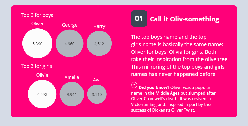
8. Next, my chart. I clicked on chart in my left-hand nav and went for a bubble chart - as per my wireframe. As soon as you insert the chart, the chart panel should open, exposing the data, which you can easily change by typing new names and numbers into the relevant cells. At this point, it's a good idea to make any colour changes too, by clicking on the dropper icon next to each row of your spreadsheet. I made all my bubbles grey, except Oliver and Olivia which I wanted to be white. I needed one bubble chart for each of the top 3s, one row of three for the boys, one for the girls. (I copied and pasted the first one, of course, and updated the values). I added chart titles manually afterwards as text boxes (‘Top 3 for boys’, ‘Top 3 for girls’) - then I grouped the chart (have a look at step 13 if you haven’t used group functionality before).

9. After you've got your basic chart, you can use the settings tab within the chart panel to make any other changes- turning labels on or off, or changing their position. I turned the value labels on, for example.
I ended up with my bubble chart more or less how I wanted it.
10. I worked through my other four panels in the same way. Re-sizing and positioning the box, then adding text, before inserting and reformatting an appropriate chart. Remember to update the fonts as well so they are consistent in all your labels and chart titles.
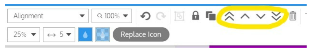
11. One quick note, as you change your mind, and decide you want to replace or update text and charts, you will often end up wanting to move things forwards and backwards. The default is that things sit on top of each other, in the order in which you created them. Use the forward/back tools in the top toolbar to move things up and down - if you've used design tools before (or even something like PowerPoint), you will be familiar with these as the 'layers' of your design. You can either move things up and down a layer, or send to the back/front if you want to move things all the way to the front or back of your graphic. Practice it now, by sending something to the back, and you’ll see it vanish behind the background. Click Control Z or the Undo icon in the top toolbar to Undo.
Try sending things forward and back
12. I'd also like to point out the icon chart I made for chart 3. The default icons are rows of men, but you can change these. So I changed them to babies (of course). If you double click on the chart, you should see the icon options appearing. I searched for ‘baby’ but you can type in cake, monkey, aeroplane or whatever works for your data. There's also a Replace icon button in the top toolbar. In addition, you update an icon chart slightly differently to other charts. There are drop-downs in the top nav bar, where you choose the number of rows and columns you want for your data (rather than a separate chart panel). You can also choose how much of your icon bar you want filled and with which colour. (I went for 100% white because it wasn’t a filled bar, just a literal count of numbers of babies).

13. One other useful thing to point out if you’re new to graphic design tools is the Group button (again, you can find this in Powerpoint too - as well as tools like Illustrator). When you’ve made a chart, it may well be a mixture of a chart, manual text labels and other elements. If you click and hold the left mouse button to draw a square around all these elements, you can group them. This makes it easier to move the whole integrated chart around. The group button is in the top toolbar (it’s the frame with a square and circle inside it - hover over it and it will say ‘Group’). Note though - it only becomes active if you select multiple objects - it’s greyed out otherwise. If you want to ungroup your chart, just select the grouped chart by clicking it, and click the Group button again.
14. You’ll notice I created multiple slopecharts for panel 4. I did this by hacking away at a line chart, essentially using negative values to show rank change, then labelling it by hand. So e.g. Natalie’s drop 3 to 843 is in the chart as -3 to -843. I then went into the axis settings to make sure the axis range could cope with these values. There may well be a more sensible way of doing this. But often, if you want to make a chart do non-conventional things, you have to play with the axis settings (or manipulate your data) until it behaves.
15. The other charts in the graphic - line charts, bar charts and an icon grid - should be easier to make. The bar chart and line chart behave exactly as you would expect. The icon grid has similar functionality to the icon row I outlined in step 12.
15. You’ll find my finished graphic here: https://venngage.net/ps/CkkZUlgXmMY/the-right-baby-name.
As I mentioned at the start, it’s pretty basic, and the colours are far from perfect. But it was very quick to make - I wanted to show you that it was possible to make a perfectly OK graphic in less than an hour. Plus it was completely free to create and publish. So Venngage is a useful tool to know about. You can hopefully see too that the longer you spend with Venngage, the more you can produce something that looks professional. It’s worth comparing Venngage with other infographic templating tools too (Canva and Infogram particularly) to see which one suits your needs best.