
Learning Materials - Chapter 5
Some examples to accompany the exercises at the end of the ‘Make’ chapter.
Visualising data
Exercise 1: Visualising data
In order to present data in ways that can be instinctively understood by a reader, circumventing the need for painstaking analysis, we use fundamental ‘pre-processed’ visual attributes. Attributes that we recognise instinctively: position, angle, size, shape, density, hue and texture.

Examples of data made visual using fundamental visual attributes: position, orientation, size, shape, hue, density & texture
Notice how some attributes are better suited to showing quantitative data than others. The easier it is to quantify the attribute (how far up the page? what angle of tilt? what circumference of circle), the easier it is to read quantity in that attribute.
We tend to use position, orientation and size to show quantitative data and shape, hue, density and texture to add categorical or qualitative meanings to those visualisations.
But also notice how the attribute chosen changes the way we interpret the data. Position becomes a race to the top, angle is all about climbing, size about imposition. All visuals frame, because these attributes are not the numbers, they are visual metaphors for the numbers, and metaphors frame meaning.
We need to make sure we are choosing the right metaphor for our data.
Exercise 2: Visual metaphor
We might approach this from the other direction: think of a visual metaphor and see if we can use it to visualise:

Various visual metaphors for babies turned into charts: literal depictions of babies, the symbolism of a stork, images of objects related to babies: feeding bottles, a mobile, balloons.
Obviously the illustration of babies is the most easily ‘recognisable’ - we know the subject matter immediately. But compared even to the circles above, it’s a lot harder to read as data visualisation. Simple, regular shapes (squares, circles, etc) are a lot easier to read in terms of quantifiable values.
Moreover their abstract nature helps disassociate them from a literal meaning. This just looks like we’re visualising the size of babies. And the complexity of visual distracts from the representation. The storks are carrying bundles of different sizes, but you’d be hard pressed to see that the way the illustration of the birds clutters up the visual field.
The bottles and balloons are probably the most successful visualisations. The bottles are basically a column chart, the balloons are bubbles. The balloons have less visual distraction but are a slightly more obscure visual metaphor than feeding bottles.
In telling our story we need to think about both the legibility (and accuracy) of our data and the legibility of its meaning and import.
Visualising structure
Our storytelling is also a matter of structure: the selection and emphasis of our material into an oder of reading and information hierarchy.
Exercise 3: Type emphasis
We can use the same visual attributes: size, position, orientation, density, hue and texture to make structure visible.

Creating structure using typeface: varying position, size and weight of fonts to create information hierarchies and read order
Obviously we’re already using some differentiation in just writing the text out: left to right, top to bottom, paragraph breaks and table alignments, all of these signalling a structure. But notice how we can subvert that with emphasis, how the the footer in the bottom right version leaps out, usurping the natural read order.
A mixture of size and density is probably the most immediately effective, but it terribly easy to over-do - the version with lots of different sizes and styles ends up with about as much structure as the original version with no differentiation in it.
Exercise 4: Gestalt groupings
Of course, we can also use other visual elements to create structure:

All of these techniques rely on the human tendency to simplify in interpreting visuals, to see a general overview first before looking in detail. This means our audience is going to be looking for grouping, ways to parse the content in first broad, then increasing finer strokes. They will for visual clues to establish these groupings - looking for similarities of positioning, shape, colour, or enclosure and separation by boxes and lines - all the visual signals defined in the Gestalt laws of grouping.
Notice how using multiple signals in conjunction can build quite a subtle structure. In the final example bottom right, the zebra striping and vertical positioning on the tables preserve the unity of the data, even as the tables are broken up by the enclosure of the box around the bottom context. Meanwhile, while in the example bottom left the box stands out, once we add type emphasis to the top half in the bottom right, it takes precedence again, and the emphasis on the rising names makes them stand out within the structure of the table.

Here are those hierarchies with visualisations added in
Adding in visualisations also, of course, adds in visuals. They also play a part in declaring visual structure and hierarchy. The inset bubbles and area charts dominate the structure, self-evidently the most important elements. Meanwhile the flip about the y-axis of the positive and negative bar charts mean it is the data itself that is making a clear distinction between different parts of the structure.
Visual language
Before we put these lessons into practice, we need to establish the visual elements we’re going to use to express them: colour, font, illustration style, etc.
For each of the example infographics for the book, I gave Sergio a set of simplified brand guidelines.
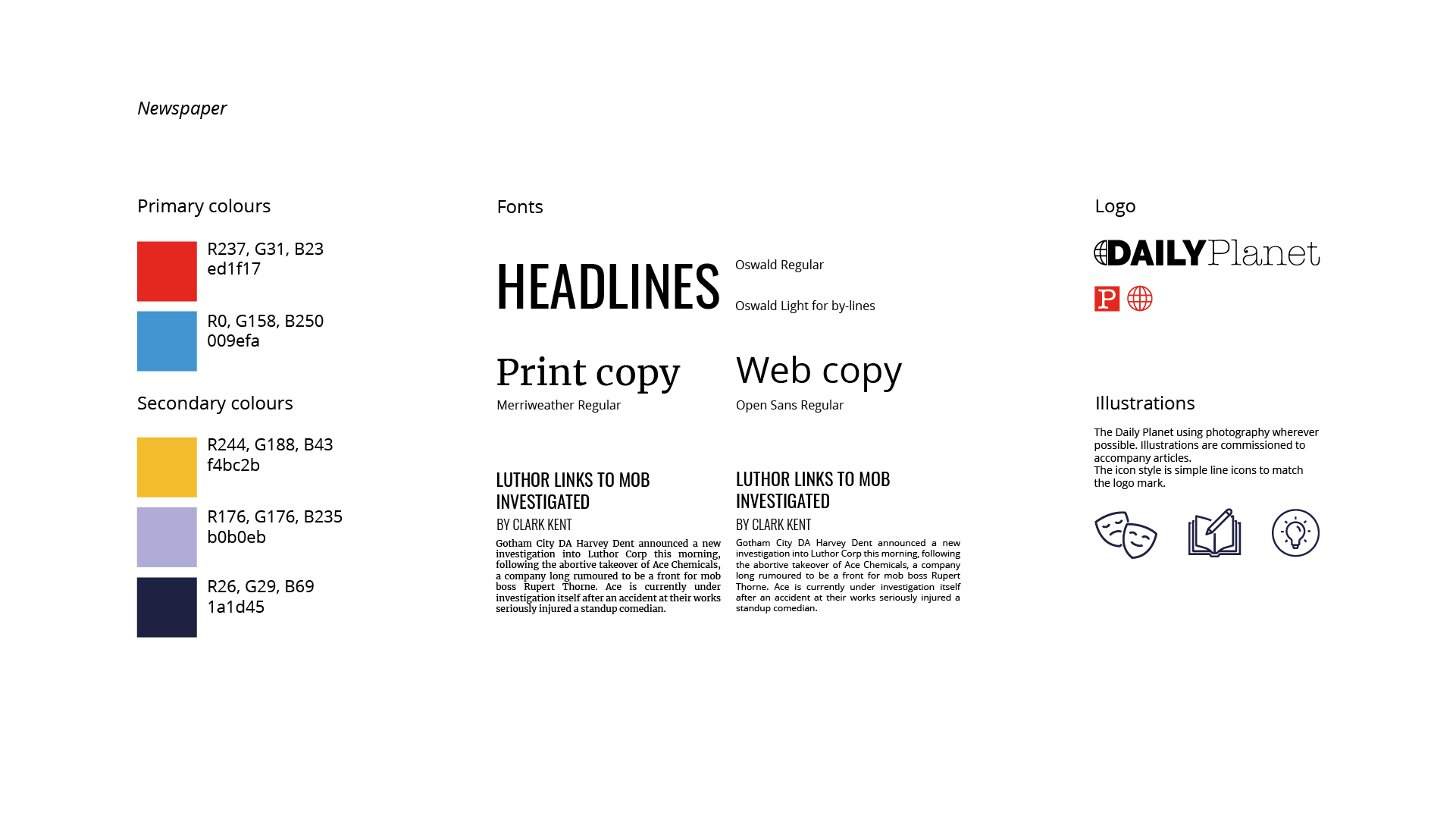

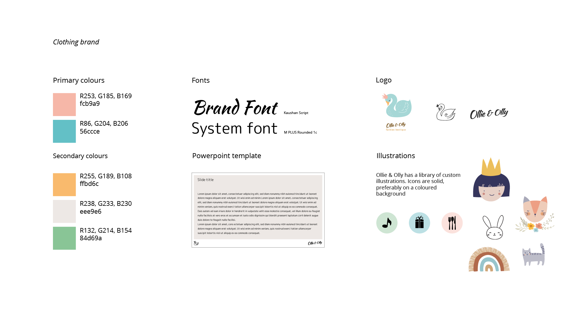
There are obviously nowhere like complete design guidelines, but even brief suggestions like these are really useful - even if you’re just making something for yourself.
Making fundamental decisions about colour, font and visual style means that you can then think more coherently about how to use those elements to create your visual structure and communication rather than having to invent everything afresh at every decision.
They also give you something to kick against, of course. If you have a look at the finished designs in the book you’ll notice how often Sergio has bent or extended these guidelines. Look how, for instance, he’s carefully dodged the colour trap I laid for him in the newspaper guidelines, eschewing the brand red and blue to pick varied colours for boys and girls instead, avoiding the colour gender stereotypes.
Speaking of colour - here’s the palette featured in the book - I’ve recreated it in Figma, so if you visit that page, you should be able to download it for yourself, if you’d like it.
Here are some tools to help you generate your own guidelines and then work with them:
Guidelines
Viz Palette
https://projects.susielu.com/viz-palette
A really useful resource for testing colour in data visualisation. Also has links to tools like Color Brewer for data viz palettes and the Chroma Palette Helper for extending your existing palette.
Coolors
A neat web app for generating palettes. You can just hit the space bar to generate random palettes or feed it a starting colour and then start generating colours around that.
Google Fonts
An amazing resource of free to use fonts. It will also suggest font pairings if you want separate headline and body fonts, or body & labelling. It also has icons.
Tools
Figma
A free to start vector editing tool that works in the browser and on desktop. Can do a lot that Adobe Illustrator does and a some things it can’t.
Raw Graphs
A free chart making tool that can do standard charts as well as more unlikely things. You can download an SVG file and then open it in a vector editing tool like Figma to tidy up.
Grid Calculator
Calculates grids. Most design tools will do this for you, but invaluable if you’re stuck using something like PowerPoint. Remember our watchword: align & distribute!
Assets
The Noun Project
Speaking of icons, the Noun Project is a site for designers to share icons. Most are free to download under Creative Commons licenses. Credit the designers.
Unsplash
Likewise, Unsplash is a site for photographers to share stock photography. Again free to download, but credit the photographers.
DrawKit
Free to download illustrations in a variety of formats (they will suggest a (low) price but you can download for free if you need to)
There: you know three chords. Now go and start a band.