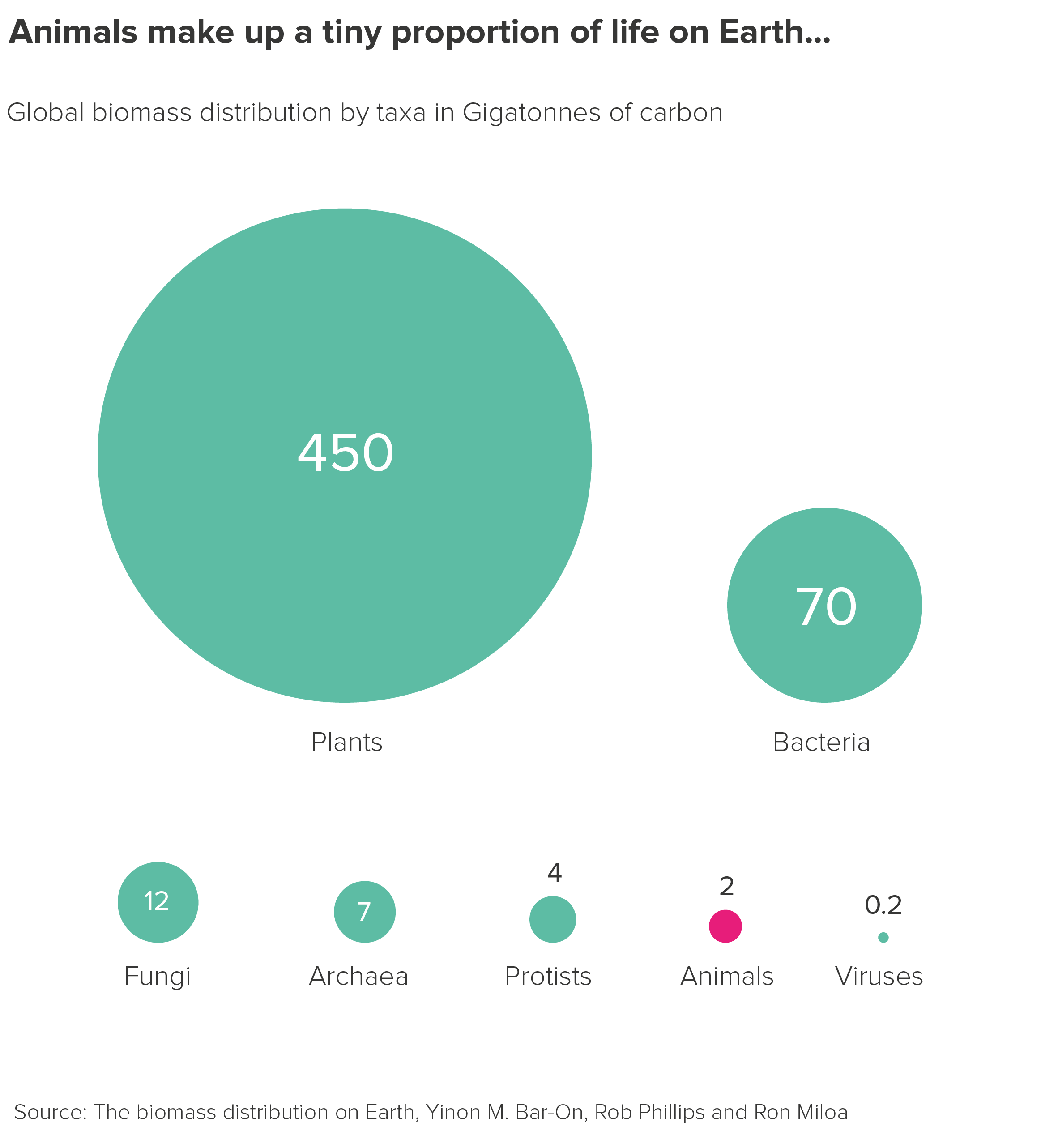
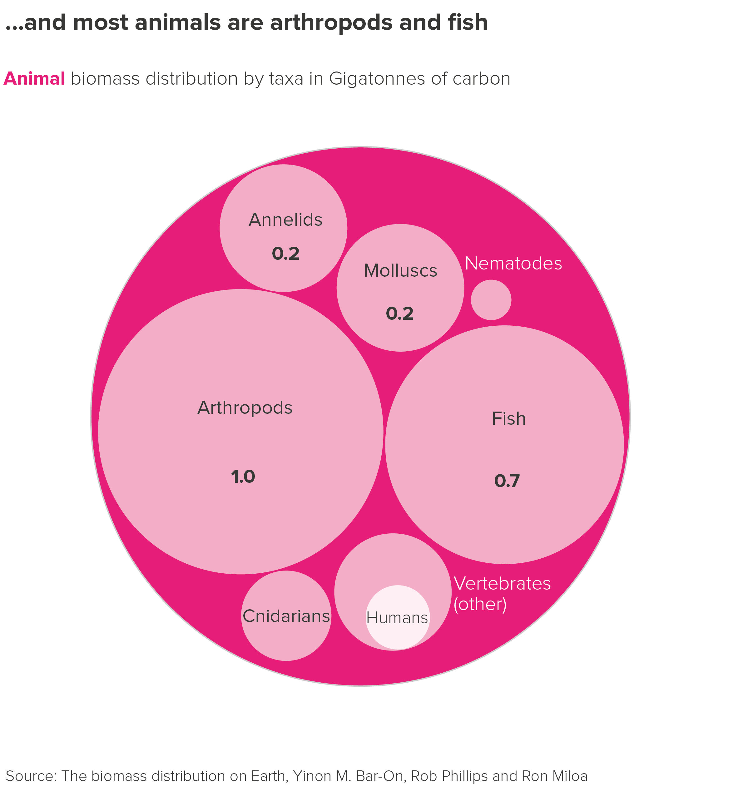
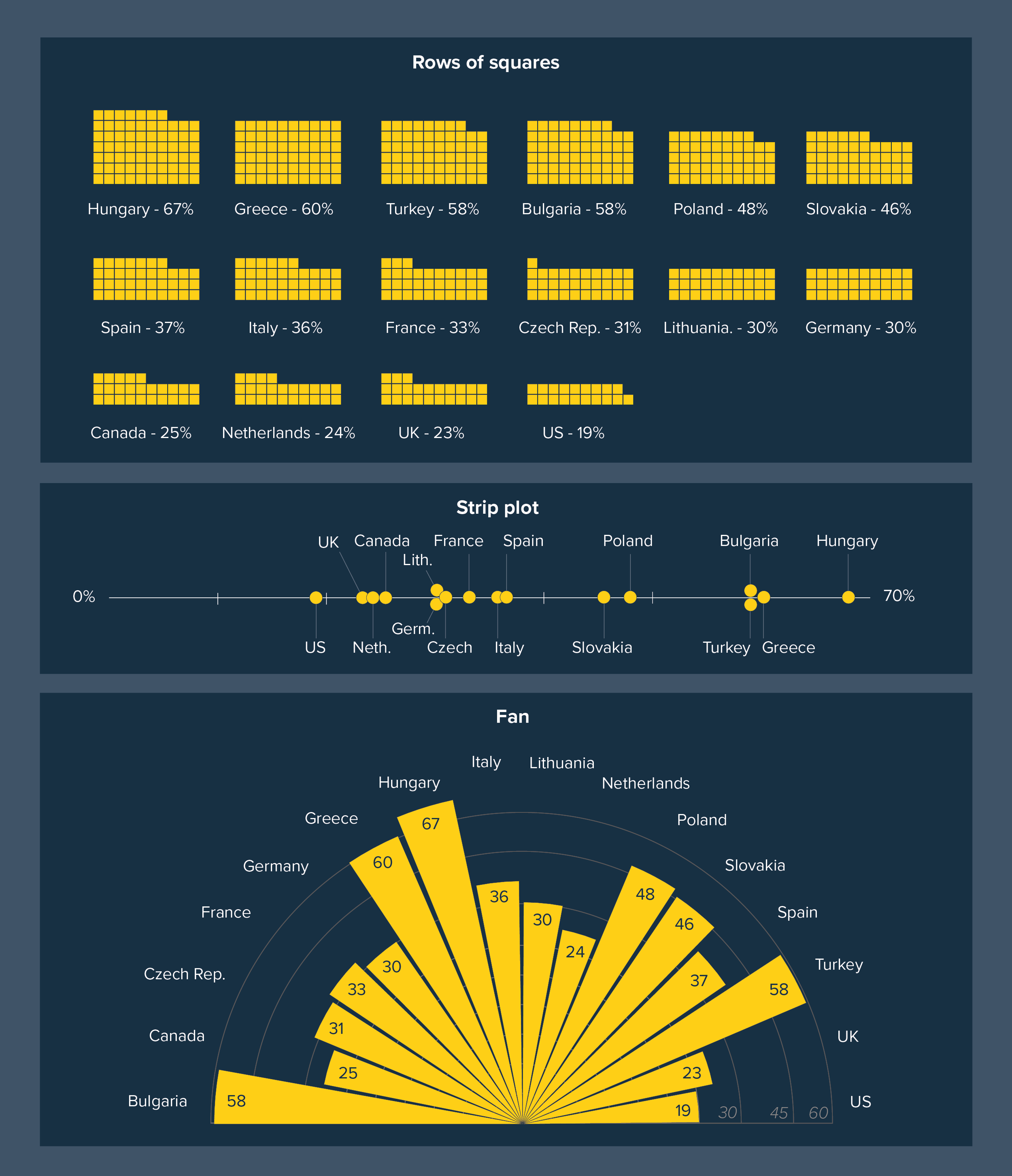
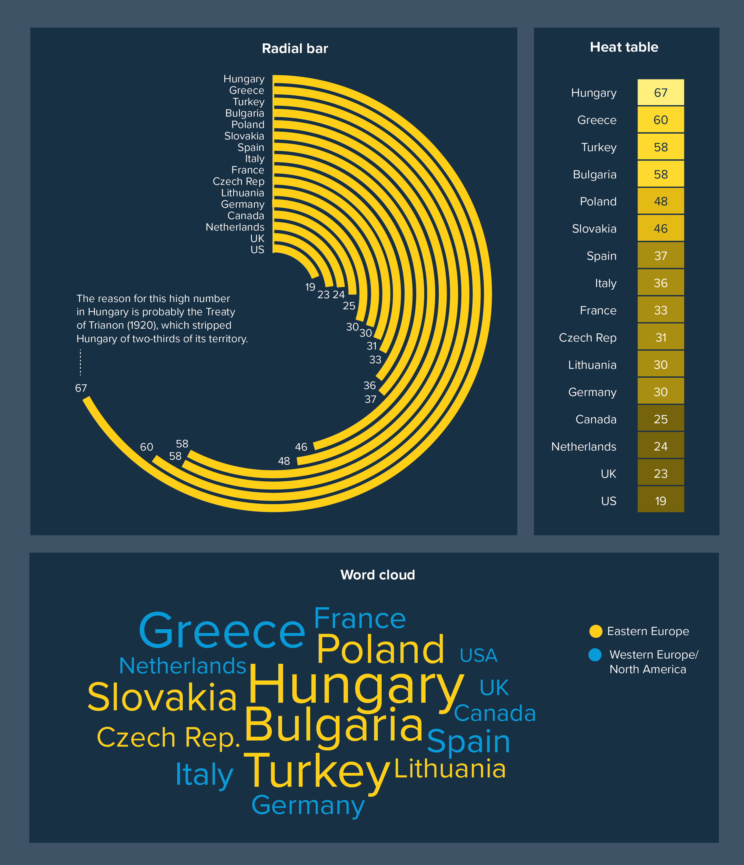
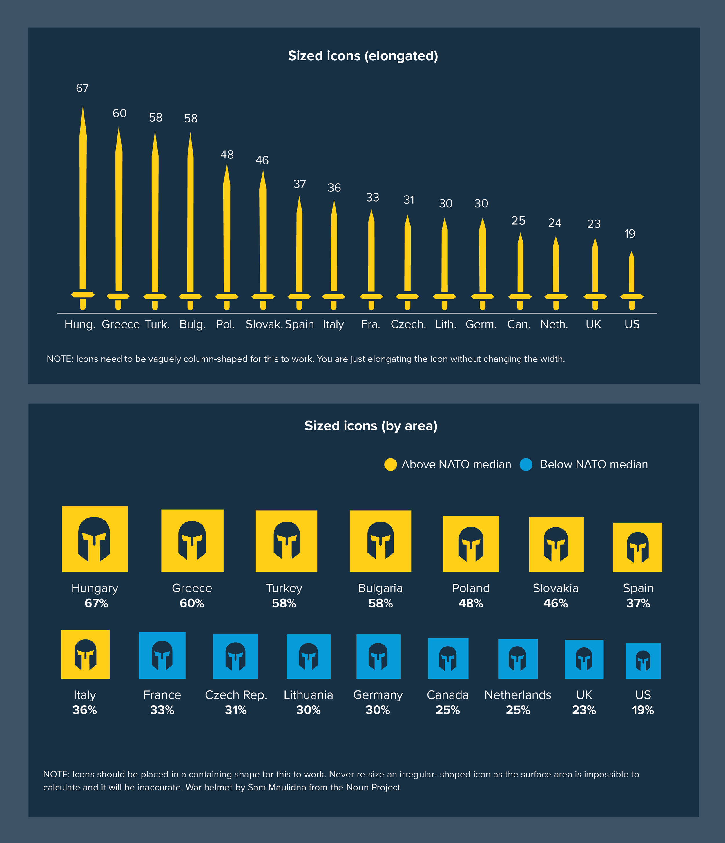
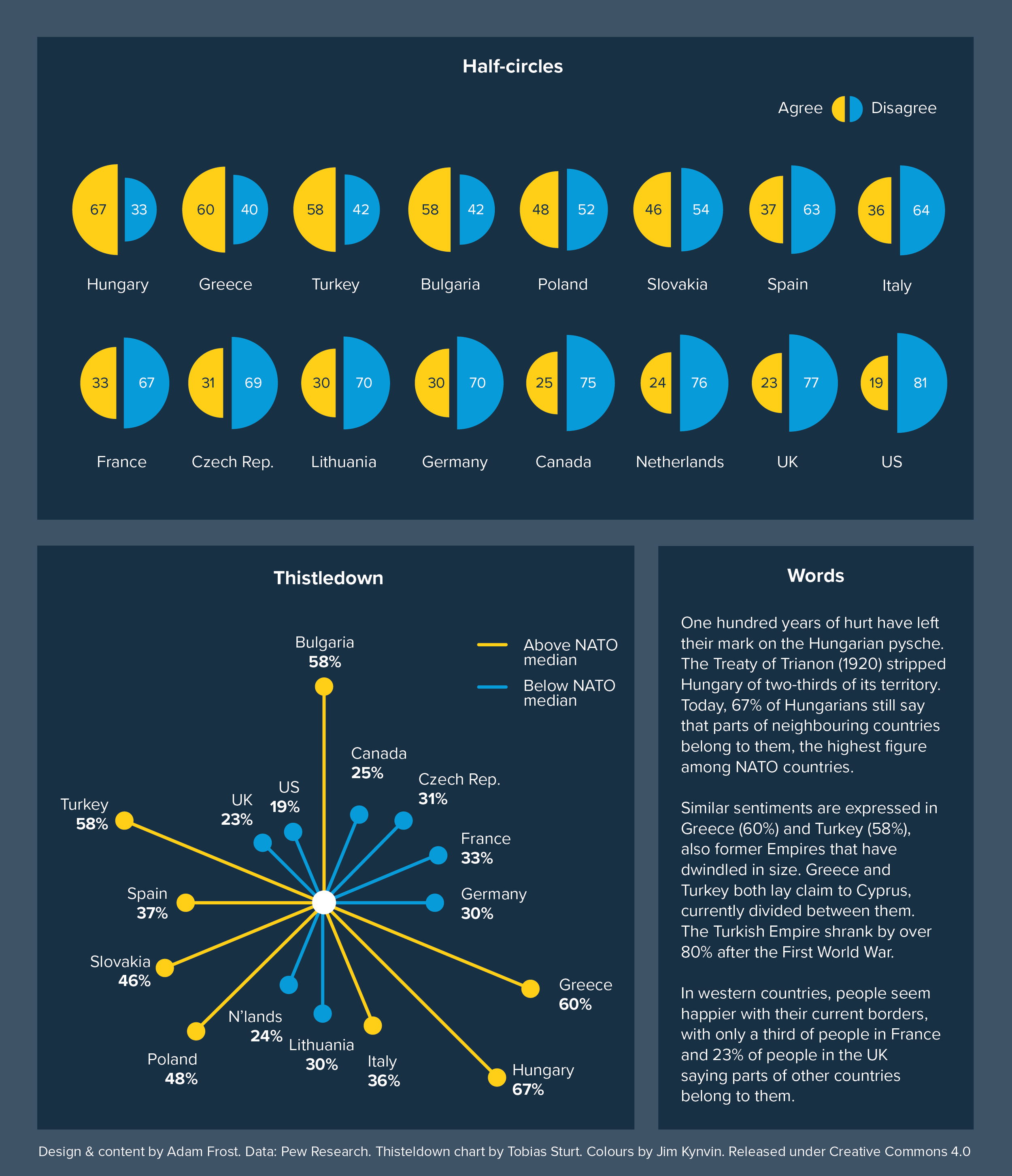
Four pie charts showing the percentage of old people in CAR (9%), India (19%), Brazil (26%) and Japan (47%).
Four doughnut charts showing the difference between female representation in Parliament - Iran (6%), USA (24%), Argentina (39%), Rwanda (61%)
Two side-by-side pie charts, showing the breakdown of the human body. The second pie chart is a breakdown of the first pie chart's 'other' wedge.
A pie chart showing the composition of the human body (mostly oxygen - 61%). A bar chart breaks down the 'Other' wedge, showing the amount of Phosphorous, Sulphur and so on.
Bubble chart showing that animals make up a tiny proportion of life on Earth, only 2 Gigatonnes of carbon compared to 450 for plants.
Circle packing chart showing that within the 'animals' bubble (2 Gigatonnes), humans are a tiny proportion. It is mostly arthropods (1 Gigatonne) and fish (0.7 Gigatonnes).
A series of charts showing how you can move a data story from bubbles to a pie chart, or from bubbles to a polar area. The circular shape persists.
A series of charts showing how you can move from squares to a treemap or squares to a voronoi. The square shape persists.
The population of Qatar by nationality in a sunburst chart. India is the largest wedge.
A sunburst chart showing the most performed Shakespeare plays. Midsummer Night's Dream, Twelfth Night and Romeo and Juliet are the most performed.
Sunburst chart where only the India wedge is highlighted (22% of Qatar's population).
Sunburst chart showing percentage of Qatar's population that is Qatari (10.5%)
Spider diagram showing population of Qatar. The South Asia bubble (1.73 million) is the largest.
Spider diagram showing total number of global air passengers and how the vast majority are from the US or China.
Treemap showing population of Qatar. South-East Asia is the largest grouping.
Treemap showing the range of foreign languages spoken in England and Wales, with Polish the most commonly spoken, followed by Panjabi.
Stacked bar showing how land area on Earth is divided up. It is hard to process.
Starburst chart showing how land is used on Earth (over a third is farming, less than 1% is built-up areas). This is a better metaphor.
A 2D bar and a hard-to-read 3D bar
A 2D pie chart and a hard-to-read 3D pie chart
A 2D line chart and a hard-to-read 3D line chart
A 2D clustered column and a hard-to-read 3D version
A sentence written in an unreadable 3D font.
Showing the optical illusion caused by tilting circles.
A photo of design guru Steve Jobs in front of a deceptive 3D pie chart with horrible colours
A 2D pie chart showing the most popular cheeses in the US. Mozzarella is top.
3D pie chart showing the most popular cheeses in the US. Mozarella (27% of all cheese consumed) then Cheddar (24%).
3D pie chart showing the most consumed cheeses in America. Mozzarella is top (27% of all cheese consumed).
3D pie chart with an exploded wedge, not starting at 12o'clock, not starting with the smallest wedge. Covered in icons. A disaster.
A 3D pie chart showing deaths in World War 2 for a small selection of countries, decorated with flags
World War 2 deaths, 3D pie chart with the flag decorations removed.
A pie chart that actually shows all estimated deaths from all countries in World War Two
Pie chart covered in icons in a confusing variety of styles
Pie chart covered in icons - all in a similar style. An improvement on the first chart.
A bubble chart with an icon on each bubble. The bubbles are a better frame for the numbers.
A treemap with an icon on each box. The rectangles are a better frame for the icons.
A pie chart with a pattern fill. The patterns all fight with each other.
A pie chart with an optical illusion pattern in each wedge
A pie chart showing London's most common trees (Cherry is top with 15%). It has a photo background.
A pie chart showing that 45% of the world's chillies are grown in China. It has a photo background.
Isotype chart showing the number of deaths in World War One. Each icon represents 1 million soldiers.
Chart showing the number of deaths in warfare over the past century. The number of deaths is represented by the size of each poppy's flower. The stalk length represents the length of the conflict.
Three proportionately-sized pie charts showing the change in India's population structure - the proportion of older people has increased
A proportionally-sized pie, based on Nate Silver's work, showing the proportion of individual investors has dropped from two-thirds to a third between 1980 and 2007.
Nate Silver's proportional pies, redrawn as a hard-to-understand stacked bar
Proportional pies overlaid on a map - with disastrous consequences
The amount of electricity generated in each state - a bubble map. Texas generates the most electricity.
Proportional pies on a map, showing that coal is still used in the midwest and in the prairie states
Proportional pies showing that natural gas is now the US's main energy source, and is used by the biggest electricity-generating states (e.g. Texas, Florida, California)
Proportional pies showing the rise of renewable energy - HEP in the north, wind power in the midwest and solar power in the southwest
Proportional pie charts - showing India's population increasing, and the proportion of old people increasing
The same data (Indian population) as a doughnut chart - impossible to compare the areas
A doughnut chart where the arcs are all a similar size and hard to compare
A bar chart where it is easy to compare the differing sizes of the bars
Pie chart showing that 34% of UK people believe in ghosts and 4% believe that vampires are real
Doughnut chart showing the same data. This time there is an icon in the centre of the doughnut to make the chart more engaging.
Illustration showing that one-third of the world is anaemic
Doughnut with illustration showing that 42% of US adults believe that spiritual energy can be located in a crystal
Stacked bar showing that dragonflies are the most successful predator, catching 95% of their prey
Doughnut charts showing that dragonflies are more successful hunters than tigers, sharks or cheetahs. An icon is used for each animal.
Doughnuts on a white background. When the arc is too thin, it's hard to read.
Doughnuts on a dark background. The thinner arc is slightly easier to read than when it is on a white background.
Overlabelled doughnut chart about changing attitudes to homosexuality. Hard to read.
Doughnut which is clearly labelled. Showing that 11% of Brits rejected homosexual relationships in 1987. By 2018, 66% accepted them.
Dougnuts showing the water content of key objects - a jellyfish is 99% water, bread is 36%
Doughnuts showing the water content of key objects, but now the icons are consistent.
Doughnut charts where the arc colour, icon colour and text colour are all different.
Doughnut charts in which the arc, icon and text colour all match
Doughnut charts showing that George Harrison was voted the best Beatle, but with unhelpful text in the centre of the doughnut
Doughnut charts showing that George Harrison was voted the best Beatle, but better use of the 'hole', showing for example an icon of George, or the 47% of the vote he won.
Doughnuts with a 40% and 55% hole. The 40% hole makes the icon look cramped.
Doughnuts with a 65% and 85% hole. The 85% hole turns the arc into a sliver.
Bar chart showing the Top 50 girls' names - Olivia and Amelia called out as the first two bars.
A bar chart showing Isla and Ava called out in 3rd and 4th place, using a highlight colour
A bar chart showing 6 names with a similar level of popularity - all called out with a highlight colour.
A bar chart showing that almost half of the girls' names in the Top 50 end with the letter A, including 7 of the top 10: Olivia, Amelia, Isla, Ava and others.
Graphic showing 6 of the stories that bar charts can be used to tell: Comparison, change over time, composition, cumulative change, distribution and targets.
Graphic showing 6 further stories that bar charts can tell: Ranking, Correlation, Funnels, Pyramids, Deviation and Scheduling
Graphic showing bars and tables combined. South Korea has the lowest fertility rate in the world and has dropped by around 80% since the 1950s.
Table that combines bars and numbers. Congo has had the highest increase in smoking rates since 2000, up 372%.
Bar chart showing that text ends up being squashed and rotated.
Bad pie chart - 3D, horrible colours, adds up to 89% instead of 100%, doesn't start at 12 o'clock, too many slices
A better pie chart - starts at 12 o'clock, only 7 wedges, colour used more sparingly
Some alternatives to bar charts: polar area, bubble map, dot chart
Some alternatives to bar charts: heatmap, illustration and big number, isotype chart, lollipop chart
Some alternatives to bar charts: pies, bubbles, doughnuts, triangles
Some alternatives to bar charts: proportionally-filled squares, waffles
Some alternatives to bar charts: rows of squares, fan chart, strip plot
Some alternatives to bar charts: radial bar, heat table, word cloud
Some alternatives to bars: sized icons (elongated), sized icons (by surface area of containing shape)
Some alternatives to bar charts: half circles, thistledown chart, words/description
Bars becoming more blurry, the more you add.
Once you get over 100 bars, it's basically an area chart
Chart showing the limited number of regions in the UK. Data represents how hard it is for Londoners to buy property compared to the rest of the country.
Chart showing a Top 10. Emma is the most popular French name.
Chart showing quality of life in various cities. Too many bars, labels rotated.
Chart showing quality of life in just 13 cities. Easier to see London's place in the middle and Edinburgh in 2nd place behind Copenhagen
Experts expect to see as much of the data as possible - usually the full dataset if visually possible
Too few bars can look suspicious to an expert audience.
Use a different colour for the average or benchmark bar
Use colour to illuminate the most important bars
When you have hundreds of bars, don't try to label all of them. Just call out the relevant ones.
Use tables and bars in combination when you have a lot of datapoints
Horizontal bars look odd when they are half-labelled
Don't wrap a vertical bar
Horizontal bars can be put in columns
More columns make for a harder-to-read chart
Not even a chart anymore
Dot charts can work better than bars
A vertical bar with lots of bars can be hard to read
A polar area can be a good alternative to a bar
A proportionally filled shape can be a good alternative to a bar
A bubble map can be more engaging than a bar chart
Bar charts showing change over time can look crowded
A line or area chart is usually better for change over time
Ed Hawkins's climate stripes can be used for other change over time data
Distribution charts can look complex for non-statisticians, obscuring the story
A clearer visual can make the story more obvious
Bar chart on plastic pollution (Coke is top). All one colour to emphasise the fact that it is one dataset.
Chart showing plastic pollution, but all the bars are multicoloured. This is distracting.
When you are trying to be neutral and unbiased, one colour is sensible as in this chart showing tourist revenue in the EU
If it is a corporate change over time bar chart, then one colour is often a sensible choice
A neutral colour can make the story harder to tease out
Using a highlight colour can make it easier for an audience to follow your story
A flat colour can suggest 'nothing to see here'
A strong highlight colour can guide the reader through a story
Use colour to distinguish between above and below average
Use colour to distinguish an average and the other datapoints
A RAG scale is not going to be visible to at least 7% of your male readers
This is how red-green colour blind viewers will see the last RAG scale chart. No difference between red and green.
A less jarring RAG scale looks more aesthetically pleasing and is more likely to be understandable for the colour blind
This is how the red-green colour blind will see the last chart - the red and green can be distinguished
Mixing up groupings can drown out the story. Here the ranking story (of smoking rates in the EU) drowns out the regional story.
Separate out the different groupings - using layout and white space - makes the chart more intuitive
Giving a bar a lighter tint can suggest an issue with data quality (e.g. low base size)
Cross-hatching can help to suggest a data quality issue e.g. a low base size
Highlighting a small but important bar is kind of pointless
rule_18_covid_shading-02.png
Jumbling up RAG colours can confuse
Separate our RAG coloured bars for a clearer picture
Sometimes you CAN use multi-coloured bars
Note that Kantar used their brand colours, not the supermarket's
In charts about political parties, you sometimes go technicolour too
Note that we used Add Two colours here, not the official party colours
It's fine to use a gradient when the colours mean something
Here the gradient means nothing.
Pattern fills are rarely a good idea
If you're limited to black and white, use shades of grey and/or move the datapoints into clear groups
A gradient fill can help to suggest speed or rapid change
Stumpy bars don't work with gradients
A ranked bar chart showing that some countries (e.g. the US, Germany) have completed death certificates. Others (e.g. India, Zimbabwe) do not. Cause of death is often omitted.
An unranked bar chart of the same data, it is hard to see the story as clearly
A chart showing how hard it is to compare similarly-sized bars when they are spread across the chart
Putting bars in rank order makes it easier to see small differences
Putting the Other bar half way across the chart is confusing.
Leaving the Other bar till last is clearer.
Putting the days of the week in rank order is a cognitive challenge
Keeping the bars in 'days of the week' order makes it easier to scan
Putting a spectrum of emotions in the wrong order reads strangely
Keep any spectrum of emotion in its original positive-to-negative order
Lots of ranked bars can be confusing
Keeping each category/country in a fixed place is easier to scan
Ranking gives a false sense of better/worse here
Unranked suggests neutrality, which is often better for official data
If the bars are similar lengths, comparing them can be hard, and ranking doesn't help
Alphabetical order is easier to read, and more visually pleasing
Distribution stories must never be ranked
Ranking a distribution story stops it being about the data's spread
Different tools have different default bar chart widths
Mixing 'Other' with the rest of the bars looks a bit confusing
Separating the 'other' bar from the rest looks clearer
Without breaks between categories, bars can get a bit suffocating
Adding breaks between bars makes the different categories easier to separate out
The bars in distribution stories should be much closer together to suggest a close relationship between them
In population pyramids, the bars are usually very close together
Charts where the bars all have different widths suggests a disconnect in the story
Keep the gap between the bars the same width throughout a graphic or presentation
prev / next