

making interactive data visualisations
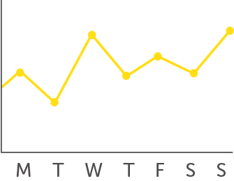
We visualise data because its complex. Human beings very quickly get overwhelmed by complexity. By charting numbers, we can make them more comprehensible...
...well, that went well.
The reason we stress storytelling so much is that to make data comprehensible we often have to edit it to control the amount of data we're throwing at our audience.
But interactivity allows us to show more complexity and allows our audience to get more out of it.
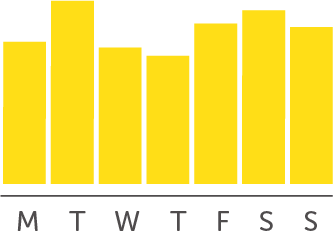
This is the same data set as the line chart above, but animation (in the growing, swapping bars) and interactivity (allowing us to change what data we're viewing) make it all so much more digestible.
And interesting. Animation catches our attention, bringing the data to life. Interactivity engages us, allowing us to control what we're looking at.
But because animation makes us look, it can quickly get too much, especially with complex data sets.
Every little moving thing is another claim on our attention and there's only so much we can deal with before we give up

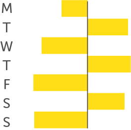
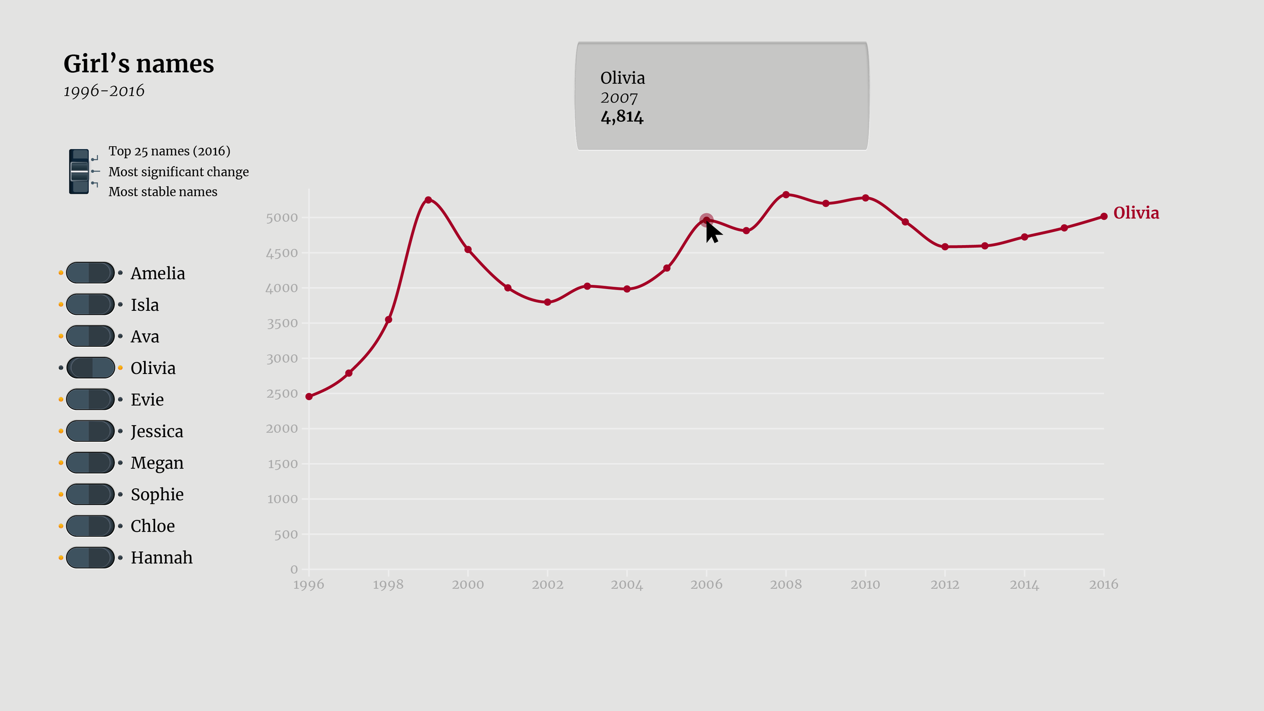
In fact - this chart was so complex it was slowing the whole page down - I’ve had to embed an image of it instead.
...and even with interactivity.
Just because the audience can now find their own stories in the data doesn't mean they're suddenly immune to information overload.
And that confusion makes it less likely that they're ever going to engage with the data and find those stories: where are supposed to start? What are they supposed to be looking for?
Too much information is still too much information.
...and too little is too little.
It can be tempting to assume that because we're inviting the audience to find their own stories, they don't need our help. But what kind of invitation is this? It tells them nothing about the data, nothing about what they might find in it, it offers no inducement, no encouragement, no welcome.
It is hard to see why anyone would want to interact with this.
Of course, interactivity allows us to use more complex charting languages.
Charts that we might use only sparingly in static visualisations - like scatter plots or treemaps - become more practical. We have a greater range to think about when it comes to picking a chart. But we still have to consider the framing effect of the visuals and how they might influence how our audience is going to understand our data. How that initial Overview is going to frame how they explore.
Change
Composition


Comparison


Correlation


And we have to think about that Overview all the more carefully. Because those more complex charts will need more work to make them show a clear Overview of the data.
A scatter plot might show a lot more data without overloading us visually in the way a line chart might, but do we get that immediate sense of change over time that a trend line gives us.
We still need that pre-conscious Overview that will help us explore the data. Fortunately, of course, interactivity can help us with that.
Because that journey from Overview to Detail can become an actual journey. By interacting, the audience can start from the Overview, zoom in on the data they're interested in, filtering out the rest, discovering the Detail they want.
We can control the amount of information in the Overview without worrying about losing Detail - it's all still there to be discovered.


This means we can look at our story and think about how we might represent the individual steps.
We can break our story up into its parts and then find the best visual Overview for each part. Rather than trying to find a visual that can show both the Overview and Detail in one image, we can instead concentrate on how best to represent each part.
We can see this movement most commonly in corporate dashboards, where the different states are explicitly different screens, different stages on the journey as the user drills down from a high-level Overview into the very specific Detail.


The role of an Overview in interactive visualisation is not just to give us that instinctive sense of the patterns and shape of the dataset.
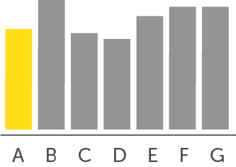
It is also there to frame the kind of data we're looking at - to let us know, for instance, that this data is all about change over time.
And it is going to frame our exploration. By giving us multiple names with different kinds of change, we are being explicitly told to think about how we might compare how different names have changed in popularity over time.
By limiting the detail in the Overview, we are not limiting the amount of detail the audience sees. Quite the opposite.
Not only do they at least gain a high-level sense of the data, that they would not have gotten from a more complex visual like the scatter plot above, but they are also now more likely to engage with the data because they can understand what they're looking at.
That means they can now drill down to find the data they're interested in and interrogate it.

But allowing our audience to navigate means we need...
interface

The world is full of interfaces - switches, handles, dials - things that allow us to interact with the object around us: turn on lights, open doors, turn up the radio.
The crucial thing to notice about these objects is how unconscious our interactions are. If we go to a new place, we don't have to learn a whole new way of opening doors.
This crucially important for interactive data visualisation. We want our audience to be concentrating on the data, not on the interface. It needs to be entirely instinctive.
Fortunately there are digital interface elements that we also understand unconsciously - things like scrollbars and tick boxes. They are different to physical interfaces, of course, better suited to their medium, but we understand them just as quickly.
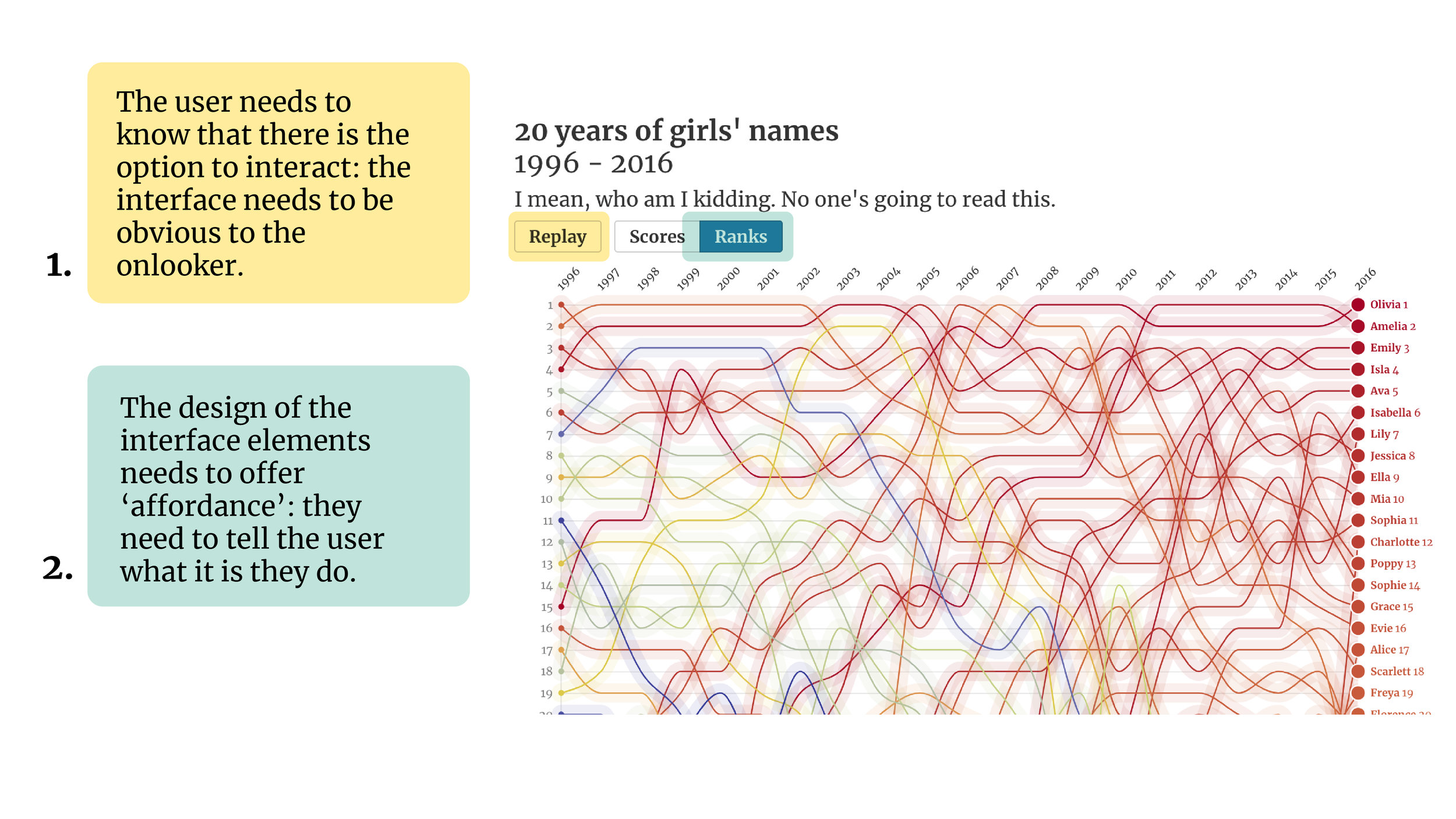
This instinctive relationship with interface gets called 'affordance'. By using elements where the audience understands its 'affordances', we show the audience that there is something to interact and help them have a good idea what's going to happen when they do.
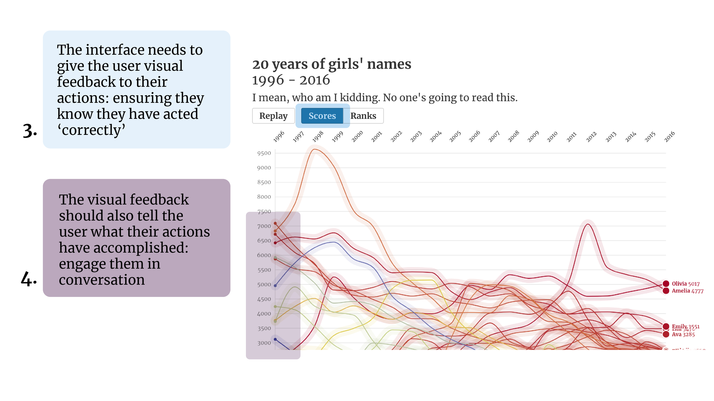
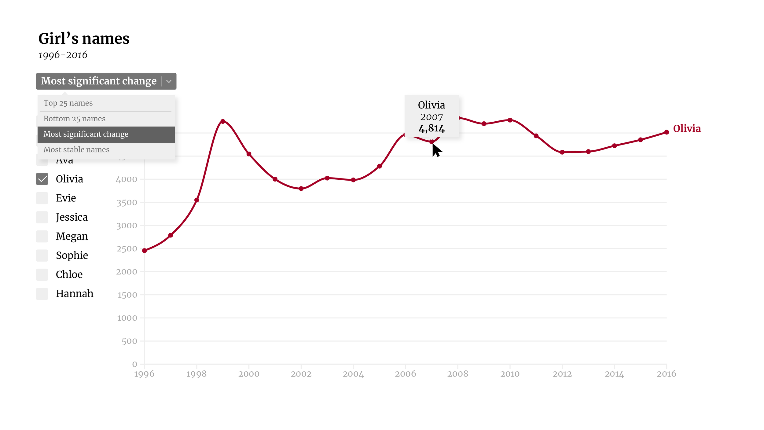
What is crucial is that once they do interact, we give them feedback to their interaction. We need to reassure them that they have correctly understood the affordances, but also show the effect their interaction has had on the visualisation. This is how we establish their engagement with the data.
Even with a chart as complex as this, clear interface design can help orient the audience.
The buttons at the top clearly advertise themselves as buttons and when we click them we get immediate feedback as the chart updates to match our interaction.
The important thing to note is that the affordances we have with interface elements are going to frame how we interact. We're going to expect very different experiences from a dimmer and an ordinary switch.
Just like all of the visual elements we use in data visualisation, the design of interface also tells stories and changes how the audience will approach our data.


Which means this is also true of animation. How things move gives then character and we understand intention, and therefore meaning, from movement.
Animating a line across the page focusses us on the developing trend, while animating growing and shrinking in place, highlights the difference. Appearing and disappearing shows us individual points, while highlighting shows us the points in context.
Our animations choices are also going to frame how our audience reads and consequently how they explore our data.
But just as with our charting, we can use the way that animation and interface frame our story to help our audience understand and engage with our data.

Dynamic charts, using interactivity and animation, give us the ability to refine and expand on what we can do with data visualisation, but we should not forget that they also give us extraordinary story telling capabilities that enable us not just to show data to our audience but to enlighten and engage them in a whole new way.