
ApPENDIX B: STATISTICAL BASICS
This appendix is designed to supplement material in our book, ‘Communicating with Data Visualisation’.
by Adam Frost
This appendix contains an explanation of some of the key statistical terms used in data visualisation projects.
Averages
In 2010, the Office of National Statistics (ONS) in the UK marked the UN’s World Statistics Day by producing a picture of the average man and woman in the UK. He was 1.75 metres tall, 83.6 kg in weight and his annual income was £28,270 a year. She was 1.61 metres tall, 70.2kg and her annual income was £22,151 a year. Neither did enough exercise. The five items most likely to be found in their weekly shopping basket were: milk, breakfast cereal, ham, bacon and chocolate. This story was leapt on by many of Britain’s news outlets, illustrated with photos and cartoons, and readers were invited to compare themselves to Mr and Mrs Average - as if they needed any encouragement.
We are fascinated by average anything. Being ‘average’ or ‘normal’ continues to be a fraught psychological term: it can be something we aspire to, it can be something we kick against, but it’s there as an invisible benchmark in many of our habits, behaviours and relationships.
When they reported on the survey, most journalists probably wouldn't have known that the ONS were using two or perhaps three ways of defining the average. Most readers wouldn’t have known either. But this didn’t matter, or stop the story being understood, because there is nothing in the three ways of measuring the average - the mean, the mode and the median - that is difficult to grasp and, in fact, switching from one to the other is something we all do naturally when we’re trying to describe a ‘typical’ something.
Of course, by combining so many different variables, the ONS created an ‘average’ person that almost certainly doesn’t exist. The chances of there being a man who is exactly 1.75 metres tall, 83.6 kg in weight and with an annual income of £28,270 a year is almost nil and that’s before you include other variables such as his exercise habits and weekly shopping. This is always the problem with these kinds of composite portraits, but they are still a useful illustrative tool, provided that you use them in the full knowledge of their limitations.
The mean
It is possible that the ONS used the mean to calculate Mr Average’s average salary (£28,270). This is when you add up all of your numbers, and divide by the number of numbers you have. So the mean of 1, 2, 3, 4 and 5 is 1+2+3+4+5 divided by 5. 15 ÷ 5 = 3. Three is our mean.
The mean is the most commonly used method of defining an average, especially when you have quantitative data (i.e. numbers). It is also a vital statistical tool, used to calculate standard deviation, confidence intervals, statistical significance and more. (More on this later).
It is also problematic because it is non-resistant, which means that it is distorted by outliers. An outlier is a datapoint that lies an abnormal distance from the other values in your dataset. Imagine the ONS carried out the same experiment one year later but, in the intervening period, all of the world’s 2,000 billionaires decide to settle in West London. (There were, in fact, 2,208 billionaires in the world in 2018 but I’ve rounded down.)
Let’s say their average annual income is £1 billion. Let’s also imagine that the rest of Britain’s 40 million working-age adults see their income drop to exactly £20,000. The presence of those 2,000 billionaires means that the mean annual income in the UK is now £70,000. Even though 40 million people have seen their incomes plummet, the average income has almost tripled. If you use the mean, that’s how much power outliers can have. 99.9% of the population can have a 'below average' income.
In cases such as this, the median is often preferred, because it is non-resistant, which means outliers don’t have the same effect on it. (This is why, for example, the ONS currently collect both the mean and median household income).
The median
The median is the middle value in your dataset if you rank them from smallest to largest. So the median for 1, 2, 3, 4 and 5 is the middle value: 3. In the ONS example, if we used the median, then the 2,000 billionaires arriving in the UK would have little effect on the average income of Mr or Mrs Average. In fact, a million billionaires could move in, and our median value would still barely move. For this reason, it’s a good idea to find out the median even if you have no intention of using it. Because if there’s a big difference between the mean and the median, then you know that there is something odd about how your data is distributed.
One related point: the fact that the median is non-resistant brings its own problems. Returning to the scenario outlined above, 39.9 million billionaires could arrive in the UK, and if the other 40 million people still earned £20,000, the median income would also remain at £20,000. If this happened in reality (almost half of the UK were billionaires), wouldn’t you want this reflected in any summary of ‘average income’? The fact is, your judgement (and conscience) are just as important as mathematical skill in deciding which measures to use.
The mode
Finally, the mode - which is the one that most of our students struggle to understand the point of. This is the most common number in a dataset. So the mode of 1, 1, 2, 3, 4 and 5 would be 1. That doesn’t feel like the ‘average’ at all. But if you take another look at the ONS data, you will see that at least one of the ‘averages’ is the mode. The most common items in the national shopping basket are: milk, breakfast cereal, ham, bacon and chocolate. This is nominal data - words rather than numbers - and you can’t create a mean or median in these cases. You simply have to choose the answers that appear most frequently. If you say ‘Mr Average has blue eyes’ or ‘Mrs Average is a Protestant’, you are doing the same thing. In many cases, the mode is the only average you have. But it is still legitimate as a measure of central tendency and it is just as true to say that Mr and Mrs Average buy milk and chocolate every week as it is to say that he weighs 83.6 kg and she weighs 70.2 kg.
Furthermore, as with the median, working out the mode can also alert you to any oddities in numerical data. For example, let us imagine that we chart the raw data that sits behind the annual male salary in the UK. I’m going to simplify here and round the average down to £28,000 and assume that there are exactly 20 million working-age men in the UK and their income in each case is a nice round number - in increments of £4,000.
It’s possible that your chart might look like this.
You will notice that the mean, the median and the mode are all the same - £28,000. This gets called a normal distribution. By saying the annual income of Mr Average is £28,000, you are not deceiving your audience or hiding any skew in the data.
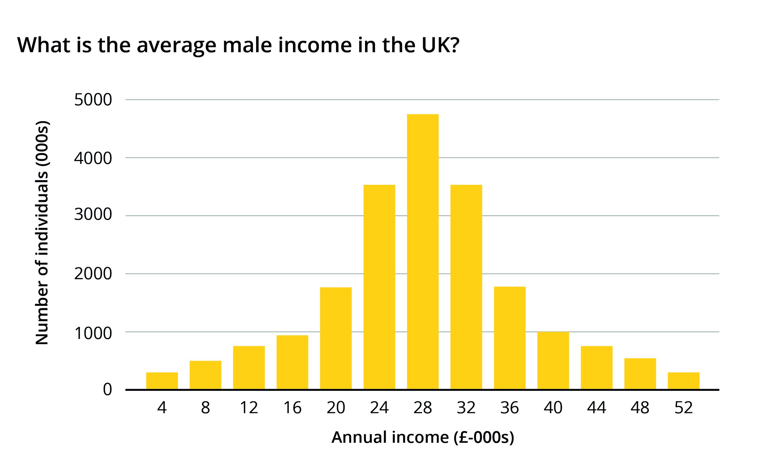
But how about if you chart the data and the adult male population is arranged like this?

Your mean is still £28,000, even though not a single man in the population has an income of £28,000. Your median is £24,000 and your mode is £4,000. So what do you tell your audience in this case? Each version of the average misses out a huge part of the picture. In fact, by charting the distribution of your data, you have found your real story - the chasm in the middle of your dataset, and the peaks at each end.
Data distribution
The example above shows the value of asking for all of the data (rather than settling for an average), and then charting its distribution. It is a great way of finding new stories.
We have used a standard bar chart above, although note that most statisticians would use a modified version called a histogram, which has no gaps between the bars. This visually emphasises the fact that you are looking at the distribution of one continuous variable, rather than comparing lots of distinct categories. It also hints at the fact that the bars are ‘locked’ together: you cannot reorder them alphabetically or by size, as you can with a standard bar chart, as the entire point of a histogram is to show how the value of each bar relates to its neighbour.
You can stick to a bar chart if you prefer - they usually look clearer - but you may be given a histogram if you work with data scientists, and now you know why.
If you do start to use histograms, you will also need to understand the concept of ‘bins’. In our bar chart above, we imagined a world in which annual income is exactly £4,000, £8,000, £12,000 and so on. In reality, there will be a variety of different values, so to make your histogram, you will need to group these values somehow e.g. £0-£1,000, £1,001-£2,000 and so on. Statisticians call these groupings ‘bins’ or sometimes ‘buckets’. The number of bins you use and their start and end points (sometimes called your bin low and bin high) can make a big difference to the stories you find, so it’s a good idea to experiment with a different number of bins.
In the figure below, we’ve shown how bin size made a big difference in our understanding of one dataset we were working on - page views for a UK consumer news website (we’ve adjusted the data slightly here). The differences between using one hour, half an hour, and fifteen minute bins gave us different insights: it wasn’t just that people were checking the site in their lunch hour (no surprises there), but most commonly between 13:15 and 13:30 - fifteen minutes into their lunch hour, presumably just after they had picked up a sandwich. Creating histograms like this is easy to do in Excel and even easier in statistical software.

What you are doing here is creating a frequency distribution. The line chart version of this is sometimes called a frequency polygon. This gives you a better sense of the overall spread of your data but, if you misjudge bin size, you can sometimes overlook spikes or dips in particular groupings.
These types of charts work well when you are comparing values in one dataset. But often you want to compare distribution across multiple datasets, and creating lots of histograms or frequency polygons is not an efficient or effective way of doing this. Instead, statisticians have devised a range of charts that effectively condense and summarise key points in your distribution to facilitate speedy comparison.
We have put versions of these charts in the data distribution section of ‘Part 2: Story types’ at the end of our book, ‘Communicating with Data Visualisation’. They include strip plots, box plots and violin plots. We won’t discuss them in detail here, but if you do find yourself regularly needing to compare data distribution in large datasets, then these charts are worth learning about, because they each emphasise different aspects of your data. What’s more, they are not just used for analysis. Simplified versions of these charts are increasingly used in data journalism - particularly in publications such as The Financial Times and Five Thirty Eight, perhaps because their readers are less wary of statistical graphics and have a better sense of when averages can be misleading.
Standard deviation
As well as creating visual summaries of data distribution, statisticians also use a mathematical shorthand to communicate quickly about the range and spread of their data. This unit of measurement - standard deviation - is as vital to statistics as Celsius is to meteorology or light years are to astronomy. Just as Celsius measures temperature, so standard deviation measures variability - how far the numbers from your dataset are from the mean.
It should be said that standard deviation works best as a measure when your data looks like the normal distribution plotted in the figure above (a bell curve). When you have a dataset that is more abnormal, with a lot of outliers - standard deviation can be less useful. These abnormal distributions can still be quantified but it involves more advanced statistical concepts and therefore falls outside the scope of this book.
If you are told the standard deviation of a population, and it has a normal distribution, then you know that 68% of your datapoints will fall within one standard deviation above or below the mean. You also know that 95% of your datapoints will fall within two standard deviations above or below the mean. Sometimes three standard distributions are used, this covers 99.7% of your dataset. This is sometimes called the 68-95-99.7 rule.
You don’t particularly need to know why it is 68%, 95% and 99.7%. For now, just understand that it’s a way of creating a standardised measure that can be applied across datasets regardless of the variables they contain.
For example, let’s imagine we were comparing average weights for two Associations of Professional Sportsmen. Both Associations are limited to 1000 members and both have the same average (mean) weight - 73 kg. However the standard deviation for Association 1 is one kilogram and the standard deviation for Association 2 is 10 kilograms.
Applying what you’ve just learnt, you can say with confidence that for Association 1, 68% of its members will weigh between 72 and 74 kg. 95% will weigh between 71 and 75 kg. That’s a pretty narrow spread, everyone is roughly the same weight. Association 2 on the other hand, with its 10 kg standard deviation, has a wide spread - 68% of its members weigh between 63 and 83 kilograms and 95% weigh between 53 and 93 kilograms.
The fact that there is such a huge difference in the standard deviation of these two groups - in spite of the fact that they share an average weight - would surely prompt you to explore further. You would subsequently discover that Association 1 represents middleweight boxers, whereas Association 2 represents chess players and is open to anyone over the age of nine.
You could of course graph your datasets and visualise the differences between the two distributions. But standard deviation gives you a quick numerical summary. When you are given a dataset, standard deviation will often be mentioned, and if it isn’t, it will have been used to calculate other measures of variability or confidence, which we will look at shortly.
Samples
In the examples above, we had a complete dataset - we could measure the average salary of every man in the UK or the weight of all 1,000 members of the Chess Association. Statisticians call this a population. A population is everyone or everything that is of interest to your question or experiment.
The problem is, the ideal population for your experiment is often exactly that - the whole population. And we rarely have the time, money or ability to count and measure everyone, even in the age of Big Data. Instead we have to make do with samples.
A sample is a smaller group of people or things that represent a larger population. You might think: how on earth can a small sample of a few thousand people represent tens of millions? Surprisingly, it can. That is the basis of almost every research project - the fact that, in the vast majority of cases, samples do accurately reflect the larger population, provided that the sample is large enough and that it is completely random.
Note the two caveats, though. When you are given a dataset, check the size of the sample. For example, most political polls in the UK have a sample size of around 2,000 voters. Much less than this, and the risks of sampling error (a sample that doesn’t reflect the population) become too high. Secondly, make sure that your sample is truly random (any reputable research company will use this method).
Random doesn’t mean random in the conventional sense. If you stood on the side of the road where you live, and counted the number of cars that went by, cataloguing their model and colour, this might feel random, but it wouldn’t be a random sample of the country’s population of drivers. It would be compromised by your choice of location, and your errors and biases as an observer. You might love red cars, and notice them twice as often. You might live in Devon, and spot nothing but SUVs and tractors.
A random sample is far more carefully orchestrated than the name suggests. For example, one way of collecting a random sample would be to list everyone in your population of, say, one million people, assign everyone a number, and then randomly choose 2,000 numbers. This means that everyone in your population has an equal chance of being selected.
There is a drawback, however. If a sample is completely random, then anything is possible. Let’s imagine I took a sample of 100 members of the 1,000-strong Chess Association I mentioned above. Let’s also imagine that 100 members of the Association are under 21 and 900 are over 21. Because it is random, my sample of 100 could end up containing all 100 members that are under 21. It’s unlikely, but it’s possible. It’s also possible that my sample of 100 could contain none of the members who are under 21. For my sample of 100 to be representative of that specific demographic breakdown, I would need 10 members who are under 21 and 90 members who are over 21. I would need exactly that ratio (1:9), every time I take a sample. No one is that lucky.
Standard error
Statisticians get round this inherent problem with samples by quantifying how confident they are that the characteristics of their sample reflect the population. As with all statistical methods, I think that this is something we all use and understand in our daily lives. If you were about to drive from London to Cambridge and you asked me how long it would take, I would answer: ‘About an hour, give or take 10 minutes’. What I would have done there is quickly sampled the 100 times I’d driven to Cambridge, calculated a rough average, distributed my journeys around it and worked out that most of them were between 50 minutes and an hour and 10 minutes. True, once it took 40 minutes (at two in the morning), and on one occasion it took an hour and twenty minutes (traffic accident) and that could happen to you, but what you are looking for is what is most likely, what is going to happen 95% or even 99% of the time. (I’ve chosen those two percentages deliberately - more in a second).
Now the problem is, you still don’t know how representative my answer is. You don’t have access to population data - every trip that everyone has made by car from London to Cambridge. So you don’t know how typical I am - maybe I consistently break the speed limit, or stop frequently for crisps. So a better method would be to ask lots of random people for their average journey time. Geoff might say 58 seconds, Louise might say an hour and two minutes, Harry might agree with me and say an hour, and so on. What you are collecting here is lots of average times: the average of Geoff’s 100 journeys, and Louise’s 100 journeys and so on. (If you were doing this properly, you would of course collect random samples, so 1,000 random journeys from lots of random drivers. Rather than 100 journeys from one driver.).
Like any dataset, this table of averages will also have an average, and a certain distribution, and a standard deviation. Note that your chart of multiple average journey times is likely to cluster much more closely to the centre of the distribution (see the figure below).

You are just measuring the average of all of those averages, after all, not every journey. If you imagine a more scientific version of this exercise, then what you will end up with is known as the sampling distribution of the mean. The standard deviation of this dataset is known as the standard error (or technically standard error of the mean - as sometimes your estimated number isn’t the mean). This is our most useful tool when it comes to visualising uncertainty in samples.
You can see that it is closely related to standard deviation (that we covered above), and you use similar mathematical methods to work it out, but it is vital not to confuse the two. Using one when you should use the other will mislead your audience. For example, when you asked me about all my journeys to Cambridge, I reported back ‘an hour, give or take ten minutes’. This will be very different from the standard error, which is more likely to be ‘an hour, give or take fifty seconds’. Remember: standard error here gives you the spread of average journey times, not every journey. So only my one hour average journey time is in this dataset.
The other magical property of the sampling distribution of the mean is that it is always normally distributed, even if the distribution of the population is abnormal. Because what you're plotting is the average position of the average, it doesn't particularly matter if the average in the population sits on the left, right or centre, the sampling distribution of sample means will form a bell curve around it.
Confidence intervals
The standard error is used to generate confidence intervals and margins of error - terms that you will have seen in many surveys and political polls. They give you an estimate of how far an average value or percentage is likely to vary in the wider population. However, it is not enough just to know the standard error to calculate a margin of error. You also need to understand how accurate your audience wants your estimate to be, or how much confidence to place in it.
The most common confidence level is 95%. If you audience needs a 95% confidence interval, then your error bars will be placed 1.96 standard errors either side of the mean. What this means is that, 95 times out of 100 (or, to simplify, 19 times out of 20), the actual average for the population will be somewhere between these two values. So let’s say the standard error for our London to Cambridge journey is 50 seconds. This means that the true average will be somewhere between one hour plus or minus 98 seconds (50 seconds x 1.96) and this will be correct 19 times out of 20. 98 seconds would be our margin of error. Our confidence interval would be all the values between 58 minutes and 22 seconds and 61 minutes and 38 seconds.
If our audience wanted to be more confident, we could set a 99% confidence interval. Now we’d be multiplying our standard error by 2.58. Our margin of error would increase to 129 seconds (50 seconds x 2.58). Our confidence interval would range from just under 58 minutes to just over 62 minutes. Now we can say that 99 times out of 100, the true average will fall between these two values. More confidence means greater accuracy. But it also means means less precision and a wider confidence interval.
The other way of increasing confidence is to increase the size of your sample. The more London-to-Cambridge journeys you collect, or the more times you collect random samples, the closer your distribution of sample means will get towards a normal distribution with more values clustering around the average and proportionately fewer outliers. By collecting more journeys, our standard error will reduce significantly from 50 seconds and our margin of error will reduce with it. The closer you get to collecting every journey ever made, the closer your margin of error will get to zero (since when you’ve got all the London-to-Cambridge trips ever made, you have an exact figure for the average journey time).

The mathematics behind calculating the standard error are of course more involved than this and, if you want to learn more, then almost all statistics textbooks will walk you through the necessary equations. (Sally Caldwell’s Statistics Unplugged is the best textbook I know of). However, for the purposes of this book, I just want to stress four things:
standard deviation and standard error are different measures. Where the standard deviation typically measures the spread of a whole dataset around a population mean, the standard error of the mean measures the standard deviation of lots of sample averages.
when you see error bars, they usually represent a 95% confidence interval. This means that if you repeated the sampling exercise on 100 occasions, the true figure for the population would sit in between those bars on 95 occasions. However error bars are sometimes used to show 80% confidence, 99% confidence, one standard deviation, two or three standard deviations or one standard error. You should always check what the error bars are showing when you are given a dataset or chart.
it is always sensible to calculate standard deviation and/or standard error when you are given a large dataset, although you then need to decide whether your audience needs to see this information. If there is a large amount of uncertainty, then you should either not use this dataset, or make the uncertainty apparent when you visualise it. For the majority of datasets and the majority of audiences, you will not need to visualise any uncertainty because it will clutter up your chart and distract from your story. It belongs in a footnote.
if you decide that it is important to show uncertainty, you must always make it clear which measure you have used to generate your error bars.
Even in academic journals, the approach can be slapdash. One BMJ study reported: ‘The terms “standard error” and “standard deviation” are often confused[...]. A review of 88 articles published in 2002 found that 12 (14%) failed to identify which measure of dispersion was reported (and three failed to report any measure of variability)’ https://www.ncbi.nlm.nih.gov/pmc/articles/PMC1255808/
Standard error and storytelling
As with all the concepts outlined above, the other good reason to understand standard error is that it can help you to find better stories. As an example, I’m going to use a project by Oli Hawkins, a journalist and data scientist who was inspired by the work of Michael Blastland to explore estimated values given in government statistics. He created a chart which showed government estimates of inward migration to the UK, based on samples taken for the International Passenger Survey.
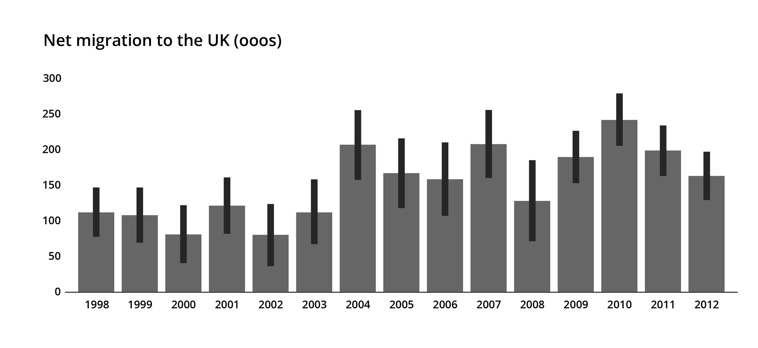
The bars themselves show a central estimate of the true number, the error bars represent a 95% confidence interval. In other words, there is a 95% chance that the actual figure falls somewhere in between the ends of those bars, and a 5% chance that it doesn’t. What you might notice is that the error bars are quite long. The confidence interval for 2006 ranges from about 110,000 to 210,000. Isn’t it deceptive therefore to report a solid 160,000 migration figure for 2006 without also showing that it could be out by 50,000 on either side? And isn’t it interesting that there is so much uncertainty around a figure that it is important for governments to know, particularly for the adequate provision of health, education and welfare services? Hawkins responded to this by creating an animation which looped between plausible re-drawings of the chart. We’ve put a few in the figures below, and you can see that they have little in common. Depending on the chart, the lowest value is in 2000, 2003 or 2008, the highest is in 2004, 2010 or 2011, and the trends over time do not match. Try the animation out yourself here: https://olihawkins.com/visualisation/1. It shows that sometimes the story is about the quality of your data, not its content.
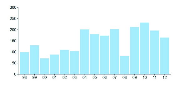


Image: All of these utterly different charts are well within the margin of error for immigration statistics
Other examples of datasets where the confidence interval is arguably as interesting as the data include the 481,000 Iraq war deaths (2003-11), cited in a 2013 University of Washington study. The 95% confidence interval ranged from 48,000 to 751,000 deaths. In 2017, the WHO estimated that canine rabies caused 59,000 deaths a year, but the 95% confidence interval ranged from 25,000 to 159,000 deaths. The same wide intervals are common in most casualty estimates for natural disasters. The story is arguably about the difficulty of collecting or authenticating certain types of data, and your chart should therefore foreground this.
Descriptive and inferential statistics
What we are talking about here gets called inferential statistics. It builds on the first set of concepts we discussed: those are called descriptive statistics.
Descriptive statistics simply describe what is in your dataset. This is the average. This is how our data is distributed. This is our standard deviation. When we described Mr Average’s salary, or the average weight of our chess players, this is what we were doing. In many cases, this will be the purpose of your visualisation project. You will have a dataset - maybe everyone who owns a store loyalty card, or the number of tourist arrivals, or dog-owners, or diabetics - and you will be describing what this dataset looks like.
In inferential statistics, you take a small sample, and infer from it what a whole population will think or do. More data than you think is built on this less stable foundation. For example, here are a few headlines generated from recent stories in the UK media:
British people check their smartphones every 12 minutes (Source)
Most British people (52%) are atheists or non-religious (Source)
9% of British people admit they are a poor or very poor lover (Source)
28% of British people say they have seen a ghost (Source)
Look at the confidence of those statements; think about the emotional effect they have on you. There is no indication at all that these proclamations about what 65 million British people think are based on small samples of 3,750, 3,000, 1,052 and 1629 people respectively. Even the biggest sample - 3,750 - is about 0.006% of the population. I’m not saying journalists are wrong to make these emotive statements - they are not - but you need to know when your chart is based on inference, so you can decide when it is appropriate to make this clear in labels, subtitles, footnotes or even (in a minority of cases) on the chart itself.
To restate: there is nothing wrong with inferring from a sample. It works. Random samples are surprisingly effective at predicting how a much larger population will think or behave. Most research projects (in medicine, sociology, economics and more) are based on this premise. But it is worth knowing what you are doing - describing or inferring - before you visualise. And certainly during the ‘Find’ phase - when you are analysing your data - your error bars and what they represent should always be in plain sight.
Statistics - and in particular inferential statistics - is a huge and complex field that we won’t have time to cover in any further depth here. However I have put descriptions of some other concepts that are relevant to data visualisation in Appendix C. They include hypothesis testing, statistical significance and correlation - all of which you are likely to encounter if you work with large and complex datasets.
I have also put a list of common errors and misconceptions in Appendix D. Sometimes this involves a dishonest data provider using particular terms or methods to distract you from something in the data that they don’t want you to find. The more you understand about the different ways that data can be described and presented, the less likely you are to be misdirected.