Rule 36: Lines should not be too thin or too thick

In this blog series, we look at 99 common data viz rules and why it’s usually OK to break them.

by Adam Frost

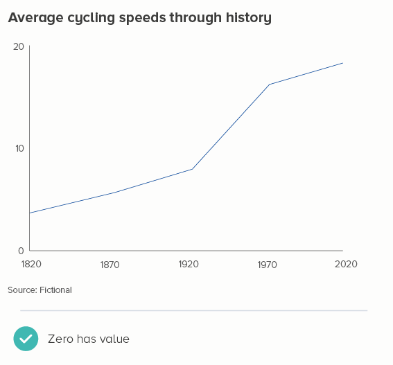
The default thickness of lines in most tools is around 2 points, give or take. Illustrator is exactly 2pt, Powerpoint is 2.25pt, Flourish uses rems (a multiple of the page’s base font size) and starts at 0.2 rems, but it ends up looking about 2pt. Much thinner than this, and it’s hard to distinguish between the lines, particularly with similar or pale colours. Much thicker, and the lines fight (one has to be on top), and the changes in direction get smudged. 

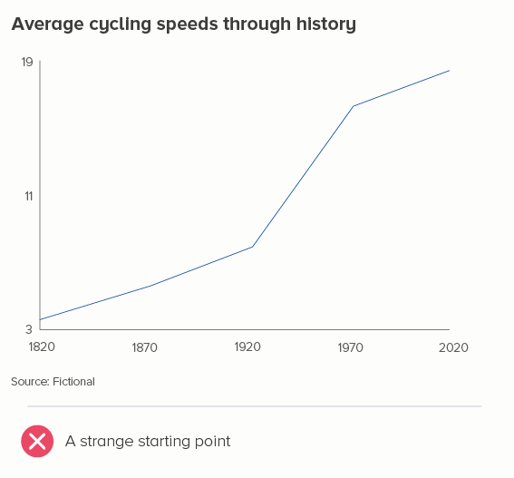
But the story doesn’t always end there. In many instances, you will want to override the 2pt default to ensure the meaning of your chart is clear.

i) lots of change

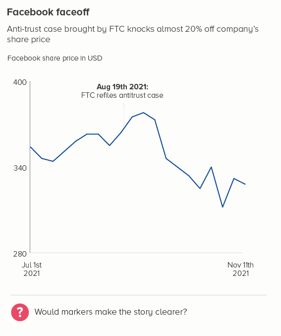
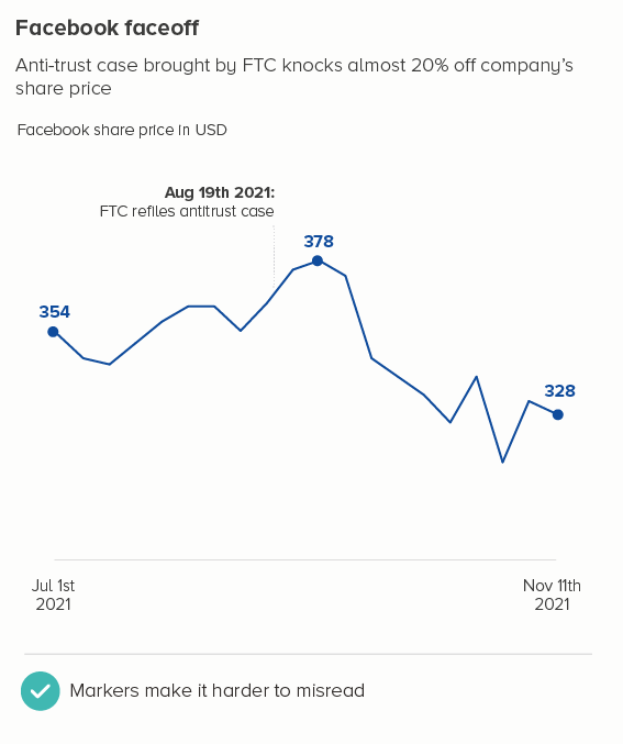
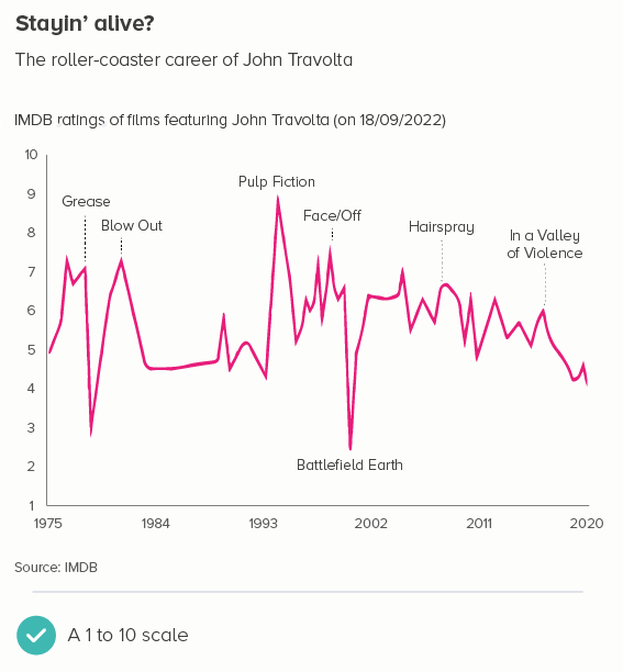
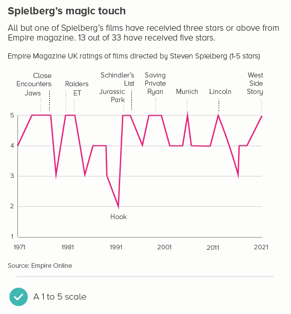
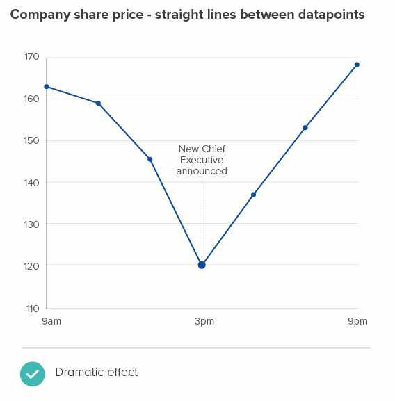
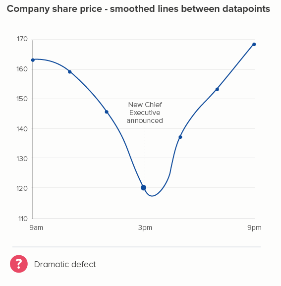
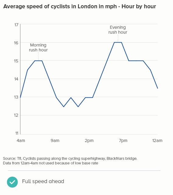
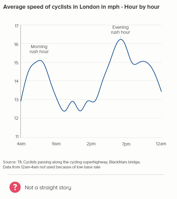
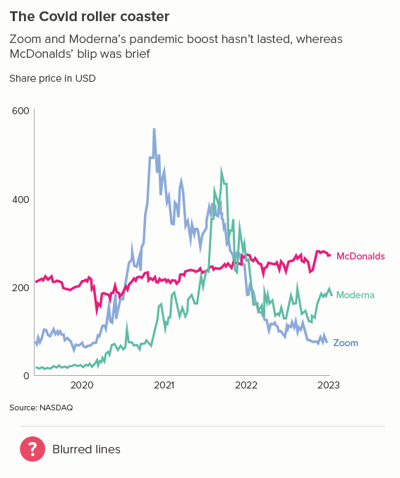
The more movement there is in your line, the thinner you will usually make it. Think stock market lines, where it is important that key fluctuations are clearly delineated.
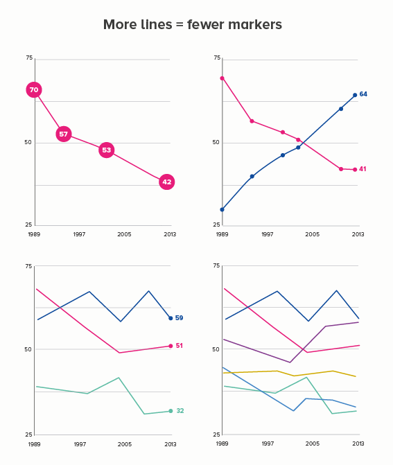
ii) lots of lines

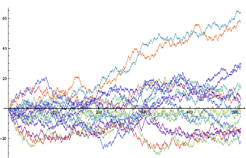
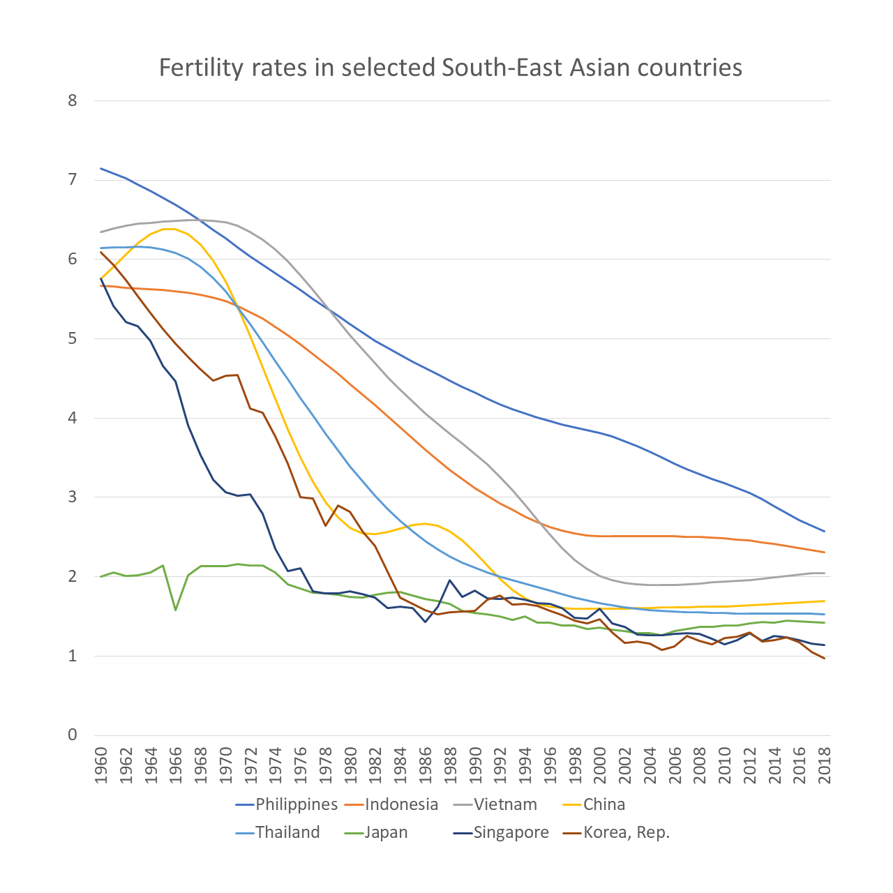
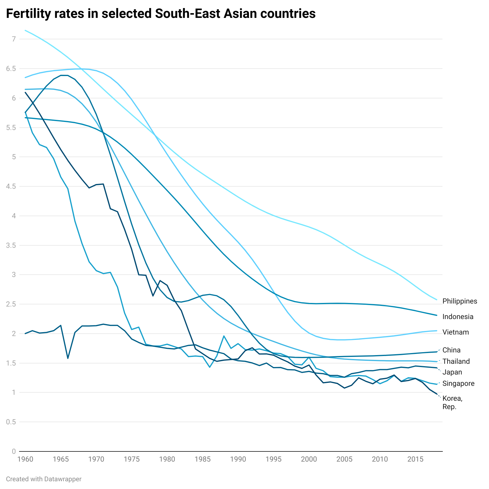
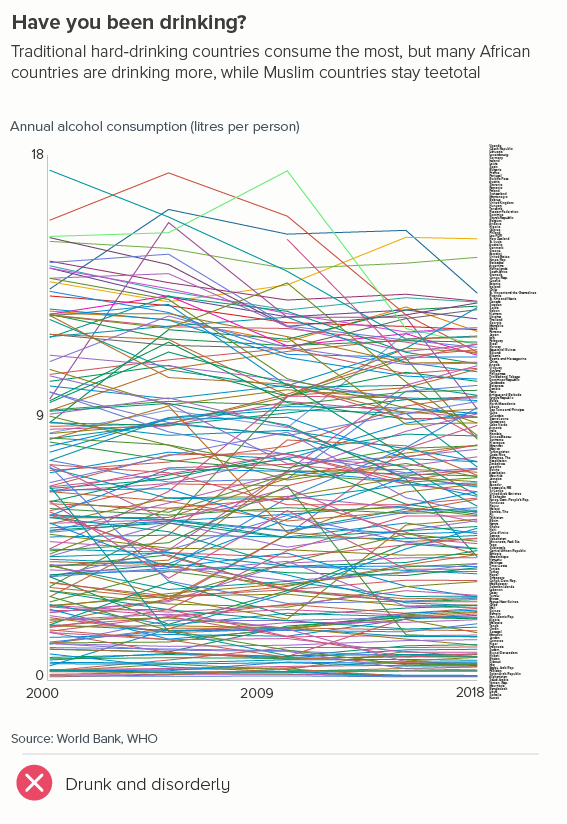
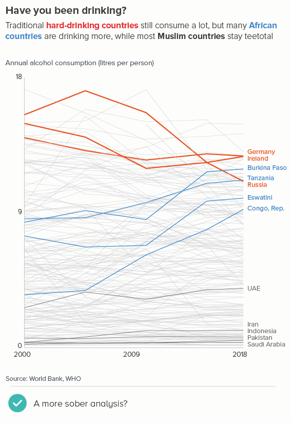
The more lines you have, particularly if some of them are close together, the more they will compete with each other. Making them thinner helps them all become more visible. Of course ideally you’d try to delete or highlight some of the lines (see the next section), but sometimes this isn’t possible or permissible (all lines must be treated equally).

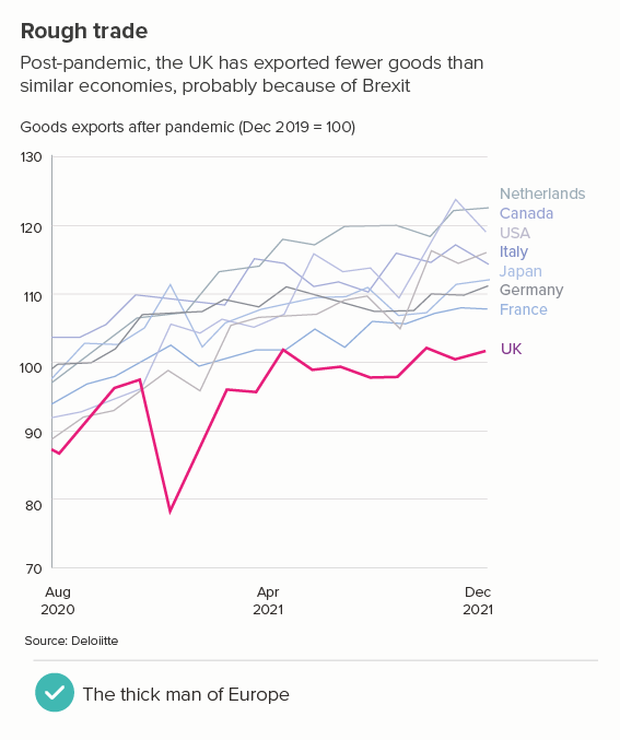
iii) one line matters more

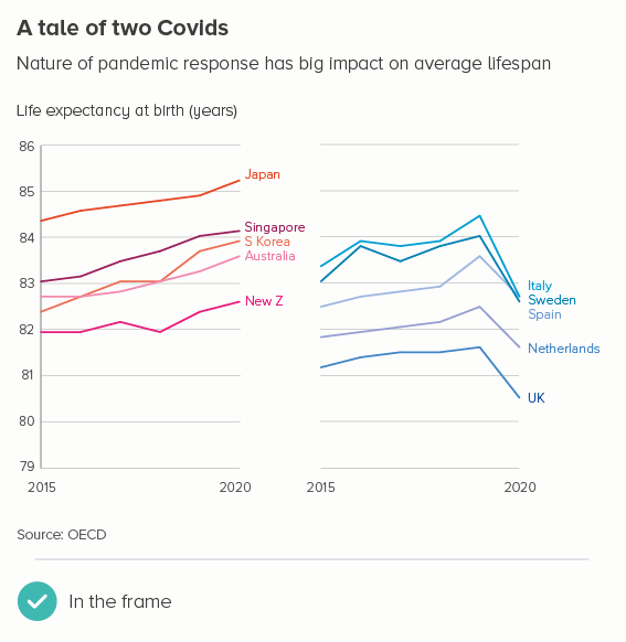
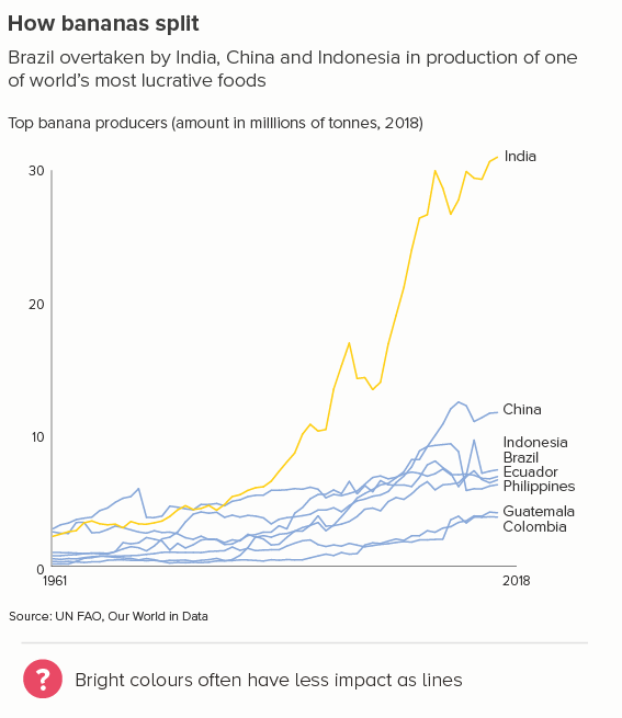
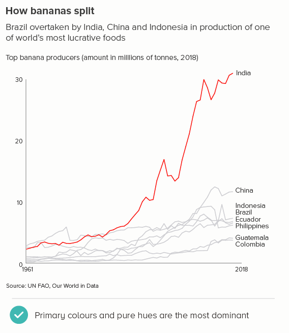
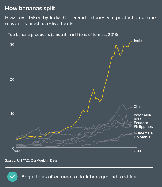
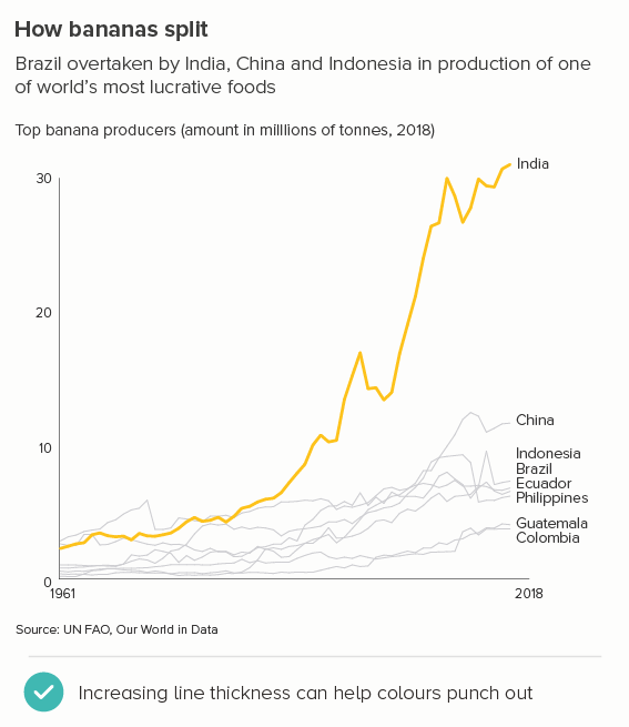
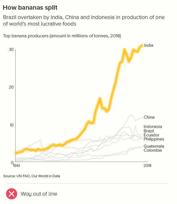
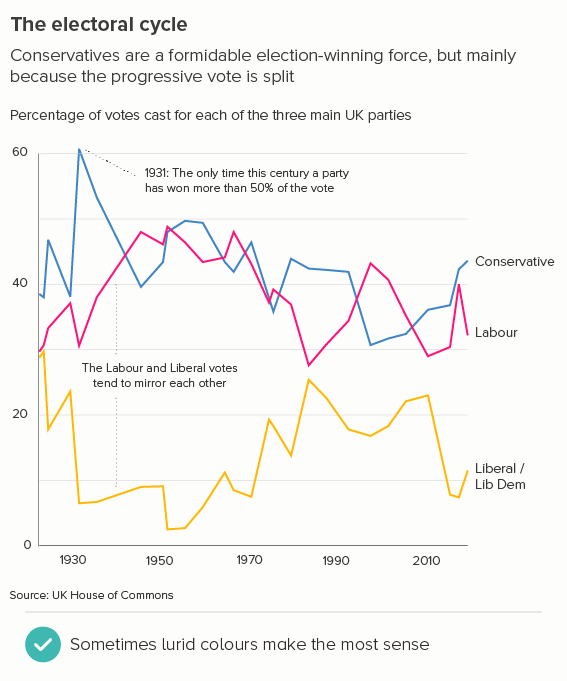
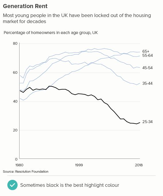
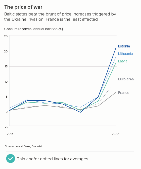
This is the most common use case. You are trying to isolate a particular line, perhaps because it is most important, or because it is the most interesting. So this line becomes thicker (and/or a more dominant colour) and the others recede. Remember, for a lot of software (e.g. PowerPoint), you will also want to put this line last in your datasheet so it sits on top of the others.

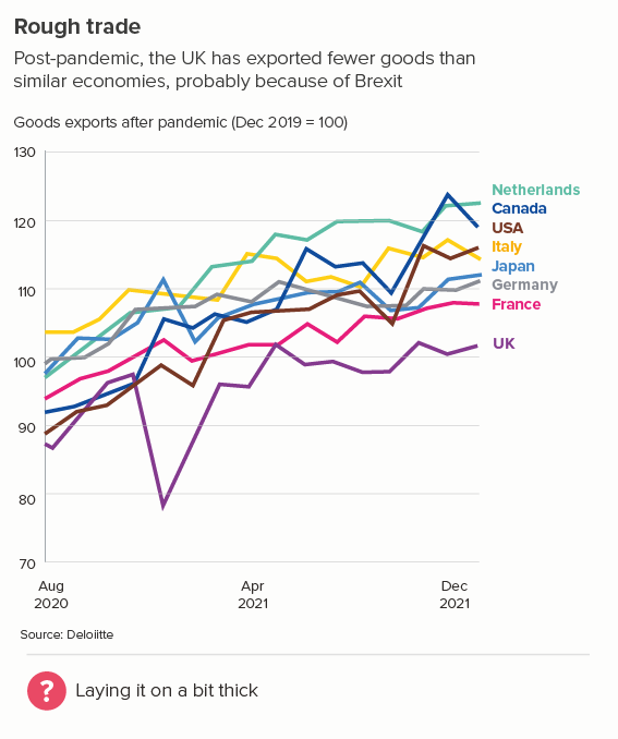
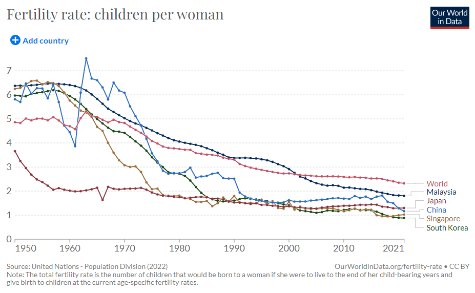
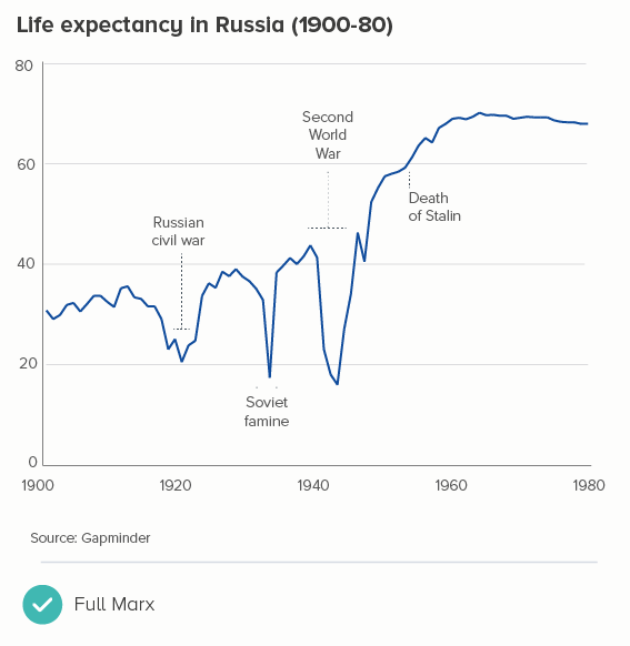
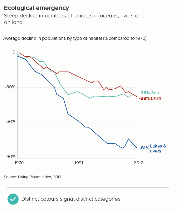
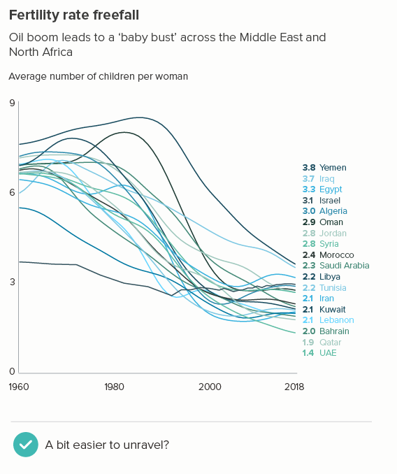
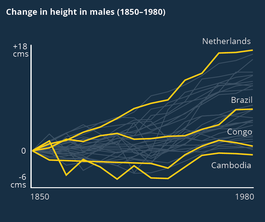
Sometimes (if it is global data), you might want to treat several lines in this way, e.g. thicken four or five lines and knock back the others, as in the first chart below. Usually you thicken the lines that finish top and bottom, and then a selection of lines in the middle.

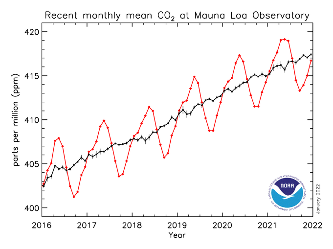
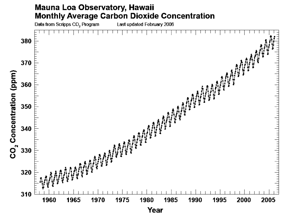
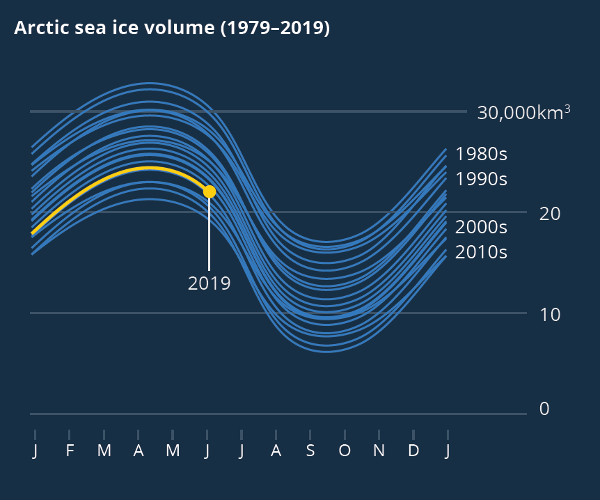
Playing with line thickness is also useful for cyclical data (the second chart below). In other words, when you are overlaying lots of lines on a line chart to represent daily or annual change. Climate change data is frequently represented in this way, and the latest year is usually the thicker line.

iv) a change in meaning

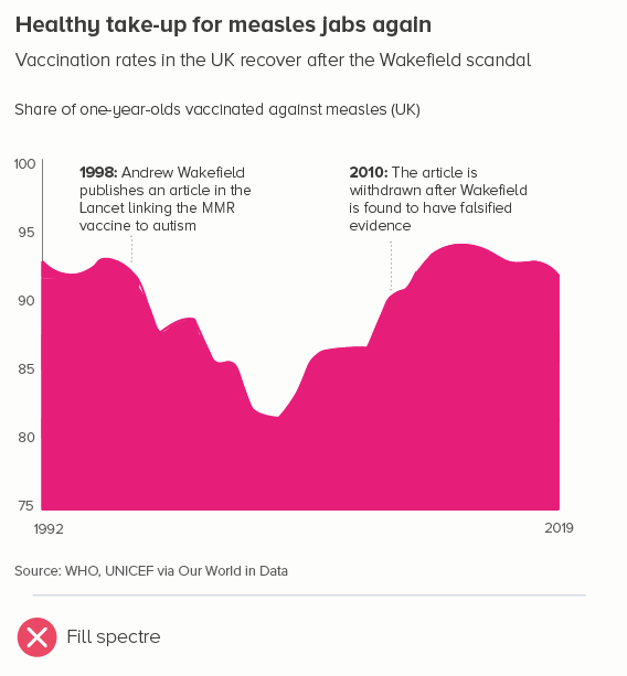
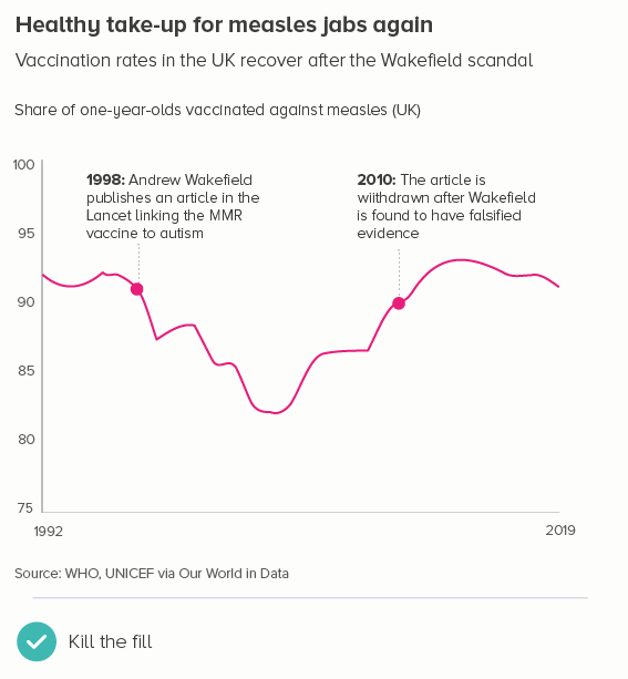
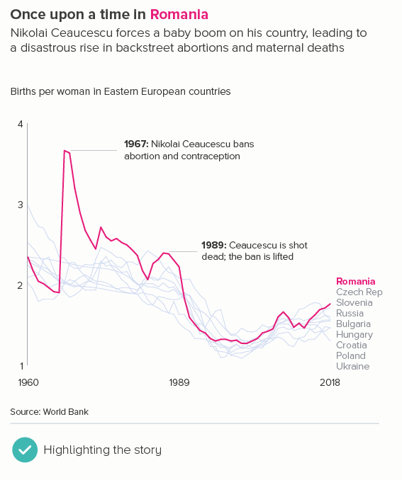
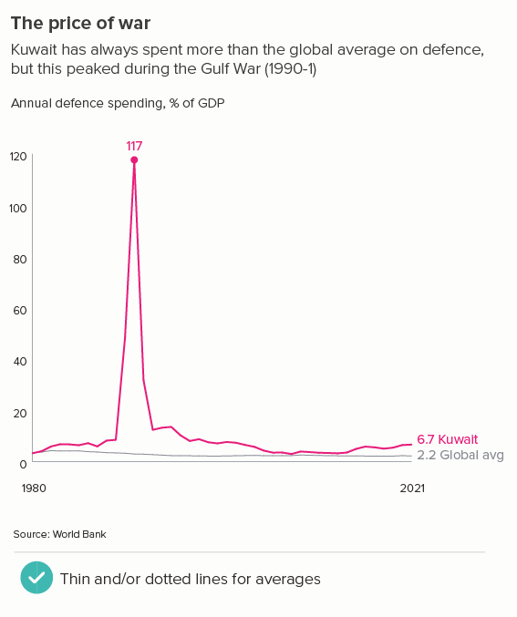
Sometimes one of your lines is different from the others - maybe it’s an average. Or a line can change its meaning - perhaps there is missing data, or after a certain date it’s a projection. These use cases can mean the default line style changes - either its width, or opacity, or a solid line becomes dashed.

v) an aesthetic choice

When you’re talking to a general audience, you often need a bolder approach. So you might make your lines thicker, or change their colour half way along, or make them part of a larger visual. Here the thickness of your lines will vary, and depend on your choice of metaphor. Nigel Holmes is a pioneer of this approach (one of his graphics is included below), but you will see similar techniques in the work of Peter Grundy, Valentina D’Efilippo, David McCandless and others. If you have an expert audience, this can backfire (‘you cannot be serious’), but I think - with the right data - graphics like this are great fun.

Source: Nigel Holmes

VERDICT: Break this rule sometimes

Sources: Stock prices - NASDAQ, Fertility rates - World Bank, Brexit trade - Deloitte, Inflation - World Bank, Defence spending - World Bank, Nigel Holmes graphic on virginity by Nigel Holmes

Rule 35: Add data markers to your lines

In this blog series, we look at 99 common data viz rules and why it’s usually OK to break them.

by Adam Frost

Like most data viz types, I spend too much time on the Our World in Data website. It’s free, well-organised and endlessly fascinating. But because they provide maps and charts for every conceivable dataset, they have to rely on computers to generate a fair number of their visuals. Which can lead to some brave design choices.

The charting engine has clearly been given the following instructions: Show where we have a datapoint with a circular marker. These markers are shown, presumably, out of a desire for full disclosure. Unfortunately, integrity can create self-sabotaging visuals.

In the first chart, those circles stop us seeing the actual lines. In the second, the markers get smeared together after 1750 where there is a datapoint for every year. A reader glancing at this might even think that the thickening of the line means something. This is the most exciting part of the story - the dramatic surge in population after 1800 - and it is undermined by those intermittent bulges.

Data markers should only be added if the story requires them, and that is not the case here. In fact, it’s almost always not the case. There are only a handful of instances where the use of data markers can be confidently recommended, and even then, I’d say this is optional, rather than compulsory. I’ll run through the key use cases here. 

i) An interactive chart on a dashboard

This is why I suspect we have markers on the Our World in Data charts. They are interactive charts and OWID want to signal where people can roll over and get the specific datapoints. But couldn’t these markers appear on rollover, rather than as a constant deforming presence? Besides, what proportion of your users want to know where the specific datapoints are? If it’s a minority, their needs shouldn’t outweigh the majority who just want to see clear trends.

ii) Data at irregular intervals

This is a legitimate use of data markers. One example might be if you are measuring party share in elections. Elections don’t always happen at regular intervals, and vote share doesn’t move steadily up and down between elections, but lurches based on policies, scandals, royal babies and so on. So accentuating the election dates rather than the connecting lines can be sensible (the first chart below).   

Similarly, you might have data at long, irregular intervals for one of your lines but not the other(s). To signal the difference in reporting frequency between these lines, you might choose to add markers to all of them. In the second chart below, comparing contraceptive use in Japan and Lesotho (1977-2000), it’s important that the audience knows that Japan collects this data regularly and Lesotho doesn’t, because it affects what you can say about the data.

iii) Not much data

Lines suggest fluid, continuous change, so if you only have a few datapoints for each line, then the metaphor and the data don’t exactly match. In these situations, it’s better to visually signal that most of the line is guesswork. Sometimes, you can make a virtue of the paucity of your data by turning the markers into a feature, with a prominent number in the centre of each (the first chart below). Note that this obscures some of the line, so you have to be careful, but it can be effective as a ‘quick glance’ chart.

Another option when you only have a few datapoints per line is a slope chart (the second chart). The effect is often more dramatic and you’re only omitting a couple of datapoints in between the start and end dates, so it’s only a mild simplification of the story. Adding contextual data can help lift your story as well.

iv) If particular points in time are key to the story 

Sometimes, you’ll want to clearly signal key dates, or flag sudden changes in direction in your lines. A marker makes that pivotal moment clearer. Often you’ll annotate these moments too (the first chart).

Usually the key datapoint is the last one, and it is sometimes a good idea to add a marker here, particularly because the y-axis and that final value will be so far apart, and specifying it means the reader doesn’t have to squint at the y-axis, track across, and guess (the second chart above).

v) if you start above zero

You’re certainly not obliged to add data markers when you start above zero. But if you feel that people might not notice the y-axis starting above zero, and it’s important that they do notice it, then adding markers - along with numbers - can be one way of making it crystal clear what the lines represent.

vi) aesthetic reasons

I’ve left the best till last. Sometimes your lines just look too boring. Particularly if you’ve only got a single line on your chart. You want to add something to make it catch the reader’s eye. A marker can be one option, if the story justifies it.

What should the markers look like

A lot of this depends on the story, the audience, and the number of lines you have. If you have one line, and just a few datapoints, you can go quite chunky, perhaps even bringing in the number too; but the more lines you have and/or the more datapoints you have, you will probably want to reduce the size and number of those markers until, when you get to more than four lines, you’ll lose them altogether (the first image below).  

Shape-wise, almost always use circles. There’s so much literature on how much humans like circles, and how we associate them with importance (draw a circle round this paragraph if you agree). Think hard before you turn that marker into a square or a triangle or a dodecahedron. A circle offers perfect visual contrast to the sharp angles of your line, whereas a polygon competes with it. And metaphorically, a circle just works - this is a datapoint and what shape is a point?

I’d also stick to a solid fill for your circles rather than any kind of texture or photo.

Finally, I’ve been talking a lot about using shapes as markers, but of course it’s also possible to just use data labels (numbers) as markers. This can sometimes work with single lines, but with multiple lines, the result is usually a mess. Again, the clarity and cleanness of the lines is obliterated. If the exact numbers are that important, maybe a table is the best option, or separate the lines out, and go for small multiples.

Conclusion

This rule is another one to treat with intense suspicion. Markers on line charts are usually overkill. The audience rarely wants or needs them. Your story should be strong enough to leave a mark without them.

Verdict: Break this rule often

Sources: Party vote share - UK House of Commons Library, Contraceptive use - World Bank, Social attitudes - NatCen BSA, Irish population - Gapminder, Gender of boss - Gallup, Facebook share price - Nasdaq

Rule 34: Always start a line chart at zero

In this blog series, we look at 99 common data viz rules and why it’s usually OK to break them.

by Adam Frost

In Rule 25, I argued that you should always start bar charts at zero. In fact, any base-aligned chart with a solid fill (e.g an area chart) should also start at zero. That filled shape will be interpreted by your audience as sitting at ground level. Nobody looks at a bar or area chart, and imagines the shapes are the top of a glacier, with hidden depths below the axis. 

So surely the same applies to all charts? Isn’t the x axis always interpreted as a horizon, as ground zero?

Not necessarily. In a standard bar chart, each bar stands in for a fixed amount of something: a pile of money, a mound of food, a bunch of people. The metaphor only works if the bar representing 200 people is twice as tall as the bar representing 100.

The bars in the second chart make a mockery of using shapes to represent numbers. Would anyone guess that you’re allowed twice as many dead insects in noodles as you are in spinach? It’s as bizarre as chopping the bottom off of a bubble chart.

But a line chart isn’t like this. Think about that line rising, diving or flatlining. The chart’s job is to communicate whether those changes in orientation matter.

Often this does mean starting at zero. For many datasets, to get a sense of whether a change is important, you need to understand the change in the total amount. The first chart below is as deceptive as the sunken bar and bubble charts above, because it makes it look like lots has changed when it hasn’t. The percentage of British politicians from a privileged background has remained depressingly consistent - and the second chart makes that clear.

But this isn’t always the case. Look at the first chart below, which I also used in rule 33, showing average speeds of cyclists in London. The y-axis goes from 11 to 17 miles per hour. In the second chart below, I’m using the same data but, this time, I’ve run the y-axis from 0 to 25. Now those cyclists look like their speed is barely changing at all. Is that accurate, useful, interesting?

One objection might be: by starting the y-axis at 11, doesn’t the first chart exaggerate the rush-hour peaks? Well, not really. Cyclists really are going a lot faster on the way to and from work (20-30% faster than at lunchtime).

What I’m doing in the first chart is removing the values that are meaningless for this dataset. Why start at zero, when zero miles per hour can’t feature? If that’s your average speed, you aren’t cycling. The full dataset shows that - apart from one outlier going at 2 mph (puncture?) and one going at 43 mph (nutter) - people cycle at between 5mph and 28mph. Given we’re talking about average speeds, showing anything below 10mph on our y-axis is just visualising dead space where no data will ever live. 

So is this a helpful mantra? Use your y-axis to show the feasible range of the data.

Not quite. For instance, often you do show zero on your y-axis even if it’s not present in the data. Let’s say instead of showing cycling speeds in London today, I was showing the change in average speeds since 1900 (I’ve made up this dataset). Starting at 3 miles per hour - as in the second chart below - looks odd.

It’s not just about showing the numbers that work for the dataset, it’s about showing numbers that work for the story. The change in cycling speeds is about the story of bikes going from very slow to fairly fast. And if you want to represent very slow, then showing how close the speed is to zero makes narrative sense.

It’s also why you often include zero in, for example, charts showing life expectancy or people’s average height as they grow. Yes, average life expectancy hasn’t ever been zero and nobody has ever been 0cm (except in a Warner Bros cartoon). But zero is an important part of these stories - our lives start at zero, a child’s height is measured from the ground up: the y-axis becomes a height chart on a door frame.

So the questions to work through are:

  • Does starting the y-axis above zero exaggerate a trivial change?

  • Could zero realistically feature in this dataset?

  • Is zero a helpful frame for the story?

If you can answer no to all of the above, then zero can go. But if you can answer yes to any of them, it should stay.

If you decide to start above zero, then there are a few more principles to bear in mind. Let’s return to life expectancy data, but this time use an example where you could start above zero. In the first chart below, it’s fine to start at 79, because your dataset is not all life expectancy data, just the last six years of data in ten specific countries, where you would expect life expectancy to be high. In addition, you are telling a story where a small dive in some countries represents major political failure. Starting at zero would have buried this story. 

What it’s not OK to do is what I’ve shown in the second chart - making the line hit the x-axis.

If the line intersects with the axis, it looks like a dive to zero. If you’re cropping your chart to focus attention on a meaningful change, you should avoid cropping this tightly, just as you would never crop any other image this tightly. You should leave space at the top and bottom, so the lines float, the story is properly framed, and there is no confusion about the highest and lowest possible values in this dataset.

(The only exception to this is perhaps when the line hitting the bottom of your chart is an important visual metaphor - like this from the Economist. Sea ice extent is so far ‘below normal’ that they have no wish to frame it aesthetically or to suggest that the decline can or should go lower. We are well below the ‘acceptable’ range of the data).

Another tip I’ve found useful: if your y-axis doesn’t start at zero, it’s often good to make the x-axis a lighter shade (or even invisible), just to make it clear that this does not have the same weight as the y-axis, it is closer in meaning to a gridline. In fact, if you have gridlines on your chart, I’d make the x-axis the same thickness and colour as your gridlines - as in the first Covid chart above.  

A couple more no-nos. One that I touched on at the start: if you’re going to start above zero, don’t fill the area below the line (this is known as an area chart). As with a bar chart, this filled shape will be interpreted as sitting at ground level.

Secondly, if you’re starting above zero, try to make those start and end numbers on your y-axis human-readable, ideally a multiple of five or ten. It’s not always possible, and it might give you slightly too much space above and below those lines, but it’s always easier to read an axis going from 20 to 40 than one going from 23 to 37. It makes the increments easier to read too: 25, 30, 35, 40, rather than e.g. 23, 26.5, 30, 33.5, 37.

There’s one final (and slightly obvious) point to make. The start at zero mantra is definitely to be ignored in datasets where zero doesn’t mean ‘nothing’ in your dataset- for example, with data on an interval scale. Let’s say you’re charting temperature change. It’s not like there are no temperatures below zero, or that zero means ‘no weather’. When you are talking about a change in temperature, you might well start at -50°C or even lower - it totally depends on the story. (If it were human temperature, you’d probably start around 33°C).

It is the same with some kinds of survey or rating data. You might have asked people to rate how happy they feel from 1 to 10. Most websites with a star rating system (e.g. Tripadvisor, Amazon, IMDB) start their scale at 1, because zero is reserved for ‘no rating’. So once again, using zero is plain wrong. 

So this is another rule with multiple exceptions. In fact, it’s a rule that can often lead to misleading charts, as starting your y-axis at zero can hide small but vital changes. Use your judgement to work out whether the story needs a tighter frame and, if it does, snap to it. 

VERDICT: Break this rule often.

Sources: Insect fragments allowed in food - FDA, MP’s education - Channel 4 Fact check, Cycling rates - TfL, Average heights - CDC, Russia life expectancy - Gapminder, Life expectancy - OECD, Measles jabs - WHO/Our World in Data, Film scores - IMDB and Empire Online

More data viz advice and best practice examples in our book - Communicating with Data Visualisation: A Practical Guide

Rule 33: Each line should contain as much data as possible

In this blog series, we look at 99 common data viz rules and why it’s usually OK to break them.

by Adam Frost

Few maxims have been as widely abused as Edward Tufte’s: ‘Graphical excellence is that which gives to the viewer the greatest number of ideas in the shortest time with the least ink in the smallest space.’ Similarly his mantra: ‘Above all else, show the data.’ Unfortunately, this is often interpreted as ‘show as much data as the chart can bear.’ The result: line charts that look like this.

Source: Philip Maymin/Researchgate, PLOS ONE

When you’re analysing data, you may well create a line chart like this, especially in an interactive dashboard where you can roll over those lines and extract specific numbers. After all, those tiny changes of direction might yield critical information. Perhaps you are monitoring sales for a specific product and your lines show second-by-second changes. As a result, you notice that a surprising number of sales came between 1:30 and 1:32pm last Tuesday just after a TV ad campaign. If you had a datapoint for each hour, you might see that sales went up on Tuesday lunchtime, but not exactly when. Or aggregating might flatten the line out and show nothing at all.

Academic and scientific publications often feature complex or busy lines too, although this is usually because of a wish to be fully transparent. For example, charts about carbon emissions frequently show prominent seasonal fluctuations - as in these examples from NOAA.

And when you are an expert talking to other experts, a busy or overcomplex line can be absolutely the right answer, reassuring your audience of your credibility and vigilance. But for any other audience, it is the wrong choice: it reduces every single story to one of wild fluctuation. They just see noise, instead of a trend.

For this reason, it’s often worth aggregating your data into wider time intervals or using other statistical methods to cancel out noise. When the clearest or most interesting story emerges, visualise only that, don't worry about putting the 'true' noisy line over it, it's just confusing. 

Here’s a recent example I worked on. I’m a keen cyclist, and I was interested to know how cycling patterns varied in my home city of London. Creating an average speed datapoint for every minute revealed little (the first chart below), and aggregating the data into five-minute intervals didn’t help much either. It was only when I used hourly data that a pattern emerged (the second chart below) - people cycle faster in the morning and evening rush hours, and much faster in the evening, presumably because you are more likely to cycle excitedly home than cycle excitedly to work.

What if I’d smoothed those lines instead? Most charting tools let you do this, just by clicking a checkbox. The argument usually runs that at least you keep the integrity of the full dataset behind your chart. Plus smooth lines apparently look nicer.

Well, not to me. Personally, I think that turning those jagged lightning bolts into limp noodles sucks all the drama out of the chart. It reminds me of Harry Potter losing all the bones in his arm during that Quidditch match in the Chamber of Secrets.

I also find smoothed lines harder to read. The beauty of line charts is in those sharp turns from point to point, the orientation of the line making the degree and pace of change obvious, something that vanishes when you use Bezier curves.

In fact, these curves inevitably overshoot each datapoint, which is no more or less deceptive than our straight line (after all, the values between each datapoint could be literally anything), but the curves are definitely a more creative interpretation of what the data might be, suggesting that time-series data naturally undulates, changing direction slowly like a supertanker, which it sometimes does, but often doesn’t - in fact, frequently when you use a line chart, it’s because specific events have triggered specific changes, and the chart needs to make those flashpoints visible.

OK, this is a fictional example, so I’ll return to my cycling data. Again, I think smoothing kills the story. In the second chart below (where I’ve used Flourish’s ‘Curve (Natural)’), the plateaus between 6am and 8am, and 5pm and 7pm now have an artificial peak at 7am and 6pm which is both untrue and - for me - less interesting than showing the consistently higher speed during the two rush hour periods.

Worse than that - look at how, between 7pm and 10pm, when the average speed stays at a consistent 15mph, our smoothed chart creates a deceptive bulge, peaking at 8.30pm! If anything, average speed would start to decrease slightly at that point - not go up - but how could a smoothing algorithm possibly know this? 

Most of all, I think smoothing is often a cop out. If your cursor is hovering over the ‘smoothing’ checkbox, ask yourself why. Why have you got a chart that needs to be smoothed out? It might be because you haven’t finished designing it yet. Deciding how simple or complex your lines are should be down to you, not a computer. If the story is clearer when you aggregate daily data into a rolling seven-day average, or a monthly total, then it’s best if you make that decision and then state what you’ve done clearly in any chart title. (You smooth, you lose).

Here’s one of the best examples of a designer manually deciding on the correct time intervals: David’s McCandless’s Peak Break-up Times, created from scraped Facebook data. By aggregating his datapoints into one daily total (and not smoothing), McCandless breathes life back into this dataset, filling it with human stories: that canyon on Christmas Day, that cruel peak on April Fool’s Day, the regular peaks every Monday, and more. ’

Image credit: David McCandless, Information is Beautiful

Conclusion

I should conclude by saying that all of the issues above are nice problems to have, because they indicate that you have more data than you know what to do with. A lot of the time, you may only have data for every year, or if it’s Census data, for every ten years - in which case, of course each line should show every datapoint you have. The charts below tracking life expectancy and population size don’t need to omit or aggregate datapoints, because the lines make perfect sense with all the data. 

But the rest of the time, you need to experiment. The data can’t speak for itself if it’s trying to say too much at once. Figure out the story in the data, and then create time intervals that allow the lines to blaze their own trail. 

VERDICT: BREAK THIS RULE OFTEN

Sources: TfL - Cycling data, Population of India - World Bank, World population - Gapminder via Our World in Data

Rule 32: Every line should be a different colour

In this blog series, we look at 99 common data viz rules and why it’s usually OK to break them.

by Adam Frost

In most data viz software, the bars in a bar chart will all be the same colour, the wedges in a pie chart will all be different colours. Which isn’t a bad starting point for these chart types. But what about a line chart? What should its default state be?

Almost every data viz tool I’ve used makes every line a different colour regardless of how many lines you have (the first chart below is made in Powerpoint, but ggplot, Flourish and Power BI do the same thing). One notable exception is Datawrapper which makes the lines shades of a single colour (the second chart below). 

As far as I’m aware, no tool makes all the lines the same colour by default, even though - as we’ll see below - there’s no reason why this shouldn’t be your starting point.

Anyway, of the defaults above, I’d recommend the second option (Datawrapper is usually right about colour), but it’s still not the right approach for every story.

The fact is, although the default colour options can sometimes work fine for bar and pie charts (especially if you are using a brand template), this is rarely the case for line charts. You almost always need to make manual adjustments to whatever the software serves up. After all, a computer can make an intelligent guess that the first wedge of a pie chart is the most important, or that the bars in a bar chart should all be the brand colour, but lines? How can a charting tool know which line to highlight? The one that rises the fastest? Drops the quickest? The one with the most fluctuation? The one that starts with an A? Or are none of the lines more important than the others? The colour and the story can start to fight, so you need to step in and break it up.

The different story types

i) four or five lines - all the same importance

If you only have four or five lines, and they are all equally important, think about whether you want to present them as similar or different categories. For example, if you’re comparing animals living on land, sea, and rivers, maybe you keep the lines distinct, to emphasise the three different habitats (the first chart below). But if you’re comparing different kinds of sea creature (the second chart), maybe you’d go for shades of a single colour to indicate their similarity as a group. 

Notice also that, where there's an obvious association between colour and category, it's sensible to exploit it - for example in the first chart, land is red-brown, lakes are blue, sea is turquoise. It’s not always possible (what colour is 'fruit', or 'Paris' or 'women under 35'?) but if you can, try to match the line colour with what it represents.

ii) four or five lines - one hero line

Usually you are presenting to an audience with a vested interest in one of those lines. Here you’d want to use a highlight colour on the hero line, and shades of a more recessive colour or even grey on the others. In the first chart below, I’m imagining that my audience is in the UK. Alternatively, your audience might not have a vested interest, but the story definitely does - one of the lines is behaving differently or atypically, and you want your audience to notice it first (the second chart).

iii) many lines - all equally important

Sometimes you have to show many lines, but you don’t want to suggest that one line - or one group of lines - is more important. Perhaps I work for the EU and don't want to suggest that Italy is more interesting than Luxembourg (even if it patently is).

I should be upfront and say that this is totally impossible: any colour (even shades of grey) introduces a hierarchy of interest, and you’ll need to experiment to work out which of the approaches below gets closest to the neutral overview you’re aiming for. 

  • It’s usually best to start with the Datawrapper approach - make all the lines different shades of one colour (here, I’ve gone for blue, because it’s the EU colour). Some of the lines will inevitably be darker shades and they will stand out more, but not as starkly as, say, putting a red line next to a yellow one.

  • If this doesn’t work, is it possible to organise your lines into groups, and repeat the chart with each grouping highlighted in turn? Of course there is bias here too - which group is shown first, which is last - but at least you’re not subjectively choosing which lines are most interesting.

  • If this doesn’t work, do you have enough space to create rows of small multiples? Usually these charts are ordered alphabetically - which again is biased, as the data for Austria, Belgium and Bulgaria will always be seen first - but at least there is no other obvious favouritism. You can show just the country line on each chart or (my preference) the line against a useful benchmark.

  • If this is too busy, could a different chart choice work? Perhaps side-by-side maps? Or should it stay as a table, with differentiated colours based on the value in each cell? Have a look at some of the options in rule 31.

iv) many lines - a hierarchy of importance

This is another common predicament when you are making a line chart. Too many lines that you can’t delete, but a definite order of importance in those lines - your audience cares about one (or some) more than others. Here it’s a good idea to combine the different types of advice above. A strong colour for your most important line(s), then a recessive colour for the next most important - usually a shade of blue. Then a strong grey and thicker line for the third-level countries. And thinner grey lines (and no labels) for all the others. 

v) colouring by meaning

Sometimes you don't want to colour lines by what they represent, or how important they are, but by what they mean (is the thing increasing or decreasing?). This should of course be implicit in the line's orientation, but when you have a lot of lines, colour can help to emphasise a performance story that might otherwise be missed. 

Which colours to choose?

As for which colours to choose to differentiate your lines, have a look at Rule 8, where I discussed colour in pie charts and how colour wheels and other tools can help you make sensible decisions. Your brand guidelines should also make it clear which colours to use in specific cases - and how to use them accessibly. (If they don’t, Rule 8 also includes some advice about how to devise your own rules).

What I’d add about line charts in particular is that you will need to experiment with your brand colours because colours that are eye-catching as fills (e.g. in bar or pie charts) don’t always work as well when they are thin lines. For example, yellows and oranges on a white background - which can punch out as solid fills - sometimes disappear as lines. 

Often you need to try stronger colours, or put those brightly-coloured lines on a dark background.

You might also need to experiment with line thickness (see Rule 35 for more on this) - making the hero line thicker as well as a strong colour. But don’t go too thick, or your lines turn into sea slugs, and certainly avoid drop shadows, glows, borders or any other visual effects. It makes the line harder to read, and it looks cheap and nasty too.

Without bold slabs of colour to help you, line charts can sometimes be underwhelming, and if you feel that those lines are failing to make your story sufficiently dramatic, then a chart that encourages a more liberal use of colour - like an area, bar or polar area chart - can be more effective at drawing an audience in. I have included examples of these in rule 31.

What I would say generally is that remember that the more aesthetic elements you add to a change-over-time chart, the more the underlying metaphor of ‘a line equals time’ can get lost. The simplicity of a line chart is its greatest strength and it’s best to use colour in a way that accentuates this. Start with every line a shade of grey, and then give the lines a colour one by one - the most important line first - until the chart makes sense, and then stop. You might find that the story is only clear with all the colours turned on (the first chart below) or you might find that one colour is all you need. Or maybe keeping the most important line black - devoid of all colour - is the best way of creating a chart that cuts through. 

VERDICT: Break this rule often

Sources: Annual alcohol consumption - World Bank, Fertility rates - World Bank, Living Planet Index, Fish stocks by fish group - Our World in Data, Smoking rates - World Bank, Number of books published - Our World in Data, Election results - House of Commons, Homeowners data - Resolution Foundation

More data viz advice and best practice examples in our book - Communicating with Data Visualisation: A Practical Guide