• Home
  • Work
  • Training
  • Resources
  • About
  • Contact
Menu

AddTwo

Information design, data visualisation and training.
  • Home
  • Work
  • Training
  • Resources
  • About
  • Contact

Polar Area

April 19, 2023

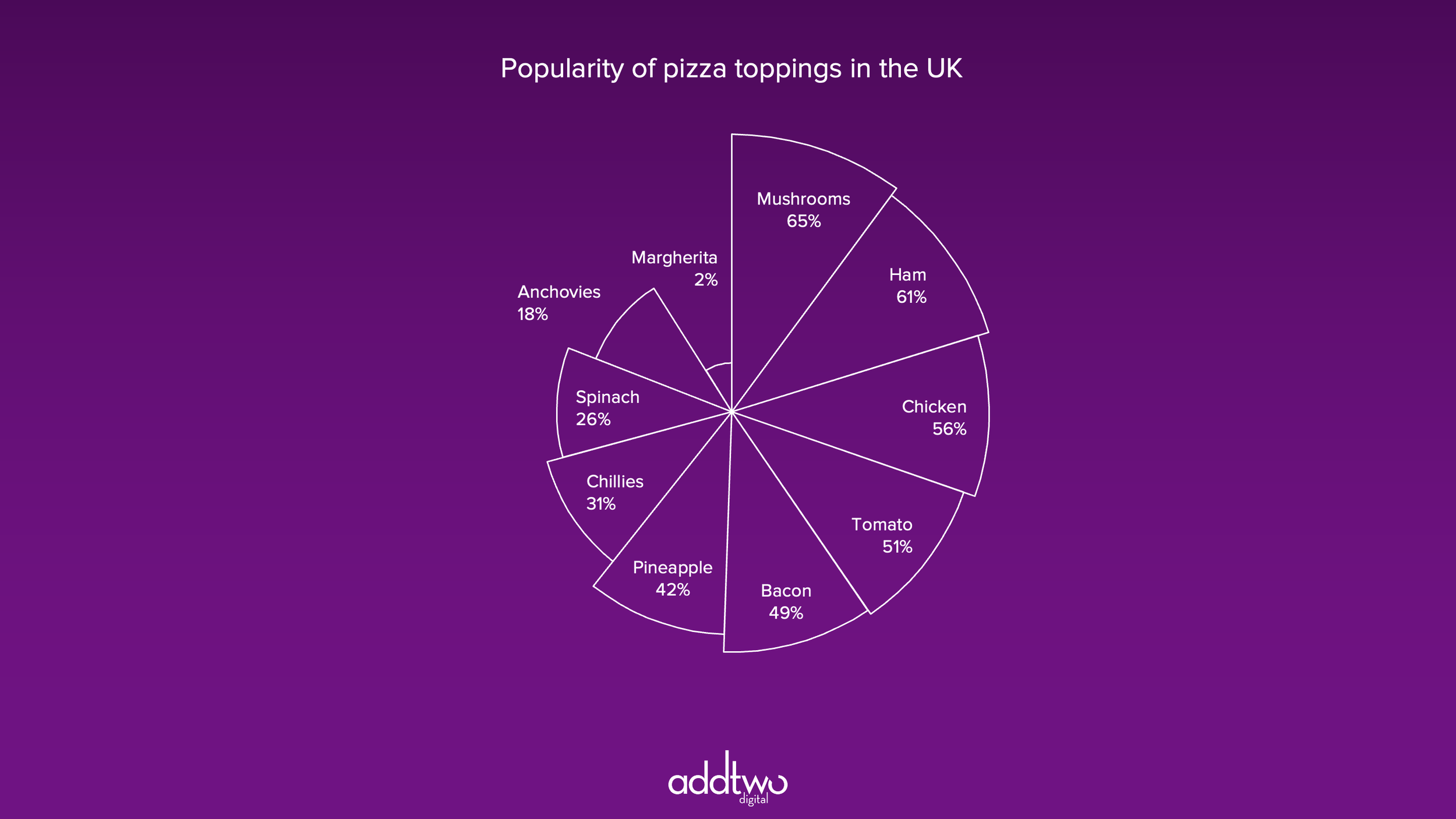
A variation on the Nightingale-Rose — the chart that changed health, warfare and history. Developed by Florence Nightingale for her report to Parliament about deaths from disease in military hospitals during the Crimean War, the Polar Area is a dramatic alternative to a bar chart.

The Polar Area shows the data by sizing equally angled portions of a circle by area to create a kind of fan. It is extremely eye-catching and effective, at least partially because it is hard to make. Which makes being able to create one in PowerPoint an extraordinary treat.

[This tutorial assumes you’re reasonably au fait with PowerPoint and how it makes charts. If you feel you need a more indepth introduction, click here to find out more about the basics of the PowerPoint charting engine]

So, how do we make this in PowerPoint?

In this how-to, we’ll be using the default sample data PowerPoint gives you, so you can follow along without needing to download anything, but if you want to, click here for the dataset we used to make the example at the top, and a PowerPoint deck with that slide in.

What you’ll need

  • A Filled Radar chart

  • Data manipulation

  • Design tweaks

  • Custom labelling

How you do it

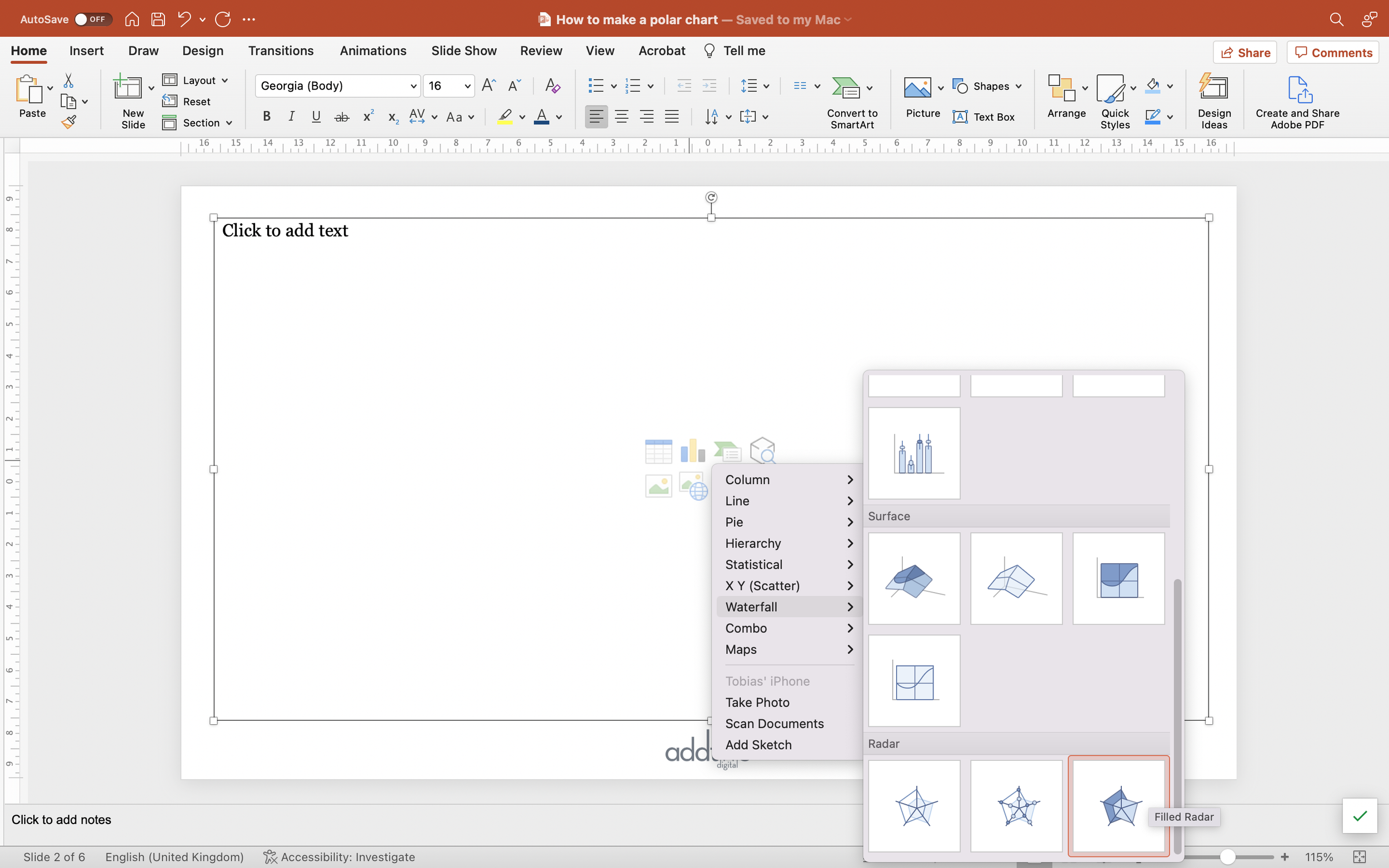
To make a Polar Area, we’re going to use a Filled Radar chart as a way of drawing with numbers. By repeating the same value in a Filled Radar we can effectively get it to draw curves. By using separate data series we can divide those curves up into segments. This, however, means that we have to calculate our values as areas not as the raw data, because otherwise the Radar would be sizing the segments by radius, which would be deceptive.

The details

Insert the chart

We’re going to start by inserting a Filled Radar chart. They’re buried away under the ‘Waterfall’ group of charts in the PowerPoint insert chart menu, right at the bottom, which is where they should be. Filled Radar charts are one of the most misused charts in the library, largely because they shouldn’t be used at all. Ghastly things.

However, they do give us a tool with which to draw shapes using data, which is going to turn out to be useful.

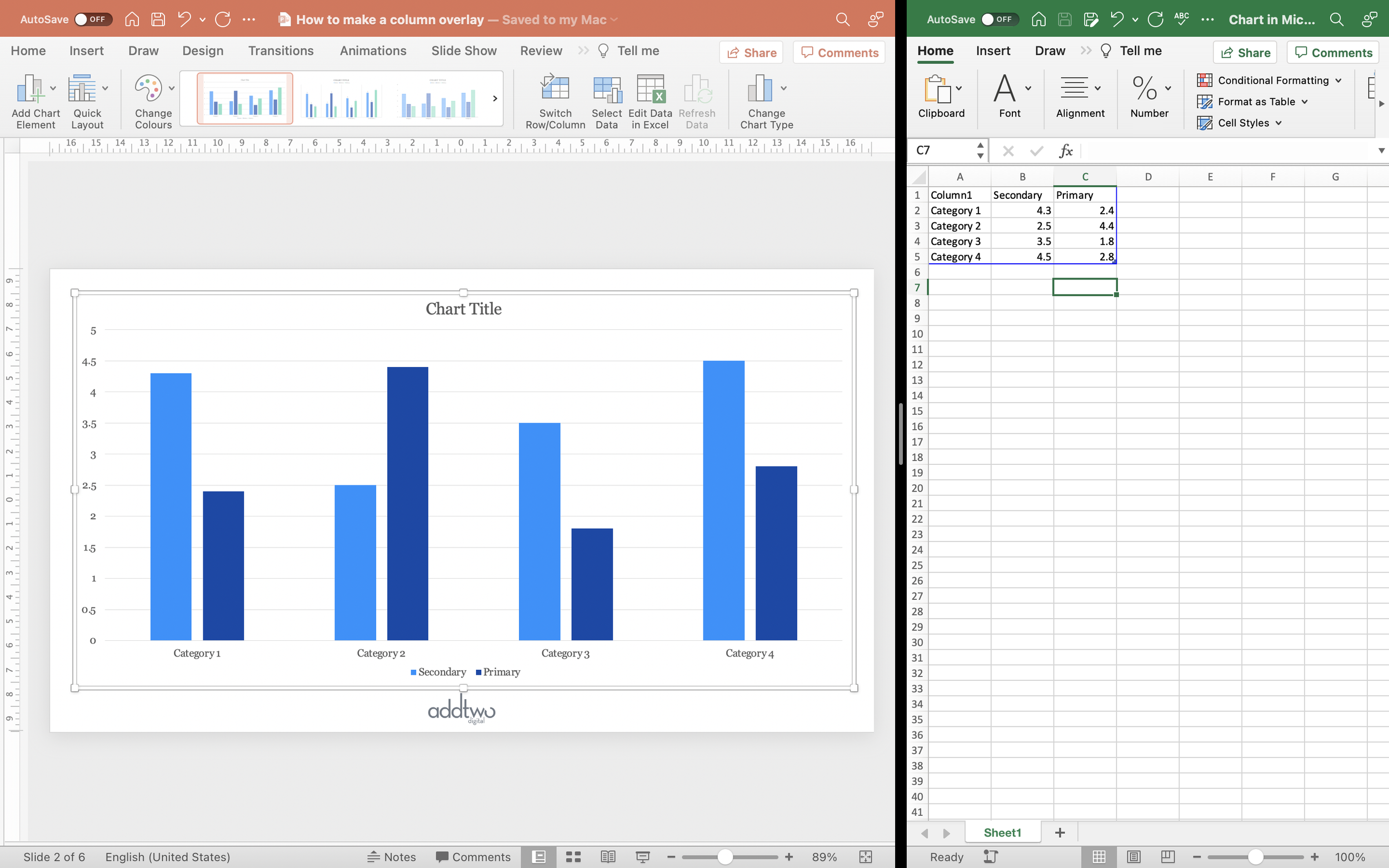
As ever PowerPoint creates us a default chart and opens a spreadsheet to show us the data behind that chart.

In order to make a Polar Area, we’re going to have to do a lot of data manipulation.

Arrange the data

As usual in these examples, we’re going to use the default data to make our chart. We’re just going to use the first column of values, although we’re going to change them a lot in the process.

First we’re going to convert the axis column from dates into numbers. This isn’t absolutely necessary, but it is going to help us keep track of what we’re doing with the data.

The Cell Format is, by default, set to Date (select the cells, right click and choose ‘Format Cells’ and you should see the cell format options). Change that to General and the dates should all change to five digit numbers. Don’t worry about why (it’s a long story).

We’re going to swap them out for just integers: 1, 2, 3, 4, etc.

You should now have five rows of data, numbered 1–5. Now insert 11 blank rows between the first data point and the second. You can do this by either selecting the Row 3 in the spreadsheet, right-clicking and selecting ‘Insert Row Above’ eleven times, or by selecting Rows 3–6 and simply pulling them down to create new blank rows.

Make sure the blue frame that designates which cells are being visualised updates to show these changes.

Now select the first data point and copy it down into the new rows (you can do this by simply grabbing the little square that appears in the bottom right corner of the selection and pulling it down). You can do the same thing with the ‘1’ in Column 1.

What you should now see in the chart is a rough polygon with a weird last quarter, where all the other values are.

Now move all the other values over one column (Column C in the spreadsheet) to create a new data series. Move them up one row so that the last row of the first column and the first row of the new column overlap.

Now do the same thing — add in 11 empty columns under that new first data point in the second column.

Then drag down the data point to copy it to all those new rows.

Now we have a polygon with more sides and two colours (where PowerPoint is automatically colouring the data series differently).

And repeat: move the remaining data points over one column, overlap the data by one row, insert 9 blank rows and copy the data point down.

Now we have a polygon with even more sides and three colours.

Repeat for all the data points. Each data point in a separate column, repeated 12 times, slightly overlapping the data series before, by one row.

On that last point: to make sure everything is neat, only repeat the last data point 11 times, and take the twelfth repetition and move it back up to the very first row, so that the first data series now overlaps with it.

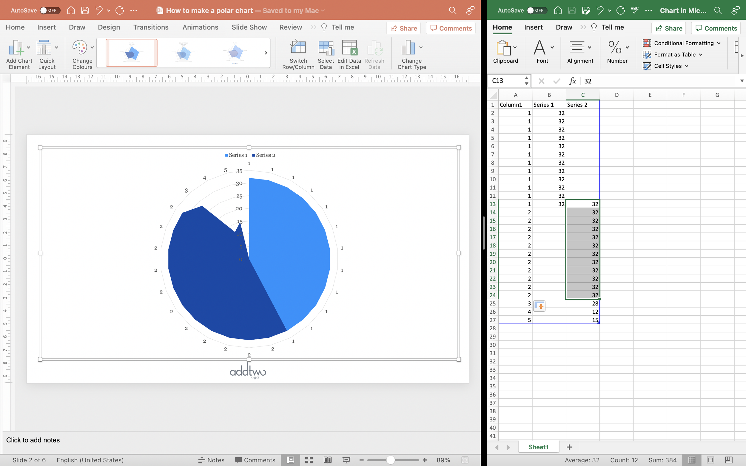
What you should now see is a polygon with so many sides it appears, basically, circular. This is why we’ve copied each data point 12 times — as it draws a Filled Radar chart with 60 data points, PowerPoint effectively ends up drawing a circle divided up into equal segments.

Edit the data

So we have our data arranged into segments, but, because we’re using the actual figures and because a Filled Radar chart is drawn along an axis spreading out from the centre, each of those segments is sized by radius, not area.

This is bad. In our example, look at the yellow ‘12’ segment compared to the green ‘28’. It should look just slightly under half the size. It instead looks much smaller. To represent the values correctly, we need to size them by area.

We could do this by square rooting and dividing by π (area of a circle is πr2, remember), but since we’re only really interested in the accurate proportion rather than the value (we’re going to be labelling by hand anyway, not drawing the labels from the spreadsheet, we can just square root everything.

We can do this with an Excel formula: “=sqrt(#value)”.

Apply this to all the data points and now the 12 looks a lot more like half the 28.

We can now finally close the spreadsheet and edit the chart itself.

Edit the chart

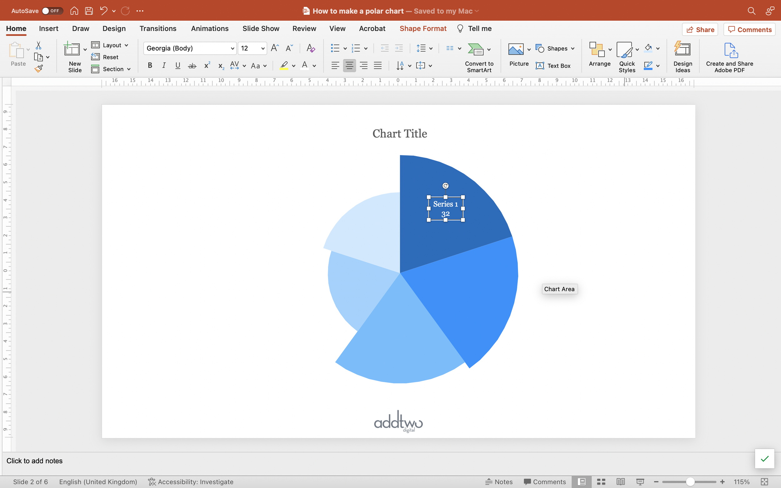
Basically, since we’re manipulating the chart with all kinds of jiggery pokery with the data, none of the chart attributes like axes and gridlines are useful. We can delete them all.

The legend can still work, but generally it’s better to label the chart segments directly anyway. We might want to hang on to the chart title, at least.

Colour the segments

Because we’ve entered the data as separate series, PowerPoint will colour them all differently by default. If we wanted to change those colours we can do it easily by just selecting a segment and using the Shape Fill menu to pick a colour, just as we would with any shape.

Add the labels

Because we’re torturing a Radar chart and because we’re having to use values in the spreadsheet to do that that aren’t our actual data points, the easiest way to label the chart is by hand.

Just add a Text Box to the slide (Insert/Text Box) and type in the label. If there’s room it’s often neater to place the label over the segment (make sure the text colour is effectively contrasted with the segment colour), otherwise position outside but next to the relevant segment.

Obviously you can style the text how you like.

So that’s how we make that in PowerPoint

Making a Polar Area in PowerPoint is a complex business, and not entirely successful — those shapes are still not perfect segments of a circle, the outline is still somewhat jaggy.

On the other hand, they are extraordinarily effective charts, giving us a really striking alternative to bar charts (which is what they work best at).

A couple of further notes. They work best when ordered by value — from large to small or small to large — and some audiences can mistake them for pie charts and get confused at first. They’re best used with care, basically.

But then that’s true of all data visualisations, really.

Tags powerpoint, charts, how to, tutorial, data visualisation

Overlaid columns

March 27, 2023

Overlaid columns are a great alternative to clustered bars. Overlaying columns is a useful way of comparing one main data series to a secondary one — an average, previous time period, contextual comparison etc.

They allow us to foreground one data set over another, making them easier to read than clustered columns and helping us show the information hierarchy clearly: one data set before another.

[This tutorial assumes you’re reasonably au fait with PowerPoint and how it makes charts. If you feel you need a more indepth introduction, click here to find out more about the basics of the PowerPoint charting engine]

So, how do we make this in PowerPoint?

In this how-to, we’ll be using the default sample data PowerPoint gives you, so you can follow along without needing to download anything, but if you want to, click here for the dataset we used to make the example at the top, and a PowerPoint deck with that slide in.

What you’ll need

  • Clustered column chart

  • Custom shape fills

  • Chart setting adjustments

How you do it

Short version: we’re going to make a standard clustered columns with two data series, then use a custom fill to make the key column narrower than the comparison. This means we can overlay the columns using the Series Overlap settings and so set one column in front of the other while keeping both visible.

The details

Create the chart

We’re going to insert a standard column chart. PowerPoint creates clustered columns by default, which is fine, because that’s what we want.

We only want two data series, though, so we’ll adjust the spreadsheet so there’s only two columns of data.

The one thing we want to make sure is that the key data — the series we want to highlight — is the final column in the spreadsheet. PowerPoint orders the layering of chart elements by placement in the spreadsheet — the last column of data will be on top. For this chart to work, we’re going to want the key data to be on top of the secondary series.

We can close the spreadsheet now as we’re not going to be doing any more with that data.

Style the columns

Now we’re going to give the main column a custom fill so we can overlay it and still have the column behind visible.

Add a square shape to the slide. Make sure it’s properly square by setting the width and height in the Shape Format tools. 6cm x 6cm allows us to divide by halves and thirds easily, so that’s something.

Set the Fill colour of the square to ‘No Fill’. This makes the Fill transparent. You can leave the border on for the time being though — it makes things easier to find.

Duplicate the square.

Set the duplicate to be of a narrower width than the square. Half width is a good start.

Give this new rectangle a fill colour that will stand out against the other column in the chart.

Now select both the rectangle and the square (shift-click will allow you to select them both) and centre the rectangle against the square both vertically and horizontally.

With them both selected set their outlines to No Outline. This will make the square entirely transparent, but still there as a notional shape, with the rectangle as a filled strip down the middle of it.

Now copy them both (Ctrl-C with them both selected will work).

TIP

To be able to see what you’re doing, try moving the shapes off the edge of the slide.

The shapes will still be there but they’ll be out of the way of your chart and they won’t show up in present mode.

(The slide works like an artboard in Illustrator, if you’re used to such things)

/TIP

Now select the main data series in the chart.

You now either open the Format Pane or right-click and select Format Data Series. Either way you want to open the Format Data Series tools and find the Fill options in the panel.

Select Picture or Texture Fill and for Picture Source select Clipboard. This will paste in as a Fill in all of the columns the combined square and rectangle we just copied.

Make sure that the Picture options are set to Stretch (PowerPoint should do this by default).

You can see, hopefully, that this gives columns that are transparent at the sides with a filled strip up the middle — a thinner column, effectively.

Overlay the columns

Now we’re going to overlay this thinner column on top of the full width one.

In the Format Data Series pane, got to the Series Options tab (it has a little chart as an icon).

Set the Series Overlap to 100%. This puts the main data set over the top of the secondary one, because we ensured that it was the last column in the spreadsheet, and so ‘at the front’ in the layer order.

We might want to make the secondary data series a little lighter, just to make sure it isn’t overwhelming our main column.

Style the chart

Let’s tidy up a bit.

We can put the legend at the top, so it’s nice and obvious.

For this chart, since we don’t have many columns, we could label them directly.

Select the main data series and then, under Chart Design > Add Chart Element, select Data Labels to be Inside End.

Set the label colour to be appropriately contrasting against the column fill.

Do the same for the secondary data set.

Some labels we’re going to have to edit individually, because of the overlay , which might mean they’re going to end up against different coloured background with the overlay, or be uncomfortably close together.

You can select a single label by selecting the whole set of labels (clicking any of them will do that) and then clicking on the individual label you want to edit.

With the labels we probably don’t need a y-axis or gridlines, so we can delete them. You can just select them and hit delete or use the Add Chart Element tools to Remove Chart Elements, too.

I’m also going to remove the x-axis line because I don’t think we need that with column charts either. We can see where the axis is perfectly well. You can do this by finding the Format Axis tools (right click on the axis to see the option) and just selecting ‘No Line’ in the Fill & Line options.

As ever the secret is a useful chart is as much removing what is unnecessary as it is showing what is necessary.

So that’s how we make that in PowerPoint

Overlaid columns are far more legible and clear than clustered bars when it comes to that act of comparison, but they still contain a density of information that means they have to be used with restraint.

Obviously they only work with two data series and those data series aren’t presented equally — one is of a different quality to the other — so we need to be definite about information hierarchy and what’s most important in our data set.

We also need to be careful with the amount of other visual elements: labels, axes, etc and keep the visuals as simple and direct as possible.

But then, that’s what we’re always doing, isn’t it?

ISN’T IT?

Tags powerpoint, charts, how to, tutorial

How do I make a chart in PowerPoint?

January 3, 2023

A introduction to the fundamentals of the PowerPoint charting engine

Read More
In Powerpoint Tags powerpoint, charts, data viz, data visualisation

99 RULES OF DATA VIZ

POWERPOINT TUTORIALS

Latest Posts

Featured
Feb 26, 2024
RULE 41: Avoid area charts?
Feb 26, 2024
Feb 26, 2024
Sep 14, 2023
Rule 40: No 3D line charts
Sep 14, 2023
Sep 14, 2023
Sep 11, 2023
Rule 39: Label all the datapoints on your x-axis
Sep 11, 2023
Sep 11, 2023
Sep 1, 2023
Rule 38: No unnecessary lines on line charts
Sep 1, 2023
Sep 1, 2023
Jul 12, 2023
Rule 37: Line charts should have a key
Jul 12, 2023
Jul 12, 2023
Mar 31, 2023
Rule 36: Lines should not be too thin or too thick
Mar 31, 2023
Mar 31, 2023
Jan 6, 2023
Rule 35: Add data markers to your lines
Jan 6, 2023
Jan 6, 2023
Oct 3, 2022
Rule 34: Always start a line chart at zero
Oct 3, 2022
Oct 3, 2022
Jul 12, 2022
Rule 33: Each line should contain as much data as possible
Jul 12, 2022
Jul 12, 2022
Jun 10, 2022
Rule 32: Every line should be a different colour
Jun 10, 2022
Jun 10, 2022

AddTwoDigital | info@addtwodigital.com | @addtwodigital