
In this blog series, we look at 99 common data viz rules and why it’s usually OK to break them.
by Adam Frost
Another set of rules about pie charts relates to how many wedges it is sensible to show. Lisa Charlotte Rost, who writes superbly about charting for Datawrapper, discourages the use of pie charts if you only have two values (a percentage and the remainder). She also says the upper limit for wedges should be ‘four max’. Robert Kosara doesn’t set a lower limit, but he does set an upper limit at ‘10 or so slices’. Other advice varies, but the consensus seems to be between three and six slices. That said, I wouldn’t be surprised to read ‘always use more than three and fewer than four slices’ because it sometimes feels like these rules are designed to discourage anyone from ever using a pie chart in the first place.
Let’s start with the lower limit. It’s true that sometimes a pie chart with two values can look like overkill. It’s particularly absurd when the values are 25%, 50% or 75% - because nobody needs help picturing those. When it’s an especially small or large percentage, it can sometimes help the story to put the number in a pie, even though it often feels more like an illustration than a chart.


Sometimes we switch to waffle, dot matrix or isotype charts in these circumstances, which can help to bring out the story’s human element.


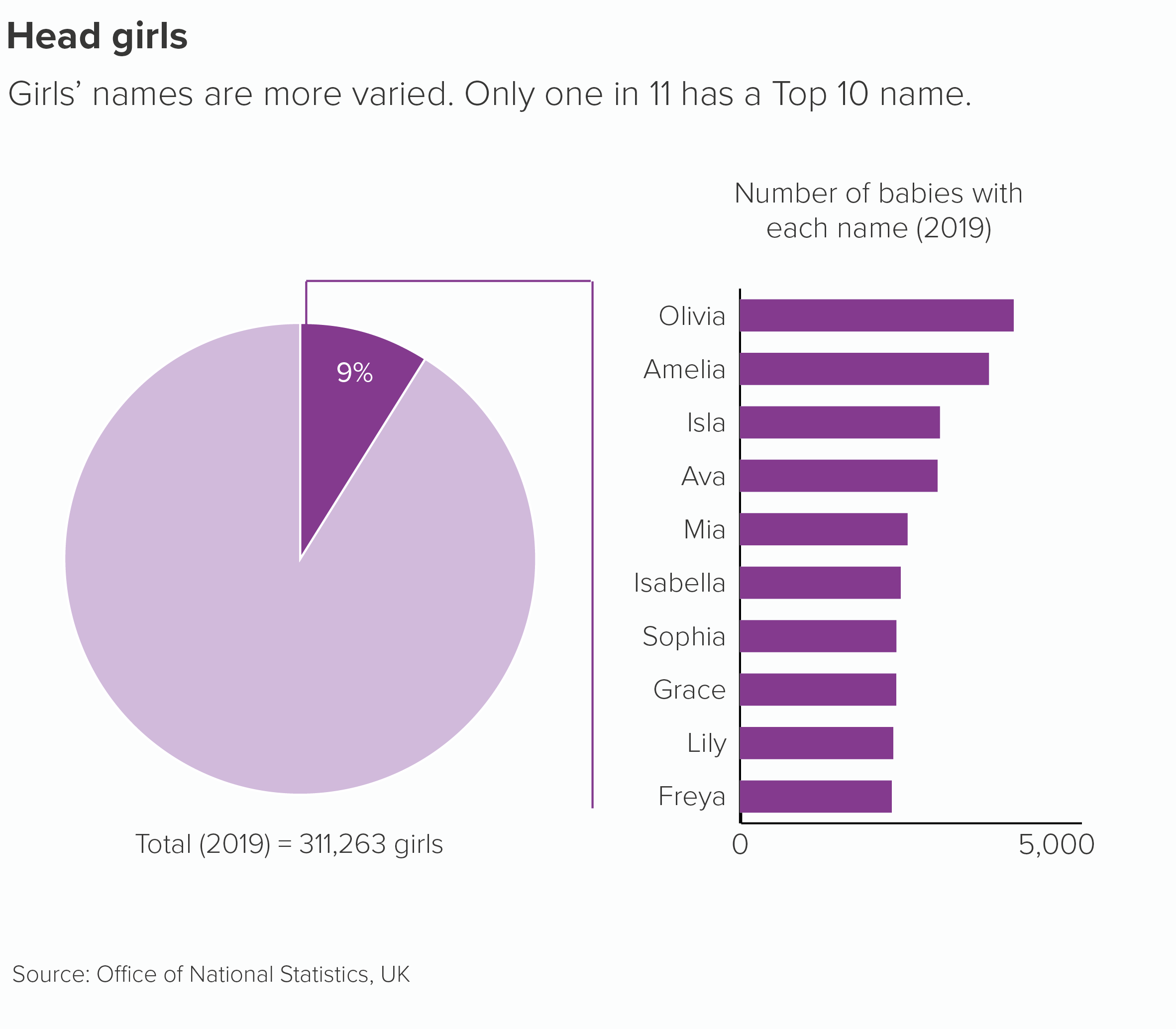
More generally, we use two-value pies when they are being combined with other charts.
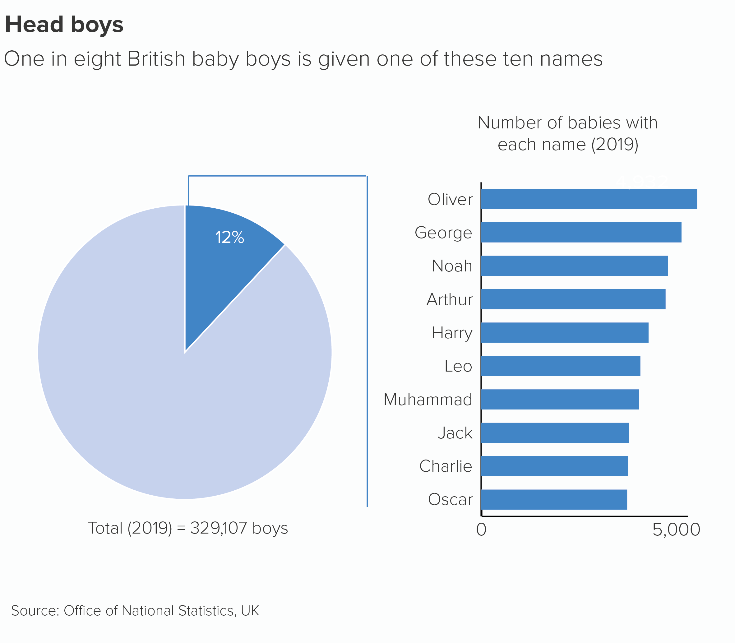
So is there a lower limit? Well, we have been known to create one-value pies, on the rare occasions when the story justifies it. During the creation of an infographic series on Jane Austen, we wanted to make the point that most of the men in her novels didn’t have jobs, and the women (of course) weren’t even permitted to have them.

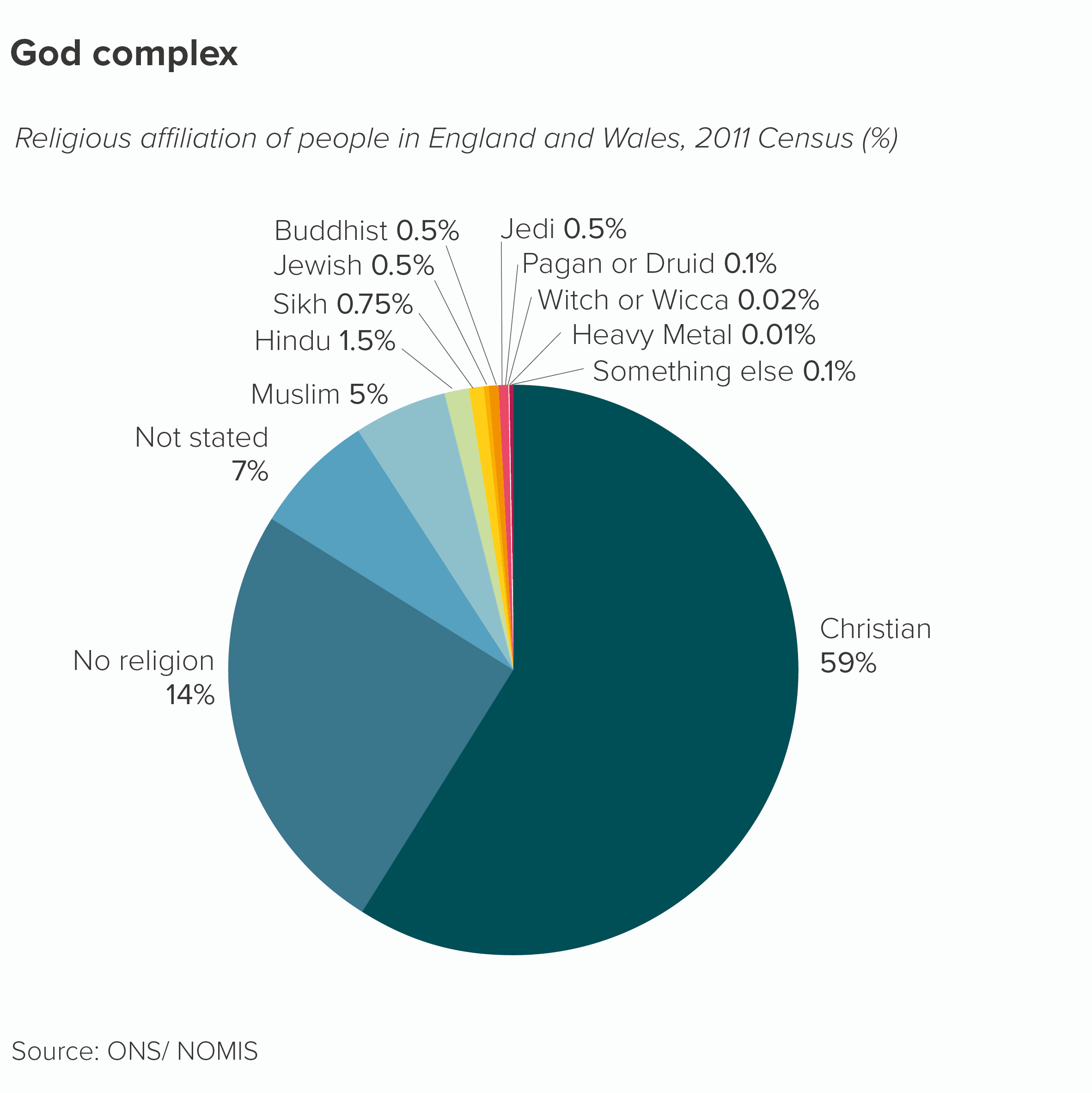
Now the upper limit. A pie is definitely not a load-bearing chart. When it starts to look crowded, it’s a good idea to bundle the smaller values together into an ‘Other’ wedge.
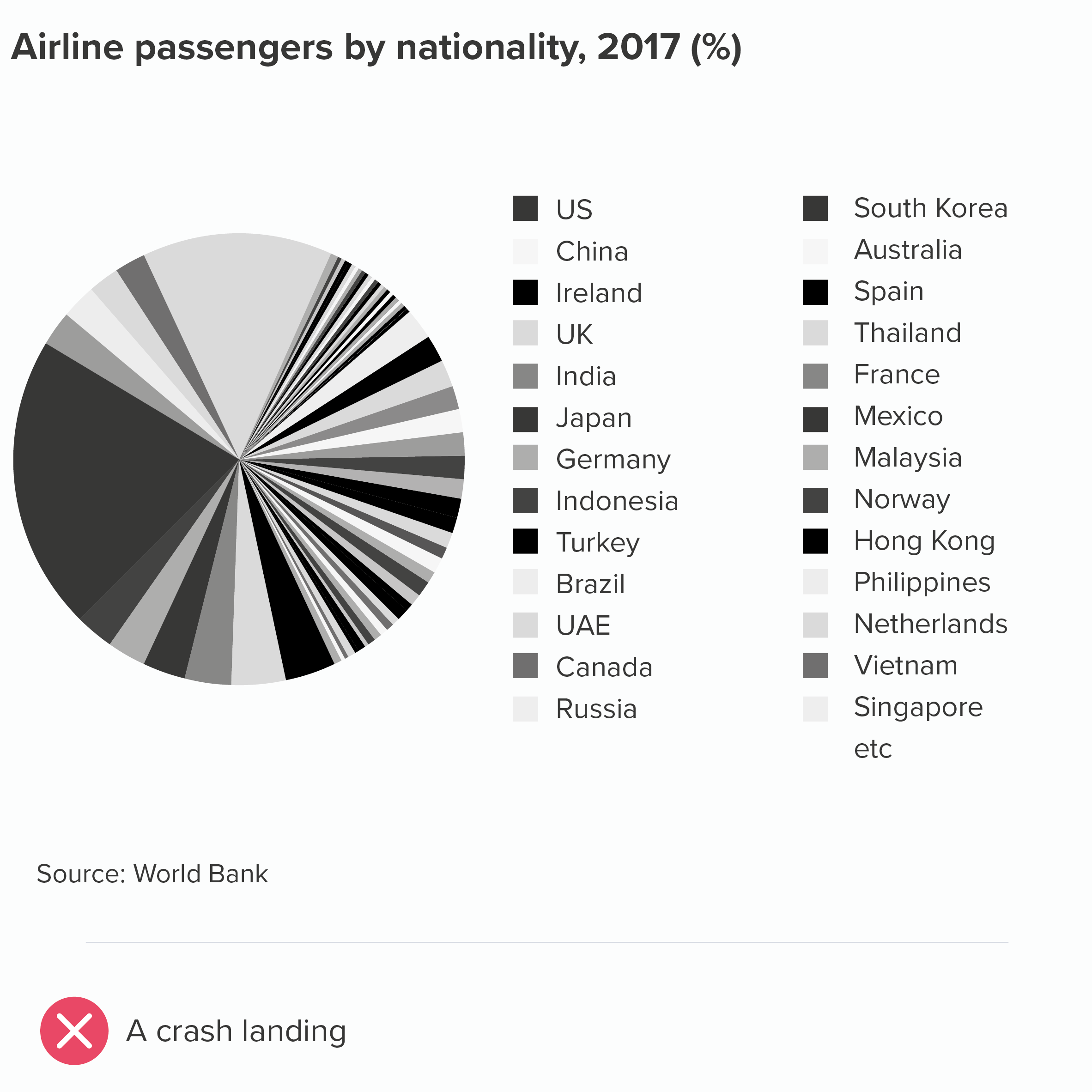

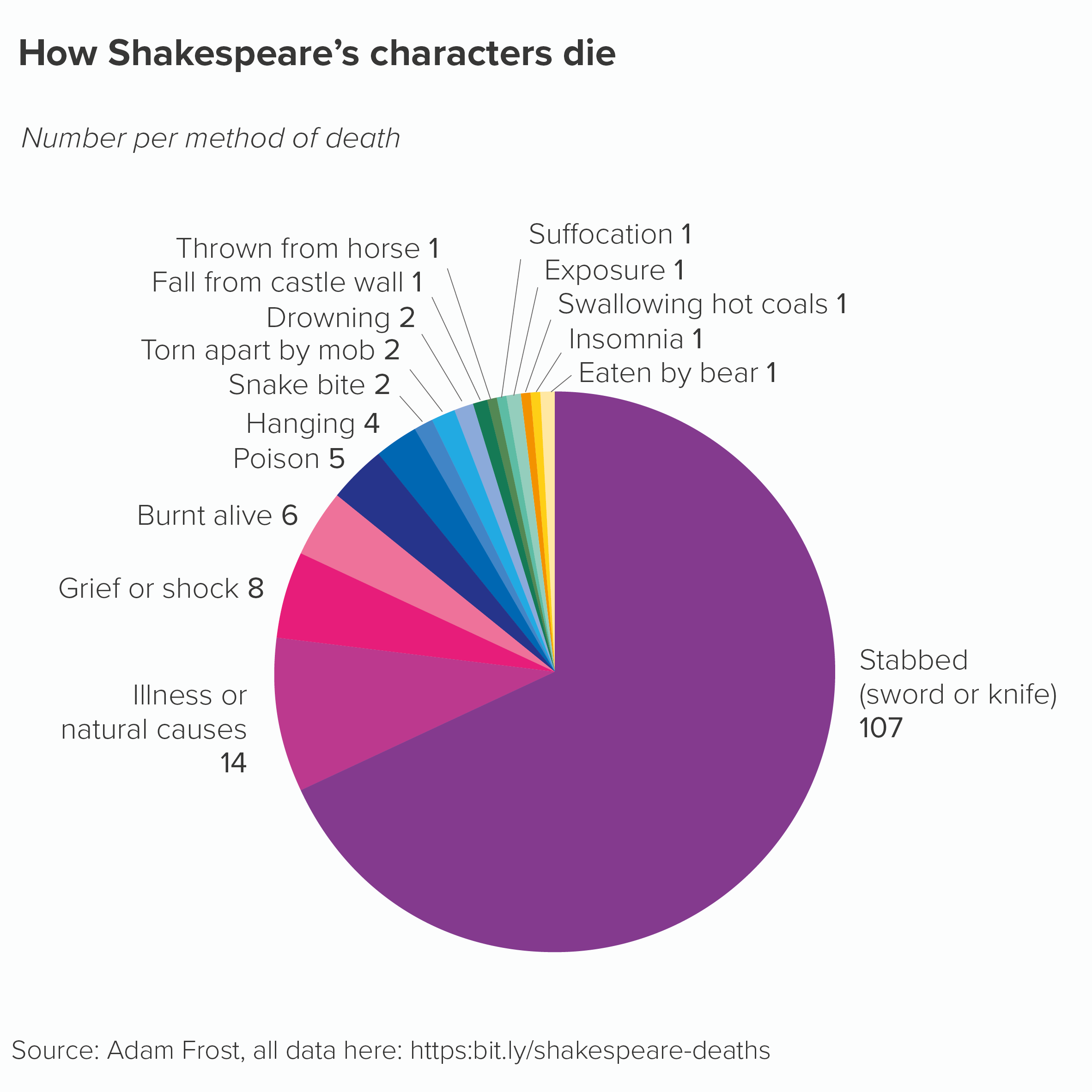
But it’s hard to specify a breaking point and sometimes there are a set number of categories (e.g. you sell nine flavours of ice cream) that you just have to show. And occasionally, you might want to tell a story of overwhelming diversity, or one where the smallest wedges are also interesting. In those cases, creating a pie that is deliberately overstuffed might be the best way of conveying a sense of the data’s ‘infinite variety’.
VERDICT: Follow this rule some of the time.
Sources: Bill Gates and Covid data from Yougov, Democrats and marijuana data from Gallup; baby names data from 2019 from the ONS UK; airline passengers data from the World Bank, Shakespeare data from Adam Frost, Religion in England and Wales data from ONS/Nomis.
More data viz advice and best practice examples in our book- Communicating with Data Visualisation: A Practical Guide