
All the rules so far - on one page
by Adam Frost
We are a digital agency based in the UK, and for the last decade or so, we have been giving data visualisation seminars at the Guardian in London, and for various charities and companies. These seminars aim to teach people how to communicate more effectively with charts, maps, illustrations and, last but not least, words.
The 99 rules project came about because our students often ask us for a checklist of rules that they can work through every time they create a visualisation. When this happens, we tend to point out of the window, shout: ‘Look! It’s David McCandless!’ and run away.
Because we don’t really have an answer. You need to have an interesting story to tell but, outside of that, we can’t really lay down the law because we break it so often ourselves. If you are communicating with an audience, you have to tailor what you are saying and how you are saying it to that audience’s interests and level of prior knowledge. If your audience loves word clouds or radar charts, and the chart suits your story, then that’s what you should use - however much you might privately dislike them.
But hang on - there are good word clouds and bad word clouds, right? So surely there are some rules? Maybe, but pinning them down is difficult.
The problem is: when you analyse data, your approach ought to be a scientific one. You are using statistical and visual tools that help you to see the data as objectively as possible. Defining rules for data analysis is therefore more feasible, as William Cleveland, Naomi Robbins and others have demonstrated. There is a hypothesis that can be tested: chart a is more accurate than chart b, chart x is better at representing change over time than chart y - and so on.
But we are not talking about data analysis. We are talking about what happens when you stop analysing and tell other people what you have found. You switch from being Sherlock Holmes to being Doctor Watson. Completely different tools and techniques are required when you are communicating your findings. You need the ability to edit, write, lay things out, choose colours, create icons and illustrations. You also need empathy, the ability to think like your audience, so you can convince them that you are worth listening to.
This is more of an art than a science, and coming up with rules for art is close to impossible. You can sit down and learn statistical methods or how to program with D3, but you can’t be taught how to paint a masterpiece or write a Number One song. ‘If I knew where the good songs came from, I’d go there more often’, as Leonard Cohen put it.
It is much harder to formalise what art is, how to make it, and why some works of art are better than others. Of course, there are some very general principles. A novel should have a protagonist you care about - except in Richard III, Lolita and a thousand other exceptions. A play or film should have a three-act structure: set-up, conflict, resolution - unless you’re Beckett writing Waiting for Godot or David Lynch directing Mulholland Drive. This is the problem: the best artists have a way of subverting the rules, or inventing new rules to reflect the age in which they live.
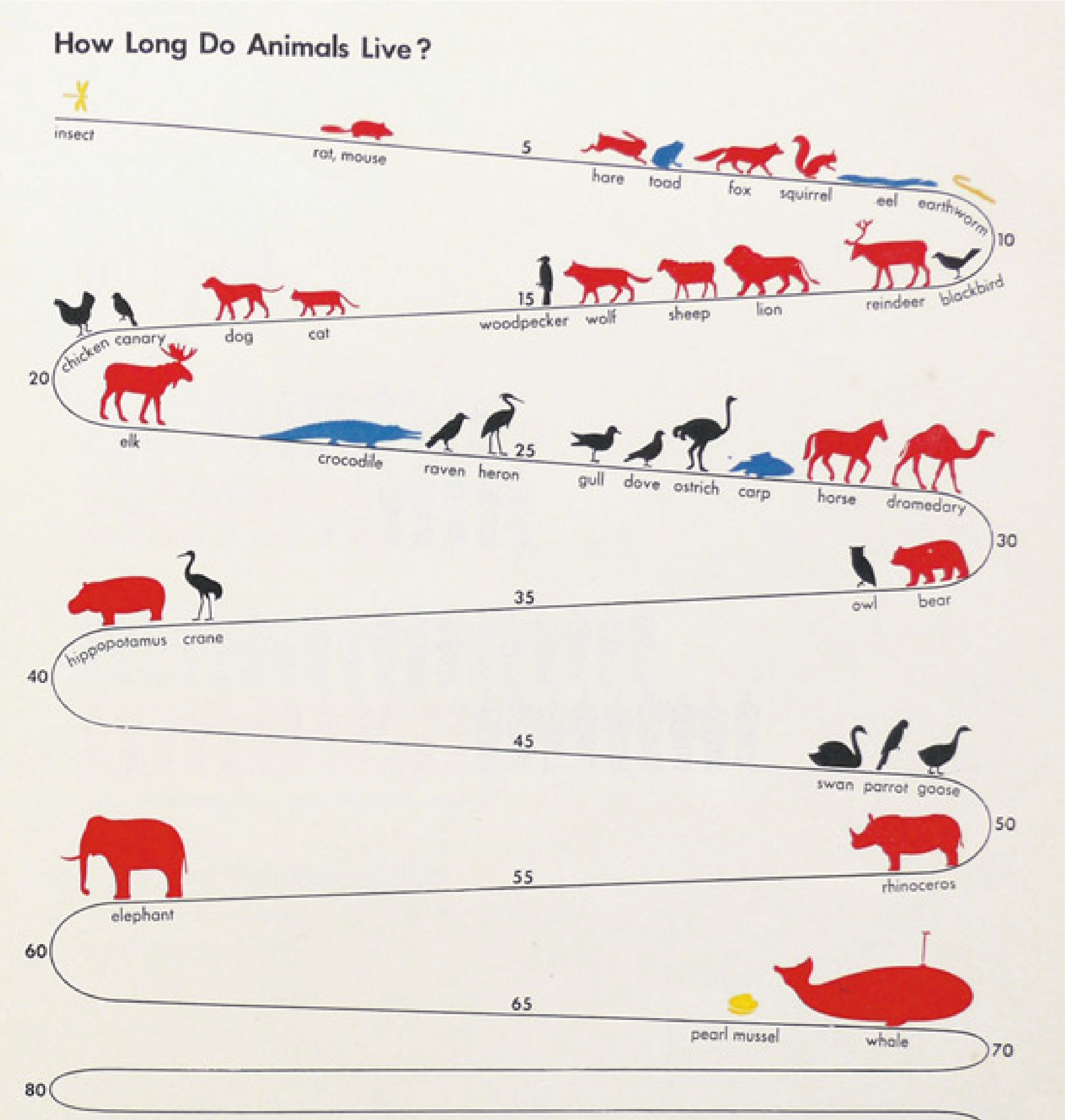
The best data visualisation practitioners are no different. If Florence Nightingale had stuck to pre-existing rules, she would never have invented the polar area chart. She understood the importance of visual innovation, particularly when trying to help an audience process new information: the fact that disease was killing more soldiers in wartime than the enemy. Likewise, Otto and Marie Neurath created the modern practice of iconography in response to the fact that governments in the 1920s and 1930s had more and more data but seemed less and less willing to make it understandable to the general population.
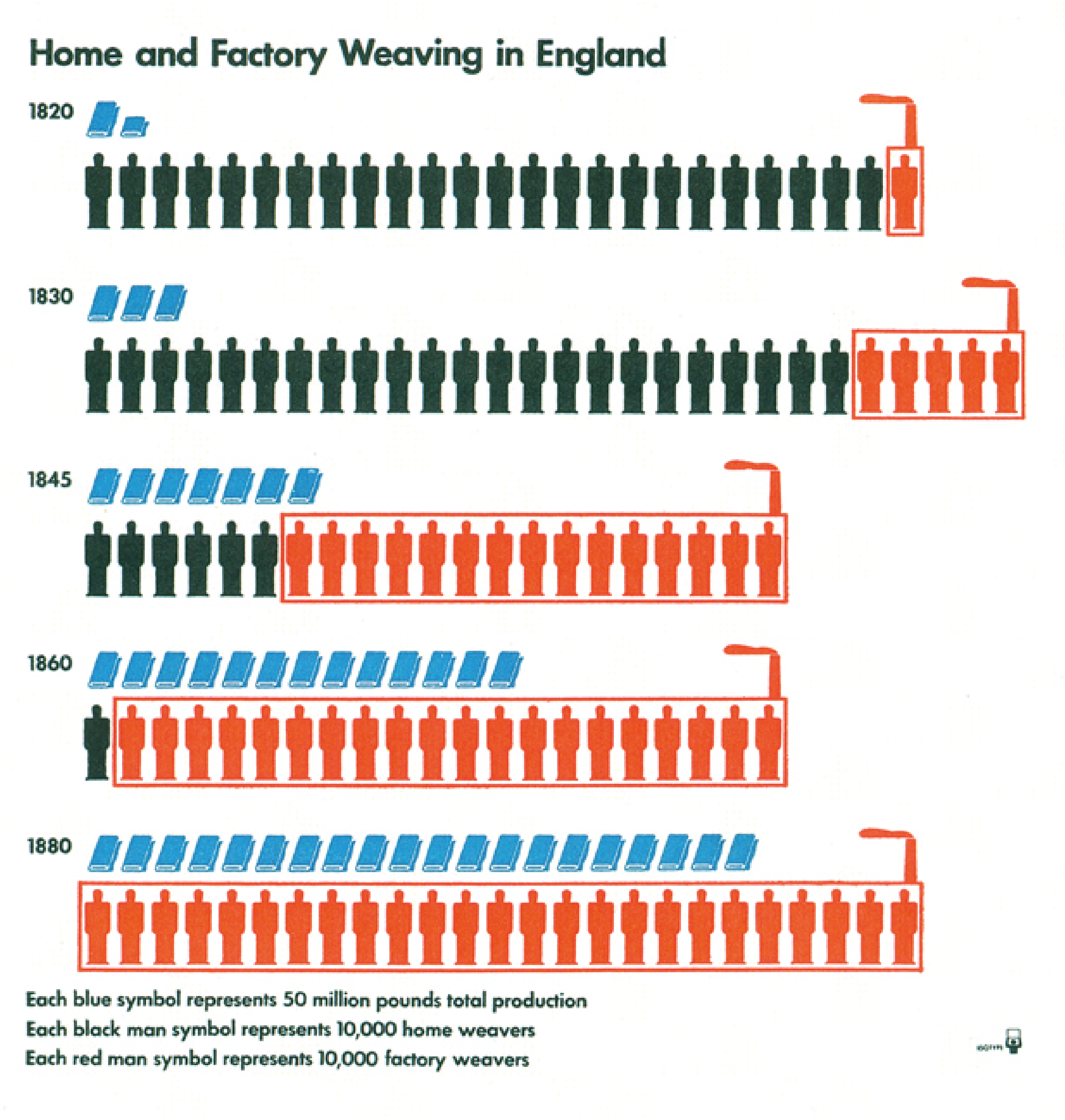
Graphics created by the isotype movement, featured in The Transformer by Marie Neurath and Robin Kinross
It continues today, with David McCandless taking a treemap, ignoring its hierarchical structure, and creating his billion-dollar-a-gram or Valentina D’Efilippo turning a multi-dimensional scatter chart into a poppy field to commemorate the millions who have lost their lives in warfare. Journalists at the Guardian, New York Times, Reuters, South China Morning Post and elsewhere have created new kinds of visual storytelling to reflect new technology and the changing needs of their audience - most recently, by figuring out how charting and mapping needs to adapt to work on mobile screens.
Of course, these designers draw on conventions and traditions. Each chart is still recognisable as a chart; it is not a virgin birth, divorced from the past; otherwise, readers would not know what they were looking at. But this balance between convention and novelty, tradition and originality is clearly detectable whenever a data story is successful: not too conventional (which is boring), and not too original (which is confusing), but somewhere in between, so that an audience is both reassured (I understand this) and challenged (I’ve never thought about it like that!). If you’re particularly skilled, your audience will reach a state of ‘moderate transient stress’ or immersion - to quote Robert Sapolsky - which is where we are all happiest.
Which brings us back to where we started. Since a fresh perspective is often a key part of data visualisation, it is hard to prescribe rules, because rules can limit innovation. Furthermore, what is innovative for one audience is distracting for another, so even if you could define rules on where and how to innovate, they would be too context-dependent to be useful. Instead, the best approach is to be aware of good models and general design principles, but to always be mindful of where your story needs to break the rules or break new ground to be emotionally effective.
So are we right? That’s what we want to test in the coming months. We’re going to sense check every data viz rule we can find and see if it holds up under pressure. Our hypothesis is that even the most sensible-sounding rule (‘Don’t use Comic Sans’, ‘Never use a marimekko chart’) has important exceptions. When the task is to communicate with an audience, the ‘wrong answer’ might be exactly what’s required to surprise or intrigue them.
We’d love your help with this. Are there data viz rules that you think should always be slavishly adhered to - no matter what? Get in touch or contact us on social media, and we’ll add it to the list. Or perhaps there are rules that you think are absurd. We’ll try to show that, in some cases, they aren’t.
At the very least, we should end up with a useful catalogue of received wisdom. After all, it doesn’t hurt to know what the conventions are, even if you end up working more instinctively. It’s hard to innovate unless you know what’s already been tried.
We’ll kick off with the most rule-bound chart category of all: the pie chart. It turns out that people have extremely strong opinions about the humble pie, including its right to even exist. Which is less of a rule and more a dictatorial edict. Let’s see if we can’t stage a rescue mission and show that the pie chart is not just worth saving, but celebrating.
All the rules so far - on one big shiny page
Individual rules:
Rule 1: Pie charts should never be used
Rule 2: Avoid pies when your values are similar
Rule 3: Not too many pie slices, not too few
Rule 4: A pie chart should add up to 100%
Rule 5: Start a pie chart at 12 o’clock and go clockwise
Rule 6: Arrange your pie slices from largest to smallest
Rule 7: No exploding pies
Rule 8: Limit the number of colours in your pie chart
Rule 9: Give your pie chart a key (or legend)
Rule 10: No multiple pies
Rule 11: Don’t chain or nest pies
Rule 12: No 3D pies
Rule 13: Don’t decorate pies
Rule 14: No proportionately-sized pies
Rule 15: Don’t use doughnut charts
Rules 1-15: Pie charts - a visual summary
Rule 16: If in doubt, use a bar chart
Rule 17: Not too many bars
Rule 18: No multi-coloured bars
Rule 19: Arrange your bars largest to smallest
Rule 20: Keep a sensible gap between the bars
Rule 21: Bar charts need a key
Rule 22: No rounded, pointed or decorated bars
Rule 23: No 3D bars
Rule 24: Label your bars and axes
Rule 25: Always start your bar charts at zero
Rule 26: Don’t use broken axes and bars
Rule 27: No unnecessary lines on bar charts
Rules 16-27: Bar charts - a visual summary
Rule 28: Use a clustered column to show multiple series
Rule 29: ‘Use log scales for many kinds of variables’
Rule 30: A line chart should only show change over time
Rule 31: Line charts shouldn’t have too many lines
Rule 32: Every line should be a different colour
Rule 33: Each line should contain as much data as possible
Rule 34: A line chart y-axis should start at zero
Rule 35: All data markers to your lines
Rule 36: Lines should not be too thin or too thick
Rule 37: Line charts should have a key
Rule 38: No unnecessary lines on line charts
Rule 39: Label all the datapoints on your x-axis
Rule 40: No 3D line charts
Rule 41: Avoid area charts?
More data viz advice and best practice examples in our book- Communicating with Data Visualisation: A Practical Guide