
In this blog series, we look at 99 common data viz rules and why it’s usually OK to break them.
by Adam Frost
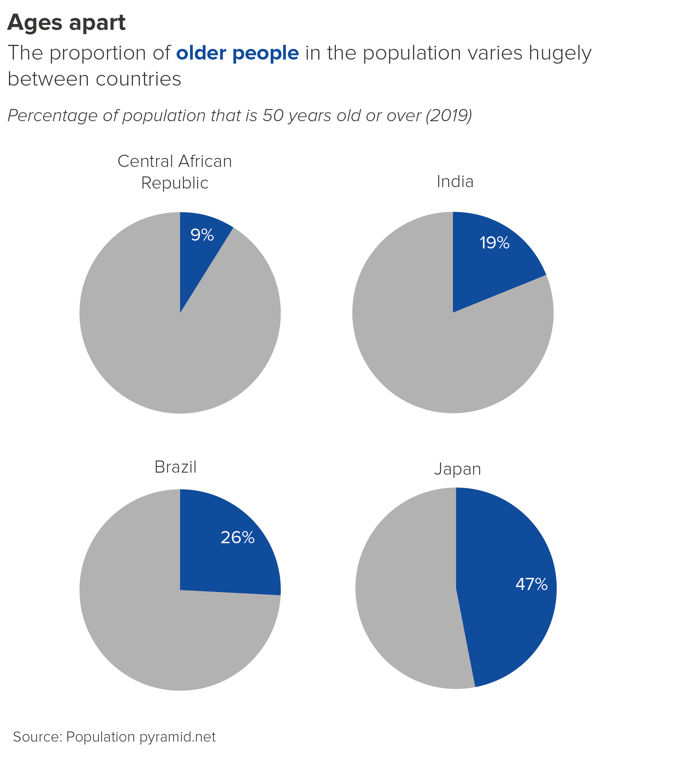
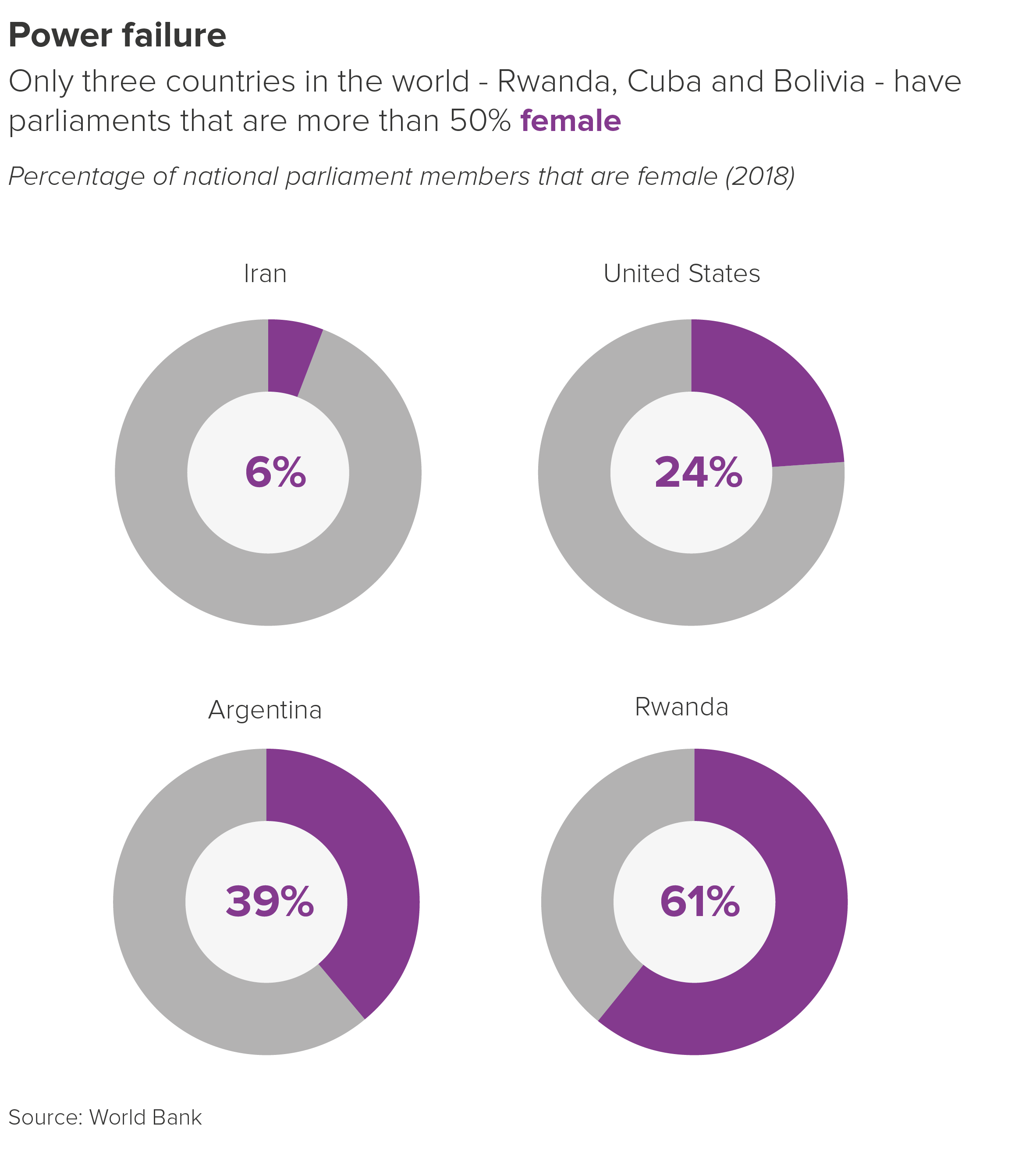
In the previous rule, I attempted to justify the use of multiple pie charts. If you’ve got three or four datapoints that you want to spotlight, then side-by-side pies - large eye-catching circles that push everything else out of their path - can be a great option.
However, these side-by-side pies work best when you are comparing single numbers, or the same wedge(s) in different pies.
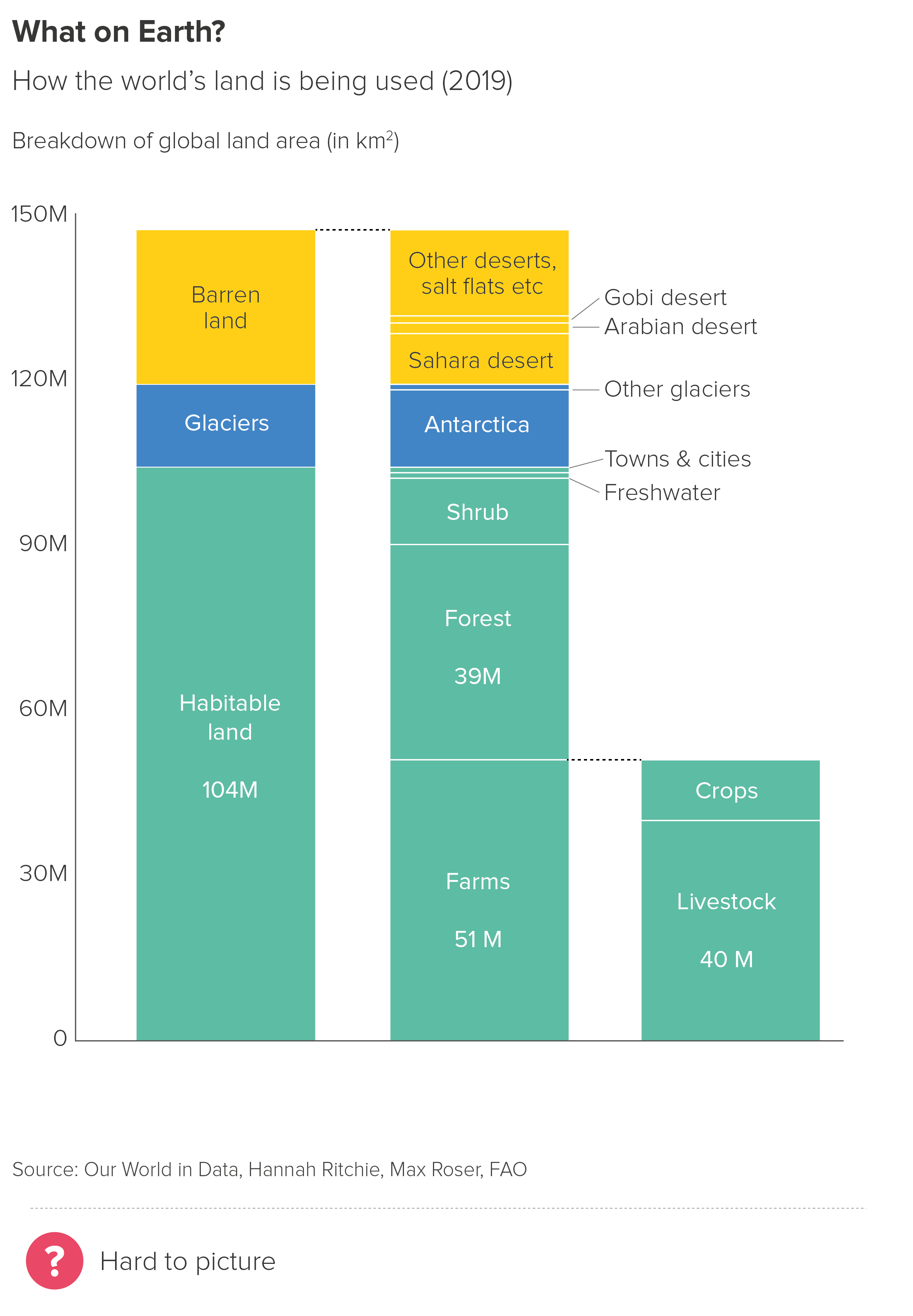
What I wouldn’t endorse is linking those pies together, to show a compositional hierarchy, or how one wedge can be further segmented.
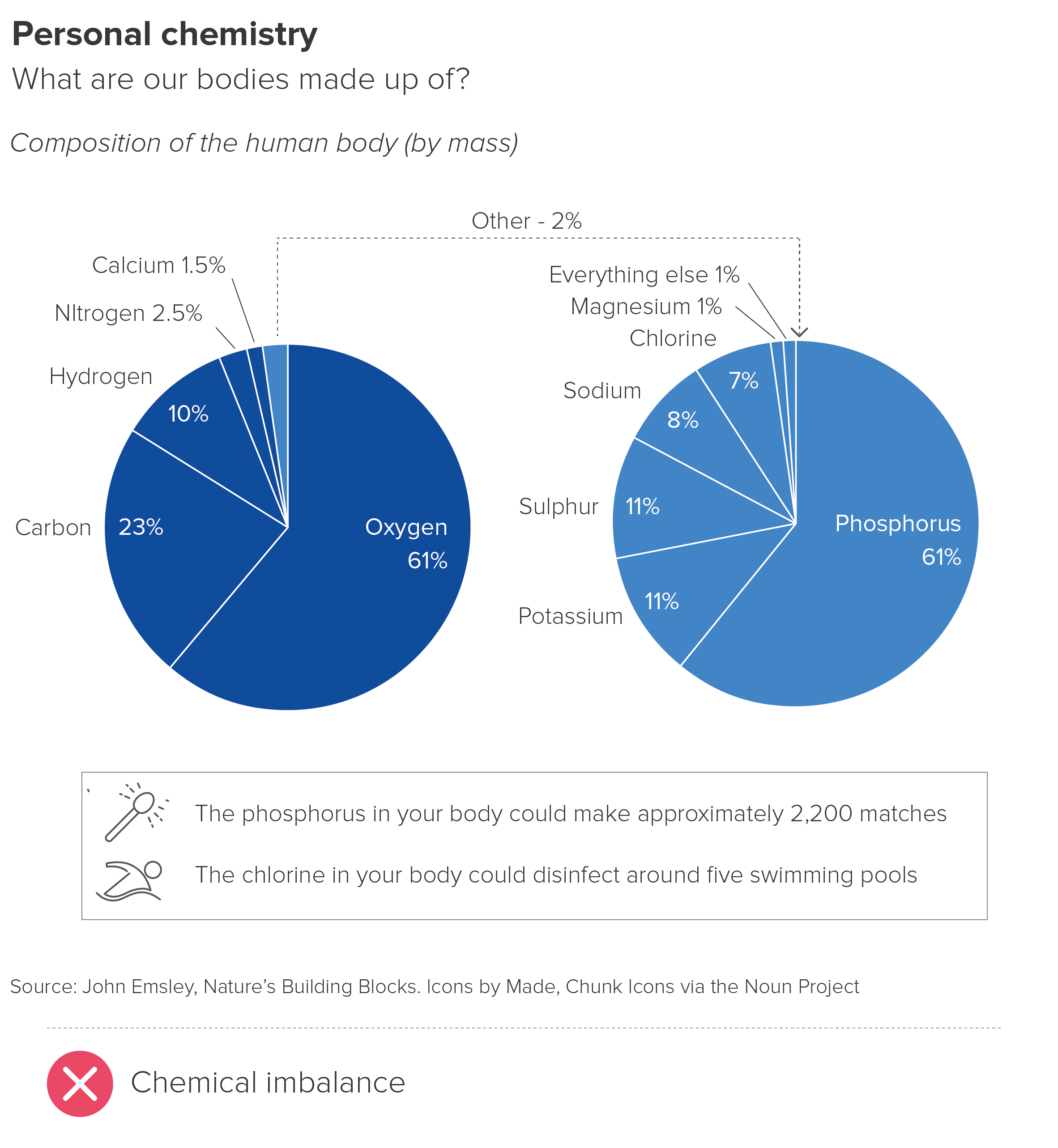
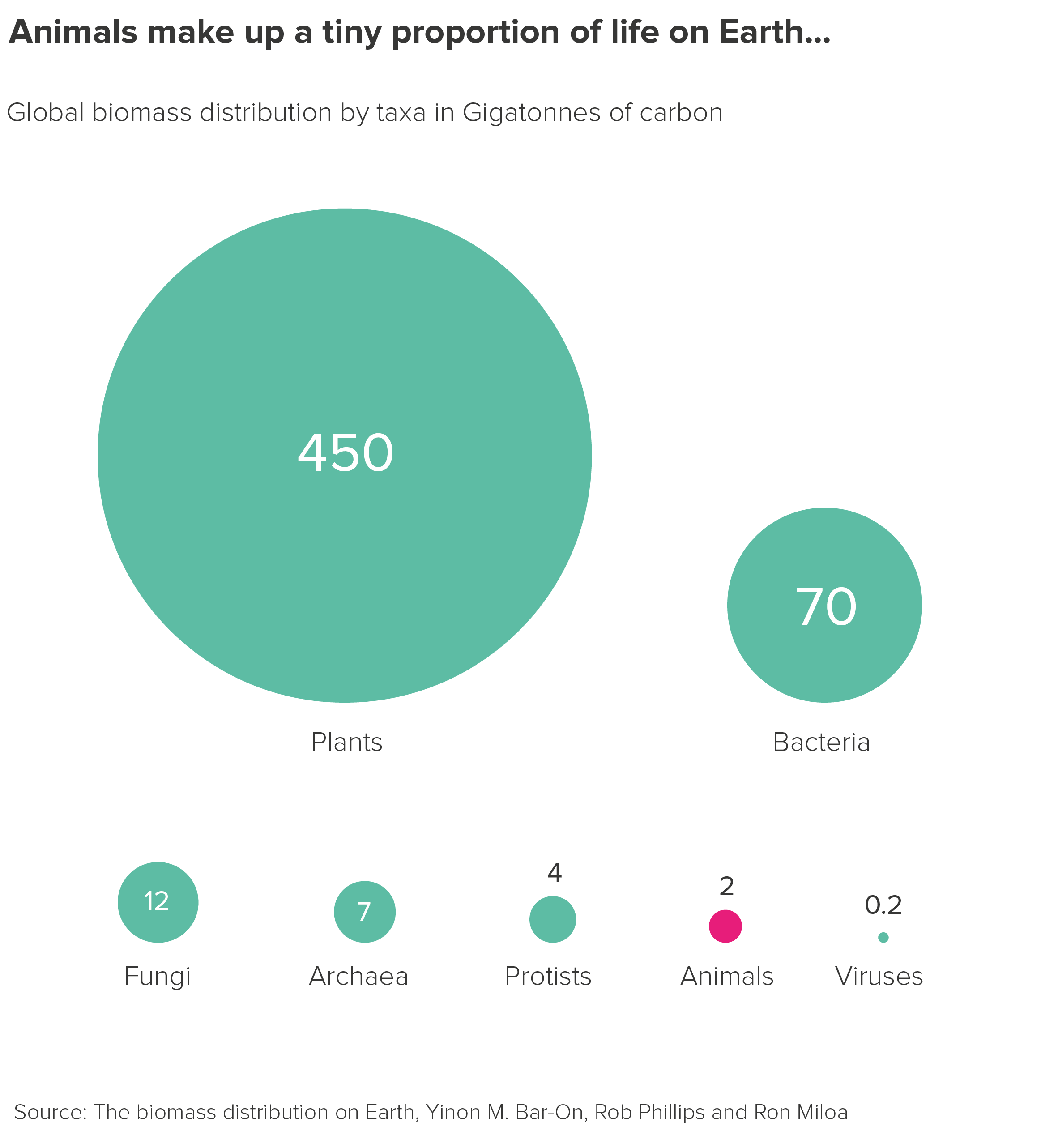
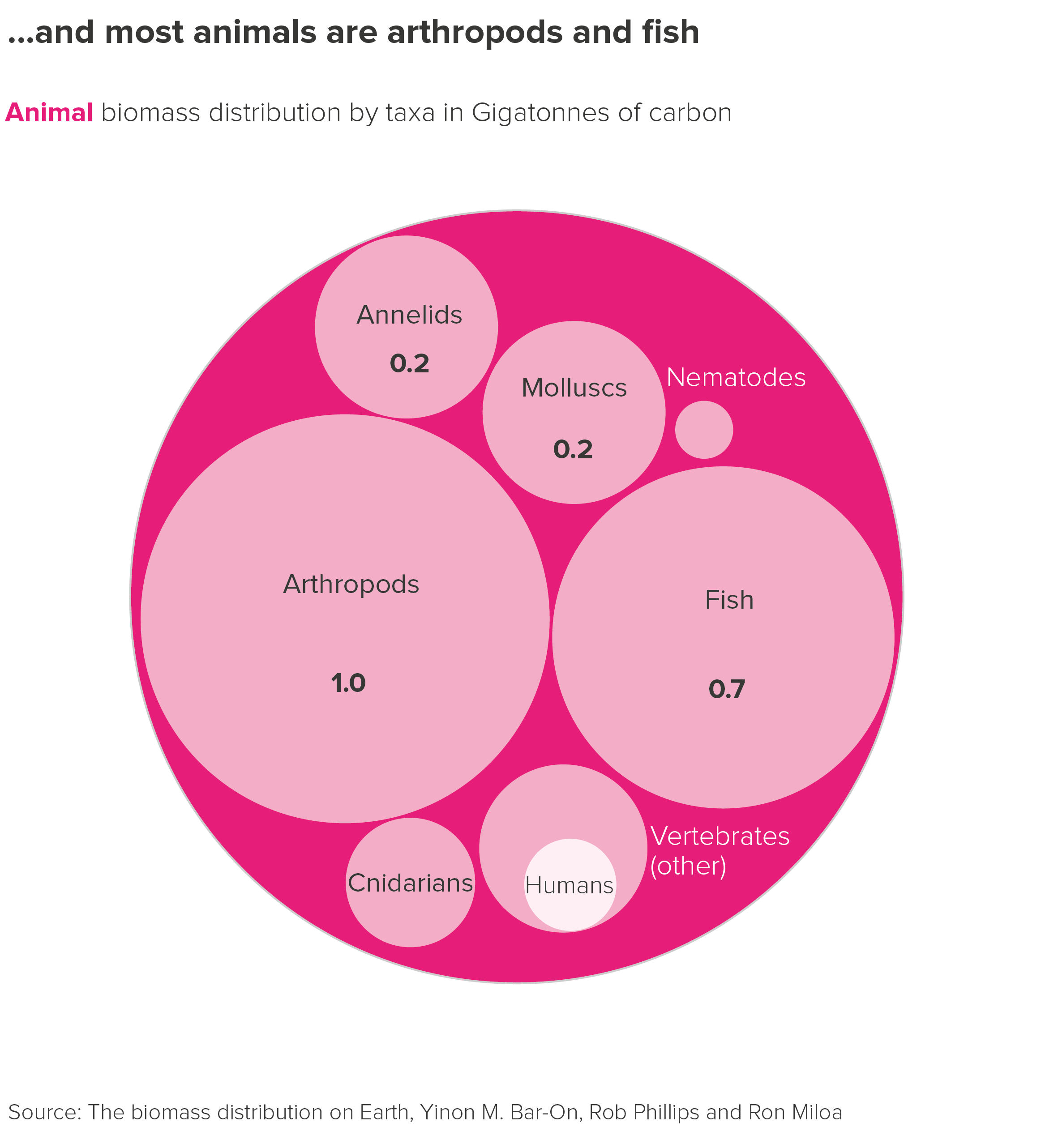
The pies in the first chart are confusing as you’re asking your audience to grasp that those two identically-sized circles mean very different things - different total amounts and different positions within an information hierarchy.* You’re also asking your audience to work out some pretty complex maths - the second pie is 2% of the larger pie, so phosphorus is 61% of that 2% and so on.
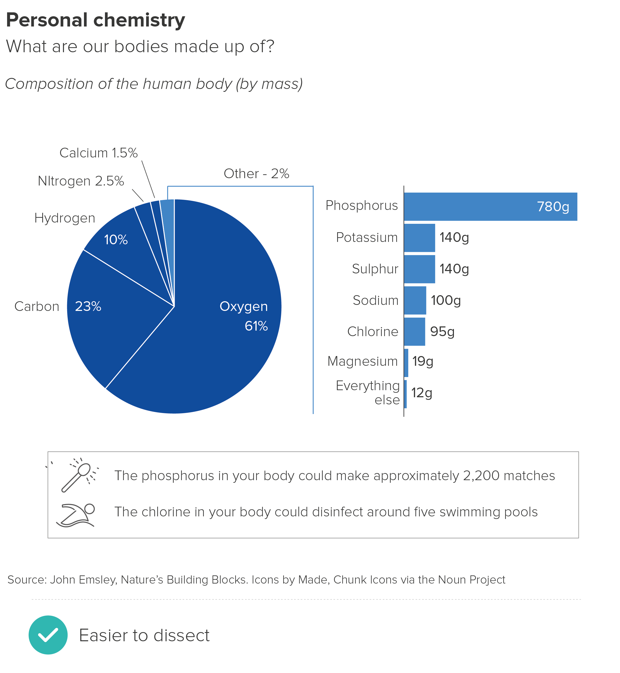
If you do need to show a detailed breakdown, then the pie-to-bar shown in the second chart works better, as the shift in chart type clearly signals a shift in information type. Stacked bars are often deployed, although I find regular bars to be clearer in most cases. It can also be helpful to change the unit of measurement in the bar chart, as it further emphasises the fact that the bars are doing a different job (here I’ve shifted from percentage to grams).
It’s still not perfect though. Whenever you drill down into a chart like this, you have to add crude linking lines or arrows or textual annotations to explain the relationship between the two visuals.
If what you’re trying to do is guide your audience from an overview of all your data to a detailed look at one category, then dispensing with pies and considering other chart types is more sensible. It’s also a good idea to break the charts into separate steps rather than merge two or more parts of your story in one composite visual. (See the discussion of cognitive load in Rule 10 for why).
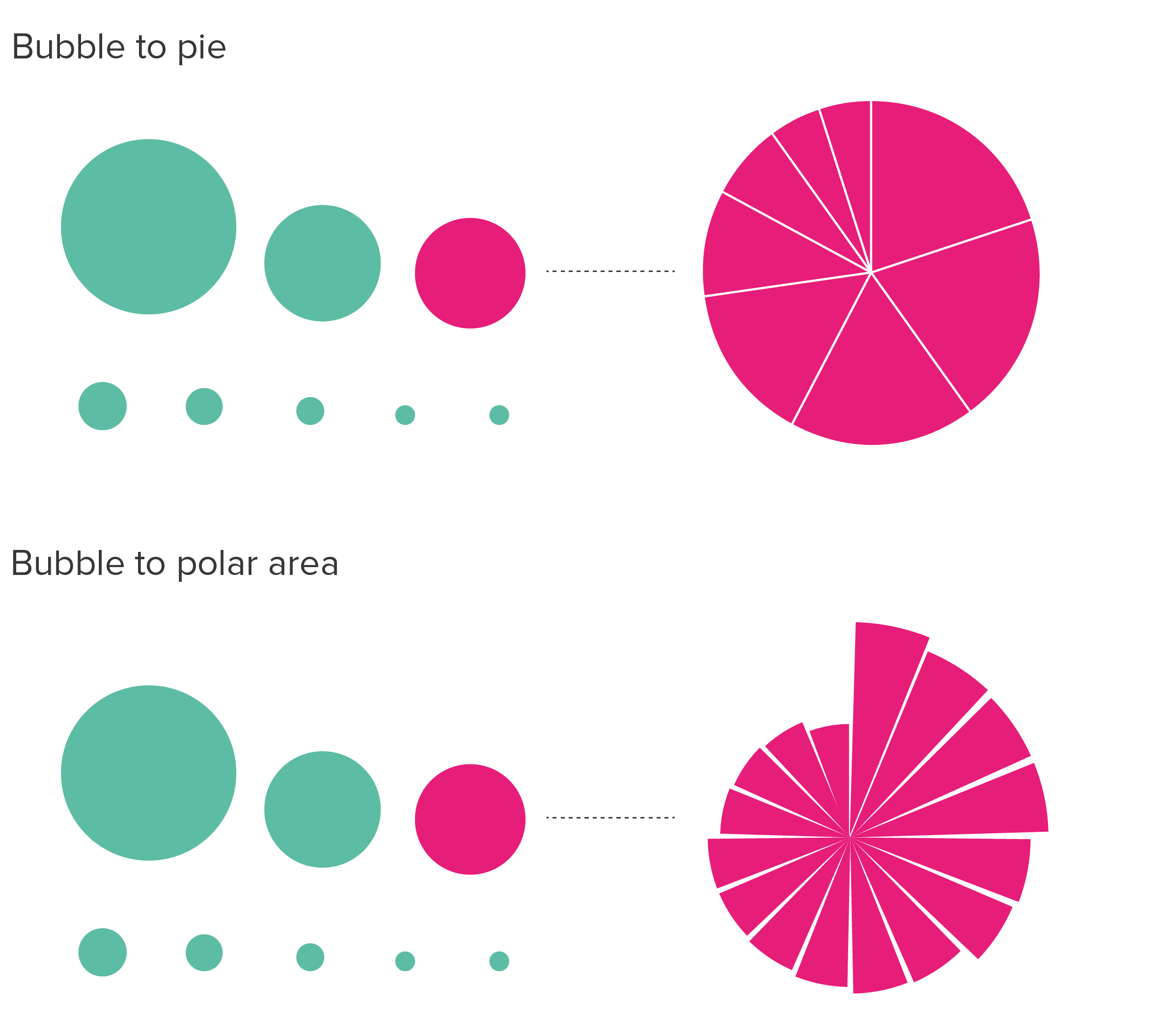
For example, bubbles to circle packing gives you a much clearer sense of the through line from overview to composition to single datapoint. It feels like you are starting with a shape representing the total and then zooming in and X-raying it.
The only issue with circle packing is accuracy. The circles at the same level in the data hierarchy will be accurately-sized in relation to each other, but the enclosing circle won’t be (because of the inevitable gaps).
I’ve used bubble to circle packing as an example here, but you can use other shapes to tell stories like this, as long as the overarching visual through line is maintained.
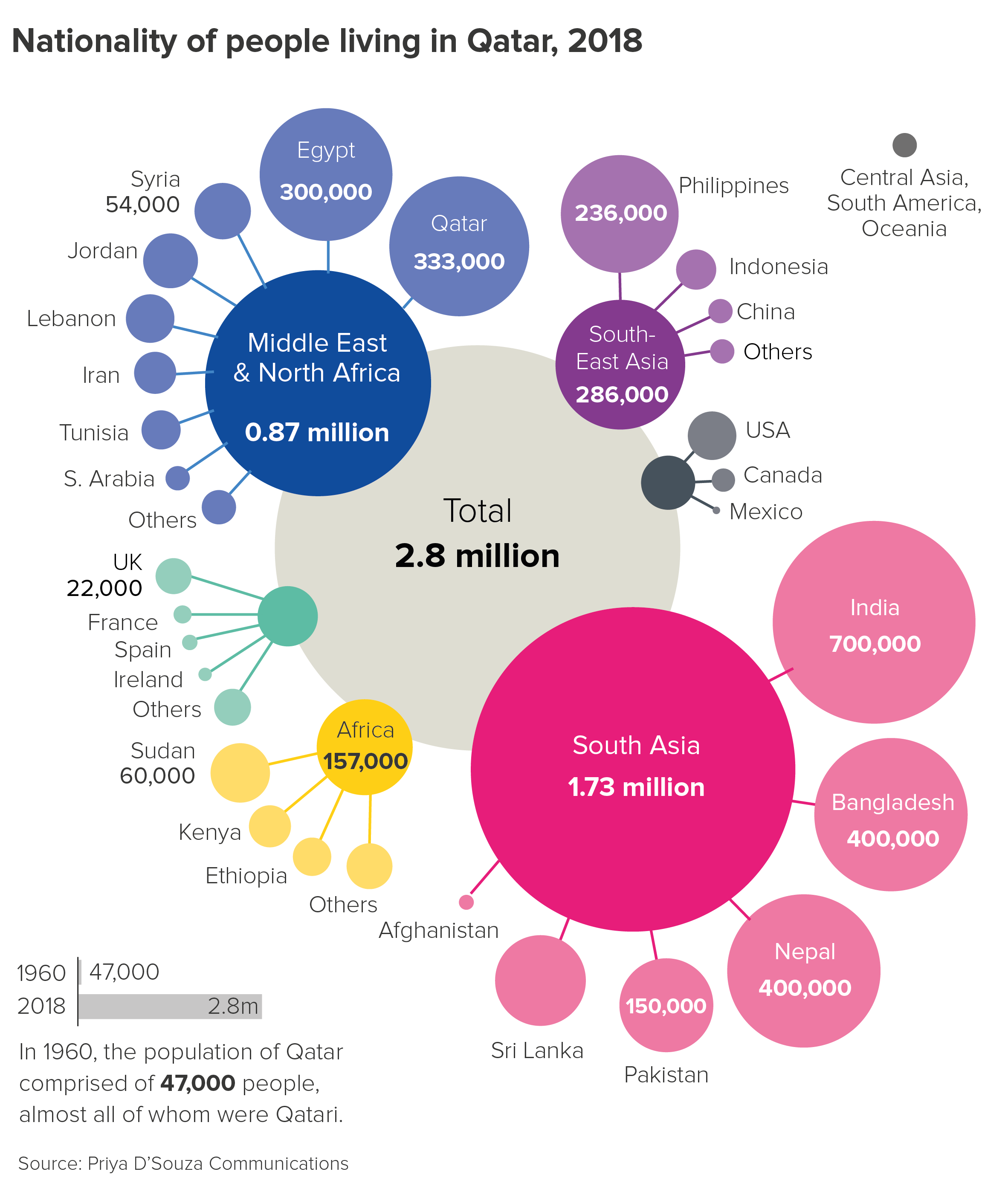
So there are good alternatives to chaining pies together. How about nesting them? This approach is sometimes adopted when you want your audience to see a breakdown of every wedge in your pie rather than just exploding out one category.
These nested pies - usually called sunburst charts - are (I think) more visually appealing than chained pies, but bring their own cognitive challenges. Most critically, you are meant to read the chart from the inside-out, which means the outer ring - which is lower down the hierarchy - is larger and more prominent.
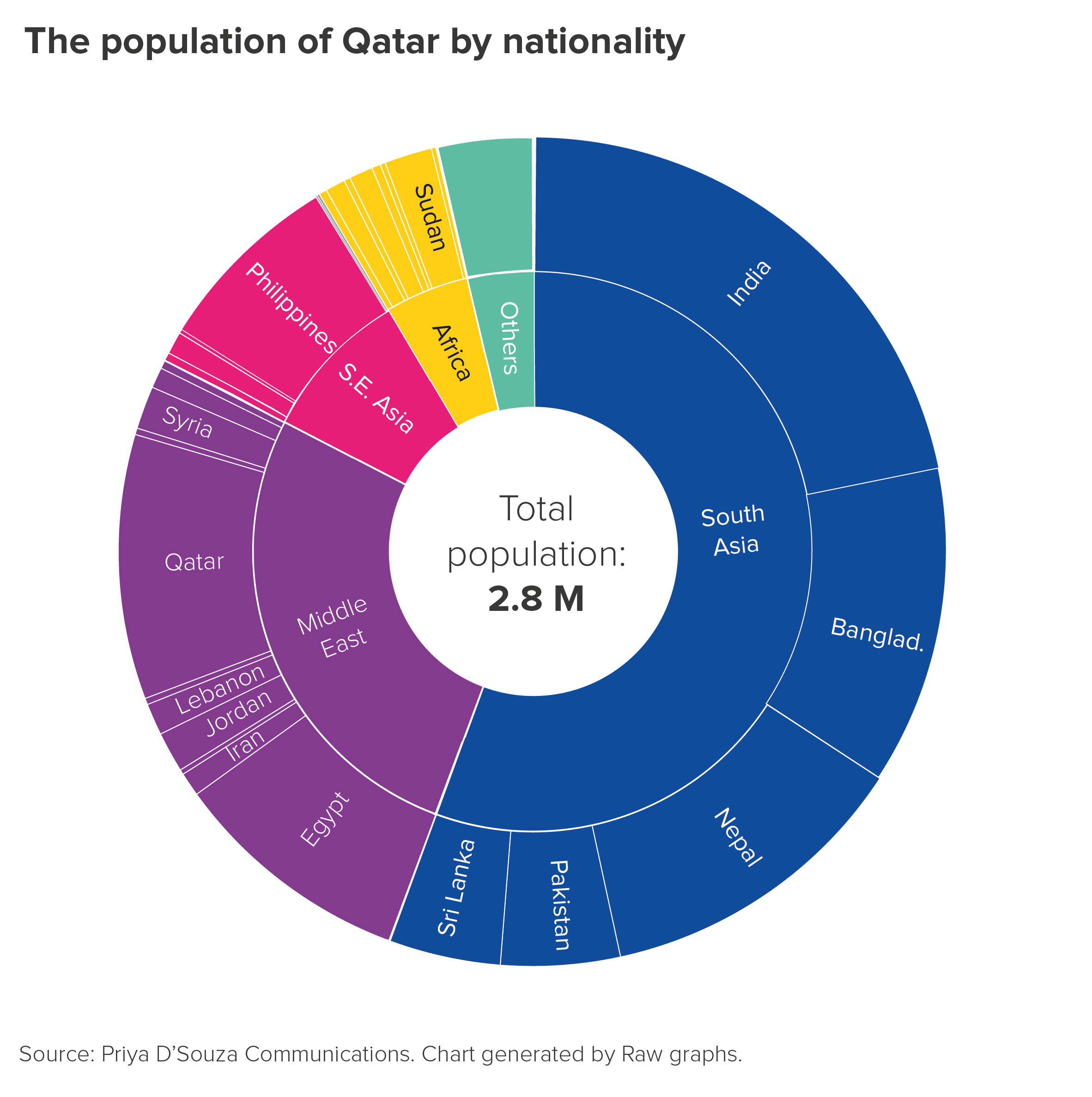
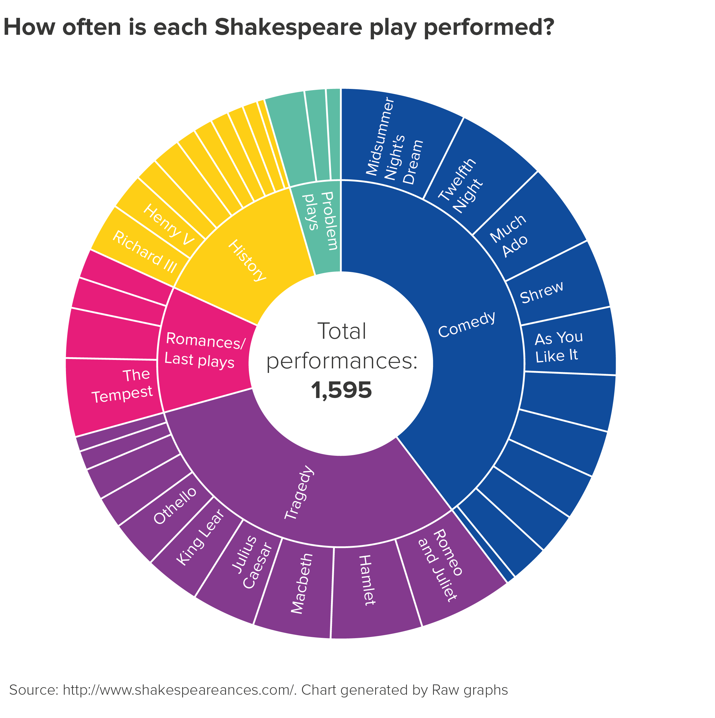
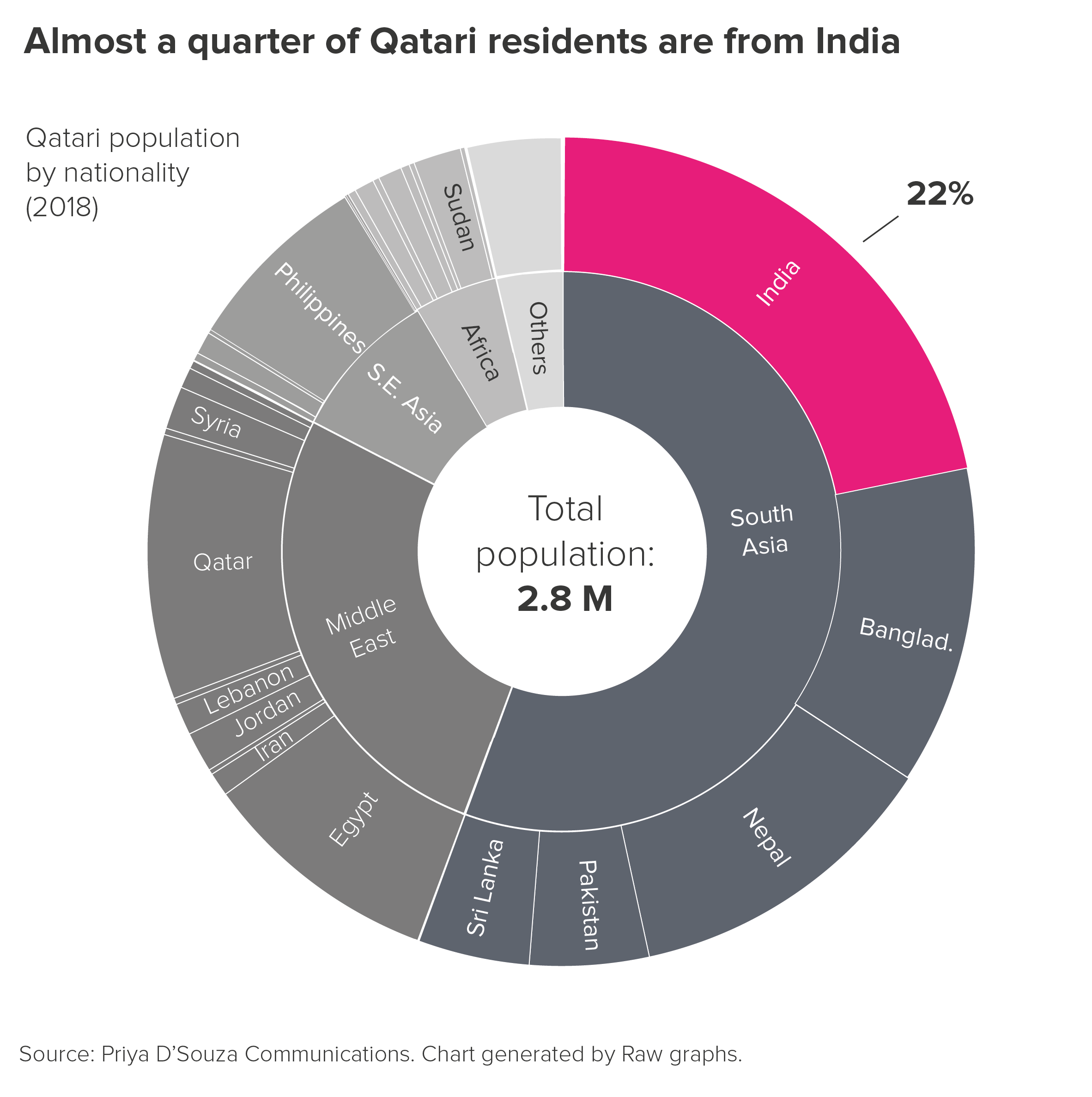
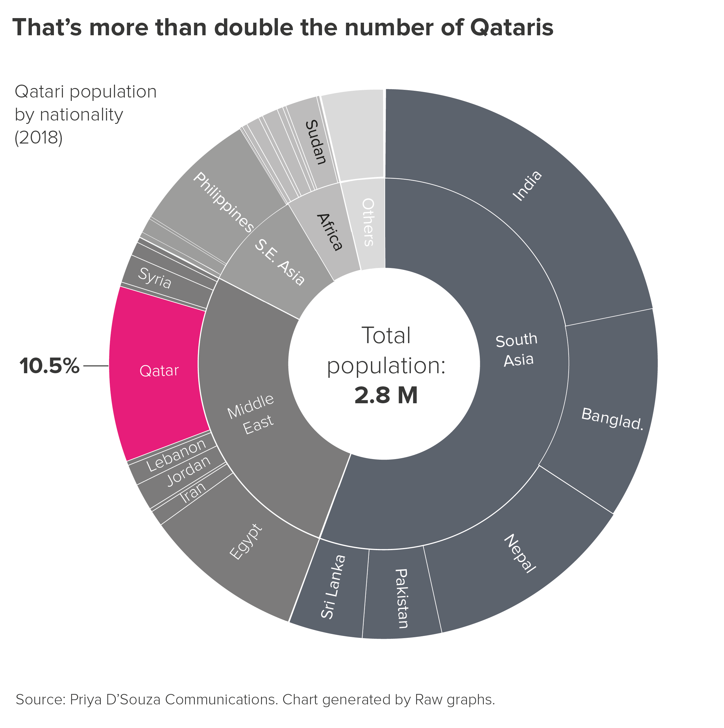
In the first example here, the combined wedges of India, Bangladesh, Nepal, Pakistan and Sri Lanka take up more space than their parent wedge (South Asia), even though they are identical values.
There is also the labelling issue. In most sunburst charts, the labels have to be rotated so they fit inside the wedges, which means they are impossible to read without getting a neckache. You often have to remove the labels for smaller wedges, because they are unreadable or overlap each other.
If you are going to use charts like this, it is best to de-emphasise their chart-like qualities, and treat them more like hierarchical diagrams, knocking back irrelevant wedges and using colour to keep your audience focussed on the sub-category in question. This also helps to discourage strict quantitative comparisons between child and parent categories, which, as I’ve said, only leads to confusion.
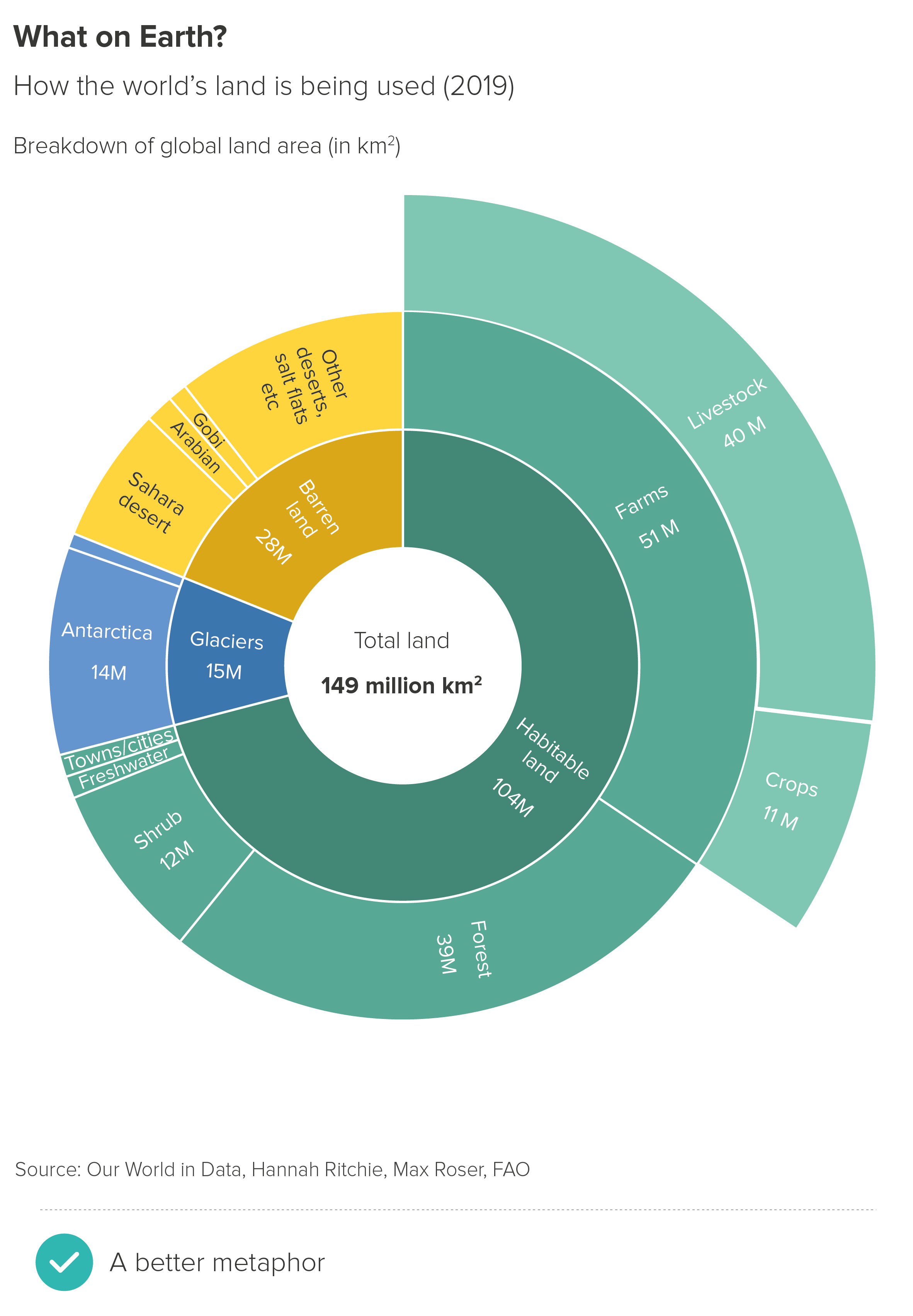
More importantly, just as there are better alternatives to chaining pies, so there are better alternatives to nesting them when you want to show a compositional drilldown. For example, I like spider diagrams.
With spider diagrams, there can be issues with double-counting - some audiences don’t immediately grasp that the value of each bubble is the total of all the bubbles below it in the hierarchy. But I think this chart immediately conveys a sense of both overview and detail, there is more space for labels, and furthermore all those bubbles are proportionately sized to each other (unlike those arcs in our sunburst chart).**
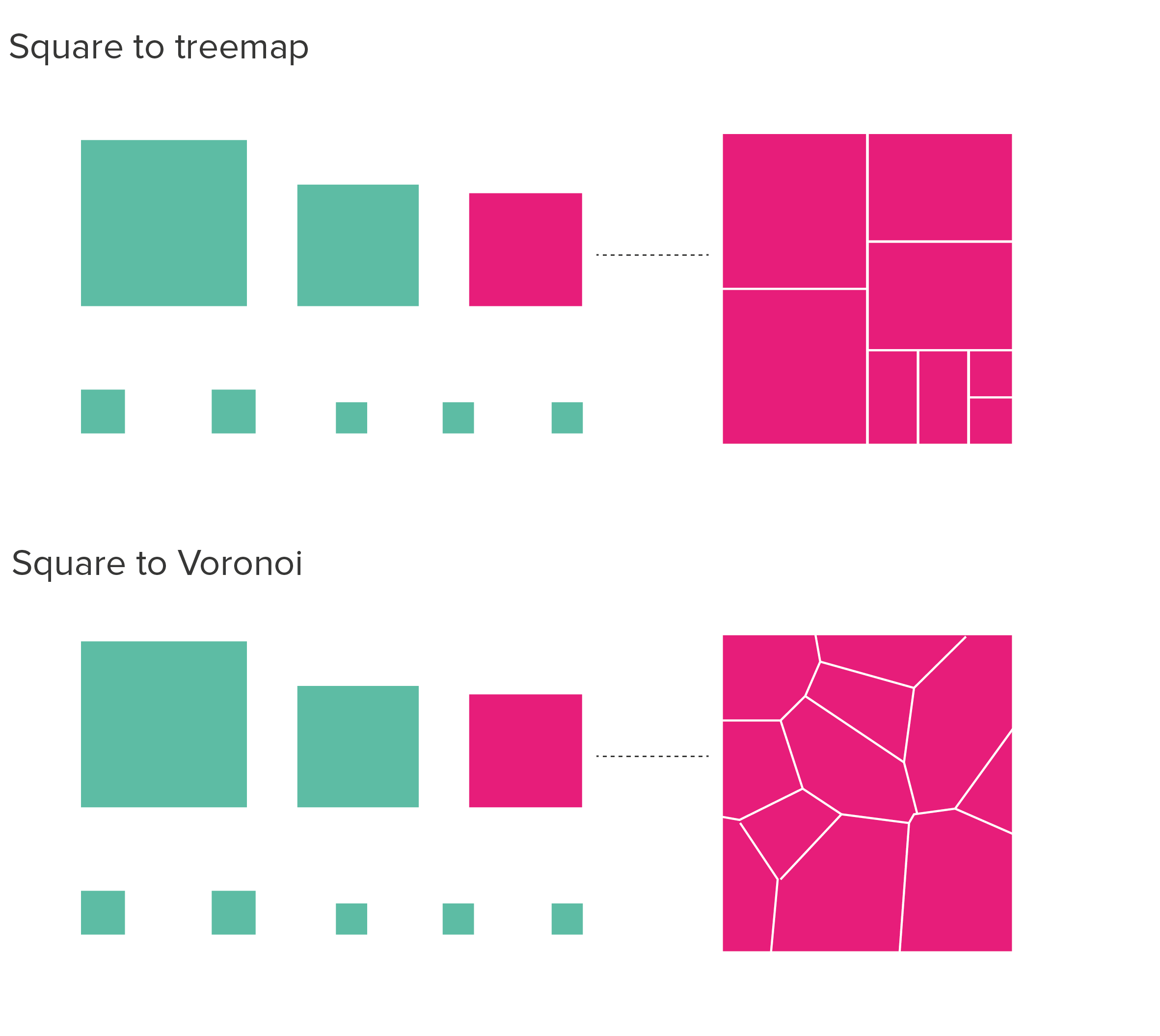
There are also treemaps.
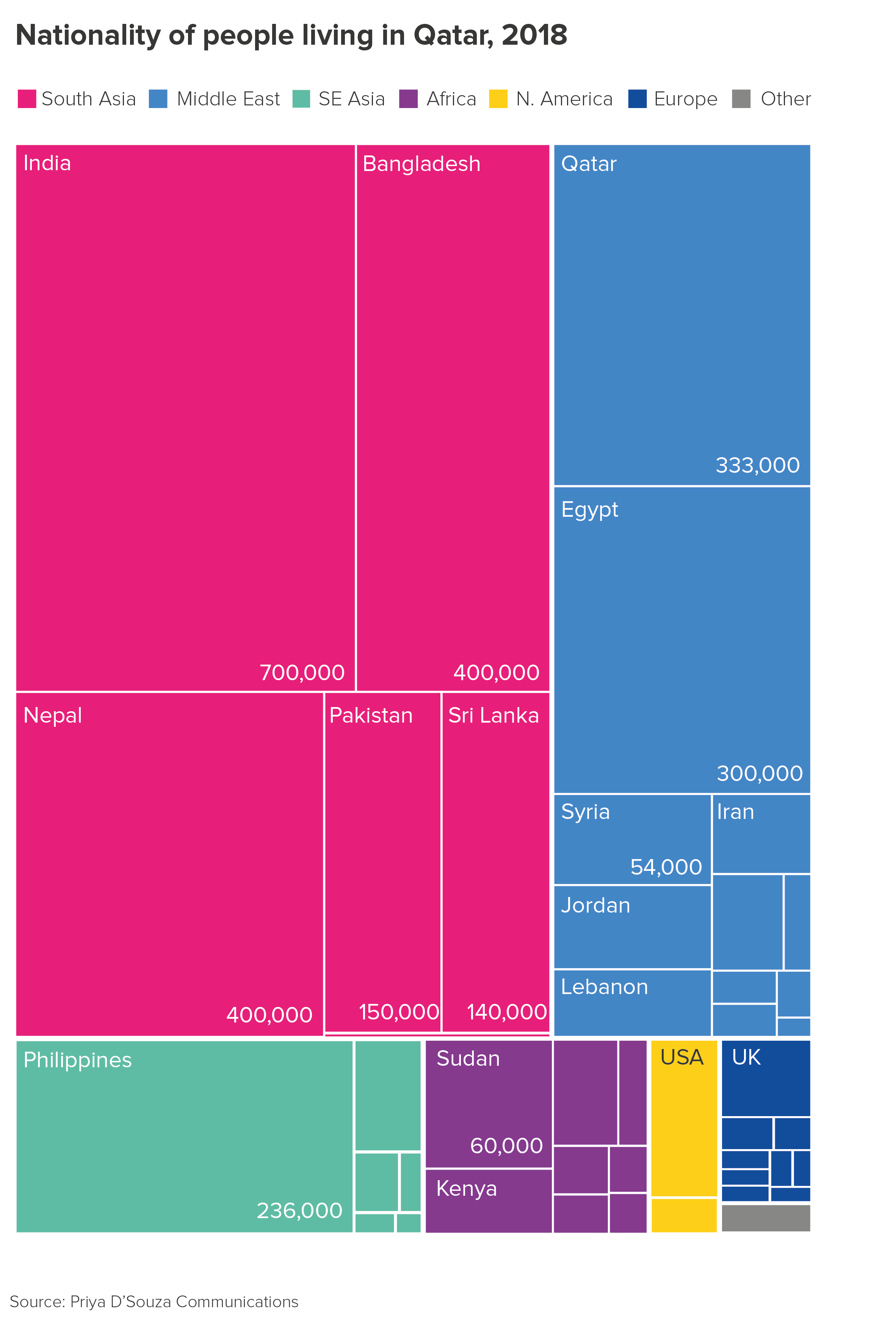
These charts are sometimes criticised because it can be hard to accurately compare the rectangles as they change in width and depth, and labelling the smaller values is impossible. But if you’re trying to give an audience an overview, particularly when you have a dominant sub-category, then treemaps can be the perfect choice. They fill the screen with colour too.
To conclude then, should you stick to this rule and avoid chained pies and sunburst charts? Most of the time, yes. Other charts will usually convey the same information more effectively. Although sometimes, just as you think there’s no earthly use for a chart like this, a story comes along and suits it perfectly.
Verdict: Follow this rule most of the time.
Data sources: Our World in Data/FAO land area data, Priya D’Souza Communications - Qatar data, Biomass distribution of Earth data, Percentage of Parliaments that are female data from World Bank, composition of the human body data from John Emsley’s book, Nature’s Building Blocks, Population breakdowns from populationpyramid.net
*For more on the problems of segmenting pie slices, see Dona M. Wong’s exceptional Guide to Information Graphics (Norton, 2010), p78-9.
**One caveat: at the time of writing, spider diagrams are not native to Powerpoint, Illustrator or any of the most common free online tools. But there are fairly simple workarounds. First generate correctly-sized circles (using e.g. Raw’s circle packing tool, or Illustrator’s pie chart tool, or any other tool that sizes circles by area, not diameter). Then use a vector-editing tool like Inkscape or Illustrator to position the circles. In fact, now Powerpoint accepts svgs, you can use Powerpoint too (you’ll need to convert to shape first). It’s a bit fiddly, but in many cases, totally worth it.
More data viz advice and best practice examples in our book- Communicating with Data Visualisation: A Practical Guide