
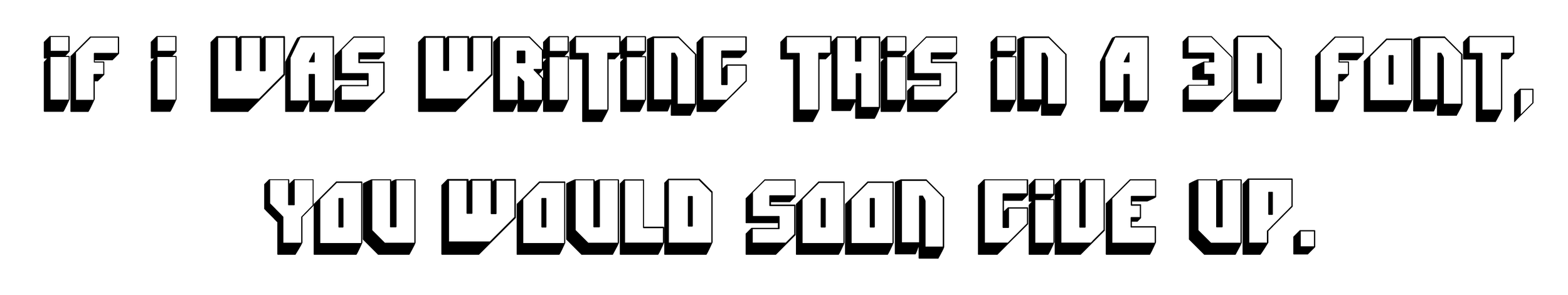
In this blog series, we look at 99 common data viz rules and why it’s usually OK to break them.
by Adam Frost
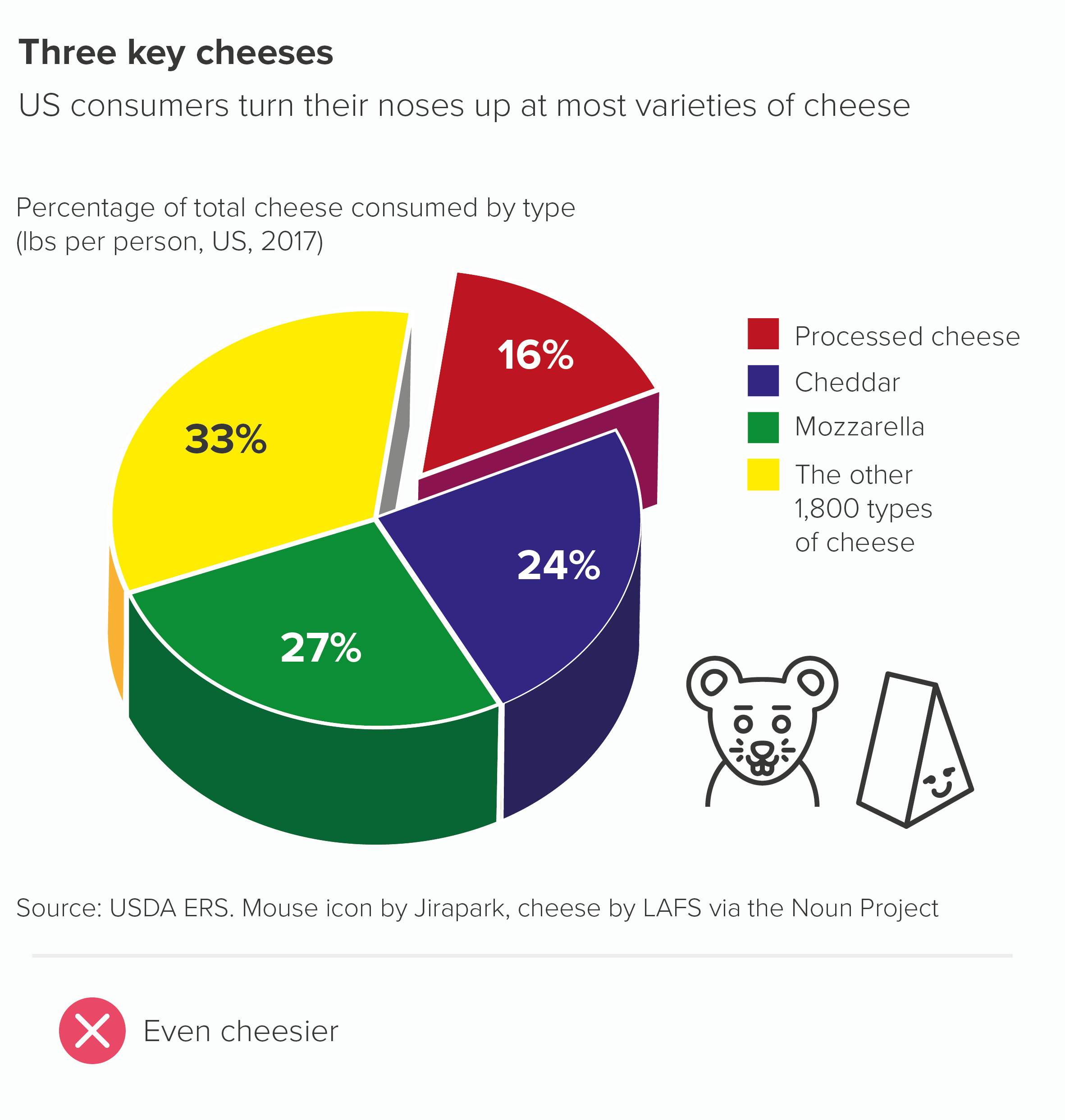
Most charts are wrecked by adding 3D - and pie charts are no exception.
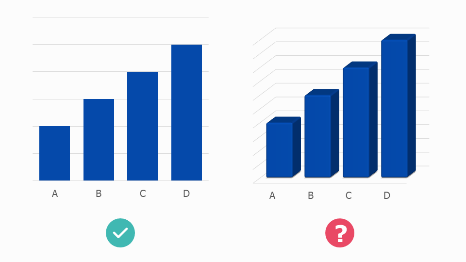
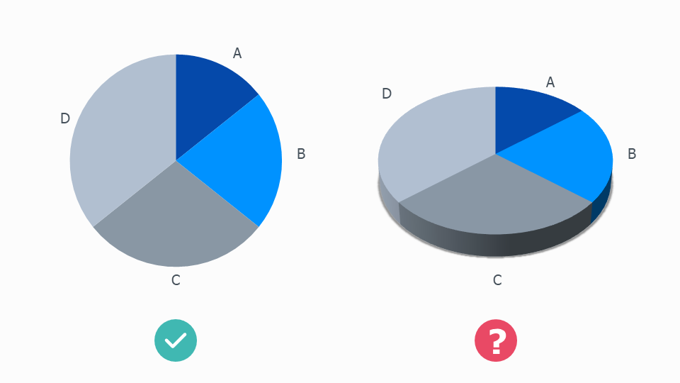
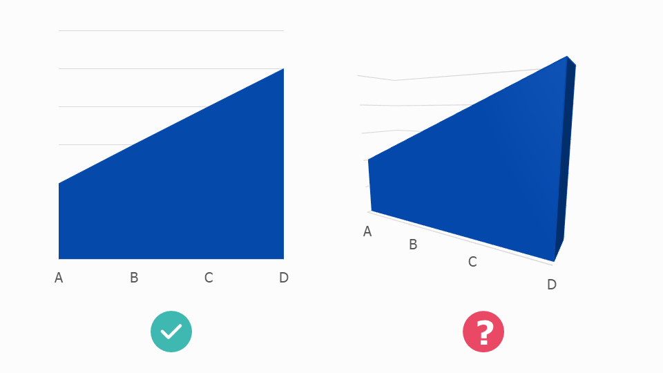
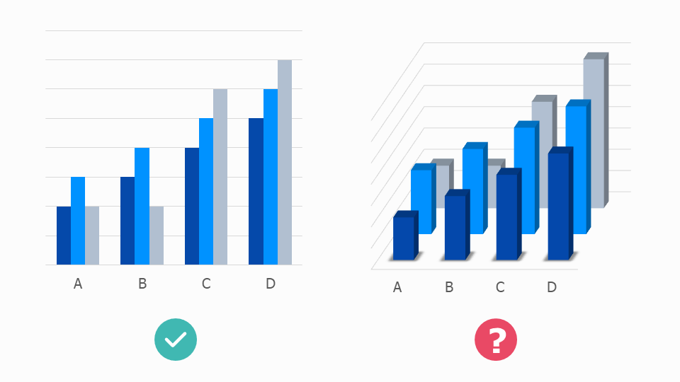
The 3D versions of the charts above are an insult to both accuracy and aesthetics. A chart’s job is to convey truthful information in a visually persuasive way, and a 3D chart achieves neither goal: severing the link between the datapoint and the size of each element, and adding visual clutter and complexity that breaks the clean outline of each shape and the harmoniousness of the overall composition. Adding ‘depth’ simply makes the chart shallow.
We’ll look in detail at why 3D is such a cognitive and aesthetic disaster in later rules. But the short answer is: for the same reason that watching a 3D movie is harder work than watching a 2D movie.
How is this possible? Surely the 3D version more closely approximates the ‘real world’, so it should be a less arduous viewing experience.
But our eyes see in two dimensions, not three. Our vision works by taking lots of 2D snapshots and passing them to our brain, which converts them into three-dimensional objects. By creating 3D charts, we interfere with this efficient system.
2D charts are much easier for our eyes to interpret, we can more quickly use them as springboards for recreating the real-world objects and situations represented by our data. Most complex information that we encounter will be flattened in this way: think of how an architect will share their designs for a building in a series of 2D plans rather than a single 3D composite. Or if I ask you to draw a map of where you live and how I would get from your house to the station. You will draw it looking down on a flattened landscape. Removing the third dimension clarifies.
So our charts should almost always be 2D for the same reason our icons should be 2D. They are easier to process and closer to how our brains imagine objects in the abstract.
This principle particularly applies to pie charts which, as we have discussed before, can be hard enough to read in 2D. Adding a third dimension means that all the perceptual distortions that apply to circles get multiplied.
Have a look at the 3D circles below. Which line do you think is the longest? And the shortest?
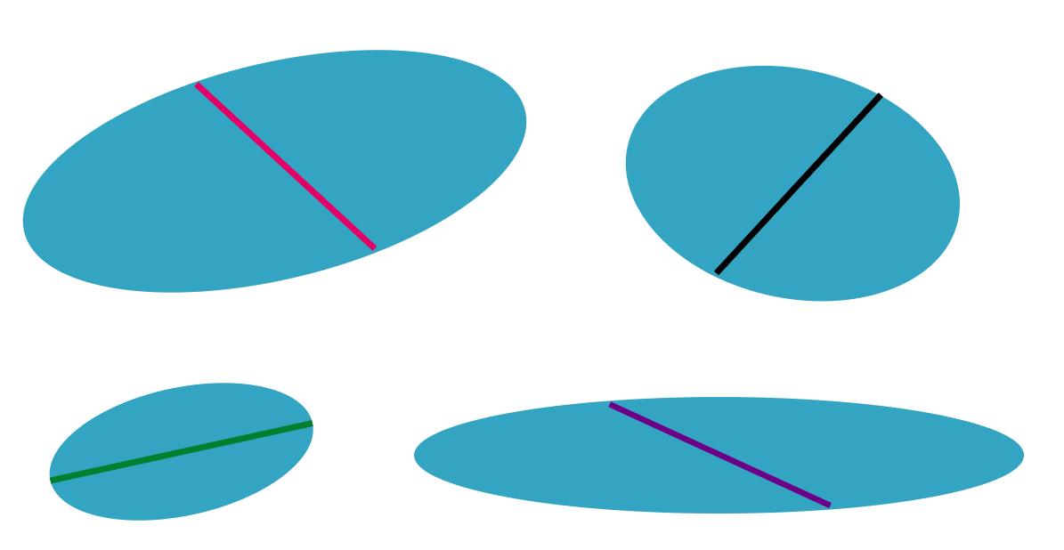
When I tell you that the green line is the longest (10% longer than the others - measure it!), this should give you some idea of what we’re up against. In fact, the only reason for using a 3D pie that I can think of is when you are actively trying to actively mislead an audience. When you are trying to artificially inflate the size of your market share and make, say, a 19.5% market share look bigger than 21.2%. What sort of scoundrel would stoop to such a cheap trick?
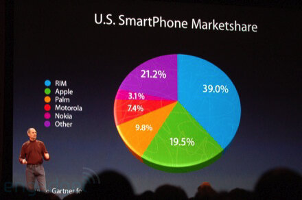
Image credit: Engadget
If there were aesthetic advantages in using a 3D pie, perhaps their usage could be justified in certain circumstances. Occasionally a student will tell us that they think 3D pies are ‘cool.’ But I used to work for the Guardian and I’ve met cool people and - trust me - they like Joy Division and kale smoothies*, not 3D pie charts. For most people, 3D pie charts are terminally uncool, the epitome of corporate cheese, making the French name for a pie chart - un camembert - horribly appropriate.
So surely this is our first unbreakable rule? Yes, I think so. Except, of course, in the real world, your boss might love them. Certainly I’d be lying if I said I’ve never taken the money and made one. I needed a five-hour shower afterwards, and I still felt dirty, but I did it. If this is you, all you can do is try to limit the damage: try to minimise the tilt so it’s as close to 2D as possible, remember that the numbers in the foreground will look bigger, particularly because they will benefit from the thick coloured band that the backward tilt adds to their edge, so think hard about whether this is distorting the story or misleading the audience.
Rules 2-10 should be closely adhered to: you’re already stretching a pie to breaking point, so now is not the time to experiment with subverting other rules. Most importantly, avoid other visual effects, so no starting at 3 o’clock or exploding out a wedge or adding drop shadows or experimenting with technicolor or decorating a wedge with flags or logos. It’s already pyrotechnical enough.
Verdict: Follow this rule unless it means losing your livelihood
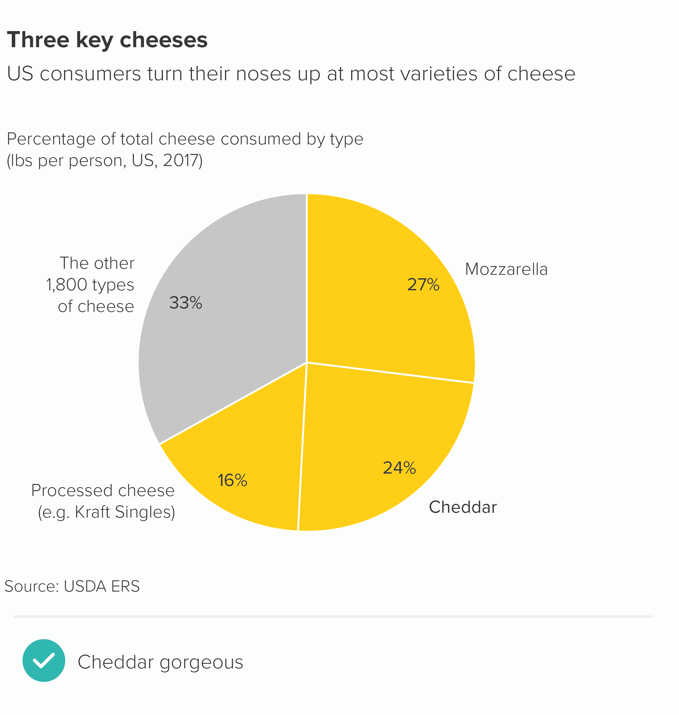
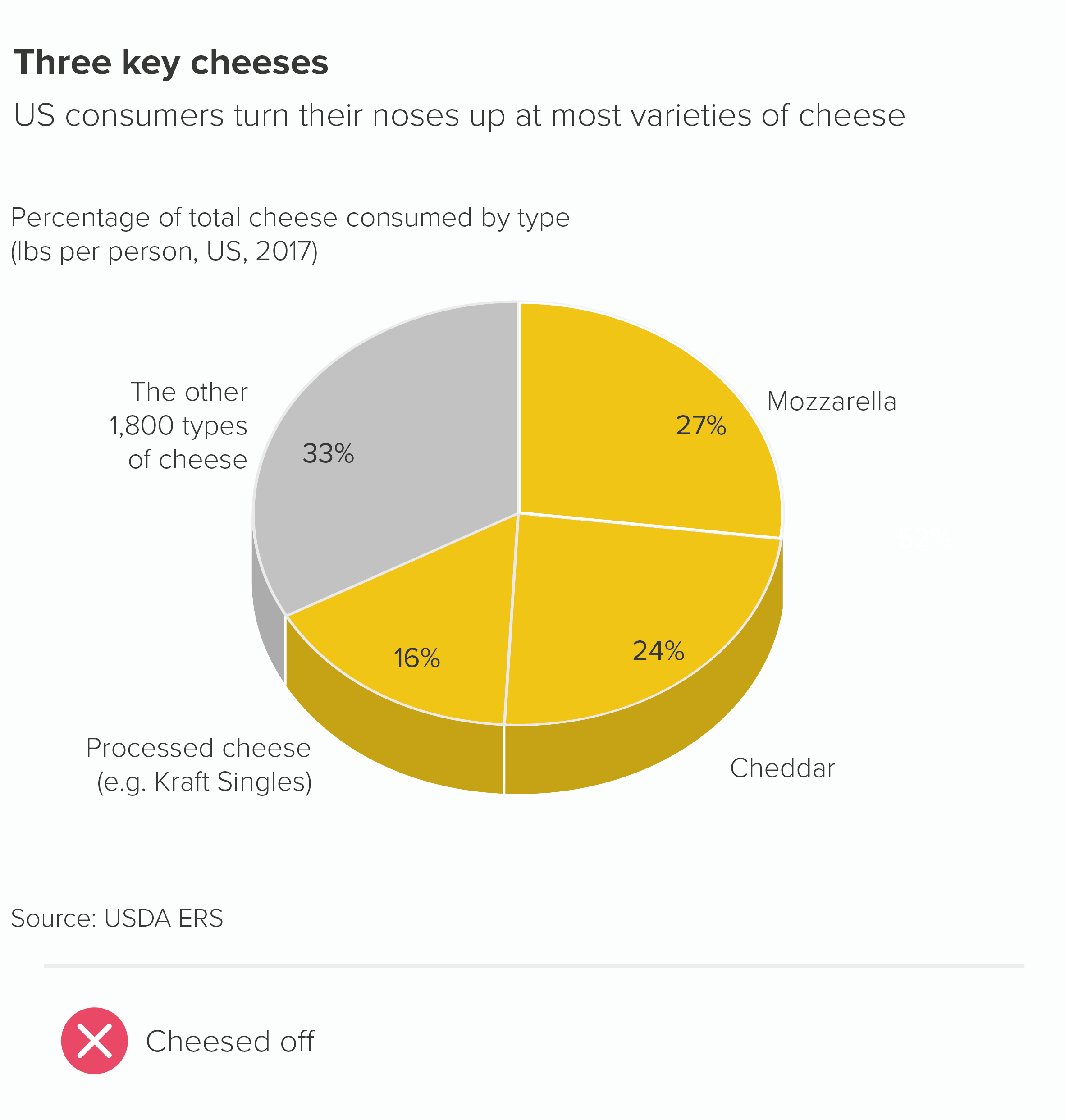
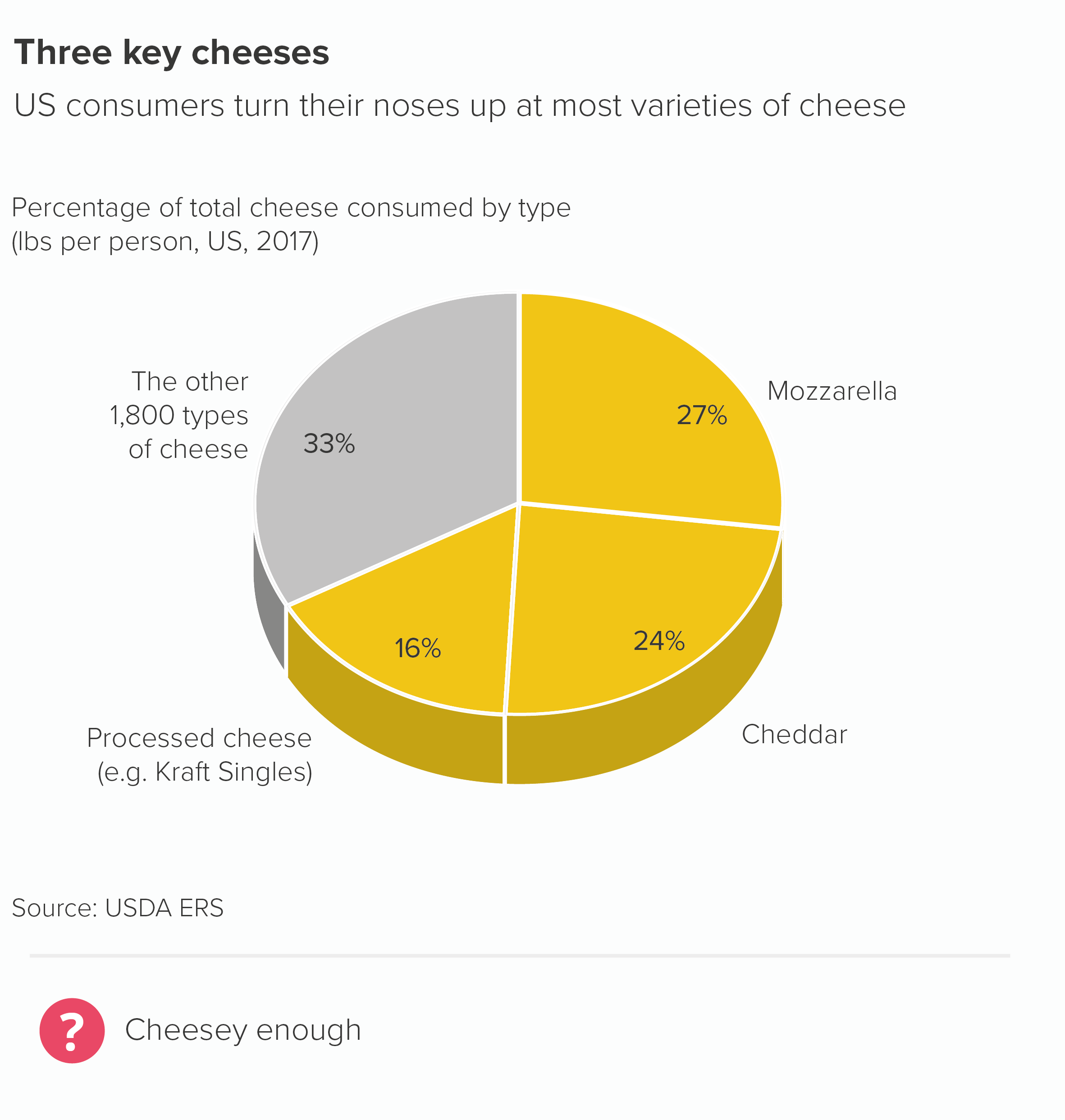
Sources: Cheese data from USDA
*Definitions of coolness are subject to constant review
More data viz advice and best practice examples in our book- Communicating with Data Visualisation: A Practical Guide