
In this blog series, we look at 99 common data viz rules and why it’s usually OK to break them.
by Adam Frost
This rule takes considerable effort to break. If you generate a pie chart in a modern software application (e.g. PowerPoint, Illustrator, Power BI) it will automatically position the first wedge at 12 o’clock and move round in a clockwise direction. If you want to offset the first wedge, you will need to make a conscious decision to open the chart settings and change the starting angle of the first wedge from 0°. Software defaults aren’t always sensible, but in this case, they are.
Pie charts didn’t always look like this. In arguably the first ever pie chart, designed by William Playfair in 1805, the United States was divided up into what were then its constituent parts. He started with his largest wedge at roughly 8 o’clock and moved round in an anti-clockwise direction.
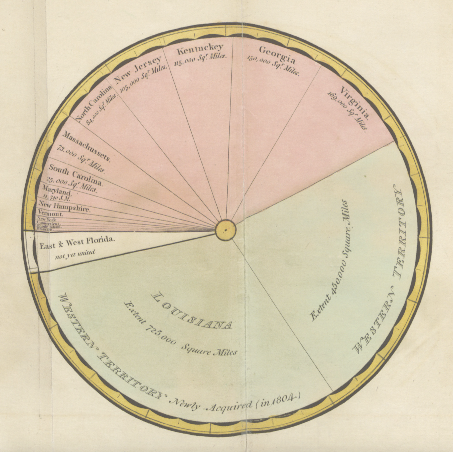
However, this Playfair chart also demonstrates perfectly why we have moved to our current model. It is hard to immediately see that the Western territory is just over half of the United States or that Kentucky, Georgia and Virginia are just under a quarter.
If we start our pies at 12, we tap into our facility at reading clock faces. If our wedges are close to (or exactly) 25%, 50% or 75%, this is even better, as we are used to dividing time into quarter and half past the hour. When our 12 o’clock start is offset, we are slowed down.
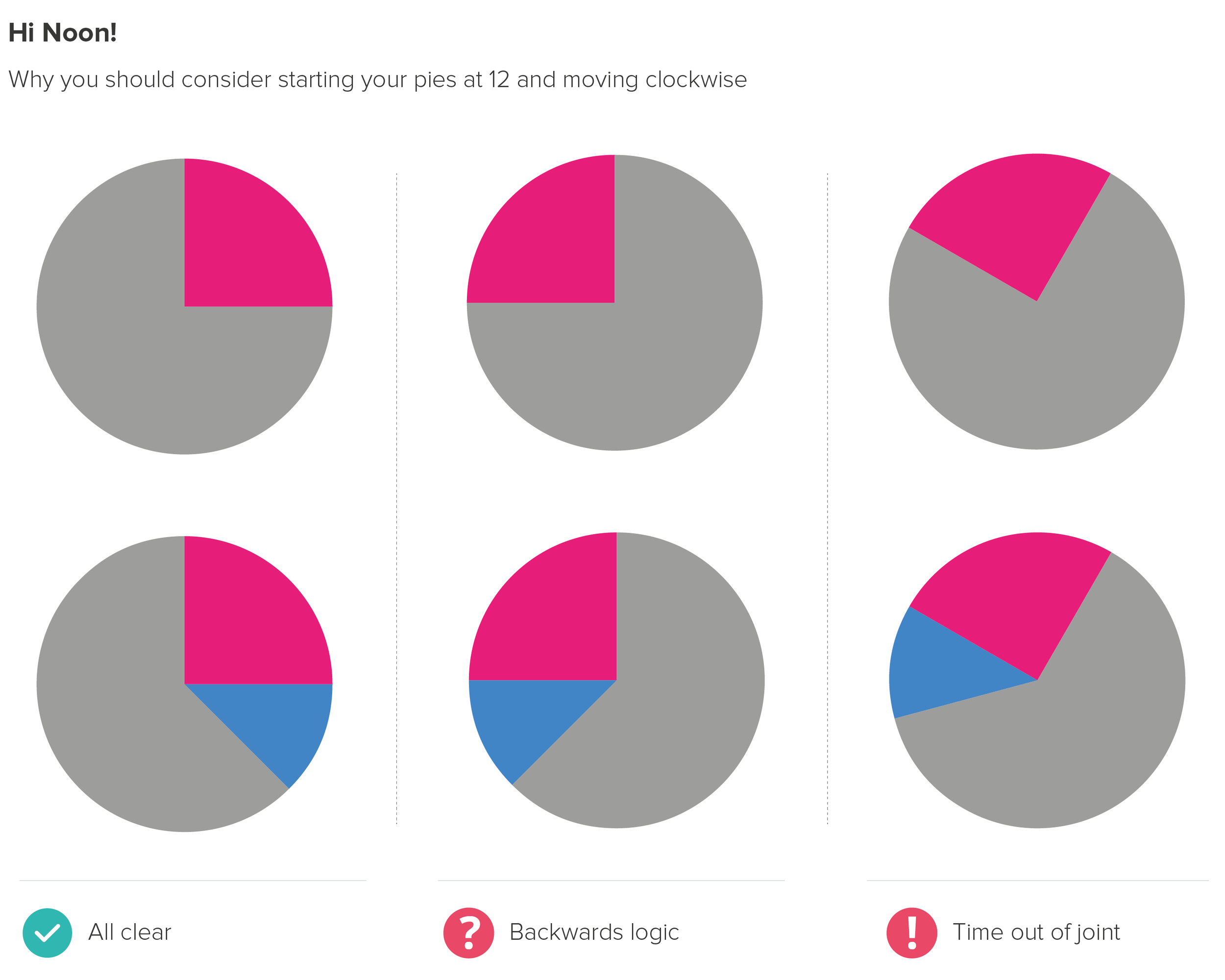
So this feels like another unbreakable rule. It’s true that our ability to read analogue clocks is declining, and it’s true that there’s nothing particularly intuitive about time going clockwise: it’s just an arbitrary byproduct of sundial design and the movement of shadows in the northern hemisphere. Indeed, if most of us are asked to draw a circle, we will intuitively go anti-clockwise.
But having said this, I’d still urge you to draw on clock design and clockwise movements when you create pie charts. We all get taught to read clocks at an early age - it’s as hard-wired as learning to read text for many of us. Furthermore, the notion of ‘clockwise’ meaning ‘go’ or ‘on’ or ‘more’ is baked into many of the dials we twist, the screws we screw in, the volume knobs we turn up and the speedometer needles we scrutinise.
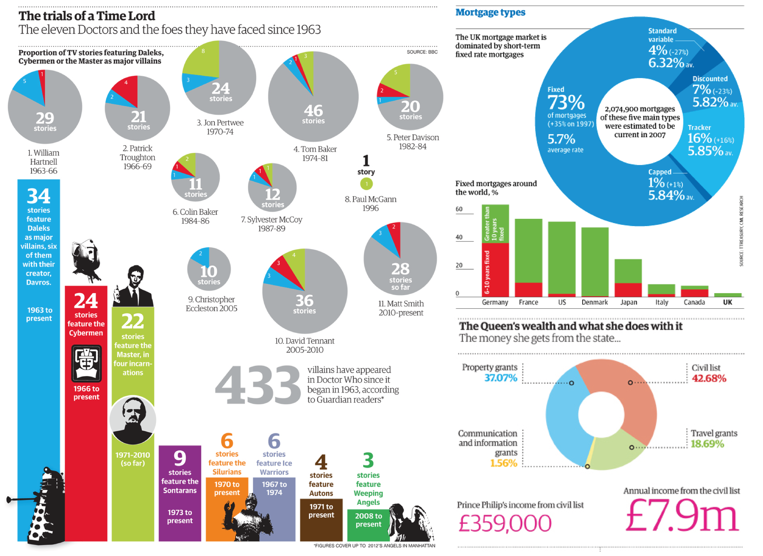
You can break this convention, of course, but you need an extremely compelling reason. I used to struggle to think of one. But then I did keep finding examples of pie charts not starting at 12 that I liked. For example, in Simon Rogers’ classic book, Facts are Sacred, there are loads. Some of them go backwards too.
Our designers would sometimes sneak them into corporate presentations and social media campaigns. I liked some of these as well.
Sometimes being different is interesting, ignoring a convention is eye-catching, or it helps with the overall composition of the graphic.
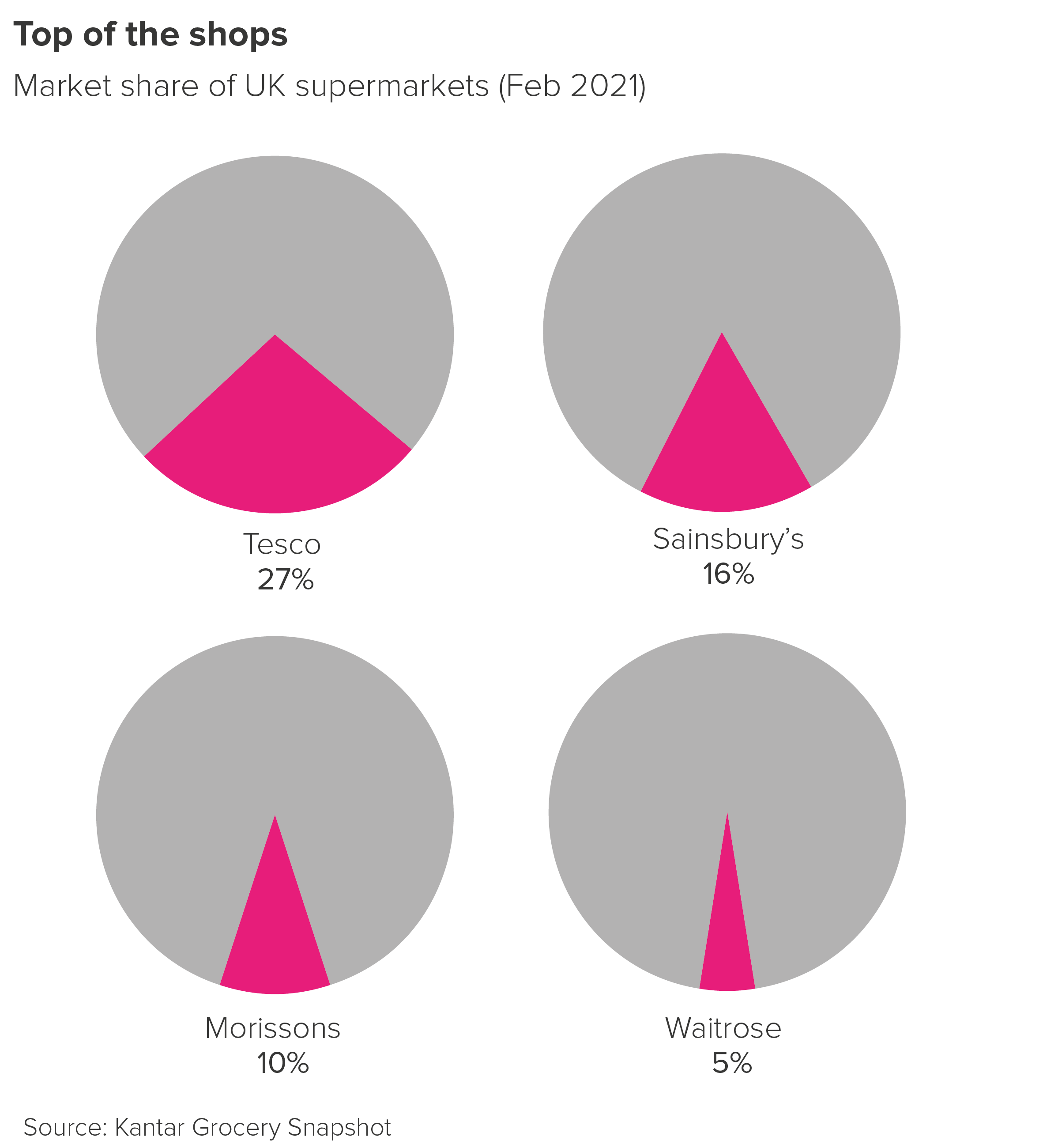
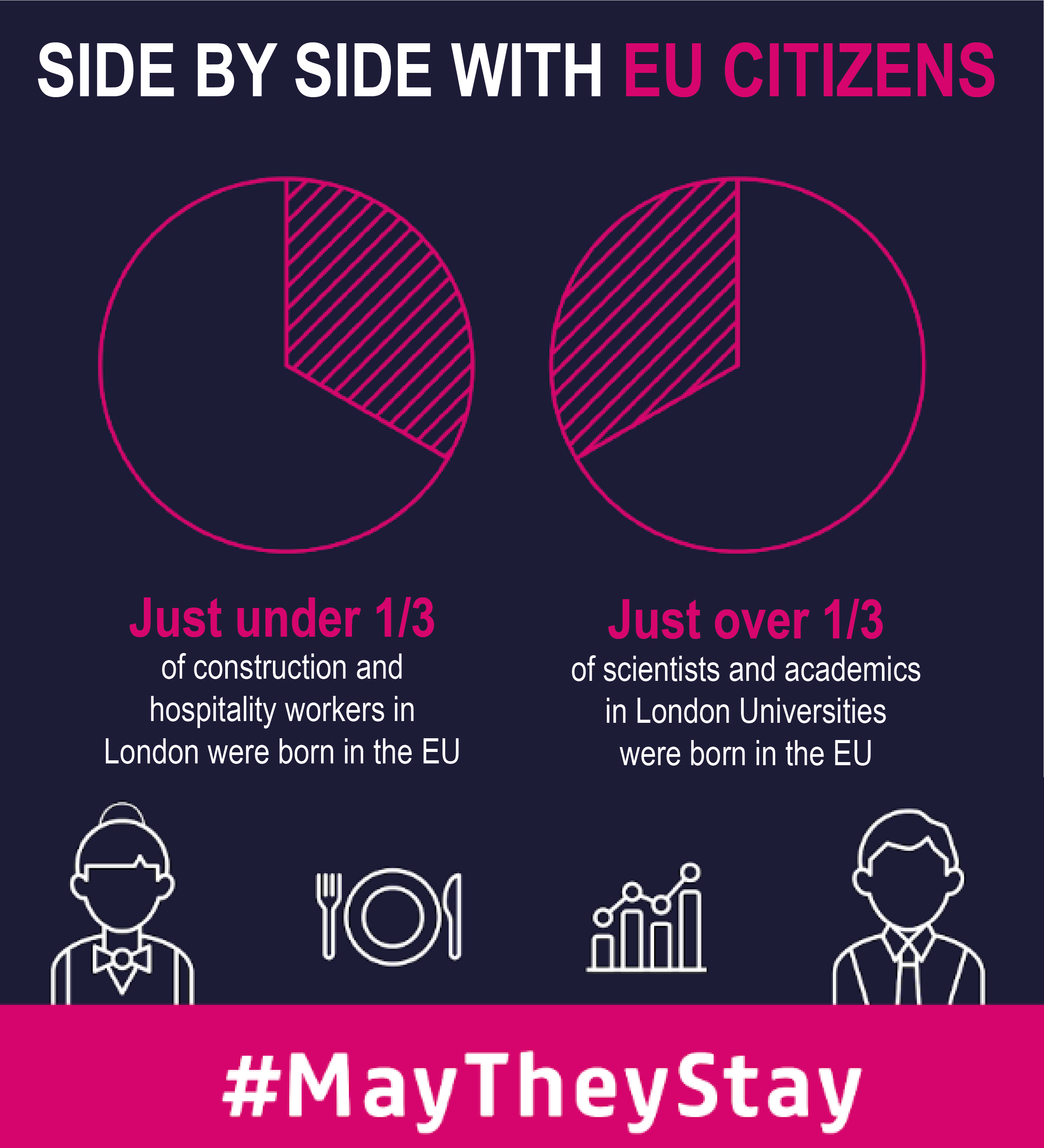
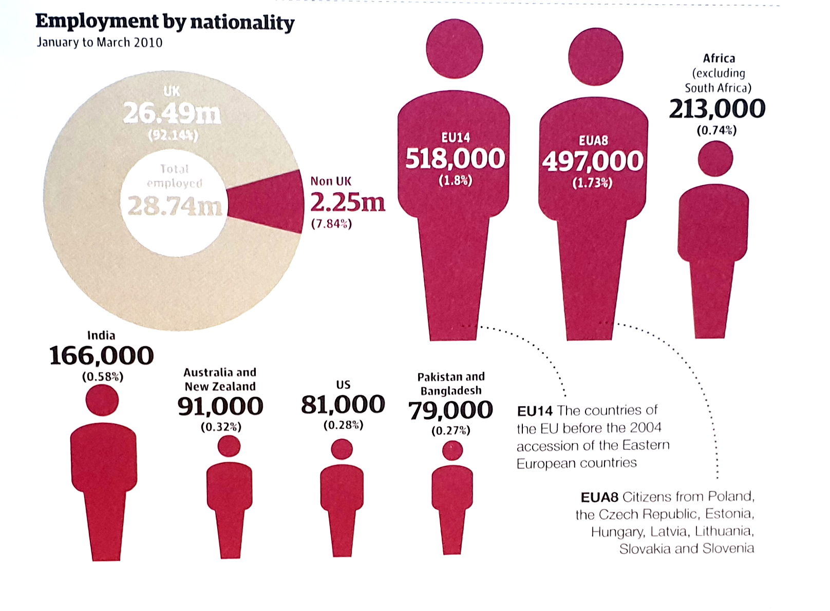
Here’s another one from Facts are Sacred: look at how the orientation and colour of the doughnut chart acts as a pointer to the next section of content, where the non-UK worker wedge is broken down.
I'm not a fan of the sized icons - we'll cover those in a later rule - but the doughnut chart works just fine.
You often see less subtle versions of this tactic in business presentations with the pie wedge leading to a bar chart or stacked bar. Once more, I’m not against it.
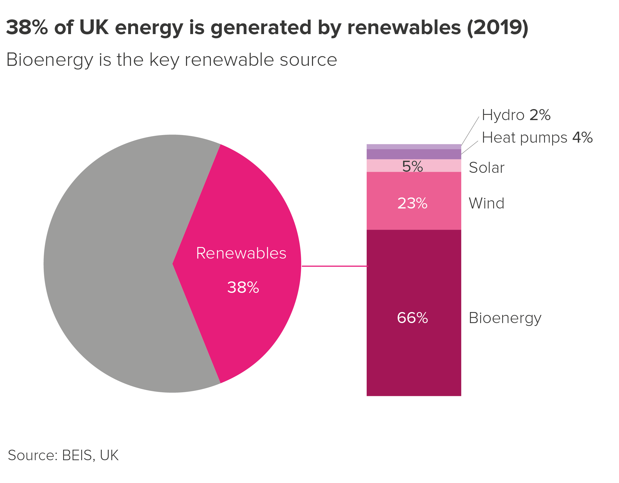
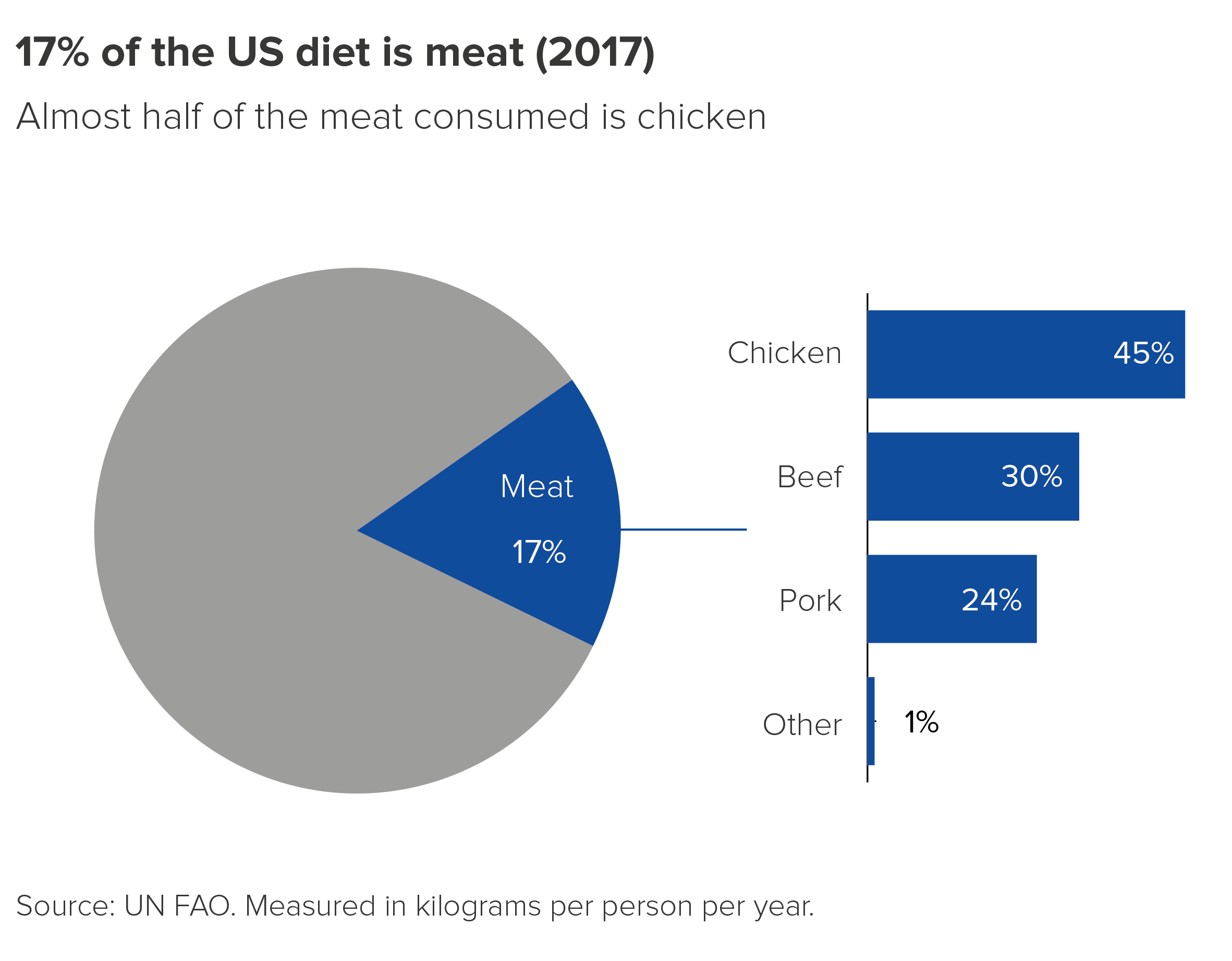
I still wouldn’t make a habit of creating pie charts or doughnut charts like this. Their novelty appeal can quickly become grating. Bear in mind too that for more data-literate audiences, the charts will look broken, or vacuously decorative. But it does show that there are exceptions to every rule, even a rule as sensible as ‘start at 12, and work clockwise’.
Verdict: Follow this rule 24-7 (almost)
Sources: William Playfair, Statistical Representation of the United States of America (1805), Facts are Sacred by Simon Rogers (2013), Kantar Grocery Snapshot, May They Stay image from London First EU campaign, Energy data from BEIS, US diet data from FAO, also visualised by Our World in Data
More data viz advice and best practice examples in our book- Communicating with Data Visualisation: A Practical Guide