
In this blog series, we look at 99 common data viz rules and why it’s usually OK to break them.
by Adam Frost
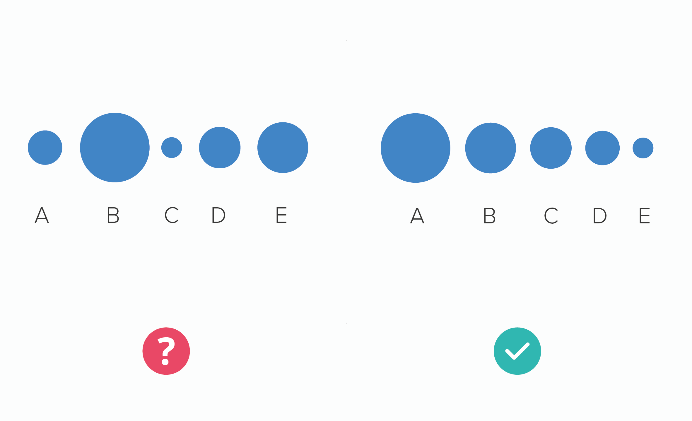
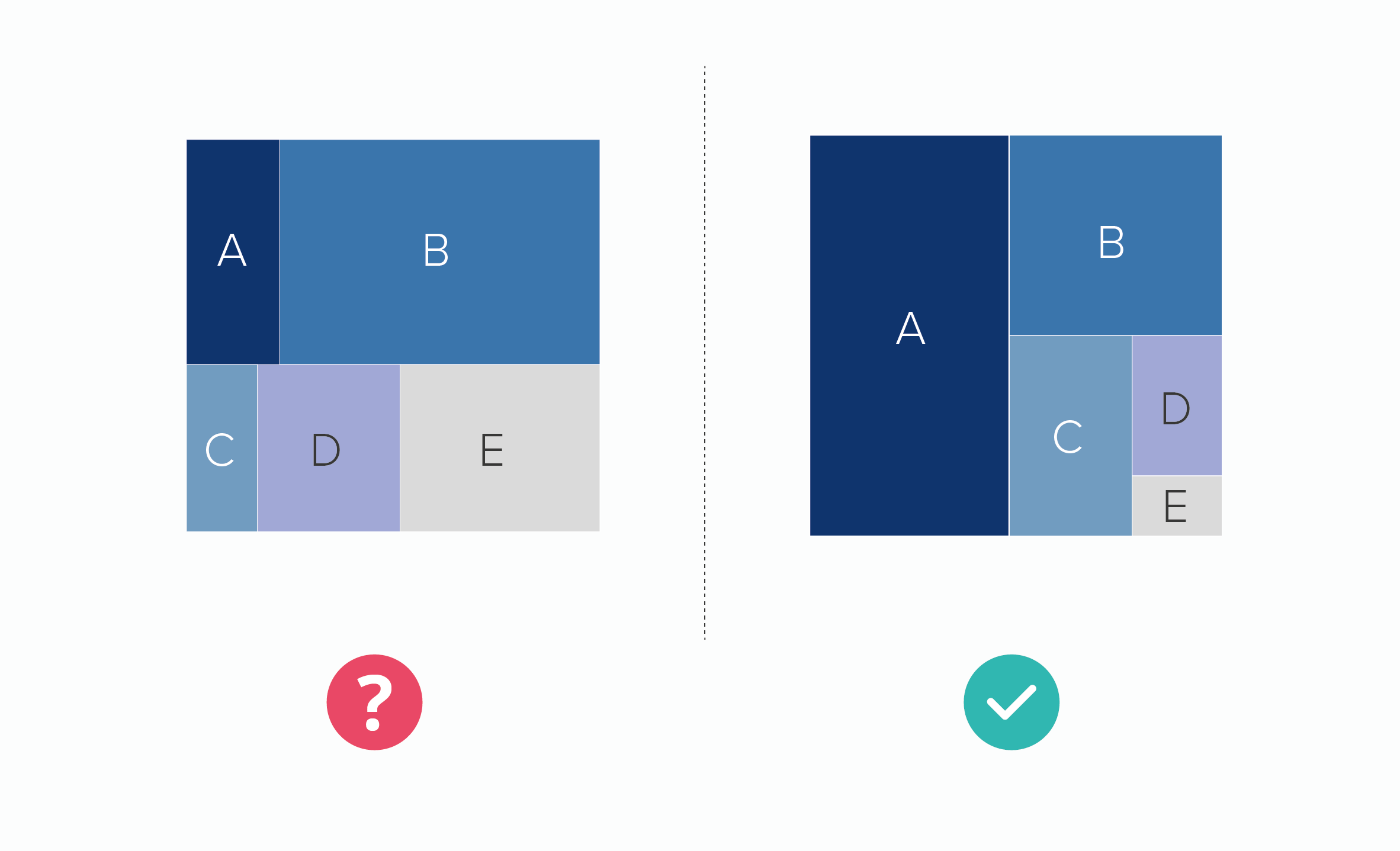
If you want your audience to compare the sizes of shapes, then sorting any chart from the largest to smallest value is helpful.
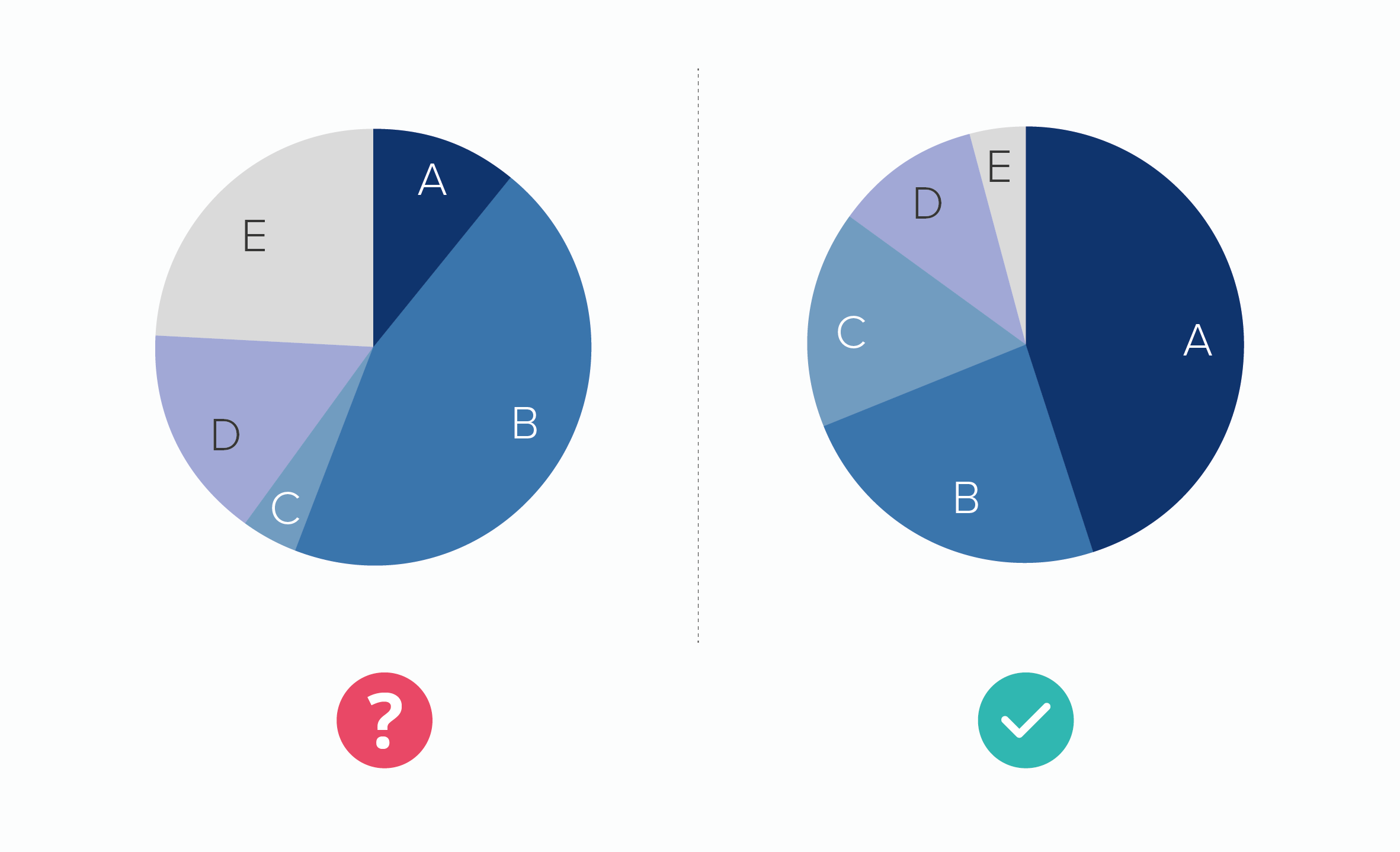
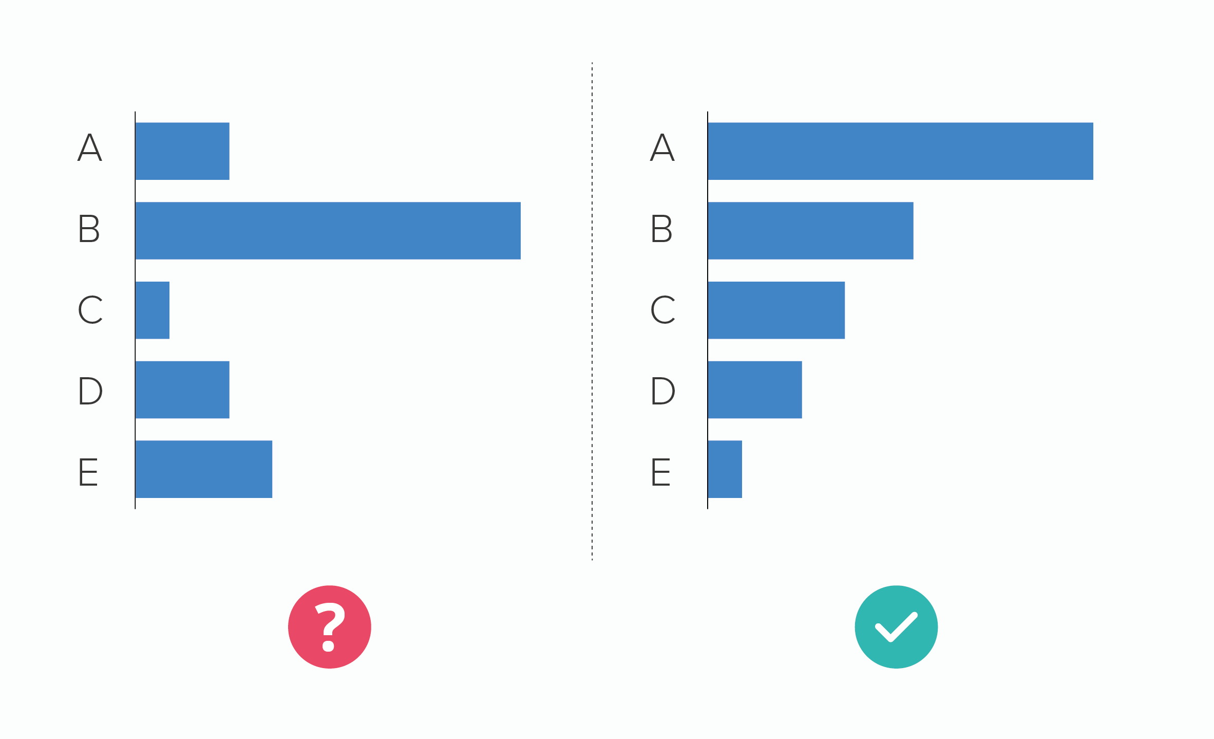
This is particularly advisable with pie charts because of everything we’ve mentioned in previous rules: it can be hard to compare similar-sized wedges, hard to read wedges that don’t start at 12 o’clock, hard to read lots of wedges. If your categories don’t need to go in a particular order, if your story doesn’t require a set arrangement of slices, then sorting by value is a wise approach.
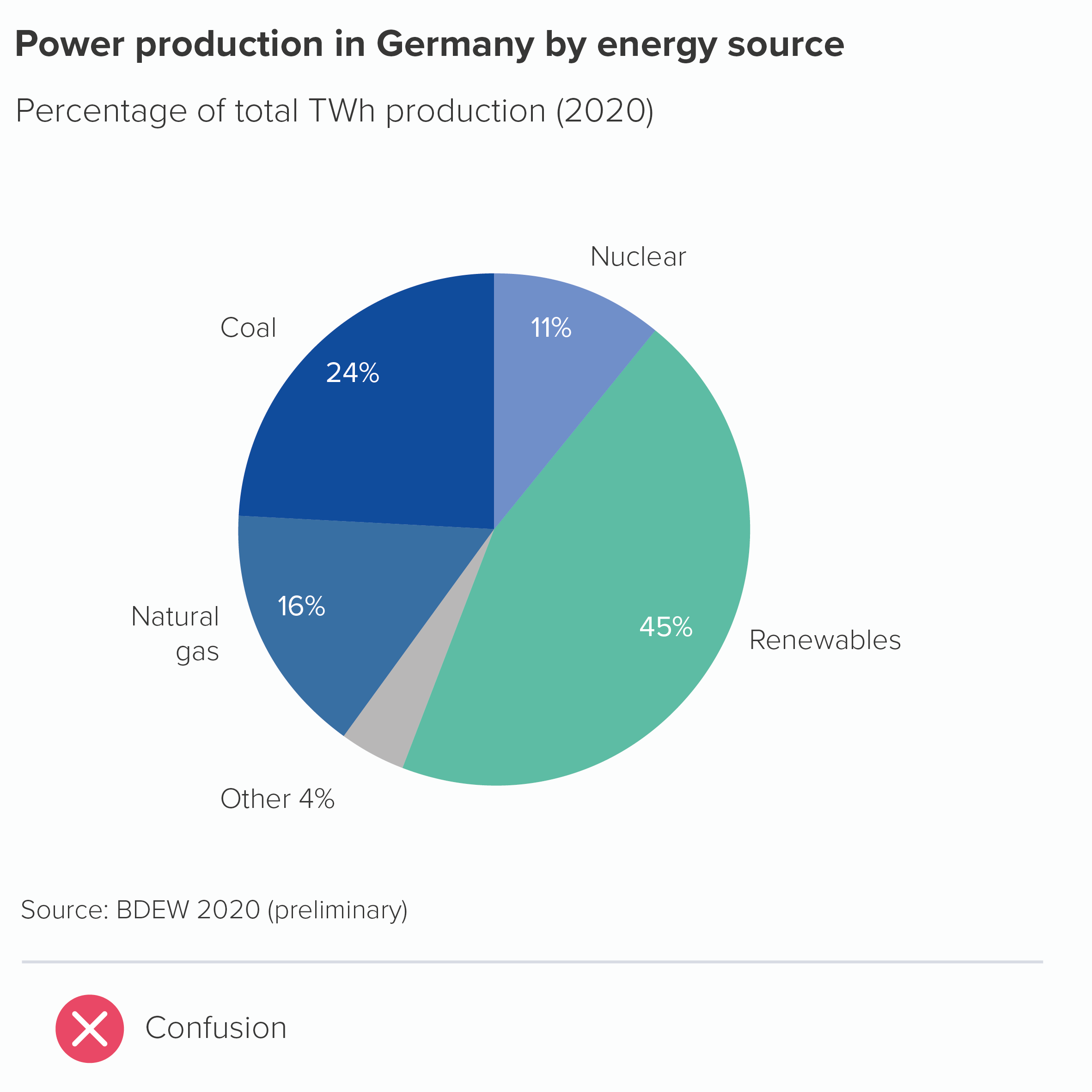
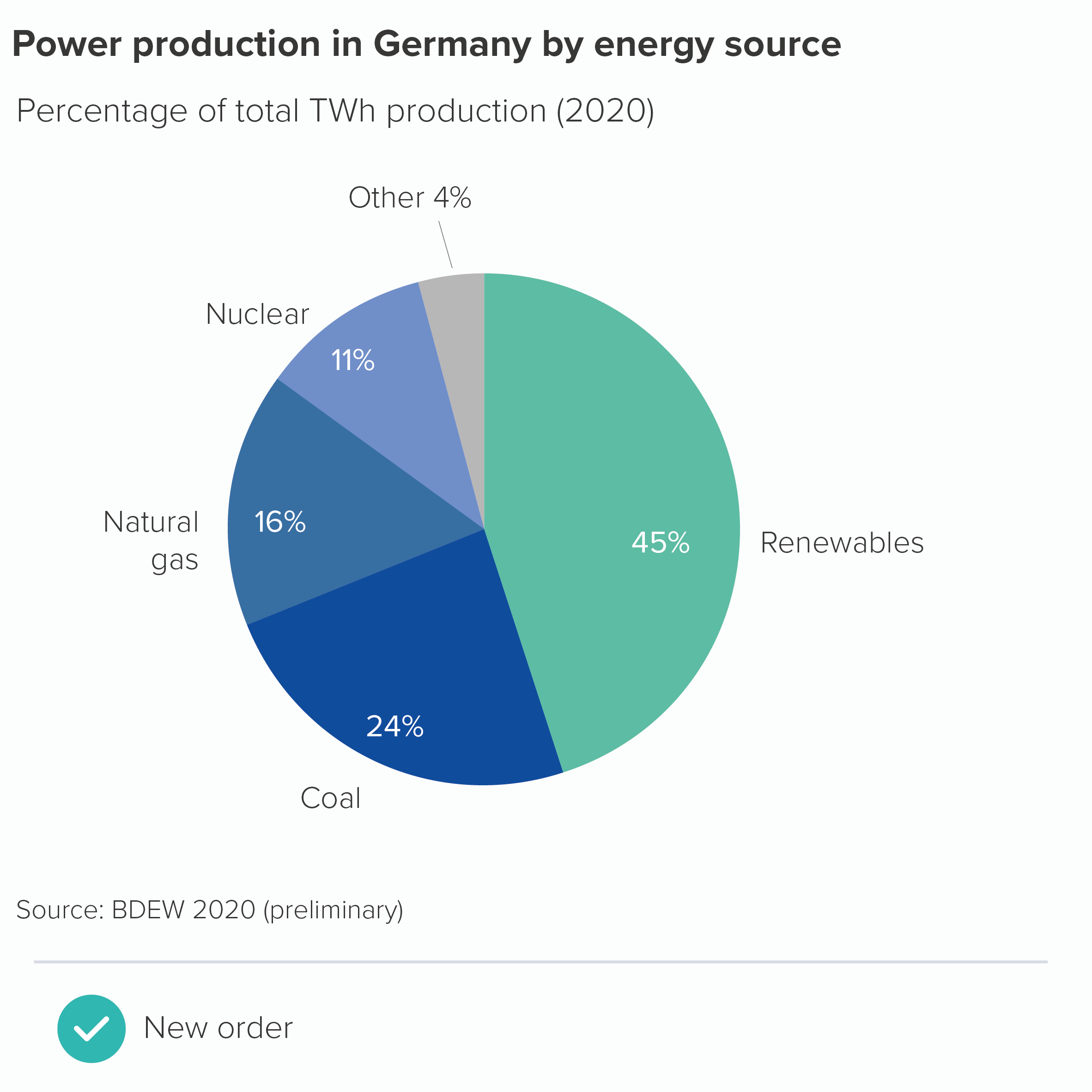
The trouble is, your story sometimes will require the slices to be in a set order. As with bars, bubbles, treemap or any other chart type, there are several reasons why you might not want to put the largest value first. For a start, we’ve mentioned in Rule 3 that you will often group the smaller values into an ‘other’ wedge. This is often your largest wedge but you would, of course, put this last. (Another instance of rules contradicting each other).
Likewise, your wedges might represent linked categories: not following their natural order can make your chart look broken. Take the example of time categories. You might want to divide a variable (e.g. sales) by days of the week.
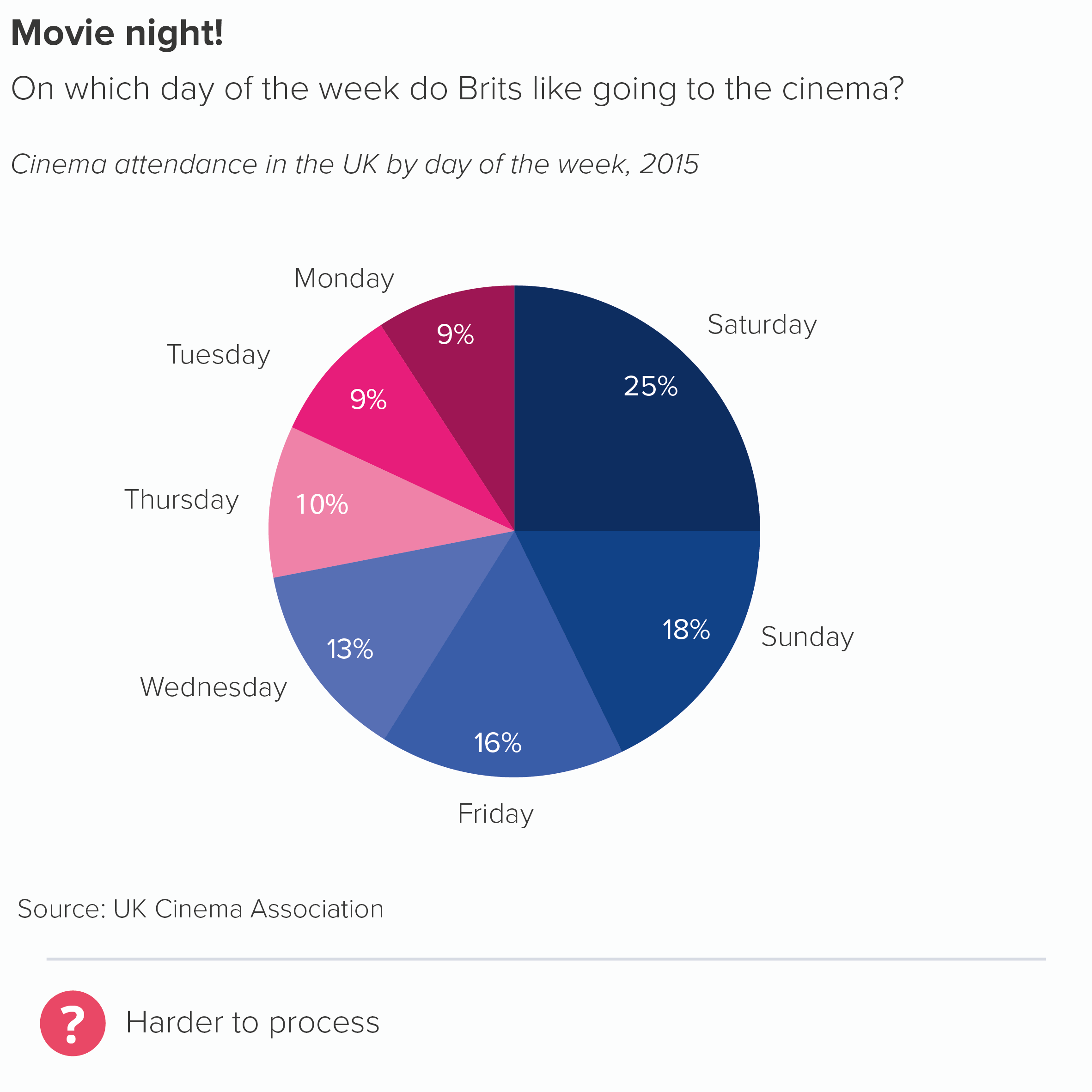
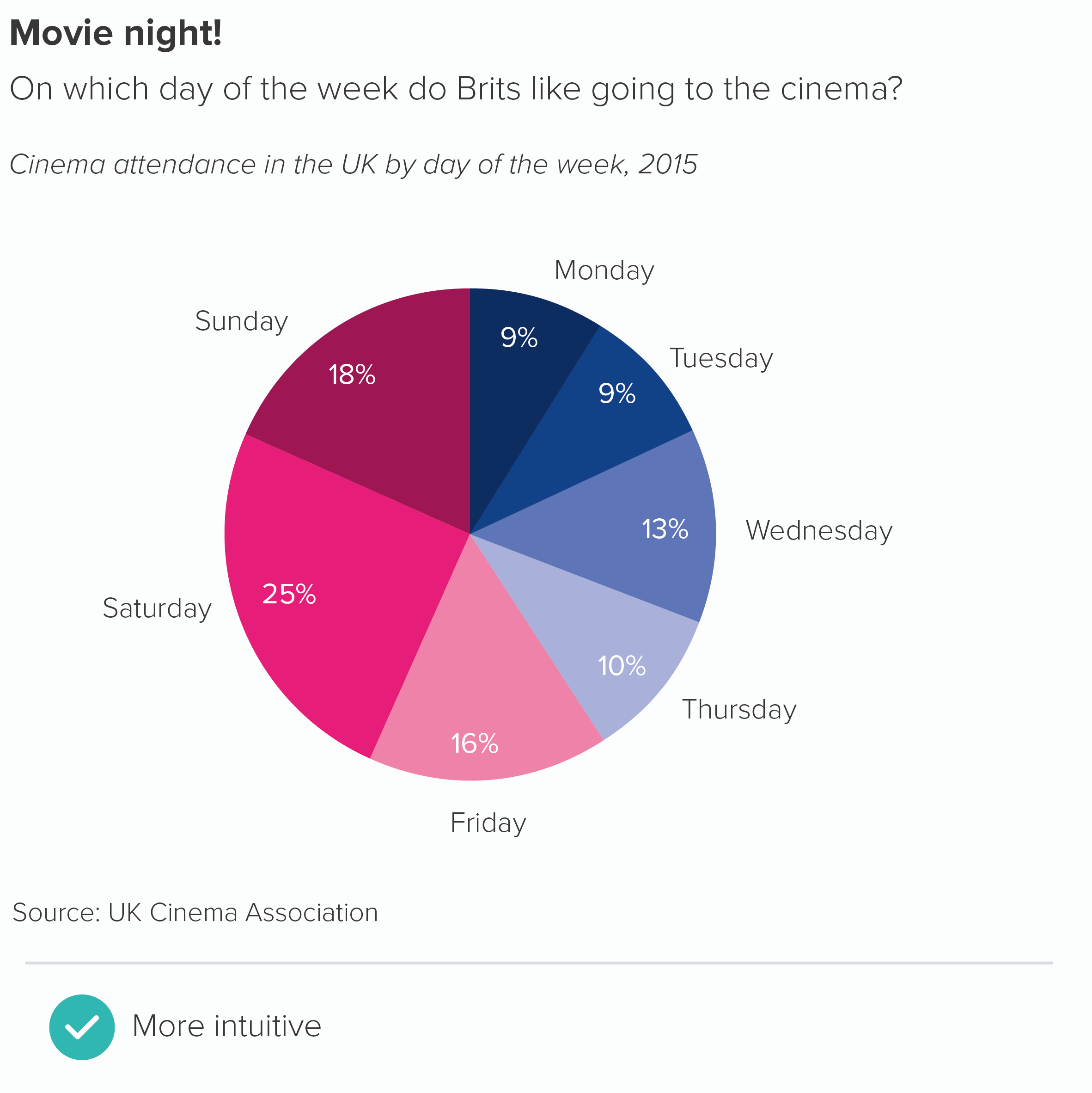
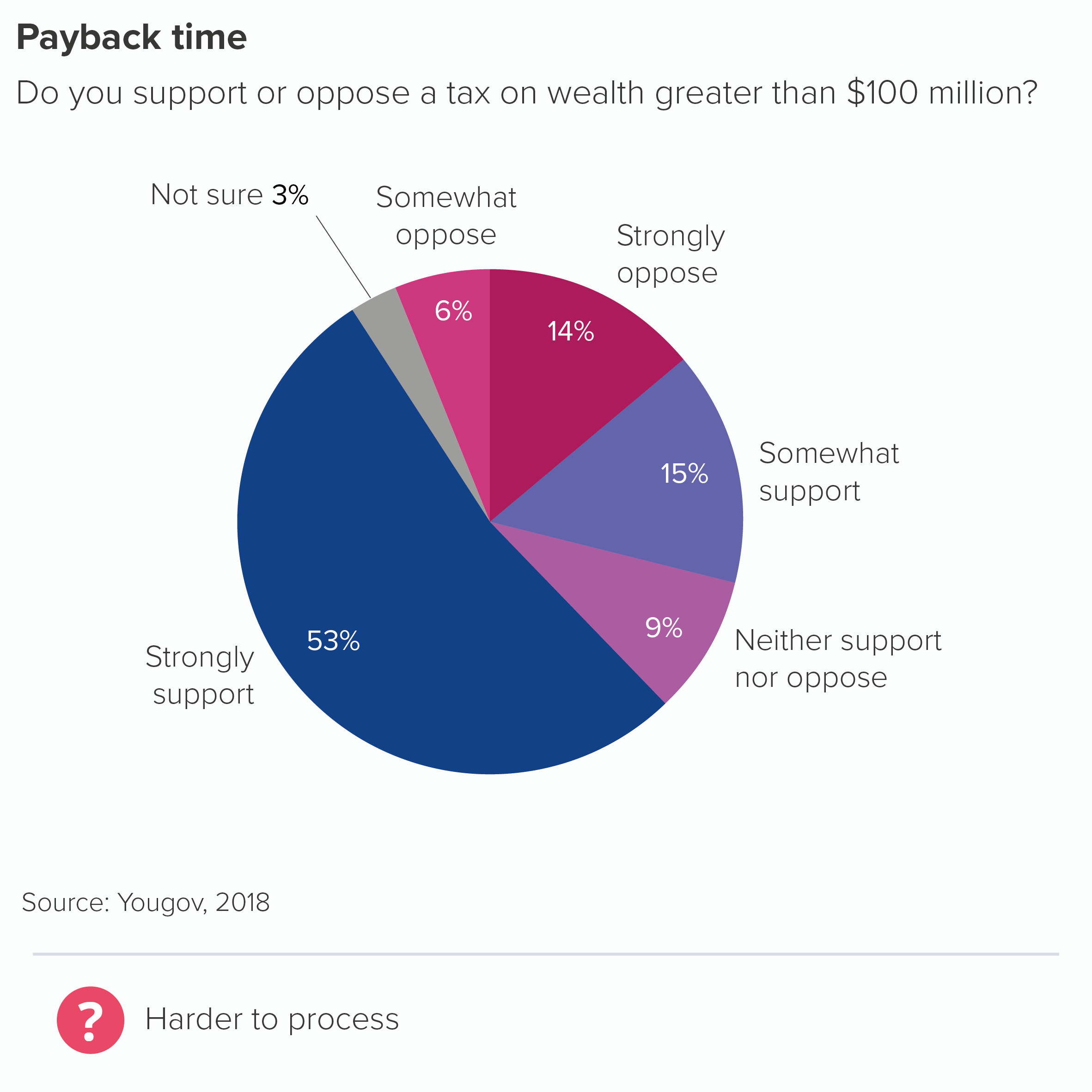
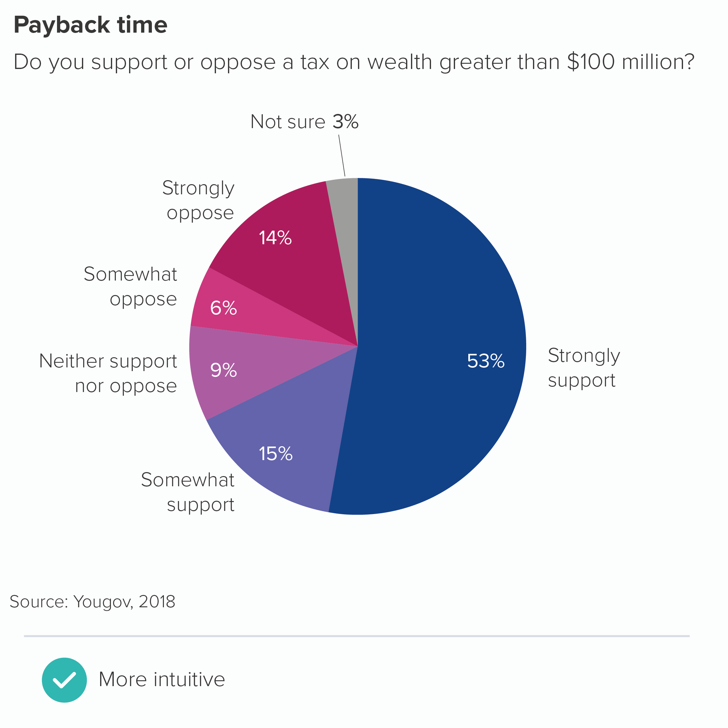
Another example would be where you are mentioning strength of feeling or anywhere else where emotions or opinions are on a continuum.
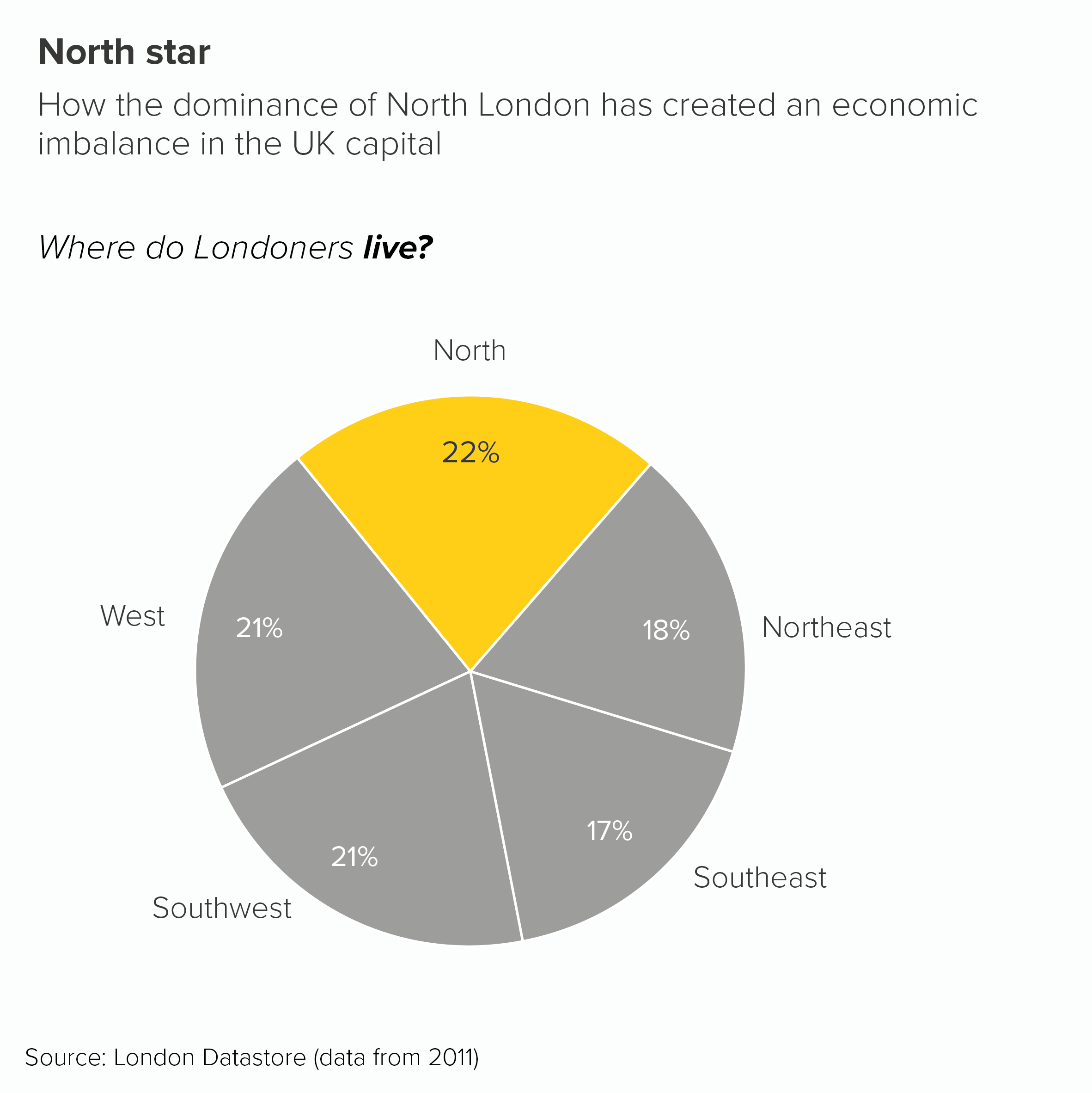
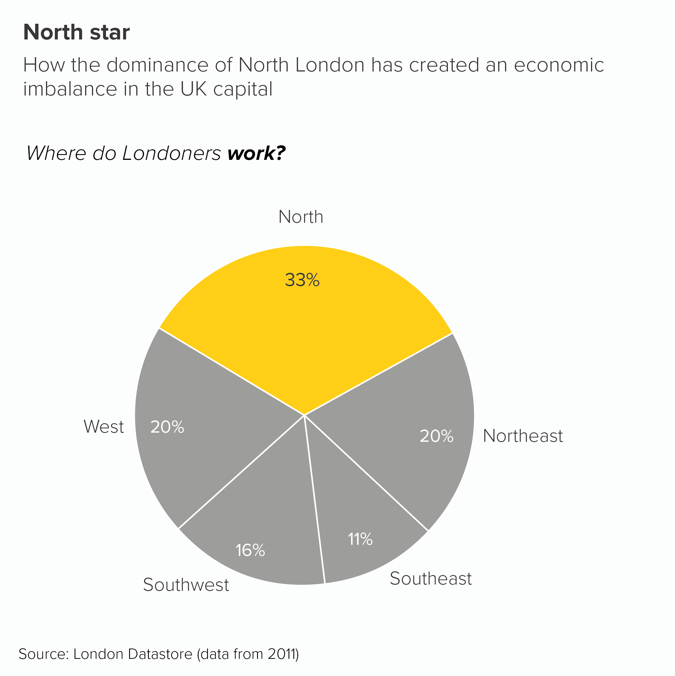
Sometimes you might be leaning into your pie chart as a visual metaphor and want the wedges to represent something spatial or geographical. (This example also breaks at least three of the other rules we’ve mentioned. Kapow!)
At other times, you might not want to suggest that it is better or worse for a category or country to be the highest value. So you might use alphabetical or a random order instead.
I’m not saying a pie chart is the best choice in all these instances, I’m just saying that if you do decide (or are made) to use one, then you might conclude that breaking the arrange highest to lowest rule is the best way of protecting your story. Because, after all, protect your story is the most important rule.
Verdict: Follow this rule sometimes
Sources: German energy data from BDEW (preliminary), UK cinema attendance data from UK Cinema Assocation, US wealth tax data from Yougov, North London data from London Datastore
More data viz advice and best practice examples in our book- Communicating with Data Visualisation: A Practical Guide