
In this blog series, we look at 99 common data viz rules and why it’s usually OK to break them.
by Adam Frost
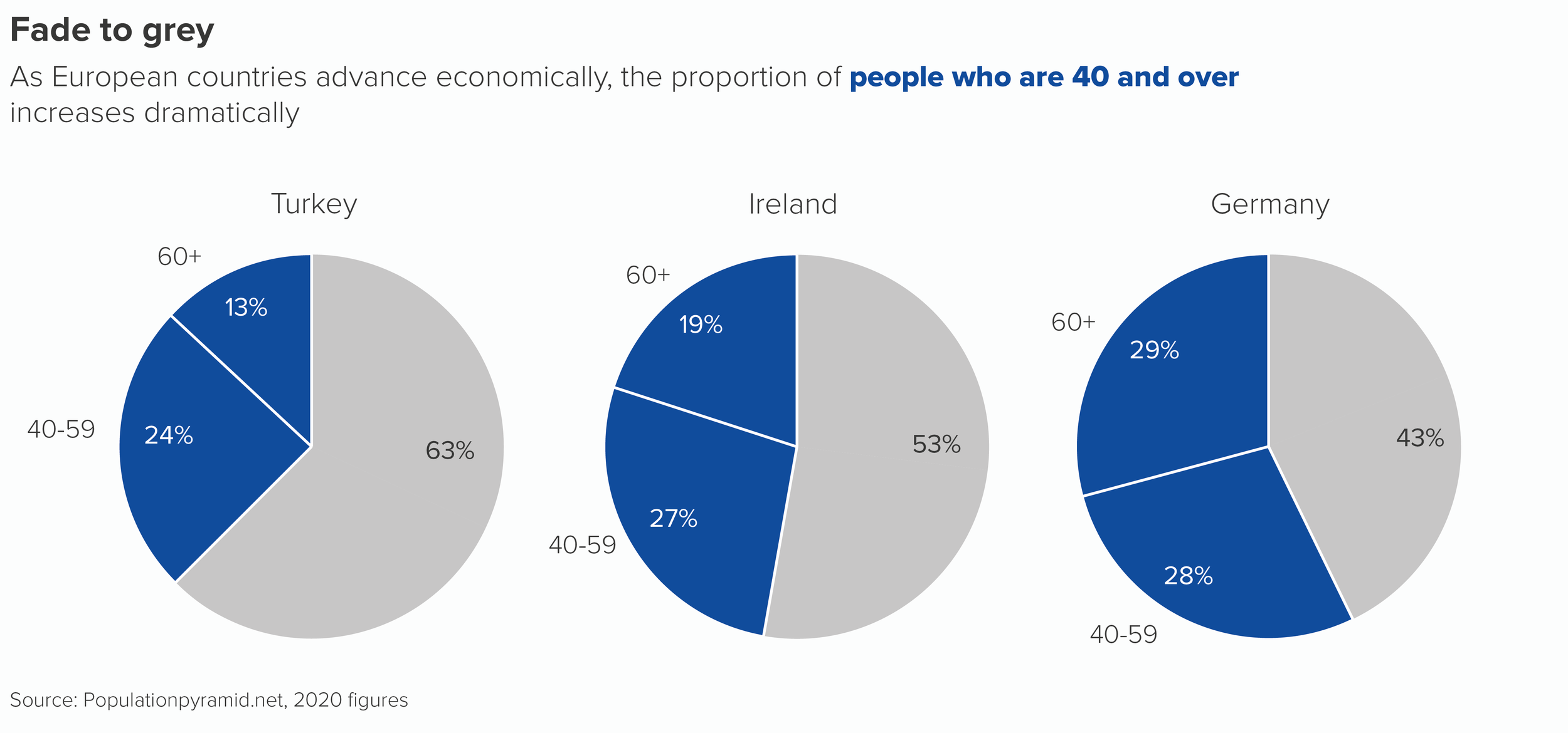
All composition charts become less effective when they are placed side by side. Whether it’s pie charts, stacked bars, treemaps, waffle charts or something else, they all struggle to communicate a clear message when they are multiplied. These charts are designed to show the breakdown of a complete dataset, or the relationship of one part to the rest, not to compare one datapoint to another datapoint in a different dataset.
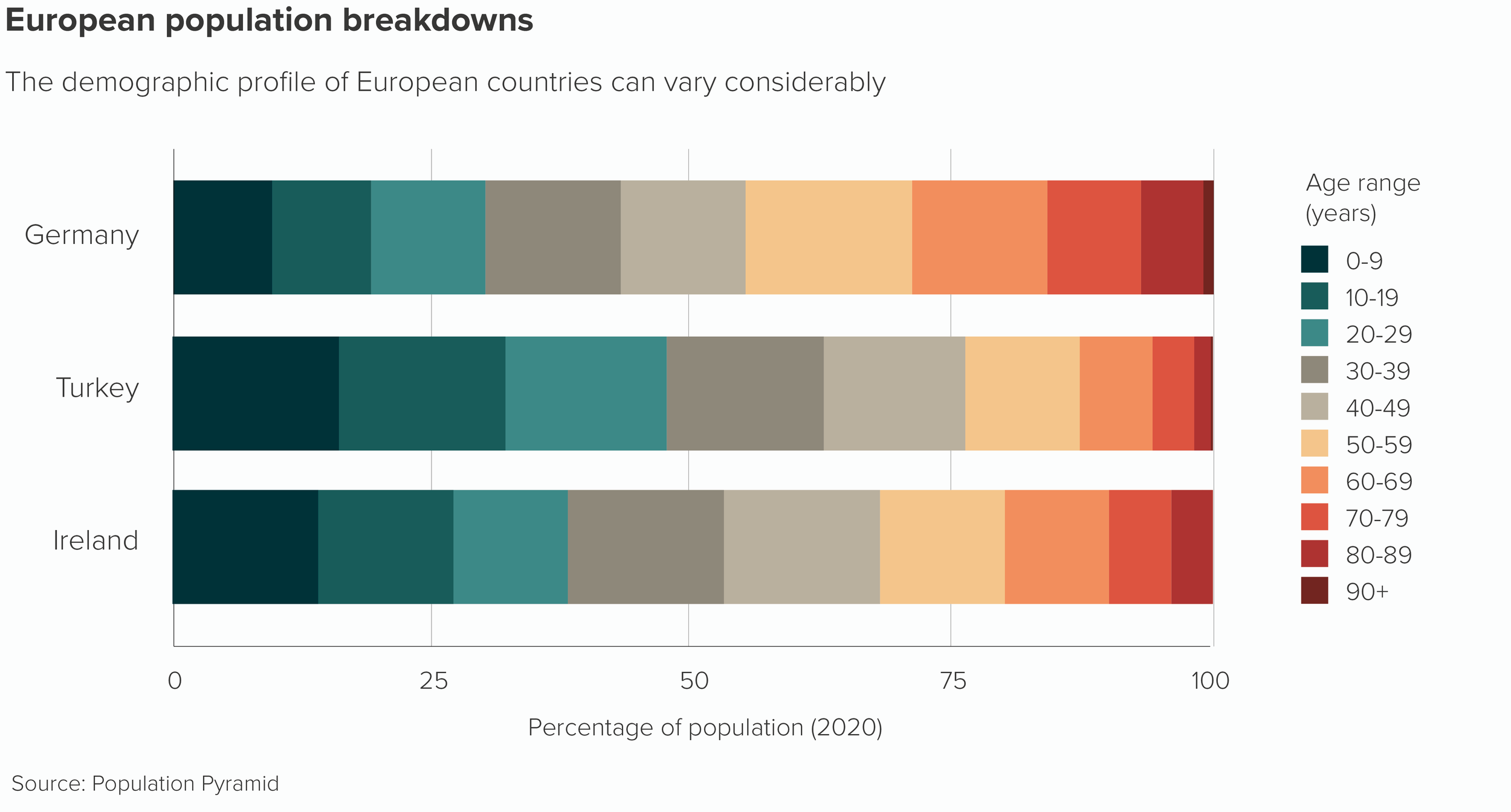
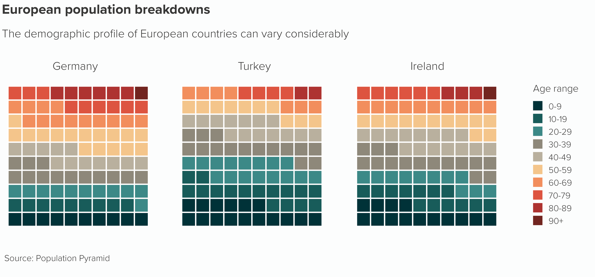
Look at how hard it is to compare the central values in those stacked bars as they jump left and right. Which country has the highest proportion of people in their 40s? With waffle charts, the task of comparison is even harder.
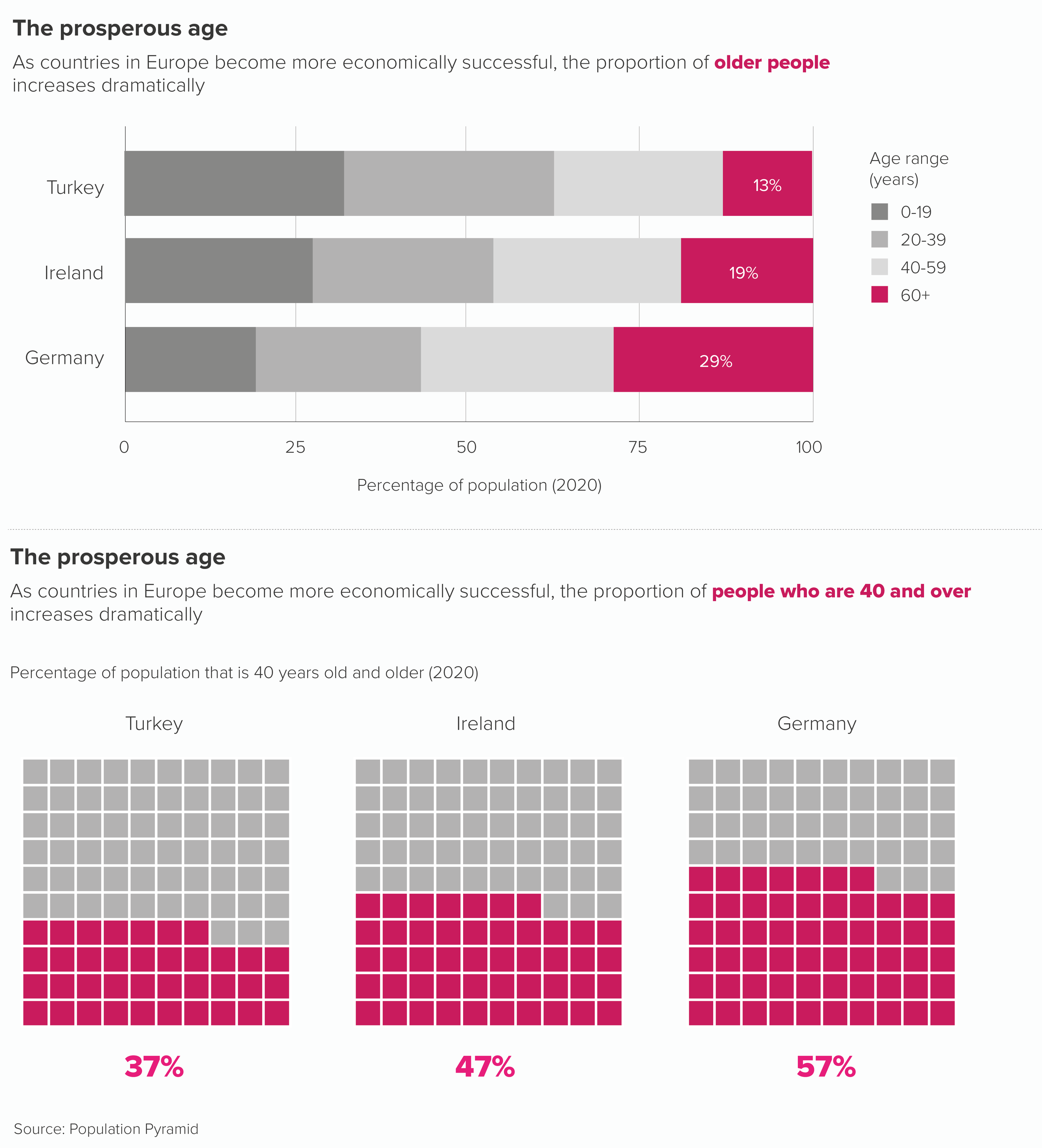
If you want to compare two or more composition charts, you almost always have to editorialise first.
Merge or otherwise reduce the number of categories.
Use a bold colour to accentuate the most important datapoint.
Use text to make the chart’s meaning clear.
Let’s remake our stacked bar and our waffle chart.
Multiple pie charts are subject to most of these problems, and a few more of their own, as comparing two angled wedges in different pies can be even more challenging than comparing two moving rectangles or two rows of squares.
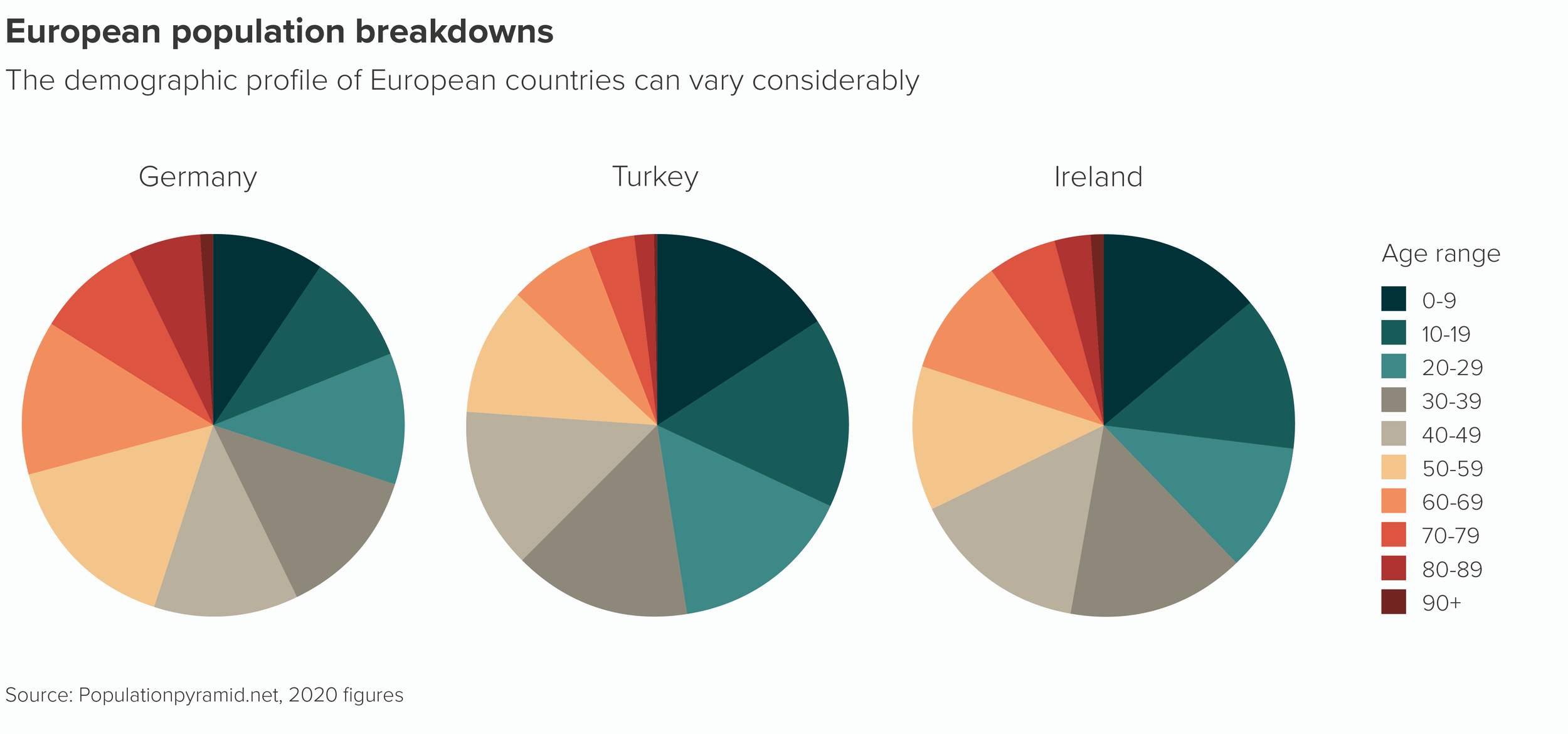
Following just one of those coloured wedges across the three pies as it expands and contracts and swivels up and swivels down is enough to make your head spin.
However, as long as you follow the same guidelines as other composition charts - editorialise and use design wisely - then multiple pies can be a highly effective storytelling tool.
In fact, as with single pies, their attention-grabbing qualities can compensate for any legibility issues and, in some cases, the fact that the audience is slowed down and made to concentrate can be an asset.
To illustrate my point in more detail, I’ll head for the airport. Because multiple pies always remind me of those rows of clocks you sometimes see at airports showing the time in different cities.
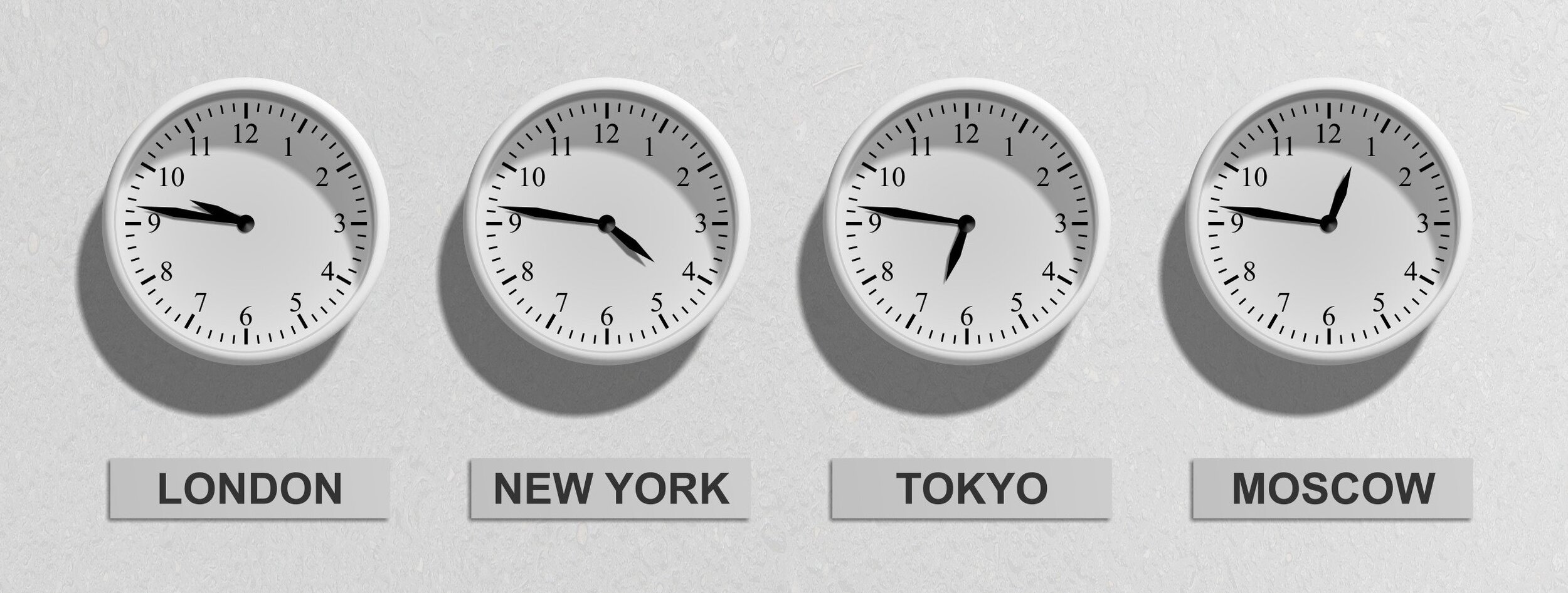
Image by Pixabay via Pexels.com
Yes, I know, it would be more efficient to have 24 hour digital displays instead - they would take up less space and it would be easier to compare the numbers - but digital displays wouldn’t be as effective, because they wouldn’t look as visually appealing, they wouldn’t make me feel anything, and I wouldn’t get the cognitive satisfaction of converting those physical shapes - the hands of the clock - into hours ahead or behind of where I am.
Just as a circle can make us look, so a row of circles can make us look even longer.
So I’ll now briefly discuss the occasions when we do use multiple pies - ahead of other composition chart types - and how we design them so they serve the story as effectively as possible.
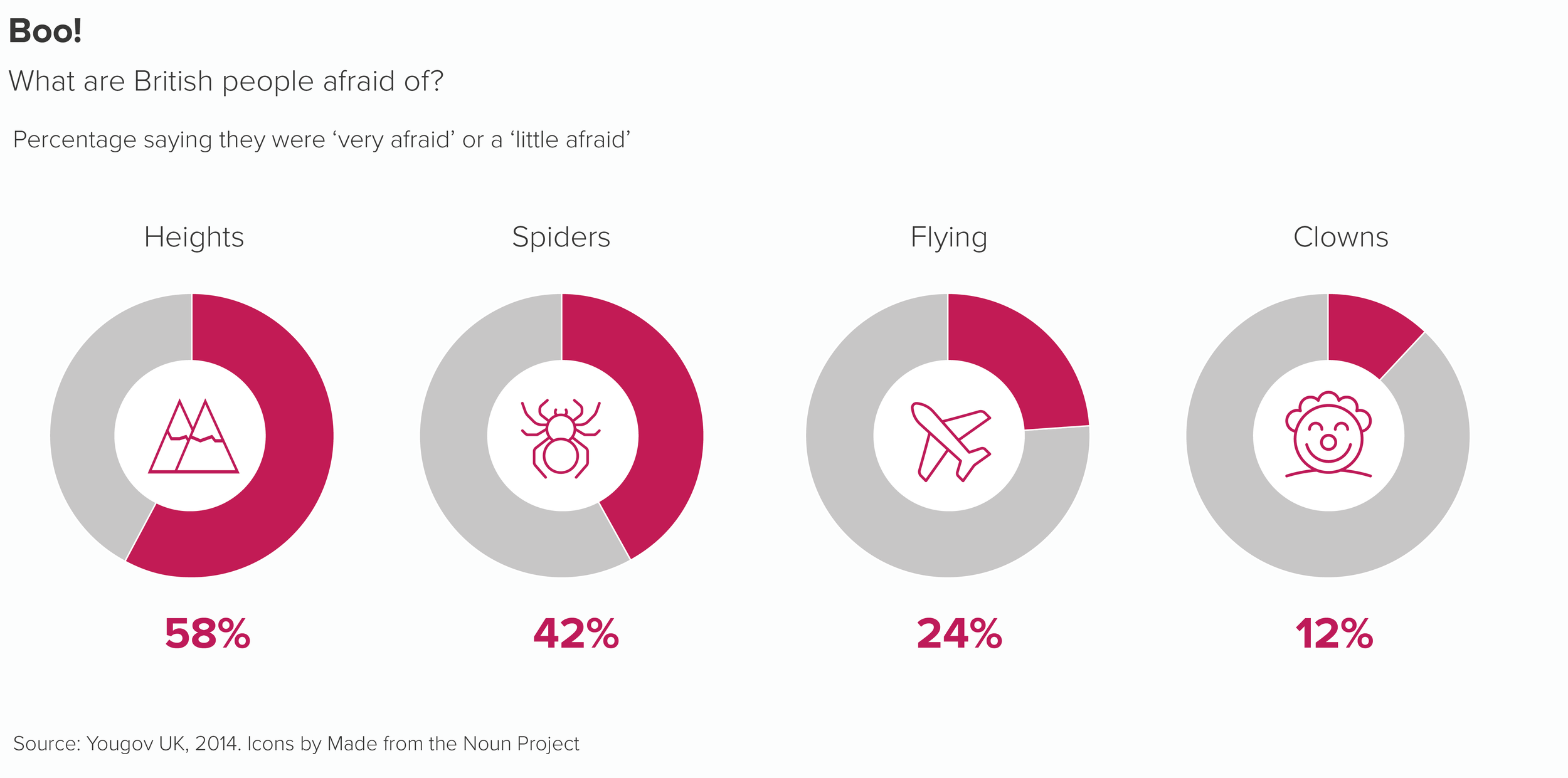
The most common use case is when we have several points in time or several categories where there is a dramatic difference between our key slice. Pies are often a better choice than stacked bars or clustered columns.
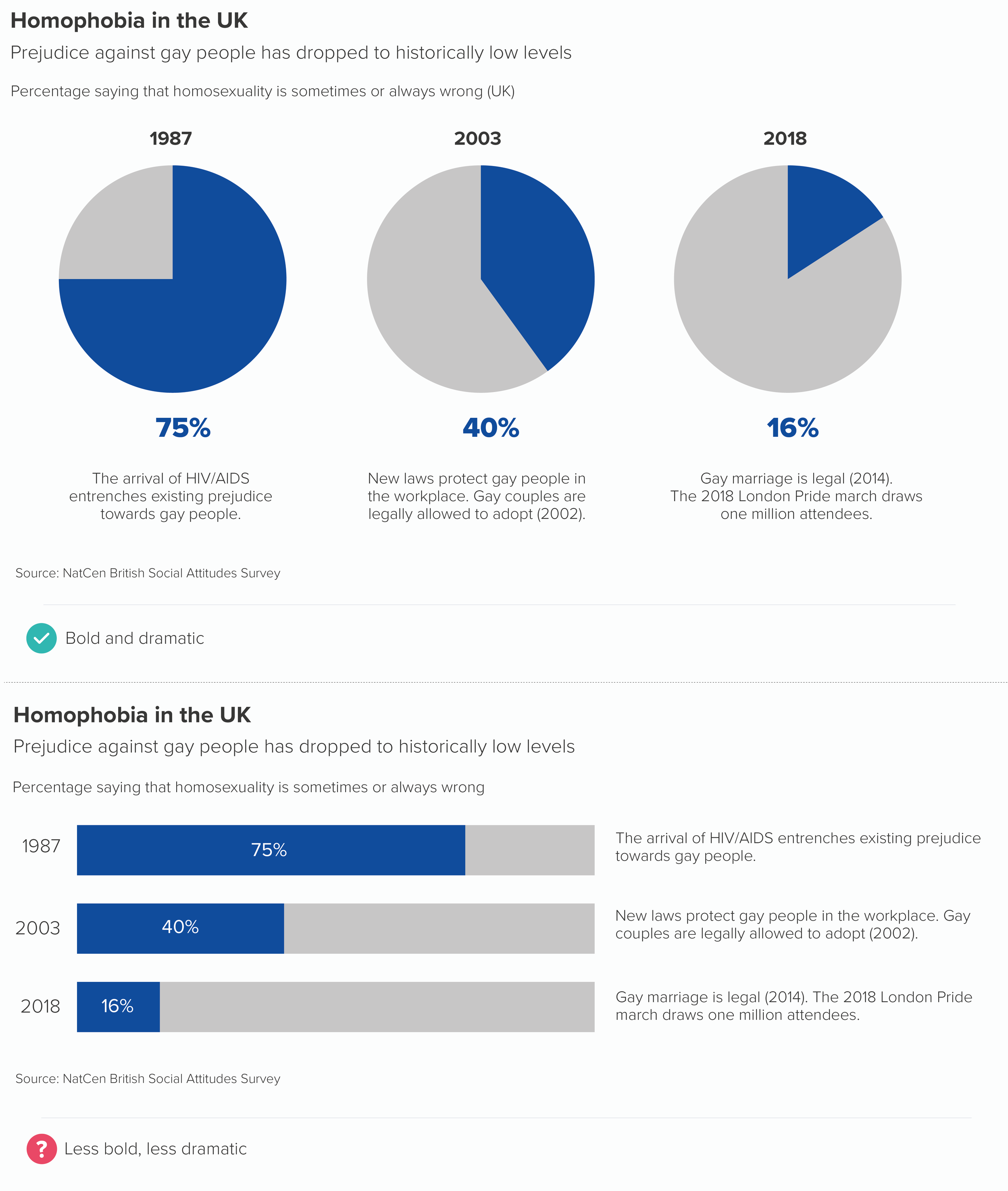
Of course a line chart or area chart can also tell this story. But sometimes, if you just want to call out two or three years, or perhaps it’s an introductory slide in a presentation, then side-by-side pies can isolate the key turning points more effectively.
Another use case: we might want to show consistency across categories. In other words, we would expect the slices to differ in size or to show a different ratio in some contexts, but they stubbornly don’t. Again, pies can be a more dramatic choice than the alternatives.
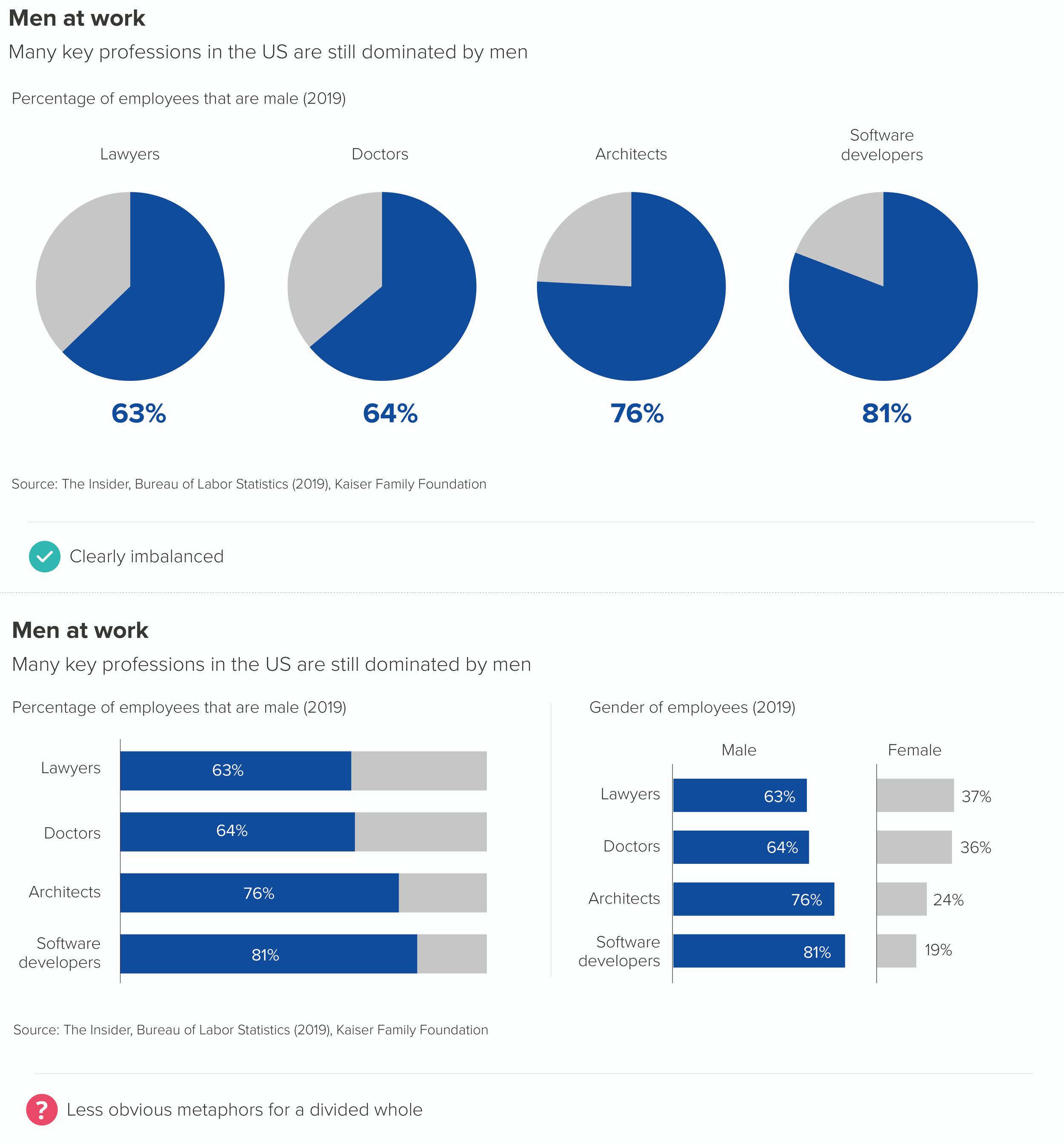
For me, the pies work here because it’s easier to picture what they should look like - a 50/50 split, a bisected circle - and therefore more surprising to see the degree to which they deviate from this perfectly-balanced shape.
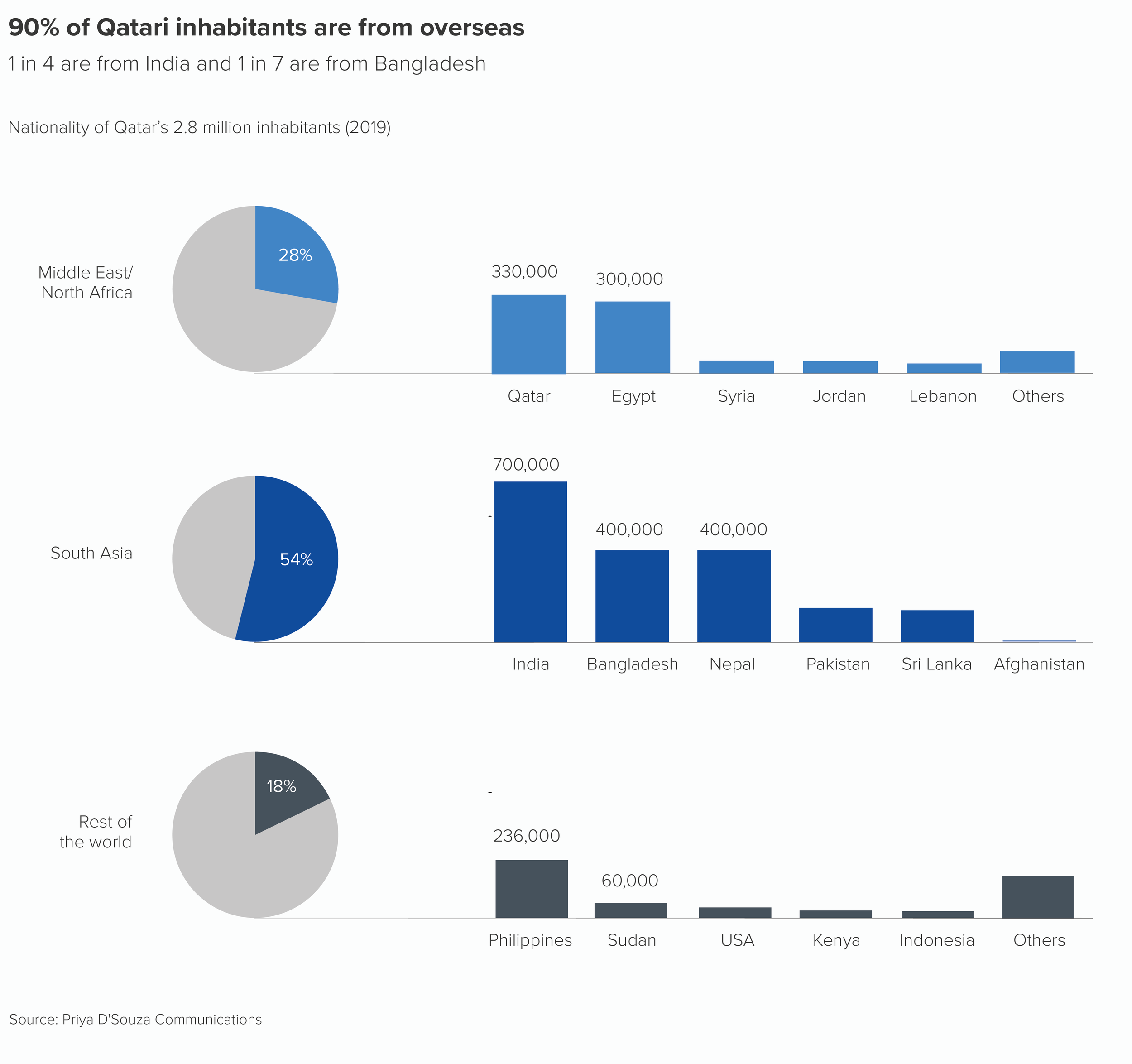
We also like to use side-by-side pies to represent results where people have been encouraged to choose multiple options in a list: tick any pizza toppings you like, tick any countries you’ve visited, that kind of thing. In other words, if you add up all the responses, the total would be a lot higher than 100%, as every option can potentially be ticked by 100% of people. Multiple pies or doughnuts can work in these situations, particularly doughnuts as you can drop an icon in the centre to illustrate the category.
Furthermore, I like using multiple pies in combination stories, where the pie almost becomes a bullet-point introducing a secondary level of detail.
One final point on side-by-side pies - and in fact pies in general. Much is made of the fact that pies take up space, and they ‘aren’t worth the space they take up’, to quote Cole Nussbaumer Knaflic. Drawing a huge circle and filling it with colours just to show two or three datapoints - what a waste of ink! A bar can convey the same information in a fraction of the space.
But remember we are communicating now, not analysing. Whereas information density is useful during the analysis stage - most dashboards cram the screen with charts - it is catastrophic when you are trying to communicate, as the example below shows.
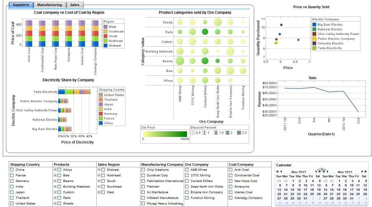
Source: Stephen Few, Perceptual Edge
When you are telling a story, limiting the amount of information you show and clearing a space around it is vital. Cognitive load theory teaches us that this is the only way we can effectively take in new information: when it is packaged into small, coherent units, spaced out and disclosed progressively.
Looked at in this light, the ‘inefficiency’ of a pie chart becomes its superpower. It not only forces you to take up a large amount of space with a small number of relevant datapoints, but it also enforces a frame, it makes its own white space around it, and clearly signals that this is one self-contained unit of information.
That white space - which is dead space when you are analysing data - here becomes breathing room, headspace, respite.
Let’s imagine you’re telling a story about prejudice towards immigrants.
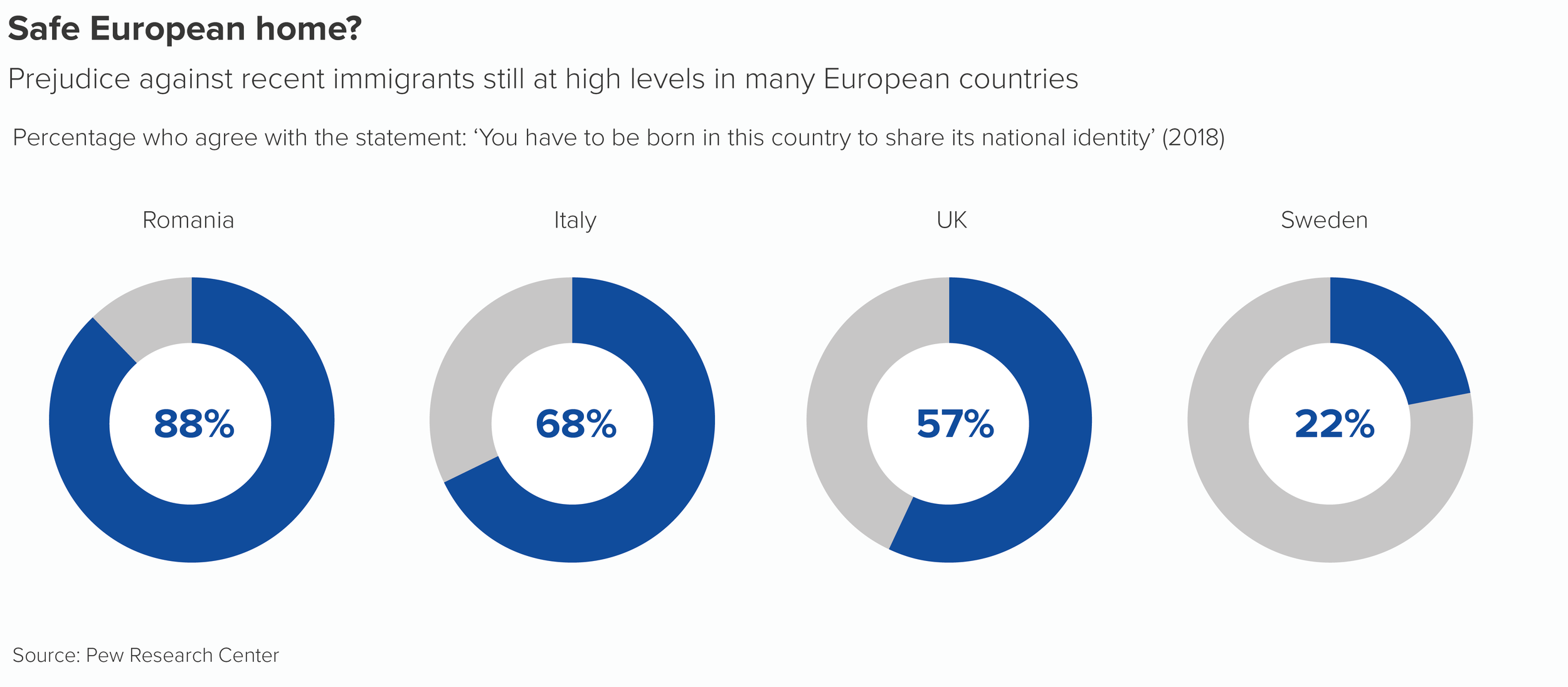
Why wouldn’t you fill the screen with these four numbers? They’re central to your story and you want people to pay attention to them.
Pie charts are superb amplifiers, so the only real danger is that they will amplify bad decisions as well as good ones. Used correctly, they are powerful narrative tools and multiplying them can be a great way of dramatising those key numbers, those vital statistics, the facts that deserve to be dwelt on for longer.
Verdict: Follow this rule sometimes
Sources: Population data from Populationpyramid.net, Homophobia in the UK data from NatCen BSA, US gender in workplace data from Bureau of Labor Statistics 2019; British phobias data, Yougov; Qatar population data, Priya D’Souza Communications; Prejudice against immigrants data, Pew Research Center
More data viz advice and best practice examples in our book- Communicating with Data Visualisation: A Practical Guide