
In this blog series, we look at 99 common data viz rules and why it’s usually OK to break them.
by Adam Frost
First things first. The terms legend and key originally meant different things. The key was just one part of the legend (I feel like I’m describing a story in the Arabian Nights). In map-making, where the terms originated, the key listed all the symbols used on the map and described what they were - e.g. a circle with a cross on top = a church with a spire. The legend included the key but also all kinds of other information - the map scale, the projection, sources, who made it, copyright details and so on.
But nowadays, key and legend are used interchangeably to mean the same thing, and because common usage should always be your guide, you can use either too. I’m going to use key just because I prefer the unlocking metaphor - reading it reveals the chart's meaning. I also like key because it always makes me stop and think before I add one. Why does this chart need a key? Why have I locked its meaning up? Isn't the job of data visualisation to release the stories locked inside spreadsheets (all those overcrowded cells...)?
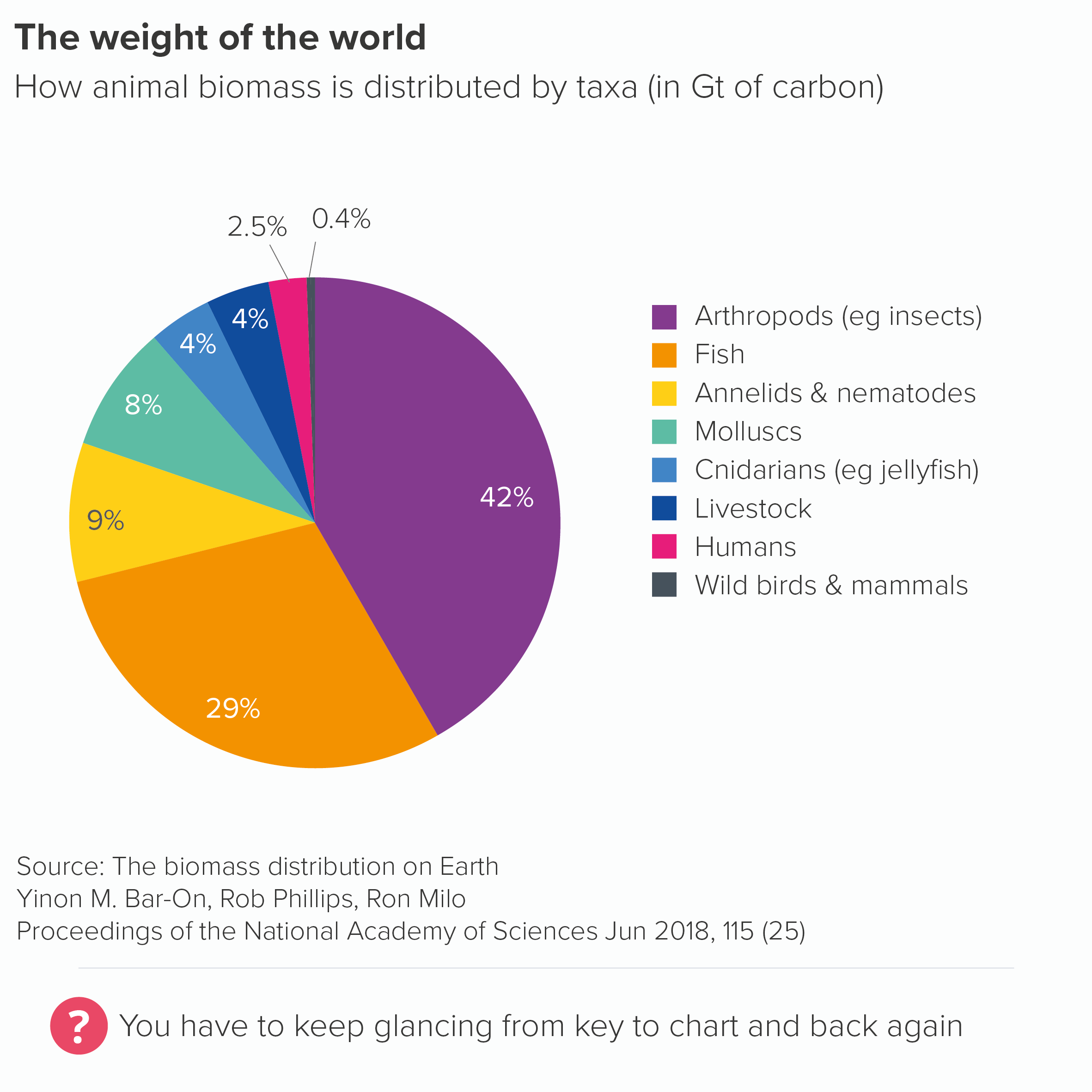
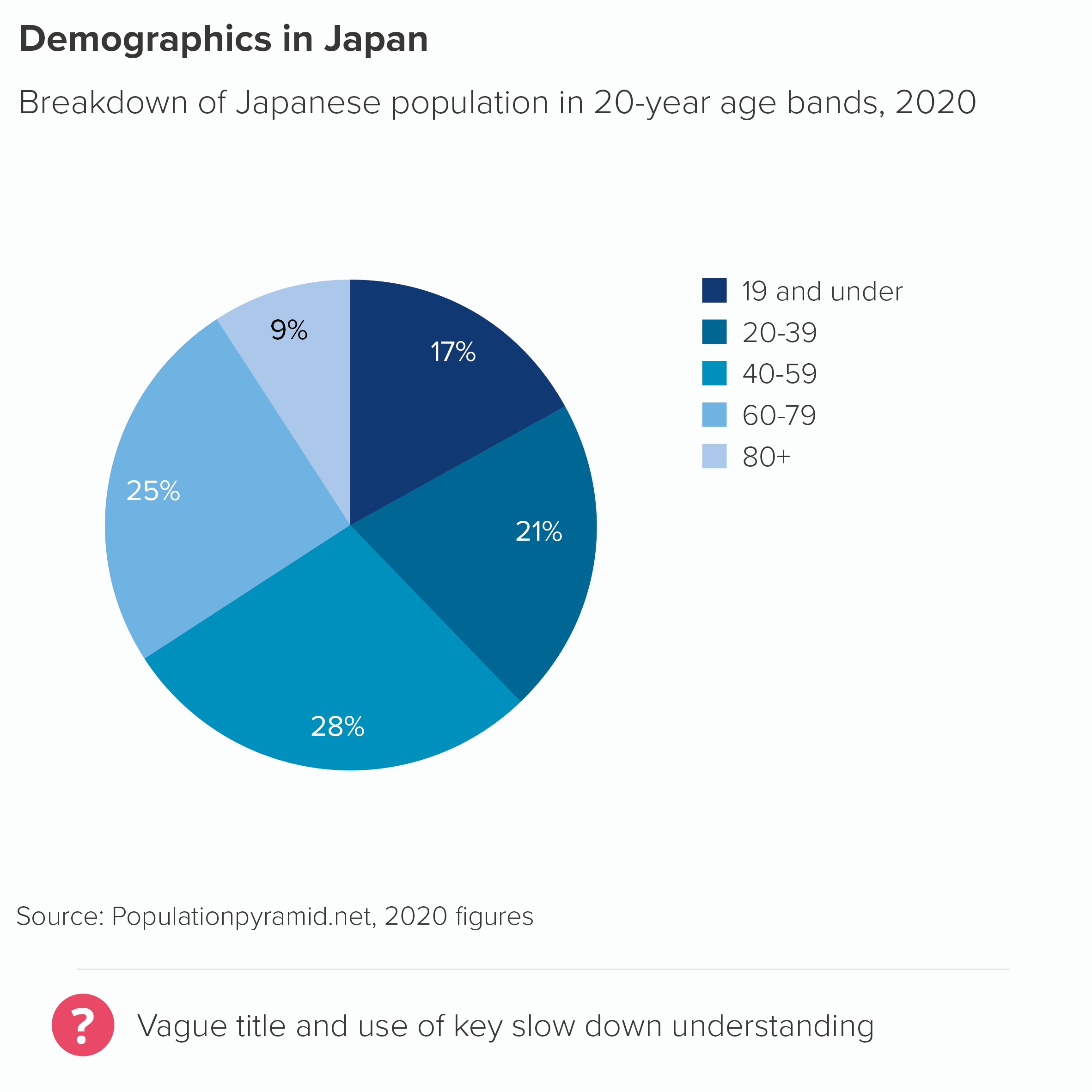
This is particularly the case with pie charts. Although ‘Give your pie chart a key’ may not exactly be a rule, it’s definitely an accepted convention. At the time of writing, if you insert a pie chart into Powerpoint, it will automatically add a key, as will ggplot, Datawrapper, Flourish, Venngage and most of the other tools we use. Default pies from Powerpoint, Datawrapper, Flourish and Venngage are shown below.
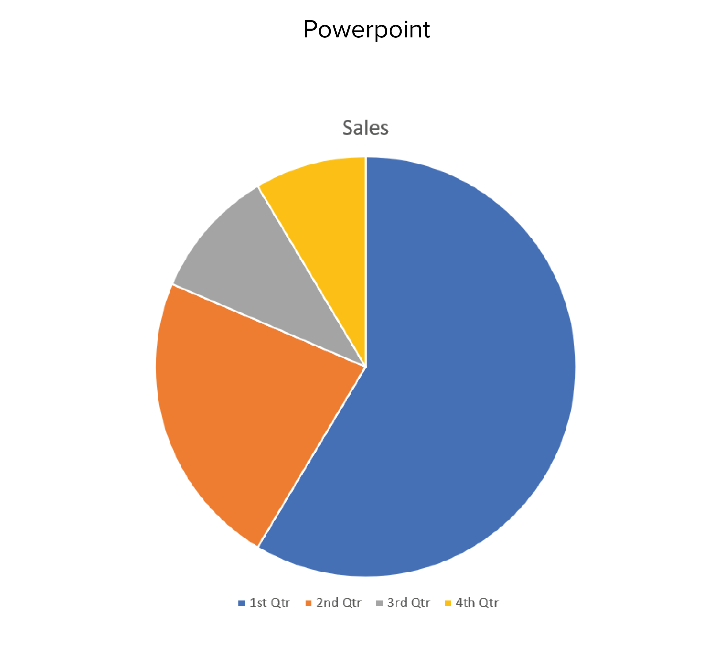
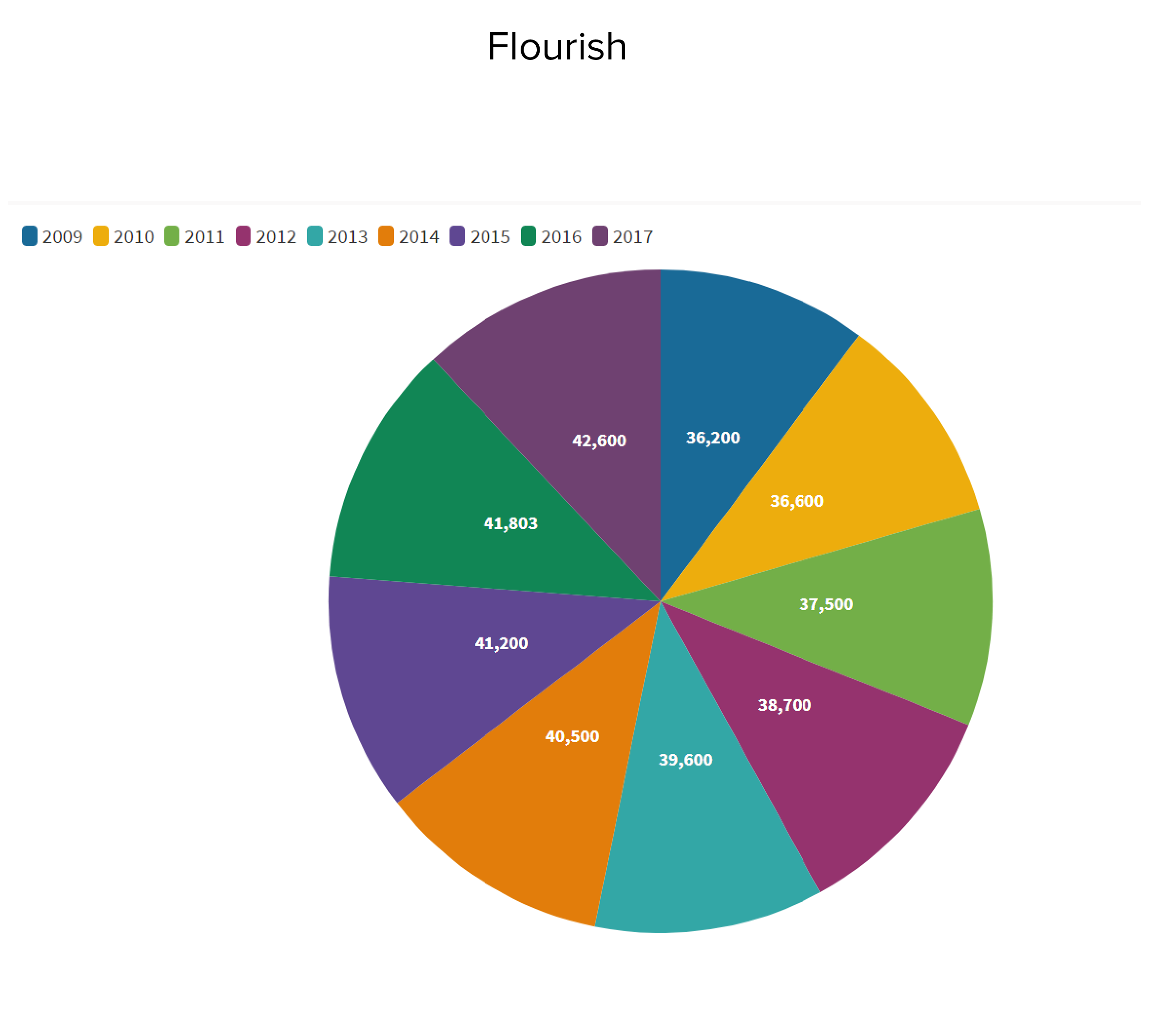
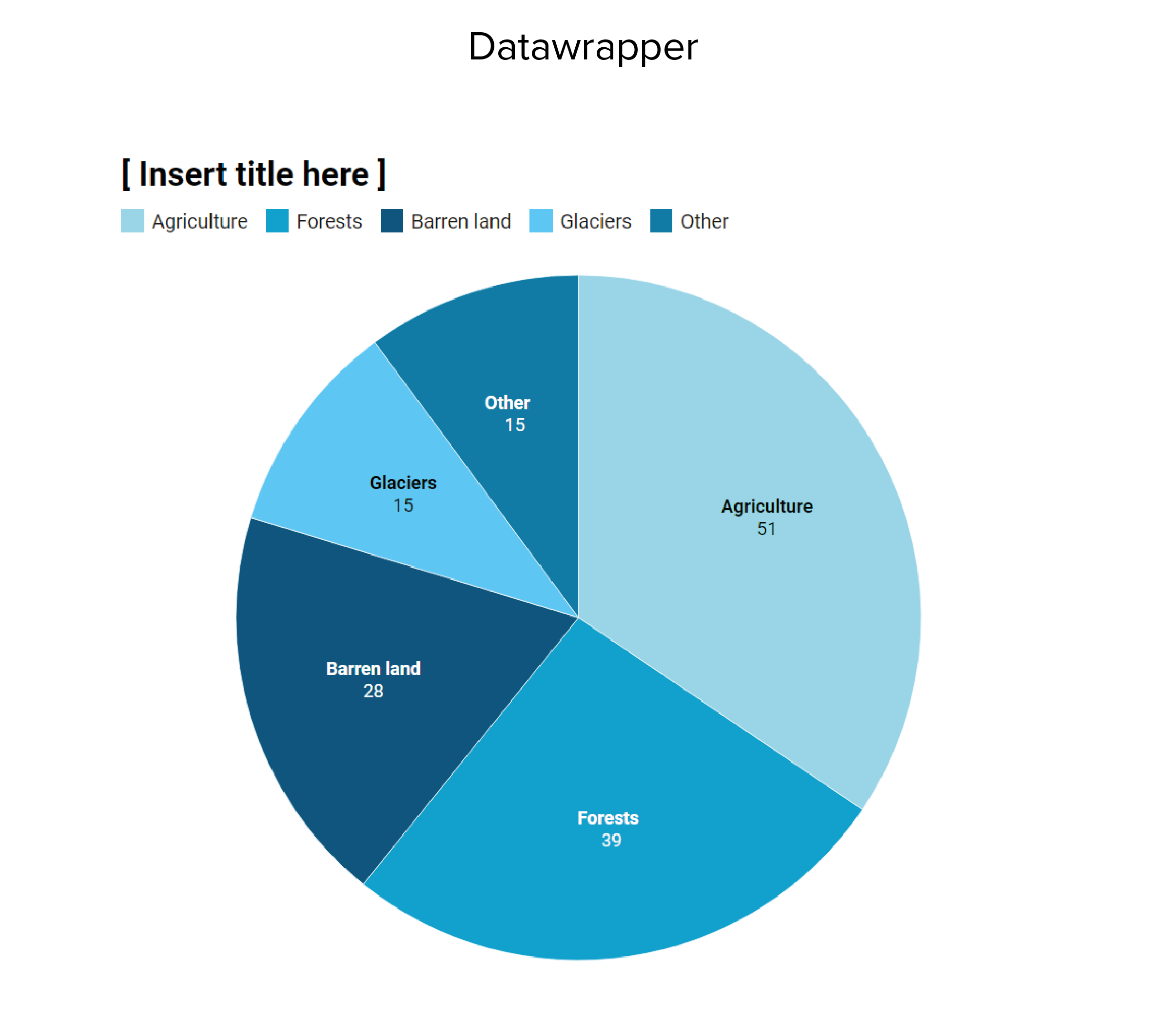
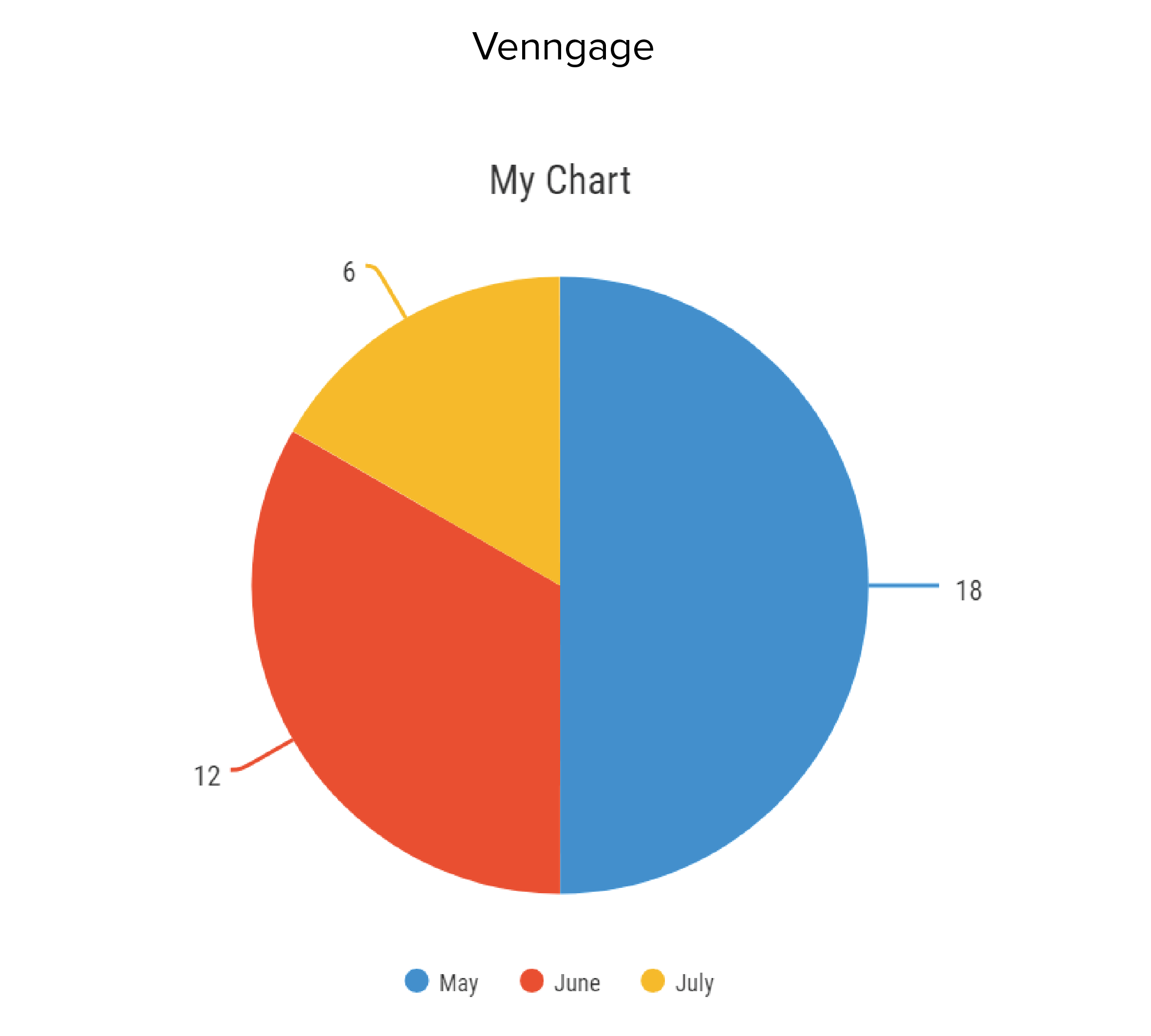
As you can see, all these tools put the pie chart key in different places: ggplot on the right-hand side, Powerpoint and Venngage underneath, Datawrapper and Flourish at the top. But they all add a key.
Datawrapper puts a text label and number on each wedge and duplicates the text labels in the key; Flourish puts a number on each wedge, but leaves the text labels on the key; Venngage is similar except the numbers are outside the wedges. Powerpoint leaves the wedges unlabelled.
This lack of consensus about the position and purpose of the key suggests a more fundamental problem: nobody knows what to do with it.
The reason for this is because the ideal position for a pie chart key is nowhere.
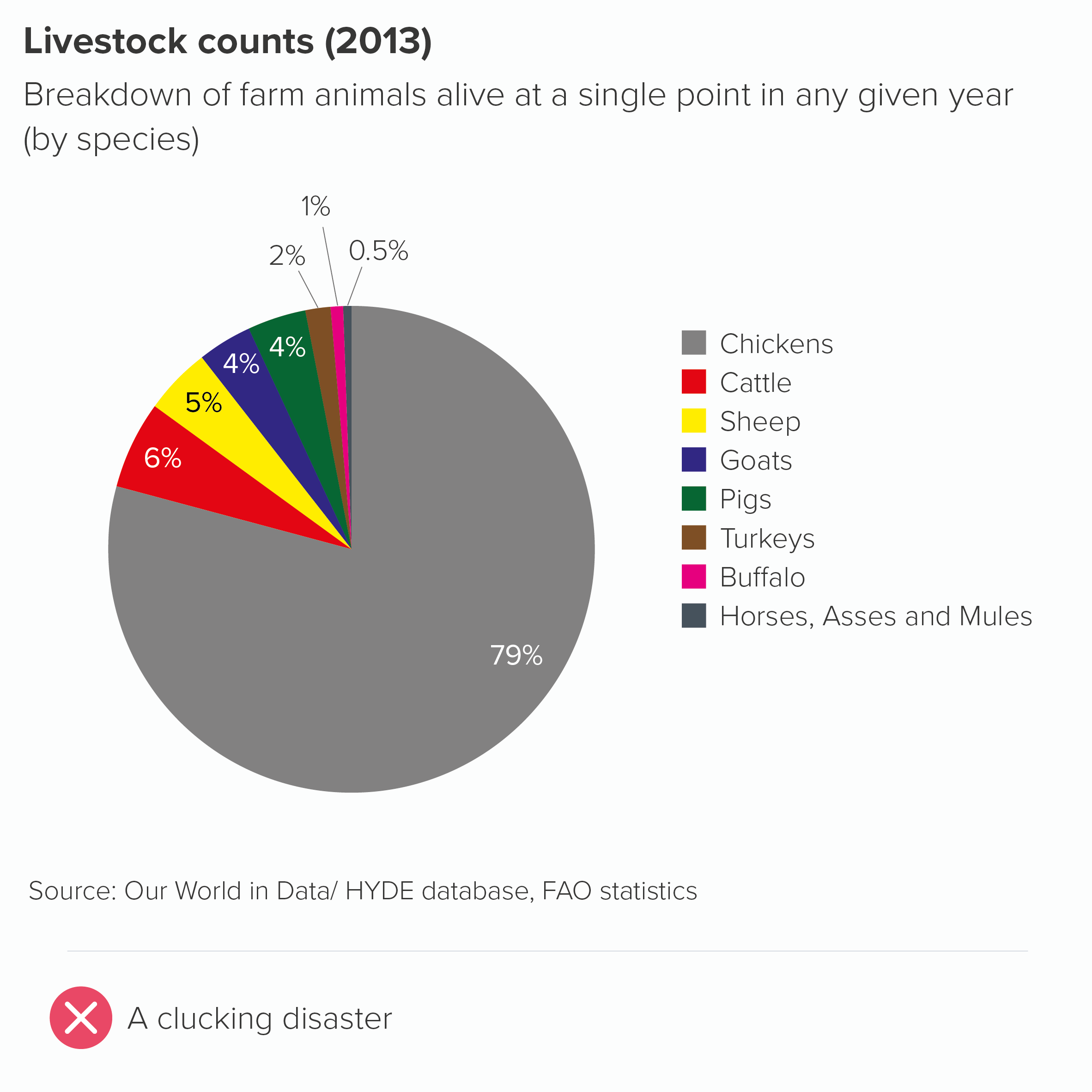
If you’re having to resort to a key for a chart as simple as a pie, there are usually deeper storytelling problems to address. Too many wedges? An unclear title? The wrong chart for the story?
The only exception I can think of is if you’re using multiple pies or repeating pies throughout a presentation. In these cases, a key for the first instance of the pie can be helpful. But even here, the title can often do the job for you. I’ll cover this in the next rule.
In all other cases, asking your audience to keep glancing from chart to key and back again involves them expending cognitive effort without any commensurate reward. Pie charts are just not semantically dense enough to give the reader any cognitive or emotional satisfaction from ‘unlocking’ them.
True, a key can sometimes look neater, making your chart appear less cluttered. But this is one of the few examples of an aesthetic approach - a cleaner design - leading to more work for the audience.
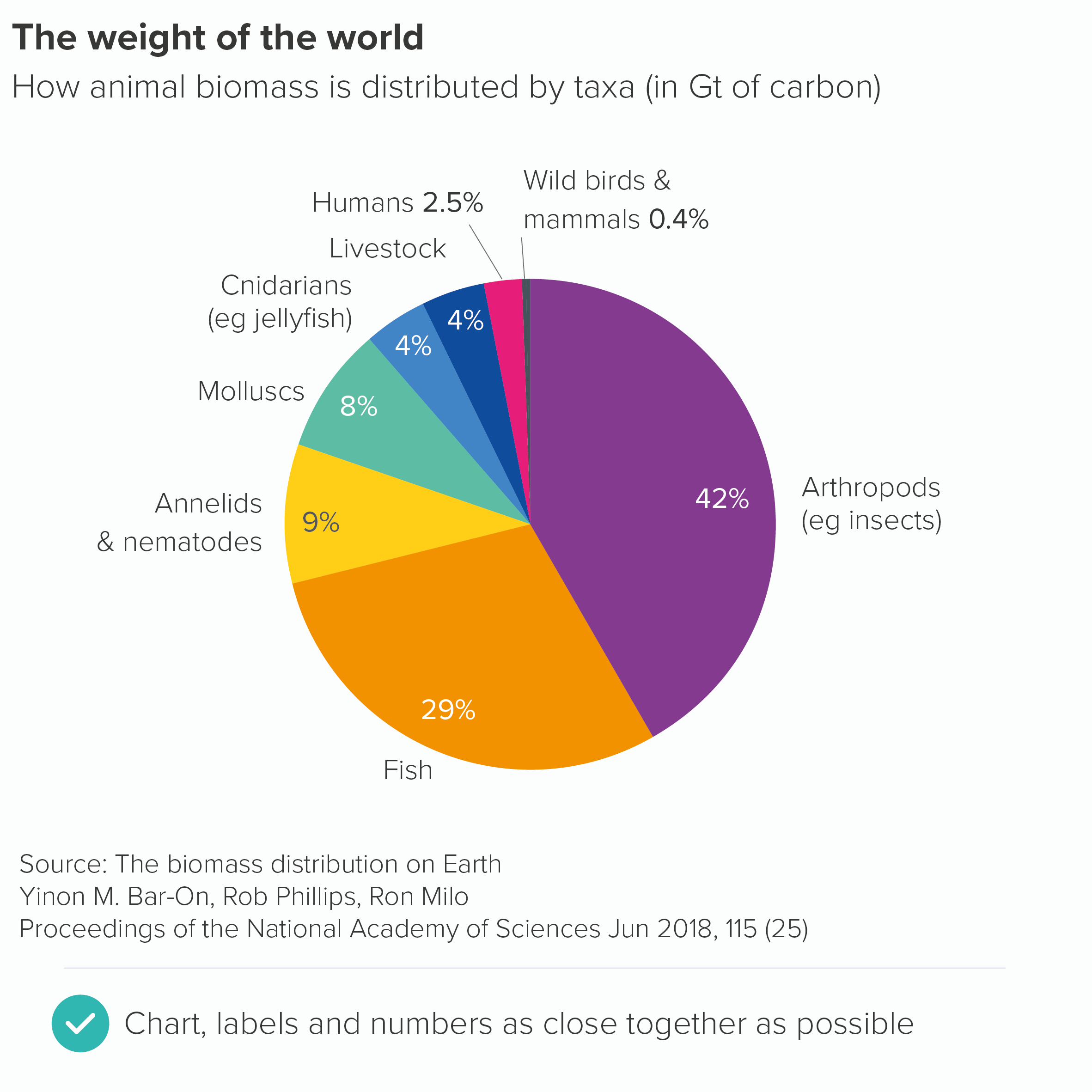
So keep your labels and numbers either on the chart (if there’s space) or next to the slices. You might end up putting the numbers on the slices and the labels outside. Sometimes the smaller wedges need to be labelled differently, as there isn’t always enough space to put either label or number on the slice itself, so you have to use a connecting line. Try to be as consistent as you can (without torturing the content) and remember that pie charts aren’t the easiest charts to read, so you are trying to minimise any extra obstacles between your audience and the chart’s meaning.
If your pie chart is interactive, you might be able to remove even more text: perhaps keeping the category labels, but only revealing the values on rollover.
The other thing to remember is that where only two or three of the wedges are relevant for your audience, you only have to put numbers on those wedges.
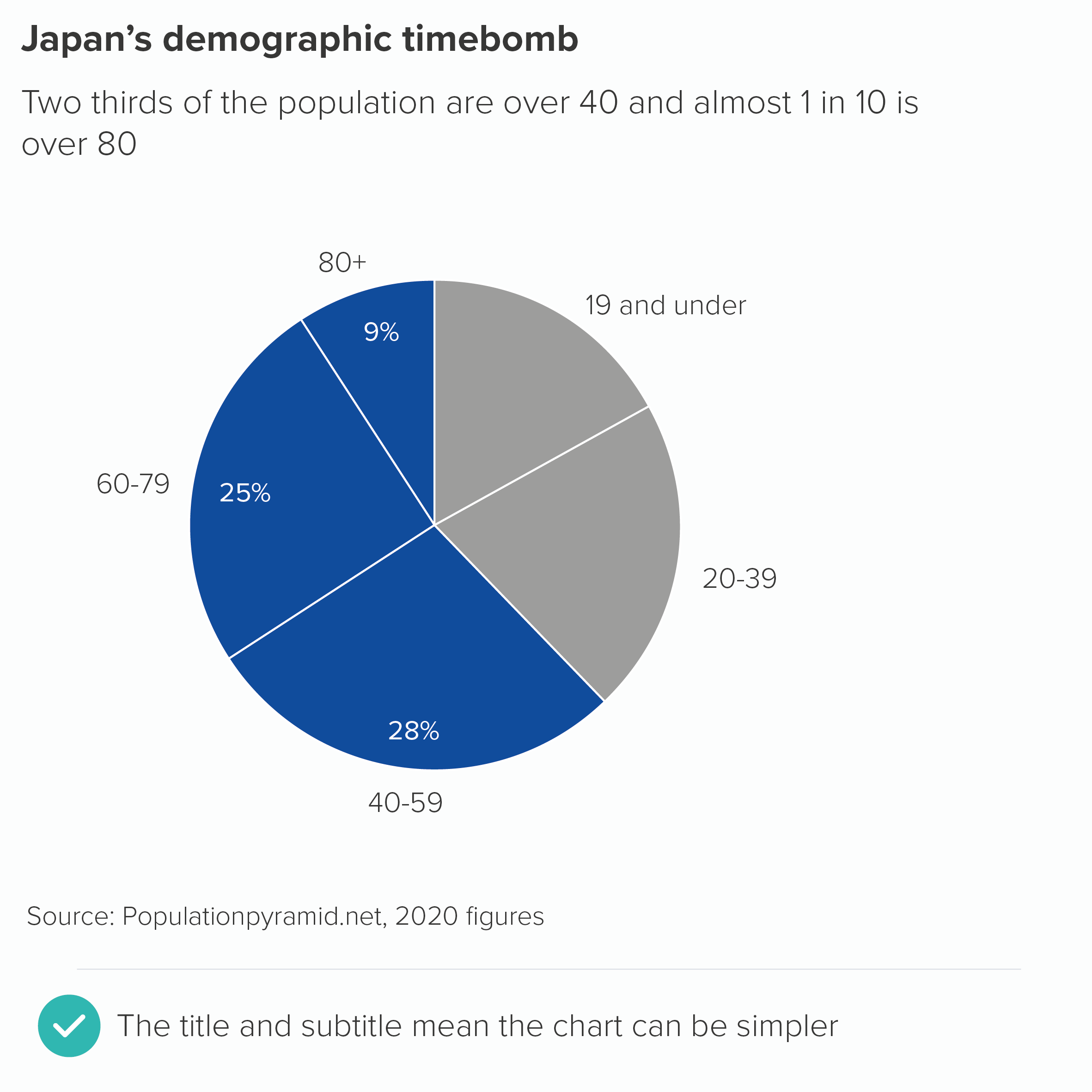
In fact, often your title can make the chart’s message sufficiently clear, and you can keep your pie chart clear of any numbers at all, and let the shapes alone work their magic.
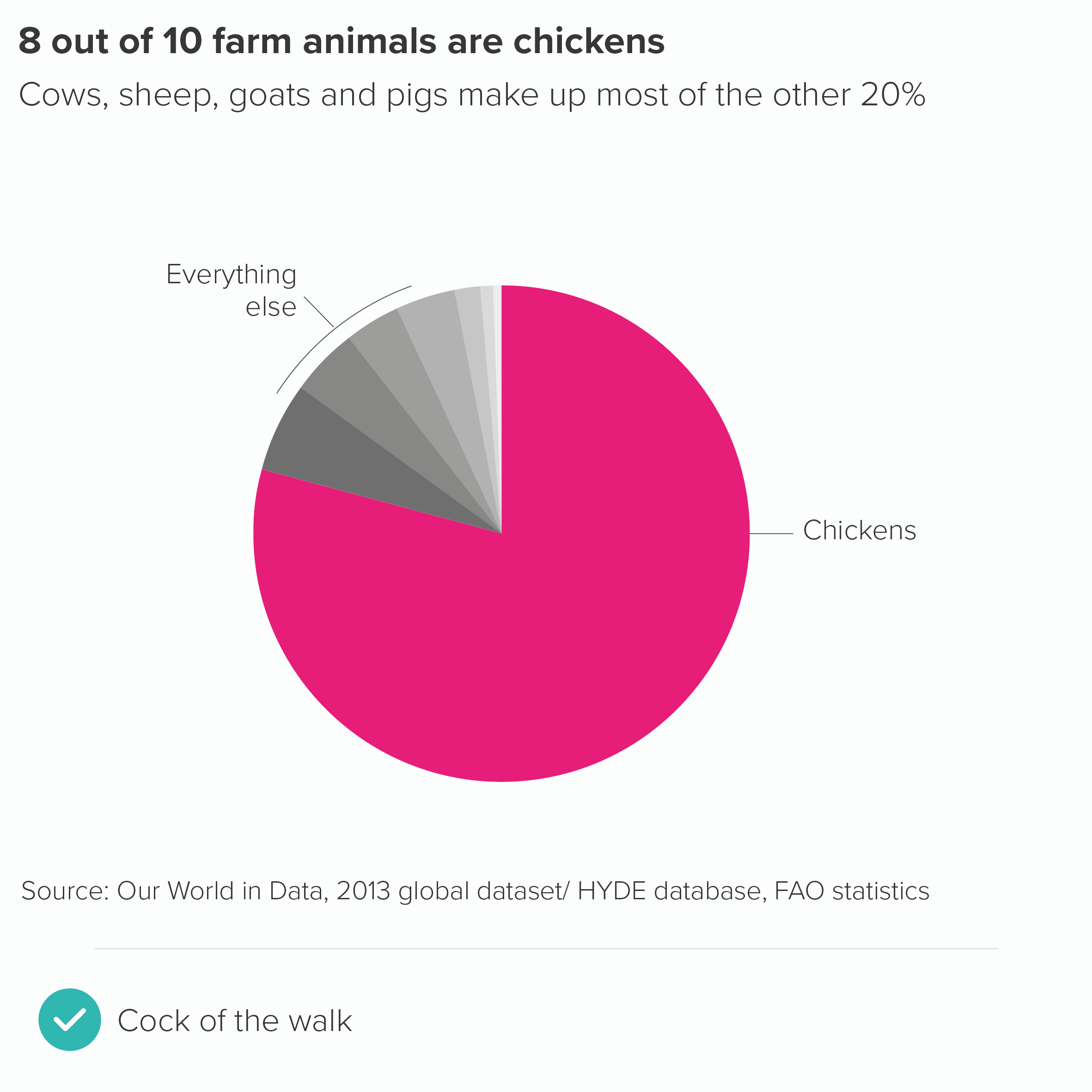
Verdict: Break this rule whenever possible
Sources: Animal biomass data from PNAS, Japan population data from Population Pyramid, Livestock data from HYDE/FAO via Our World in Data
More data viz advice and best practice examples in our book- Communicating with Data Visualisation: A Practical Guide