
In this blog series, we look at 99 common data viz rules and why it’s usually OK to break them.
by Adam Frost
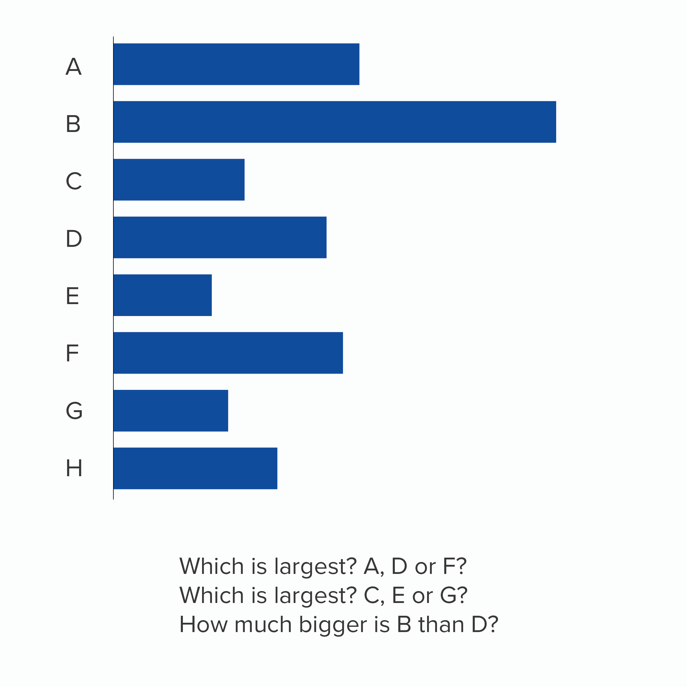
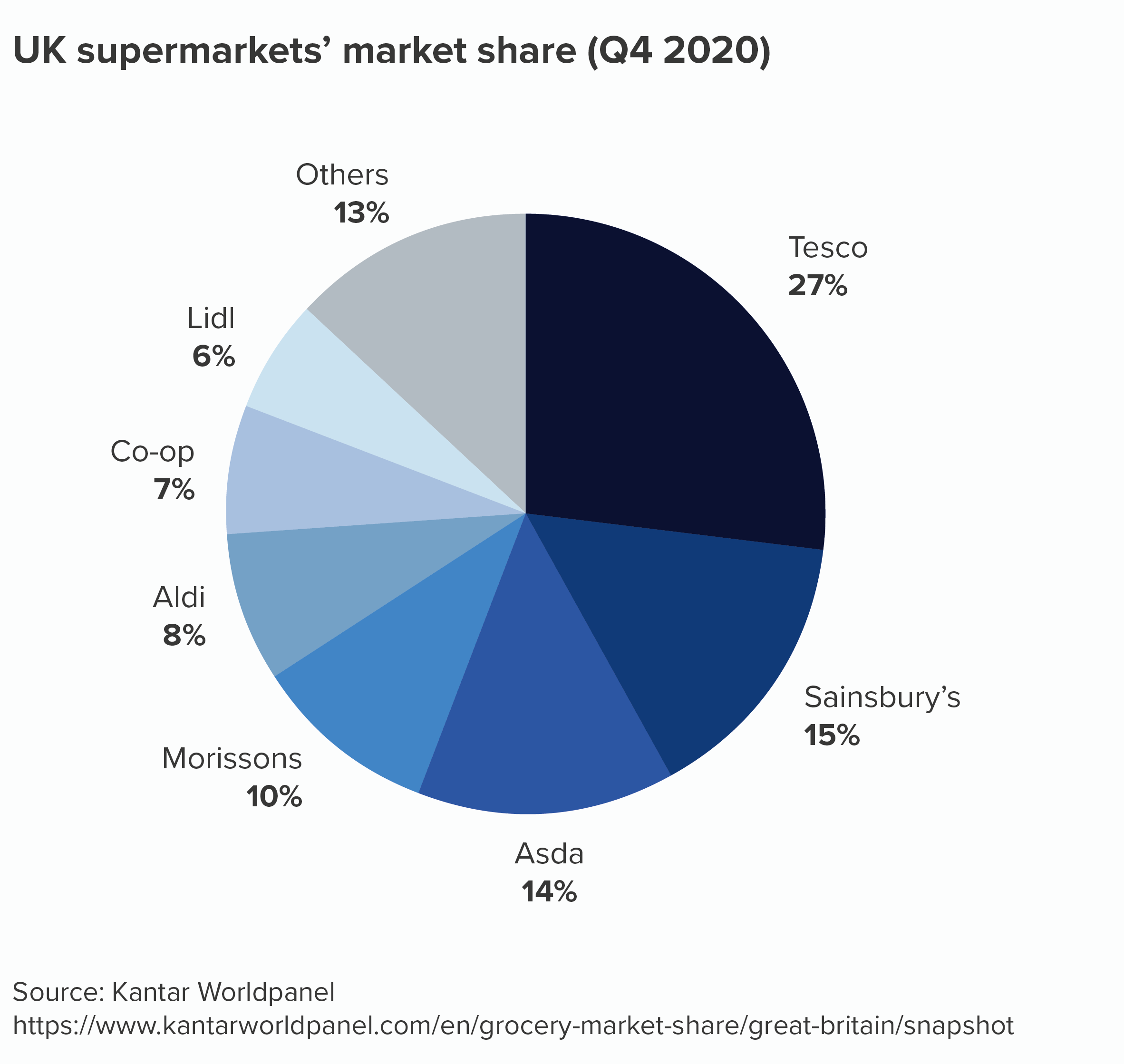
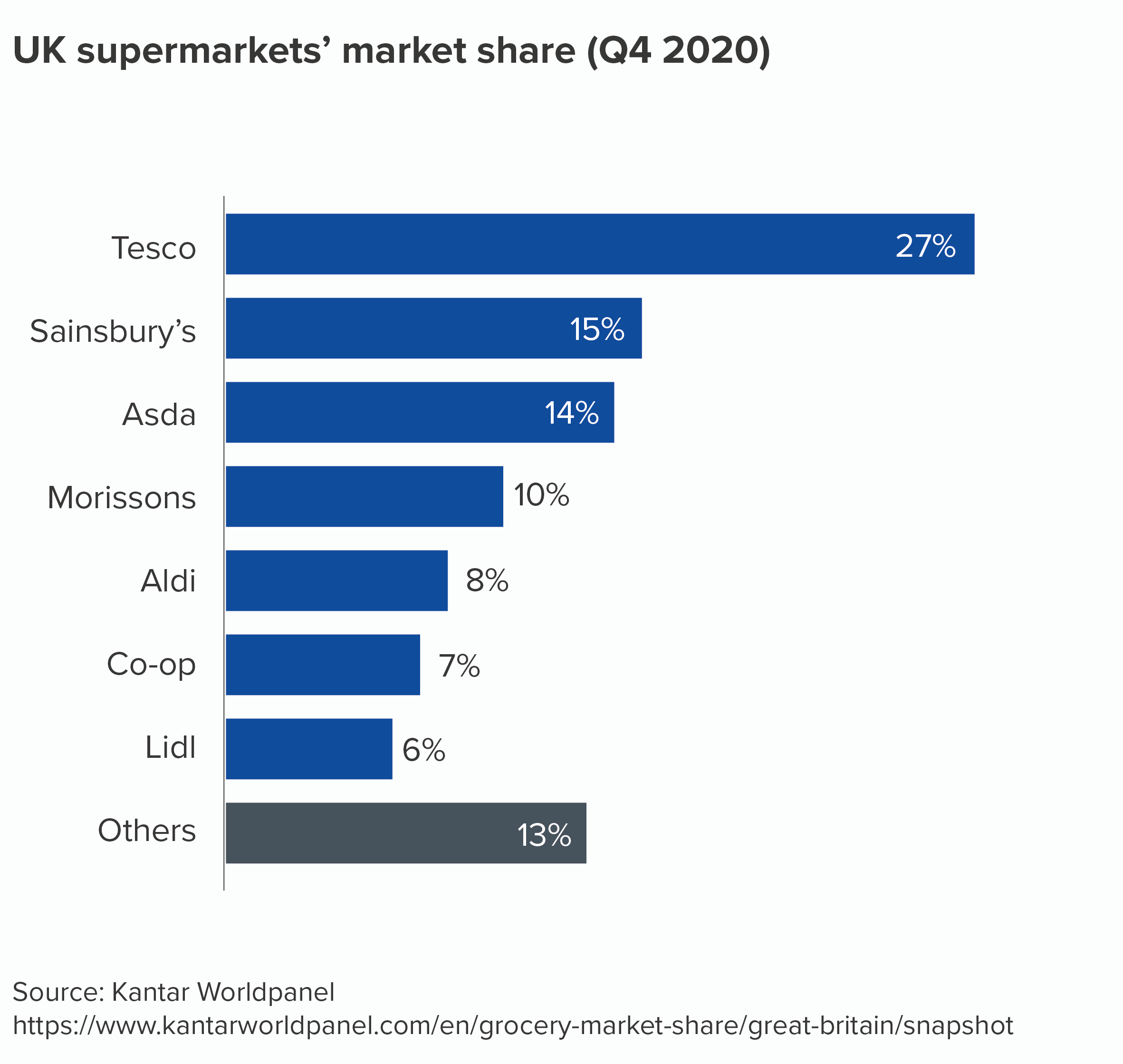
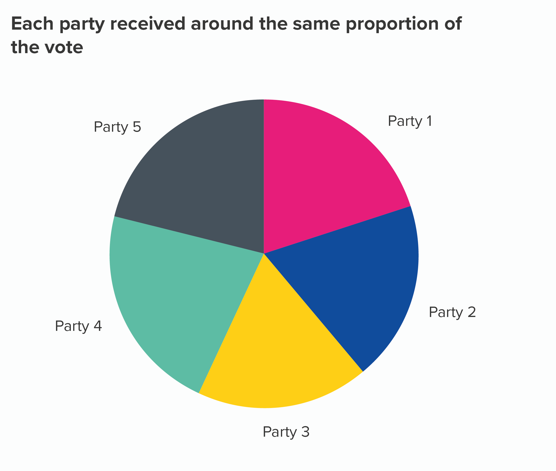
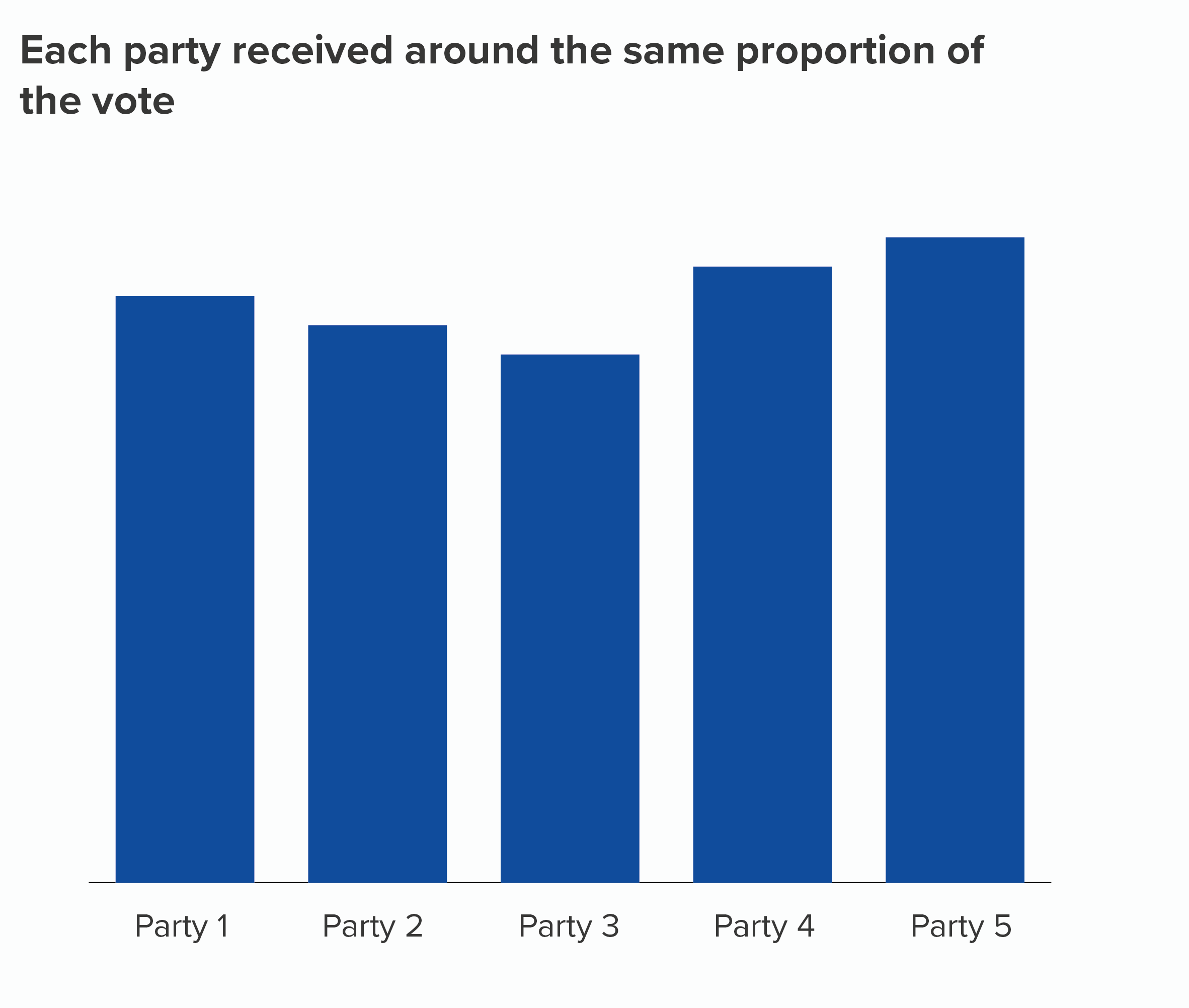
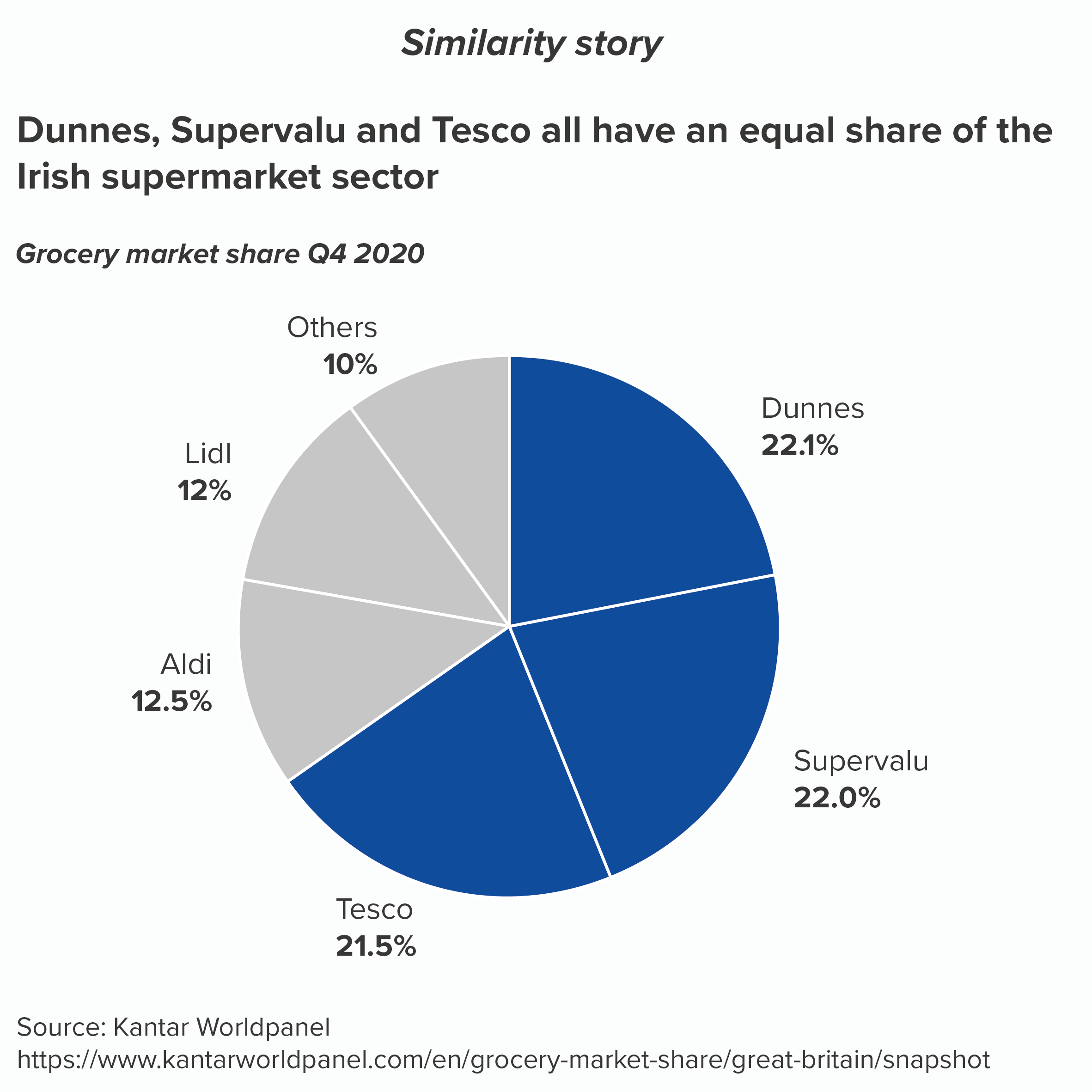
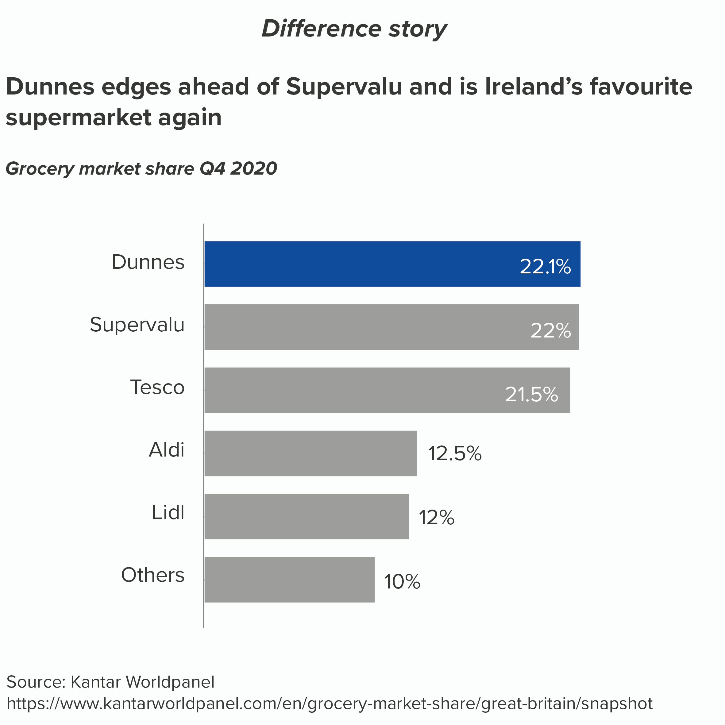
In Rule 1, we established that it’s fine to use pie charts. But how do we make sure we are using them well? In an excellent blogpost, Robert Kosara suggested that you should avoid pies if you want to compare the size of wedges, and it’s a particularly bad idea ‘for values that are very similar’. Many other practitioners have said the same. It’s easy enough to test for yourself: if you take lots of datapoints of a similar size, and plot them in a pie and a bar chart, you will be able to distinguish the differences between values more easily in the bar chart. I have done it here with UK supermarket data.
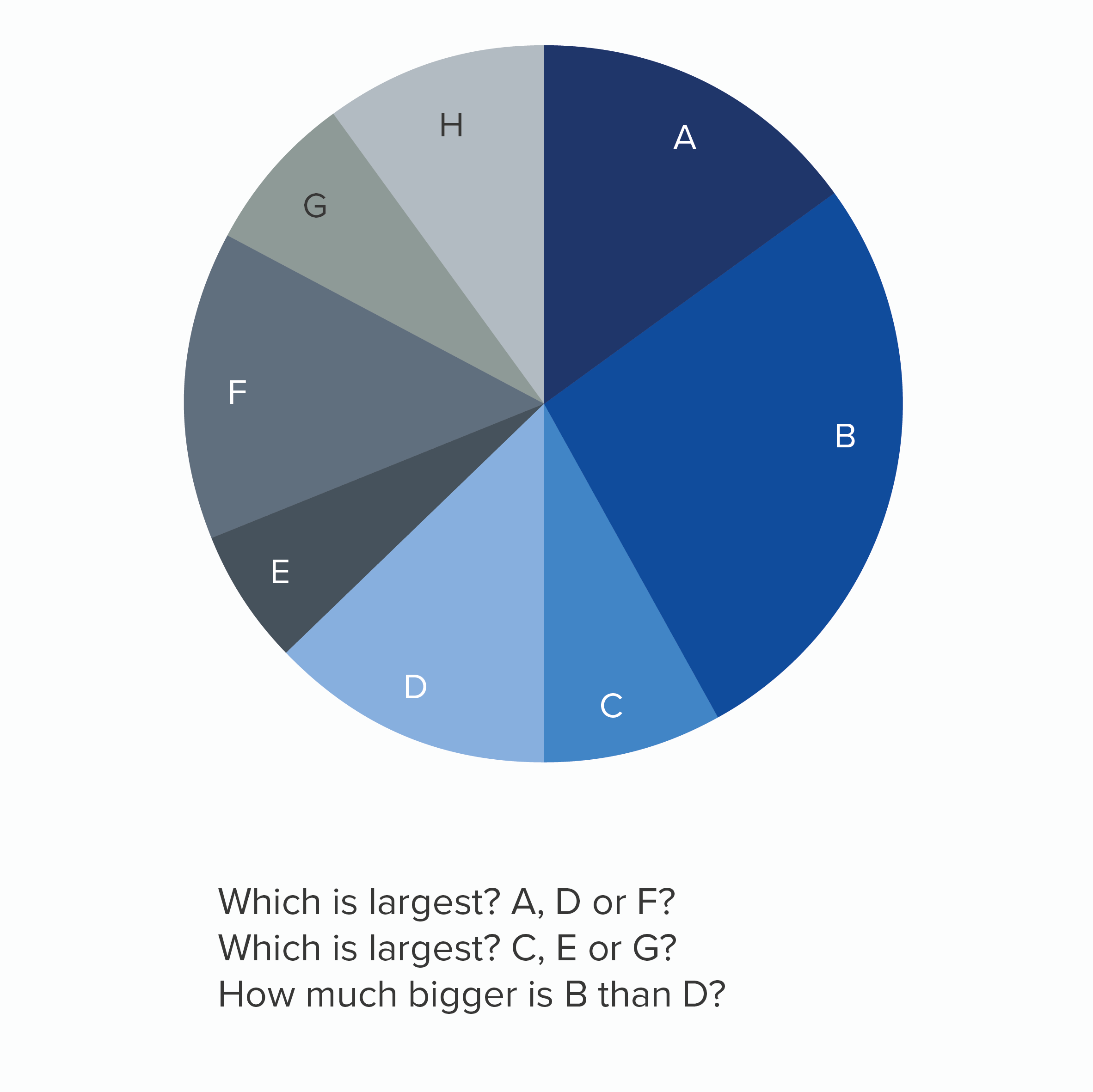
But of course to prove my point, I have been a little naughty. I have had to break two other rules: ‘always start pie charts with the largest wedge’ (we’ll cover this in Rule 6), and ‘label your pie chart clearly’ (Rule 10). If I had stuck to these rules, then the pie would have been more readable.
Still a little harder to read than the bars perhaps, but not exactly difficult. It is perfectly legitimate to decide that a pie chart’s visual and narrative appeal outweighs any limitations in its ability to represent small differences in value.
It is also worth remembering that a pie chart’s weakness can be its greatest strength. Sometimes you are telling a story of similarity. You want your audience to compare datapoints and think: ‘They are all roughly the same size.’ Bar charts suck at this: all you see is difference.
As always, a lot of this comes down to your audience. The same dataset will often contain stories of similarity and difference and one chart can’t effectively show both. So depending on audience needs, switch your chart type so the most pertinent elements are seen first.
VERDICT: Follow this rule some of the time.
Sources: Data from Kantar Grocery Snapshot
More data viz advice and best practice examples in our book- Communicating with Data Visualisation: A Practical Guide