
In this blog series, we look at 99 common data viz rules and why it’s usually OK to break them.
by Adam Frost
When a user called ebase131 recently asked how to make proportionally-sized pie charts on an Excel Help forum, the reply from ‘forum guru’ JosephP was unequivocal: ‘Pie charts are not the right chart for this kind of comparison [...]. It's bad enough that pie charts exist without encouraging people to use them in this way.’
This is a widely-held and completely justifiable point of view. However ebase131’s response was also interesting: ‘I would wholeheartedly agree, but the company I work for has their mind set on [these] pie charts.’ The user also added: ‘Not sure why you want to limit anyone from doing anything they would want to do to present data as they see fit.’ Which is the practitioner v theorist divide in one handy exchange.
So in this spirit, let’s take a look at proportionately-sized pie charts which are both ‘bad’ charts but also popular charts - particularly within companies.
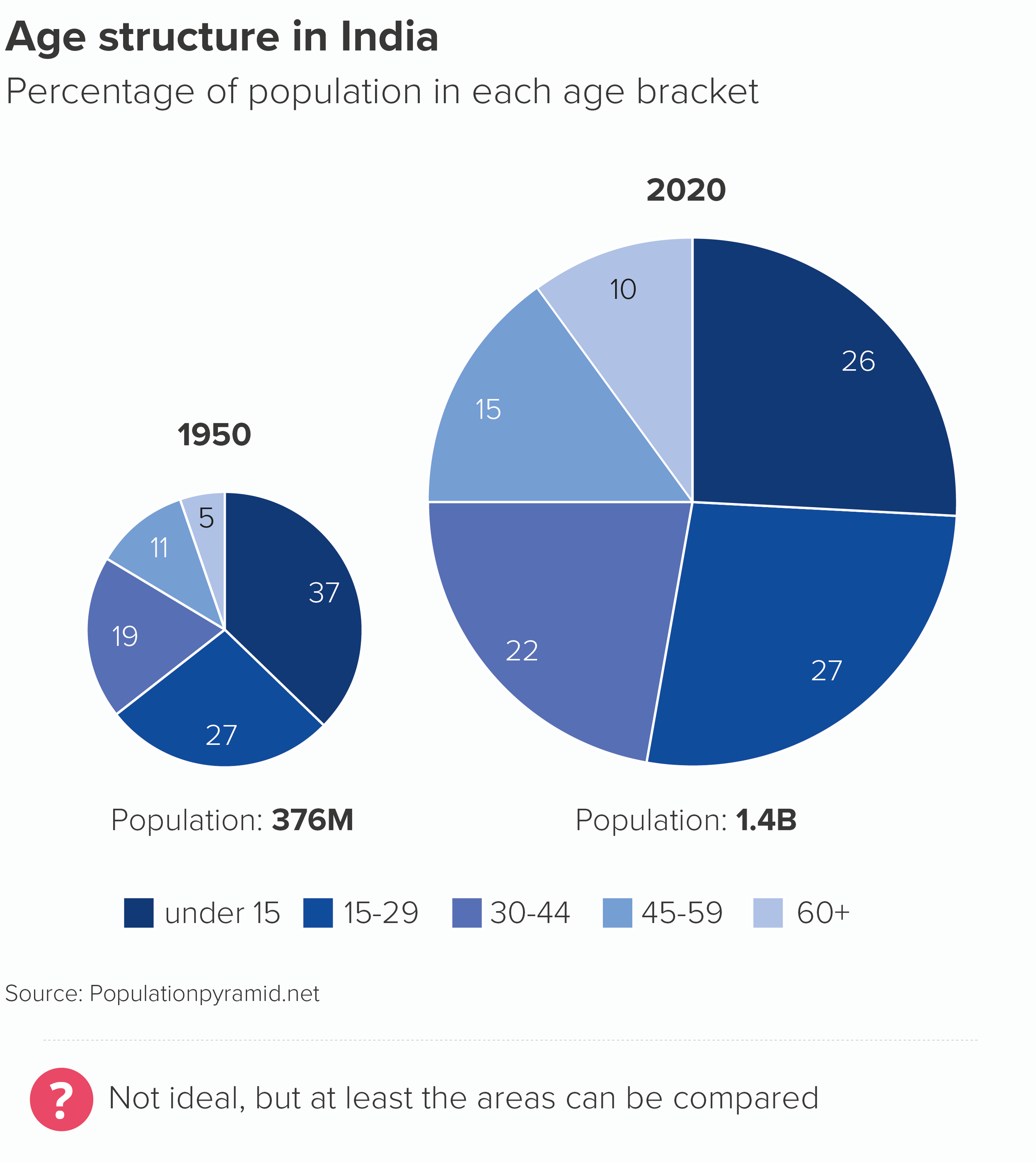
They are usually used for stories like this.
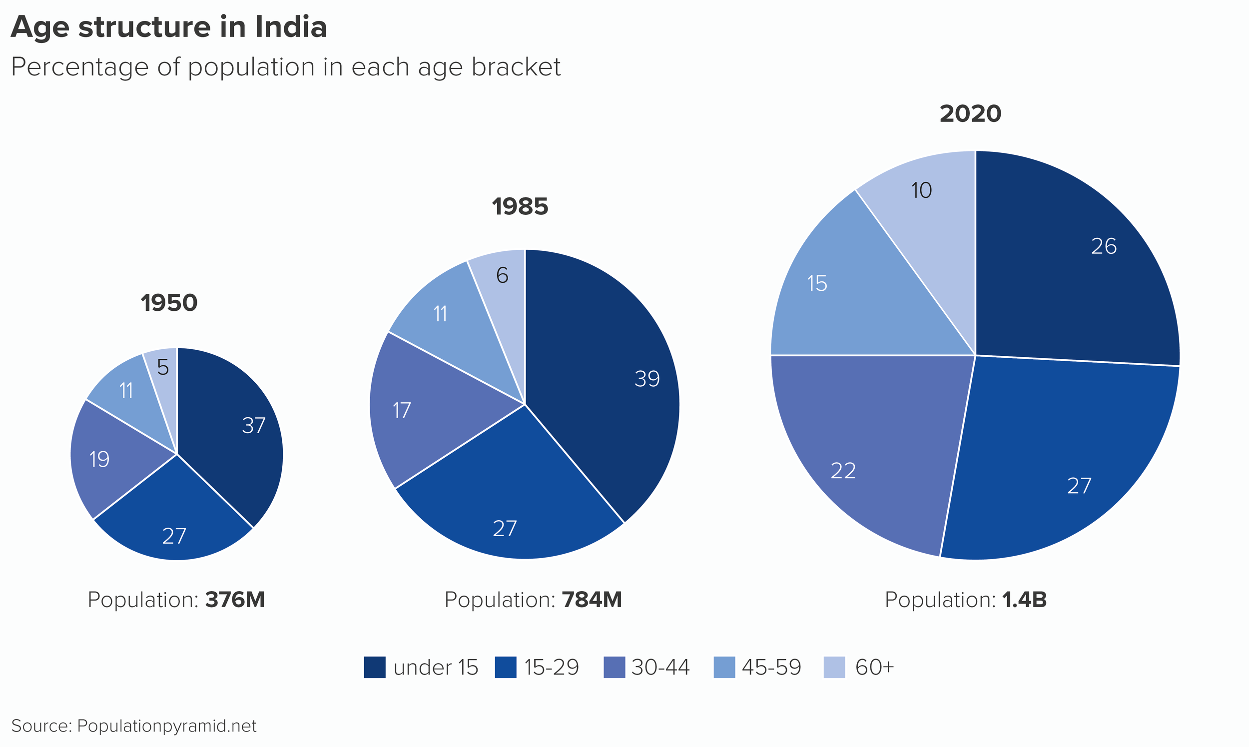
As you can see, they are very difficult charts to compare. For example, if I want to compare the percentage of 15-29 year olds in the Indian population across the three years, I have to find the three relevant wedges, angle my head and imagine what they might look like side by side.
In this case, those three slices are the same value (27%) but they don’t look it, because the increasing size of the slice distorts what the wedge represents. An interesting story - India’s shifting age structure - is smothered by the overlaid (and less interesting) story of India’s population increase.
Note that I also need to include a key for charts like this (or my labelling gets crazy) and in Rule 9, we talked about how aggravating chart keys can be.
For this reason, I was surprised to see a proportionately-sized pie chart in Nate Silver’s book The Signal and the Noise. Silver is usually seen (rightly) as the model for any statistician who wants to communicate interesting data stories without compromising on accuracy. However, his proportional pies (which I’ve redrawn here) also show the ideal way of using them.
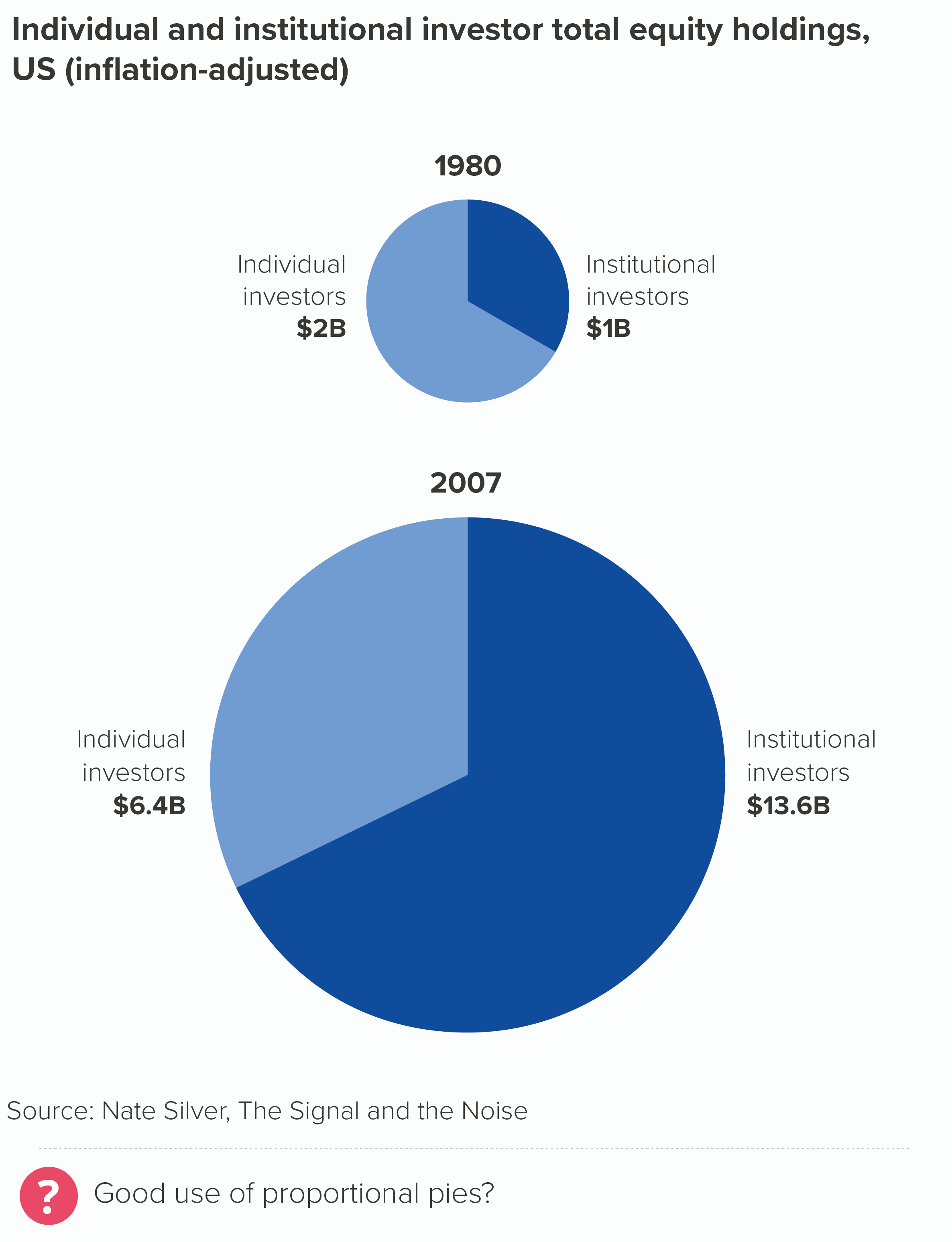
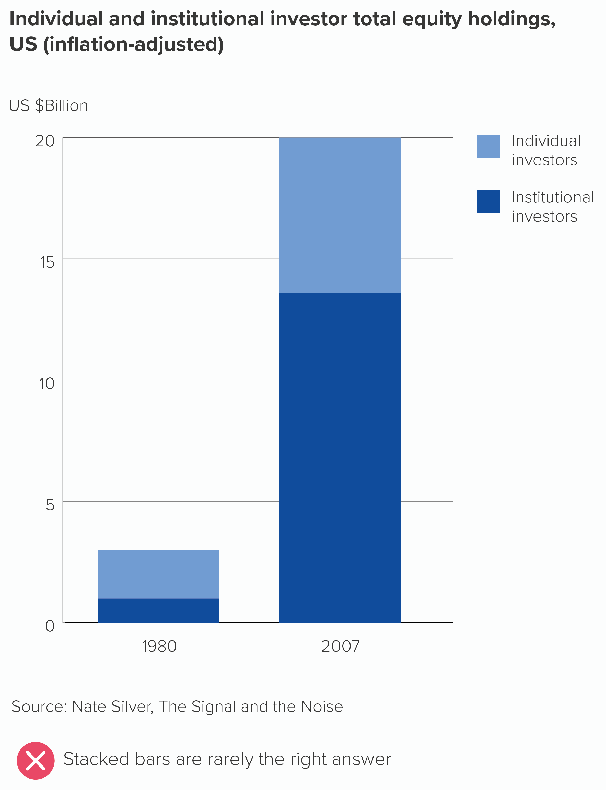
I’ve put Silver’s chart next to a stacked bar, so you can see a less appealing way of charting this story.
In his pies, Silver is using just two categories - individual and institutional investors. He has isolated two representative years - 1980 and 2007. Furthermore, the charts show a clear and dramatic change - in 2007, the proportion of institutional investors (hedge funds, pension funds etc) has hugely increased. In fact, the two pie slices have swapped sizes; the compositional breakdown (two-thirds v one-third) is flipped.
Because his story is so clear (or he has made it clear), he is able to use the size of the charts to add another layer to his story - the fact that the size of the market has hugely grown too.
Notice other things that he has got right.
He is sizing the pies by area, not radius (we’ll cover why this is vital in our bubble chart rules).
He is starting his pies at 12 o’clock (see Rule 5).
He is labelling his pies directly, rather than using a key (see Rule 9)
He is using just two shades of the same colour, and using colour consistently across the two pies (Rule 8)
Sounds like a minor detail, but it isn’t: he has right-aligned his left-hand chart labels, and left-aligned his right-hand chart labels.
Most critically, it is a wholly appropriate chart for his story (see all the previous rules and all the rules still to come). He is turning his pies into two bubbles. His story is about the fact that, when institutional investors increase, stock-market bubbles are a near-inevitability. Not only are traders investing other people’s money, rather than their own, but they are rewarded by their companies for short-term increases in a stock’s value, which drives riskier and riskier behaviour. The visual metaphor of an expanding circle is perfectly judged, particularly because its rapid and unsustainable inflation makes us wonder when it will burst.
Compare Silver’s pies to the stacked bars. Yes, it’s a bit easier to compare the two base-aligned values (institutional investors), but that’s the only thing it’s got going for it. You certainly can’t compare the two bars sitting on top (individual investors). It has lost its narrative impact; we don’t see those bars as ‘the total size of the market’ anymore because rectangles don’t have that metaphorical association: they don’t suggest a complete, self-contained whole. And the flipping of the two proportions (one third v two-thirds) that we get on the pies is gone on the bars.
Most fatally, our expanding stock-market bubble analogy has evaporated. And it’s been replaced with a metaphor that suggests the opposite: those bars can keep growing indefinitely.
So if you are in the position of ebase131 on the Excel forum and your company ‘has their mind set on’ proportional pies then follow Nate Silver’s lead. Use them simply, and only when they have a clear metaphorical link to your story. Too many wedges, or too many pies, or too little narrative justification and they quickly become useless. I have a particular aversion for proportionally-sized pies overlaid on maps, which we encounter far too often in business presentations.
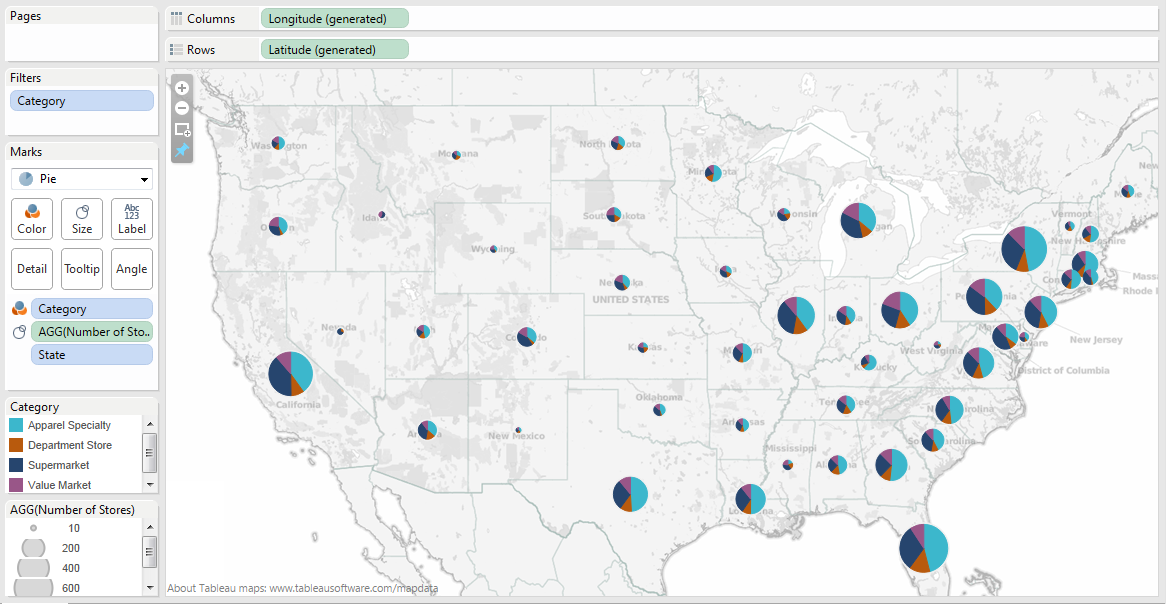
Image credit: Arunkumar Navaneethan
The signal is lost in all the visual noise (to borrow from Nate Silver again). Overlaying three stories means you see none of them clearly.
If your company is set on using proportional pies in this way, then at least walk your audience through the levels of your composition story. Maybe start with the pies as simple bubbles. Then you could X-ray those bubbles, turning them into pies, but highlighting one wedge at a time, so it is clear what your audience is seeing at each stage.
This kind of structure could also be used in a dashboard user journey. Start with bubbles; then users click or roll over to see an interactive pie, but they don’t start with the pie.
One final note of caution: however hard your boss leans on you, never use proportional doughnut charts. It’s hard to compare the areas of two proportionally-sized pies, but it’s possible, and the chart is technically accurate. Once you put a hole in the middle, there’s no way on Earth you can compare the areas of those shapes, nor would you even imagine it’s something you were expected to do.
Otherwise, although they are hard to pull off, proportional pies are occasionally the right answer for that story that pulls in two directions, within-group and between-group. This is particularly the case when - as in the Nate Silver example - the expanding or shrinking circle adds a metaphorical dimension to your chart and helps your audience picture the real-world scenario behind the abstract shapes.
VERDICT: Break this rule very occasionally.
Sources: India population from populationpyramid.net; Proportional pies from Nate Silver, The Signal and the Noise; US energy data from EIA
More data viz advice and best practice examples in our book- Communicating with Data Visualisation: A Practical Guide