RULE 41: Avoid area charts?

In this blog series, we look at 99 common data viz rules and why it’s usually OK to break them.

by Adam Frost

Area charts don’t get a lot of love, but I love them nevertheless. 'We rarely (but not never!) find ideal use cases for the area graph.' declares Storytelling with Data, comparing it to 'such controversial visualizations as bubble charts.' (Which I also like). Datawrapper describes area charts as 'not easy to read.' And in a post titled 'I hate stacked area charts', Dr Drang argues that the stacked kind are ‘often misleading’, and clinches his argument with: 'Here’s a fictitious example to show what I’m talking about.'

Ah, ‘fictitious examples.’ So much more manageable than the factual kind. 

So, without (I hope) resorting to fictitious examples, I'm going to argue that there are many good reasons for using area charts. It's why they are deployed regularly and brilliantly by data journalists - for example, here, here and here by The Economist, here and here by The Guardian or here and here by the Financial Times.

Those bold, fluctuating slabs of colour can be the perfect fit for change over time stories, particularly if the change is dramatic, or you want to show the changing proportions of one important part compared to the whole. Yes, area charts can be misused, but so can bars, pies and lines, as we've seen in previous rules. Used well, they are as powerful as any other chart type in your toolkit.

When not to use them

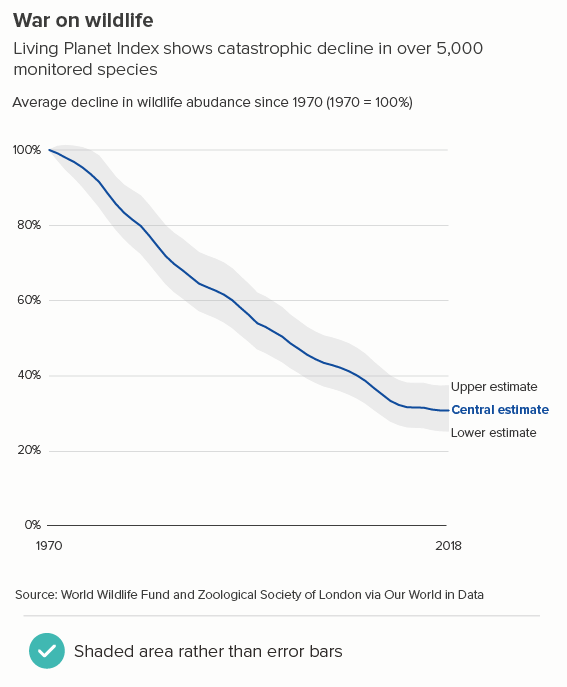
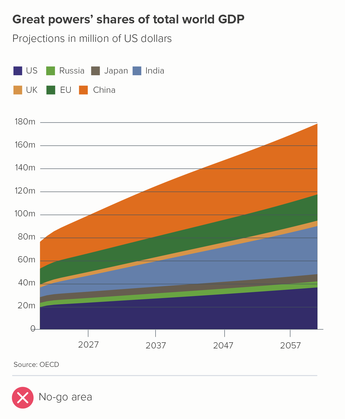
I’ll start by acknowledging that area charts are sometimes a bad idea. Take a look at this chart that appeared in a UK current affairs magazine in September 2023 - I’ve recreated it below (the first chart).

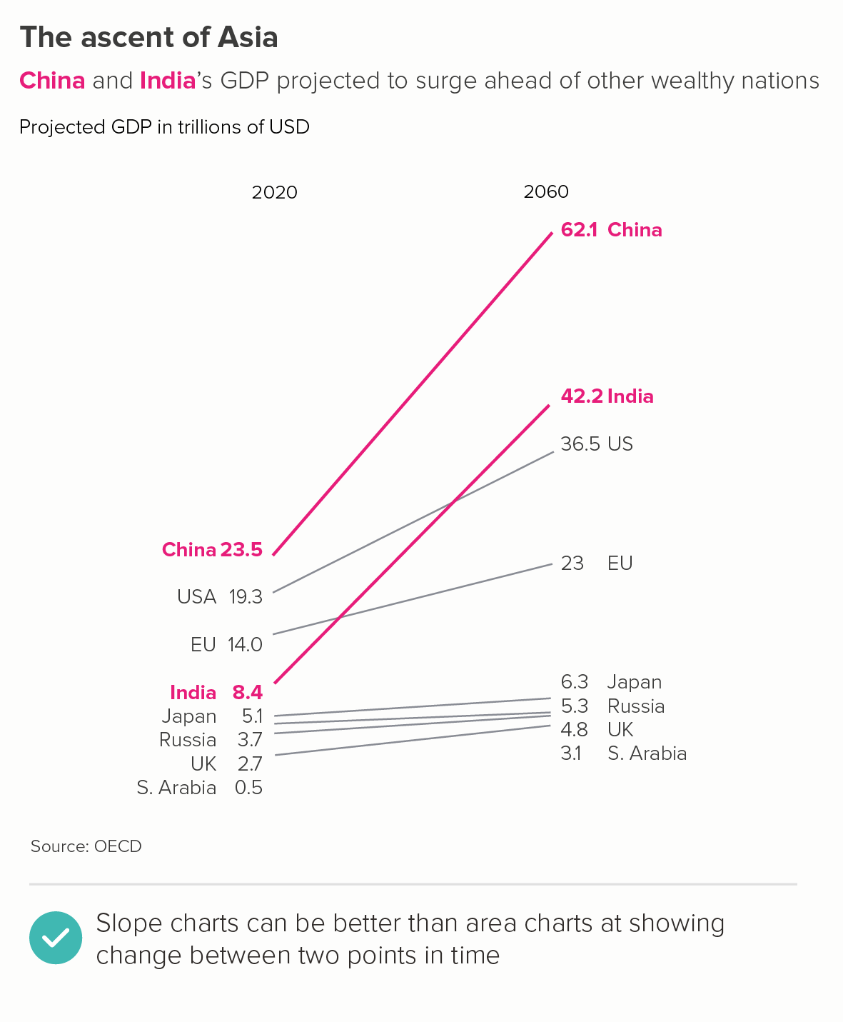
There are many things that don’t work in the first chart (the x-axis labels, the colours, the legend, the title etc). But let’s focus on the three core problems that are specific to area charts.

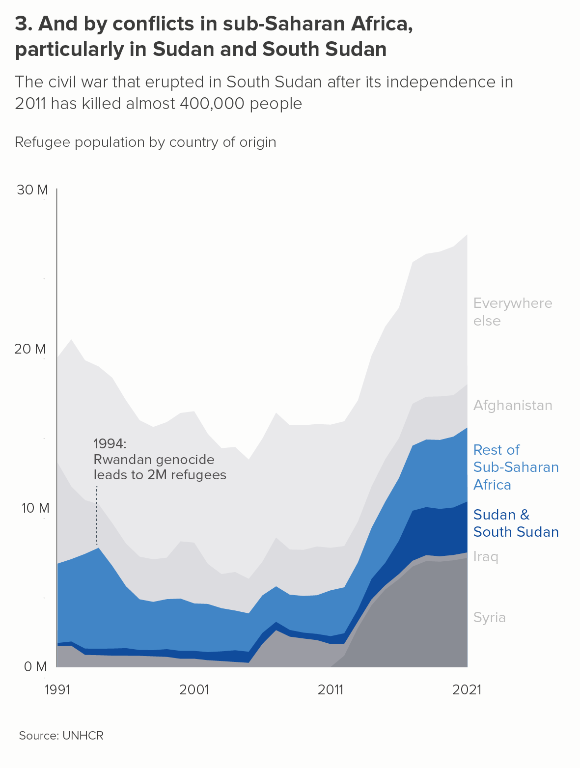
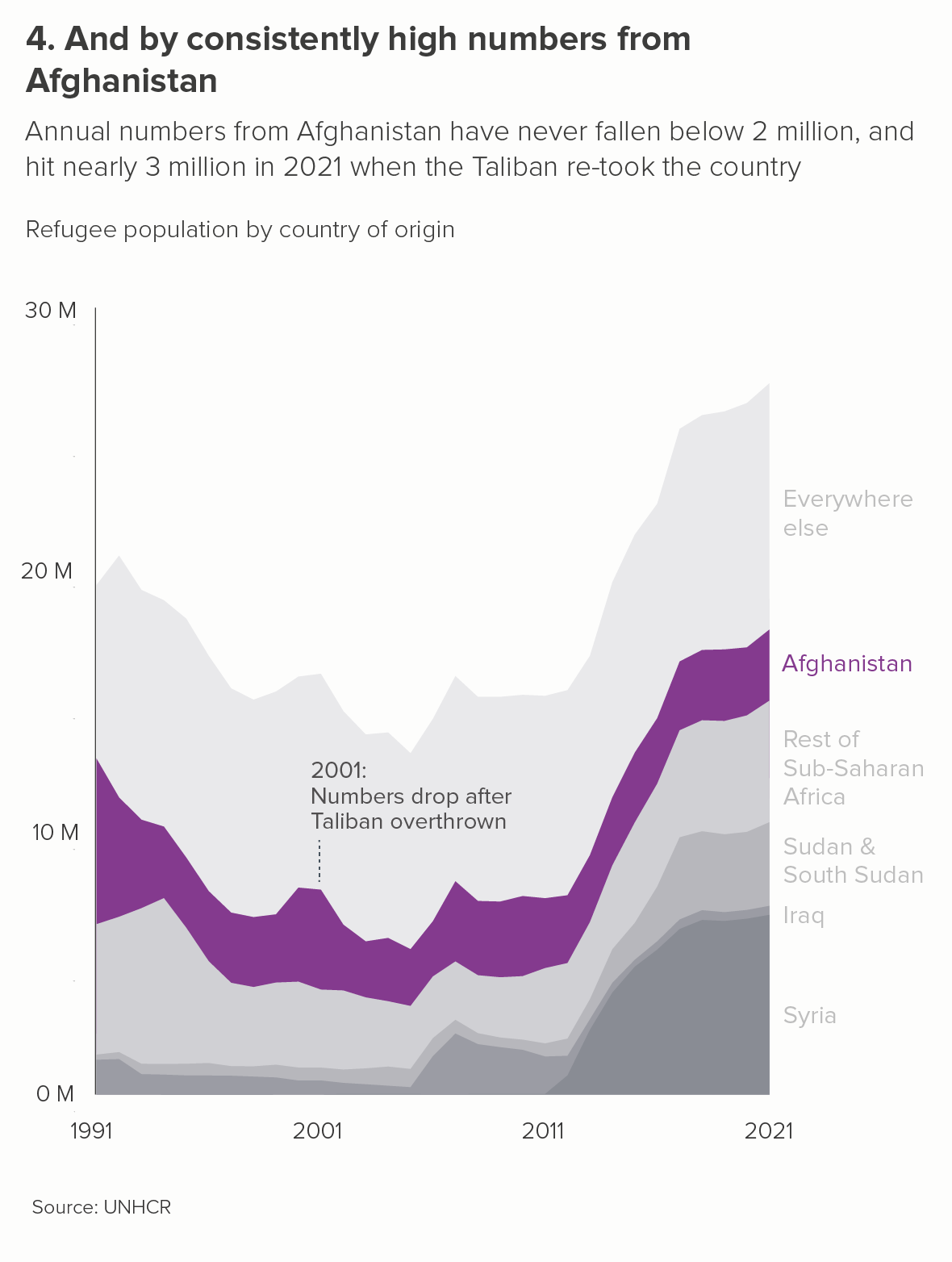
  • It is telling several stories at once. The change in the total, and the changing composition of that total, and the changing total of each individual country. Which is most important?

  • It is hard to read. Try to work out by how much the EU or Russia or India or any of the middle values have changed. Is it clear that China’s GDP will almost triple between 2020 and 2060?

  • It is visually ambiguous. Are those wedges stacked on top of each other, or is the China wedge sitting behind the others, like the highest mountain in a mountain range? 

A slope chart (the second chart above) has none of these issues - it draws on the same dataset and tells a clear story.

When to use area charts

But the three problems mentioned above are also an important clue, because they can help us to work out when area charts can be used. If we can bypass or minimise their potential clarity and legibility issues, then we can start playing to the chart type’s strengths and telling the sorts of stories that area charts excel at.

i) a single line 

If your area chart just has one line, then all the perceptual confusion mentioned above instantly disappears - you are telling one clear story and there is no visual ambiguity.

Some critics are not keen on using area charts in this way.  Mike Yi of Chartio states: ‘an area chart is typically used with multiple lines to make a comparison between groups’. If you have a single line, consider using a line chart, he argues. But, with the right data, I think filling the area below the line makes any movement in the line clearer and also draws on colour’s ability to evoke drama and emotion. 

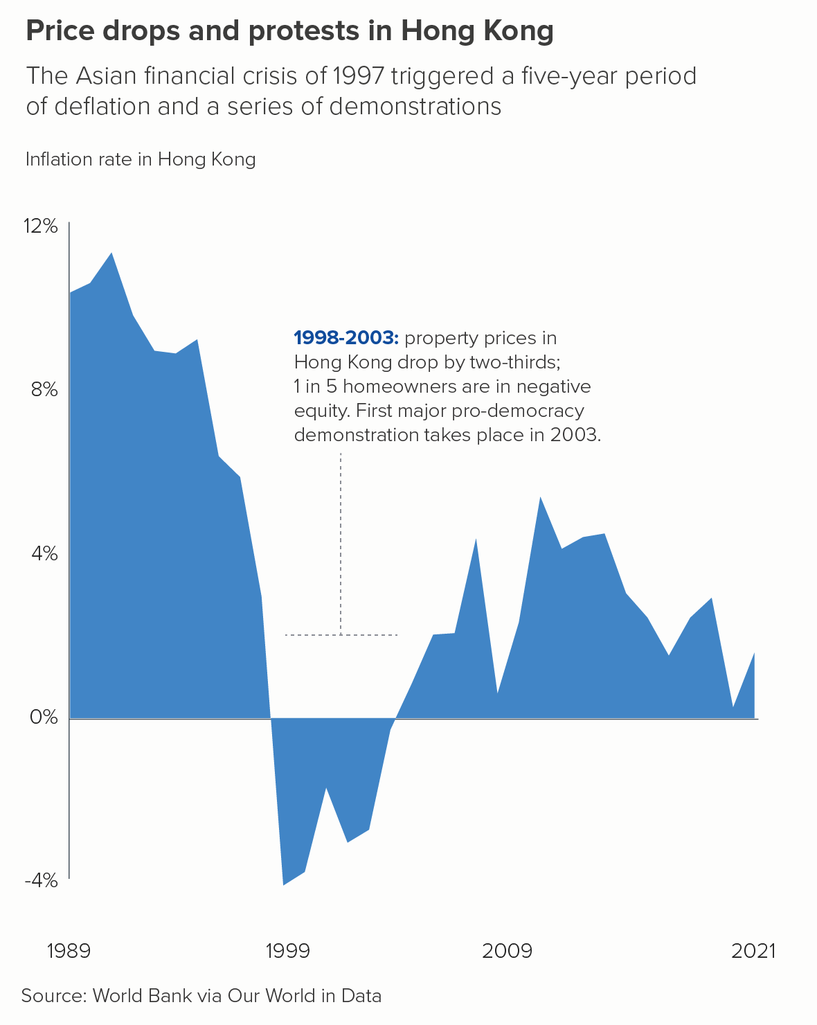
I like the line charts above well enough, but I find the area charts more engaging.

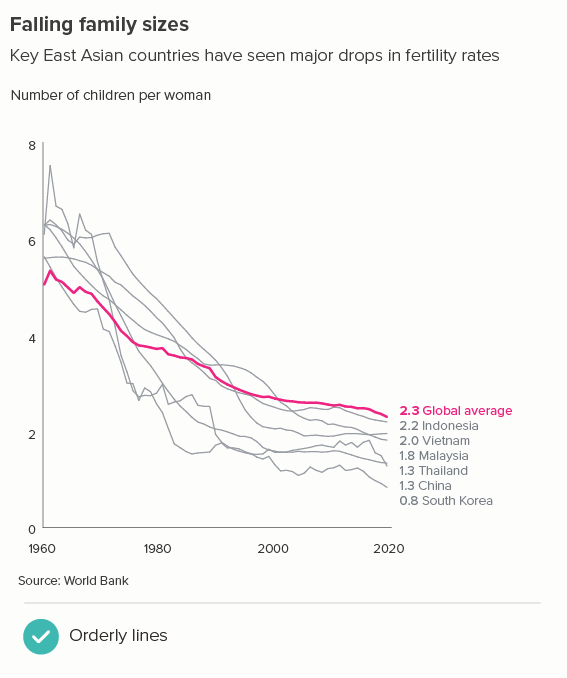
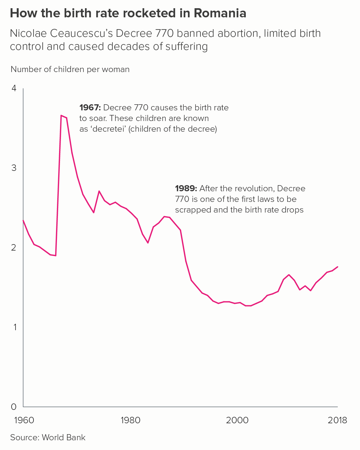
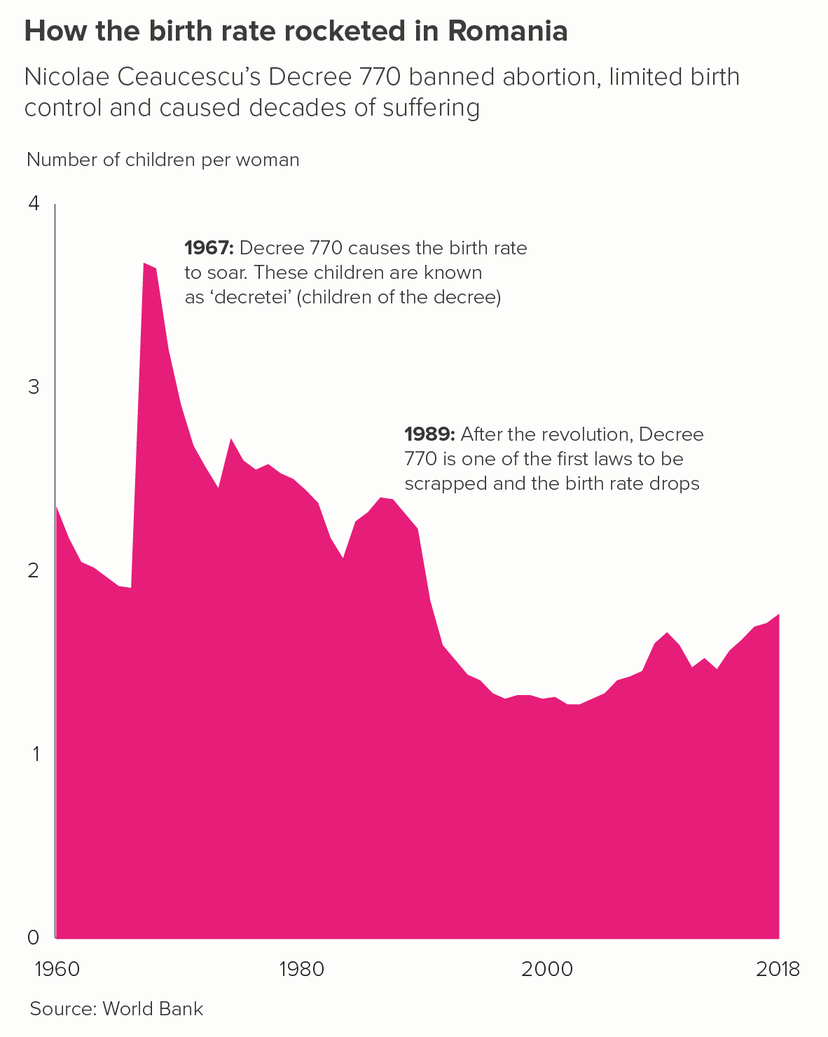
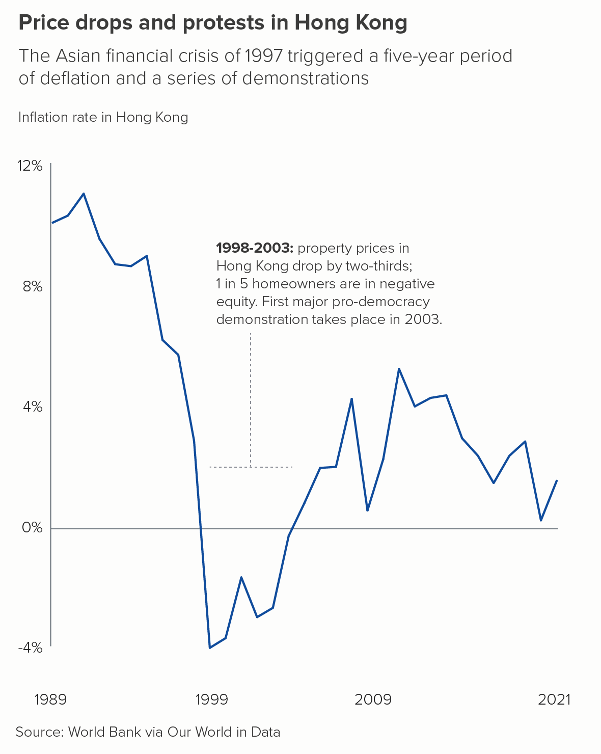
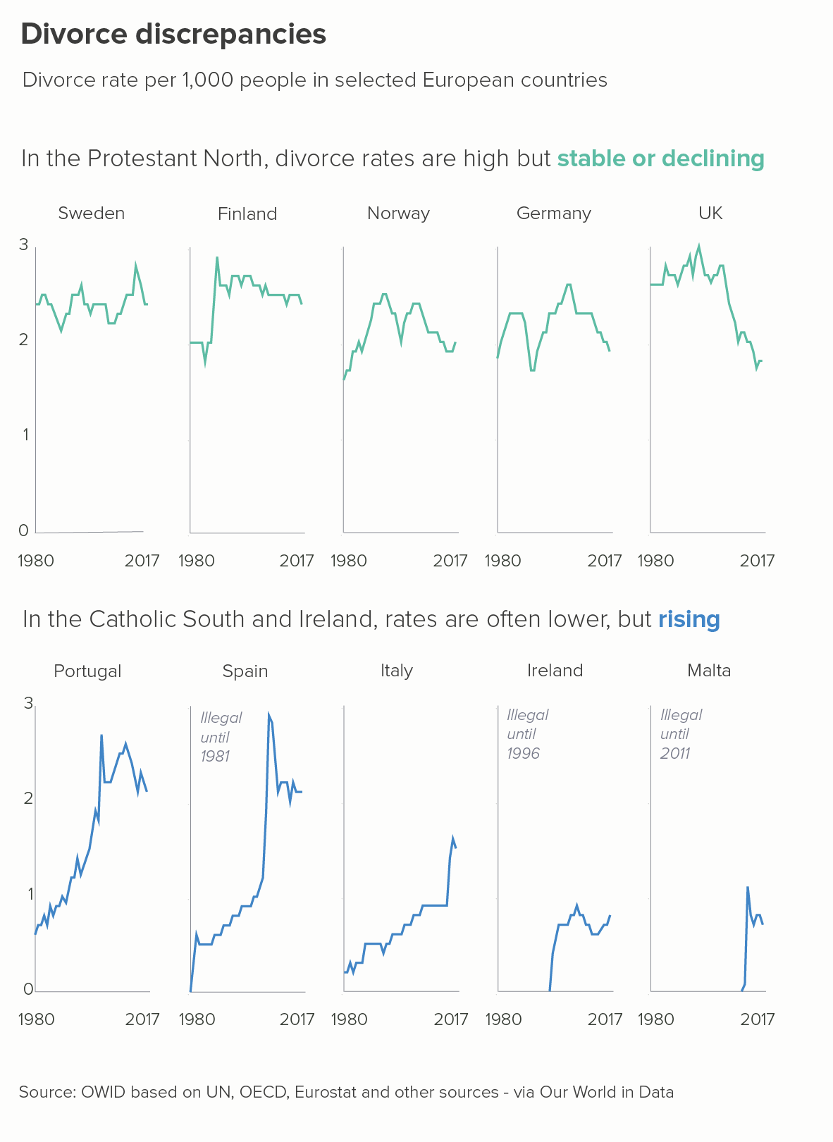
There are caveats though. Take another look at the two charts above - birth rates in Romania and inflation rates in Hong Kong. They both have these elements in common. 

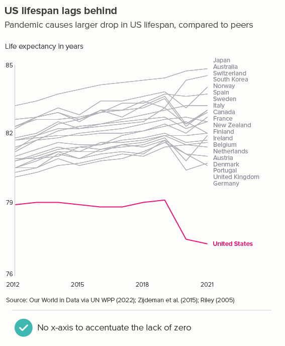
  • Both y-axes show zero clearly. It is deceptive to start an area chart above zero, just as it is with a bar chart. Any filled, base-aligned shape will be seen by your audience as sitting at ground level and moving above (or beneath) it. 

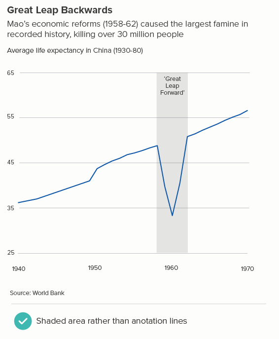
  • They both have a key moment or key moments of dramatic change that the colour helps to make clear - Romania’s spike in birth rates in 1967 and Hong Kong’s long period of deflation between 1998 and 2003. A flat area chart with few datapoints and/or minimal change ends up looking more like a rectangle. 

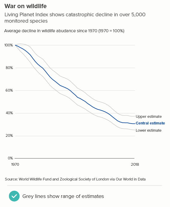
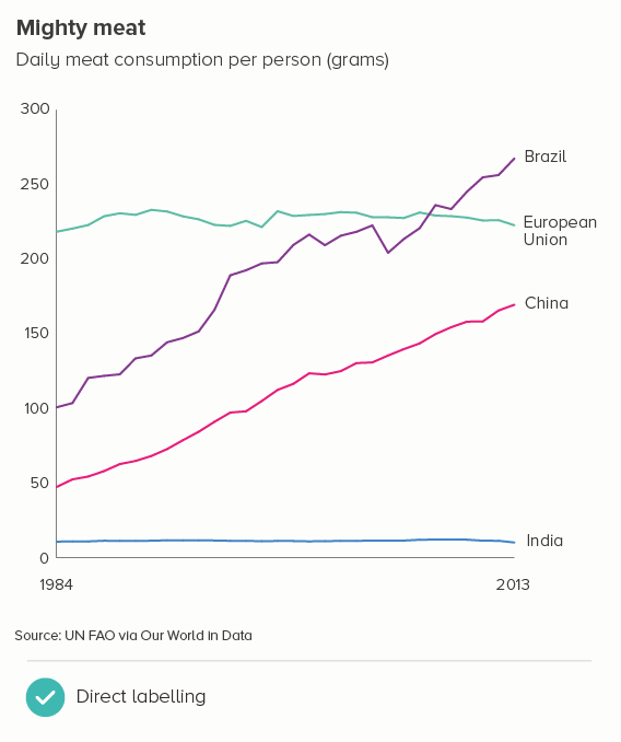
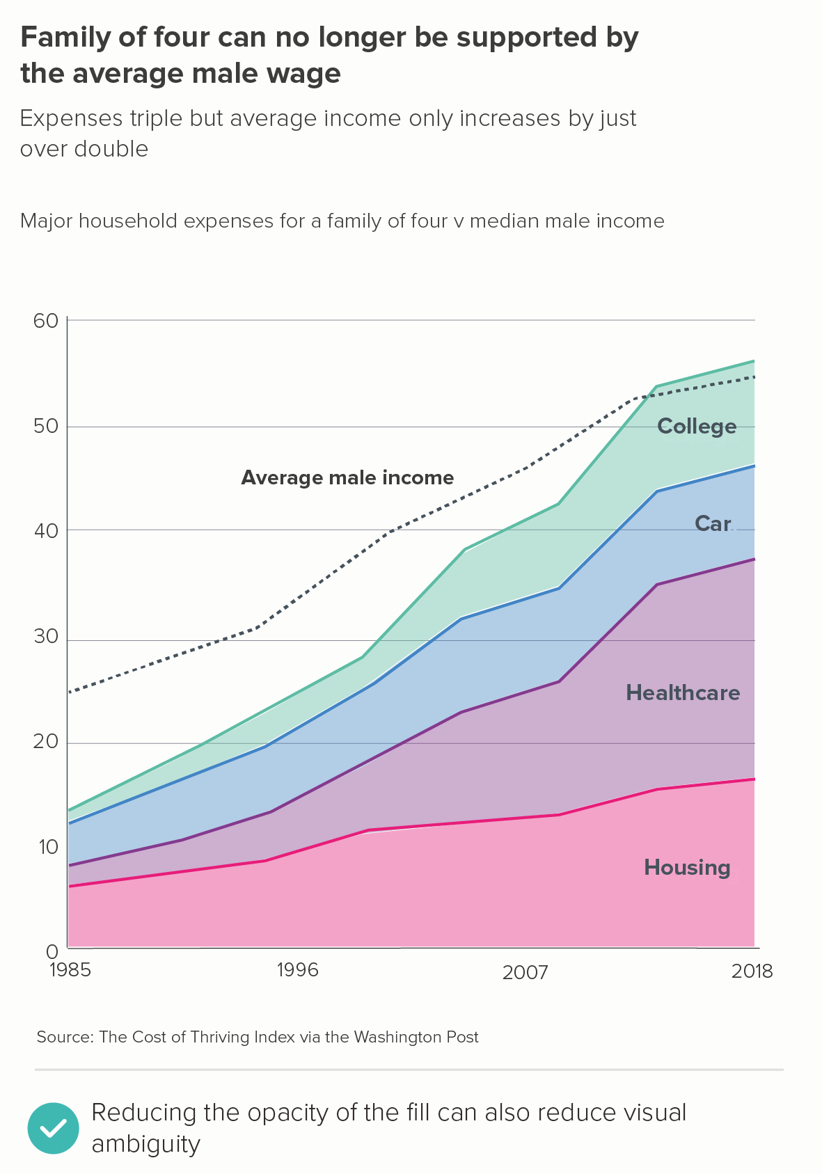
As long as these conditions are met, then a single line area chart can be a good choice. For other examples, take a look at this chart about Facebook break-up times by David McCandless, this from the Financial Times, or these from the Washington Post.

ii) small multiples

Just as a single line area chart can be the right answer, so too can several. Small multiple area charts are more eye-catching than single floating lines. This is particularly the case when you want to use colour to highlight particular elements of the story, or group the charts in some way - perhaps by region or sector.

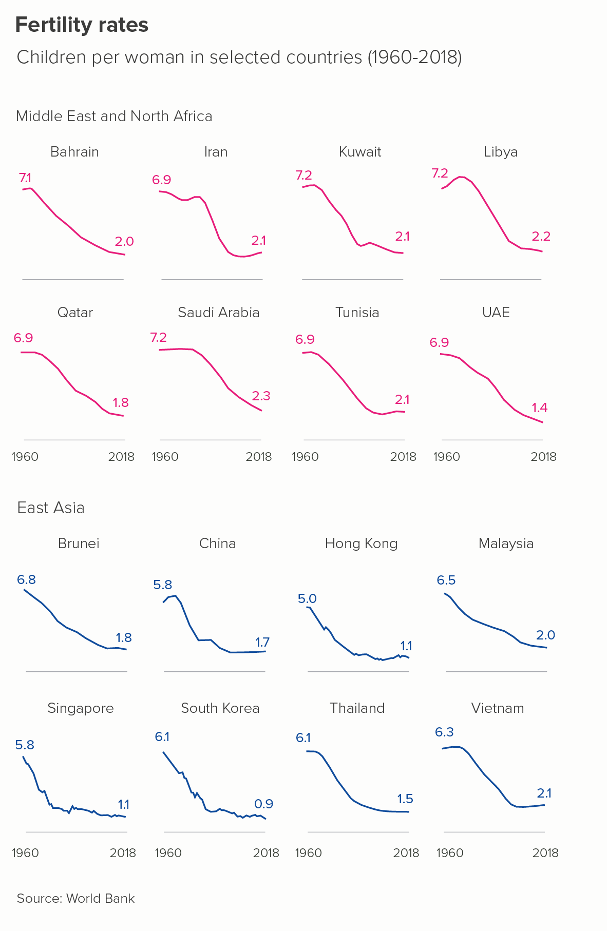
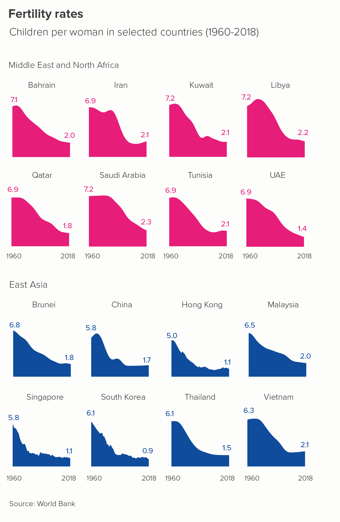
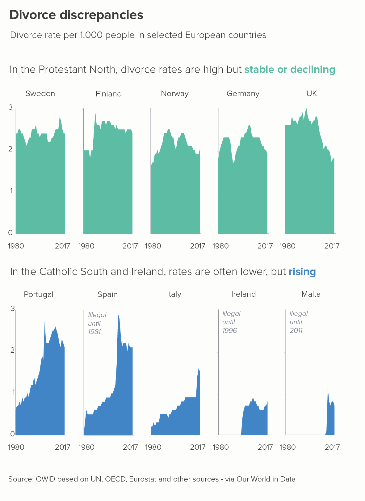
I find the area charts above clearer and more visually persuasive. Notice that, once again, we have zero represented clearly on the y-axis and we are illuminating stories of clear and dramatic change.

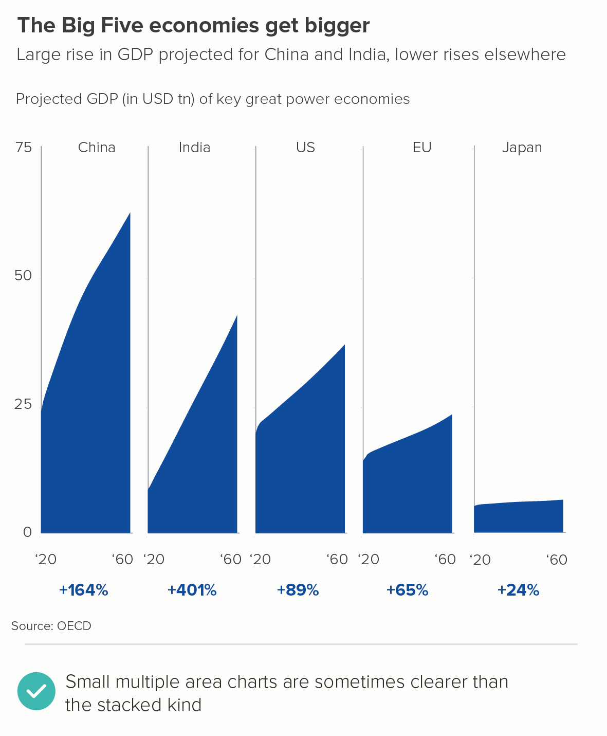
Even the confusing GDP share story mentioned at the start of this article works just fine as ‘small multiple’ area charts. It is easier to see the sharpness of China and India’s rise and Japan’s flatness.

A related kind of small multiple area chart is the ridgeline plot. I’d think of these as half-way between small multiples and the overlapping area charts I’ll be discussing below. The overlap doesn’t mean anything in this case, it’s purely aesthetic. They are quite a niche chart, usually used to tell distribution stories and rarely seen outside of academic circles. That said, here’s a good example from Henrik Lindberg via Visual Capitalist. And this is a stunning one from National Geographic. (The original, larger version is on the National Geographic site, but it’s behind a paywall, as websites owned by Disney tend to be).

iii) Overlapping areas

Above, I mentioned that area charts can be misread, as it is not clear whether the categories are stacked or sitting behind each other. One way round this is to tell clear stories of overlap. This approach works when you have related data series which cover different points in time and/or which peak at different times. 

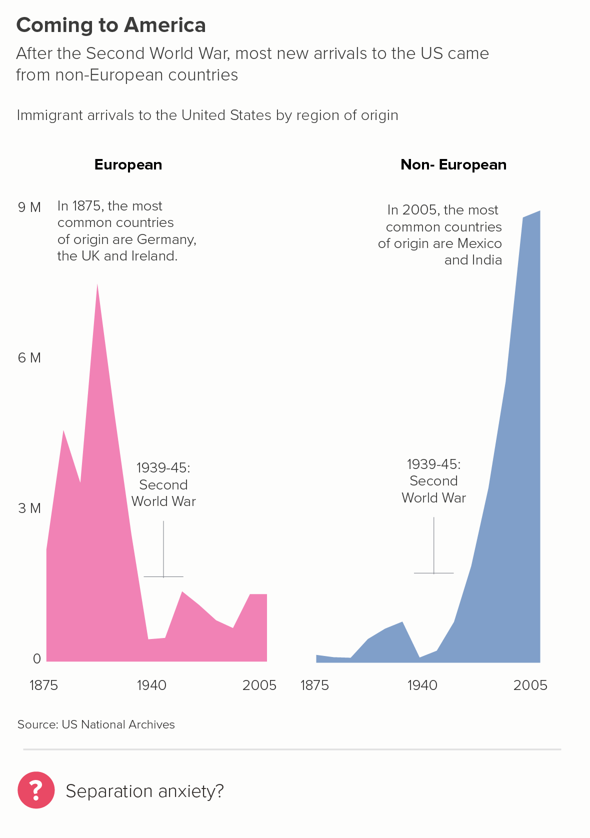
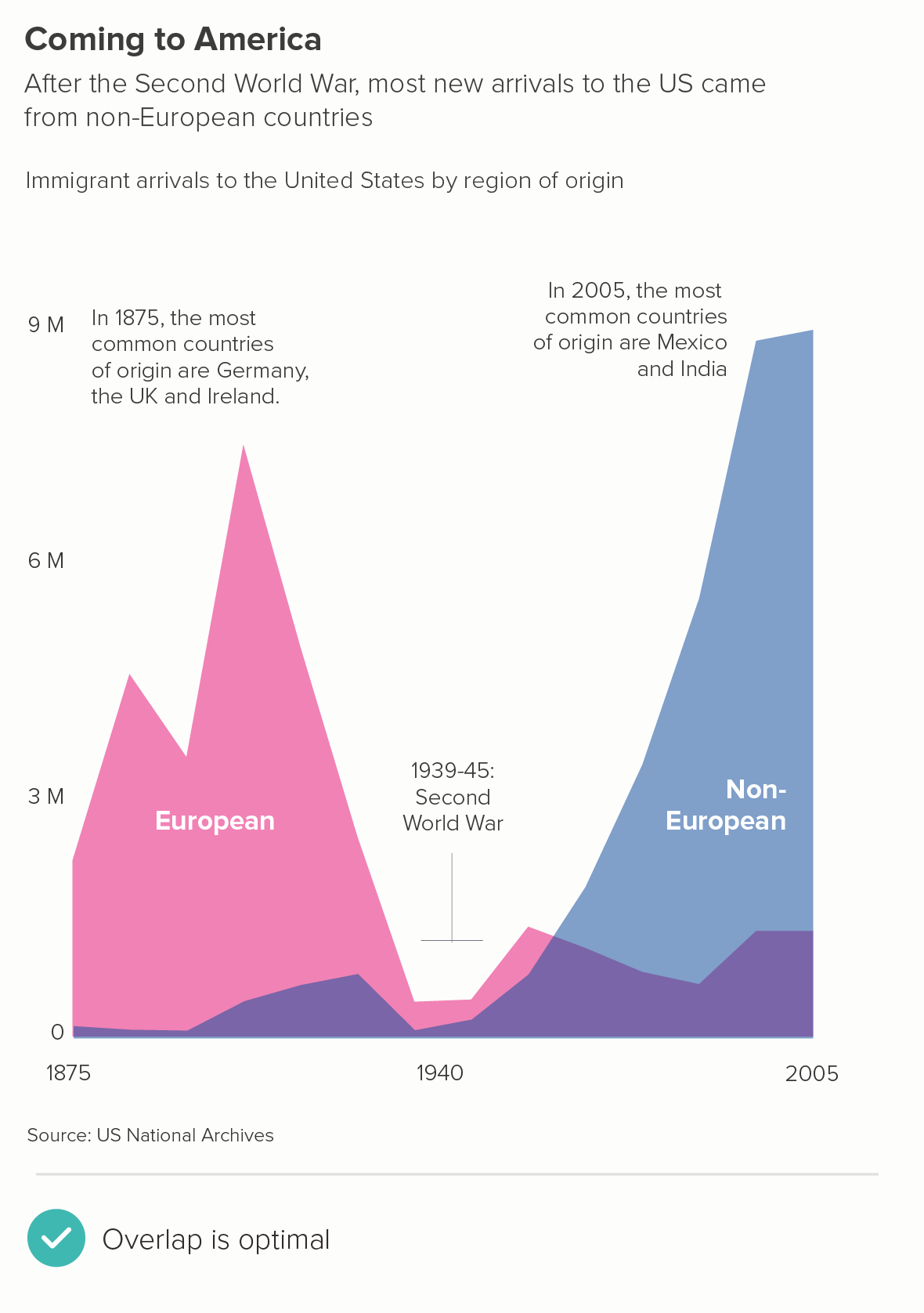
For me, the first chart above isn’t as effective - it’s the fact that the two series overlap which is the point of the story, one wave of migration dropping away as the other one ramps up. Also note how we have reduced the opacity of the fill. This is always essential for these stories - a solid fill of course makes any overlap invisible. 50% opacity is usually a good starting point and then adjust down or up accordingly.

There are other effective overlapping area charts here from Pew Research.

iv) A walk-through

Another way around the potential ambiguity of area charts is to walk through the different stages one slide or screen at a time. This can be done manually - in a PowerPoint presentation, for example - or in an interactive with transitions.

For example, if you have a stacked area chart, you can start with the total (a single line area chart), and then effectively ‘x-ray’ the component parts of the chart, using your titles and subtitles to make what you’re doing clear.

v) 100% stacked area

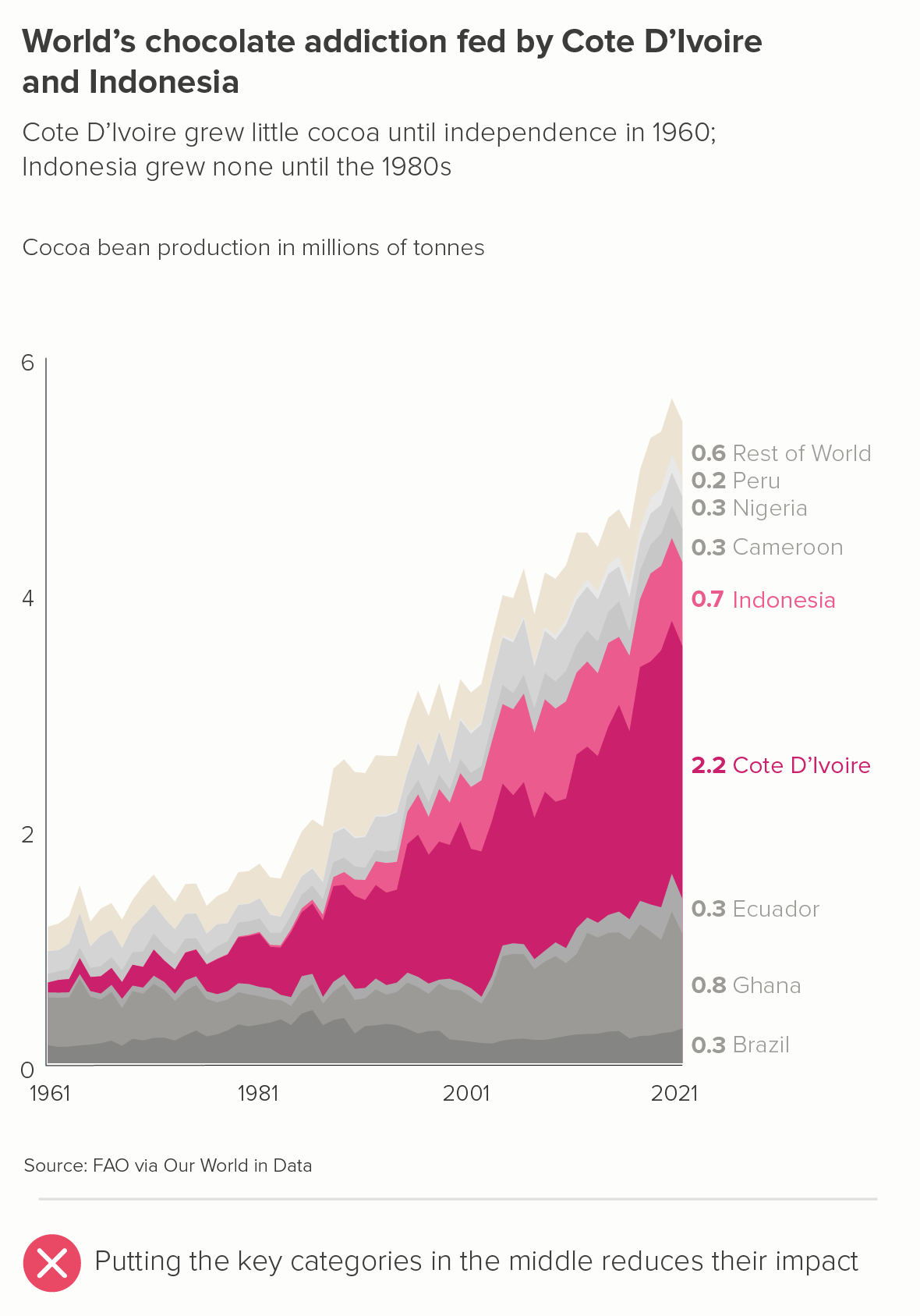
Another way of removing the confusion that can occur when you’re trying to show the changing composition of a fluctuating total is to remove the total from the equation. Instead, just tell the changing composition story.

We had this recently with a project we worked on for York University, cataloguing and visualising the sculptures in St Paul’s Cathedral.

Initially we tried a conventional stacked area chart (the first image below) but, not only was it confusing, it seemed to tell a counter-intuitive story. The curators knew that sculptors were using less white marble as the nineteenth-century proceeded, but the chart seemed to show the material’s enduring popularity. 

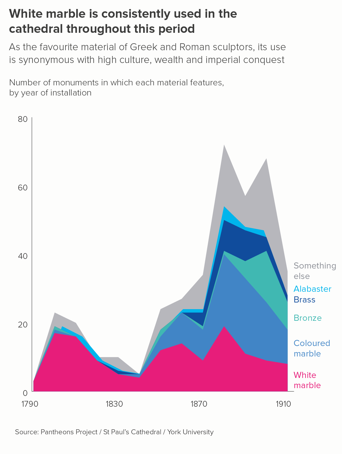
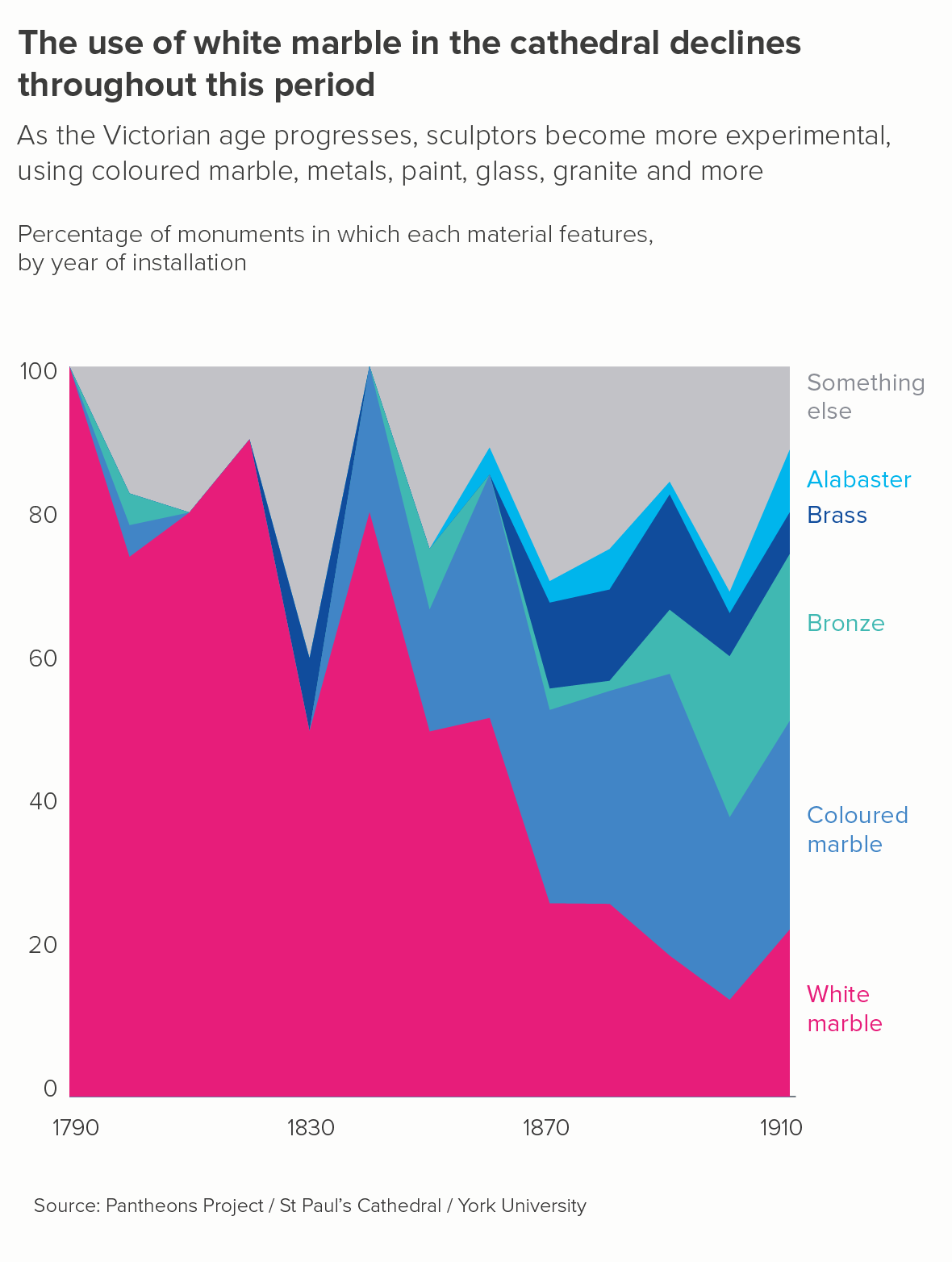
So we switched to a 100% stacked area (the second chart above). The chart became less confusing - we’re telling just one story, and people are less likely think those shapes are overlapping, they are clearly stacked up, like geological strata. But the chart also tells a clearer, more truthful story. Sculptors were using proportionately less white marble, as more experimental materials became available. 

There are other examples of excellent 100% stacked area charts here from the Economist, here from the Wall Street Journal, here from Flowing Data and here from Our World in Data.

vi) use text, colour and layout to direct attention

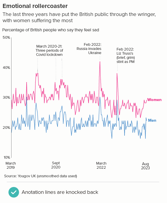
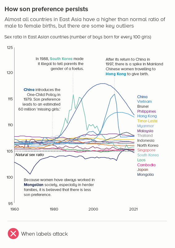
There’s one final option. If you use a standard stacked area chart, you can make it clear using text, colour and layout where your audience should look first. This doesn’t infallibly remove all confusion, but it definitely diminishes that sense of ‘too many stories at once’. 

a) highlight only the key category (or categories)

This is the most common use case - there are one or two categories which are the most interesting or important. Let’s return to our original GDP chart. Instead of trying to show everything (the total and all seven different countries), we could zero in on the most dynamic part of our dataset, and rebuild the chart around it.

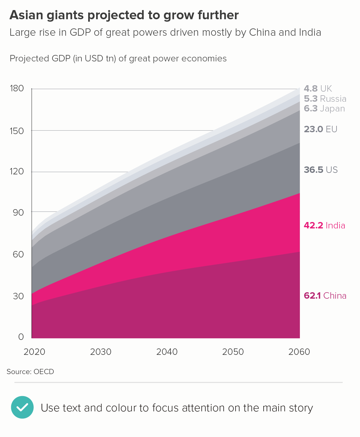
Notice that in the second chart, I have:

  • made it clear with my text that I am telling one key story - the growth of China and India relative to the others

  • put China and India at the bottom - not in the middle and/or at the top - so we can see how their growth is driving the change in the total

  • used highlight colours to make China and India stand out

  • put the final value for each country on the right, which should make it clearer that these are stacked-up categories, not overlapping

  • put the country names on the right, not in a separate key 

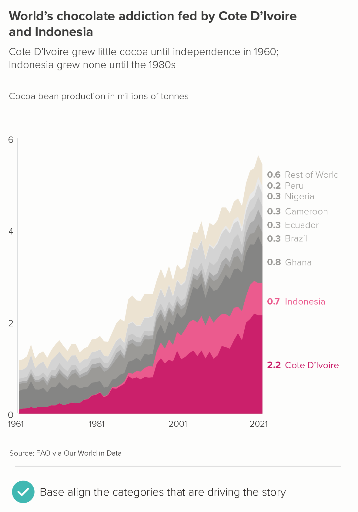
There’s another example below, where I’ve kept the colours the same in both charts, to accentuate the importance of base aligning the key categories.

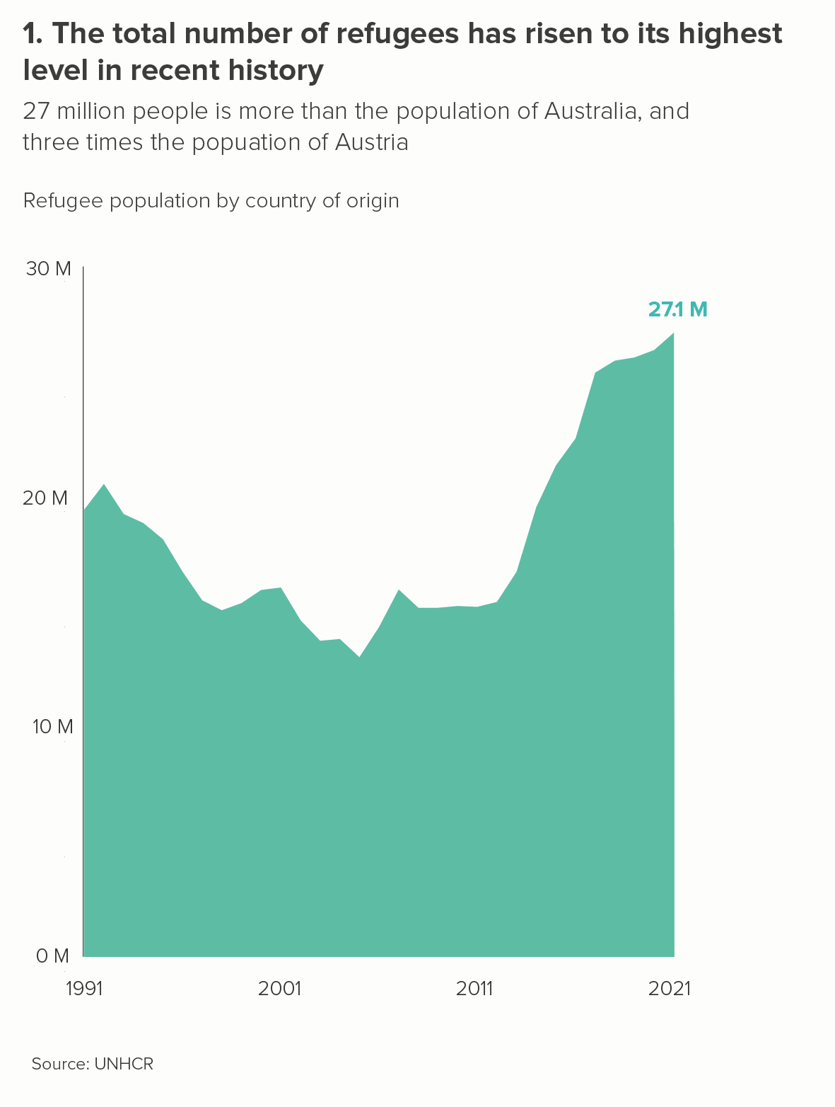
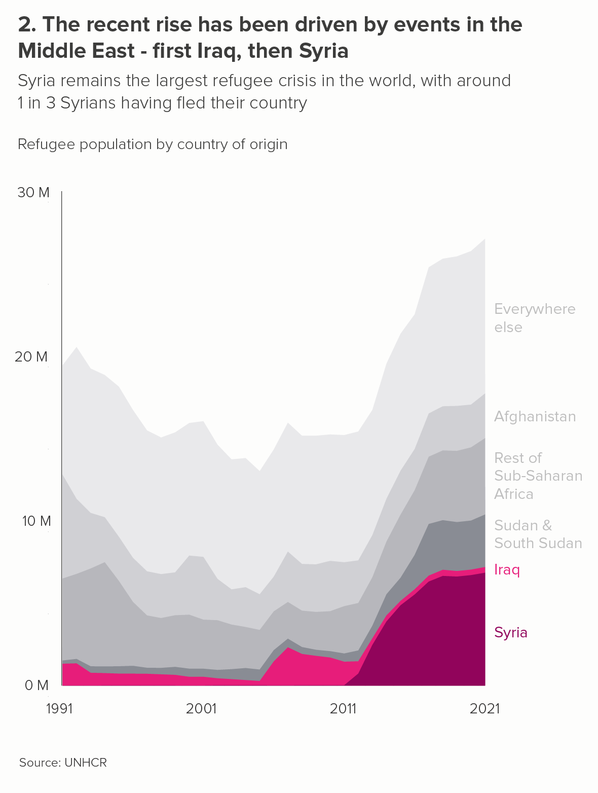
b) highlight the total first

Sometimes you don’t have a highlight category -  it’s the total that’s the main story. So in these cases, you’re looking to knock the individual areas back. 

For example, say I wanted to talk about the effect of the Ukraine invasion on Russia’s fossil fuel exports. The first chart below would definitely not be ideal, as I’m now seeing this as a story of warring fuel types, with crude oil dominating because of that bright yellow colour. This clashes with the title which seems to want me to focus on the overall fall.

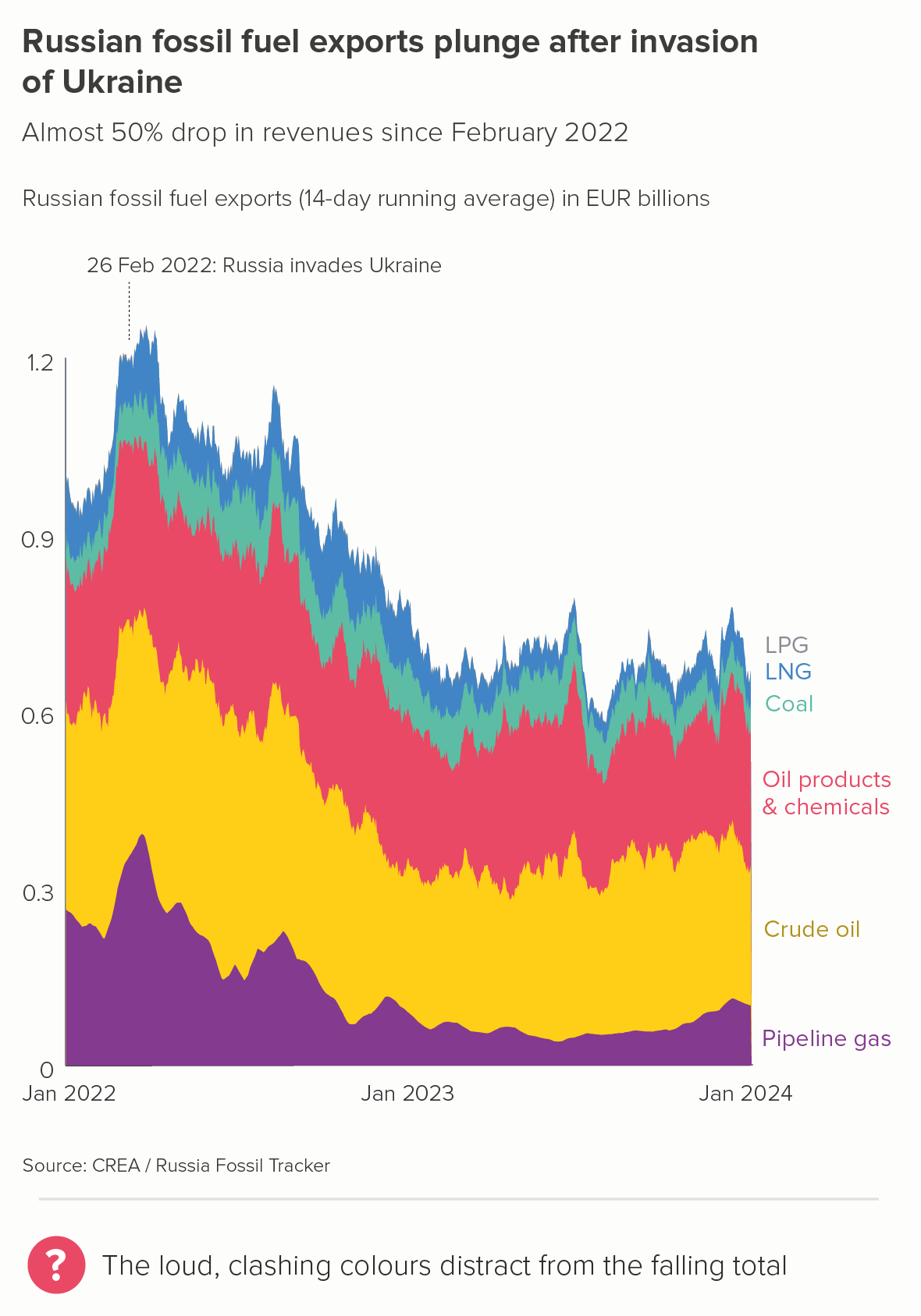
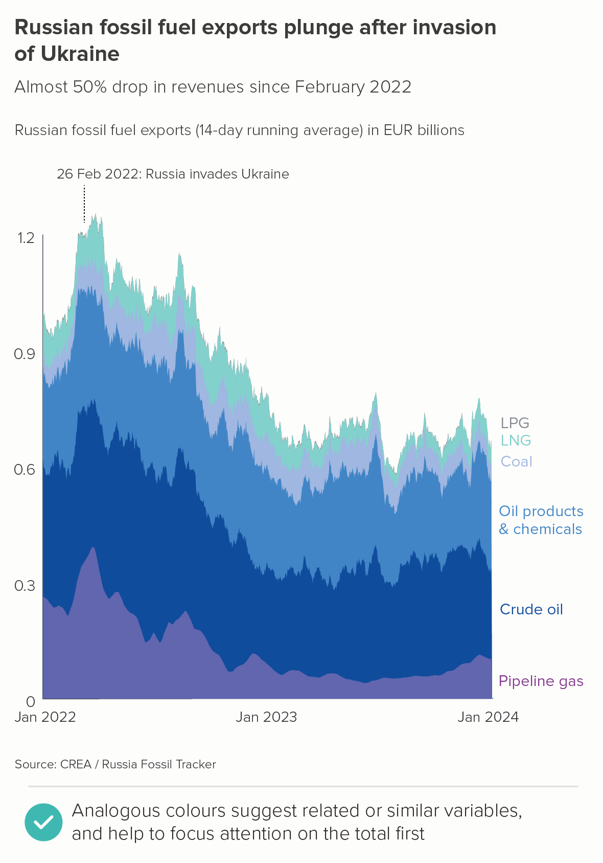
In the second chart, by using different shades of purple/blue for the different fossil fuel types, I’m keeping my audience focussed on the overall fall first, and then (if they’re interested) inviting them to study the individual fuel types. This also emphasises the similarity of the categories - they are all part of a single dataset (fossil fuels).

c) highlight all the categories

Finally, there are cases where you do want people to focus on all of the constituent areas, as they are all of equal importance. You want all the areas to be seen at once - before the total. 

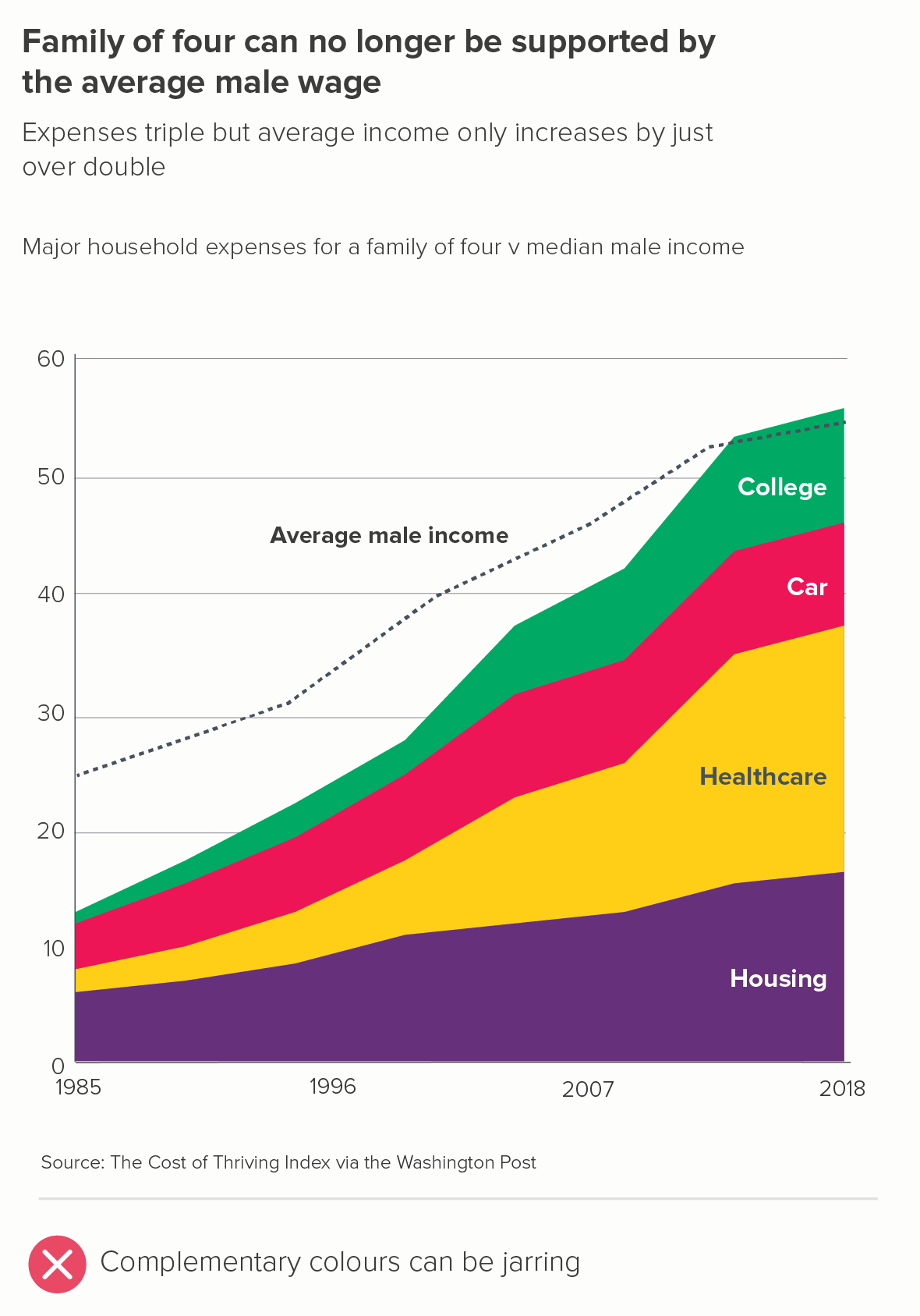
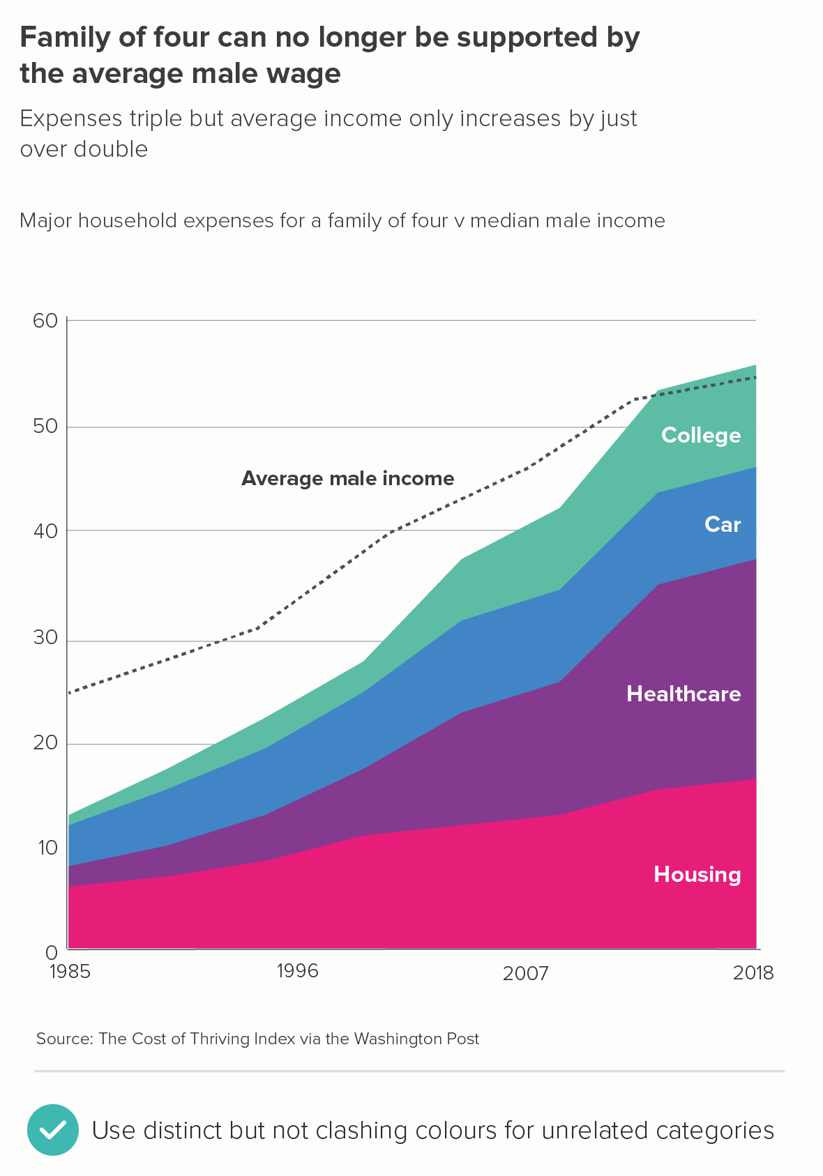
In these cases, to avoid jarring colour choices, it’s a good idea to move around the colour wheel, rather than across it. In the first chart below, we’re zigzagging across the colour wheel and creating clashing colours; in the second, we’re moving two steps at a time - red, purple, blue, green. This signals that the areas are distinct categories but are all equally important drivers in the story.

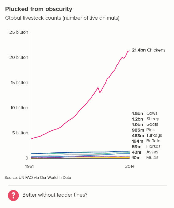
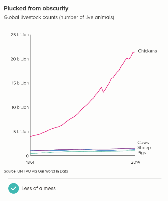
If you are concerned that the areas look like they are overlapping, then there are a couple of design tricks that can mitigate this effect too. 

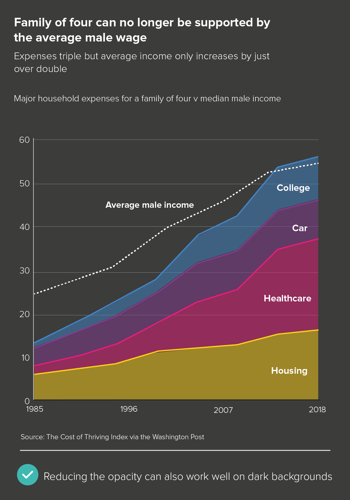
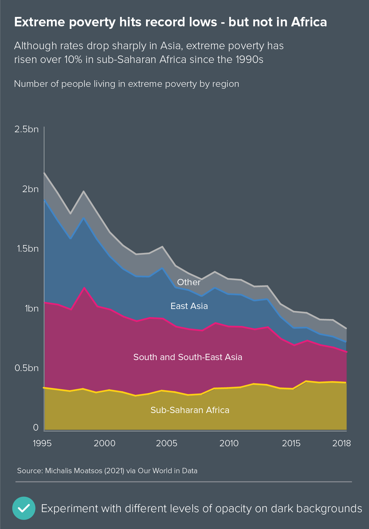
The first is to keep the lines solid, but reduce the opacity on the fill (the first chart below). This works particularly well on dark backgrounds (the second chart below).

Neither of these completely get rid of an area chart’s visual ambiguity. But where it’s the right chart for the story - and in the example above, I think it is - then an intelligent use of text, colour and layout can usually reduce that ambiguity to acceptable levels.

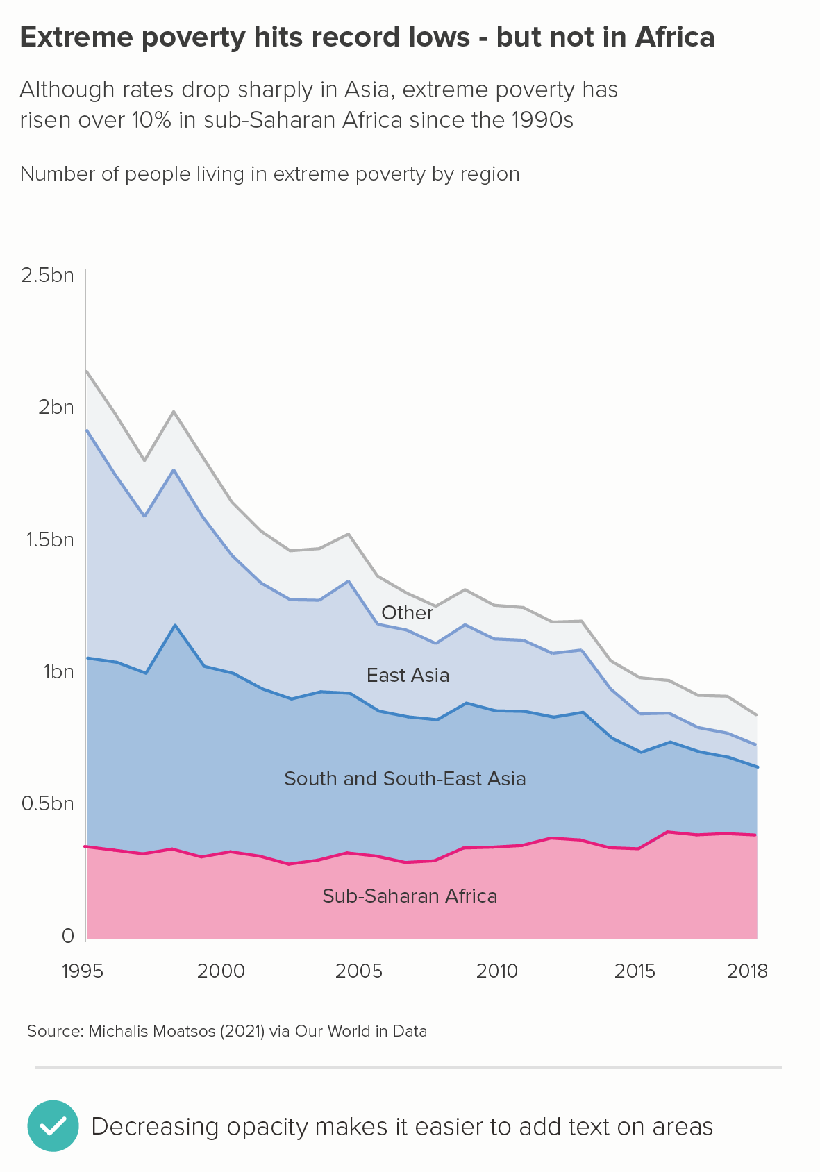
Note how reducing the opacity also makes it easier to sit labels on the areas (rather than next to the chart), without damaging legibility. I’ve included another couple of examples of this below.

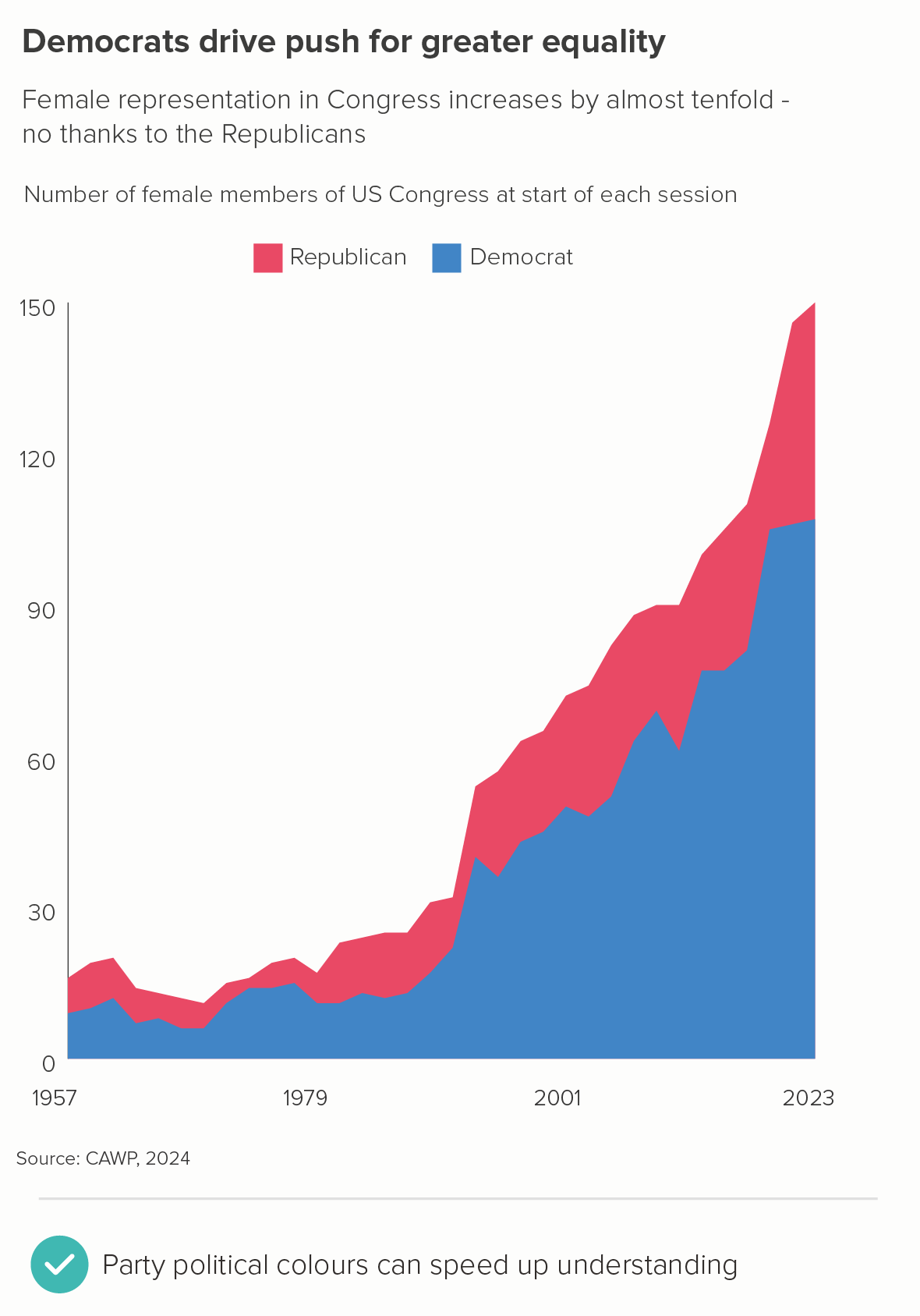
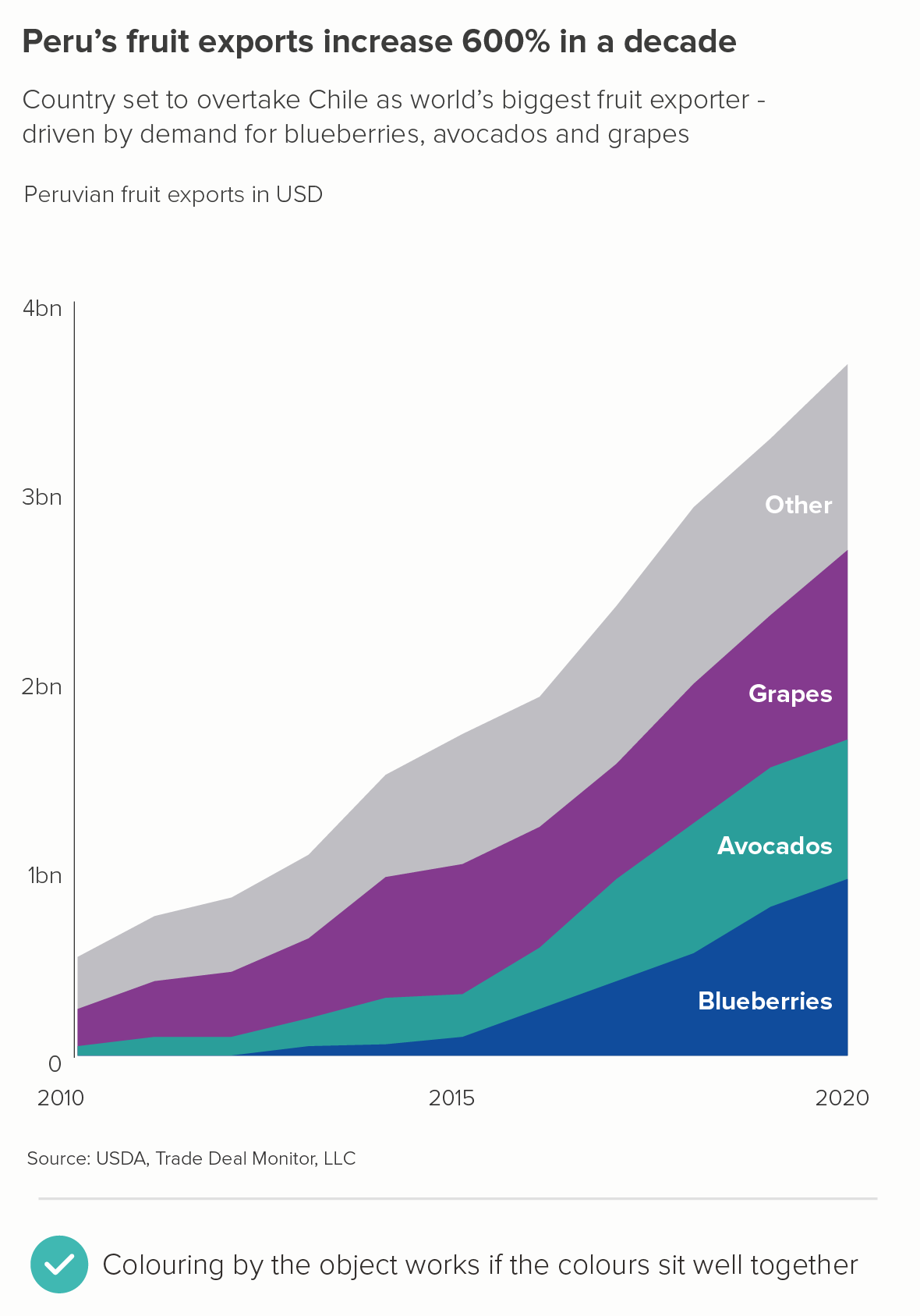
d) Colouring by the object or category

Sometimes you just have to accept that groups have such clear colour associations that not using the appropriate colour would be strange. One example would be political parties (the first chart below), another would be fruit and vegetables (the second chart). But I’d still choose harmonious palettes if you can - in the second chart, grapes are never that shade of purple, and avocados are a darker green, but these colours sit better with the blue of the blueberries. Refer to the colour wheel advice in section c) above to avoid jarring colour choices. And try to use your title and subtitle to reduce any visual confusion.

CONCLUSION

To conclude then, area charts can work wonderfully, and are often a great alternative to line charts, stacked bars, side-by-side pies and other charts that you might be tempted to reach for when telling either composition or change-over-time stories. The fact that you can add a fill makes them eye-catching, and using your fill colours intelligently can help your audience perceive the chart’s meaning more quickly. (Nobody likes grey areas). They need to be handled with care, but which chart type doesn’t? Keep laser-focussed on your story, make sure your area chart only tells that story, and watch as those bold slabs of colour help your message to find its perfect shape. 

VERDICT: Break this rule regularly.


Sources: Fertility rates - World Bank, Divorce rates - UN, OECD, Eurostat via Our World in Data, Migration to America - US National Archives, Refugee numbers - UNHCR, St Paul’s statues - the Pantheons Project, Cocoa growing - FAO, Russia’s fossil fuel exports - CREA Fossil Tracker, Living costs in the US - The Cost of Thriving Index via Washington Post, Extreme poverty rates - Michael Moatsos (2021) via Our World in Data, Women in politics - CAWP 2024 data, Peru fruit exports - USDA

More data viz advice and best practice examples can be found in our book- Communicating with Data Visualisation: A Practical Guide

Rule 40: No 3D line charts

In this blog series, we look at 99 common data viz rules and why it’s usually OK to break them.

by Adam Frost

Whenever people complain about bad data viz, 3D pie charts always feature heavily. And fair enough. But in my view, 3D line charts are worse, as they take perhaps the clearest, cleanest, most useful chart, and take a sledgehammer to it.

It’s partly a misunderstanding of the metaphor. Although I dislike 3D pies (rule 12) and 3D bars (rule 23), you can at least make a justification for that third dimension on metaphorical grounds. You are turning piles of stuff into bars so we can compare them, or dividing stuff into pie slices so we can understand its composition, and actual bars and actual pies are 3D objects in the real world, as are (often) the things they’re standing in for. But a line? Representing change over time? A 3D pie remains a pie, but a 3D line is no longer a line - it’s a shape. A strange, crooked, tilted shape that no longer looks like it signifies passing time (linear, a timeline, across date lines) or like a quantity rising and falling.

But even if 3D line charts did work as metaphors, they would still fail because of their unintelligibility. Let’s put a 2D and 3D line chart side by side. 

Both charts were made using Microsoft’s standard charting library.

The 3D version fails all the basic criteria of data representation. Namely:

  • The lines seem to start at different points, first green, then (possibly?) blue, then (maybe?) pink

  • The lines seem to end at different points, first pink, then blue, then green

  • The pink and the blue lines seem to be running in parallel between about 1986 and 1992 even though the values for the blue (male boss) line are much higher.

  • In 2017, the blue and green lines are only 2% apart, but they look much further apart than this.

  • The gridlines become useless. The green line finishes at 21% in 2017, but the gridlines suggest a value of about 5%.

Needless to say, the 2D version has none of these issues. Note that the only thing different about the second chart is the addition of the third dimension - the colours, typeface, axis intervals etc are all identical in both charts. The use of 3D alone obliterates what is otherwise (in my view) an interesting story.

Even if we just use a single line, there are still serious problems.

The dive to zero is obvious in the 2D version, but in the 3D version, the line seems to hover above the axis. And in the 2D version, the fact that the bank collapsed quickly (in just 48 hours) is clear, whereas in the 3D version, it is more of a gentle glide. More generally, the line has become a ribbon, something a gymnast might twirl, devoid of the clarity and precision we usually get from a line chart.

So it’s almost never a good idea to use 3D in line charts. The only exceptions I’ve seen are when all of the following apply:

  1. the third dimension represents something (another dimension in the data)

  2. this third dimension is explained - either by user interactions or animations

  3. the interactive designer is expert enough to walk through the story in a succinct and intelligible way

  4. the audience is sophisticated enough to follow the various stages of the walkthrough

The only example I’ve ever seen of all of the above applying is the New York Times’ 3D yield curve by Gregor Aisch and Amanda Cox. It’s a fantastic piece of work, precisely because they have made a chart work that shouldn’t work. It also takes an incredibly dry subject (bond yields! hell yeah!) and invigorates it, by placing it in a wider economic and political context. But if you’re not Gregor Aisch and Amanda Cox (the ‘and’ is important), and I’m definitely not, then stay in flatland and keep your lines 2D. If your story is good enough, it will have multiple dimensions anyway.

VERDICT: Almost never break this rule.

Source: Gender of bosses - Gallup, SVB share price - NASDAQ

Rule 39: Label all the datapoints on your x-axis

In this blog series, we look at 99 common data viz rules and why it’s usually OK to break them.

by Adam Frost

On a vertical bar chart, an x-axis usually contains critical information about your story. You can't just drop x-axis labels because otherwise those bars could mean anything (the first chart below). Even if your chart doesn't have an x-axis, as in a pie chart, it's still unusual to leave categories unlabelled (the second chart).

This logic is sometimes carried over into line charts. If you have a datapoint, you should have an x-axis label to go with it.

Source: Business-Q

But, unless you're Marty McFly, time moves in one direction, and clocks tick at regular intervals, so labelling every minute or month or year is often overkill. It's a good idea to start with just two datapoints- the start and the end of your series, and then check if the story is clear. Sometimes it is (the first example); sometimes it isn't (the second).

In charts like the second example, keep adding x-axis labels until the audience has all the key information.

And I would add them in regular intervals - just because it makes the axis cleaner, even if those intervals are every three years, or seven years, or something that’s not especially intuitive (the first chart below). But with longer time periods, it’s better to use more human-readable intervals e.g. every 20 or 50 years rather than, say, every 37. If you've got, for example, 2,017 years of data (or any other prime number), go for big leaps, and then just put the final label at an irregular interval e.g. 1800 1900 2000 2023. If there’s not much of a gap between the last two labels, you can make that final interval wider, e.g. 1800 1900 2003. Or sometimes the first label also needs to be irregularly positioned to make the chart comprehensible - 1896 1920 1940 1960 1980 1996 - as in the second chart below.

You can also assume a certain level of intelligence in your audience (they are choosing to spend time with a line chart, after all). If your first label is 2005, the next can be ‘06 ‘07 ‘08. You don’t always need to repeat the first two digits - 2006, 2007, 2008. Particularly if you’re short of space.

Try to always remember what the point of your x-axis labels is. How vital are they to the story? How many are vital? 

A couple of other notes. Horizontal labels only. If you're going diagonal or vertical or hyphenating, you have too many labels. Abbreviation is fine (Jan or J for January), but never rotation. When, as a reader, do you ever yearn for text to be positioned diagonally? Or vertically? Remember this is about making life easier for your reader, and we prefer text to be horizontal and legible. So if you can't abbreviate, delete. 

Finally, I know a lot of software (e.g. Powerpoint, Illustrator) leaves a mysterious and unhelpful gap between the y-axis and your line’s first datapoint. Like there’s a strange lacuna in time, before your data starts. Override the default, position your first x-axis label at the bottom of the y-axis and make those lines run edge-to-edge. 

VERDICT: Break this rule constantly

Sources: England and Wales baby names - ONS, Bond yields - CNBC, John Travolta films - IMDB, Human height - Our World in Data, Migration data - UNDP via Our World in Data, Civil service numbers - Institute for Government

Rule 38: No unnecessary lines on line charts

In this blog series, we look at 99 common data viz rules and why it’s usually OK to break them. Here are all the rules so far.

by Adam Frost

In rule 27, I mentioned that most of the lines on bar charts are superfluous (borders, grid lines, axis tick marks and so on). This is doubly the case with line charts, because these unnecessary lines fight with the necessary lines on the chart.

With a line chart, I’d recommend starting with just the (data) lines, the y axis line, and the start and end x and y axis labels. Then slowly add elements until the story is clear.

Gridlines

With one line, you often need to add almost nothing, as in the stock market example below. When you have a few lines (as in the second chart below), sometimes gridlines are good reference points, just because their clear horizontal orientation can act as a helpful visual contrast to the curving or zigzagging lines.

I’ve used horizontal gridlines above, as these tend to be the most useful kind for line charts. The key story is almost always the direction and degree of change, and horizontal gridlines emphasise this. Vertical gridlines emphasise the values on the x axis (the time axis) and these are usually of secondary importance. (the story order is usually ‘What’s changed? By how much? When did it change? Why did it change?’). 

X-axis line and tick marks

For your x-axis, if your y-axis contains zero, it’s good practice to have an x-axis line. This is especially the case if it starts below zero. Tick marks are not needed though - in most cases, they just look fussy.

If your dataset doesn’t contain zero (or if zero isn’t a meaningful reference point), consider making your x-axis line fainter (the same line weight as your gridlines - if you have them). This accentuates the fact that the chart is showing a selected range of values, not everything from zero upwards. Alternatively, in these cases, you can just have x-axis data labels - no axis line - and let the line(s) on the chart float. 

Annotation lines

When you annotate line charts, you also have to be careful for all the reasons mentioned above. Use a thinner line, a dashed line, a more recessive colour or all three at once to ensure that there is no confusion between the lines on your chart and any call-out lines. 

If there is the option to use a shaded box (perhaps you are talking about a historical period), consider using this option rather than call-out lines as it neatly avoids any visual conflict between line types.

Error bars

There’s one final kind of line that gets superimposed on line charts: error bars representing confidence intervals, standard errors, standard deviations, upper and lower estimates, or related quantities.

There are two decisions to make here:

i) are the error bars necessary for your audience? 

ii) if error bars are necessary, how vital are they? In other words, is the uncertainty of the data your main point? Or a secondary point? Or are the error bars simply a signal to your expert audience that you are being fully transparent about the limitations of your dataset.

Regarding the first decision, if you are talking to non-experts, then error bars should almost always be omitted. Expressing uncertainty about your story is never a good look for a general audience, plus most of them will have no idea what the error bars mean (in fact, a fair number of experts will have no idea either). Instead consider putting any data limitations or uncertainties in a footnote or link through to the source paper with the warts-and-all academic chart.

If you do have an expert audience, and/or if uncertainty is a key part of your story, then error bars should be used. However, wherever possible, avoid using those strange horizontal lines that look like TIE-fighters. So not this:

The error bars are like graffiti, obscuring the main lines.

Conversely, grey lines (the first example below) or a shaded area (the second example) complement your main data line more effectively.

Note that this only works if you have a single line. Error bars with multiple lines always look terrible and, in these instances, think about placing the charts side by side or, for lots of lines, use small multiples instead.

You can see that, in the second chart above, not only is it clearer that Latin America’s wildlife abundance has dropped further than Africa’s, but also that the Latin America numbers are more reliable, as the upper and lower estimates are much closer to the central estimate.

So this is a rule to stick to most of the time. With line charts, you’re looking for any excuse to delete non-data-bearing lines. When you do need to add ‘unnecessary’ lines, keep them subtle and minimal, never upstaging the shapes drawn by the data.

VERDICT: Break this rule rarely

Sources: Fertility rates - World Bank, Human height - Our World in Data, Guyana GDP - Our World in Data, Life expectancy - Our World in Data, Happiness index - Yougov UK, Historical life expectancy at birth - World Bank, Living Planet Index - Our World in Data,

Rule 37: Line charts should have a key

In this blog series, we look at 99 common data viz rules and why it’s usually OK to break them.

by Adam Frost

In rule 9, I discussed keys in pie charts and in rule 21, keys in bar charts, and how they usually make life harder for the audience. It’s doubly true for line charts. Let’s look at the default line chart in PowerPoint, for example.

Source for data: ONS UK

A key gets dropped in, even if you just have a single line. The key is also placed at the bottom of the chart, the least useful position imaginable. Of course you should remove this: it duplicates information and it adds clutter.

With multiple lines, is a key more useful? Compare the two charts below - with the first, you expend cognitive effort tracking back from chart to key and back again. By directly labelling the lines, as in the second example, your audience has less work to do. 

But what if the end points of some of your lines are similar values, and their labels sit closely together? Is it easier for the audience to decipher the information in a key? I’d argue that as long as you nudge up/down any labels that actually overlap, direct labelling is still preferable, as the Our World in Data example below shows.

The only thing I’m not convinced about in this chart is those angled leader lines - are they strictly necessary? It’s not like they help us disentangle the six visible lines into those nine named categories. For me, leader lines are almost always redundant. In this instance, the order of the labels clearly indicates the highest to lowest final value. So I’d consider either losing the leader lines - and possibly add the final value to the label (the first example below). Or even better, reduce the number of lines, which makes leader lines redundant, the labels more legible, and it improves the clarity of the story too (the second example).

It’s also fine to keep all the lines but delete some of the labels, if some of the lines add useful context, but are not vital for the story.

The fact is, keys are bad enough in pie and bar charts, but in lines, there’s an extra challenge. In bars and pies, you have a solid fill in the chart, and a clear bright square in your key. Still not as good as direct labelling, but at least you have a fighting chance of matching colour to bar (or slice). With a line chart, the colours are harder to distinguish, particularly once you get past six or seven lines, and matching the thin line on the chart to the thin line on the key is like having an eye test with a particularly sadistic optician. (Played, ideally, by Steve Martin)*.

So should a line chart ever have a key? I’d say No, always directly label and if you find there’s something stopping you from adding labels, then check your chart - is something else broken?

But if you absolutely have to add a key - maybe it’s your organisation’s house style - then check those defaults. PowerPoint, as we’ve seen, puts the key under the chart, but also orders the labels by the order the categories appear in the spreadsheet (the first chart below). This is unhelpful, to say the least. Your key should go on the right, and the order of the labels should match the order of those final line values (the second chart). There’s no need to make the chart any harder to unlock than it has to be.

VERDICT: BREAK THIS RULE WHENEVER YOU CAN

*If you haven’t seen Steve Martin’s hilariously twisted dentist in Little Shop of Horrors, then brace yourself.

Sources: Baby names - ONS UK, Livestock counts - FAO via Our World in Data, Gender ratio at birth - UN via Our World in Data, Fertility rates - World Bank.

More data viz advice and best practice examples in our book- Communicating with Data Visualisation: A Practical Guide