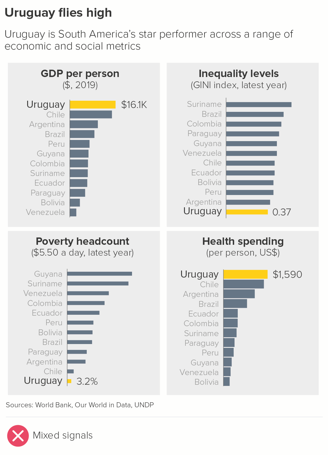
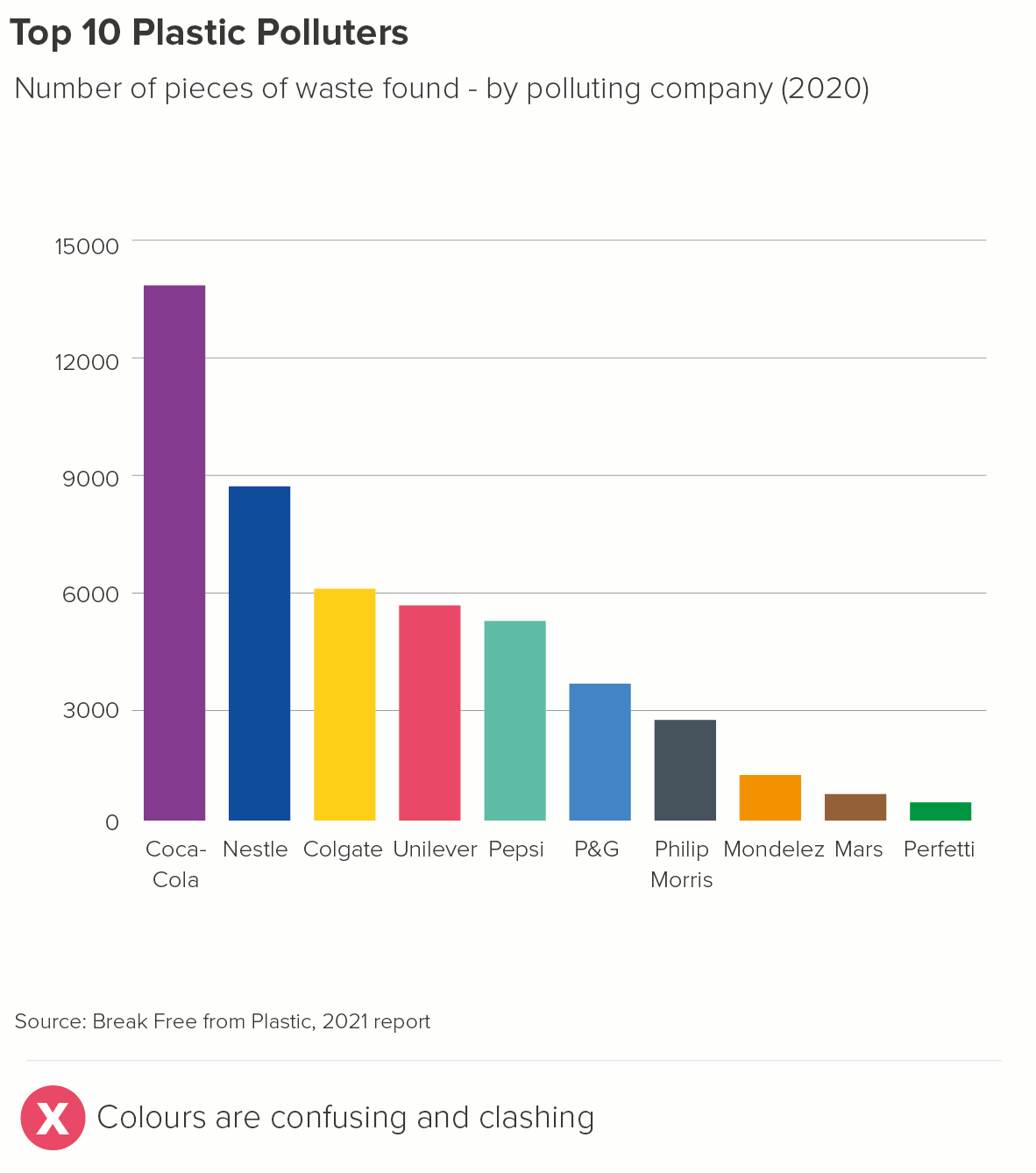
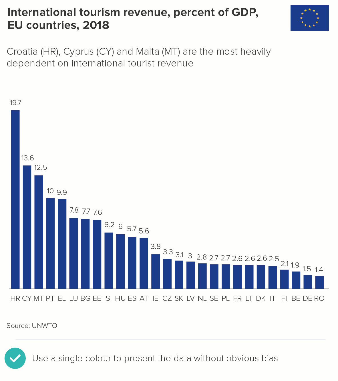
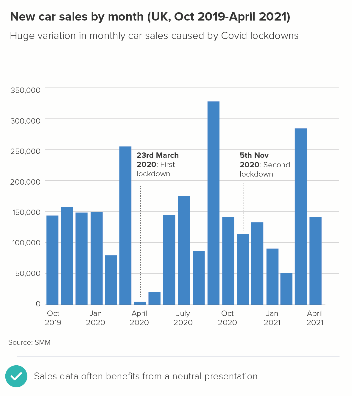
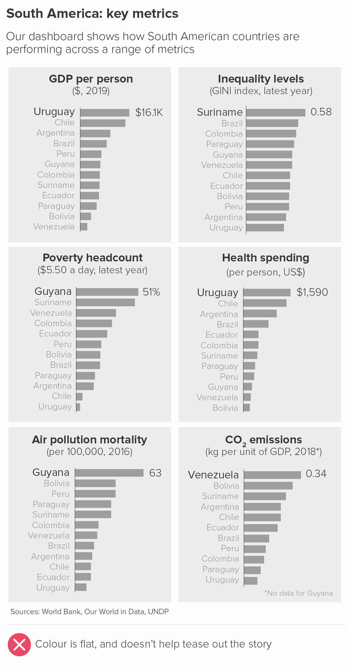
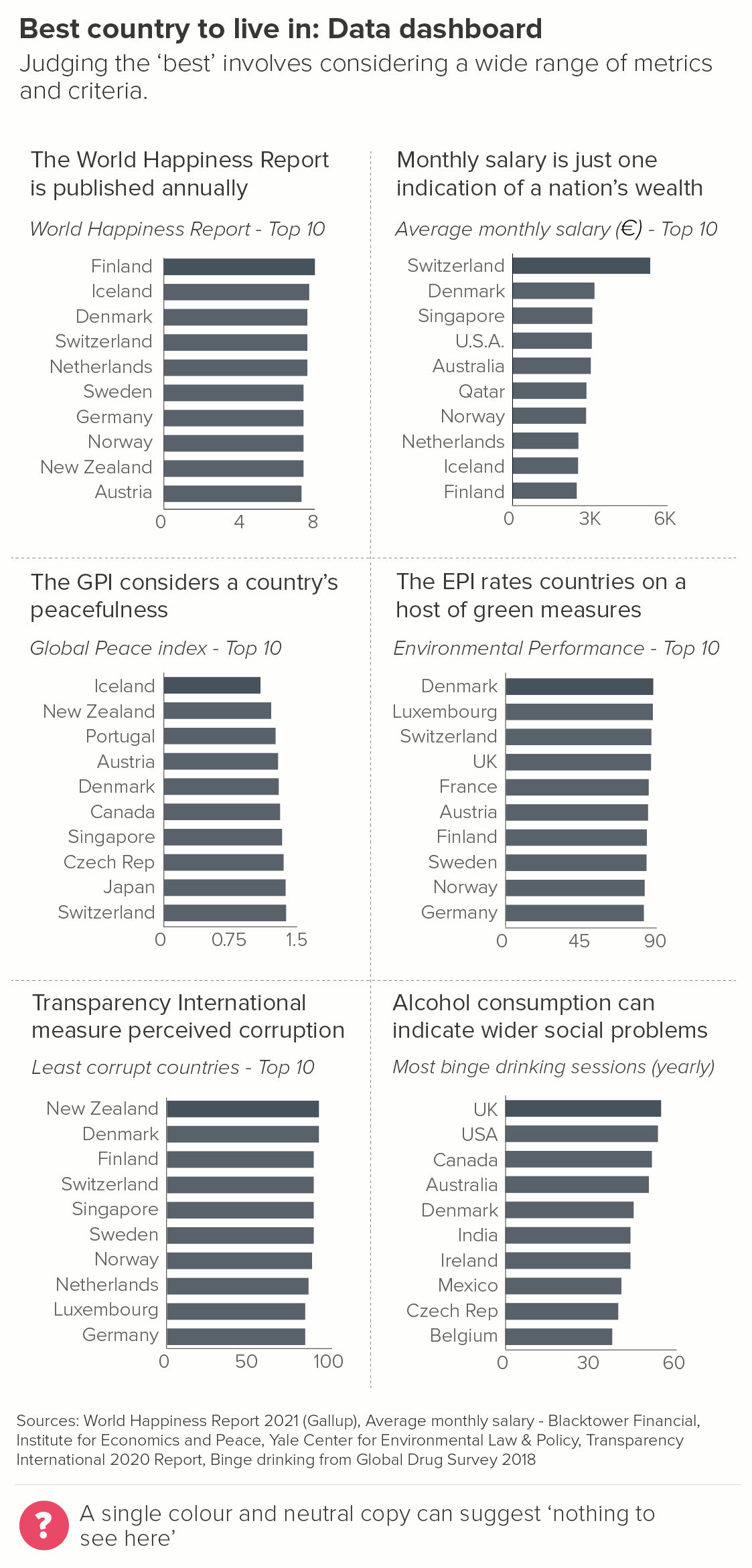
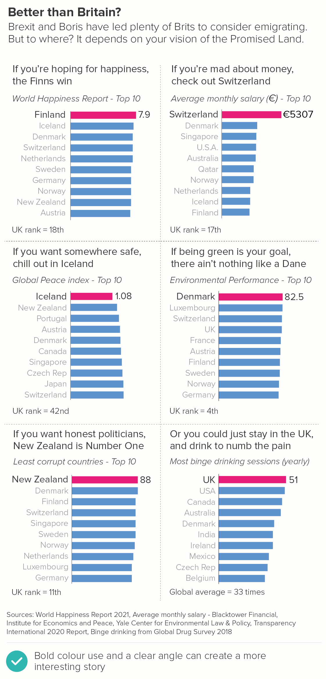
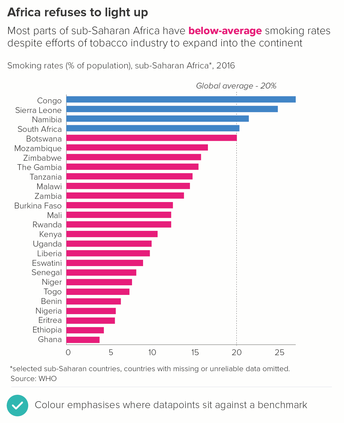
In this blog series, we look at 99 common data viz rules and why it’s usually OK to break them. Here are all the rules so far.
by Adam Frost
Changing the shape or style of your bars is possible in many software applications. Particularly in vector graphic editors like Illustrator, it is all too easy to give rectangles rounded corners, or decorated tops, or to quickly turn them into a different shape.

The arguments against these structural modifications are as follows.
i) Accuracy
In rule 16, we saw that bars are one of the easiest charts to read, because humans are good at comparing the sizes of rectilinear shapes. Further research has shown that adding visual embellishments to a rectangle makes it harder to extract the underlying datapoint.
ii) Aesthetics
This is always subjective, but I think that in most cases rounded, pointed or decorated bars look strange and confusing. They also hint at a quiet desperation on the part of the designer: how can I rescue this dull data?
iii) Narrative
Audiences will read meaning into shapes.
If you round the top of a bar, you are suggesting the value is rounded or an approximation.
A triangle implies an upwards motion or a rapid ascent.
Decorating the top of your bar with an icon turns your rectangle into a plinth or pedestal, structural support for an illustration rather than the reason for the chart’s existence.
Is modifying your bars helping or confusing your audience? In most cases, sticking to rectangles gives you a chart that is clearer, more accurate, and more elegant.
However, sometimes the three factors listed above mean that a standard bar is misleading or underwhelming. Cosmetic enhancements are necessary.
i) Accuracy
Sometimes you do want to suggest that the bar is just an approximation or even an illustration, so rounding the end can help to give this impression. For example, a progress bar. This is rarely an accurate reflection of how much has been saved or downloaded; that’s why it can stay on 5% for three minutes and then jump to 95% a second later. The bar just gives reassurance that something somewhere is happening.
ii) Aesthetics
In some situations, a stylised bar might be the right visual choice, perhaps because it’s part of an illustration-led infographic, and a standard bar would get lost in all the visual pyrotechnics. Or just look out of place.


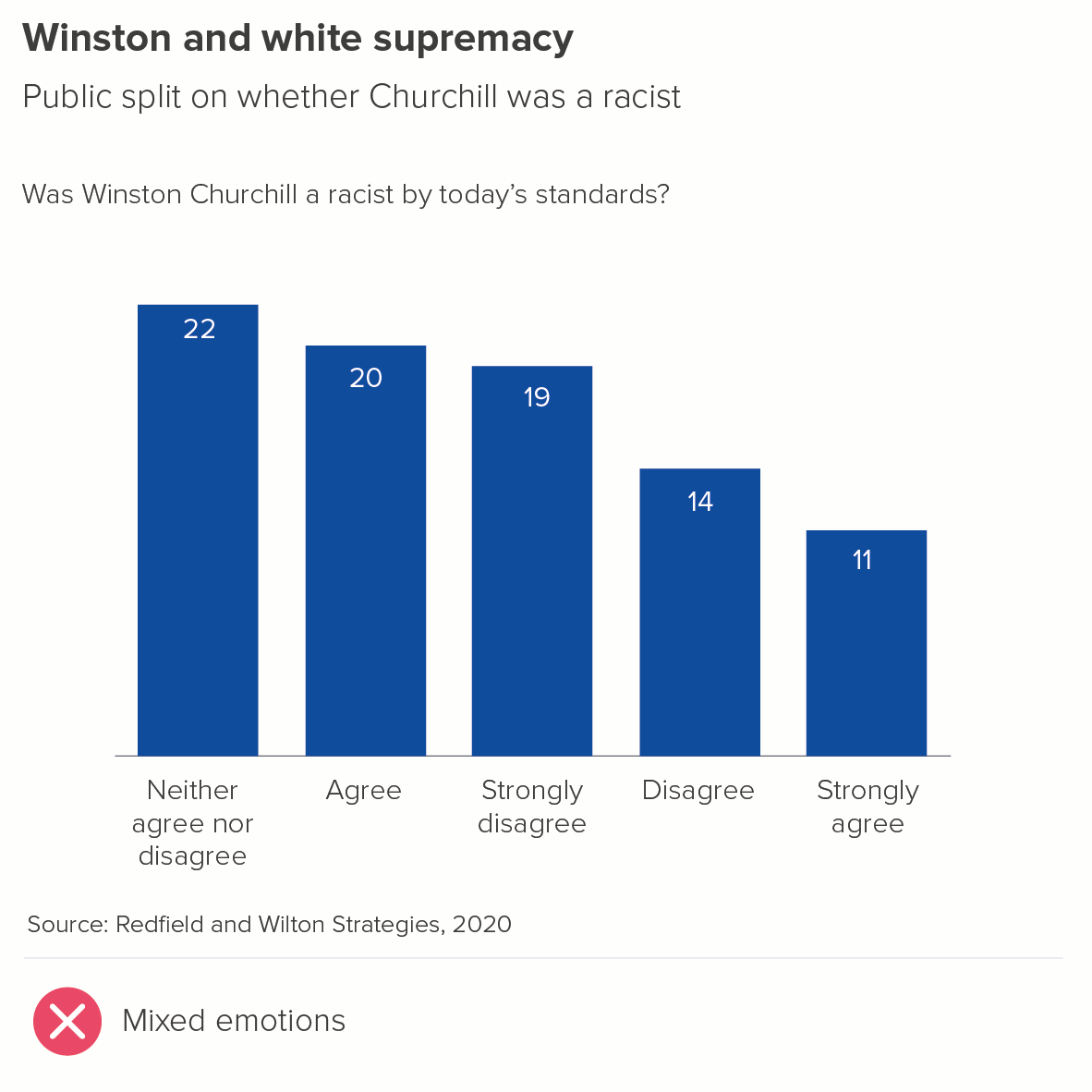
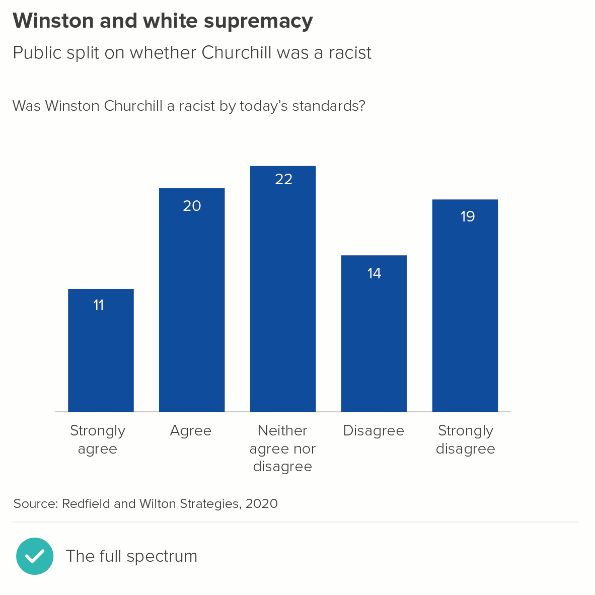
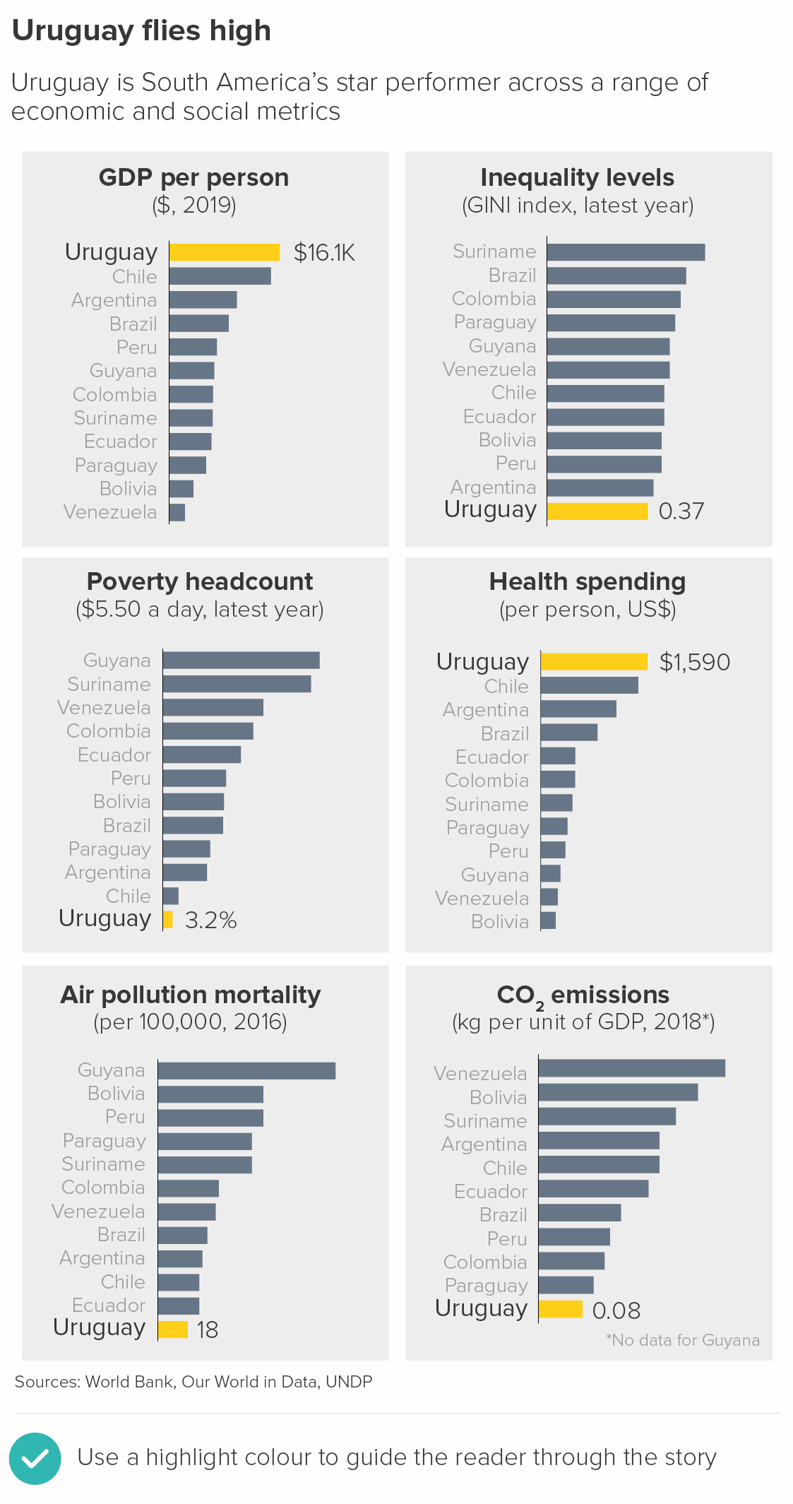
Image credit: Sergio Fernandez Gallardo for Kantar, Jim Kynvin for London First
In the second example above, there’s no particular reason why the cities with the most overnight visitors should be represented by overlapping triangles, but it suits the overall style of the infographic, and it looks distinctive enough to compete with the bold icons and illustrations.
Related to this is the question of client branding. Sometimes regular bars look out-of-place alongside other brand elements (e.g. logos, lock-ups, illustrations), or their use is specifically discouraged in brand guidelines. For example, Google sometimes like to round the tops of their bars in their publications (e.g. on their Think with Google site). Perhaps it is judged to be a friendlier and less corporate shape? The curved ends also hint at Google’s most recognisable invention - its lozenge-shaped search box.

Source: Google
(In fact, if you make a bar chart in Google Sheets, the ends are slightly rounded by default, and there is - at the time of writing - no way of changing this).
iii) Narrative
Sometimes altering a bar’s shape or adding decoration is right for the story.
Rounded bars
If you are showing temperature or meteorological phenomena, then rounding the end of your bar to suggest the mercury in a thermometer can be a helpful metaphor. Alternatively, you might want to decorate the end, to suggest the thermometer’s bulb, as in this example from a series about Gothic novels.

Image credit: Adam Frost/ Zhenia Vasiliev
The thermometer metaphor can be extended - for example, when you want to indicate that you are figuratively ‘taking the temperature’ of a nation or marketplace. Another example from Google, this time one we worked on. The company had created a product called the Google Barometer; an online dashboard with a lot of bars. We ended up rounding the bars very slightly to suit the barometer theme.

Image credit: Google
Note that we didn’t go ‘full meniscus’ in this case, as the product was aimed at analysts who still wanted to be able to quickly and accurately compare the bars.
Triangle
Sometimes what your bars are representing is essentially triangular - for example, a mountain.


Image credit: BBC, Accurat
I’ve been literal here - but sometimes mountains can be used as metaphors too. For example, I think triangles can work when you are showing large amounts of money - as in mountains of cash - or showing heaps of food - for example, surplus food production in the EEC during the 1980s caused so-called beef and butter ‘mountains’.
Here’s an example from one of my children’s books, where we were trying to show the huge quantities of food used in European food-throwing festivals.

A triangle also suggests a dynamic movement upwards (or downwards) and sometimes this is exactly what you want your chart to suggest. The bar becomes a sized arrowhead.
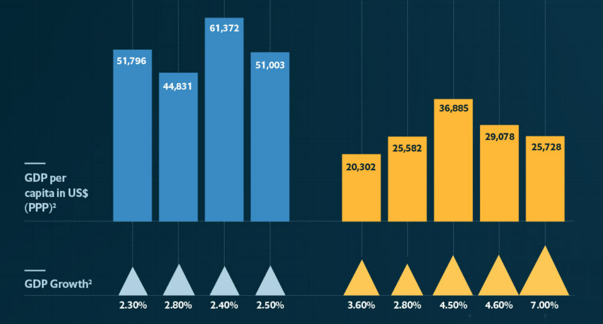
Image: Sergio Gallardo, The Economist
Note that in this example by Sergio Fernandez Gallardo for the Economist, it is not the height but the whole area of the triangle that is used to represent GDP growth. I prefer this approach.
As well as measuring amounts rising or falling, something we are literally measuring objects rising or falling in space. Speed, acceleration, distance travelled, Again, triangles can be a great fit.

Image: Jim Kynvin
In this example, designer Jim Kynvin wanted to show the speed of different vehicles and vessels. Turning bars into triangles suggests both a rapid movement through space, but also cleverly gives each vehicle a vapour trail.
You can also turn part of the bar into a triangle; it doesn’t have to be the whole bar. In this example about cheating in the Tour de France created by designer Mark McClure, McClure placed a triangle at the top of all the bars he used, to hint at rapid movement through space but also to preserve the solidity and readability of the bar.

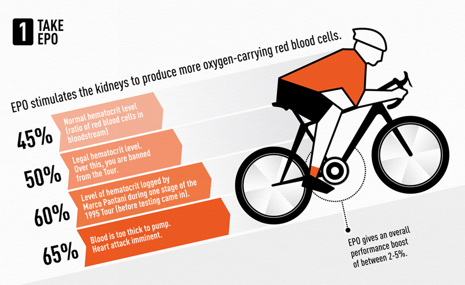

Image credit: Adam Frost/ Mark McClure
Decorated tops
Decorating the top of your bars can be difficult to get right, but it’s worth making the effort when your story justifies it. Here’s a justly-celebrated example by David McCandless.

Image credit: David McCandless
Yes, it is hard to read those bars accurately anymore (are we reading the tops of the bars or the tops of the skyscrapers? Are those skyscrapers to scale?). But many of the measurements used here are approximations, so suggesting pinpoint accuracy would arguably be misleading. Besides, in terms of aesthetics and storytelling, this graphic is a triumph. Sacrificing a little accuracy is worth it for the sake of visual and narrative impact.
Adding a cityscape to the top of each bar makes the places immediately recognisable. It also makes us think about the humans and the human civilizations that will be wiped out by sea level rises: no more St Mark’s Square in Venice, no more windmills of Amsterdam. This makes us feel the scale of the tragedy more intensely.
Locking the bars together is also a brilliant design choice (there are no gaps between the bars). This makes us think about the Earth these cities share, and how they are all on course to share the same sea bed.
Essentially, all of these visual effects turn a boring old bar chart into Atlantis, with the survivors bobbing past in the boat at the top (hopefully sans Kevin Costner).
Decorated bottoms
Less inaccurate but also possibly less engaging is putting an icon at the bottom of your bars - either inside or outside the end.
If it’s inside the end, this approach works best when the bar is a solid colour and the icon is white. If it’s outside, putting the icon in an identically-sized enclosing shape (usually a circle) can be a good approach.
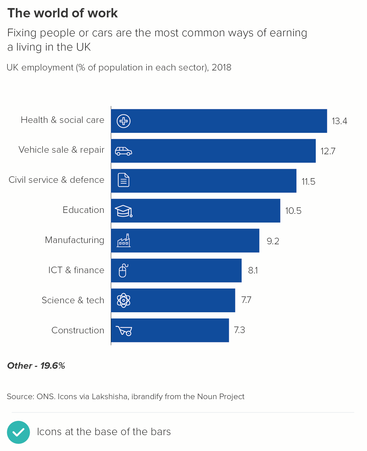

Another approach is for the icon to fill all the bars, almost like a watermark, as in these examples from Facts Are Sacred by Simon Rogers. This only works if your bars don’t represent different categories, but are, say, a change over time or data distribution story.
Image credit: Simon Rogers, Facts are Sacred
Decorated whole bar - illustrations
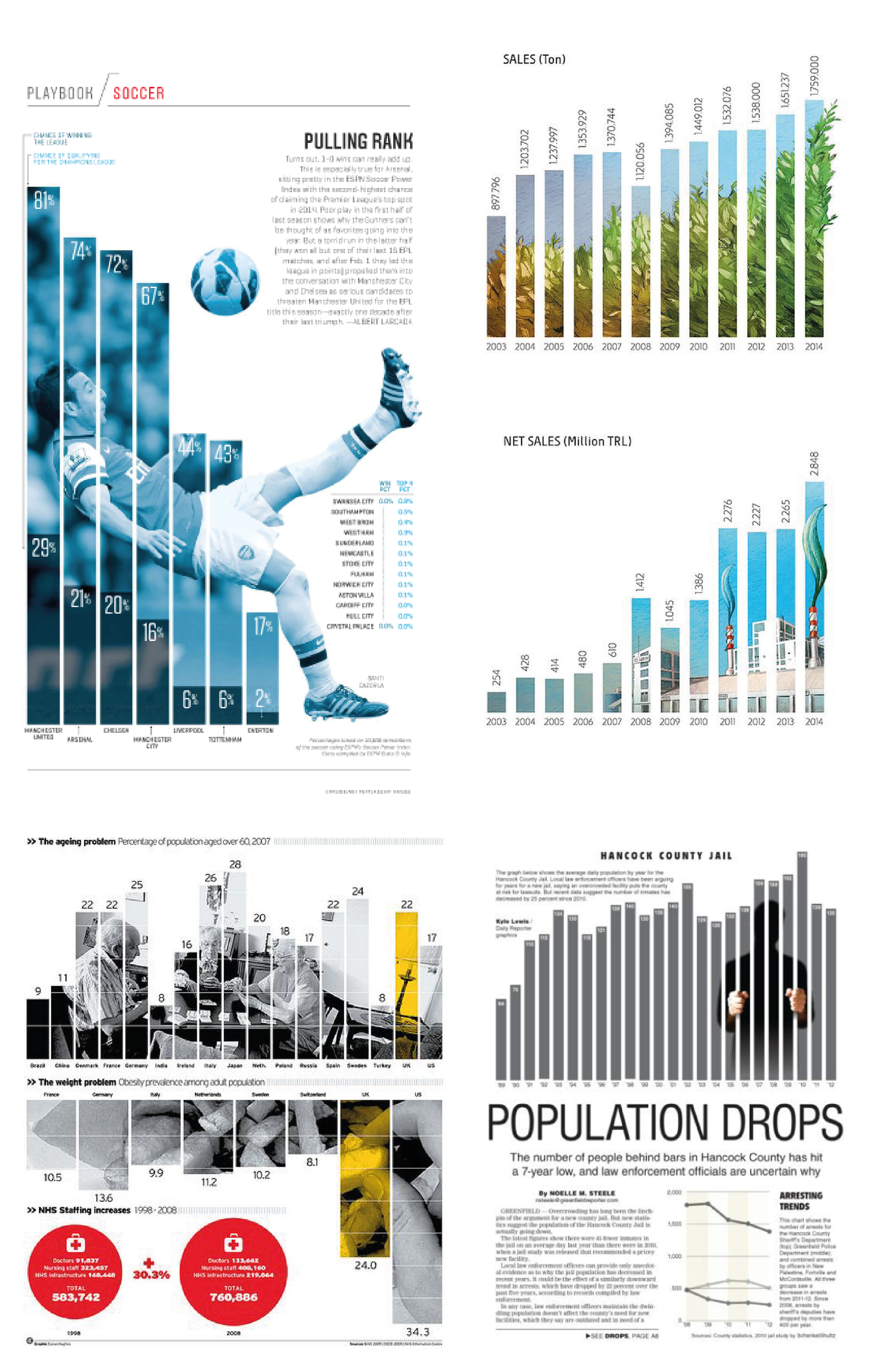
As well as adding an icon or illustration to the top or bottom of your bar, you can also turn the whole bar into an illustration. Once more, this only works when it’s a good fit for the story - usually when the data represents objects or places (e.g. mobile phones, New York) rather than concepts (e.g. unemployment, poverty). The object also needs to be broadly rectangular - a skyscraper, a rocket, a bottle, a book - and an object that doesn’t look distorted or turn into something else when it’s extended. (Unintentionally phallic bar charts are an occupational hazard).
Finally, it needs to be a story where making clear and exact comparisons between the bars is not critical for the audience.

Image credits: Marmota Magazine, Guardian, Lloyd’s of London, Statista/Independent
The examples above also show the size of the prize. We use bars because they are a compelling visual metaphor for real-world objects, our audience can quickly turn those rectangles into piles of money or bricks or bananas in their heads. Turning the chart into the thing itself goes one step further, it restores the data to its native form, converting it back into the real-world phenomena that inspired the original dataset.
We’ll talk more about how to use icons and illustrations in later rules, but for now, the only critical point to make is that your rectangular objects should stay roughly the same width. As you stretch them upwards, they should ideally not grow outwards by the same degree. Look at the buildings in the second example about Thatcher’s Britain: they get taller, or get an extra storey, but they don’t get wider. In other words, they act like bars in a bar chart, only getting stretched in one direction.
If you stretch in two directions, you will find yourself in data distortion territory.
Look at the two examples above. In the first chart, I’ve made the Australia house 2.7 times taller - in keeping with the data. In the second example, I’ve preserved the aspect ratio and made the Australia house 2.7 times taller and 2.7 times wider. This makes it look about seven times bigger. In fact, it could be argued that, given the shape is representing a three-dimensional object, the audience will perceive it as 2.7 times deeper too. Therefore the Australia house has potentially become about twenty times the size of the UK house. Very far from fair dinkum.
One final point: try not to overdecorate. If you embellish too much, your chart can look crass or superficial. It becomes dictator chic, the data viz equivalent of Trump Tower or Saddam’s palace, all the expensive accretions just a distraction from the moral and intellectual void within.

Image credit: favpng.com, slidebazaar.com
To recap then:
In the majority of cases, your bars should simply be bars. Adding decoration is never going to make your bars easier to read or compare. So if in doubt, don’t.
But decoration can dramatise a story. So make sure, when you do embellish a bar, it suits your topic and is immediately understandable as a visual metaphor
Any embellishments should be mindful of your audience’s level of prior interest, their aesthetic preferences and any branding restrictions
In most cases, keep your decorations as simple as possible, because decorating well is difficult
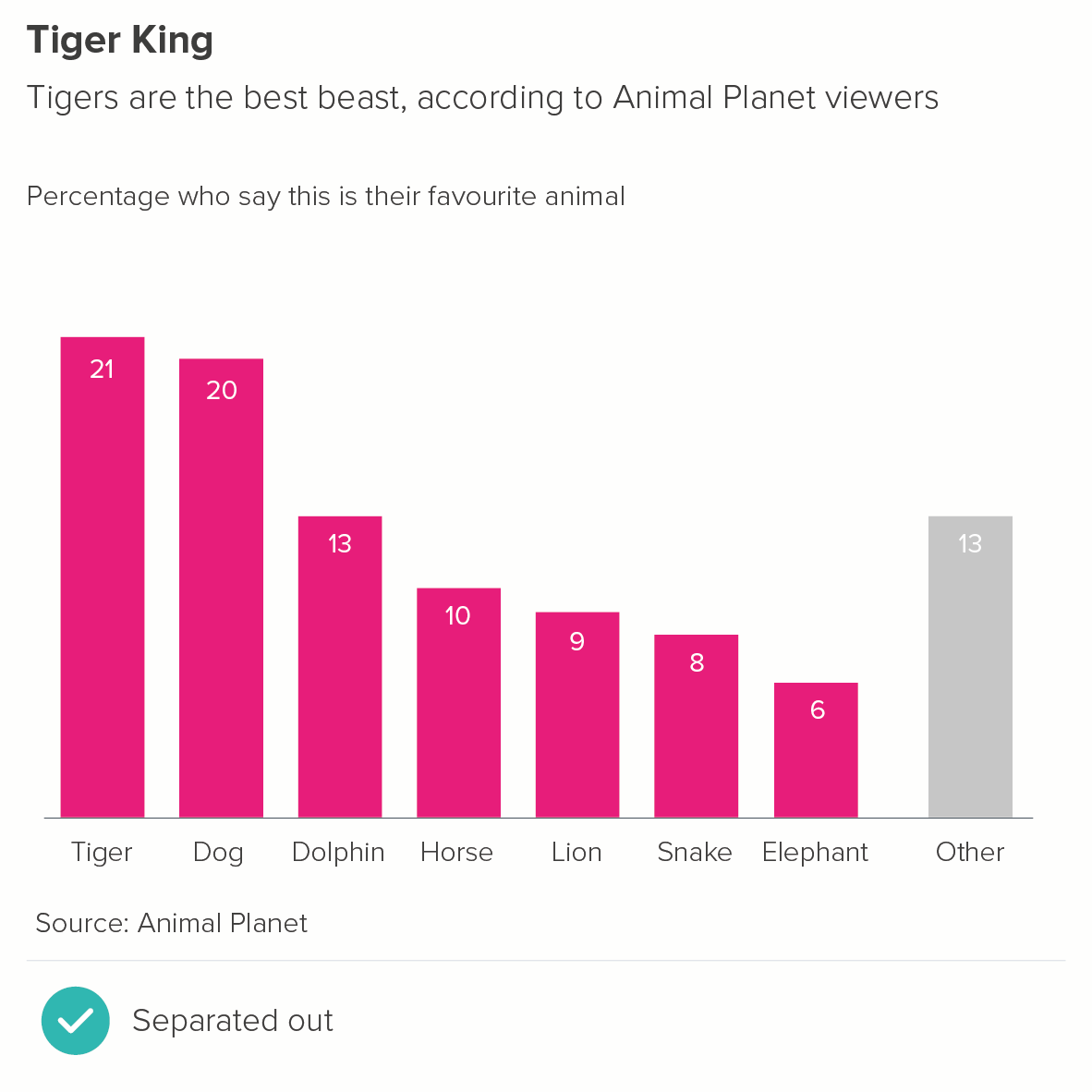
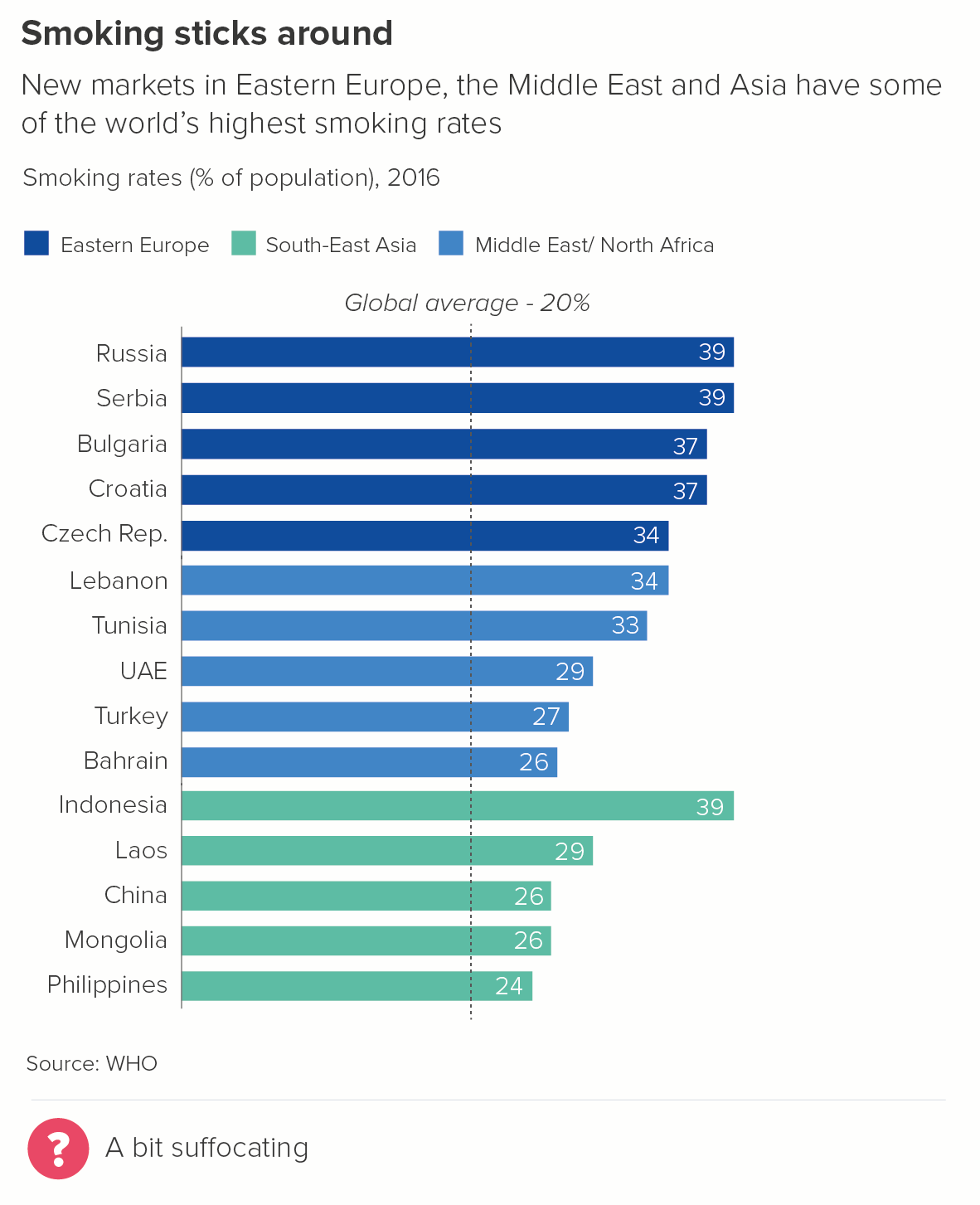
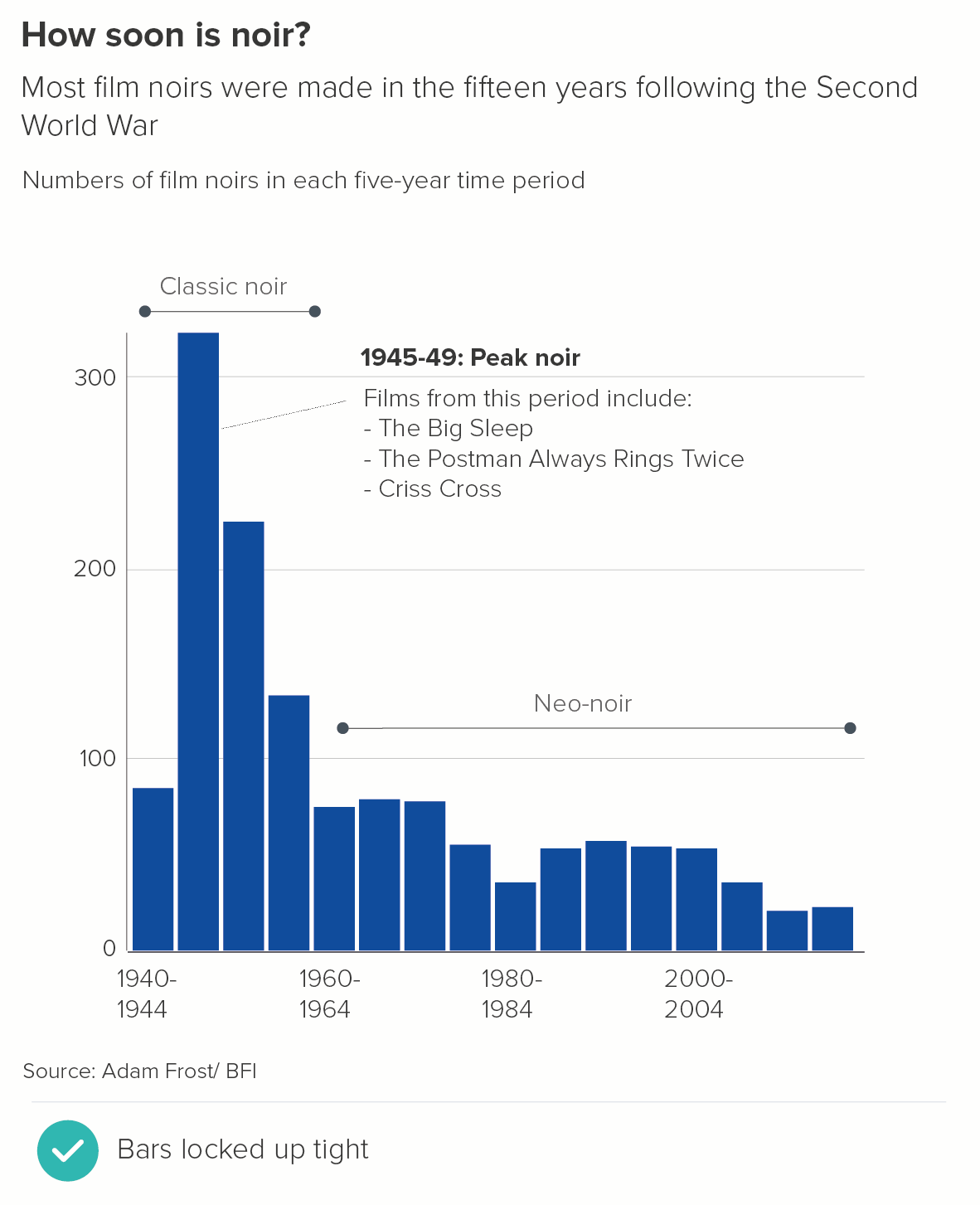
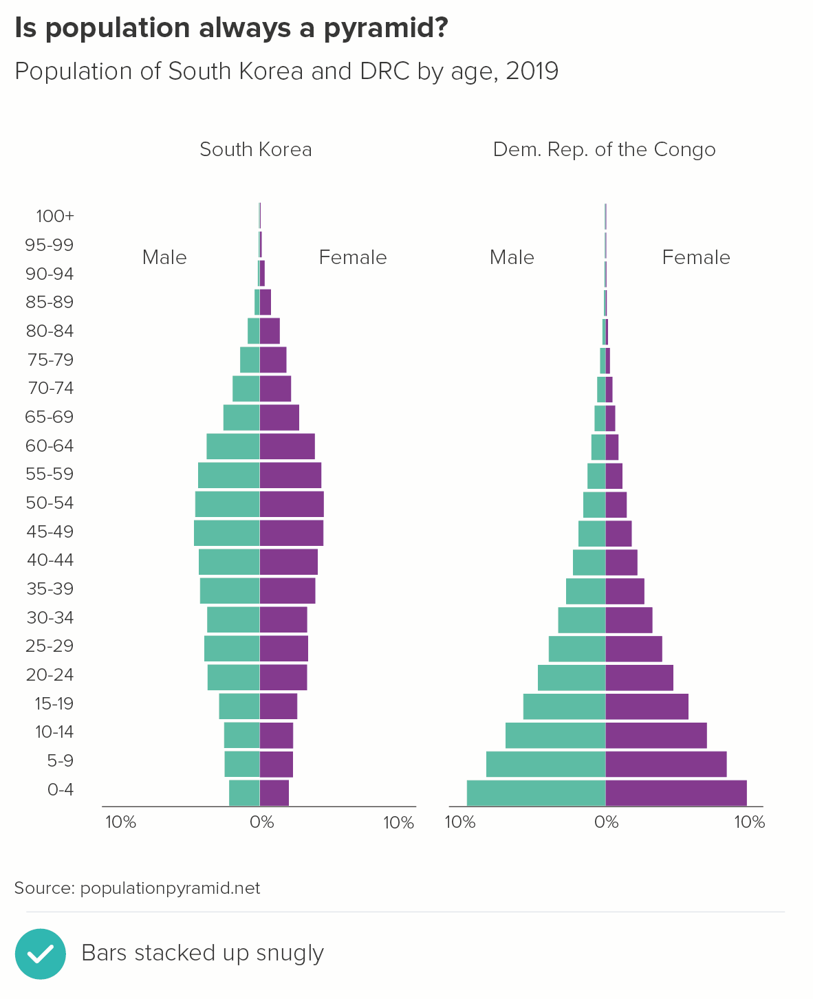
VERDICT: Break this rule sometimes
Sources (for original charts): Employment sectors - ONS; Average square feet of new builds - Shelter.
More data viz advice and best practice examples in our book- Communicating with Data Visualisation: A Practical Guide