Rule 17: Not too many bars

In this blog series, we look at 99 common data viz rules and why it’s usually OK to break them.

by Adam Frost

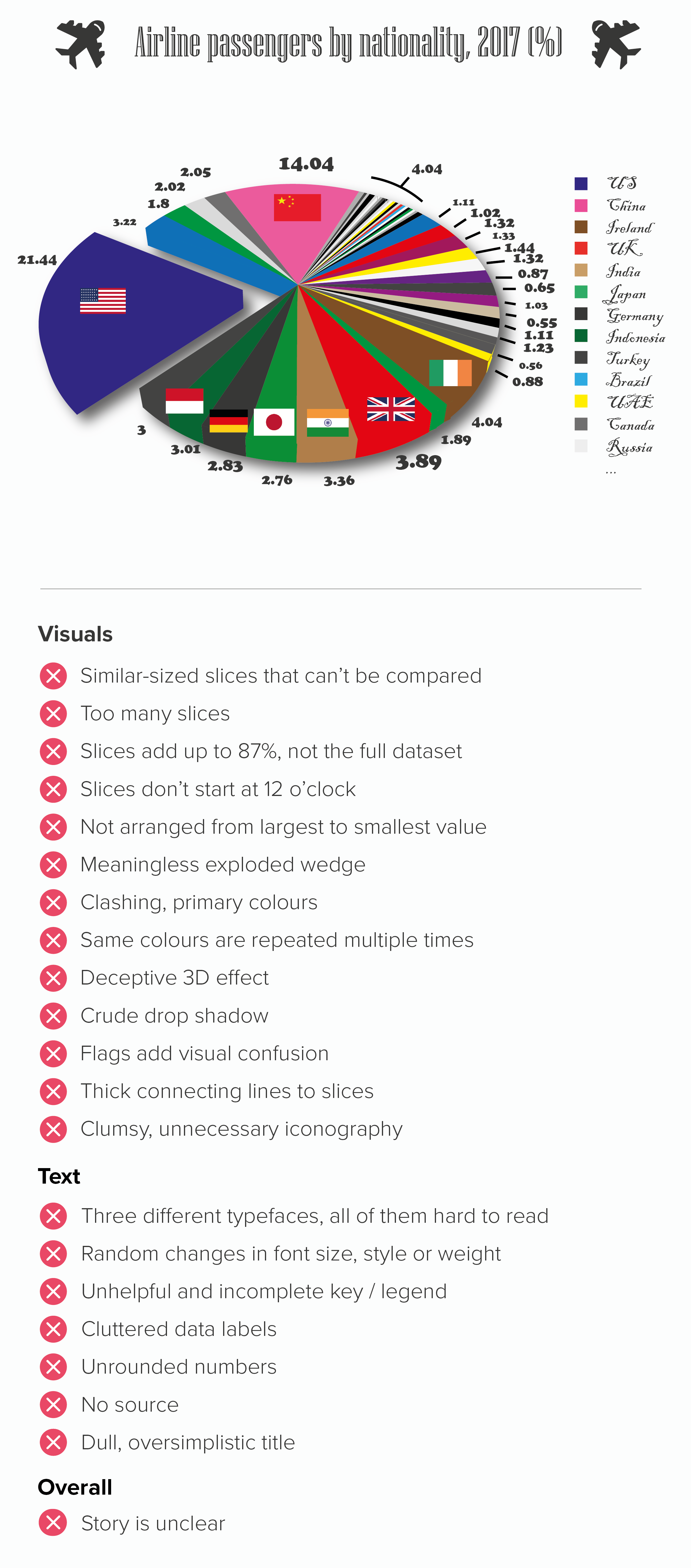
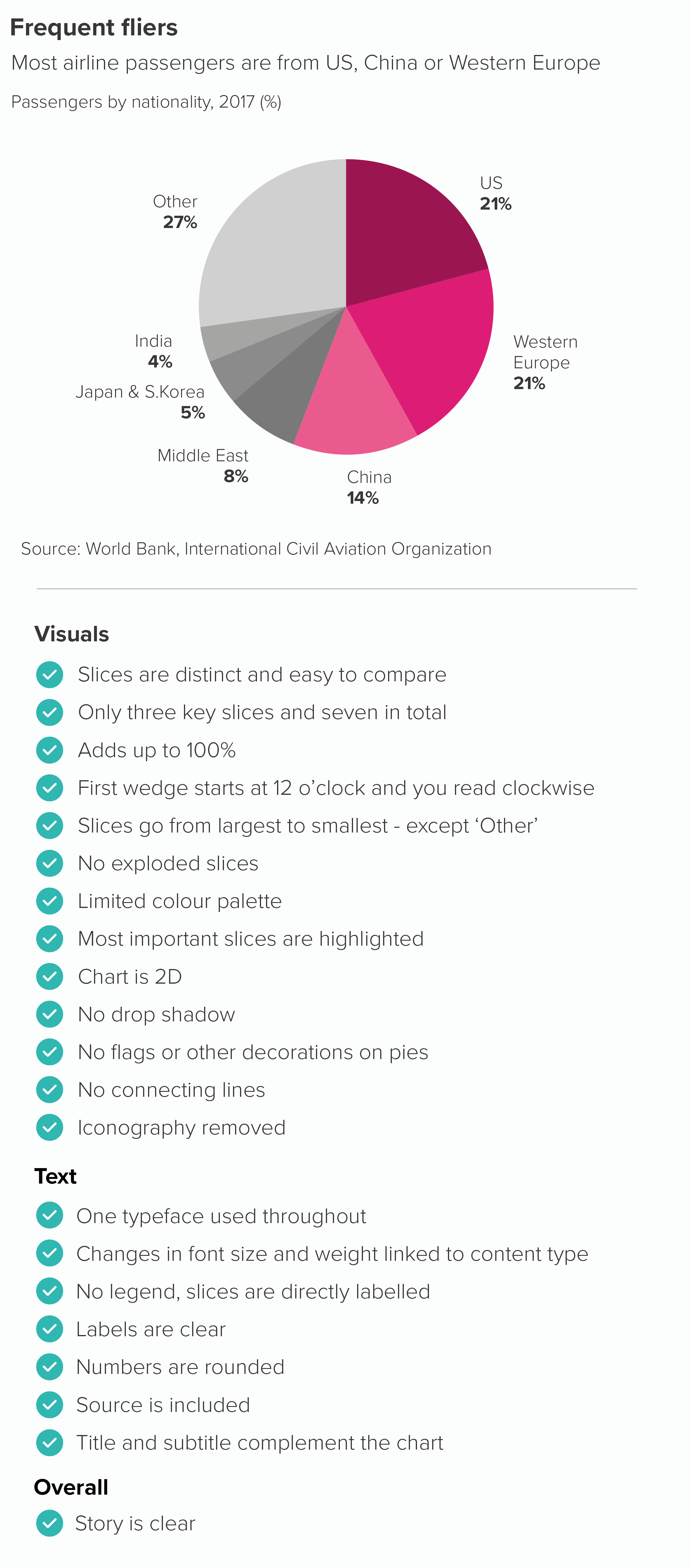
Too many bars is always bad; that’s what too many means. But can we put a number on it?

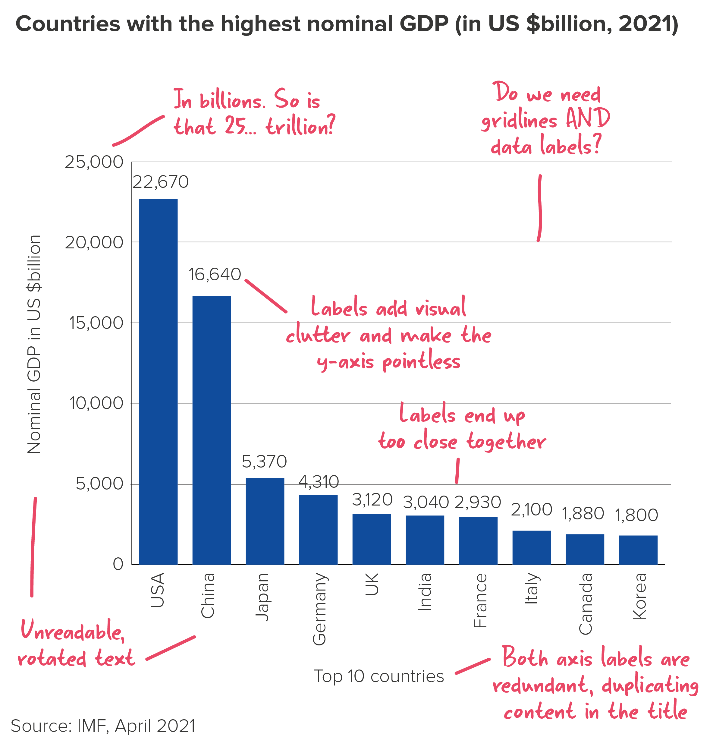
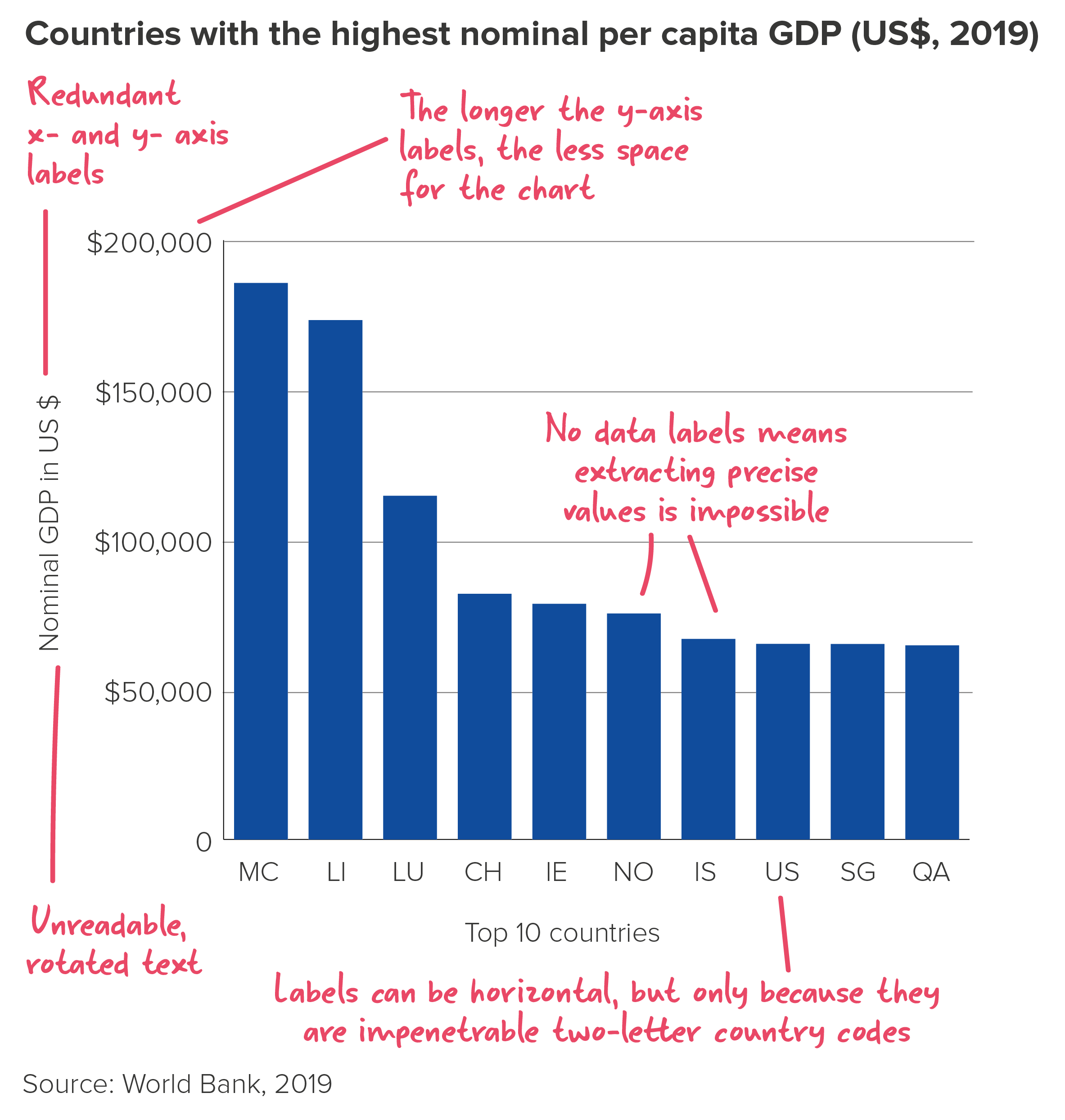
While working with the charting library Highcharts a few years ago, I discovered that their developers had set the maximum number of bars in a vertical bar chart to 1,000. If you try to use 1,001 bars, the chart breaks.

Very wise. But, of course, the chart will have broken long before that. Or at least it will have morphed from a bar chart into an area chart at roughly the 100-bar mark (depending on the chart width), which is a different chart with a different purpose.

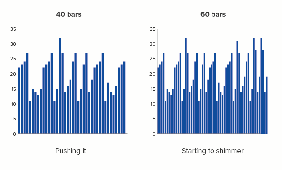
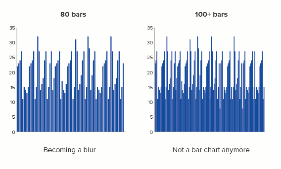
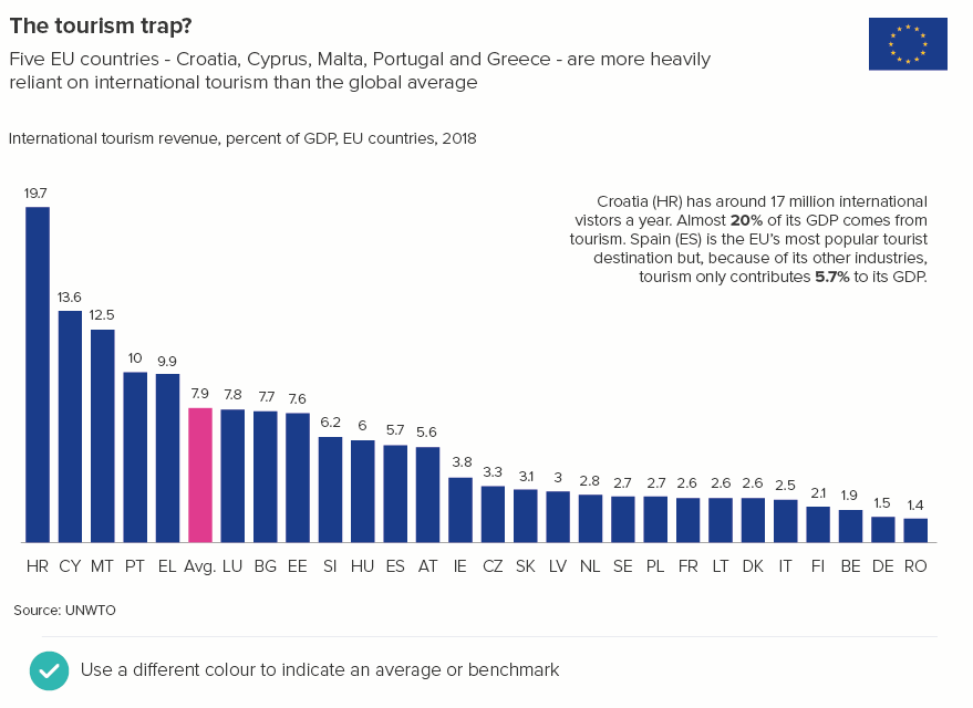
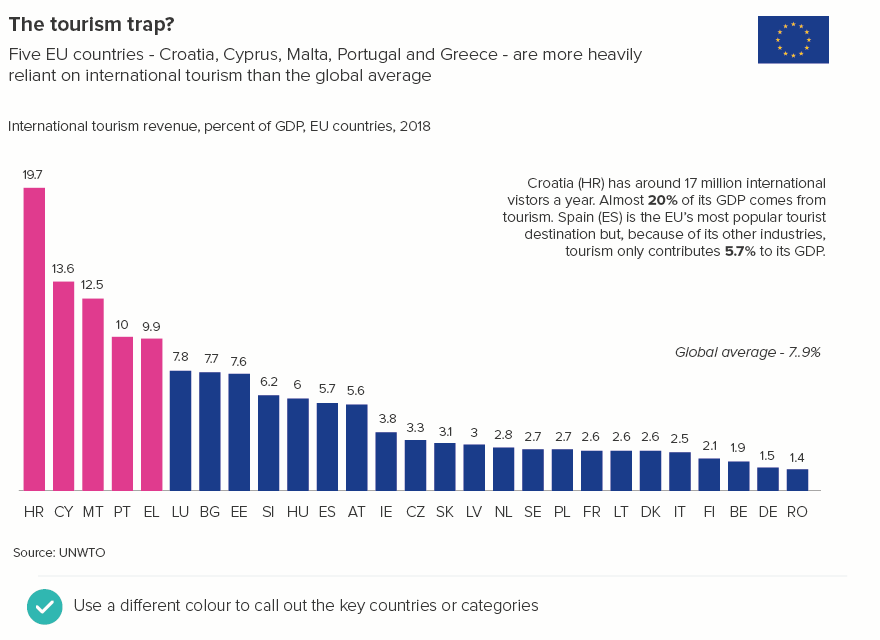
This is the main reason why data viz style guides often set a specific limit on the number of bars that you should use. The chief purpose of this chart type is to compare one bar to the rest (your country or company, the largest bar, the average bar) or to assess the distribution of all the bars (e.g. do more people visit our website in the morning or the evening?).

If you can’t distinguish between the bars, or identify which bar or group of bars is different, or read any of the labels because the bars are squashed together, then you’ve ended up turning your original data table into something even harder to read. 

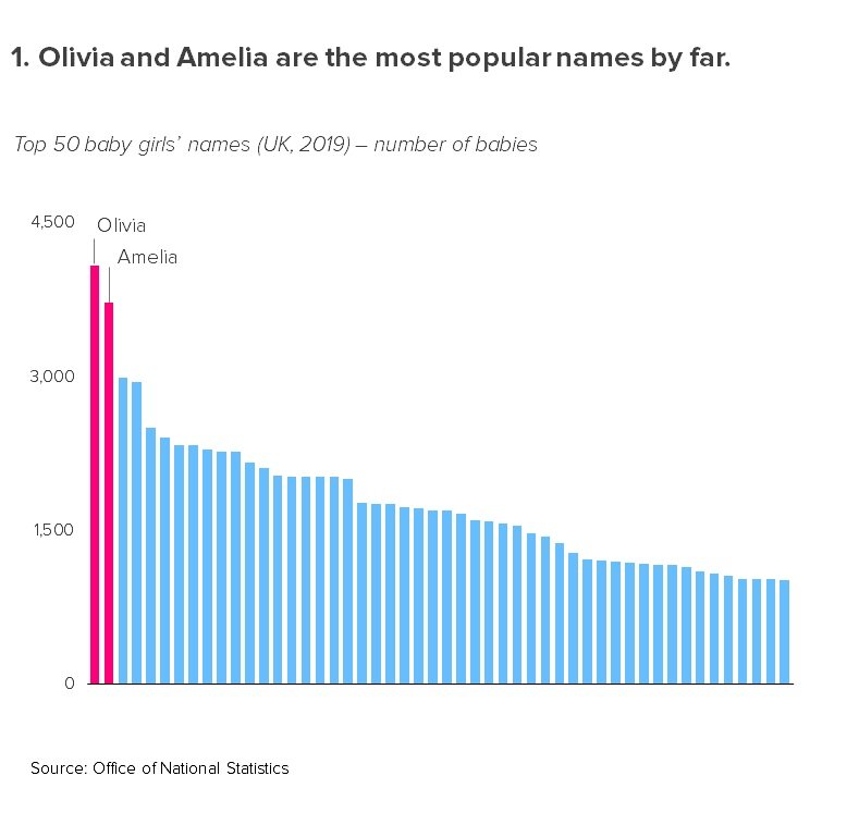
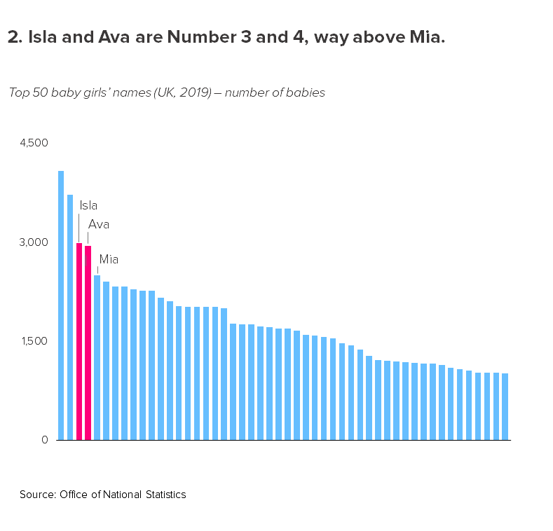
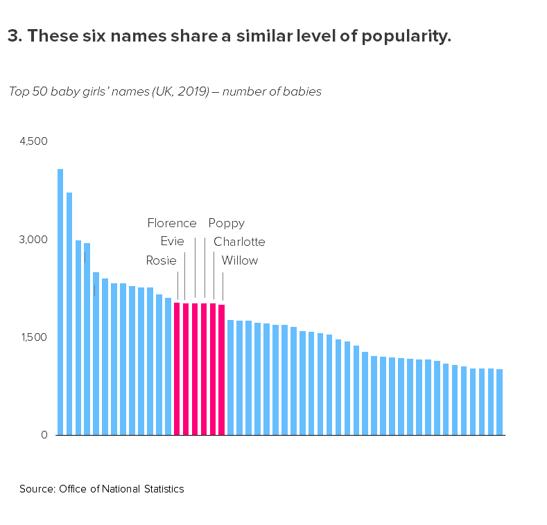
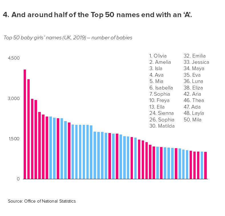
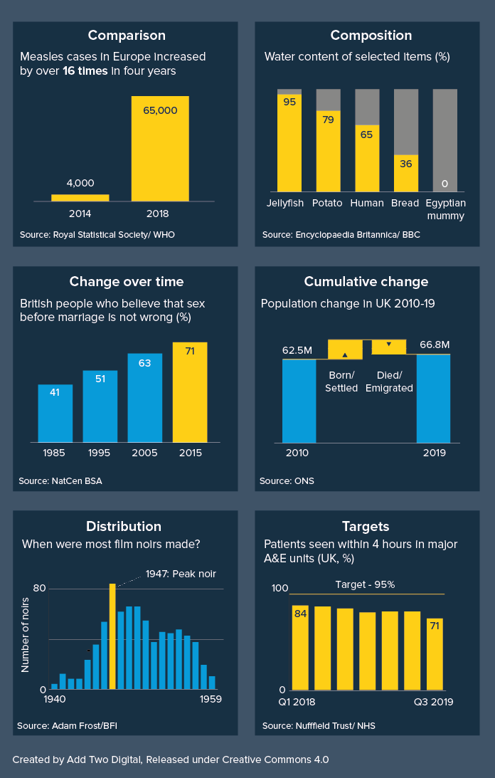
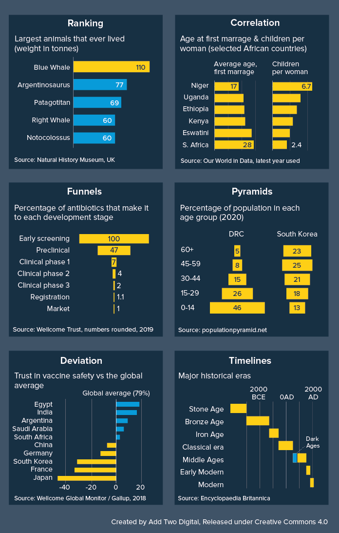
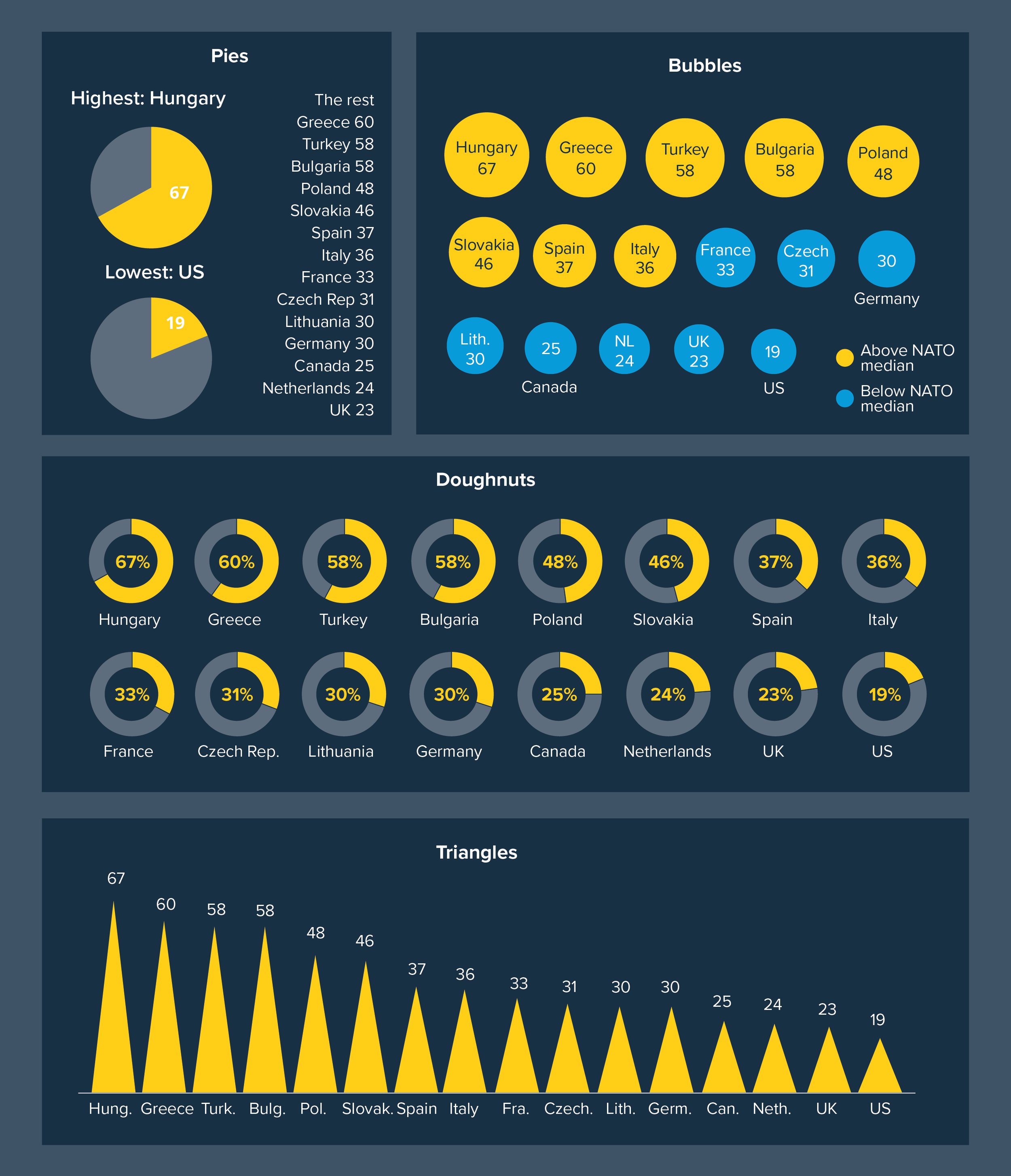
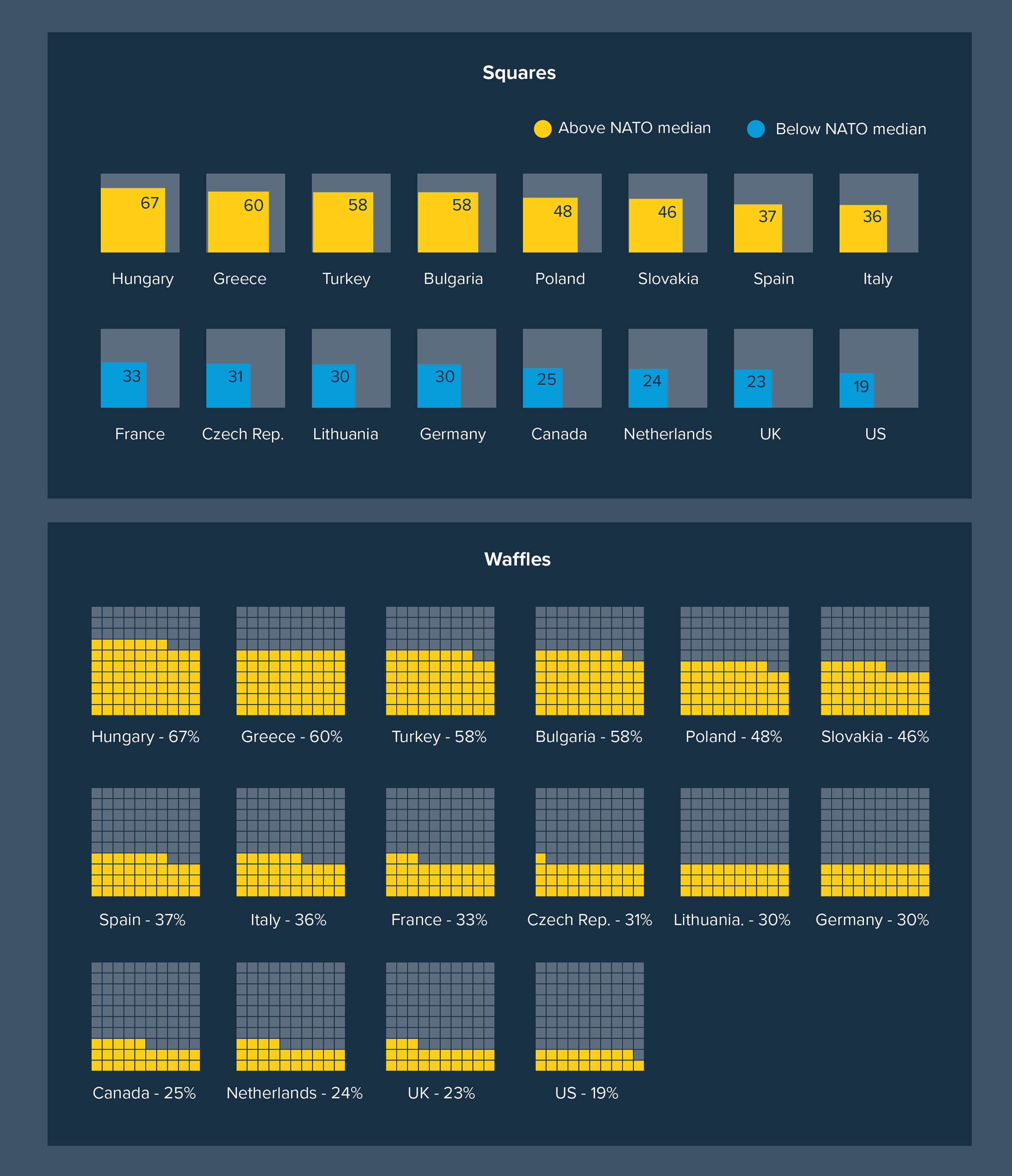
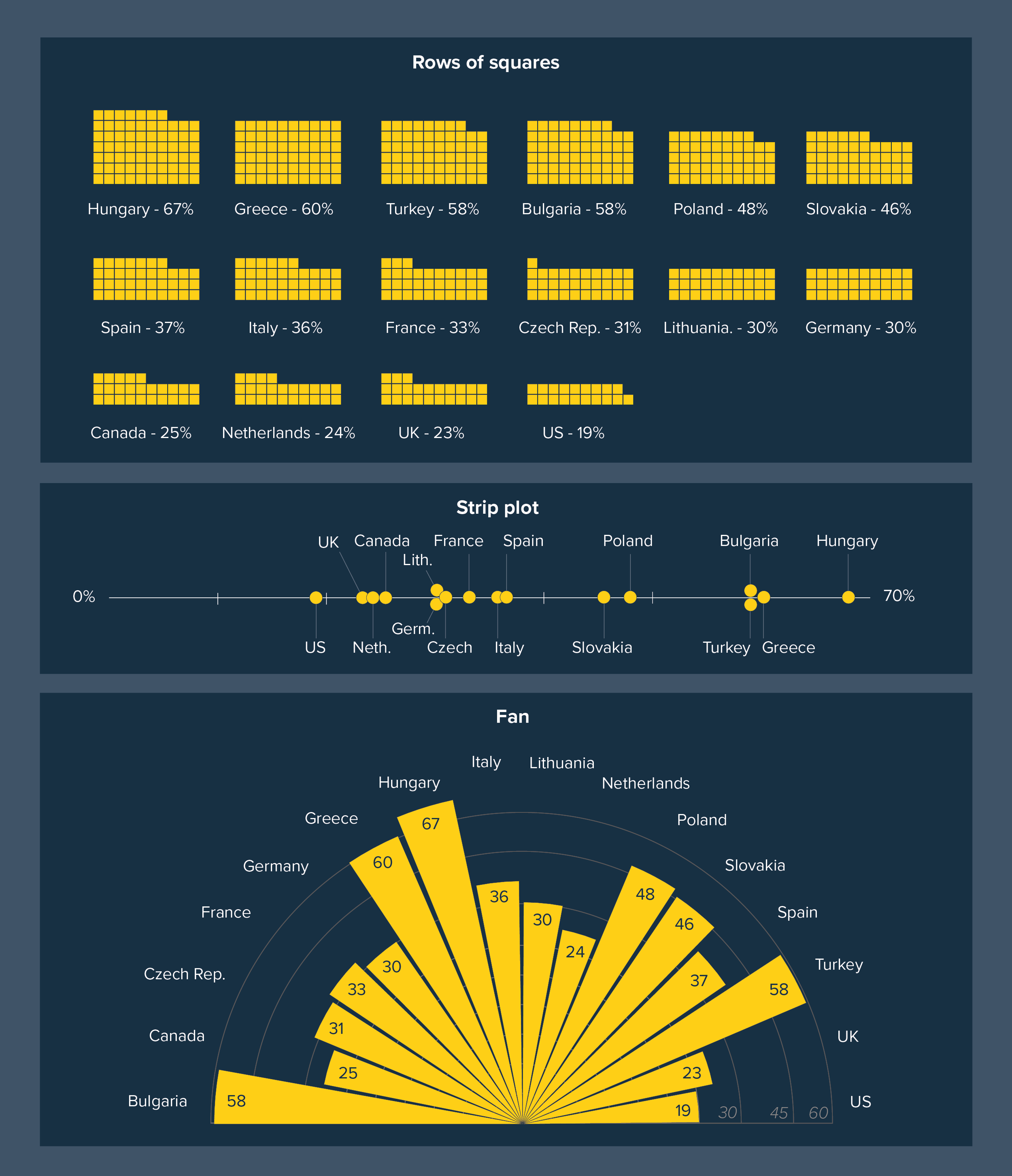
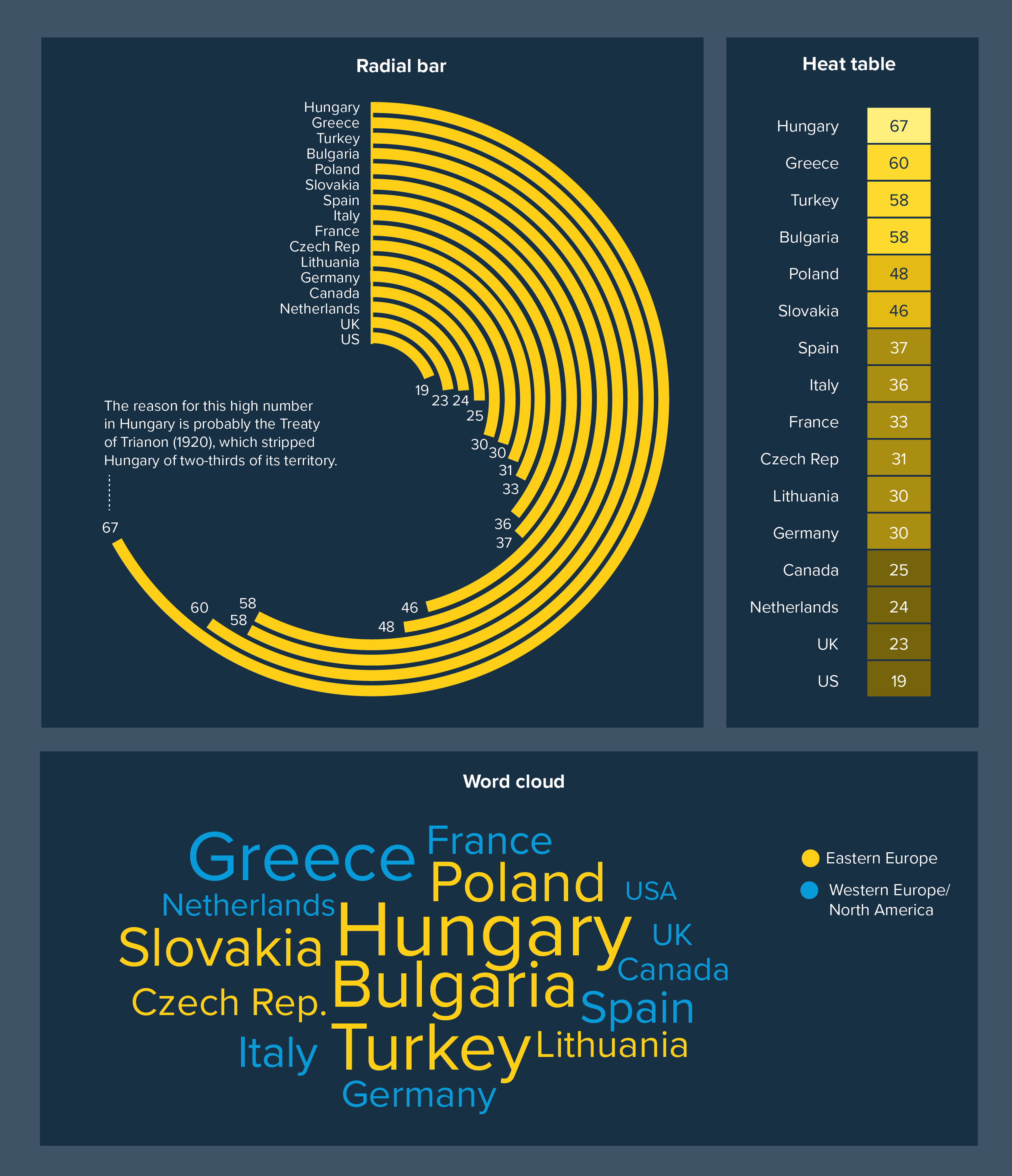
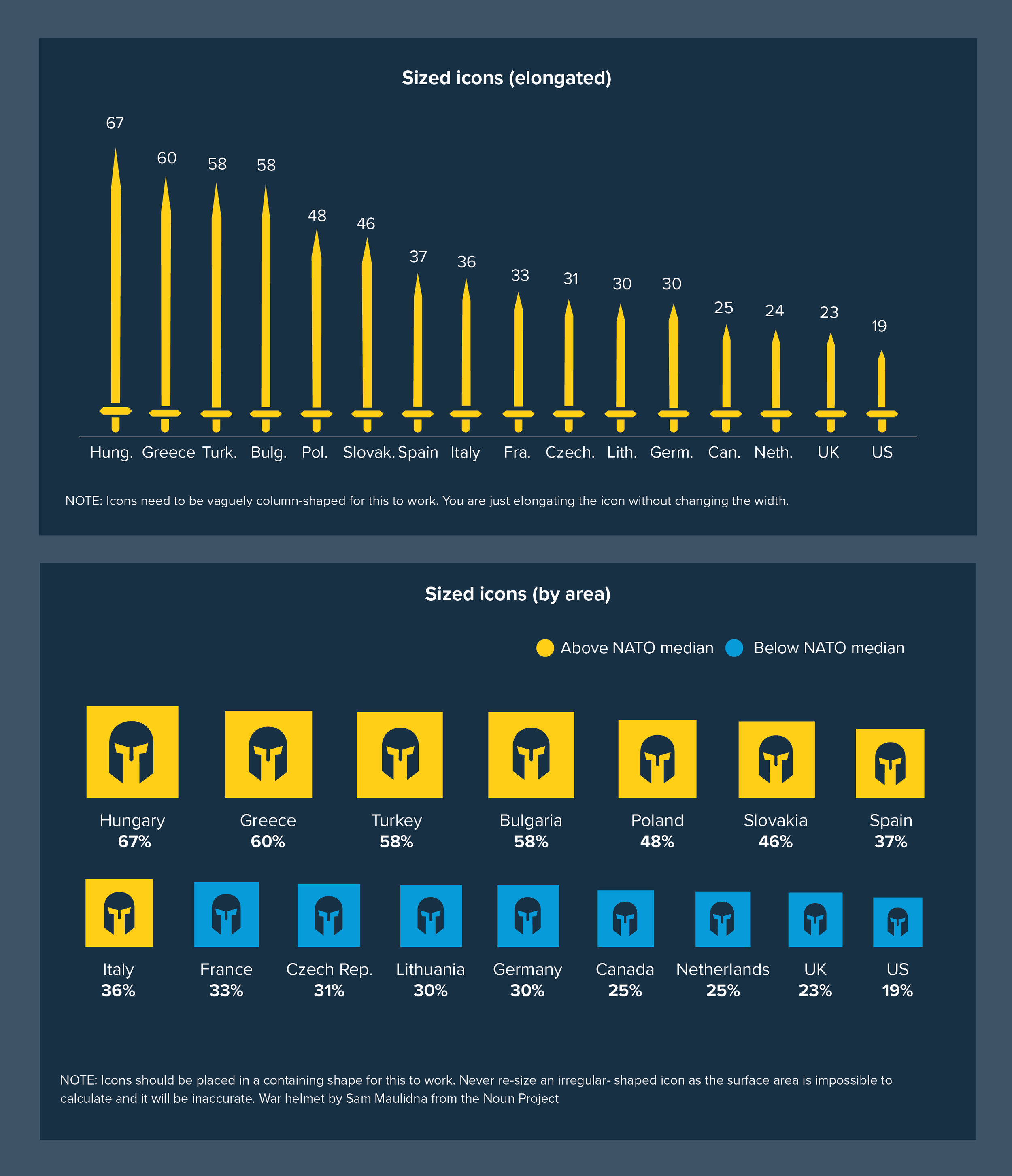
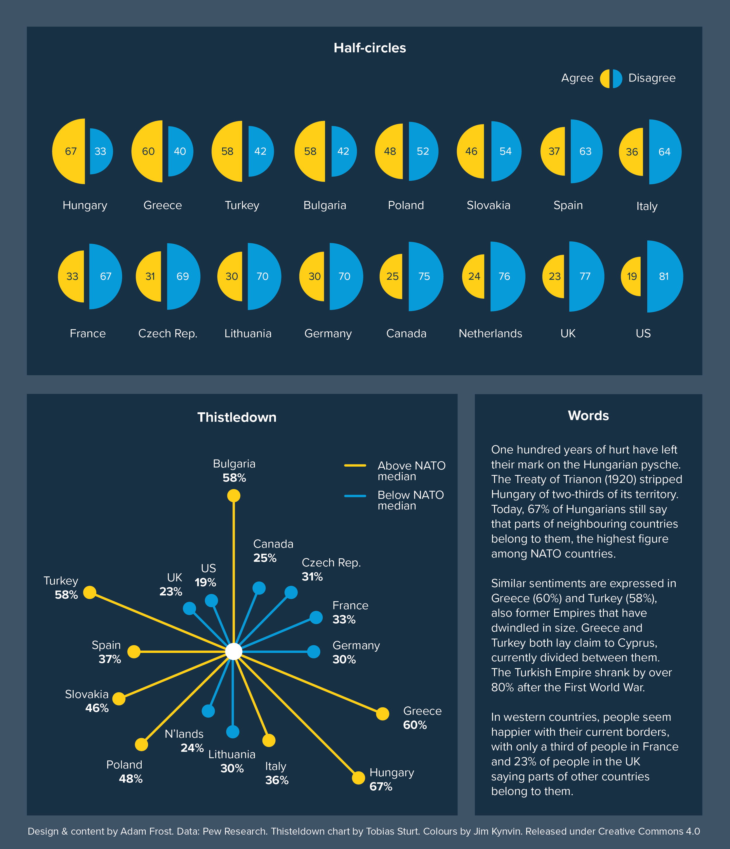
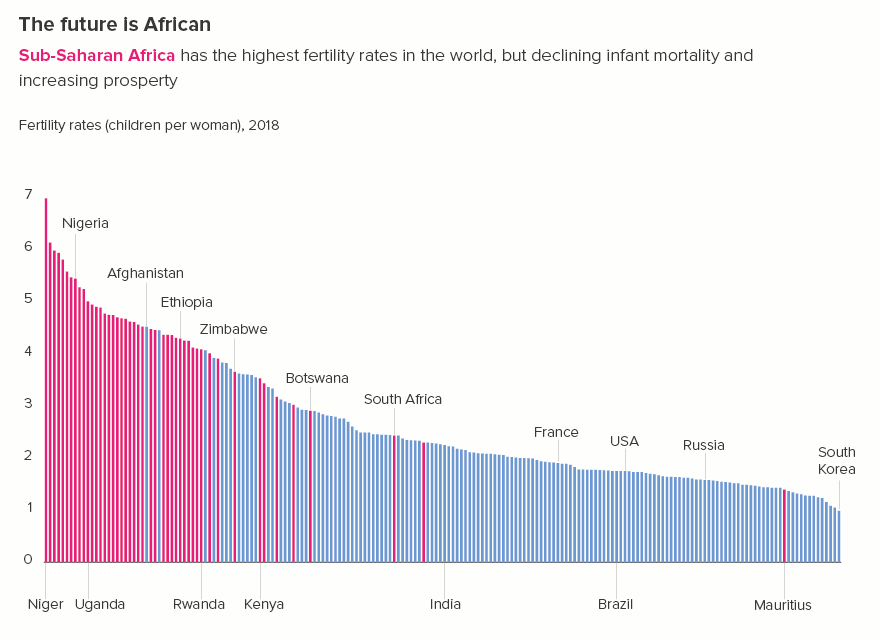
So exactly how many bars is too many? In the corporate style guides we have used, recommendations vary. The average limit for comparison stories is usually set at 12 bars. For change over time or distribution stories, it’s usually 24 bars, just because of the frequent need to show change over a 24-hour day.

Compare and contrast

Let’s start with comparison stories: where you want your audience to be able to accurately judge the relative sizes of your bars.

Is 12 bars a sensible limit? Most of the time, yes. If you can bring it down to less than this - seven or eight bars - even better.

Seven or eight bars gives us a hero bar and a manageable number of contextual bars. The more bars you add, the more the audience’s ability to concentrate and care diminishes.

Imagine your bars as characters. In Star Wars, we have perhaps eight key characters we care about: Luke, Leia, Han, Darth Vader, Obi-Wan, Chewbacca and the two droids. Or if you prefer something more highbrow, in Hamlet, we have Hamlet, Ophelia, Claudius, Gertrude, Laertes, Polonius, Horatio and the Ghost.

There seems to be a limit to human bandwidth, our ability to simultaneously consider several objects or concepts. Cognitive load theory suggests that we can only take in between four and seven new pieces of information at once. Psychologists believe that we can maintain an average of five close friendships and an additional ten ‘second tier’ friendships. Our brain defines the limits of our world narrowly, so we are better able to order and navigate it. 

In the same way, the world defined by your bar chart will usually be more easily processed if you deliberately limit its size.

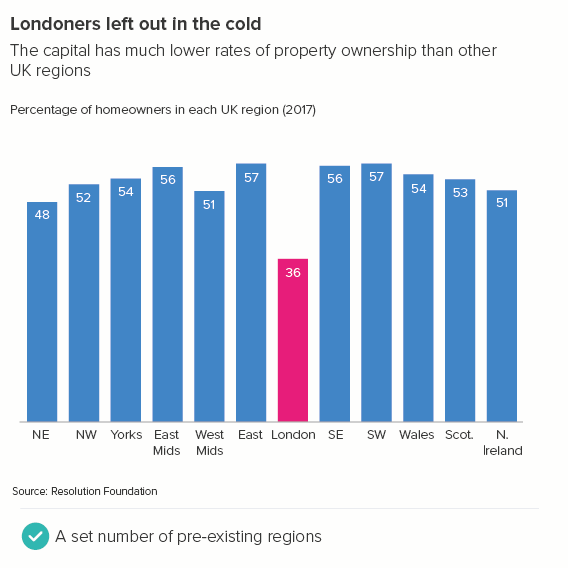
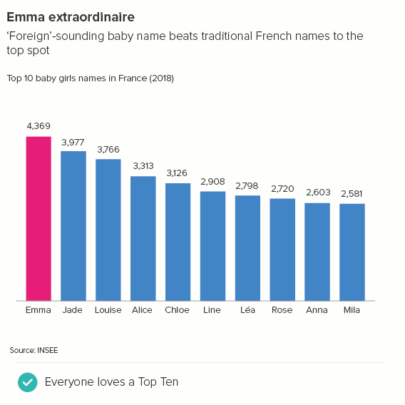
In many cases, this will have been done for you, because these cognitive limits also define and structure reality. There are seven days in a week, twelve months in a year. Most countries are organised into a limited number of regions (e.g. the UK has 12, France has 13). In most sectors, there are a small number of dominant brands - e.g. the UK has eight major supermarkets; the illusion of choice can only be stretched so far. For most large datasets, there is usually a cut-down version which gets all of the attention: the Top 10 for the music charts, the ‘Big Six’ Premier League clubs, the current roster of ‘A list’ celebrities.

If the dominant culture hasn’t kindly whittled down your huge dataset to a shorter list, then you will have to do this yourself, but it’s usually a fairly easy task. If you’ve been crafting a story for an audience - isolating only the most relevant and dramatic information - then you will already have deleted extraneous categories, or set up an ‘other’ category, or grouped similar categories into bands, or perhaps established an average as a benchmark. One of the remaining categories will be the obvious focus (the one the audience is most invested in) and there will be a natural competitive set.

For example, take a look at the two charts below. The subject is the quality of life in different cities. I’m going to assume my audience is based in the UK. In the first chart, I have too many datapoints and I’ve chosen the cities (except London) more or less randomly. In the second chart, I’ve tried to see the world through my audience’s eyes and allowed this to determine the cities I include.

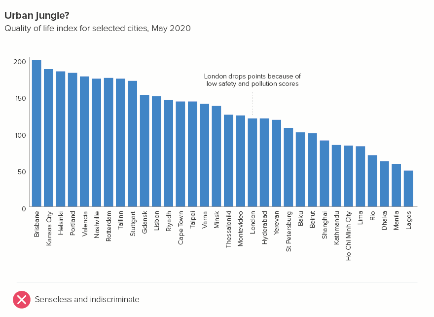
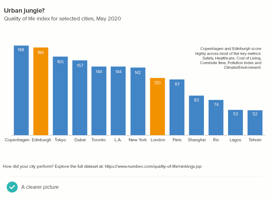
More specifically, in the second chart:

  • Comparison: I have thought about the cities that London is most often compared with: Paris, New York, Tokyo.

  • Contrast: I have included a few cities from rising economic powers - Lagos (Nigeria), Rio (Brazil) and Shanghai (China). I’ve also added Dubai - to represent ‘new’ affluence.

  • Who’s top?: I have included cities in countries that are commonly seen as the most successful - Copenhagen (Denmark) and Toronto (Canada)

  • Who’s bottom?: I have included the city at the bottom of the list - Tehran in Iran. So my audience is aware of what bad looks like as well as what’s good

  • What’s the average?: A global city average was not provided in this dataset. It’s probably not helpful in any case - an ‘average’ city is hard to picture.

  • Amplify the most relevant: Having deleted dozens of cities, and focused on the most pertinent, I now have space to amplify the presence of the UK in this chart. My first chart just had London; in the second, I can also add the Scottish capital, Edinburgh. I have called these two cities out visually. This also gives us an interesting secondary story: competition within the UK, and how Edinburgh is the clear winner. I have also included a second US city (Los Angeles) because, after UK cities, it is US cities that will be most familiar to my audience.

Most critically, my 32 bars have become 13: enough to give my audience meaningful context, but not an overwhelming blizzard of bars. And the labels (just about) fit too - without having to rotate them.

At the bottom, there is a link to the full dataset for those that want the bigger picture. Now the chart is clearer, some of our audience might actually click on it.

So is that our rule? Around a dozen bars, but ideally 7 or 8? Well, sort of. The truth is, although this approach suits many stories, it’s a mistake to put a set number or even a range of numbers (‘between five and 15’) on the number of bars you should use in a bar chart. Because the final number is always narratively-derived. Yes, sometimes there are six infinity stones, Seven Samurai or Twelve Disciples. But there can also be Forty Thieves, 101 Dalmatians or 300 Spartans.

Avengers Infinity War - one of the highest-grossing movies of all time - has 22 major characters in it - according to the faces on the poster* - or possibly 19 if you just count the actors’ names in block capitals. Either way, a lot.

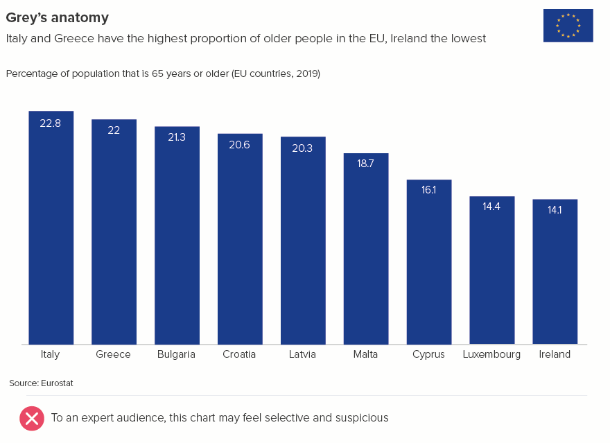
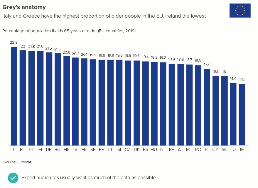
Yes, this is because the audience already knows the characters, so you don’t need to clear as much narrative space around them. But this can be true of your bar charts too - you’re talking to people who are familiar with the dataset already. Say you work for the European Union: your audience will be well aware of the 27 countries that belong to the organisation. Indeed, they will expect any bar chart to feature every country. They will also understand the 2-letter country codes that you will need to use to make all the labels fit. 27 is only too many bars if all the information is new.

Or sometimes you are talking to the general public, but you may have 27 or 227 bars that are all equally important for the story. Perhaps you need to show every state in the USA (50) or every country in the world (195).

When you have these kinds of stories, there are a few techniques you can use to keep your bar charts clear and memorable.

i) use colour carefully

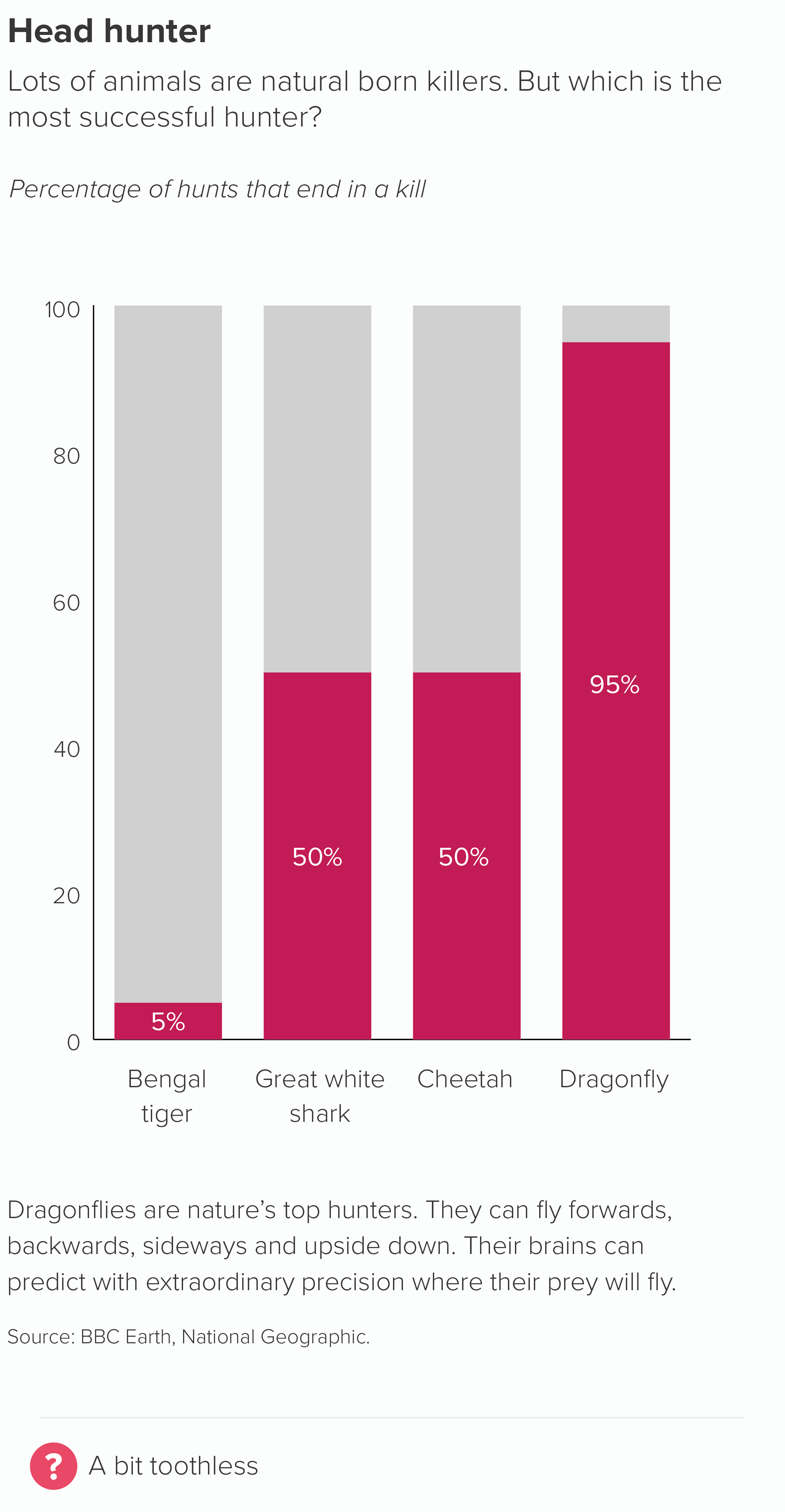
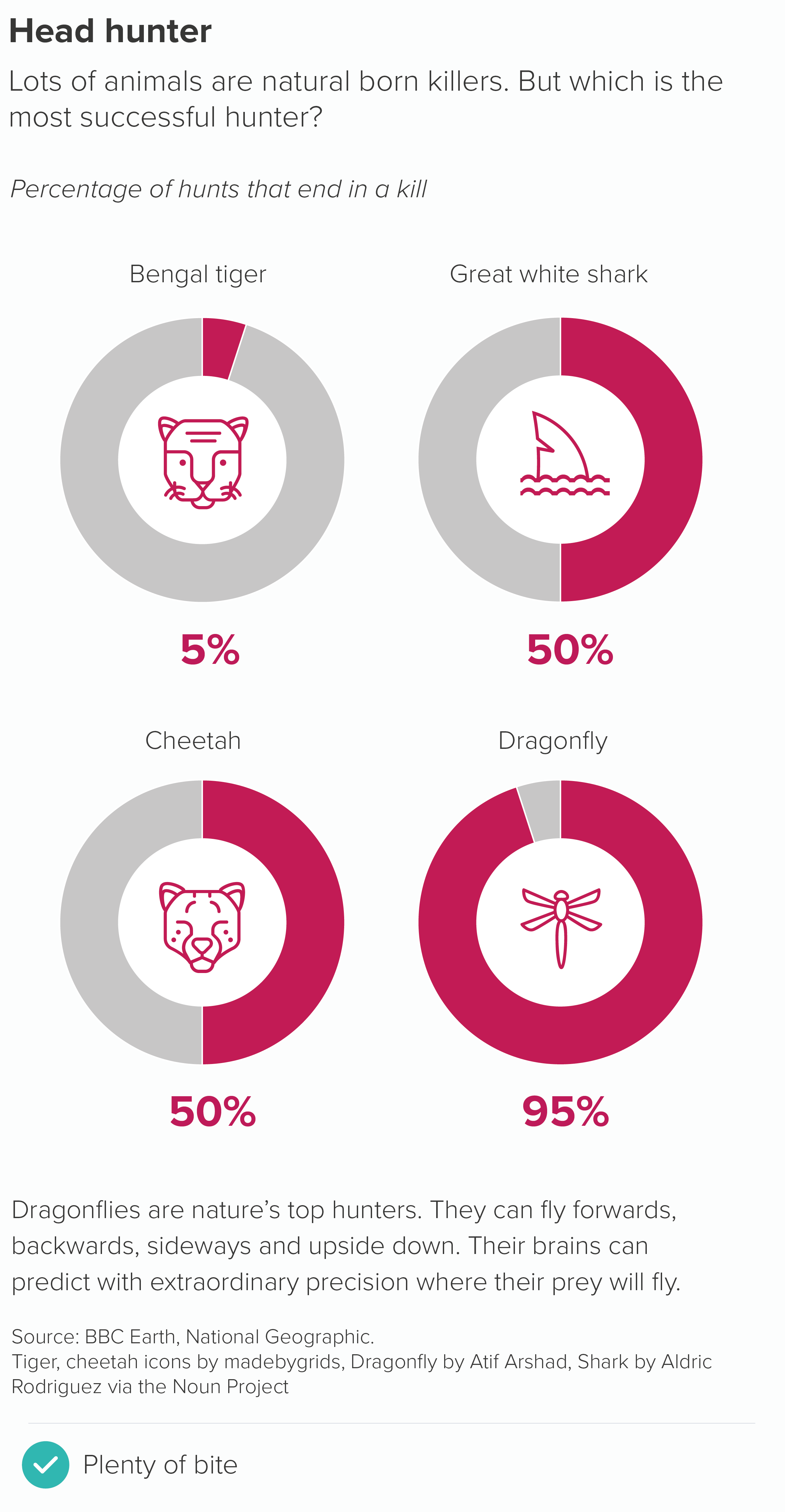
First, keep all the bars the same colour - unless there is a single bar or group of bars that you want to call out. This could be the highest performer, the audience’s own country, or an average.

We’ll talk more about colour in bar charts in a later rule.

ii) Label strategically

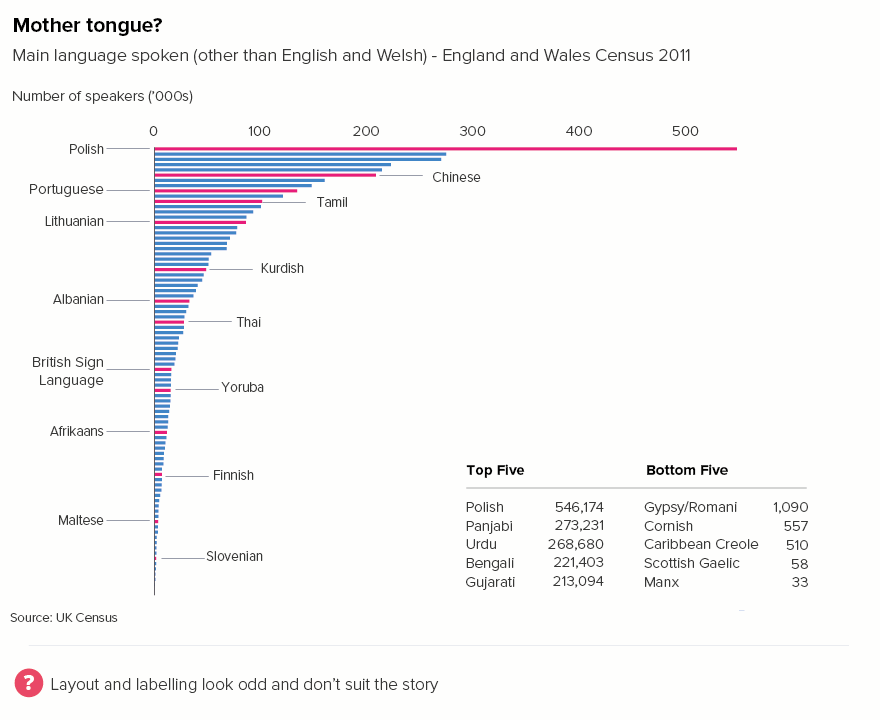
Secondly, you don’t need to label all the bars. With large datasets, labelling everything is labelling nothing because all the text becomes unreadable (tiny font, rotated, overlapping). Just label the bars that are most meaningful to the audience, using the criteria listed above: which bars are useful for comparison and contrast, which are the largest and the smallest, which sit in the middle or act as an average? These labels don’t always need to sit under the axis, you can use connecting lines and have the text sit above the bars too. Also, it’s a good idea to lose most or even all of the numbers. (More about text in bar charts in rule 24).

iii) Combine charts and tables

Thirdly, think about using summary maps or tables alongside your bar chart to provide information that the chart can’t.

rule_17_england-languages-no-tick-cross-01.png

If your chart is interactive, you may not need accompanying tables or maps, because your users will be able to roll over or click on the bars to get further information. But I’d still recommend following the other suggestions - one colour for all or most of the bars, minimal labelling - because the chart needs to be readable and interesting before anyone clicks.

Horizontal comparisons

The advice above mainly applies to vertical bars. Horizontal bars require a slightly different approach. You tend to use horizontal bars when:

  • your canvas is mobile portrait or A4 portrait (they often struggle in landscape format unless used in combination with other charts)

  • you want to tell a ranking story (with the bars ordered largest to smallest)

  • you want the labels to be readable

These reasons mean that:

  • there is usually space for more bars on your canvas

  • audiences expect more bars because for a story of ranking to be meaningful, you need a Top 10 or a Top 20 or even the whole dataset

  • all the category labels need to be visible, because that’s why you’re using this chart type -  so the labels are legible

In terms of advice then:

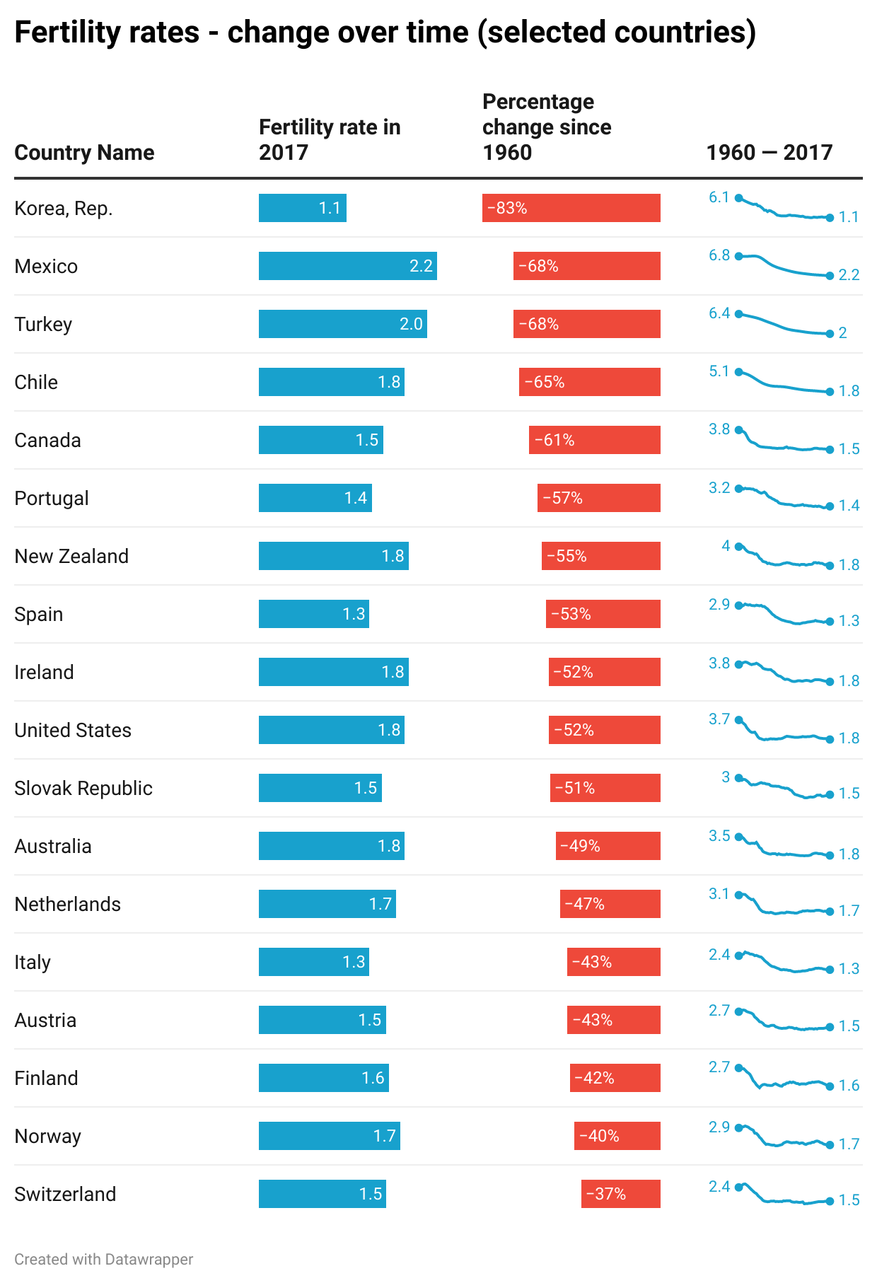
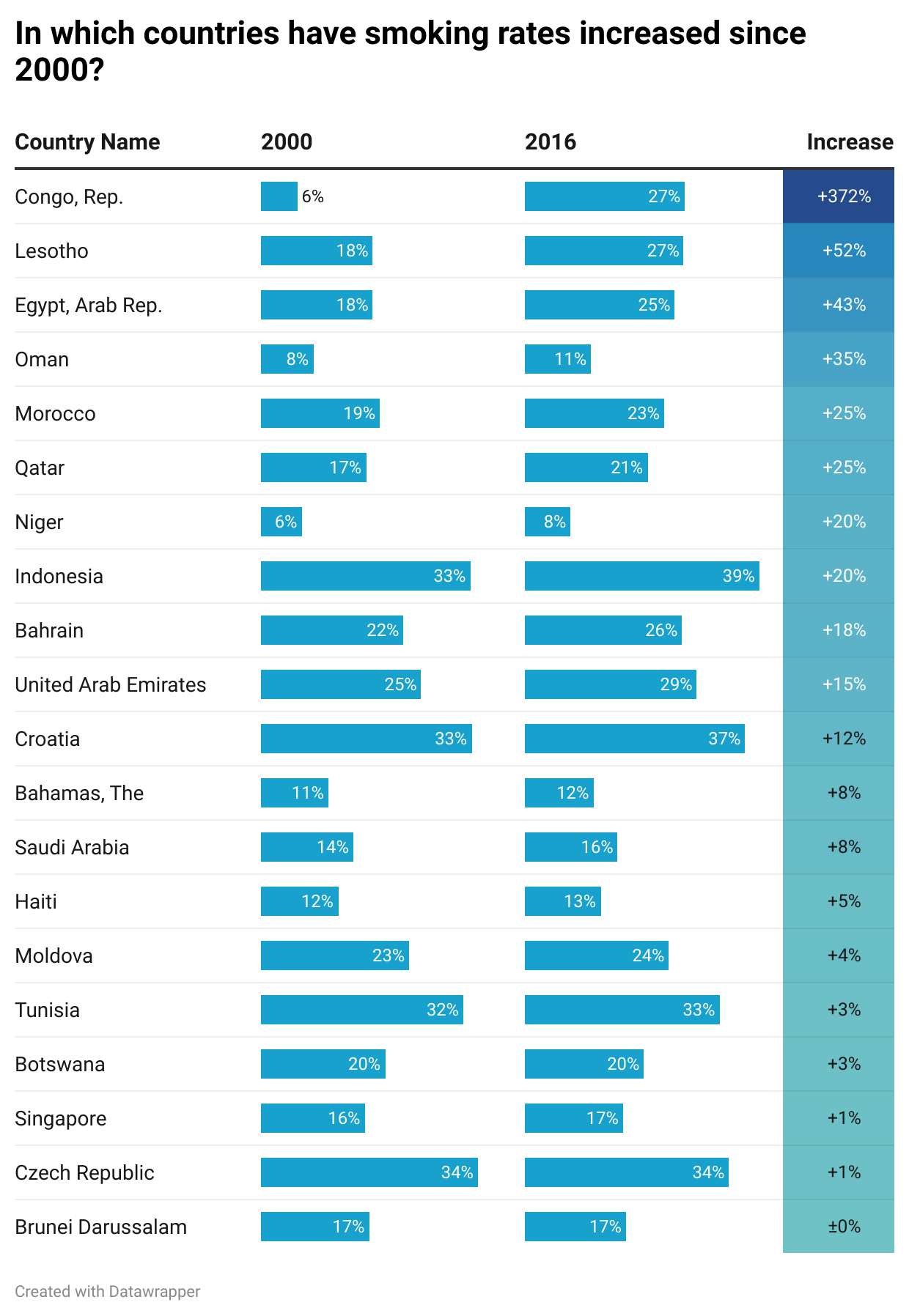
  • If a good rule of thumb for the ideal number of bars is between seven and 12 for vertical bars (depending on the story), for horizontal bars, it’s more like between 10 and 25. 

  • If you have lots of bars, yes, you can drop category labels for vertical bars, but avoid doing this with horizontal bars. This chart’s key strength is its ability to incorporate text, so leaving text out is self-defeating. Furthermore, the fact that horizontal bars excel at ranking stories means that missing out labels can make the story feel misleading or hollowed-out. 

One other piece of advice: if you have a large number of horizontal bars, you can organise them in columns. This is not an option with vertical bars. If you wrap a vertical bar, it looks like you’ve created several separate charts.

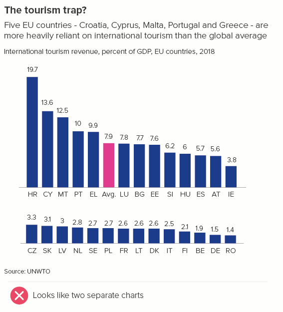
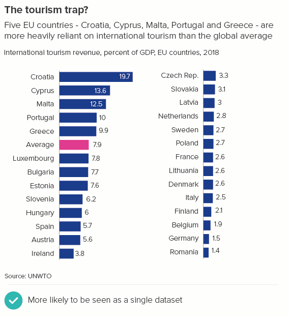
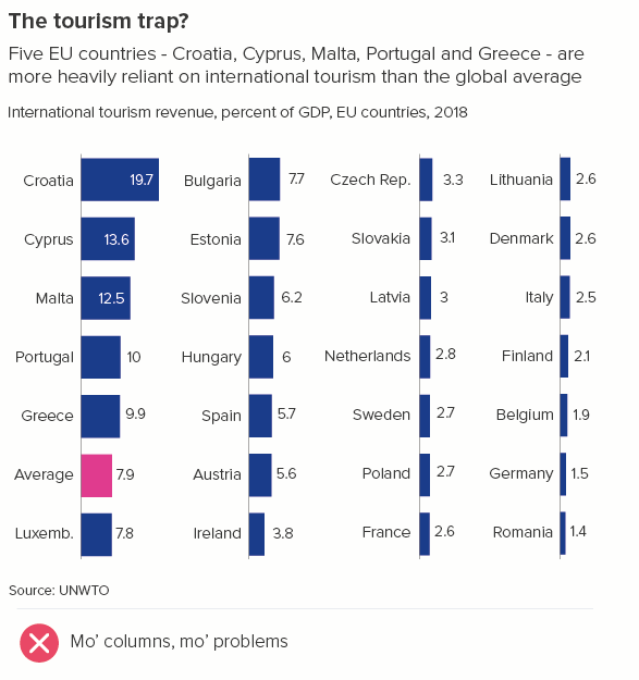
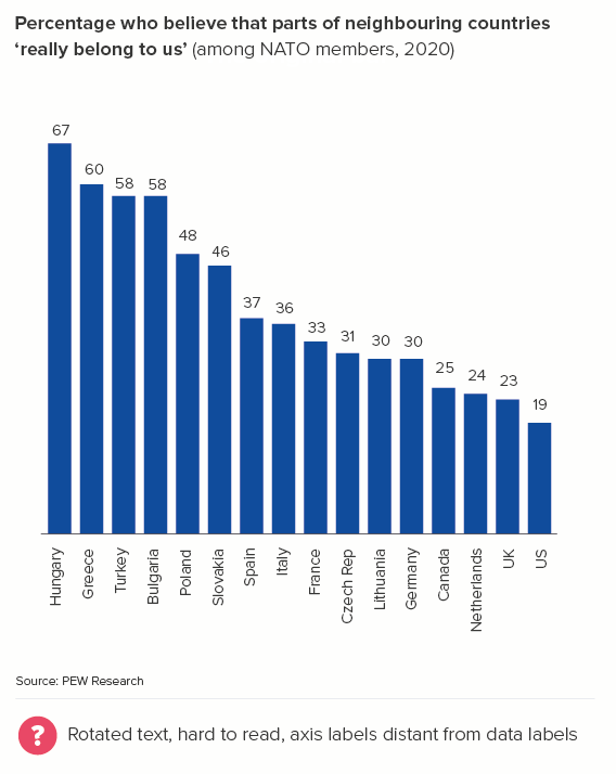
What I would say is that a columnar layout is still a sub-optimal use of horizontal bars, particularly if you group them into three, four or more columns. Two columns is probably the maximum. Otherwise you lose the ability to compare the bars (how much bigger is Croatia than Romania in the first chart below?) Also there’s a risk that you end with a chart that is mostly text instead of mostly shapes and therefore not a chart at all (the second chart below).

As with any chart choice, it’s also worth thinking about whether an alternative might tell your story better.

Alternative options

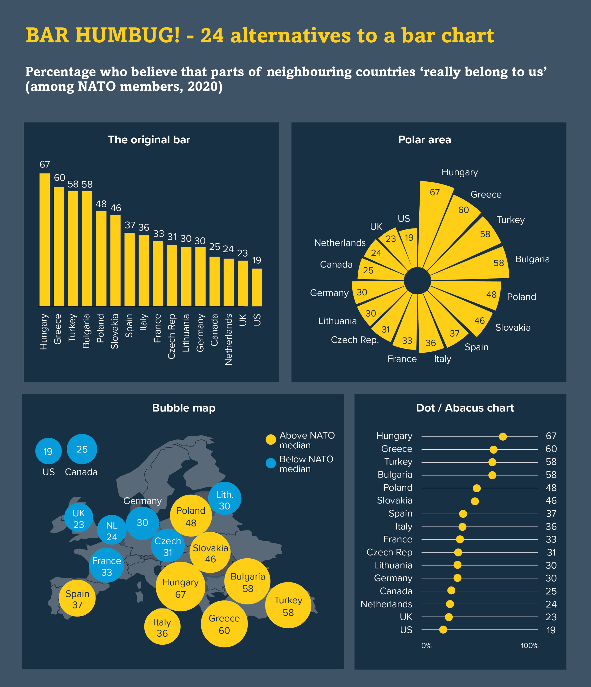
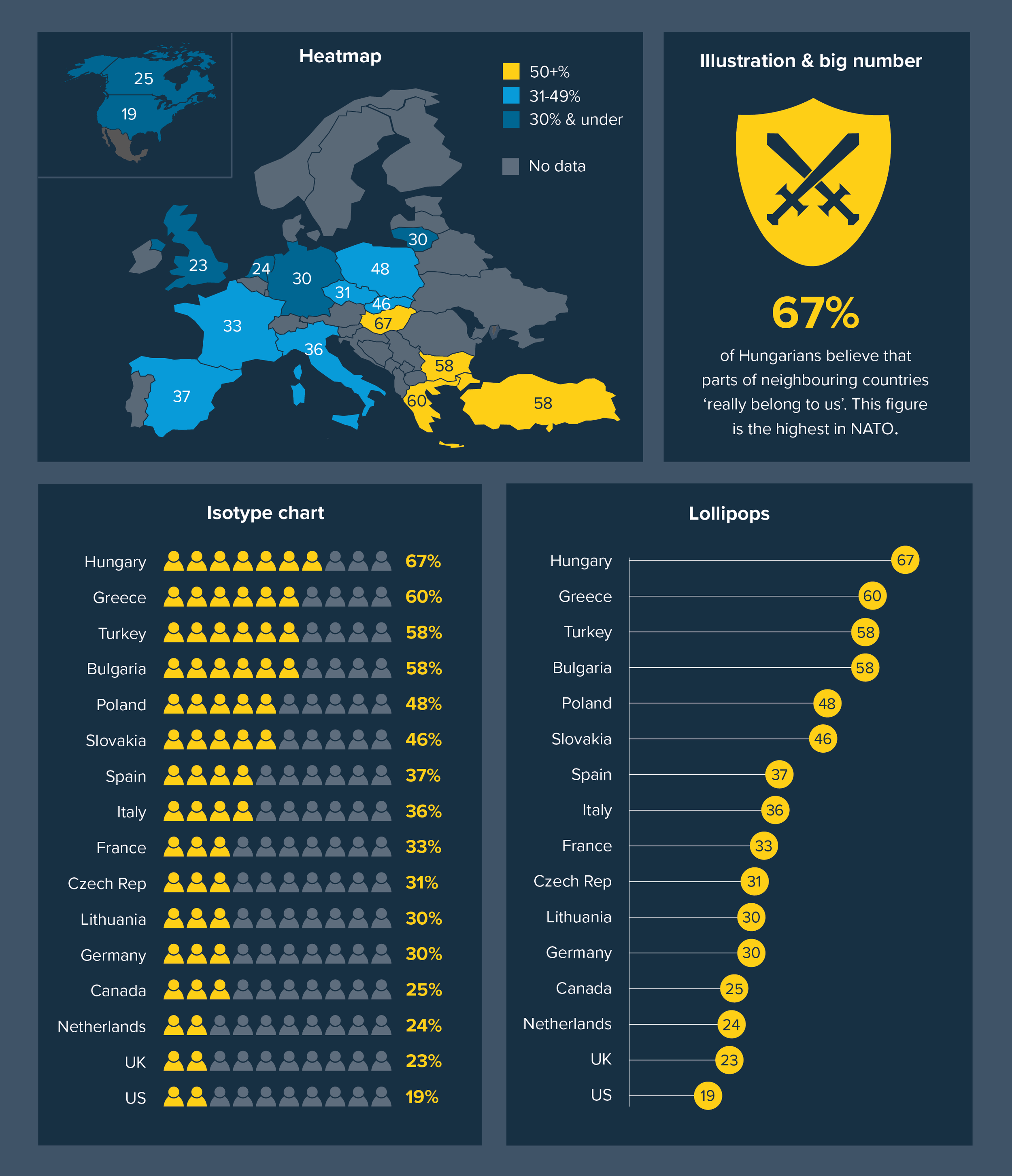
When you need to compare a large number of datapoints, does a field of bars really help your audience access and understand the underlying numbers? The end of each bar, so critical for understanding the chart’s meaning, can become blurred by proximity to its neighbours. Dot charts make it easier for your audience to pinpoint each category’s value. They are also less visually overwhelming as there is no fill to generate visual after effects (e.g. the McCollough effect) or optical illusions.

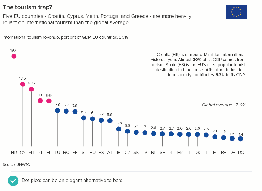
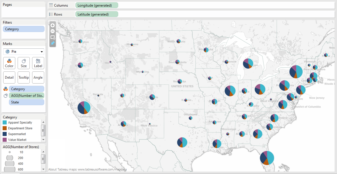
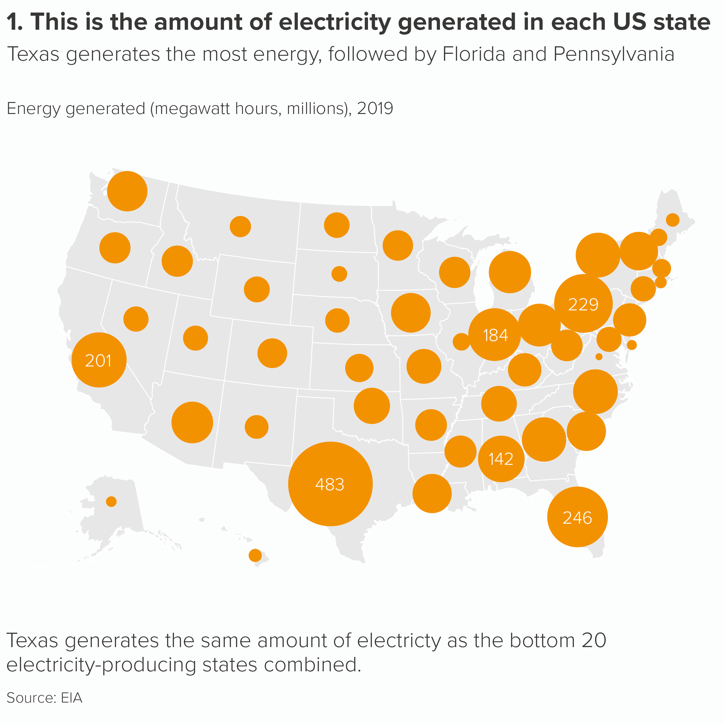
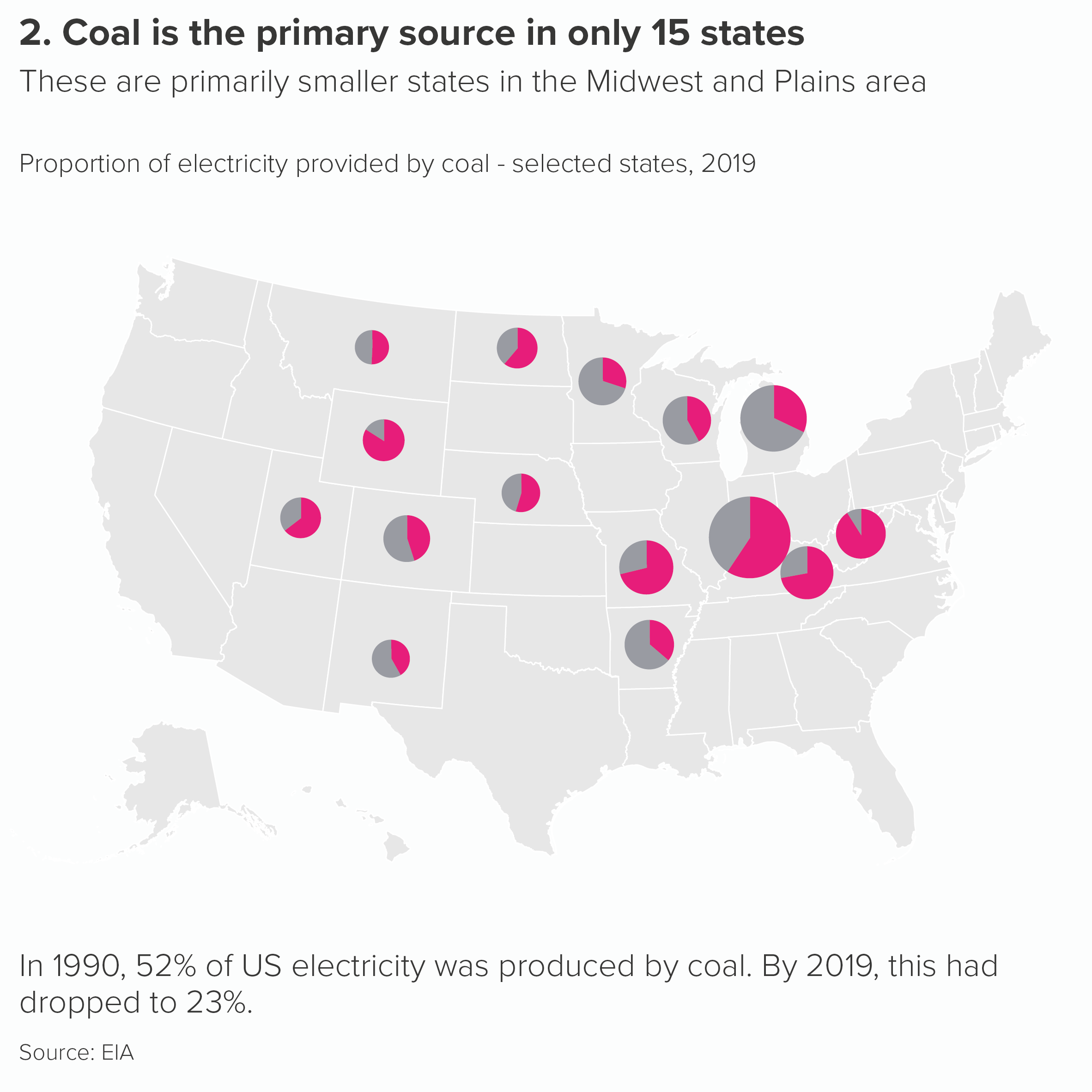
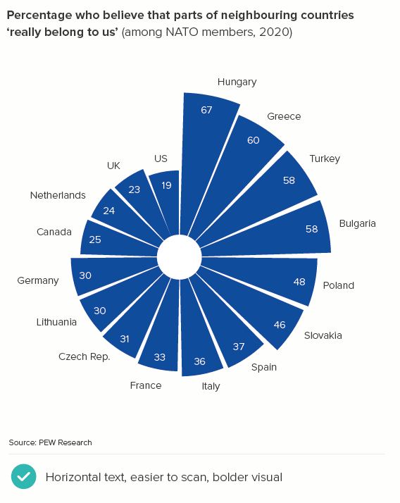
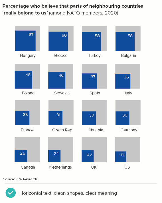
It is also worth considering polar area charts, bubble tables and other proportionately-sized shapes. The precise differences between the datapoints are sometimes harder to judge, but these charts can be more visually appealing and easier to label than vertical bars. Or, if you have geospatial data, there are always maps - which everyone loves and which we will discuss in more detail in later rules. I’ve put some examples below.

Change over time

For change over time stories, when you have lots of bars, many people quite rightly switch to a line or area chart.

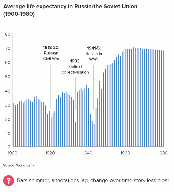
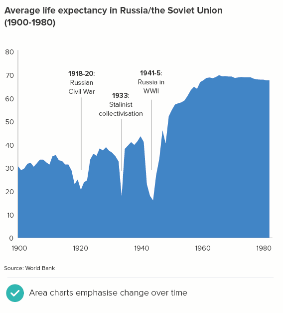
Line and area charts also help people to understand that the key story is the change in value - the trend, the shape, the direction of the data. (The line across the page becomes the data’s heartbeat). 

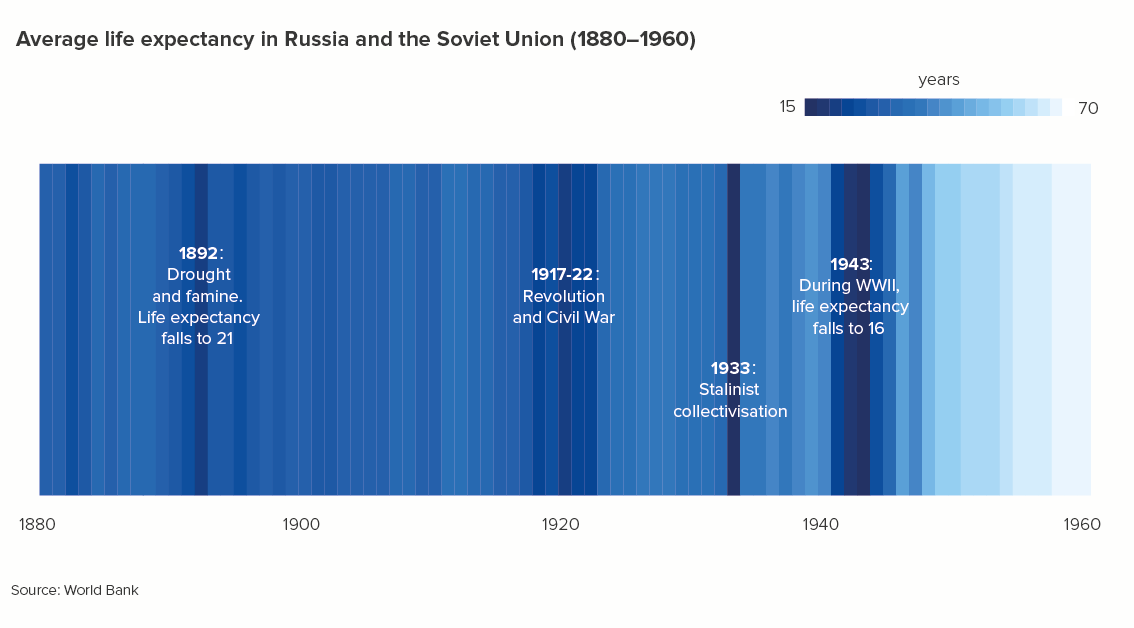
Another innovative alternative to a crowded bar chart is Ed Hawkins’s climate stripes. Hawkins originally used his chart to visualise the change in temperature over the past 200 years, but you can use them for other change-over-time datasets too. Flourish have recently added a climate stripes chart maker to their excellent online tool.

Evenly distributed

Let’s conclude by briefly considering distribution stories: this is when you’re trying to show your audience the spread of your data, usually by ‘binning’ or ‘bucketing’ the data. This involves dividing all the values in your dataset (e.g. hours in the day) into a series of equally-spaced intervals and plotting them on a type of bar chart called a histogram.

When you are using histograms to analyse your data, the number of bars/bins is often mathematically-derived (most commonly: the number of bins = the square root of the number of values you are binning). However, this tends to give you some odd divisions. For example, say I had 10,000 daily visitors to my website and I wanted to know at what time these visitors first arrived on the site. The square root of 10,000 is 100 - so I would have 100 bars/bins. Each bin would be 14.4 minutes long. My intervals would be 0:00:00-0:14:24, then 00:14:24-00:28:48 and so on. Not a human-readable format.**

This isn’t a huge problem when you are analysing. But when you use bars to communicate distribution stories, you should use bin widths that make sense in the real world. In my website example, you might use divisions of an hour, thirty minutes or fifteen minutes. Note that we are not worrying about a minimum or maximum number of bars. It is a question of how we most clearly show the overall spread of the data and any important patterns or outliers.

rule-17-distribution-bins-website.PNG

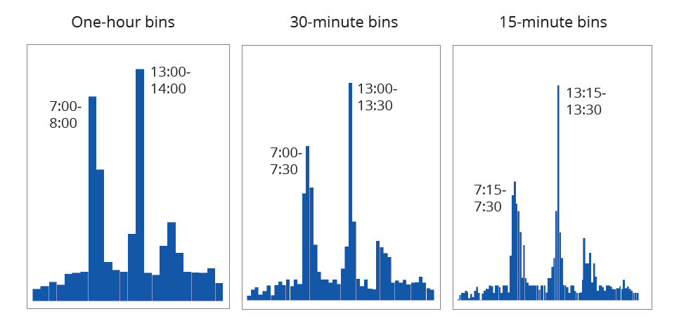
In this example, adapted from a dataset for a media website, we would end up using the 15-minute bins, because this gives our audience the most useful information. Yes, most website users visit the site at lunchtime - between 13:00 and 14:00 as the first chart shows. But what’s even more surprising is that, within that one-hour slot, the majority of users visit between 13:15 and 13:30, fifteen minutes after their lunch hour starts, presumably after they’d picked up a sandwich and started to eat it al desko.

So I’m not sure setting a maximum number of bars in a histogram is helpful, as you might never find that critical exception or outlier. Furthermore, you are usually showing distribution stories to more data-literate audiences and they will not only already know the data, but they can usually tolerate higher levels of information density. 

When presenting your distribution chart however, it’s still worth considering all of the guidance around crowded vertical bars. You can see this in our example histograms above. Use a single colour, minimise labelling, annotate only the most pertinent bars. And if the story isn’t clear enough, switch to a different chart. Or just pull out the key insight, and dramatise that.

To conclude then, do everything you can to limit the number of bars for your audience. Remember that humans cannot cope with large amounts of new information in a single sitting. However, sometimes what your audience demands is more detail, more data, more depth, and in these instances you should minimise colour, labelling and other visual clutter to make the story in that crowded bar chart stand out. And if that still doesn’t work, then your chart’s days are clearly numbered. Time to raise (and raze) the bar.

VERDICT: Breaking this rule is unavoidable 

Data sources for charts: UK home ownership levels from Game of Homes - Resolution Foundation, French baby names from INSEE, Quality of Life index from Numbeo (extracted May 2020), Older people in the EU from Eurostat, Fertility rates from World Bank, Tourism data from UNWTO, Most common languages in England and Wales from UK Census 2011 (via ONS), Russia life expectancy from Gapminder/World Bank, Most popular baby initials, derived from ONS 2019 release

*Vision, Scarlet Witch, Dr Strange, Wong, Thanos, Black Panther, Captain America, Iron Man, Thor, War Machine, Star-Lord, Black Widow, Spider-man, Drax, Gamora, Nebula, Rocket, Bucky, Hulk, Mantis, Shuri, Okoye

**Sometimes, you might use bars of varying widths in your histogram. The guidance for a standard bar chart doesn’t apply in these cases, so I won’t cover these charts here. Also, I think they look confusing for non-statisticians and would only ever use them for analysis, never communicating with others.

More data viz advice and best practice examples in our book- Communicating with Data Visualisation: A Practical Guide

Rule 16: If in doubt, use a bar chart

In this blog series, we look at 99 common data viz rules and why it’s usually OK to break them.

by Adam Frost

The idea of the bar chart as the ur-chart, the Überchart, the chart to end all charts has its origins in a 1985 paper by William Cleveland and Robert McGill which showed that charts using ‘position along a common scale’ like scatter charts and bar charts were read more accurately than those using angle and slope (pie charts), area (bubble charts, treemaps) or colour intensity (heatmaps).

Given that one of the principal goals of anyone making a chart is to convey the data accurately, why wouldn’t you use the most accurate chart? Elizabeth Ricks’s view of bar charts is pretty universal: ‘Use them and use them frequently.’ 

As well as being accurate, bars allow you instant access to every story at every level of your dataset. You can get a sense of the overall spread of your data, pick out clusters of similar-sized datapoints, or zero in on a single bar, and assess its relationship to the rest of the dataset. Few other charts allow you to move so frictionlessly from overview to detail and back out again.

Look at the third chart above - the six names that have similar counts. Not only can you tell that the bars are similar sizes, but you can also make out the (tiny) differences between them. 

Bars are also astonishingly versatile, capable of taking almost anything you throw at them. They can tell stories of comparison, change over time, composition, geography, correlation, distribution, deviation, progress towards a target, and more.

Get this graphic as a hi-res, editable PDF here.

Finally, bars deliver all of this with exceptional efficiency, taking up not much more space than a data table, and indeed, when information density is a priority, bars and tables are often combined. 

Image Credit: Charts made using Datawrapper, Data sources: World Bank, WHO

This is why, when you are experimenting with the right chart for your story, it isn’t a bad idea to start with a bar chart, because it will give you an accurate sense of what your dataset contains, you will be able to grasp both overview and detail, it will almost always suit your story, and you will be able to see everything in a relatively condensed area, usually without the need to scroll or zoom.

The key test is what happens next. Because although bar chart’s are an analyst’s dream, they can be an audience’s nightmare. If you don’t use them carefully, all the strengths listed above become weaknesses.

  • Their position as a default chart can mean that an audience doesn’t always engage with a bar unless the story is exceptionally strong or they are being paid to pay attention. It’s just a chart, a chart they have seen a thousand times before, why should they care about this one? 

  • The fact that bars show overview, detail and everything in between, means that an audience can flounder a little without clear direction from the designer. This chart contains many stories, what am I supposed to notice first, second, third? 

  • The fact that bars can take any data means that they don’t immediately advertise what kind of story they are. With a pie chart, you instantly know you are getting a story of composition, with a line chart, it is a trend over time, a scatter is correlation. But a bar chart - it can take a few seconds to work out which of the many possible story types you are being told. It could be a story of comparison, change, distribution, all of the above, none of the above.  

  • Their efficiency, the fact that they can convey a lot of information in a small space, can also be a barrier to good storytelling. It can encourage analysts to cram lots of them onto a screen or slide, or overlay secondary stories on top of them. This comes in handy when you’re assessing a dataset, but not when you’re presenting what you’ve found to others (see dashboard below. Yikes).

rule-16-bar-charts-bad-dashboard.JPG

Image Credit: Stephen Few/ Perceptual Edge

  • There is, for me, a more serious issue with bars too, particularly vertical bars. It concerns the small matter of the text. In fact, I would say that the only good thing about bar charts is the bars. Those clear, clean rectilinear shapes - so easy to read and compare. But when it comes to the other stuff, the stuff that tells your audience what the chart actually means, bar charts tend to shove it into the margins, leaving it tiny or rotated or overlapping or truncated so it’s difficult to understand. It’s one reason why data journalists - and others for whom text is a foundational part of any visual story - often seek alternatives to bars.

All of these shortcomings matter less when you are analysing. In fact, default bar charts with cluttered text are usually fine as a tool for spotting general patterns and trends. But when you are trying to persuade others to care about what you have found, a hard-to-read bar can be disastrous. 

In the rules that follow, we’ll look at how you can fix some of these issues with bars. But for now, I’ll just say if you are trying to engage an audience, it is worth experimenting with other chart types, ones where the text is always horizontal and unabbreviated, and where the shapes dramatise your story in a more memorable way. Sometimes a (tidied-up) bar chart will be the right answer. But in many cases, a different kind of chart will help you to communicate the story that a bar chart helped you to discover.

I’ve put some alternatives to bar charts below. This focuses on one type of bar chart story (comparing different countries on a 0-100% scale). Some of these charts clearly work better than others. But hopefully it gives you a sense of the range of options available to you if your bar chart topples over.

Get this graphic as a single, hi-res pdf here.
Get this graphic as a PowerPoint presentation here. (Note: uses svgs, might look weird in less recent versions of ppt).

VERDICT: Break this rule often

Data sources: UK baby names from ONS; Image Credit: Fertility rates, smoking rates from World Bank, nominal GDP from IMF, Hungarians believing parts of other countries belong to them from Pew Research, Global Attitudes Survey Q50f

More data viz advice and best practice examples in our book- Communicating with Data Visualisation: A Practical Guide

Rules 1-15: Pie charts - a visual summary

In this blog series, we look at 99 common data viz rules and why it’s usually OK to break them.

by Adam Frost

The animation above contains a quick summary of the key steps to work through when you’re ‘fixing’ a broken pie.

I’ve also included two static graphics below which contain side-by-side lists of the main issues that crop up when pies go rogue. All of these have been explored in the main 99 rules blog.

I’ve included a recap of individual pie chart rules below. If you read the individual blogposts, you will see that the degree to which you follow or break these rules always depends on your role, your story and your audience.

Rule 1: Pie charts should never be used

Rule 2: Avoid pies when your values are similar

Rule 3: Not too many pie slices, not too few

Rule 4: A pie chart should add up to 100%

Rule 5: Start a pie chart at 12 o’clock and go clockwise

Rule 6: Arrange your pie slices from largest to smallest

Rule 7: No exploding pies

Rule 8: Limit the number of colours in your pie chart

Rule 9: Give your pie chart a key (or legend)

Rule 10: No multiple pies

Rule 11: Don’t chain or nest pies

Rule 12: No 3D pies

Rule 13: Don’t decorate pies

Rule 14: No proportionately-sized pies

Rule 15: Don’t use doughnut charts

More data viz advice and best practice examples in our book- Communicating with Data Visualisation: A Practical Guide

Rule 15: Don't use doughnut charts?

In this blog series, we look at 99 common data viz rules and why it’s usually OK to break them.

by Adam Frost

‘Donuts? Is there anything they can’t do?’ mulls Homer Simpson. Quite a lot, it turns out, when you turn them into charts, but that still doesn’t mean you shouldn’t use them.*

Let’s start with the case for the prosecution. Because people who hate pie charts tend to hate doughnut charts even more. Cole Nussbaumer Knaflic, who is on record saying ‘pie charts are evil’ has added ‘donuts are even worse.’ (Storytelling with Data, 2015, p61). Jorge Camoes writes in Data at Work: ‘Every bad thing you can say about pie charts can be applied to donut charts, and then some.’ (Data at Work, 2016, p210).

The main reason for this animosity is because, as with pie charts, research has shown that they are harder to read than the same data in, say, a bar chart. In fact, doughnuts arguably perform worse than pies, because at least in a pie chart, we are comparing the sizes of slices, but in a doughnut, we lose that central point of convergence, we only have the tops of our clock hands, which means we are effectively comparing arcs. This is hard enough for us to do when the arcs start at the same point, but it’s nigh on impossible when each arc’s starting angle is rotated.  

Here is a doughnut and a bar chart showing the same data.

The key question is: does any of this matter? Yes, doughnuts are a little harder to read, but they’re visually distinctive, and besides that’s what text is for, to clear up any ambiguity that our shapes - any shapes - cause if they’re asked to work alone. It’s not as if a bar or line chart makes sense without labels, or you live in a world where everyone strips all the helpful text off their charts, so they can stage some kind of accuracy dogfight between different groups of abandoned shapes.

No, charts are a collaboration between shapes, text and illustration and it turns out that doughnut charts are excellent collaborators. Perhaps even the best. 

That hole in the middle is the perfect place to drop an important stat or a helpful icon.

Or you can add an illustration or photograph.

Image credit: Earth doughnut chart from Jim Kynvin

As the examples above show, they are at their best when you follow most of the rules that we’ve outlined for pie charts: starting at 12 o’clock, no explosions or 3D.

I’d add a few more. Firstly, they are at their best when you just have two values, an important number and the remainder. I also think they bear repeating, a series of doughnuts with a number or icon in the middle - with the right content - can be more engaging than the same data in a row of pies, or a bar chart.

There’s also the vexed question of how big the hole should be. Unless the chart is purely illustrative (like the Planet Earth example above), I personally don’t like it when the arcs become slivers. Graphic designers seem to favour this approach - they are increasingly the norm in the corporate brand guidelines I see - and I'll admit that when they're put on a dark background, they can look… well… ok.

Image: Do thinner slices work better on a dark background?

But, on the whole, I think it’s good to give your audience an outside chance of working out what the number might be from the shapes alone.

At the same time, making the hole too small means that the number or icon in the middle looks cramped, or ends up having to be shrunk down, thereby undermining the point of using a doughnut in the first place. I’d start with the hole at about 65% - which is usually fine - but adjust it up or down if required.

Most applications seem to get the default hole size slightly wrong - either too big or too little - so I’d get used to opening the doughnut chart settings and resizing to suit your use case. 

Once you’ve chosen an appropriate size, make sure you use it consistently throughout your report or presentation.

A couple of other tips. Doughnuts don’t like being labelled. With a pie, you have the option of putting values in the wedges, but with doughnuts, there is less space, so the values or labels often need to go on the outside, sometimes with connecting lines to make it clear which label connects with which arc. In the process, the chart itself gets shrunk or barged out of the way.

If you can, keep your doughnuts clear of labels. Use the title to make the chart’s meaning clear or put the key number inside or underneath the chart. As I mentioned above, try to only use doughnuts to represent a single number and the remainder, because it will make the job of removing labels easier.

If this isn’t possible, follow the same rules as pie charts. Merge categories where you can, keep all the labels as close as possible to the chart, and avoid adding a key.

Finally, I’ve suggested icons. We will talk about icon use more generally in later rules, but for now, I’ll just say that any icons you choose for your doughnuts must be in a consistent style. Don’t just search google or the (wonderful) Noun Project and choose the first icon you see. You’ll end up with a mess.

Ideally your icons will all be created by the same designer (Noun Project lets you search by creator), but if this isn’t possible, make sure they share a family resemblance; for example, they might be all be in an outline style (as above), or all share a similar level of visual detail.

With colour, if you have a row of doughnuts, usually they will share the same colour for their main arc, as in the examples above. But if your story requires different coloured charts, then icon colour should match arc colour (as should the text).

One final point about doughnut holes. If you’re going to fill them, don’t fill them with crap. It’s not where you put the chart title, or a legend, or footnote content. Use it for key information or useful decoration. If it’s relevant, you could add the total number or a percentage symbol to make it clear what’s being measured. But, as a rule, the key number or an icon works the best.

As with pie charts, the main risk with this chart type is using them when your data is dull or irrelevant, as a doughnut chart will amplify whatever qualities your data possesses, and your audience could potentially get annoyed that you have used a bold visual for data that doesn’t merit any special treatment. Also, if you have serious data, or an audience that prefers dense, detailed charts, then doughnuts are usually the wrong choice, as they are fundamentally a lightweight chart, and they can bear even fewer datapoints than pies without buckling under the strain.

I’d think about doughnuts - and pies to a lesser extent - as the charting equivalent of informal language. Just as sometimes a conversational style is appropriate (it suggests you are approachable and on the same level as your audience) and refreshing (it makes a change from business jargon or statistical terminology), so sometimes a row of doughnuts indicates a welcome change of tone. The audience can relax a little: they are not being asked to concentrate too hard, or treat everything in the dataset with the utmost seriousness.

But the opposite is also true. There’s a reason you don’t see too many doughnut charts in academic papers or scientific journals. It’s the same reason that these publications discourage the use of exclamation marks (‘The vaccine works!!!’) or writing in italics or CAPITAL LETTERS to underline a point, or the insertion of intensifiers (‘really’, ‘incredibly’, ‘totally’) to emphasise importance. The information should not need to be cranked up in such a crude way. Your audience will just find it inappropriate, or suspicious. 

So always consider your audience’s expectations. If you wouldn’t use informal speech with them, don’t use an informal chart. Especially doughnuts, but also bubbles, isotype charts or any other informal visual elements (icons, illustrations, photos).

But if a conversational tone is appropriate, or if you want to intersperse a formal presentation with more conversational elements, then doughnut charts are the charting equivalent of their real-world namesake. Not especially healthy, but guaranteed to cheer everyone up.

VERDICT: Break this rule often.

Sources: Ghosts data from Yougov, belief in crystals data from The Guardian, predators data from various sources but mostly this from BBC Earth, gay relationships data from NatCen BSA, water content data from various sources, including Encyclopaedia Britannica, mobile phone data from Ofcom, Beatles survey from NME

*A note on spelling. Unlike Homer, I am spelling the word as ‘doughnut’ for this post and only use ‘donut’ when I’m quoting people who prefer the variant. This is because English-language speakers outside of the US usually spell it as doughnut, and in fact many Americans also spell it as doughnut. According to Time magazine, the ‘donut’ spelling only took off after ‘Dunkin’ Donuts’ arrived on the scene in the late twentieth century. (This doesn’t bode well for the U.S. spellings of crispy and cream). So, call me old-fashioned, but I’m going to call those nut shapes made of dough, doughnuts.

More data viz advice and best practice examples in our book- Communicating with Data Visualisation: A Practical Guide

Rule 14: No proportionally-sized pies

In this blog series, we look at 99 common data viz rules and why it’s usually OK to break them.

by Adam Frost

When a user called ebase131 recently asked how to make proportionally-sized pie charts on an Excel Help forum, the reply from ‘forum guru’ JosephP was unequivocal: ‘Pie charts are not the right chart for this kind of comparison [...]. It's bad enough that pie charts exist without encouraging people to use them in this way.’

This is a widely-held and completely justifiable point of view. However ebase131’s response was also interesting: ‘I would wholeheartedly agree, but the company I work for has their mind set on [these] pie charts.’ The user also added: ‘Not sure why you want to limit anyone from doing anything they would want to do to present data as they see fit.’ Which is the practitioner v theorist divide in one handy exchange.

So in this spirit, let’s take a look at proportionately-sized pie charts which are both ‘bad’ charts but also popular charts - particularly within companies.  

They are usually used for stories like this.

As you can see, they are very difficult charts to compare. For example, if I want to compare the percentage of 15-29 year olds in the Indian population across the three years, I have to find the three relevant wedges, angle my head and imagine what they might look like side by side.

In this case, those three slices are the same value (27%) but they don’t look it, because the increasing size of the slice distorts what the wedge represents. An interesting story - India’s shifting age structure - is smothered by the overlaid (and less interesting) story of India’s population increase.

Note that I also need to include a key for charts like this (or my labelling gets crazy) and in Rule 9, we talked about how aggravating chart keys can be. 

For this reason, I was surprised to see a proportionately-sized pie chart in Nate Silver’s book The Signal and the Noise. Silver is usually seen (rightly) as the model for any statistician who wants to communicate interesting data stories without compromising on accuracy. However, his proportional pies (which I’ve redrawn here) also show the ideal way of using them.

I’ve put Silver’s chart next to a stacked bar, so you can see a less appealing way of charting this story.

In his pies, Silver is using just two categories - individual and institutional investors. He has isolated two representative years - 1980 and 2007. Furthermore, the charts show a clear and dramatic change - in 2007, the proportion of institutional investors (hedge funds, pension funds etc) has hugely increased. In fact, the two pie slices have swapped sizes; the compositional breakdown (two-thirds v one-third) is flipped.

Because his story is so clear (or he has made it clear), he is able to use the size of the charts to add another layer to his story - the fact that the size of the market has hugely grown too.

Notice other things that he has got right.

  • He is sizing the pies by area, not radius (we’ll cover why this is vital in our bubble chart rules).

  • He is starting his pies at 12 o’clock (see Rule 5).

  • He is labelling his pies directly, rather than using a key (see Rule 9

  • He is using just two shades of the same colour, and using colour consistently across the two pies (Rule 8)

  • Sounds like a minor detail, but it isn’t: he has right-aligned his left-hand chart labels, and left-aligned his right-hand chart labels.

Most critically, it is a wholly appropriate chart for his story (see all the previous rules and all the rules still to come). He is turning his pies into two bubbles. His story is about the fact that, when institutional investors increase, stock-market bubbles are a near-inevitability. Not only are traders investing other people’s money, rather than their own, but they are rewarded by their companies for short-term increases in a stock’s value, which drives riskier and riskier behaviour. The visual metaphor of an expanding circle is perfectly judged, particularly because its rapid and unsustainable inflation makes us wonder when it will burst. 

Compare Silver’s pies to the stacked bars. Yes, it’s a bit easier to compare the two base-aligned values (institutional investors), but that’s the only thing it’s got going for it. You certainly can’t compare the two bars sitting on top (individual investors). It has lost its narrative impact; we don’t see those bars as ‘the total size of the market’ anymore because rectangles don’t have that metaphorical association: they don’t suggest a complete, self-contained whole. And the flipping of the two proportions (one third v two-thirds) that we get on the pies is gone on the bars. 

Most fatally, our expanding stock-market bubble analogy has evaporated. And it’s been replaced with a metaphor that suggests the opposite: those bars can keep growing indefinitely. 

So if you are in the position of ebase131 on the Excel forum and your company ‘has their mind set on’ proportional pies then follow Nate Silver’s lead. Use them simply, and only when they have a clear metaphorical link to your story. Too many wedges, or too many pies, or too little narrative justification and they quickly become useless. I have a particular aversion for proportionally-sized pies overlaid on maps, which we encounter far too often in business presentations.

Image credit: Arunkumar Navaneethan

The signal is lost in all the visual noise (to borrow from Nate Silver again). Overlaying three stories means you see none of them clearly.

If your company is set on using proportional pies in this way, then at least walk your audience through the levels of your composition story. Maybe start with the pies as simple bubbles. Then you could X-ray those bubbles, turning them into pies, but highlighting one wedge at a time, so it is clear what your audience is seeing at each stage.

This kind of structure could also be used in a dashboard user journey. Start with bubbles; then users click or roll over to see an interactive pie, but they don’t start with the pie. 

One final note of caution: however hard your boss leans on you, never use proportional doughnut charts. It’s hard to compare the areas of two proportionally-sized pies, but it’s possible, and the chart is technically accurate. Once you put a hole in the middle, there’s no way on Earth you can compare the areas of those shapes, nor would you even imagine it’s something you were expected to do.

Otherwise, although they are hard to pull off, proportional pies are occasionally the right answer for that story that pulls in two directions, within-group and between-group. This is particularly the case when - as in the Nate Silver example - the expanding or shrinking circle adds a metaphorical dimension to your chart and helps your audience picture the real-world scenario behind the abstract shapes.

VERDICT: Break this rule very occasionally.

Sources: India population from populationpyramid.net; Proportional pies from Nate Silver, The Signal and the Noise; US energy data from EIA

More data viz advice and best practice examples in our book- Communicating with Data Visualisation: A Practical Guide