Rule 13: Don't decorate pies

In this blog series, we look at 99 common data viz rules and why it’s usually OK to break them.

by Adam Frost

I don’t like to hate on others’ creativity. I’m also aware that there are lots of correct answers in data visualisation. I realise I’ve emphasised the importance of trial and error, and experimentation, and the audience always being right. But come on now.

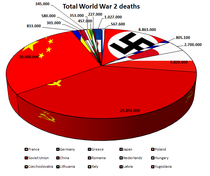
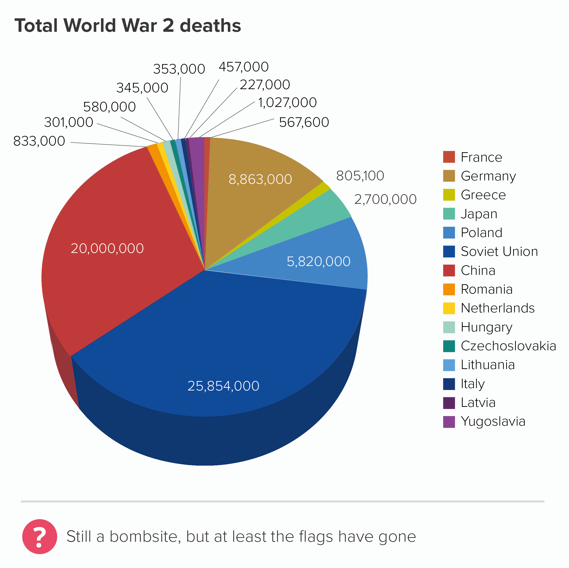
This pie chart, posted on the topforeignstocks website a few years ago, doesn’t have an image credit, so I’m not sure of its author. But whoever made it, is certainly committed to their theme. It’s an unintentionally fitting testimony to the horrors of the Second World War.   

We’ve said all along that although you should see our rules as flexible, and break them when the story justifies it, you should still do this with care and consideration, and certainly limit yourself to breaking one or two of the rules rather than all of them at once. But this chart takes no prisoners.

  • rather than starting at 12 o’clock, it starts just after. Why?

  • it doesn’t represent 100% of the dataset. Several countries that fought in the Second World War have been omitted. e.g. I have a vague memory of Britain being involved. And didn’t the USA show up at some point?

  • rather than limiting the number of wedges, or grouping the smaller slices into an ‘other’ category, it shows fifteen countries

  • it doesn’t arrange its wedges from largest to smallest, or alphabetically. The order seems to be entirely random

  • it has many wedges that are a similar size, and they are impossible to compare

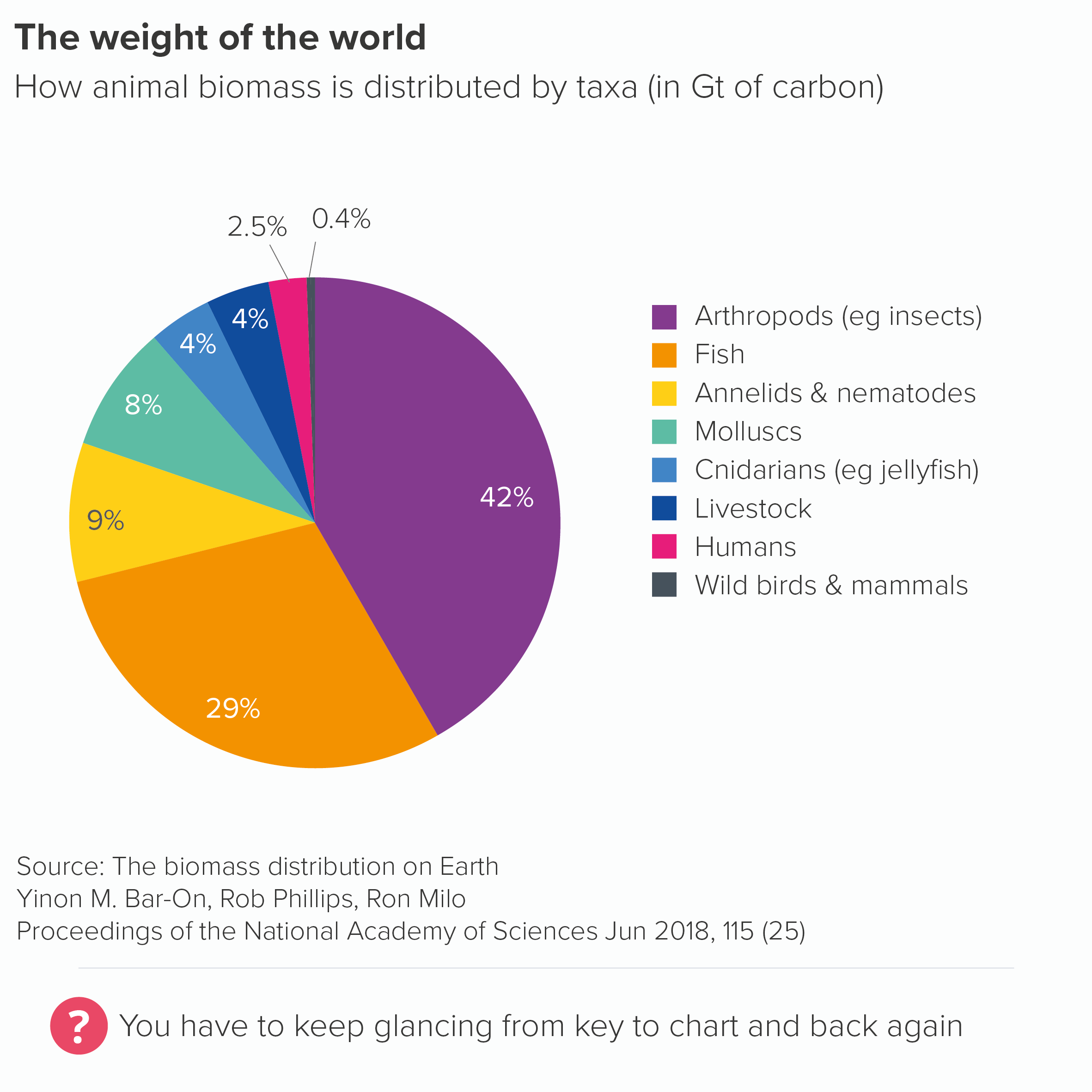
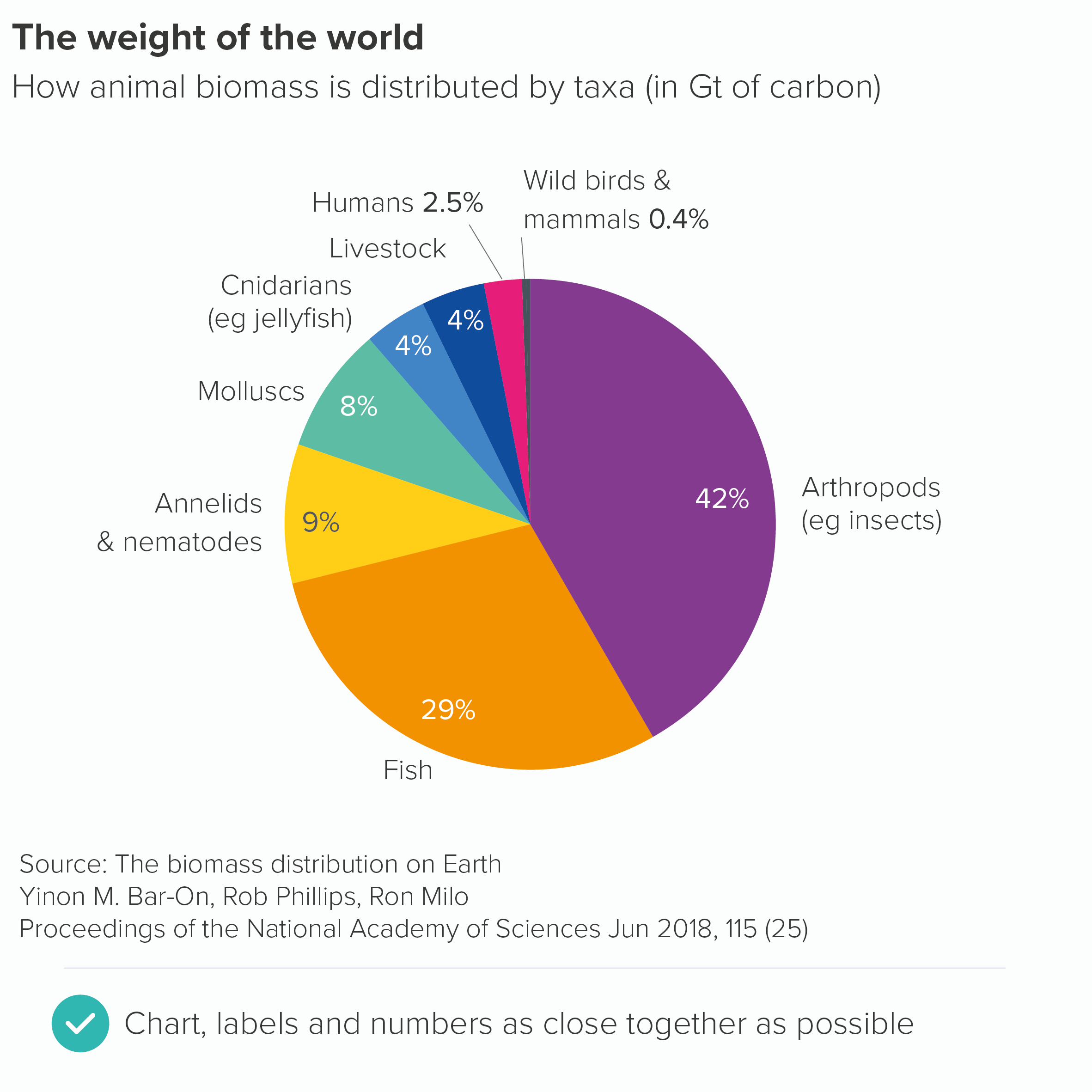
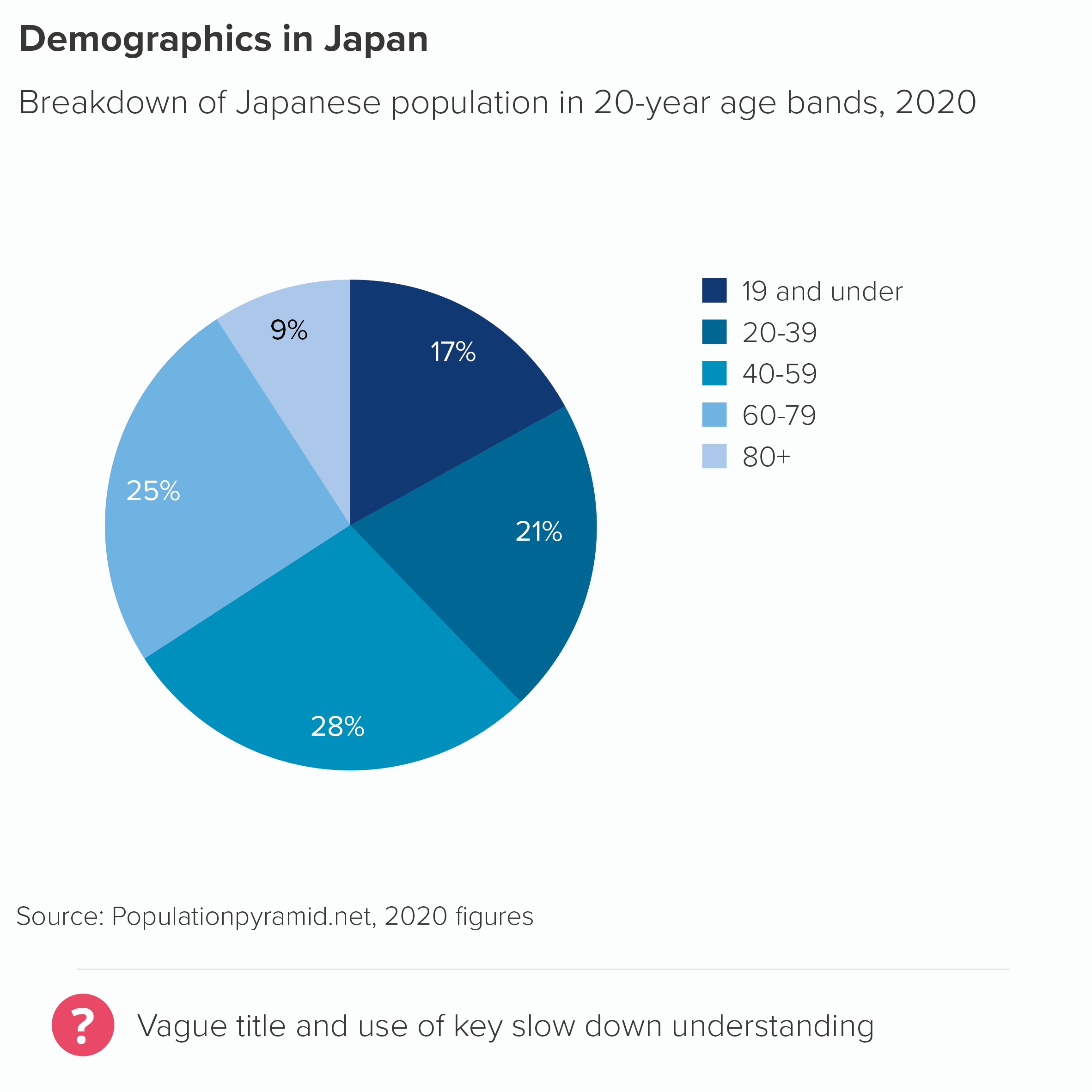
  • rather than directly labelling the chart, it has a key, which is impossible to read because of the thick black border around each element  

  • the data labels are crudely positioned; many float alongside the chart title, which disrupts the information hierarchy

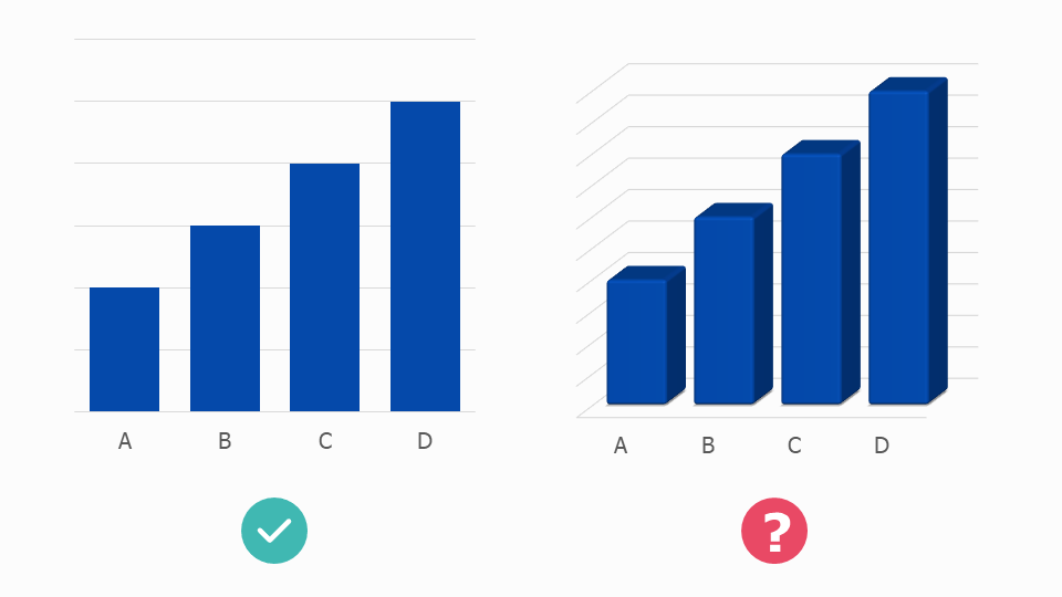
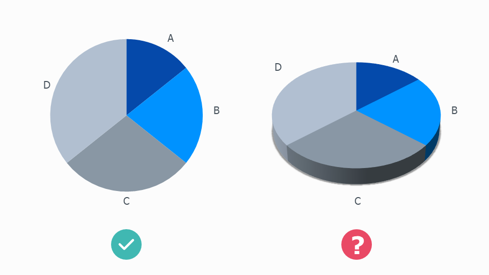
  • it adds a meaningless and unattractive 3D effect. This also distorts the data. Compare the 20 million slice for China and the 25 million slice for the Soviet Union. The Soviet Union slice looks about 50% bigger than China’s, not 25%.

It’s worth stressing that no software application on Earth would make a pie chart like this by default, all of the choices above were conscious and deliberate. 

There are other issues too. The text is poor. It has a crude title (‘Total World War 2 deaths’), spelling mistakes (‘Nederlands?’) and even though the chart is in English, it ignores the US/UK convention of using a comma for thousands (‘2,700,000’) and uses the European convention of decimal points (‘2.700.000’). Sometimes these numbers are rounded, sometimes they aren’t. These things may sound minor, but they all contribute to an overall impression of somebody who hasn’t thought seriously about their work (this is meant to commemorate deaths in war!), or has spent too long thinking about the wrong things.

But even though all of these decisions are regrettable, the most obvious mistake - the one that literally jumped out at me as I’m sure it jumped out at you - is the use of decoration. Those flags! You should always think twice before adding flags to any chart because people only recognise a handful of them at the best of times, but particularly when the countries (e.g. Yugoslavia, Czechoslovakia) don’t exist anymore. Furthermore, each flag’s colours will inevitably clash with other flags, with your brand colours, and sometimes with themselves (for example, the flag of Saint-Pierre and Miquellon has nine distinct colours). More crucially, the job of a flag is to draw attention to itself, which means they draw the eye away from the numbers and the shapes in your chart, and create emotional associations which will inevitably be different from those you want to convey in your story.

With pie charts, all of these problems are magnified because you can’t even maintain the rectangular shape associated with (most) flags, instead they become slivers, and they also have to sit right up against each other, so there is no visual respite, no white space between those clashing colours. It also doesn’t help if, like the author of our World War 2 chart, you stretch the flags to fit in the sliver, I’m assuming so the most recognisable element is visible.

war-deaths-pie-3d.jpg

I say recognisable. If you can tell me the nine countries represented by those nine tiny tapering flag slices, you deserve the Medal of Honor

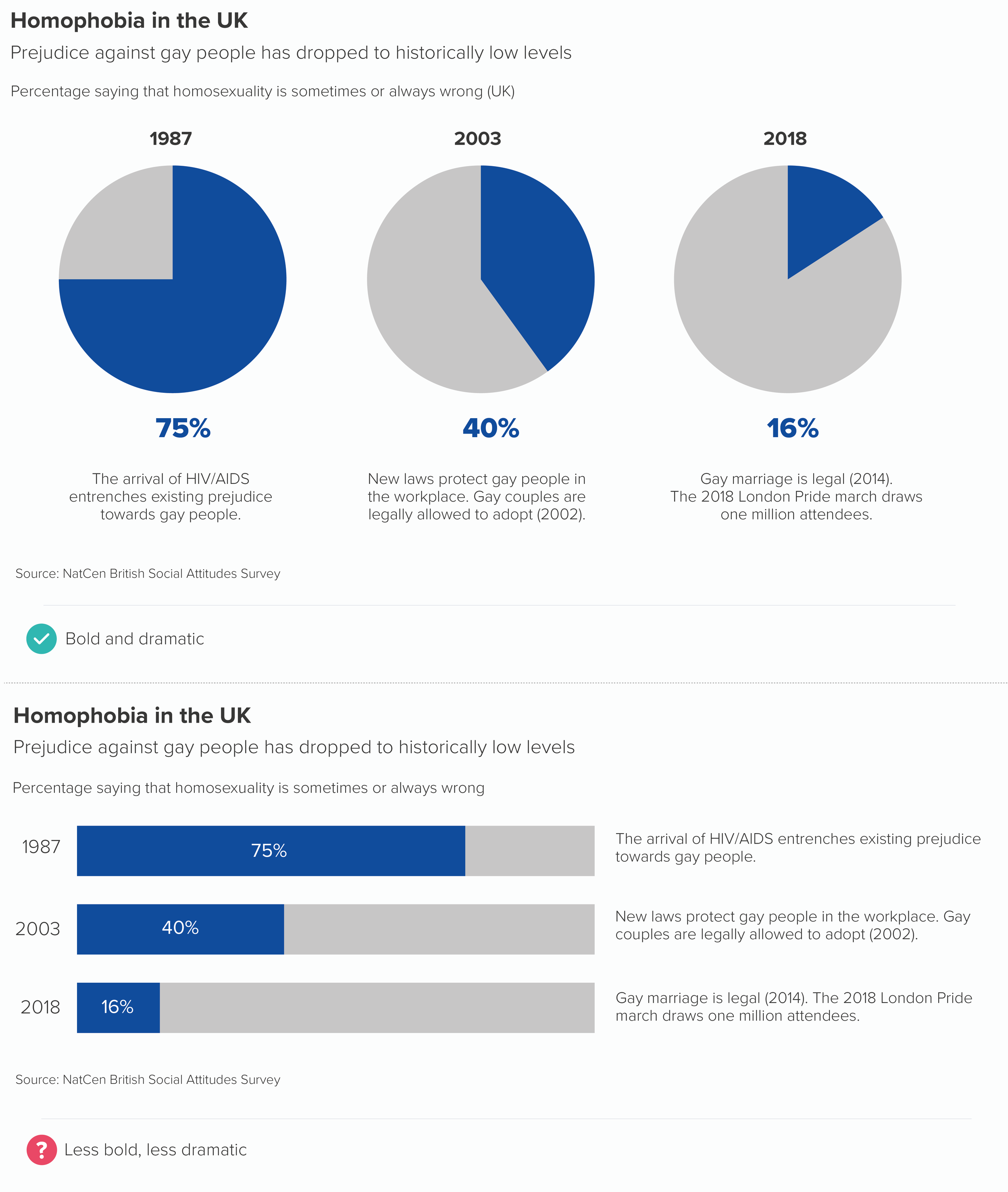
Removing the decorations and adding colour to the slices doesn’t suddenly make this a good chart. But it certainly means you can read it without recoiling from the screen (the first chart below). I’ve also made a version that is 2D (see rule 11 for why) with the slices ordered by size and with accurate data, which hopefully becomes even more useful.

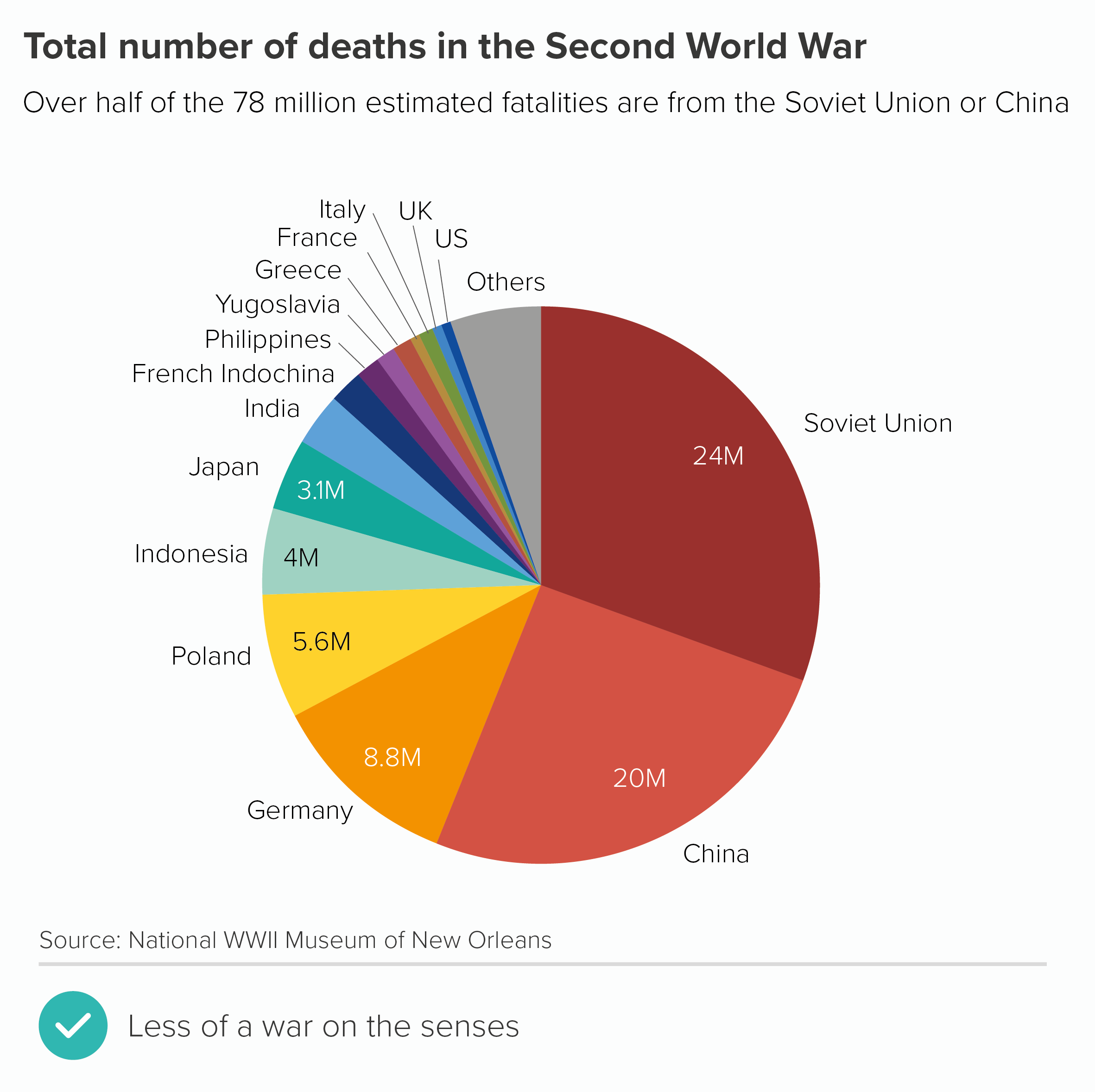
Most importantly, with these redesigned versions, you get a sense of the subject more clearly - war deaths. When it was plastered with flags, I started thinking about communism and fascism, and uniforms, and rallies, and ‘Where’s my country’s flag?’ and ‘Is that meant to be Japan?’ and maybe even how problematic flags are as symbols, but I wasn’t immediately thinking about the 75 million people killed.

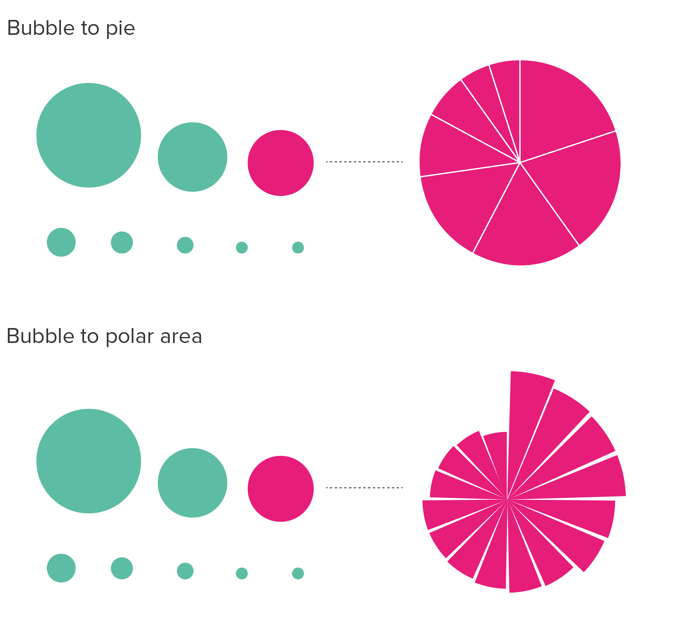
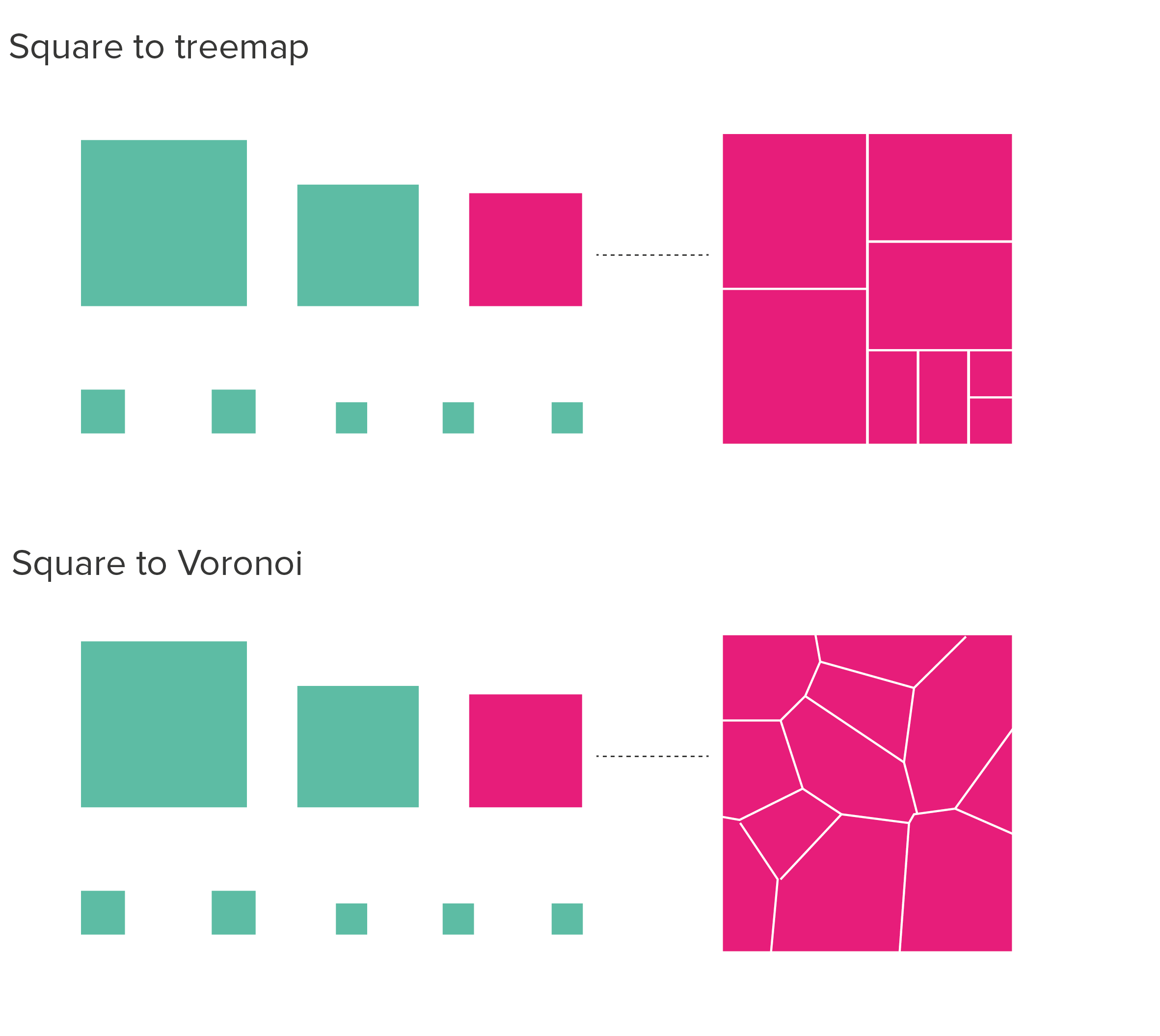
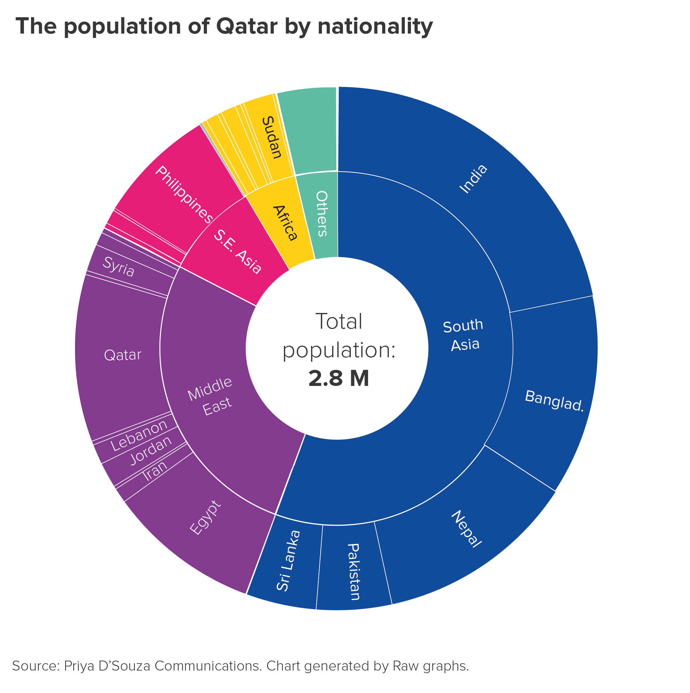
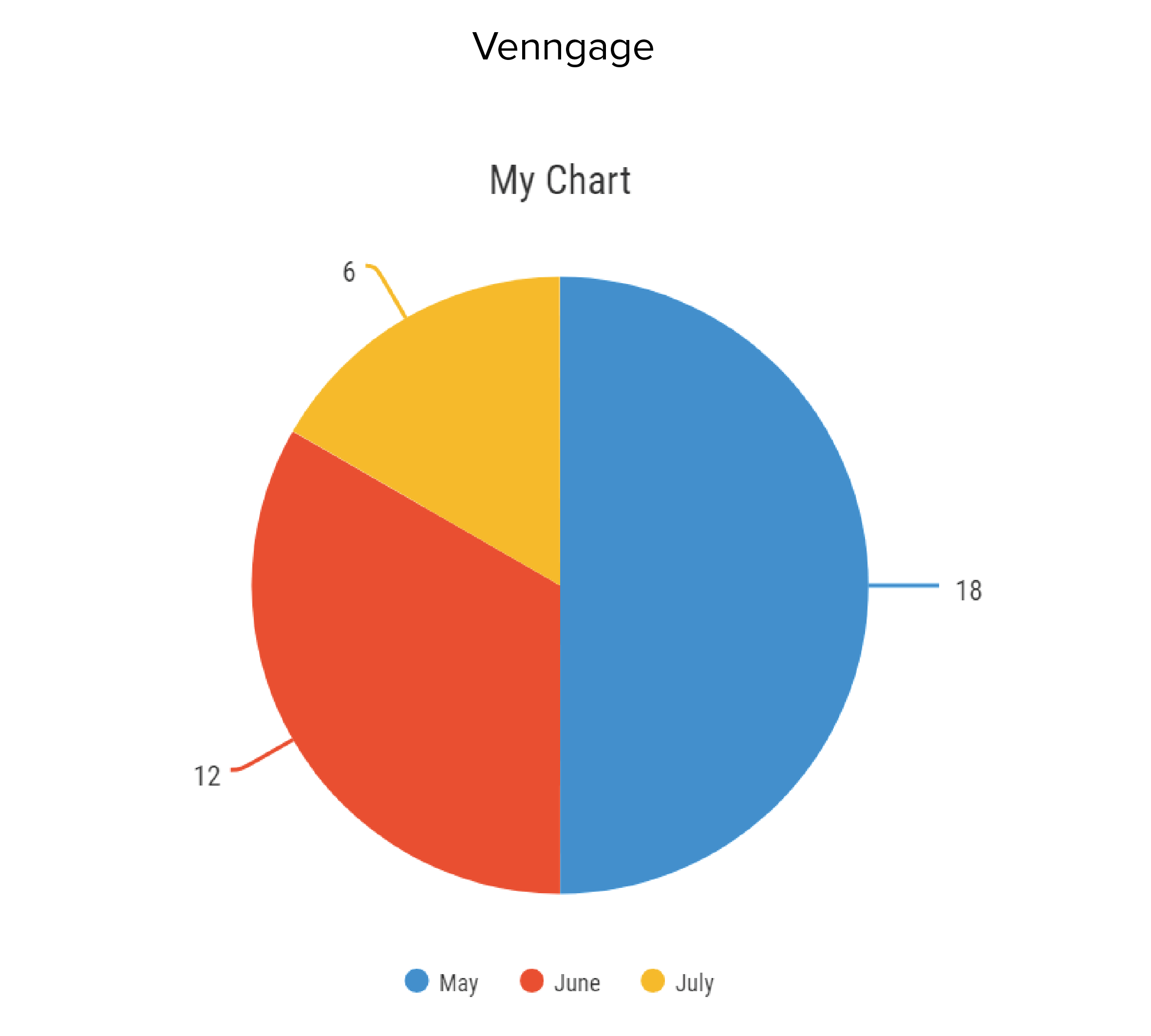
I’ve been hard on flags here, but any kind of decoration tends to damage pie charts. Whether it’s logos, icons or something else, pie chart wedges are rarely a good frame for illustrations. You are already asking your audience to process difficult shapes (angled slices), it’s best not to distract them with unnecessary visual overlays. If you absolutely must use icons or logos on pies, the illustrations should be the same size, colour and style (chart 2 below). And even then, you might want to switch to a chart that works better with illustrative elements, like bubble charts (chart 3), doughnuts or treemaps (chart 4).

Adding a pattern fill is problematic too. This is rarely a good choice for any chart, but with pies, it’s particularly bad, because we read pies by comparing angle and area, and patterns can confuse both processes, as the fills often have angles of their own, and also the fill areas can appear larger or smaller depending on pattern type, with parallel lines in particular affecting distance perception (look at wedges B and D in the first pie below. They are the same size, but don’t look it).

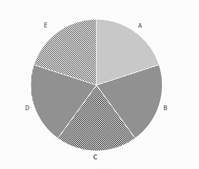
Moreover, as with flags, the fact that our wedges are side-by-side means the textures interfere with each other too and can even create optical illusions, which are great fun in the right setting, but not when we’re trying to convey information on a serious topic. 

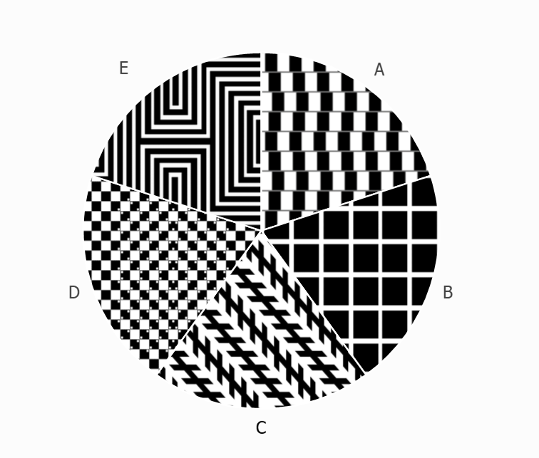
In the second pie above, I’ve deliberately filled the wedges with optical illusions - try to spot the illusion type in each case. (Answers at the end of the article).*  

So is this an unbreakable rule? Never decorate pies?

I suppose it depends what you mean by decoration. I would say that putting a decoration on a pie is rarely justified. I’ve seen it work on only a few occasions, and in each case, it was achieved by an extremely talented designer so if this isn’t you (it certainly isn’t me), I wouldn’t try it. I’ve also seen it work (sort of) when the pie is essentially a decoration itself: say, part of a museum display, aimed at children or non-specialist adults, when the authors are trying to get us to think how much of the country is farmland, or how much of our body is made up of water, or something like that. A giant pie on a wall with a texture or photo fill is attention-grabbing, and may persuade a passing visitor to explore further. 

However, even on these rare occasions, I would still say that the information would be better displayed if the photograph or illustration was beside or behind the pie, rather than on it. In fact, because they are such simple charts, pies often work well with images (if they are well-chosen).

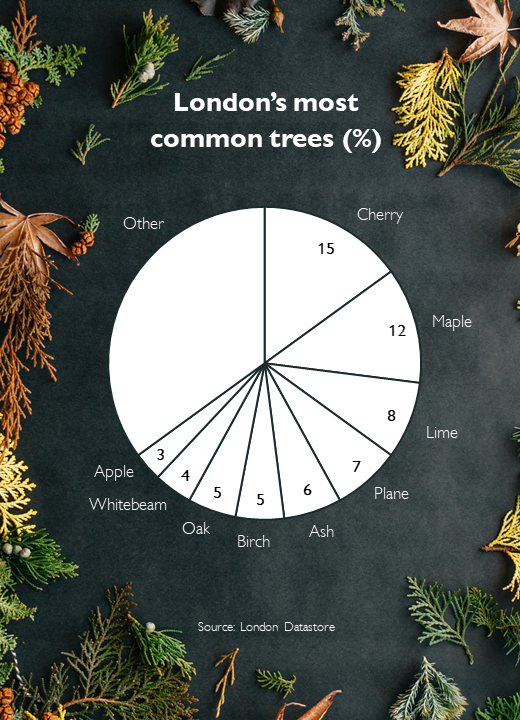
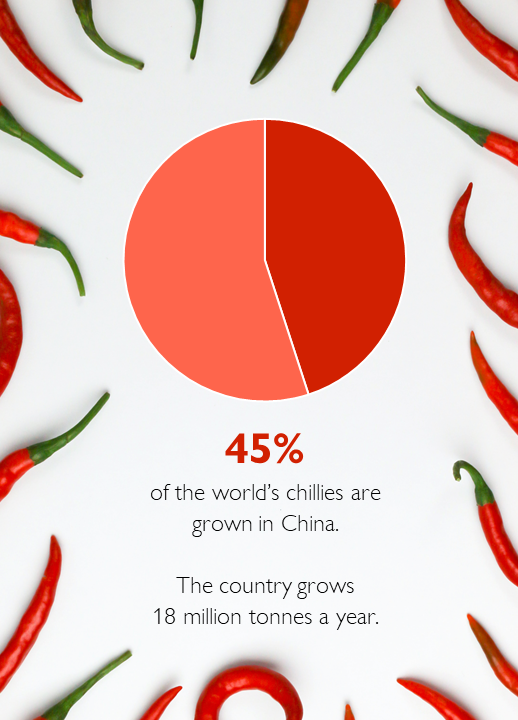
Photo credit: Erol Ahmed (trees), Tamanna Rumee (chillis) via Unsplash

There is nothing wrong with the urge to decorate; it just has to be appropriate for the chart type and the subject-matter. 

In fact, looking back at our initial 3D World War II pie chart, perhaps the author’s biggest mistake is less the flags, and more that this data shouldn’t ever have been put in a pie chart in the first place. Certainly, if the right chart had been chosen, it could have incorporated iconography or illustration - perhaps even flags. Take a look at this classic infographic by Otto and Marie Neurath about the casualties of the First World War.

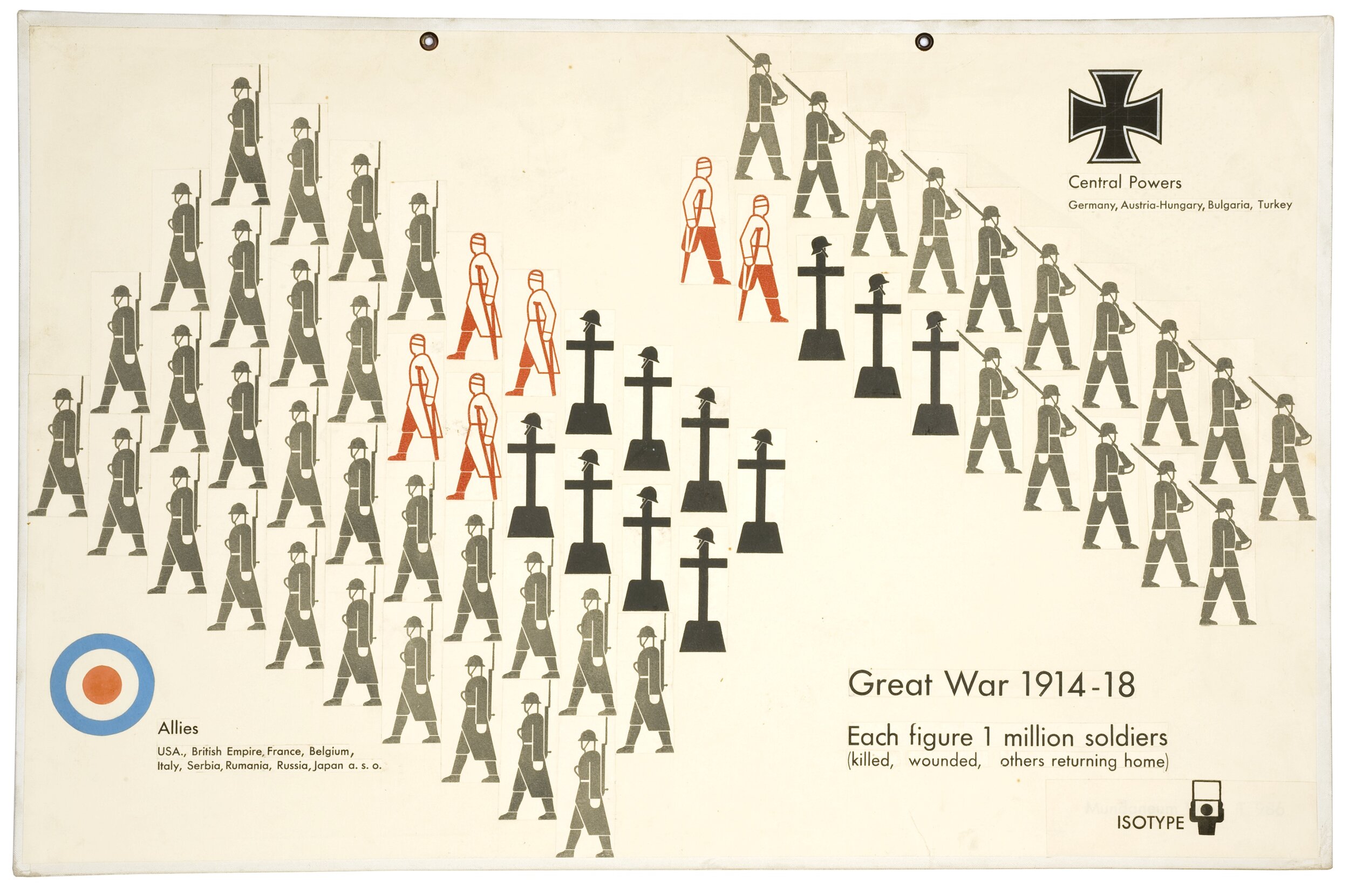
There are flags, illustrations, numbers, text. At no point are all the different types of visual information and decoration ‘too much’; instead, they harmonise perfectly. The graphic works as both communication and commemoration.

The same is true of a recent graphic by Valentina D’Efilippo. If ‘don’t decorate pie charts’ is a sensible rule, then ‘don’t decorate multi-dimensional scatter charts’ is surely even more sensible. However D’Efilippo shows that, in the hands of the right designer, even a complex chart about deaths in warfare can become not just information, but great art.

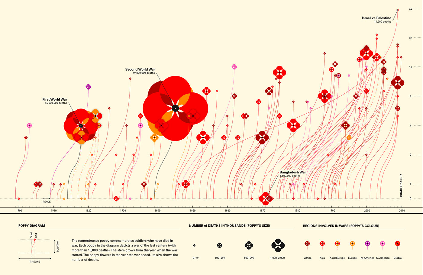
Image credit: Valentina D’Efilippo, https://www.poppyfield.org/

VERDICT: Break this rule infrequently

*Optical illusion answers: Wedge A is the cafe wall or shifted chessboard illusion. The parallel lines between staggered rows of squares appear sloped not straight. Wedge B is the Hermann Grid illusion. ‘Ghost-like’ grey squares appear at the intersection points of a white grid on a black background. Wedge C is the Zollner illusion. The long parallel diagonal lines appear to tilt because of the angle of the shorter parallel lines intersecting them. Wedge D is the bulging chessboard attributed to Akiyoshi Kitaoka. The positioning of tiny little squares inside the main chessboard squares, makes the whole board appear to bulge. In Wedge E we see a diamond shape in the centre of those lines, even though there is no diamond, just straight lines changing direction.
Sources: World War 2 data, the World War Two Museum of New Orleans; UK occupation data from Office of National Statistics; London’s most common trees from the London Datastore; largest producer of chillies statistic from the Guinness Book of Records

More data viz advice and best practice examples in our book- Communicating with Data Visualisation: A Practical Guide

Rule 12: No 3D pies

In this blog series, we look at 99 common data viz rules and why it’s usually OK to break them.

by Adam Frost

Most charts are wrecked by adding 3D - and pie charts are no exception.

The 3D versions of the charts above are an insult to both accuracy and aesthetics. A chart’s job is to convey truthful information in a visually persuasive way, and a 3D chart achieves neither goal: severing the link between the datapoint and the size of each element, and adding visual clutter and complexity that breaks the clean outline of each shape and the harmoniousness of the overall composition. Adding ‘depth’ simply makes the chart shallow. 

We’ll look in detail at why 3D is such a cognitive and aesthetic disaster in later rules. But the short answer is: for the same reason that watching a 3D movie is harder work than watching a 2D movie.

How is this possible? Surely the 3D version more closely approximates the ‘real world’, so it should be a less arduous viewing experience.

But our eyes see in two dimensions, not three. Our vision works by taking lots of 2D snapshots and passing them to our brain, which converts them into three-dimensional objects. By creating 3D charts, we interfere with this efficient system.

2D charts are much easier for our eyes to interpret, we can more quickly use them as springboards for recreating the real-world objects and situations represented by our data. Most complex information that we encounter will be flattened in this way: think of how an architect will share their designs for a building in a series of 2D plans rather than a single 3D composite. Or if I ask you to draw a map of where you live and how I would get from your house to the station. You will draw it looking down on a flattened landscape. Removing the third dimension clarifies.

So our charts should almost always be 2D for the same reason our icons should be 2D. They are easier to process and closer to how our brains imagine objects in the abstract.

This principle particularly applies to pie charts which, as we have discussed before, can be hard enough to read in 2D. Adding a third dimension means that all the perceptual distortions that apply to circles get multiplied.

Have a look at the 3D circles below. Which line do you think is the longest? And the shortest?

When I tell you that the green line is the longest (10% longer than the others - measure it!), this should give you some idea of what we’re up against. In fact, the only reason for using a 3D pie that I can think of is when you are actively trying to actively mislead an audience. When you are trying to artificially inflate the size of your market share and make, say, a 19.5% market share look bigger than 21.2%. What sort of scoundrel would stoop to such a cheap trick?

Image credit: Engadget

If there were aesthetic advantages in using a 3D pie, perhaps their usage could be justified in certain circumstances. Occasionally a student will tell us that they think 3D pies are ‘cool.’ But I used to work for the Guardian and I’ve met cool people and - trust me - they like Joy Division and kale smoothies*, not 3D pie charts. For most people, 3D pie charts are terminally uncool, the epitome of corporate cheese, making the French name for a pie chart - un camembert - horribly appropriate.

So surely this is our first unbreakable rule? Yes, I think so. Except, of course, in the real world, your boss might love them. Certainly I’d be lying if I said I’ve never taken the money and made one. I needed a five-hour shower afterwards, and I still felt dirty, but I did it. If this is you, all you can do is try to limit the damage: try to minimise the tilt so it’s as close to 2D as possible, remember that the numbers in the foreground will look bigger, particularly because they will benefit from the thick coloured band that the backward tilt adds to their edge, so think hard about whether this is distorting the story or misleading the audience.

Rules 2-10 should be closely adhered to: you’re already stretching a pie to breaking point, so now is not the time to experiment with subverting other rules. Most importantly, avoid other visual effects, so no starting at 3 o’clock or exploding out a wedge or adding drop shadows or experimenting with technicolor or decorating a wedge with flags or logos. It’s already pyrotechnical enough.

Verdict: Follow this rule unless it means losing your livelihood

Sources: Cheese data from USDA

*Definitions of coolness are subject to constant review

More data viz advice and best practice examples in our book- Communicating with Data Visualisation: A Practical Guide

Rule 11: Don't chain or nest pie charts

In this blog series, we look at 99 common data viz rules and why it’s usually OK to break them.

by Adam Frost

In the previous rule, I attempted to justify the use of multiple pie charts. If you’ve got three or four datapoints that you want to spotlight, then side-by-side pies - large eye-catching circles that push everything else out of their path - can be a great option.

However, these side-by-side pies work best when you are comparing single numbers, or the same wedge(s) in different pies.

What I wouldn’t endorse is linking those pies together, to show a compositional hierarchy, or how one wedge can be further segmented.

The pies in the first chart are confusing as you’re asking your audience to grasp that those two identically-sized circles mean very different things - different total amounts and different positions within an information hierarchy.* You’re also asking your audience to work out some pretty complex maths - the second pie is 2% of the larger pie, so phosphorus is 61% of that 2% and so on. 

If you do need to show a detailed breakdown, then the pie-to-bar shown in the second chart works better, as the shift in chart type clearly signals a shift in information type. Stacked bars are often deployed, although I find regular bars to be clearer in most cases. It can also be helpful to change the unit of measurement in the bar chart, as it further emphasises the fact that the bars are doing a different job (here I’ve shifted from percentage to grams). 

It’s still not perfect though. Whenever you drill down into a chart like this, you have to add crude linking lines or arrows or textual annotations to explain the relationship between the two visuals. 

If what you’re trying to do is guide your audience from an overview of all your data to a detailed look at one category, then dispensing with pies and considering other chart types is more sensible. It’s also a good idea to break the charts into separate steps rather than merge two or more parts of your story in one composite visual. (See the discussion of cognitive load in Rule 10 for why).

For example, bubbles to circle packing gives you a much clearer sense of the through line from overview to composition to single datapoint. It feels like you are starting with a shape representing the total and then zooming in and X-raying it. 

The only issue with circle packing is accuracy. The circles at the same level in the data hierarchy will be accurately-sized in relation to each other, but the enclosing circle won’t be (because of the inevitable gaps).

I’ve used bubble to circle packing as an example here, but you can use other shapes to tell stories like this, as long as the overarching visual through line is maintained.

So there are good alternatives to chaining pies together. How about nesting them? This approach is sometimes adopted when you want your audience to see a breakdown of every wedge in your pie rather than just exploding out one category.

These nested pies - usually called sunburst charts - are (I think) more visually appealing than chained pies, but bring their own cognitive challenges. Most critically, you are meant to read the chart from the inside-out, which means the outer ring - which is lower down the hierarchy - is larger and more prominent.

In the first example here, the combined wedges of India, Bangladesh, Nepal, Pakistan and Sri Lanka take up more space than their parent wedge (South Asia), even though they are identical values.

There is also the labelling issue. In most sunburst charts, the labels have to be rotated so they fit inside the wedges, which means they are impossible to read without getting a neckache. You often have to remove the labels for smaller wedges, because they are unreadable or overlap each other.

If you are going to use charts like this, it is best to de-emphasise their chart-like qualities, and treat them more like hierarchical diagrams, knocking back irrelevant wedges and using colour to keep your audience focussed on the sub-category in question. This also helps to discourage strict quantitative comparisons between child and parent categories, which, as I’ve said, only leads to confusion.

More importantly, just as there are better alternatives to chaining pies, so there are better alternatives to nesting them when you want to show a compositional drilldown. For example, I like spider diagrams.

With spider diagrams, there can be issues with double-counting - some audiences don’t immediately grasp that the value of each bubble is the total of all the bubbles below it in the hierarchy. But I think this chart immediately conveys a sense of both overview and detail, there is more space for labels, and furthermore all those bubbles are proportionately sized to each other (unlike those arcs in our sunburst chart).**

There are also treemaps.

These charts are sometimes criticised because it can be hard to accurately compare the rectangles as they change in width and depth, and labelling the smaller values is impossible. But if you’re trying to give an audience an overview, particularly when you have a dominant sub-category, then treemaps can be the perfect choice. They fill the screen with colour too.

To conclude then, should you stick to this rule and avoid chained pies and sunburst charts? Most of the time, yes. Other charts will usually convey the same information more effectively. Although sometimes, just as you think there’s no earthly use for a chart like this, a story comes along and suits it perfectly. 

Verdict: Follow this rule most of the time.

Data sources: Our World in Data/FAO land area data, Priya D’Souza Communications - Qatar data, Biomass distribution of Earth data, Percentage of Parliaments that are female data from World Bank, composition of the human body data from John Emsley’s book, Nature’s Building Blocks, Population breakdowns from populationpyramid.net  

*For more on the problems of segmenting pie slices, see Dona M. Wong’s exceptional Guide to Information Graphics (Norton, 2010), p78-9.

**One caveat: at the time of writing, spider diagrams are not native to Powerpoint, Illustrator or any of the most common free online tools. But there are fairly simple workarounds. First generate correctly-sized circles (using e.g. Raw’s circle packing tool, or Illustrator’s pie chart tool, or any other tool that sizes circles by area, not diameter). Then use a vector-editing tool like Inkscape or Illustrator to position the circles. In fact, now Powerpoint accepts svgs, you can use Powerpoint too (you’ll need to convert to shape first). It’s a bit fiddly, but in many cases, totally worth it.

More data viz advice and best practice examples in our book- Communicating with Data Visualisation: A Practical Guide

Rule 10: No multiple pies

In this blog series, we look at 99 common data viz rules and why it’s usually OK to break them.

by Adam Frost

All composition charts become less effective when they are placed side by side. Whether it’s pie charts, stacked bars, treemaps, waffle charts or something else, they all struggle to communicate a clear message when they are multiplied. These charts are designed to show the breakdown of a complete dataset, or the relationship of one part to the rest, not to compare one datapoint to another datapoint in a different dataset.

Look at how hard it is to compare the central values in those stacked bars as they jump left and right. Which country has the highest proportion of people in their 40s? With waffle charts, the task of comparison is even harder.

If you want to compare two or more composition charts, you almost always have to editorialise first.

  • Merge or otherwise reduce the number of categories.

  • Use a bold colour to accentuate the most important datapoint.

  • Use text to make the chart’s meaning clear.

Let’s remake our stacked bar and our waffle chart.

Multiple pie charts are subject to most of these problems, and a few more of their own, as comparing two angled wedges in different pies can be even more challenging than comparing two moving rectangles or two rows of squares.

Following just one of those coloured wedges across the three pies as it expands and contracts and swivels up and swivels down is enough to make your head spin.

However, as long as you follow the same guidelines as other composition charts - editorialise and use design wisely - then multiple pies can be a highly effective storytelling tool.

In fact, as with single pies, their attention-grabbing qualities can compensate for any legibility issues and, in some cases, the fact that the audience is slowed down and made to concentrate can be an asset.

To illustrate my point in more detail, I’ll head for the airport. Because multiple pies always remind me of those rows of clocks you sometimes see at airports showing the time in different cities.

Image by Pixabay via Pexels.com

Yes, I know, it would be more efficient to have 24 hour digital displays instead - they would take up less space and it would be easier to compare the numbers - but digital displays wouldn’t be as effective, because they wouldn’t look as visually appealing, they wouldn’t make me feel anything, and I wouldn’t get the cognitive satisfaction of converting those physical shapes - the hands of the clock - into hours ahead or behind of where I am. 

Just as a circle can make us look, so a row of circles can make us look even longer.

So I’ll now briefly discuss the occasions when we do use multiple pies - ahead of other composition chart types - and how we design them so they serve the story as effectively as possible.

The most common use case is when we have several points in time or several categories where there is a dramatic difference between our key slice. Pies are often a better choice than stacked bars or clustered columns.

Of course a line chart or area chart can also tell this story. But sometimes, if you just want to call out two or three years, or perhaps it’s an introductory slide in a presentation, then side-by-side pies can isolate the key turning points more effectively.

Another use case: we might want to show consistency across categories. In other words, we would expect the slices to differ in size or to show a different ratio in some contexts, but they stubbornly don’t. Again, pies can be a more dramatic choice than the alternatives.

For me, the pies work here because it’s easier to picture what they should look like - a 50/50 split, a bisected circle - and therefore more surprising to see the degree to which they deviate from this perfectly-balanced shape.  

We also like to use side-by-side pies to represent results where people have been encouraged to choose multiple options in a list: tick any pizza toppings you like, tick any countries you’ve visited, that kind of thing. In other words, if you add up all the responses, the total would be a lot higher than 100%, as every option can potentially be ticked by 100% of people. Multiple pies or doughnuts can work in these situations, particularly doughnuts as you can drop an icon in the centre to illustrate the category.

Furthermore, I like using multiple pies in combination stories, where the pie almost becomes a bullet-point introducing a secondary level of detail.

One final point on side-by-side pies - and in fact pies in general. Much is made of the fact that pies take up space, and they ‘aren’t worth the space they take up’, to quote Cole Nussbaumer Knaflic. Drawing a huge circle and filling it with colours just to show two or three datapoints - what a waste of ink! A bar can convey the same information in a fraction of the space.

But remember we are communicating now, not analysing. Whereas information density is useful during the analysis stage - most dashboards cram the screen with charts - it is catastrophic when you are trying to communicate, as the example below shows.

Source: Stephen Few, Perceptual Edge

When you are telling a story, limiting the amount of information you show and clearing a space around it is vital. Cognitive load theory teaches us that this is the only way we can effectively take in new information: when it is packaged into small, coherent units, spaced out and disclosed progressively.  

Looked at in this light, the ‘inefficiency’ of a pie chart becomes its superpower. It not only forces you to take up a large amount of space with a small number of relevant datapoints, but it also enforces a frame, it makes its own white space around it, and clearly signals that this is one self-contained unit of information.

That white space - which is dead space when you are analysing data - here becomes breathing room, headspace, respite. 

Let’s imagine you’re telling a story about prejudice towards immigrants.

Why wouldn’t you fill the screen with these four numbers? They’re central to your story and you want people to pay attention to them.

Pie charts are superb amplifiers, so the only real danger is that they will amplify bad decisions as well as good ones. Used correctly, they are powerful narrative tools and multiplying them can be a great way of dramatising those key numbers, those vital statistics, the facts that deserve to be dwelt on for longer. 

Verdict: Follow this rule sometimes

Sources: Population data from Populationpyramid.net, Homophobia in the UK data from NatCen BSA, US gender in workplace data from Bureau of Labor Statistics 2019; British phobias data, Yougov; Qatar population data, Priya D’Souza Communications; Prejudice against immigrants data, Pew Research Center

More data viz advice and best practice examples in our book- Communicating with Data Visualisation: A Practical Guide

Rule 9: Give your pie charts a key (or legend)

In this blog series, we look at 99 common data viz rules and why it’s usually OK to break them.

by Adam Frost

First things first. The terms legend and key originally meant different things. The key was just one part of the legend (I feel like I’m describing a story in the Arabian Nights). In map-making, where the terms originated, the key listed all the symbols used on the map and described what they were - e.g. a circle with a cross on top = a church with a spire. The legend included the key but also all kinds of other information - the map scale, the projection, sources, who made it, copyright details and so on. 

But nowadays, key and legend are used interchangeably to mean the same thing, and because common usage should always be your guide, you can use either too. I’m going to use key just because I prefer the unlocking metaphor - reading it reveals the chart's meaning. I also like key because it always makes me stop and think before I add one. Why does this chart need a key? Why have I locked its meaning up? Isn't the job of data visualisation to release the stories locked inside spreadsheets (all those overcrowded cells...)?

This is particularly the case with pie charts. Although ‘Give your pie chart a key’ may not exactly be a rule, it’s definitely an accepted convention. At the time of writing, if you insert a pie chart into Powerpoint, it will automatically add a key, as will ggplot, Datawrapper, Flourish, Venngage and most of the other tools we use. Default pies from Powerpoint, Datawrapper, Flourish and Venngage are shown below.

As you can see, all these tools put the pie chart key in different places: ggplot on the right-hand side, Powerpoint and Venngage underneath, Datawrapper and Flourish at the top. But they all add a key. 

Datawrapper puts a text label and number on each wedge and duplicates the text labels in the key; Flourish puts a number on each wedge, but leaves the text labels on the key; Venngage is similar except the numbers are outside the wedges. Powerpoint leaves the wedges unlabelled.

This lack of consensus about the position and purpose of the key suggests a more fundamental problem: nobody knows what to do with it.

The reason for this is because the ideal position for a pie chart key is nowhere.

If you’re having to resort to a key for a chart as simple as a pie, there are usually deeper storytelling problems to address. Too many wedges? An unclear title? The wrong chart for the story? 

The only exception I can think of is if you’re using multiple pies or repeating pies throughout a presentation. In these cases, a key for the first instance of the pie can be helpful. But even here, the title can often do the job for you. I’ll cover this in the next rule.

In all other cases, asking your audience to keep glancing from chart to key and back again involves them expending cognitive effort without any commensurate reward. Pie charts are just not semantically dense enough to give the reader any cognitive or emotional satisfaction from ‘unlocking’ them.

True, a key can sometimes look neater, making your chart appear less cluttered. But this is one of the few examples of an aesthetic approach - a cleaner design - leading to more work for the audience.

So keep your labels and numbers either on the chart (if there’s space) or next to the slices. You might end up putting the numbers on the slices and the labels outside. Sometimes the smaller wedges need to be labelled differently, as there isn’t always enough space to put either label or number on the slice itself, so you have to use a connecting line. Try to be as consistent as you can (without torturing the content) and remember that pie charts aren’t the easiest charts to read, so you are trying to minimise any extra obstacles between your audience and the chart’s meaning. 

If your pie chart is interactive, you might be able to remove even more text: perhaps keeping the category labels, but only revealing the values on rollover.

The other thing to remember is that where only two or three of the wedges are relevant for your audience, you only have to put numbers on those wedges.

In fact, often your title can make the chart’s message sufficiently clear, and you can keep your pie chart clear of any numbers at all, and let the shapes alone work their magic.

Verdict: Break this rule whenever possible

Sources: Animal biomass data from PNAS, Japan population data from Population Pyramid, Livestock data from HYDE/FAO via Our World in Data

More data viz advice and best practice examples in our book- Communicating with Data Visualisation: A Practical Guide