Rule 8: Limit the number of colours in your pie charts

In this blog series, we look at 99 common data viz rules and why it’s usually OK to break them.

by Adam Frost and Tobias Sturt

We often have this conversation with clients.

CLIENT: ‘What colours should the slices in my pie chart be?’
US: ‘Use the colours in your brand guidelines.’
CLIENT: ‘But the colours in our brand guidelines are horrible.’
US: ‘Not as horrible as everyone picking their own colours.’

The fact is, 99% of the time, you shouldn’t need to think about which colours to use. Unless it’s a personal project, or you work for a new business that doesn’t yet have them, your organisation’s brand guidelines should make it clear which colours your charts should be.

And this is a Good Thing.

Most of us are not professional designers and have no idea which colours sit well together. The people who develop software applications seem to have no idea either. There are a few heroic exceptions (e.g. Datawrapper), but in most chart-making tools, the default colours will be boring, clashing, inappropriate for your story or (somehow) all three. Here are the current defaults in Powerpoint and Spotfire.

rule_8-colours-ppt-spotfire-01.png

Most importantly, brand guidelines ensure that publications and presentations look visually consistent, which means that your audience can spend more time focussing on the information, and less time figuring out how to read it.

Here are some example brand guidelines.

rule_8_daily_planet_brand_guidelines.PNG

Image by Tobias Sturt

So what we’re talking about here is how to use your brand colours, rather than which specific colours to use. And if you don’t have brand guidelines, or you do, but they don’t have enough information to help you choose chart colours, then I hope that this summary will act as a starting point for evolving your own charting guidelines (which if you’re an organisation that visualises a lot of data, you need).

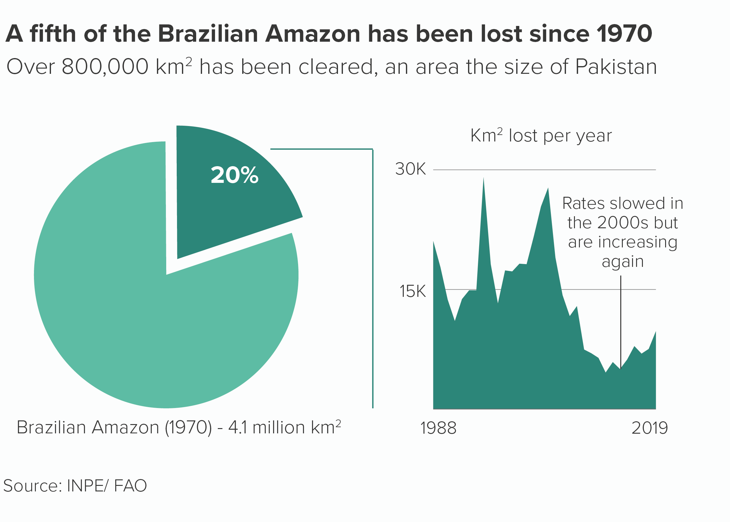
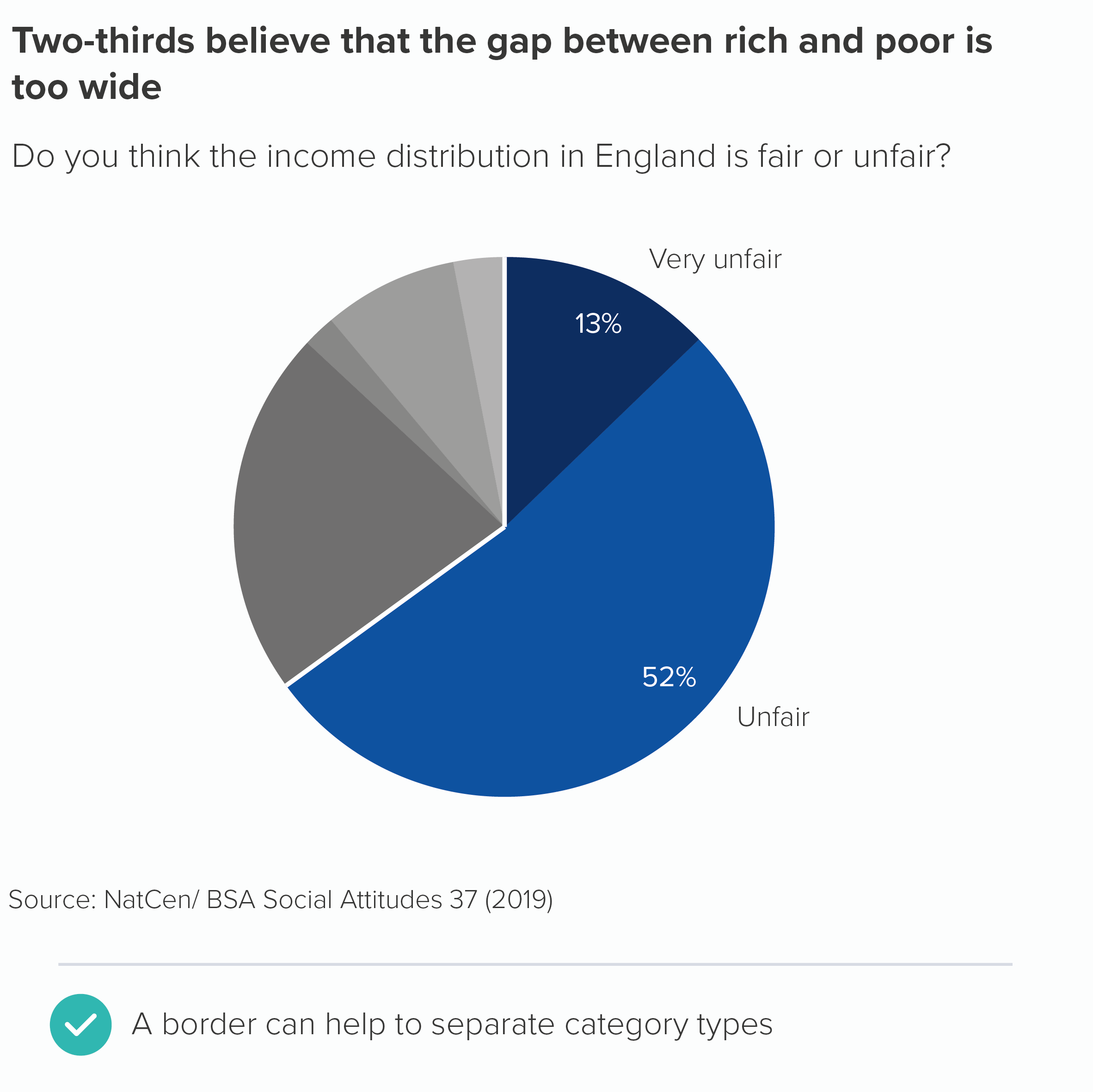
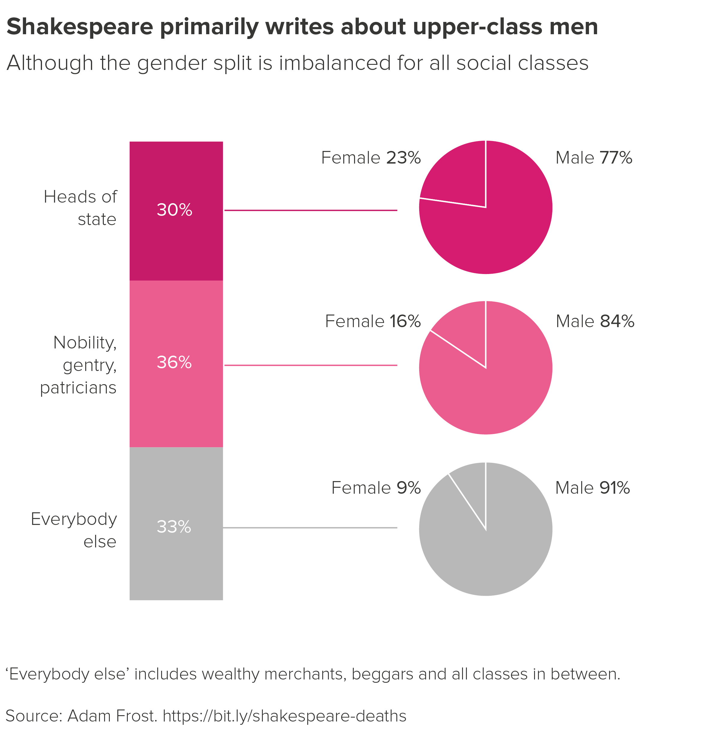
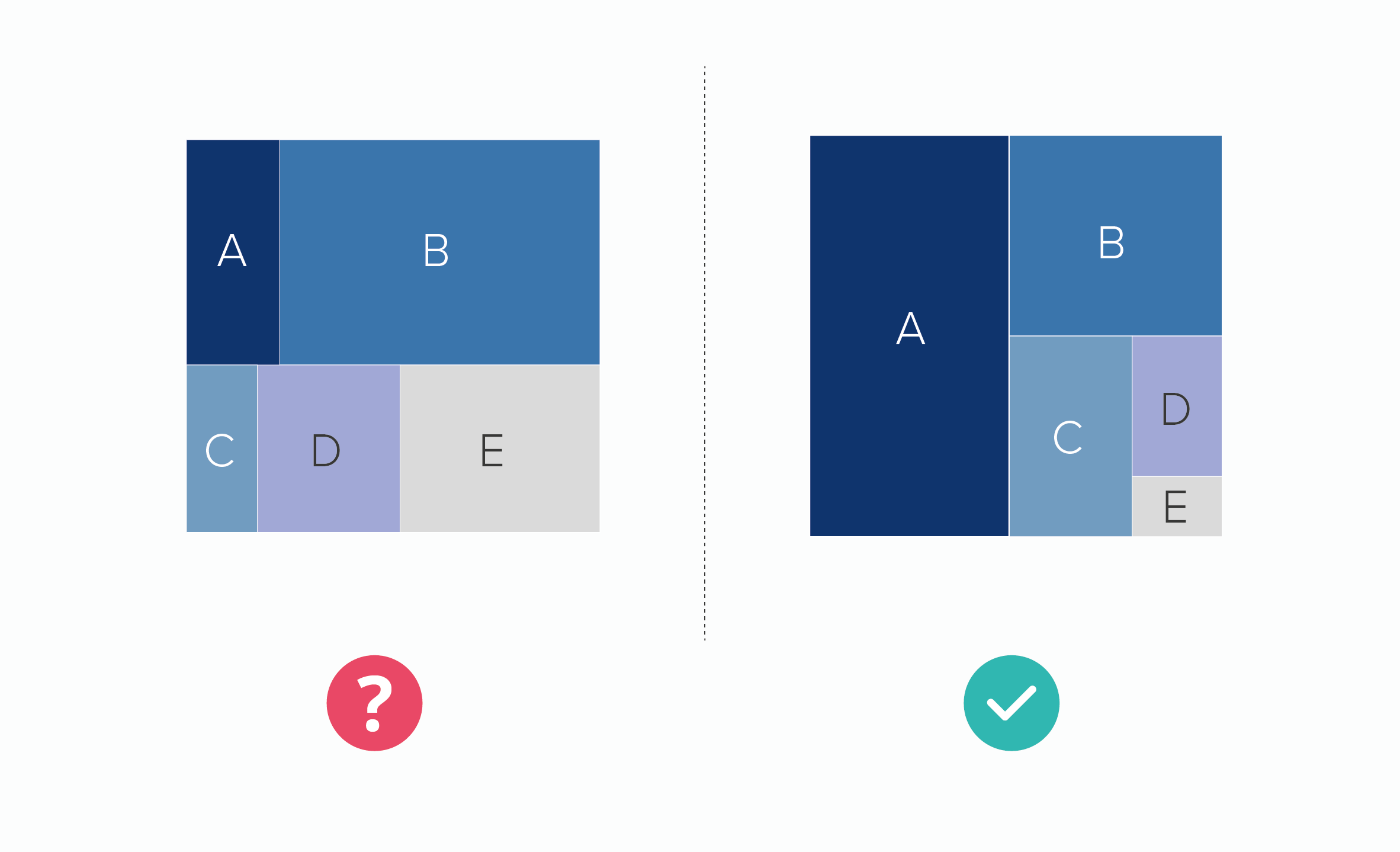
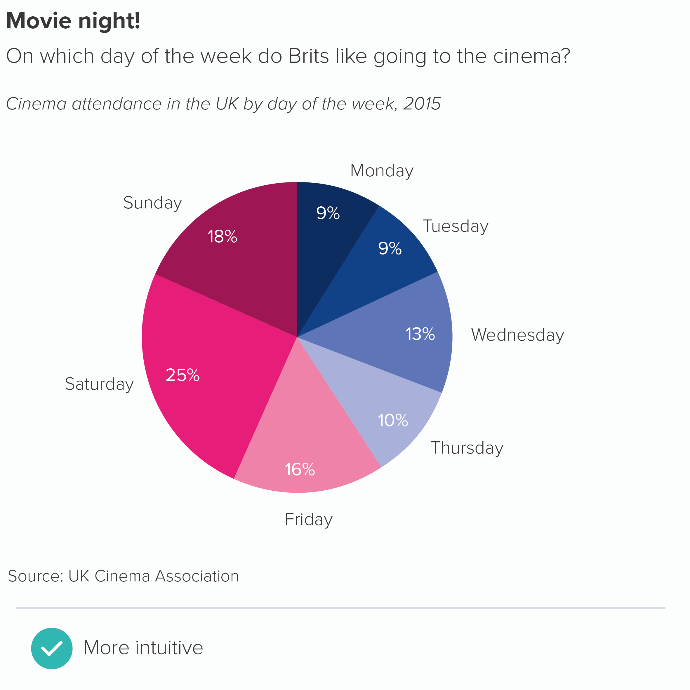
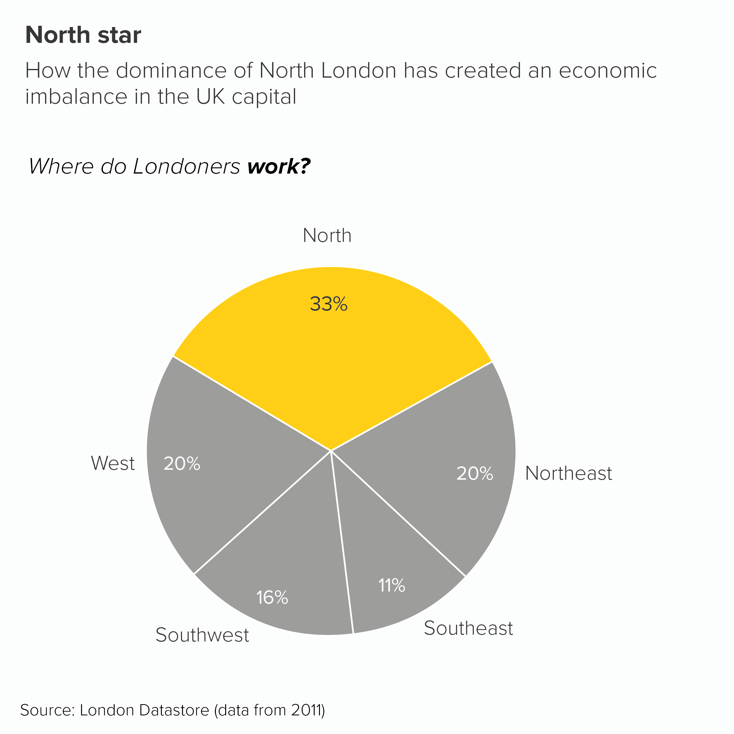
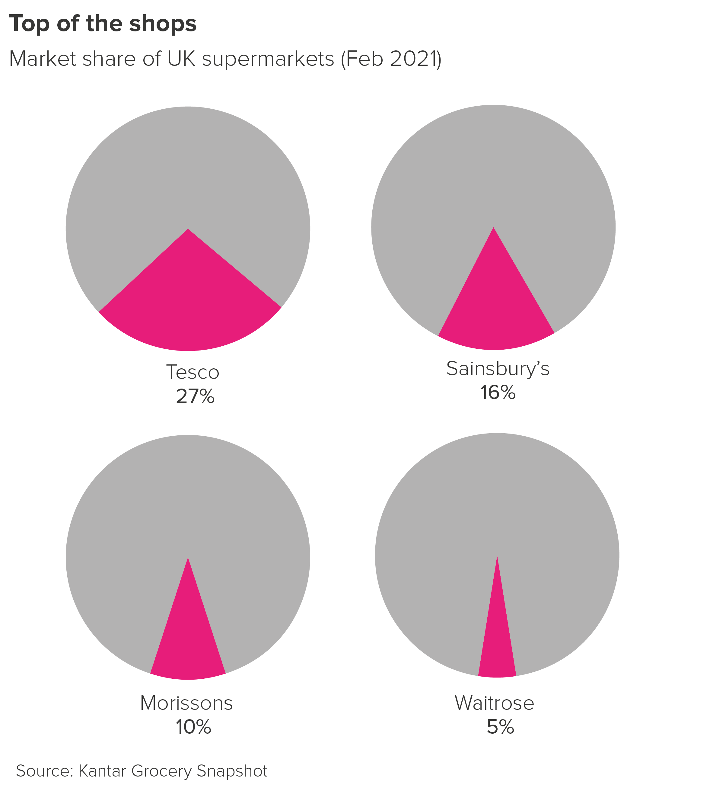
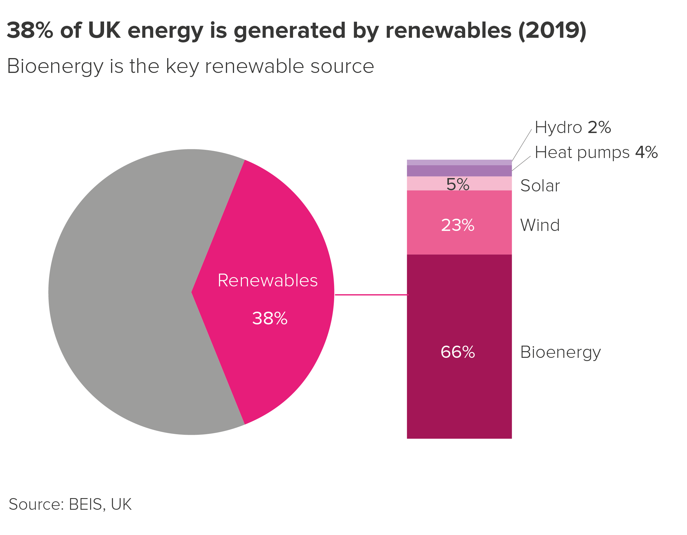
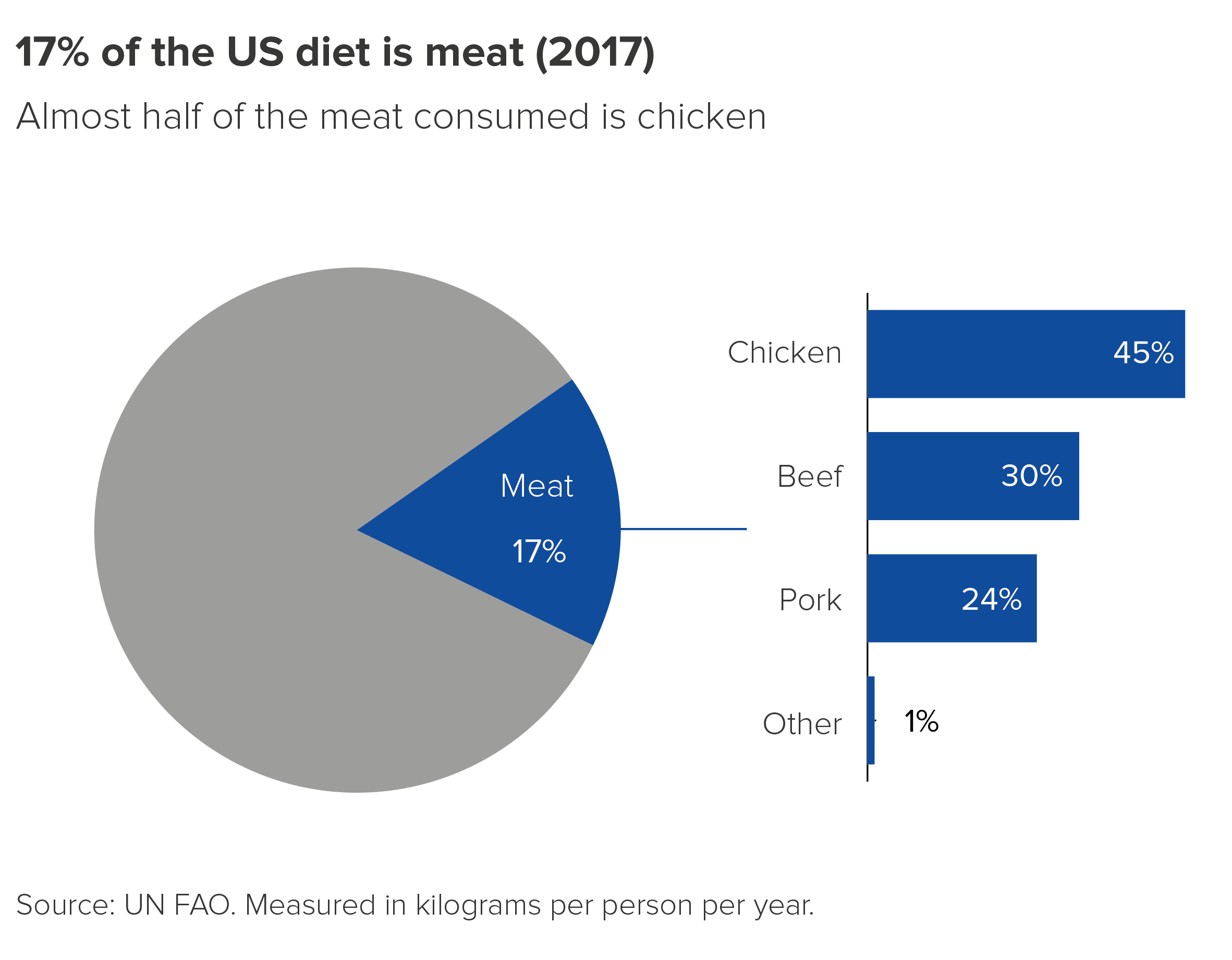
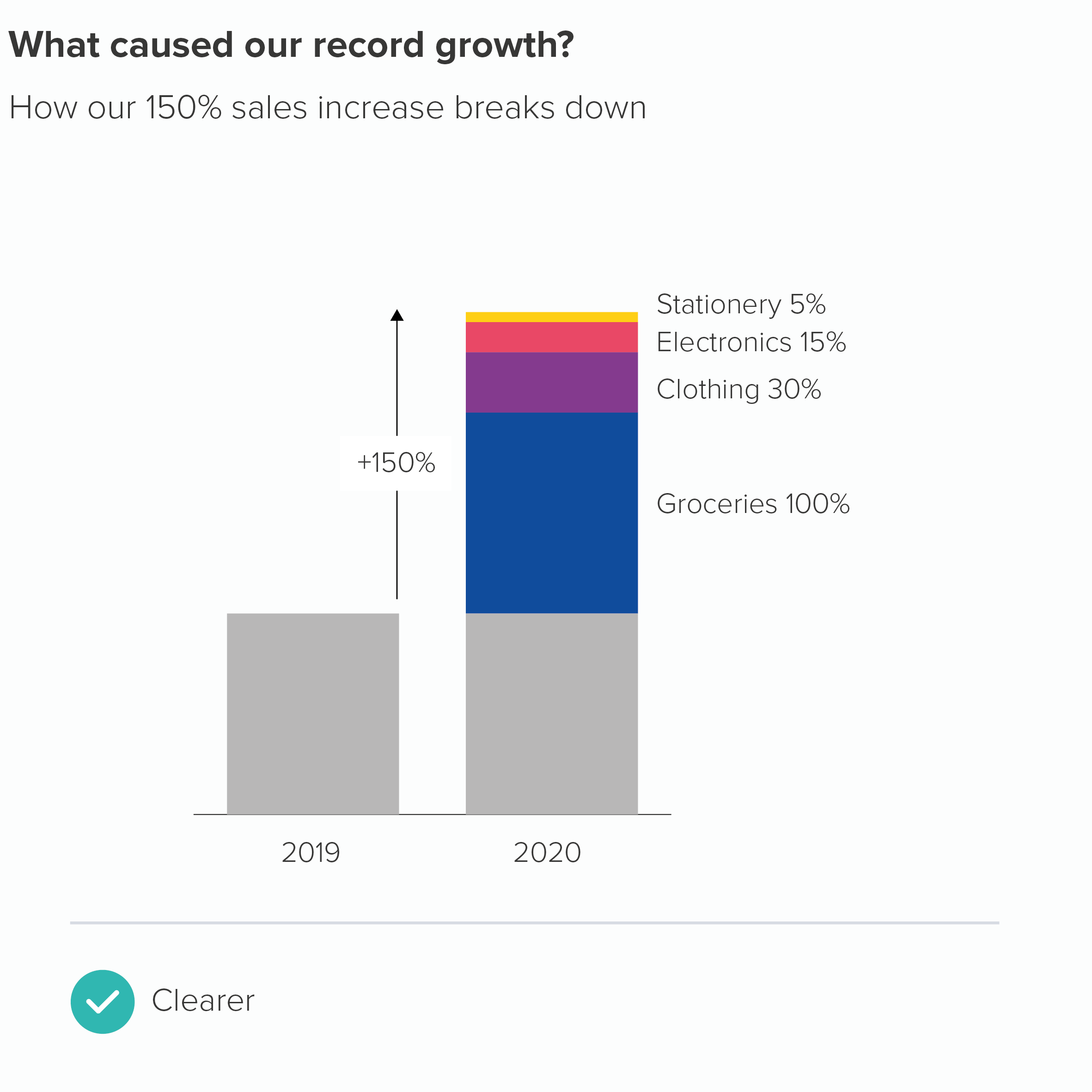
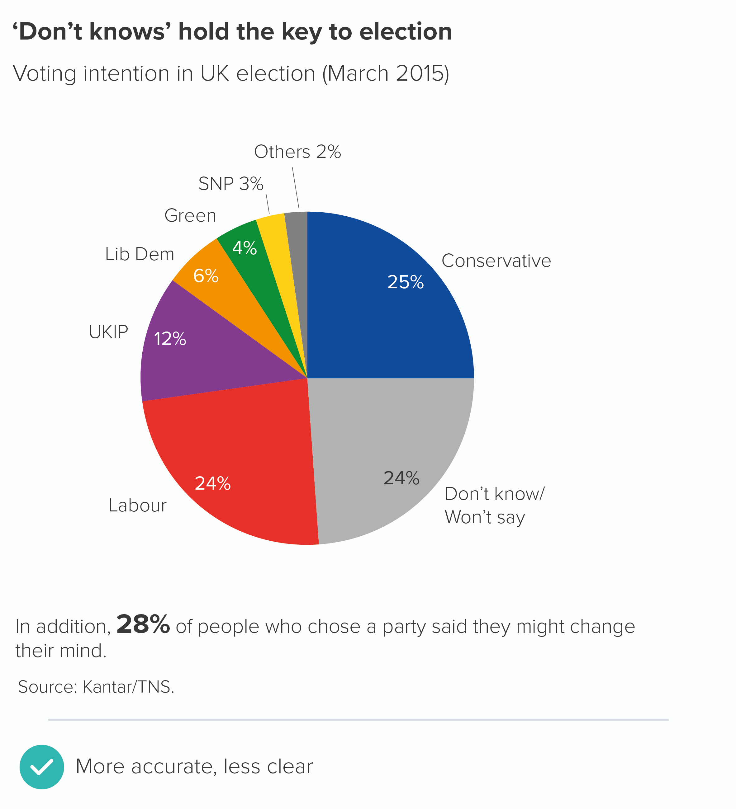
OK, back to the rule. ‘Limit the number of colours you use in pie charts.’ In most situations, this is a good idea. You will usually have a hero slice - often your brand or your country or just the largest slice - that you will want to highlight in some way. So use your brand colour, or a similarly strong colour from your guidelines, for that hero slice. Then knock back the others, perhaps with greys or light blues.

However, sometimes you will have a group of slices that are all important, or all linked in some way, and you might want to call them out and de-emphasise the slices that remain. So you might use your key brand colour alongside tints or shades of that colour. This, by the way, is a cunning way of sticking to brand guidelines as a tint is technically the same colour (or hue), just in a lighter or pastel shade, whereas a shade is again the same colour but a darker version. Therefore you haven’t introduced a new colour to your brand guidelines, just ‘extended’ the current options. Mwa ha ha.

Anyway, in these situations, you could use tints or shades of your main colour to imply that the important wedges are a group. Then you would use grey for the other slices.

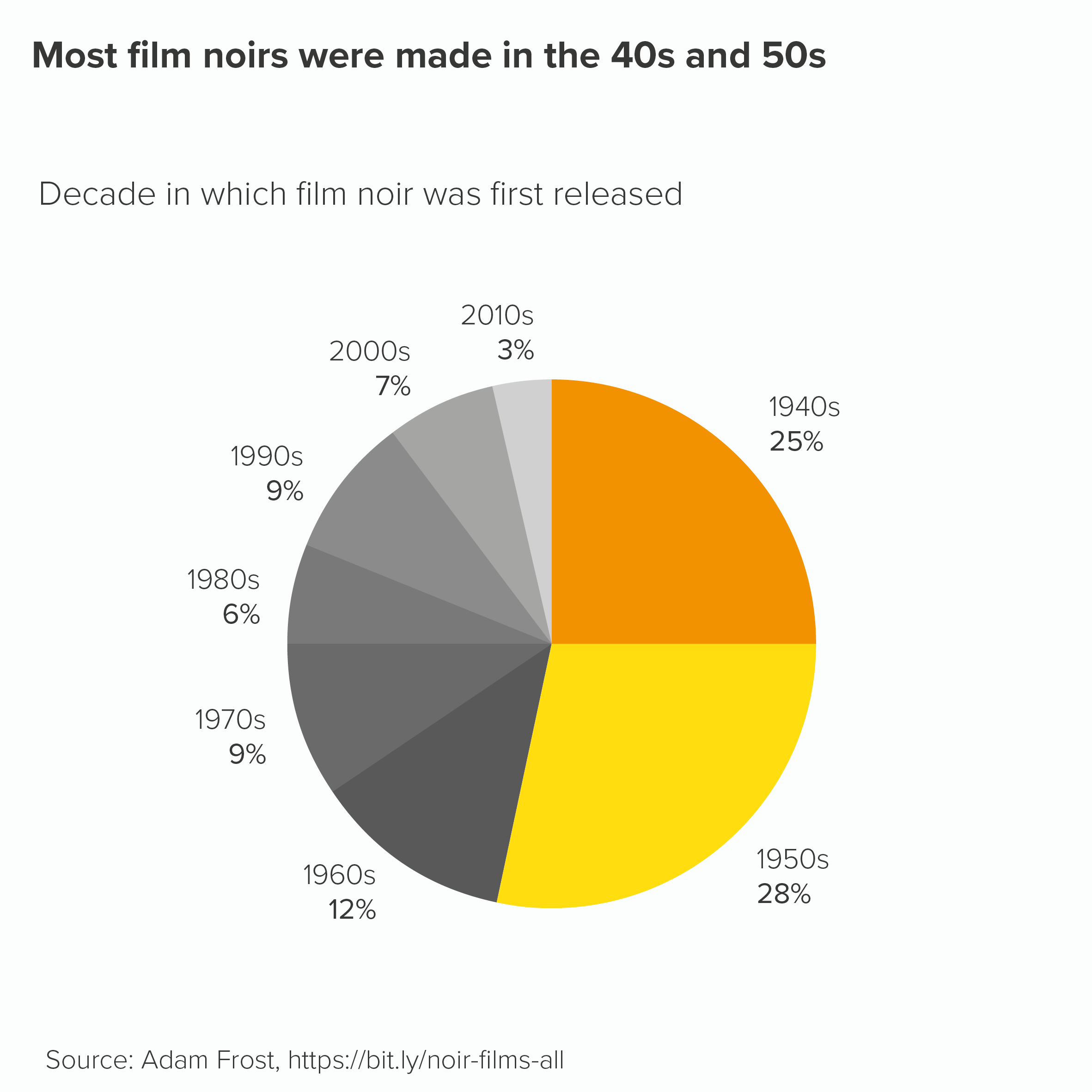
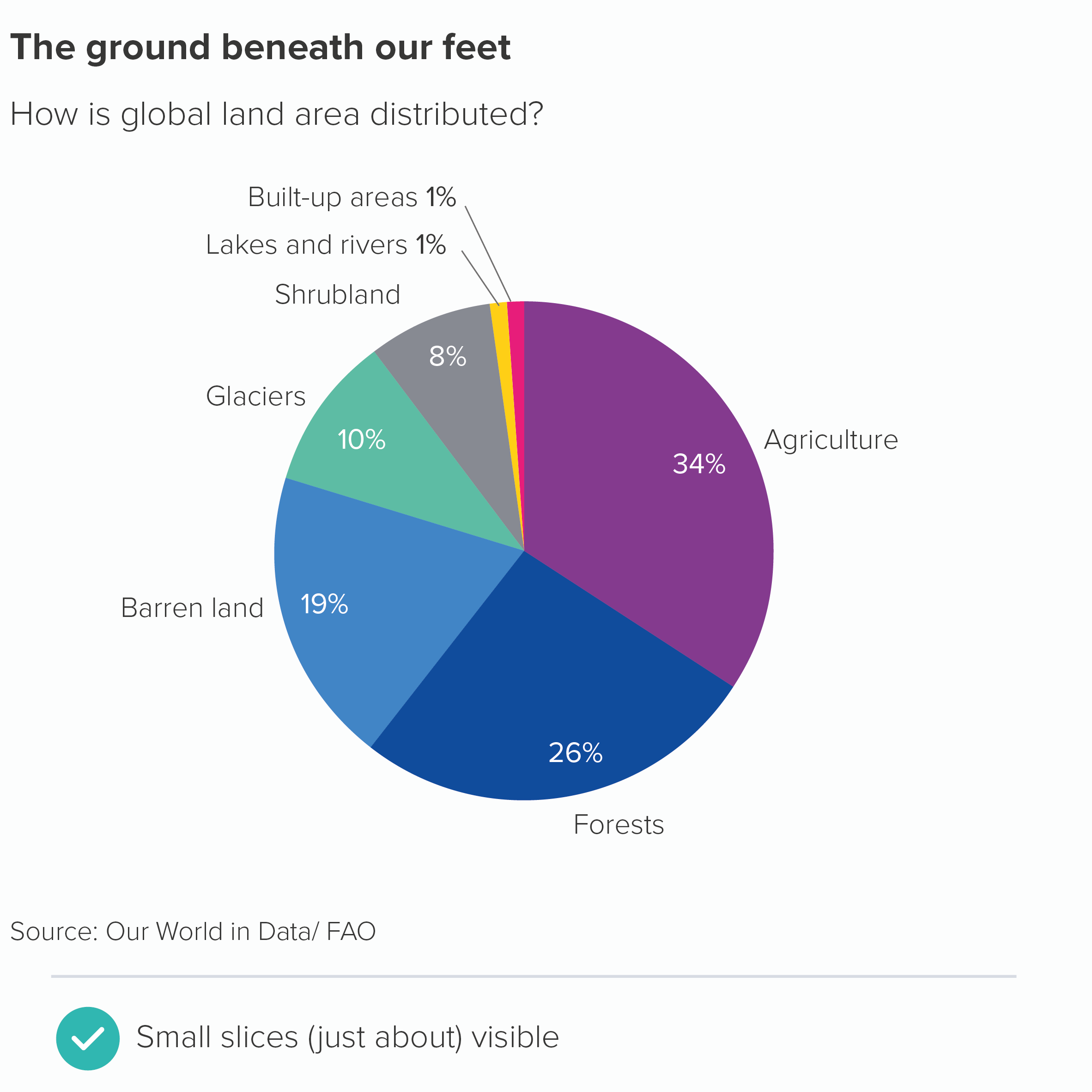
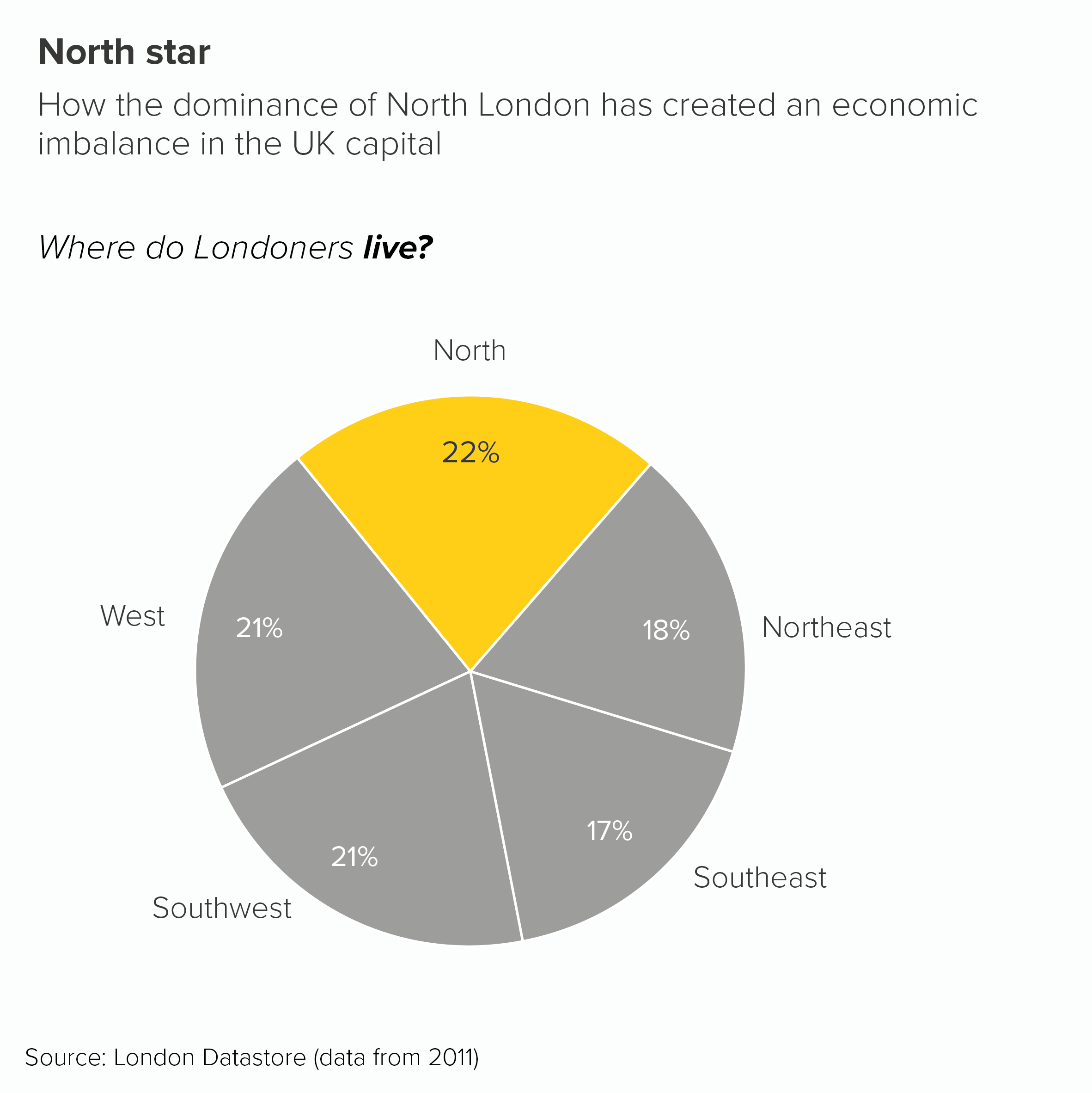
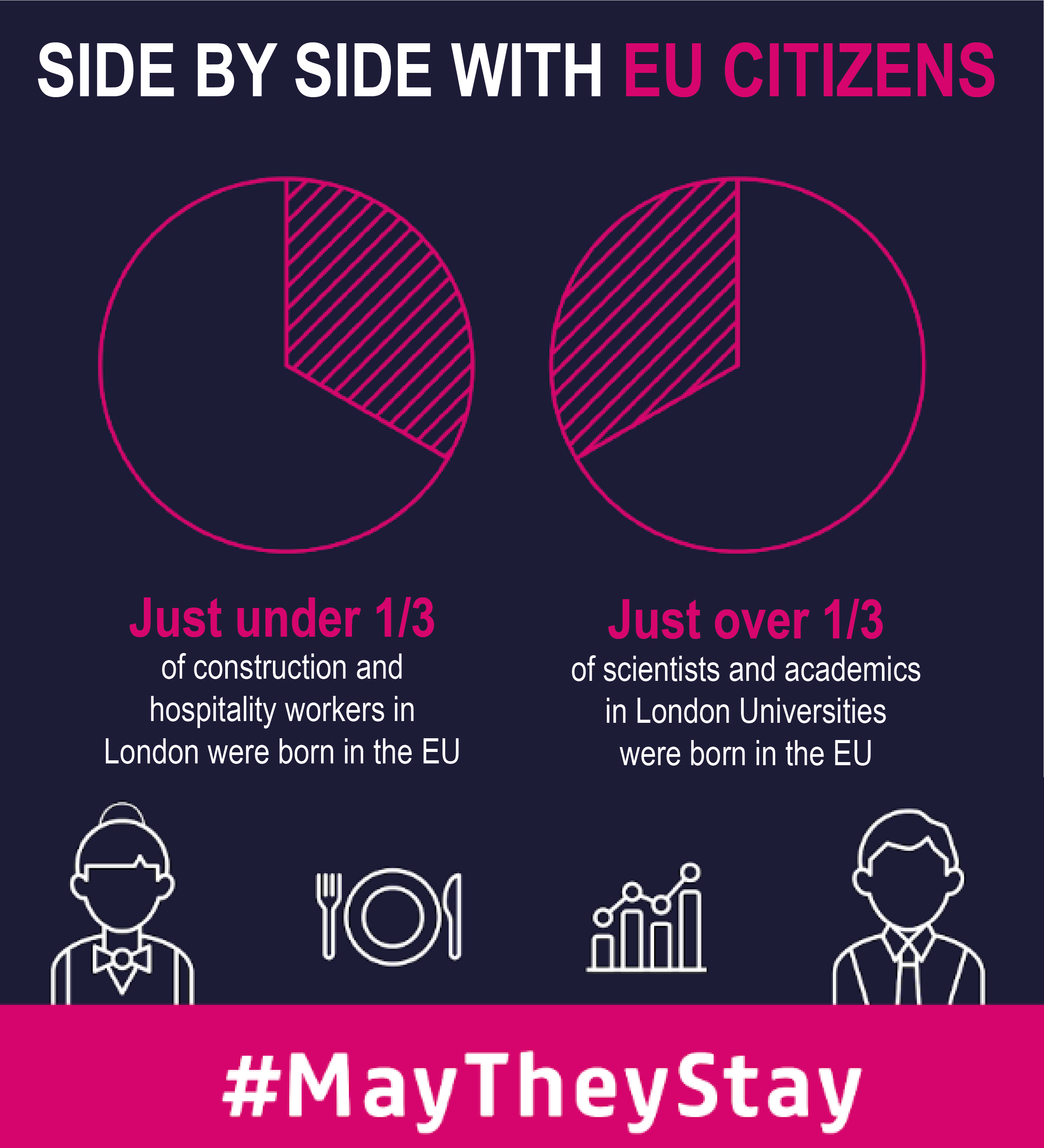
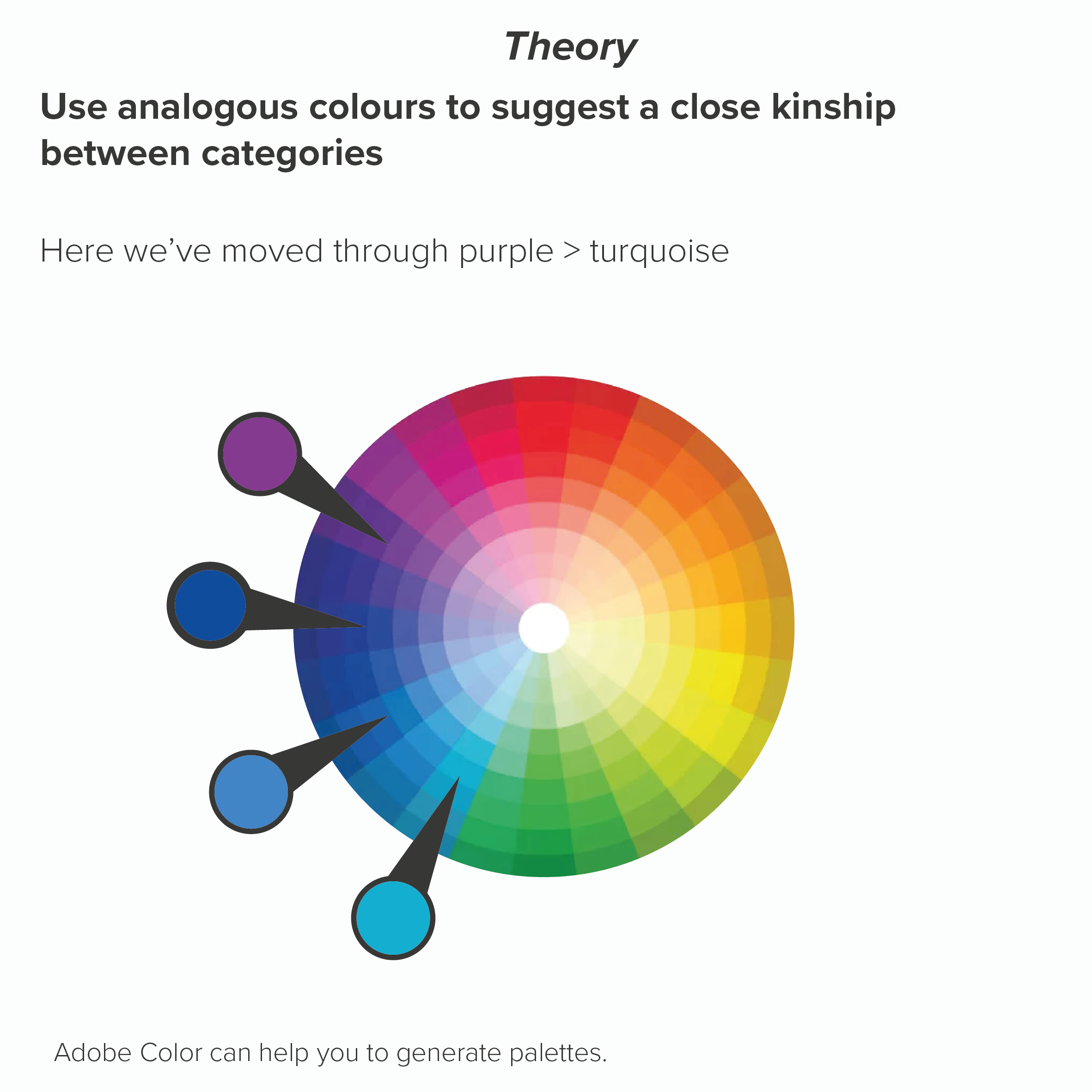
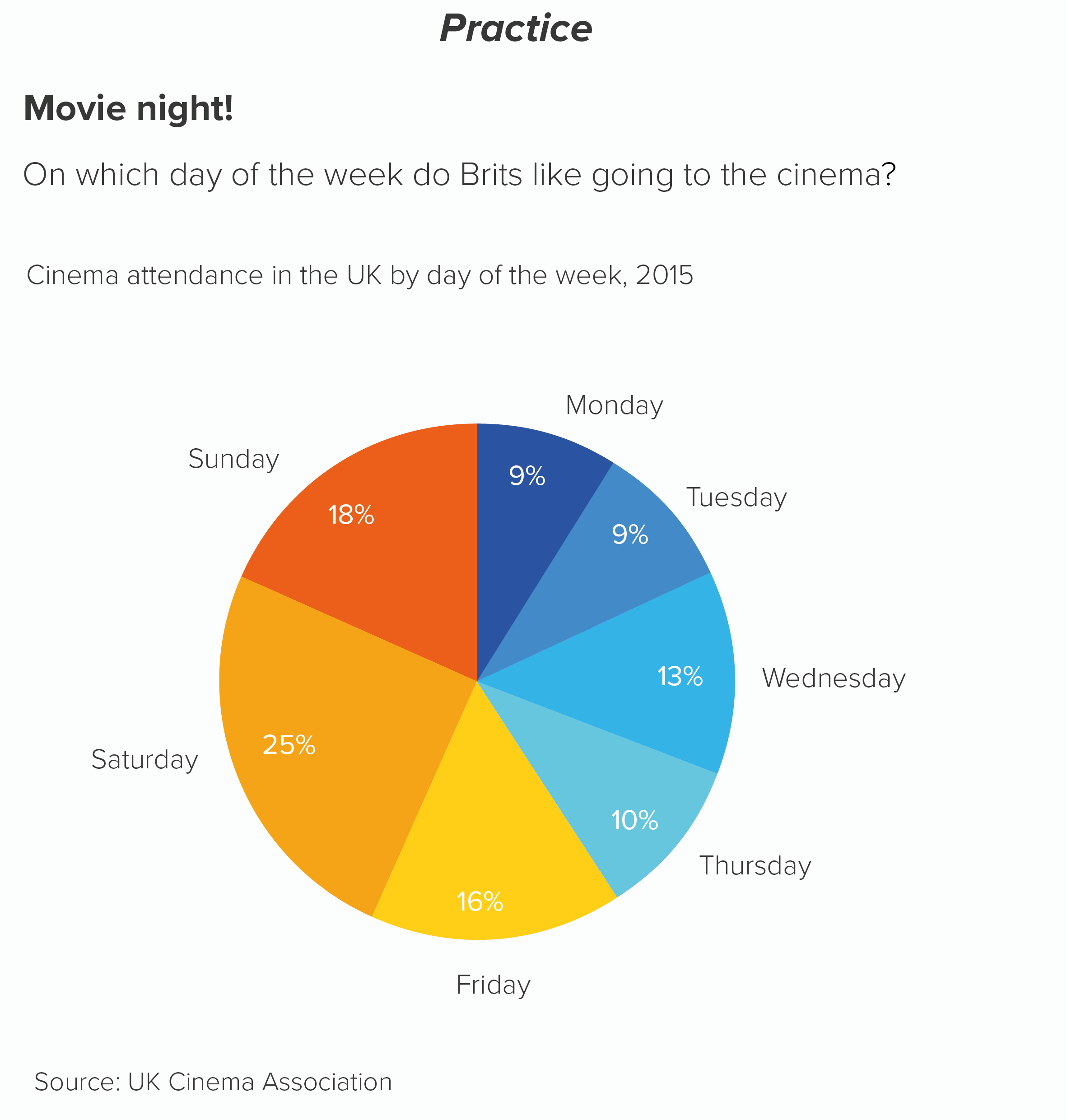
Sometimes all your slices are equal in importance. Using colour to call out one or several wedges would suggest a hierarchy of importance that doesn’t exist. The question then becomes: are your categories similar types of thing? E.g. all things you wear, or all kinds of transport, all types of fish? In which case, you would stay pretty close to your brand colour again. Perhaps your brand colour for the first slice, then analogous colours for the other slices, moving round the colour wheel. This signals to the audience that there is kinship between the categories.

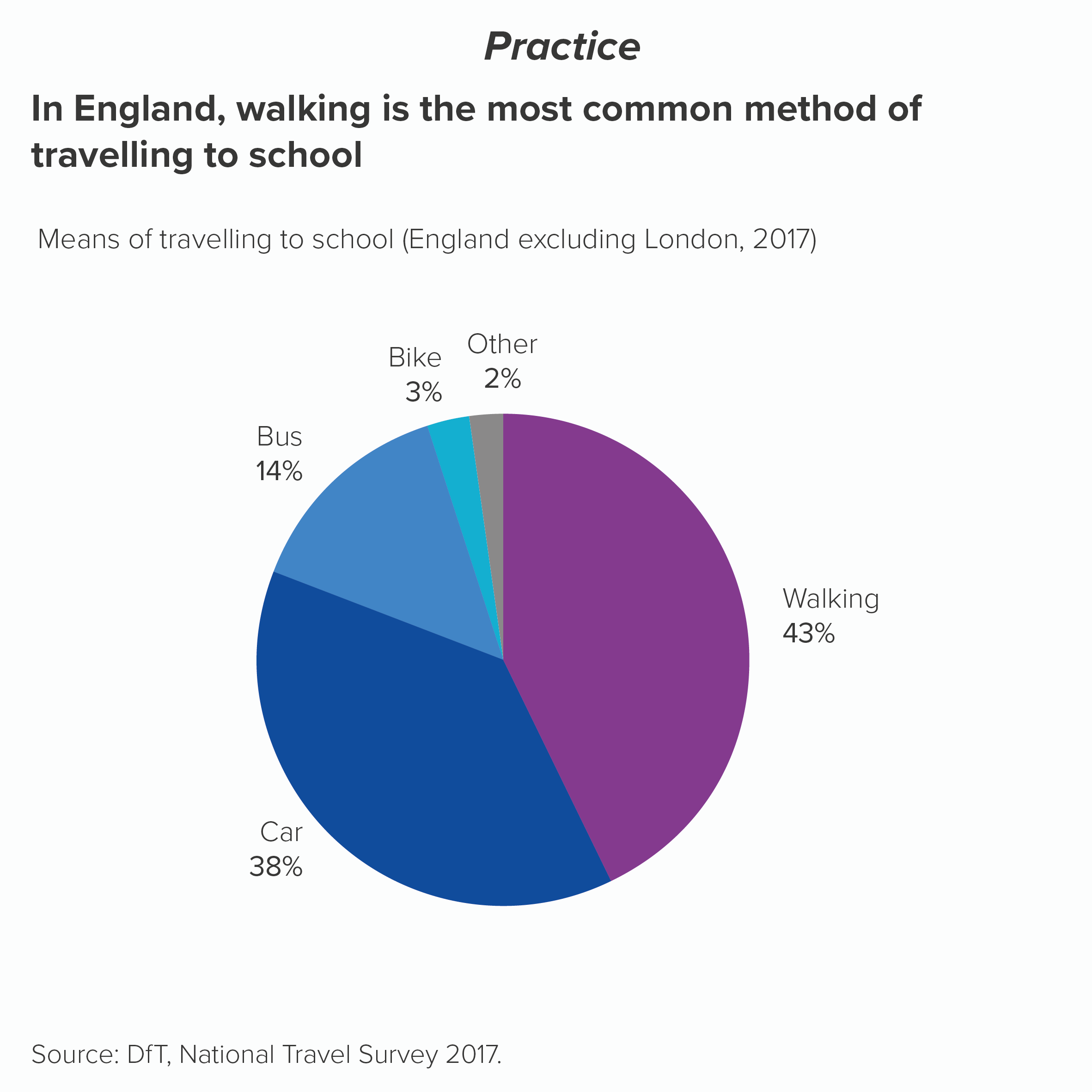
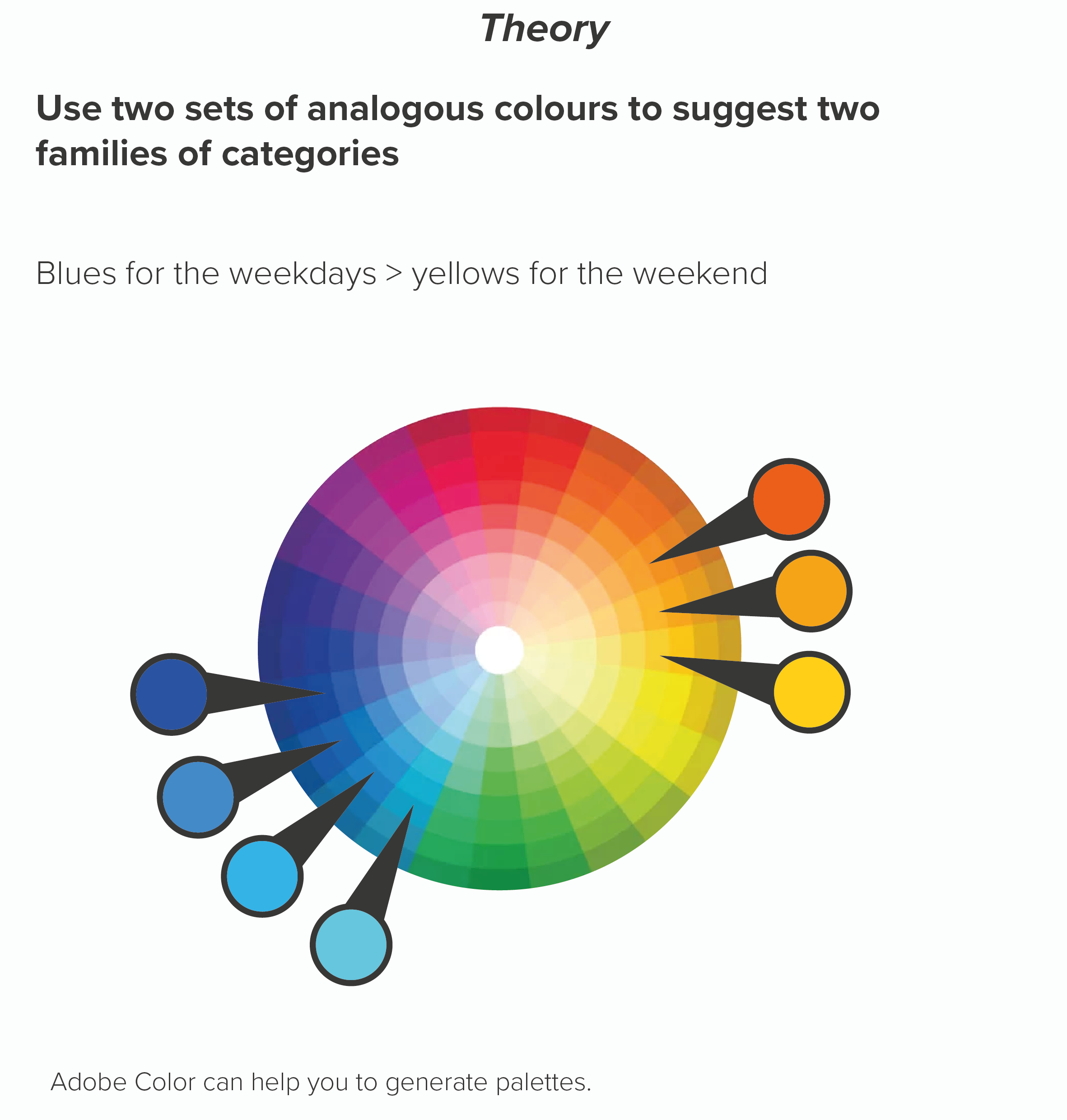
Or maybe there are sub-groups in your data. Four types of fruit and four types of vegetables. Four European countries and three South American countries. The days of the week versus the weekend. Here you might want your colours to help signal these groupings.

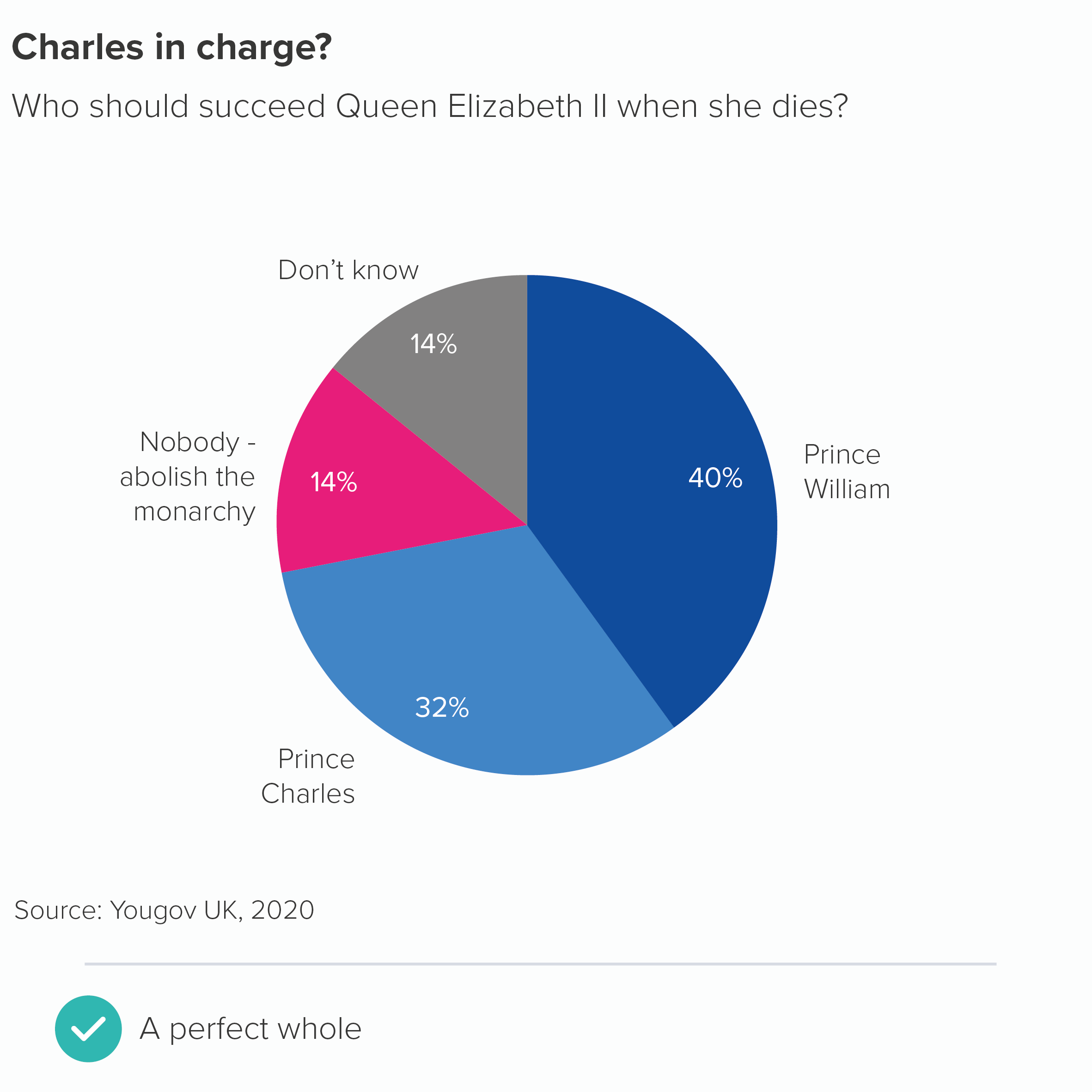
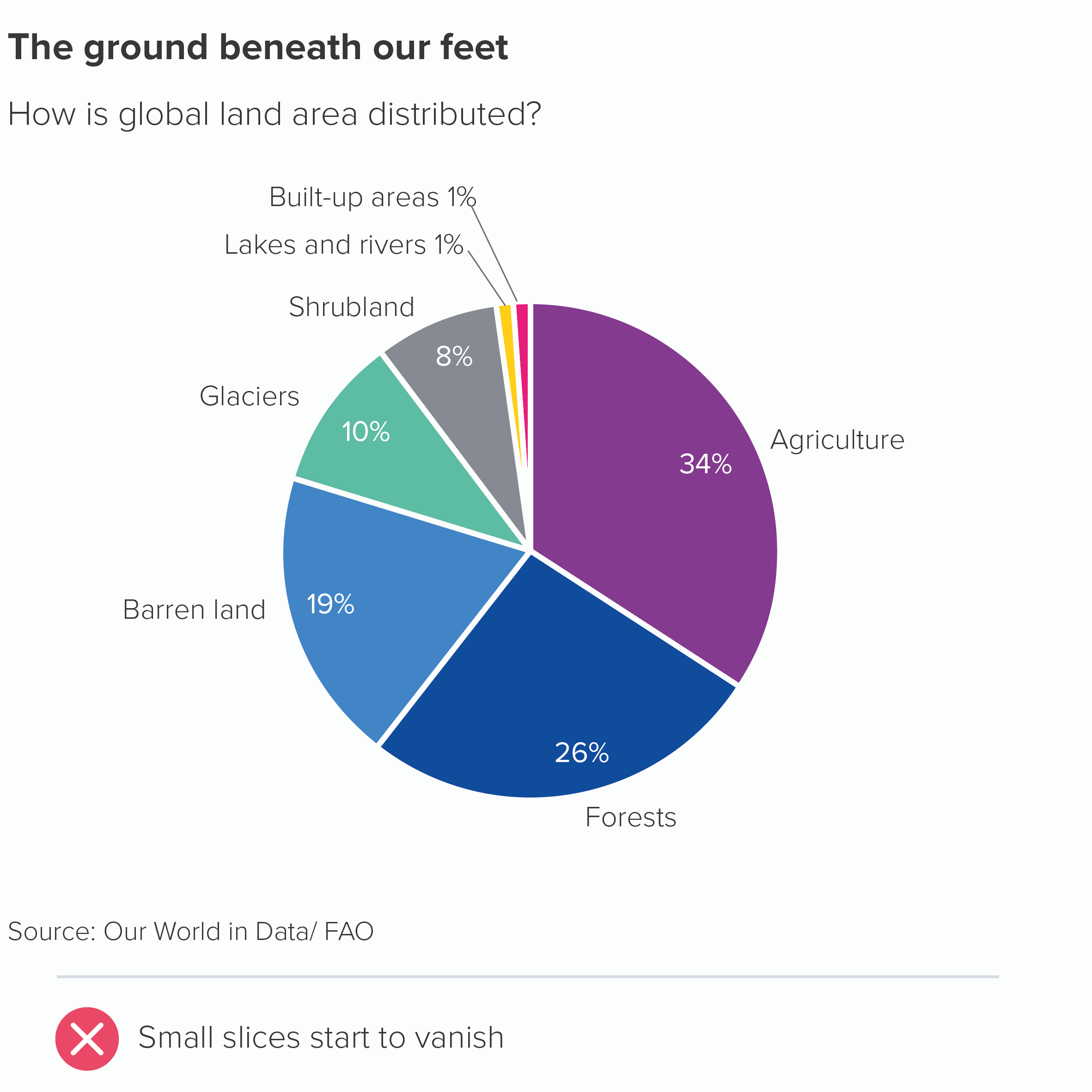
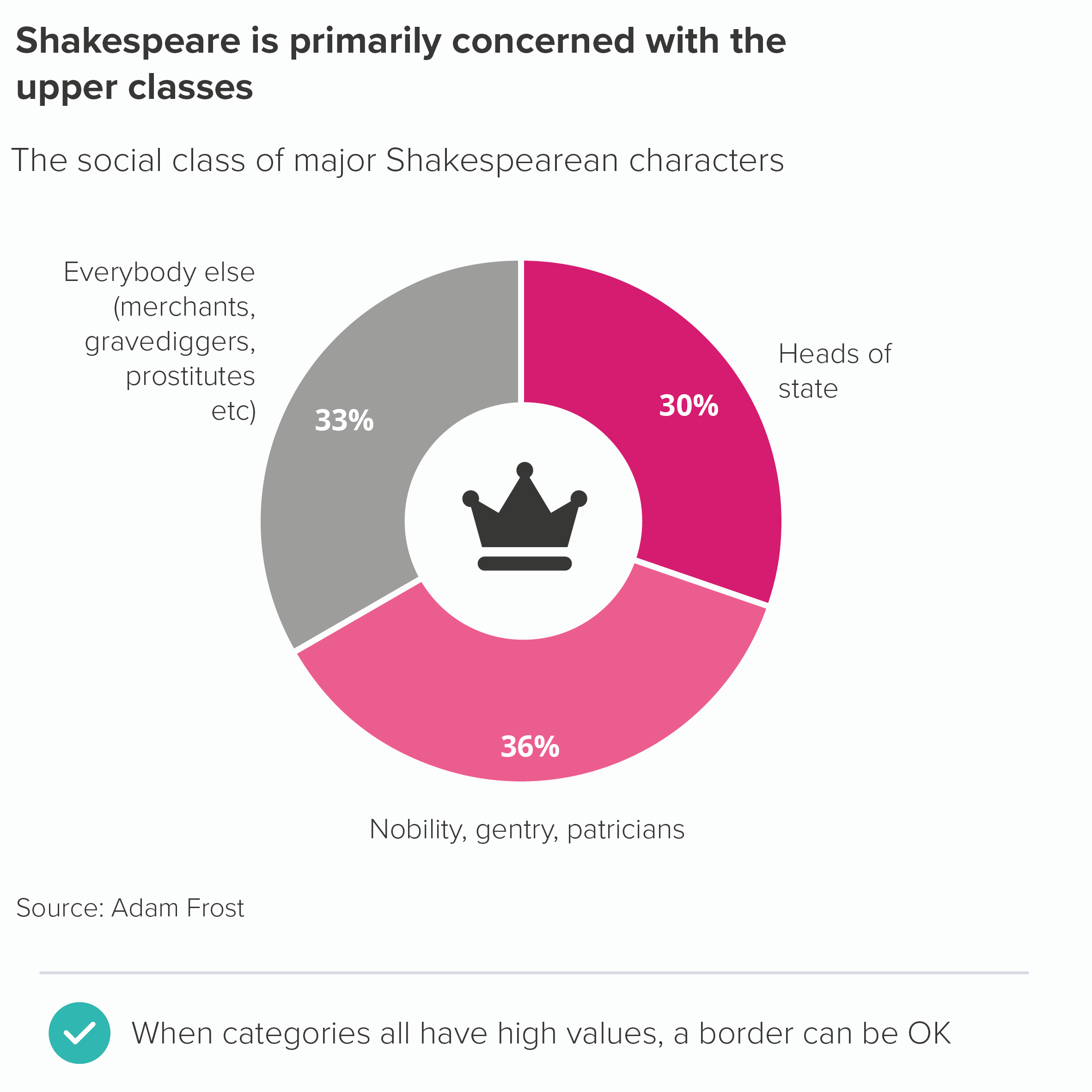
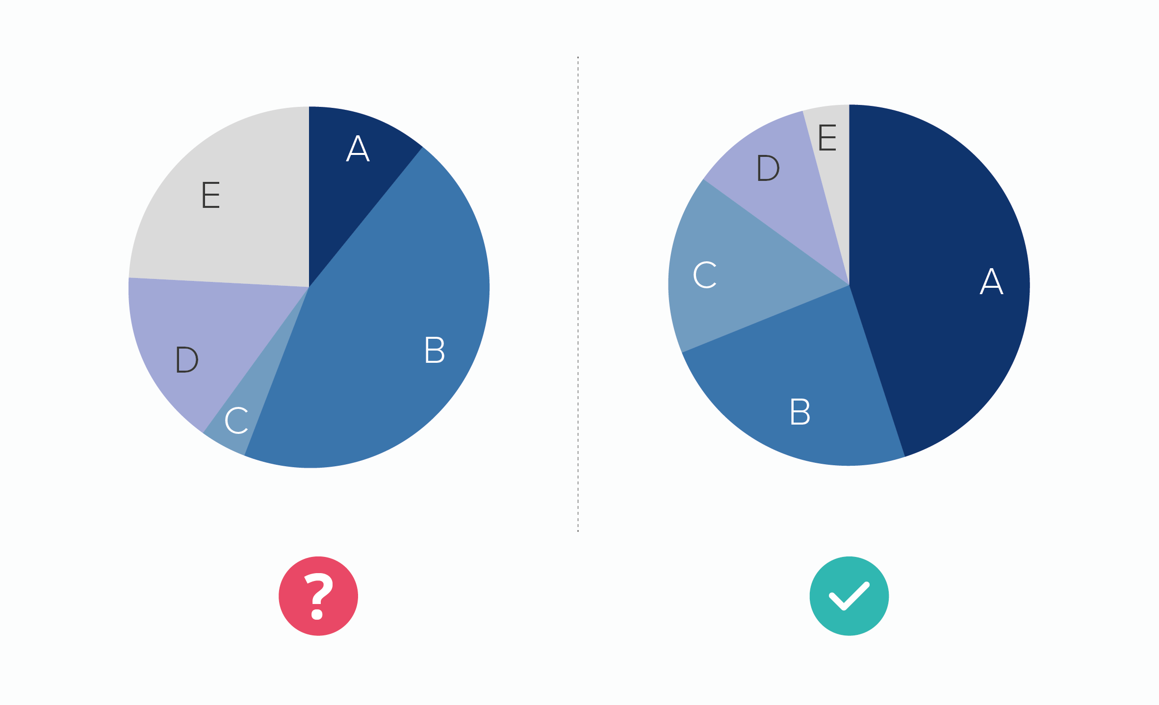
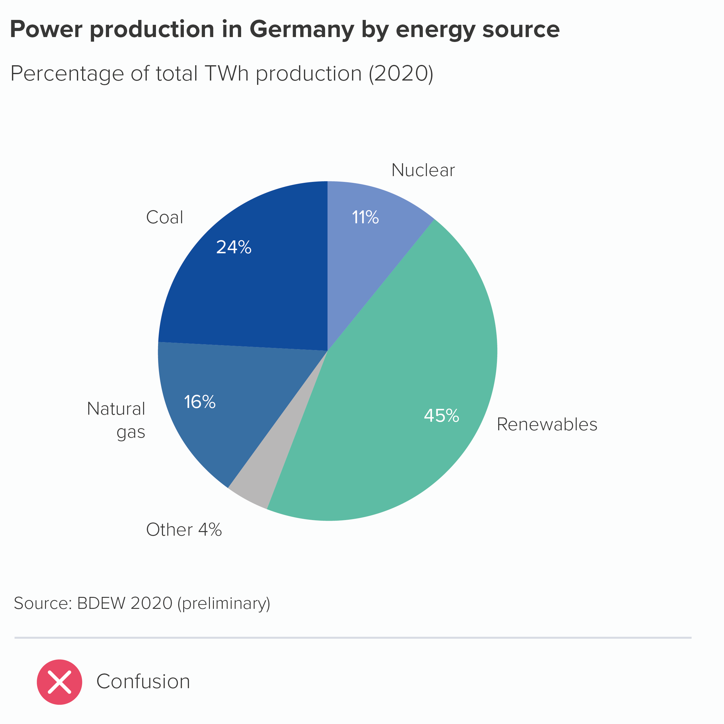
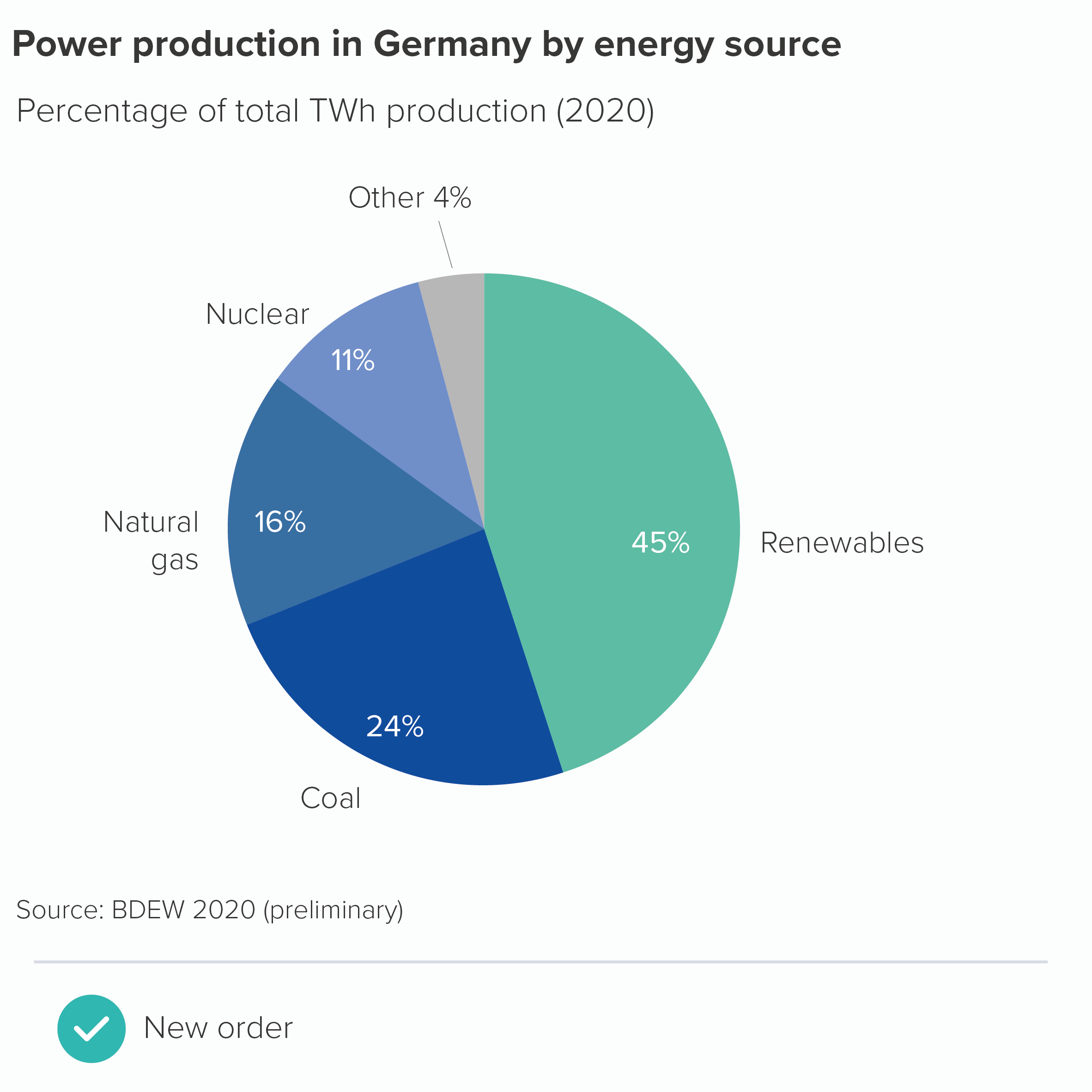
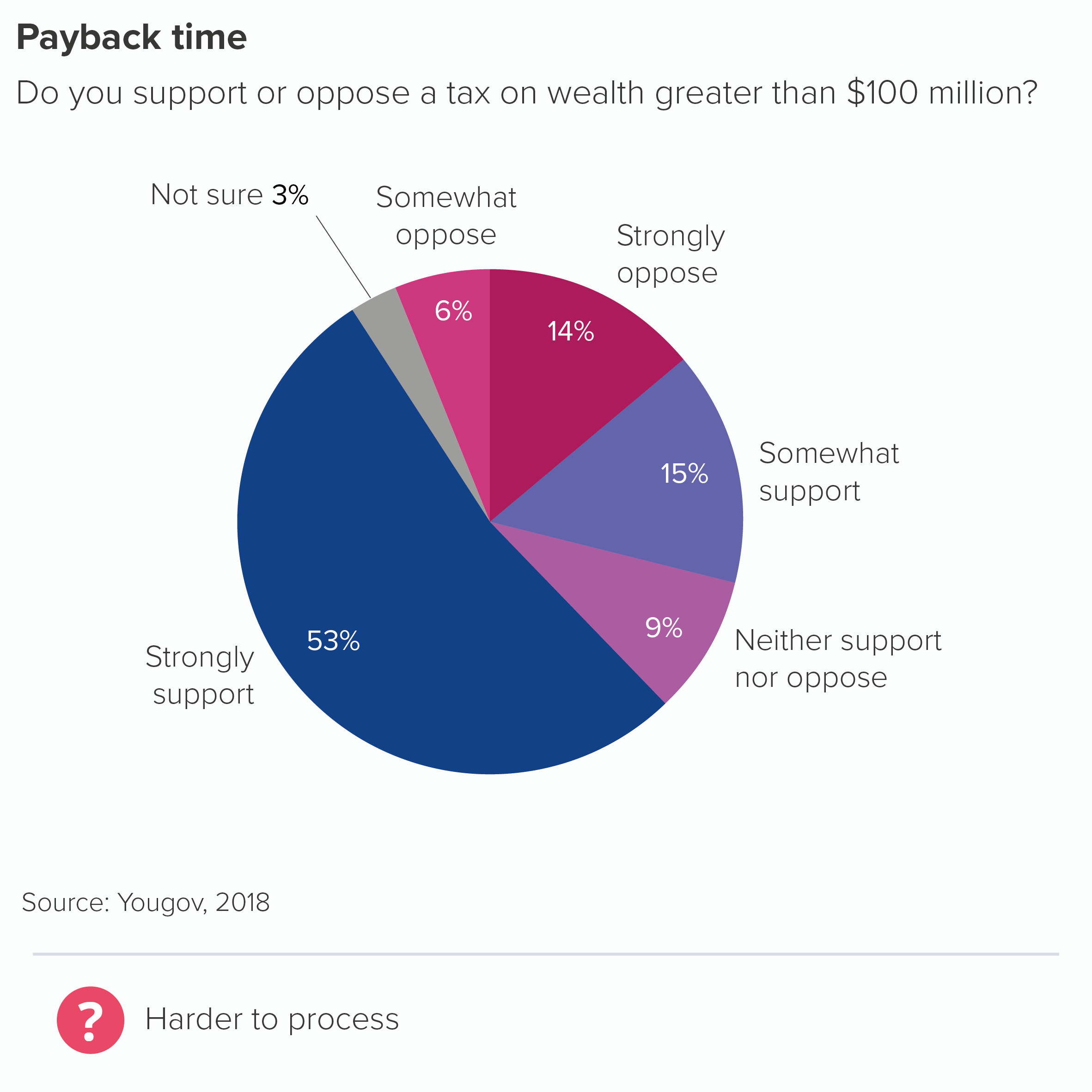
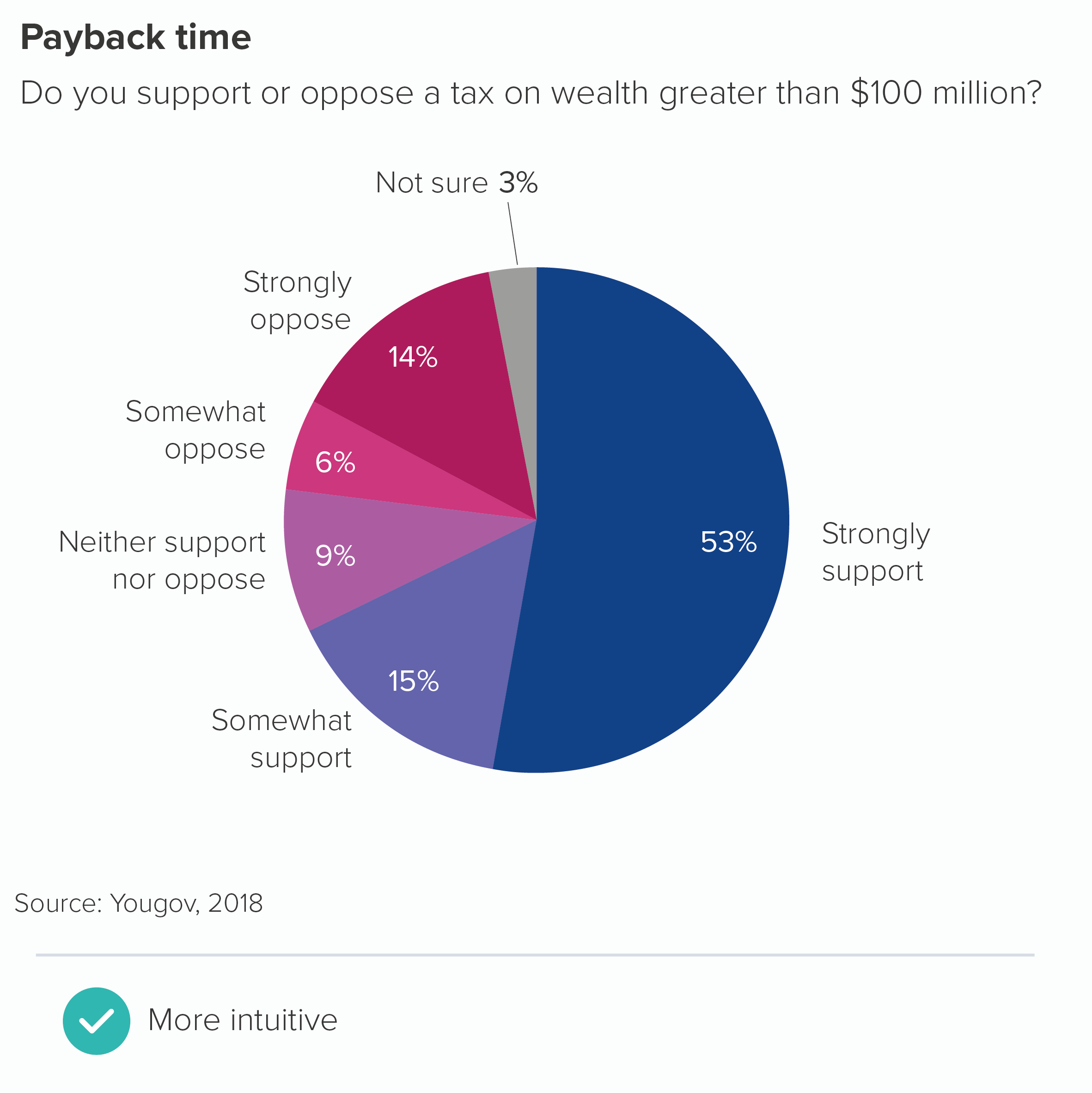
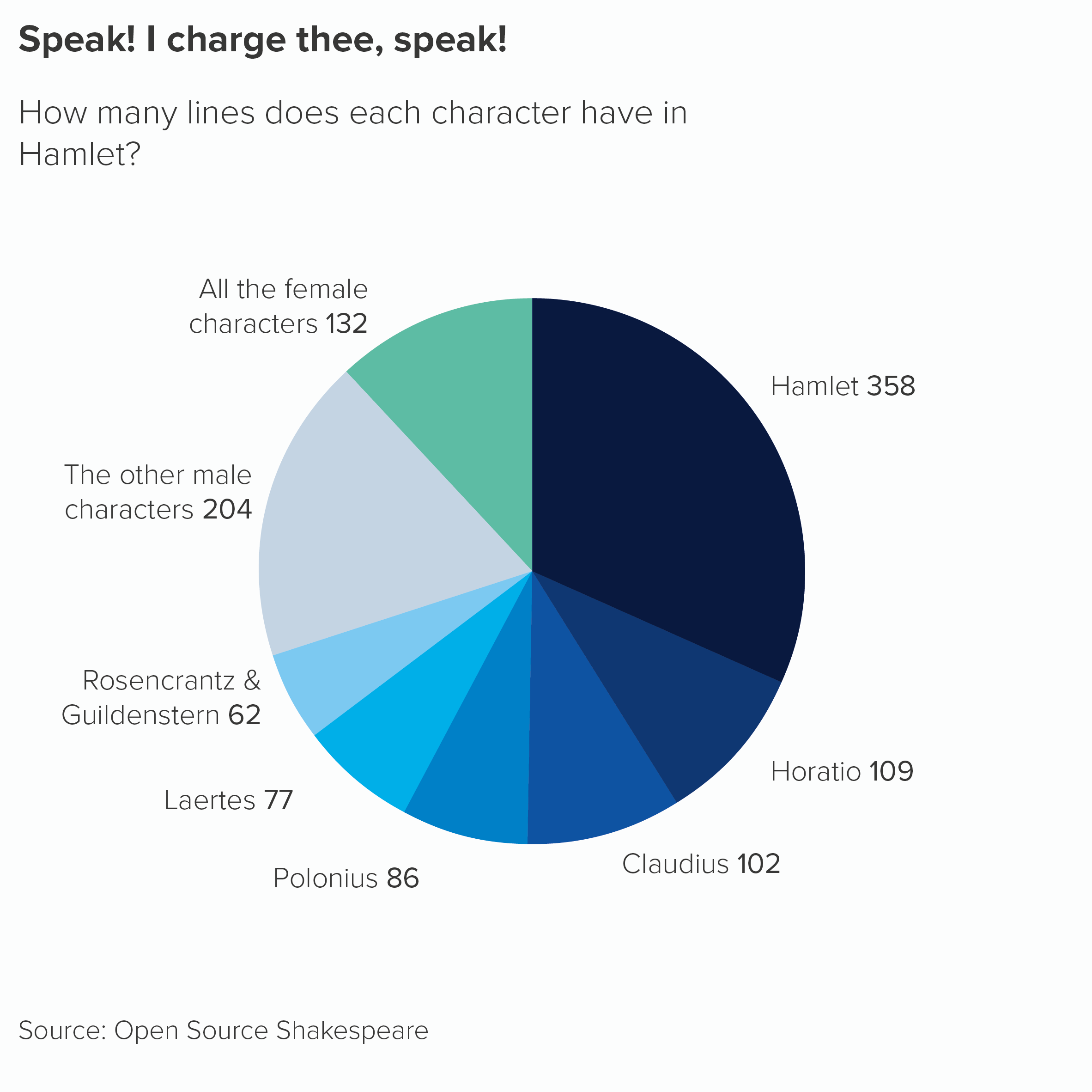
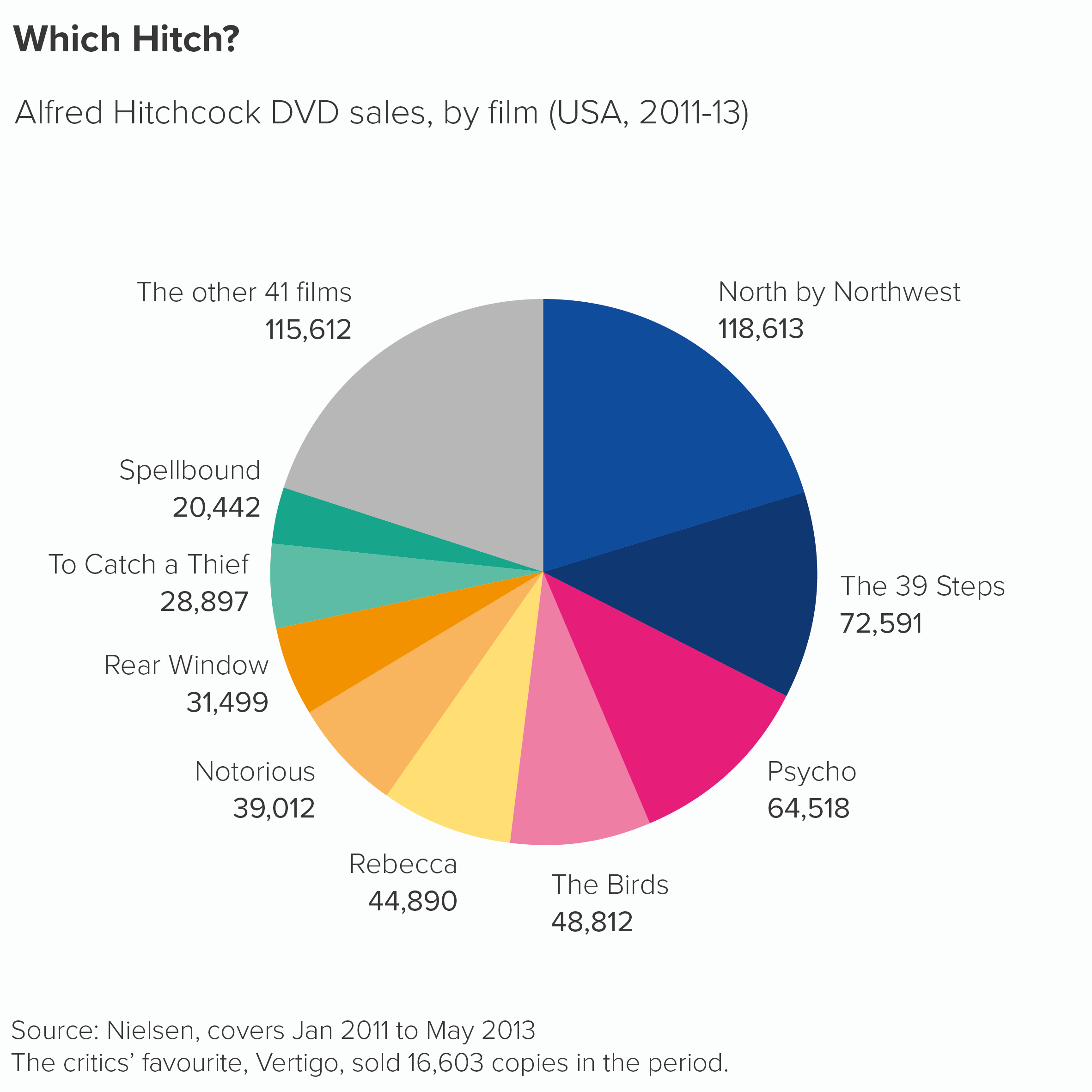
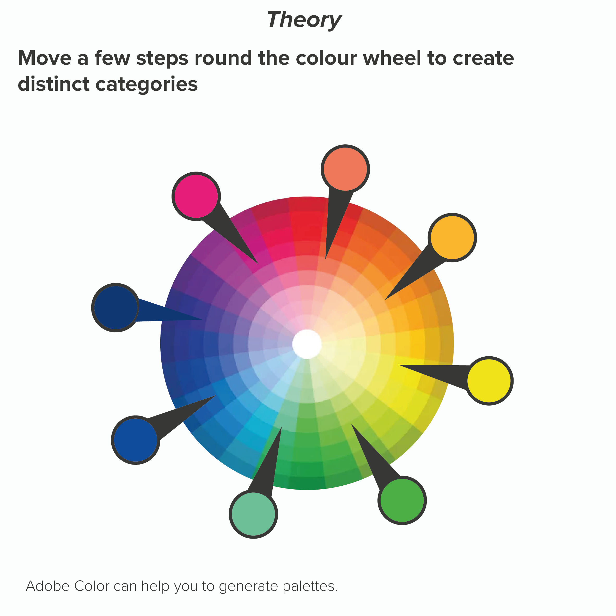
Sometimes all your wedges are important and they all represent very different categories. Here you have no choice but to use colours that emphasise that difference. However, there are ways of applying this principle that avoid the use of jarring complimentary colours (e.g. red and green, purple and yellow). If you keep moving a few steps around the colour wheel, your colours should be clearly distinct (e.g. blue to red to orange) but not directly opposed. Your brand guidelines should have enough distinct colours to allow you to alternate in this way (you might need to dive into the secondary palette). Remember never to repeat colours on a pie - this is guaranteed to confuse.

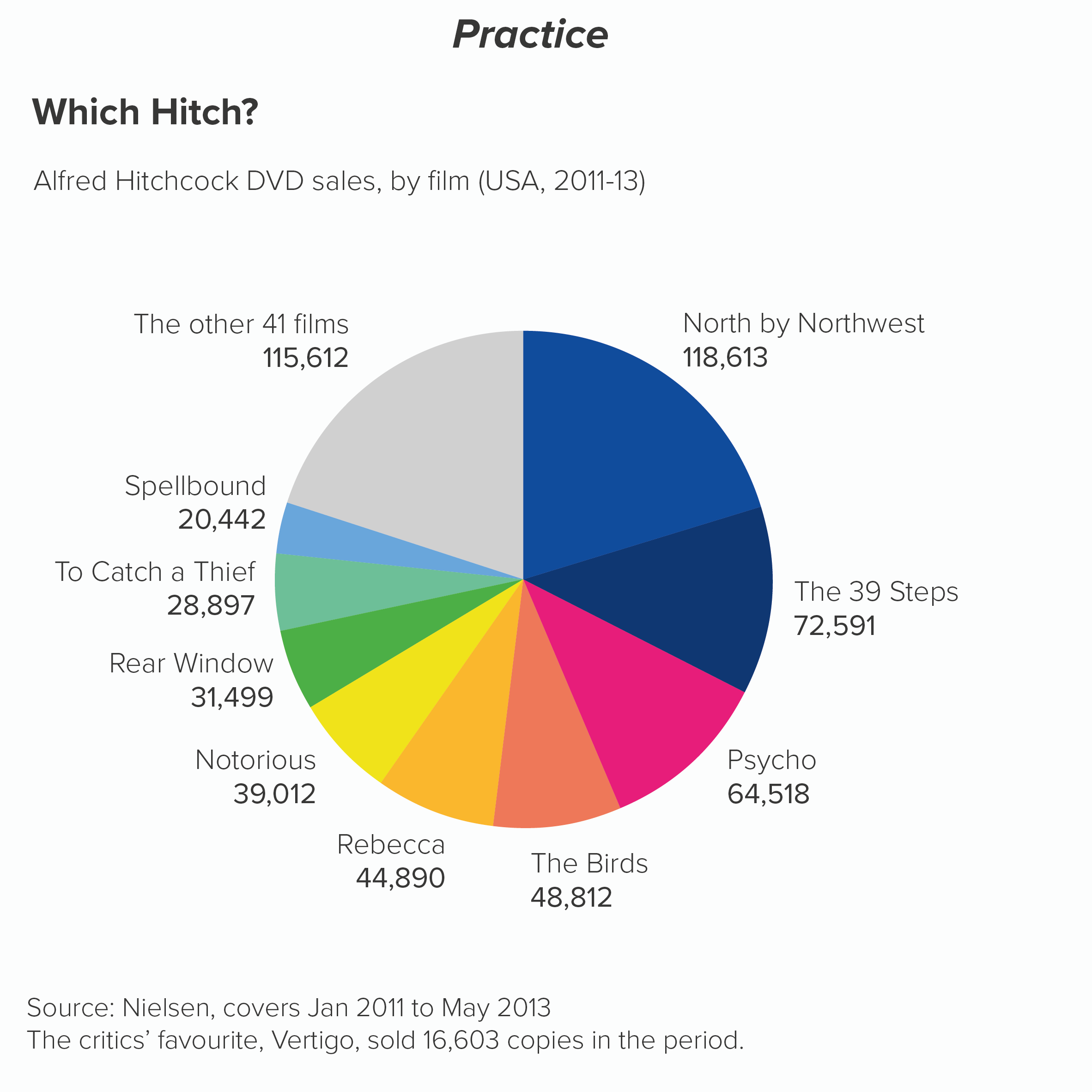
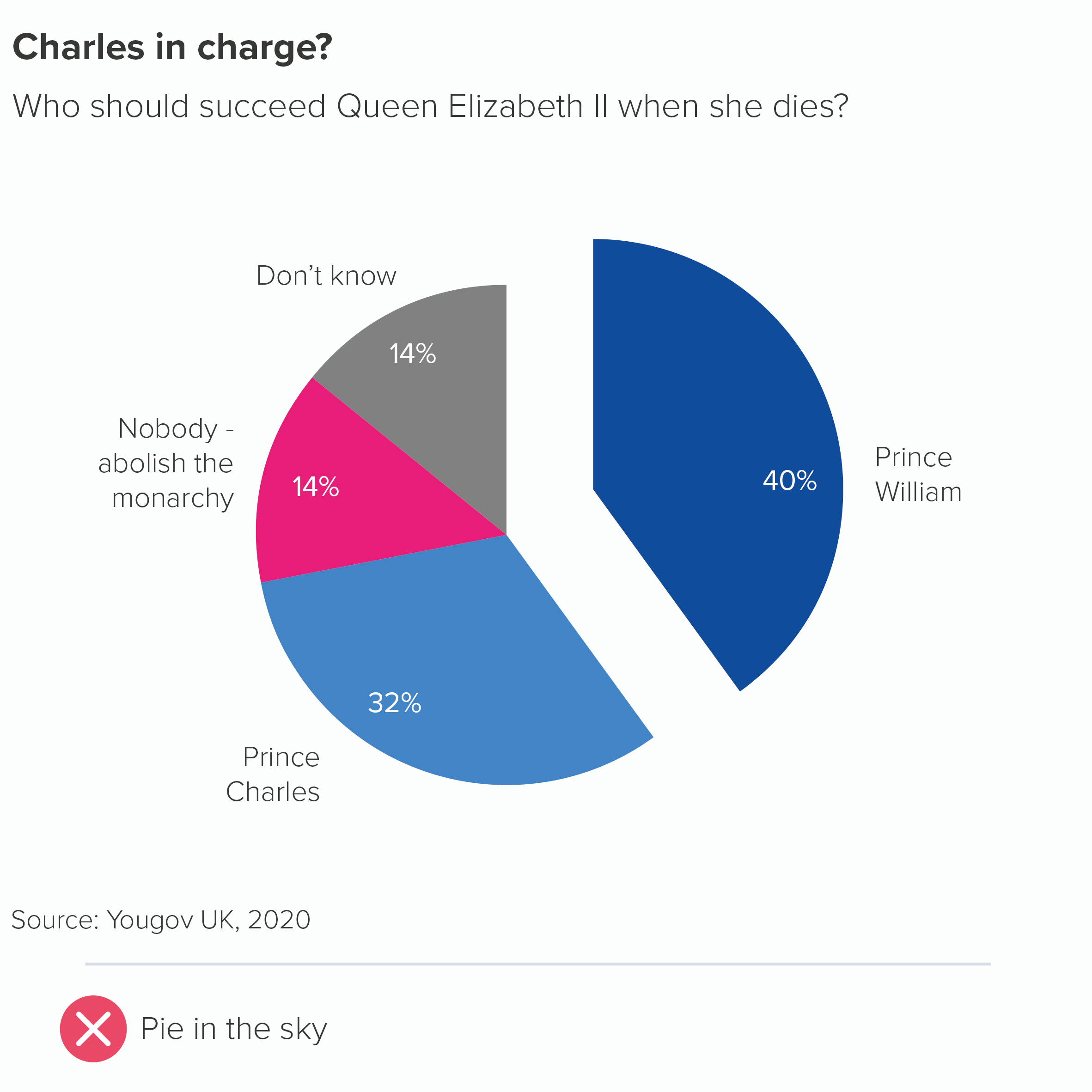
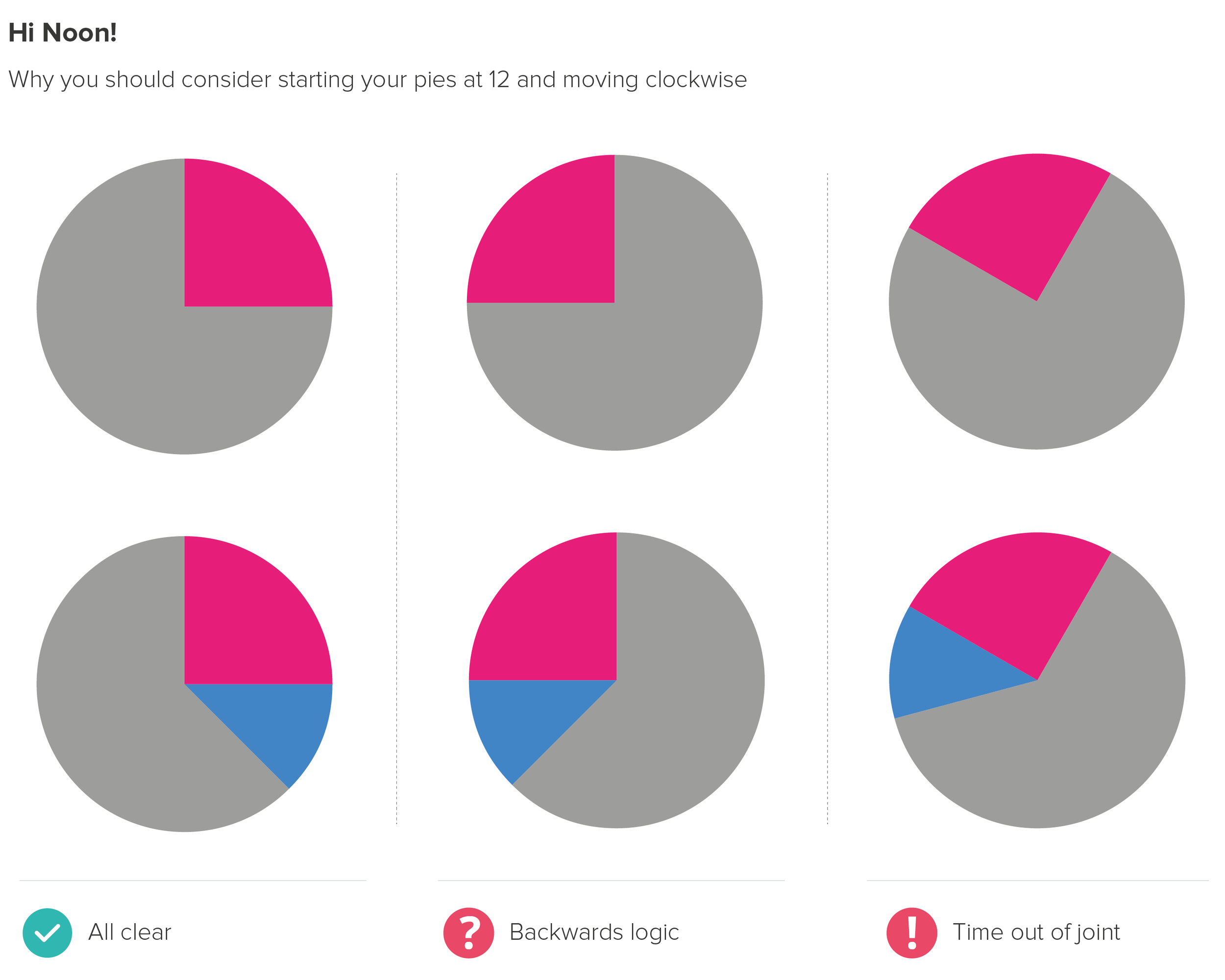
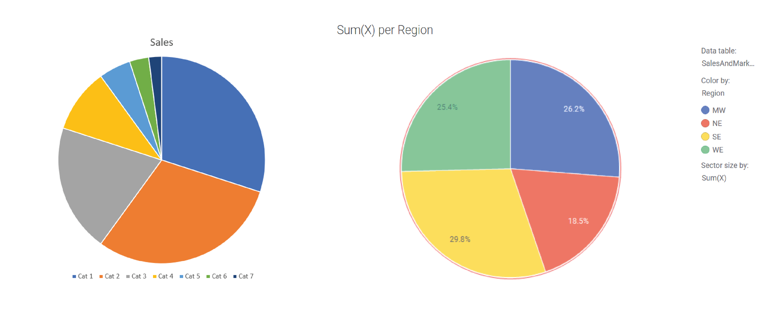
Here’s what happens if I use the same palette but alternate between complementary colours.

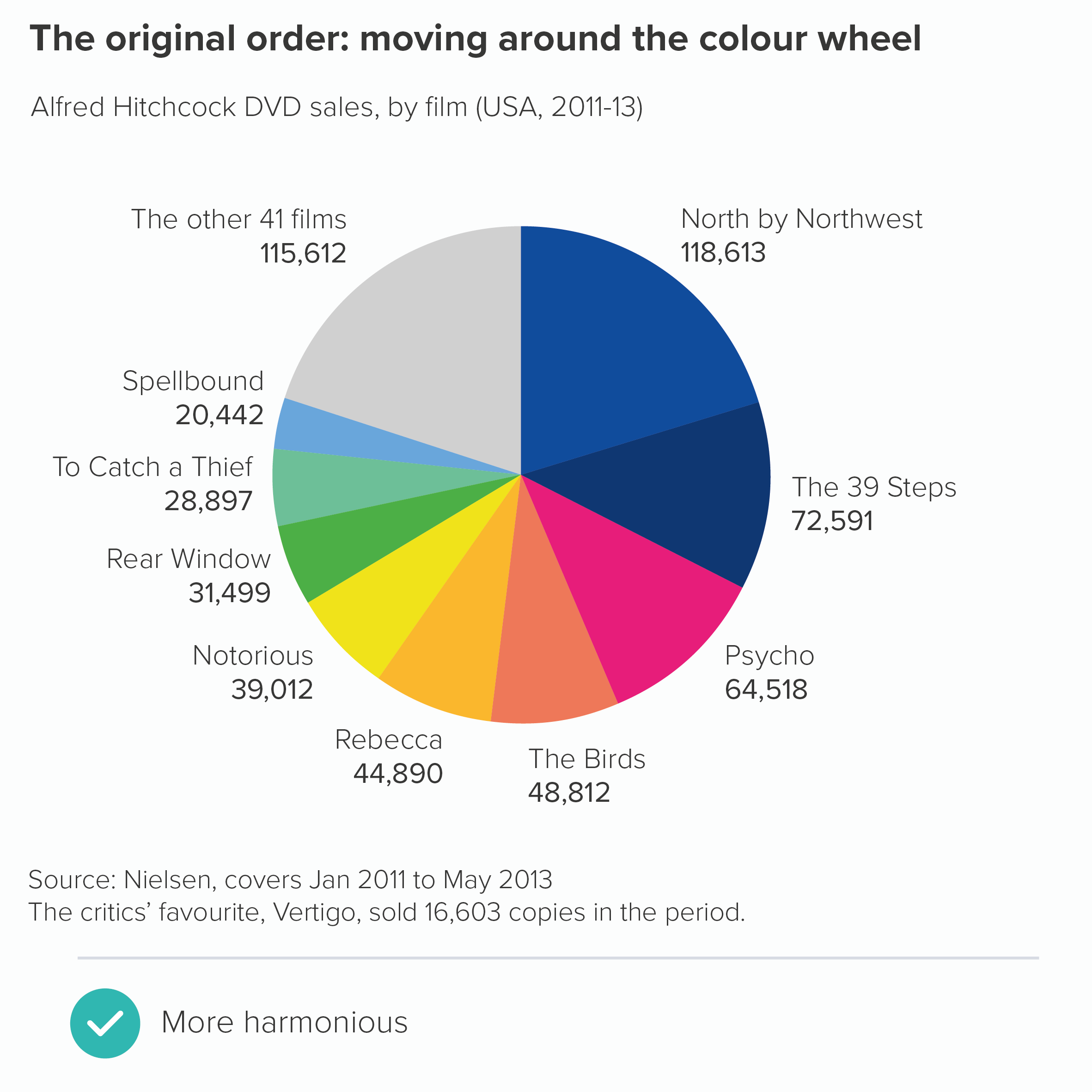
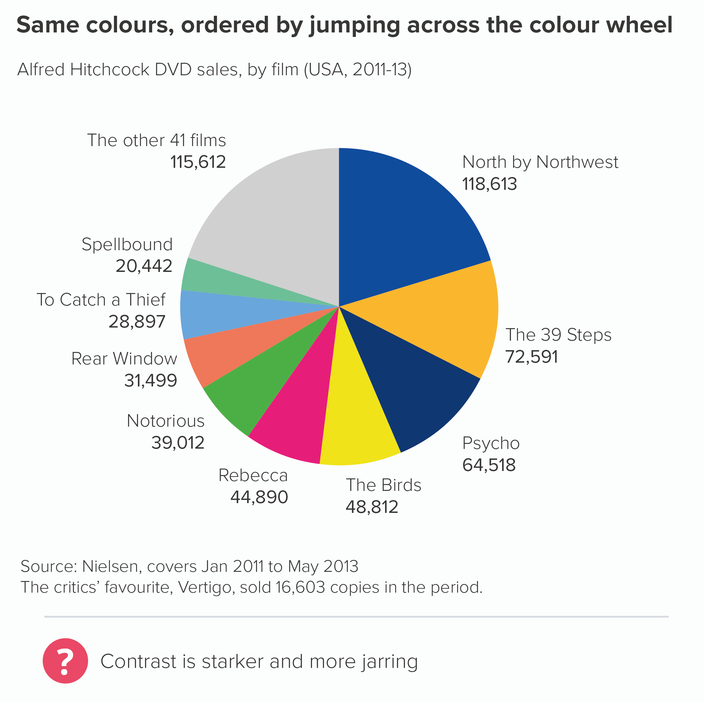
This shows the power of colour: it feels like a minor change - shuffling the order of the colours - but it has a major aesthetic and narrative impact.  

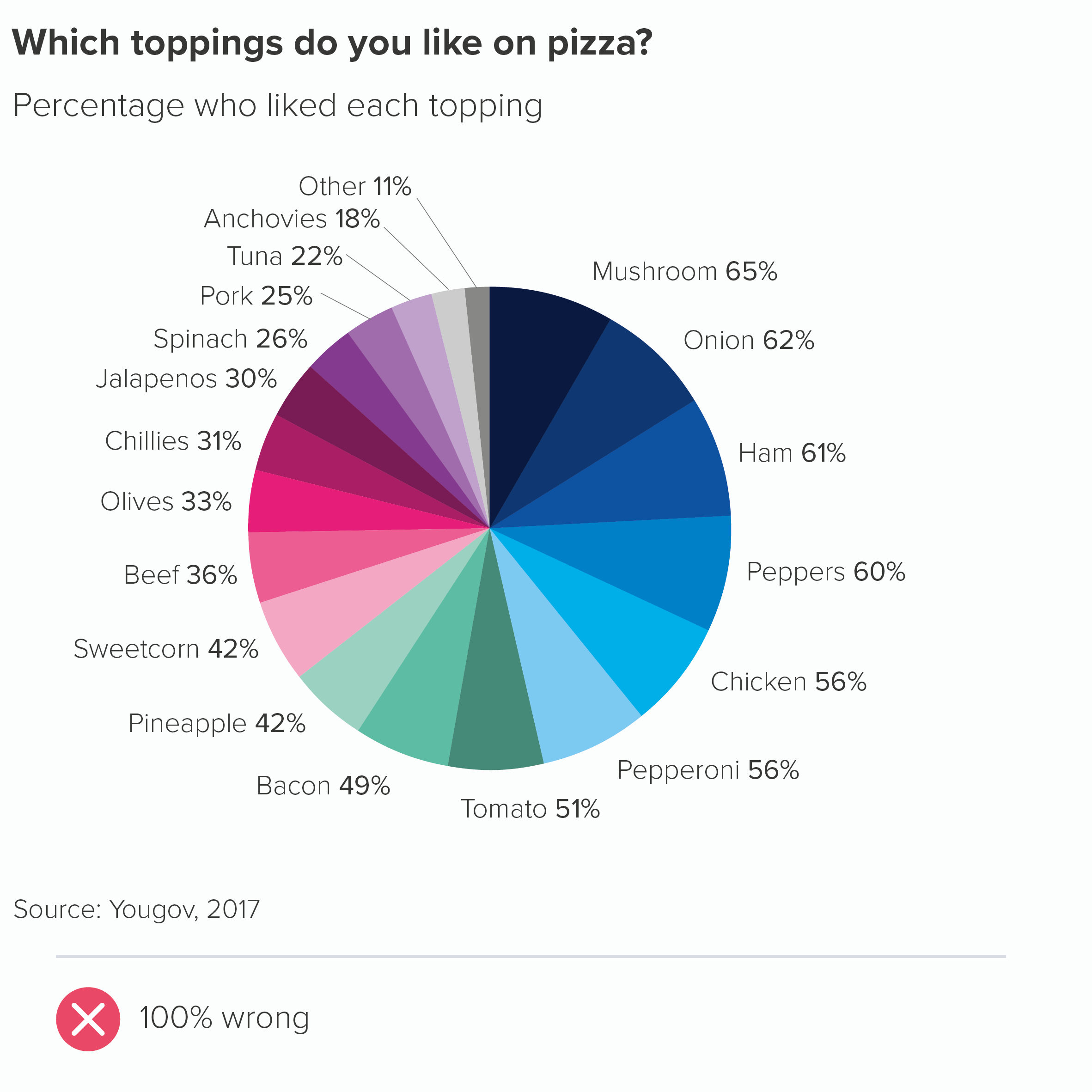
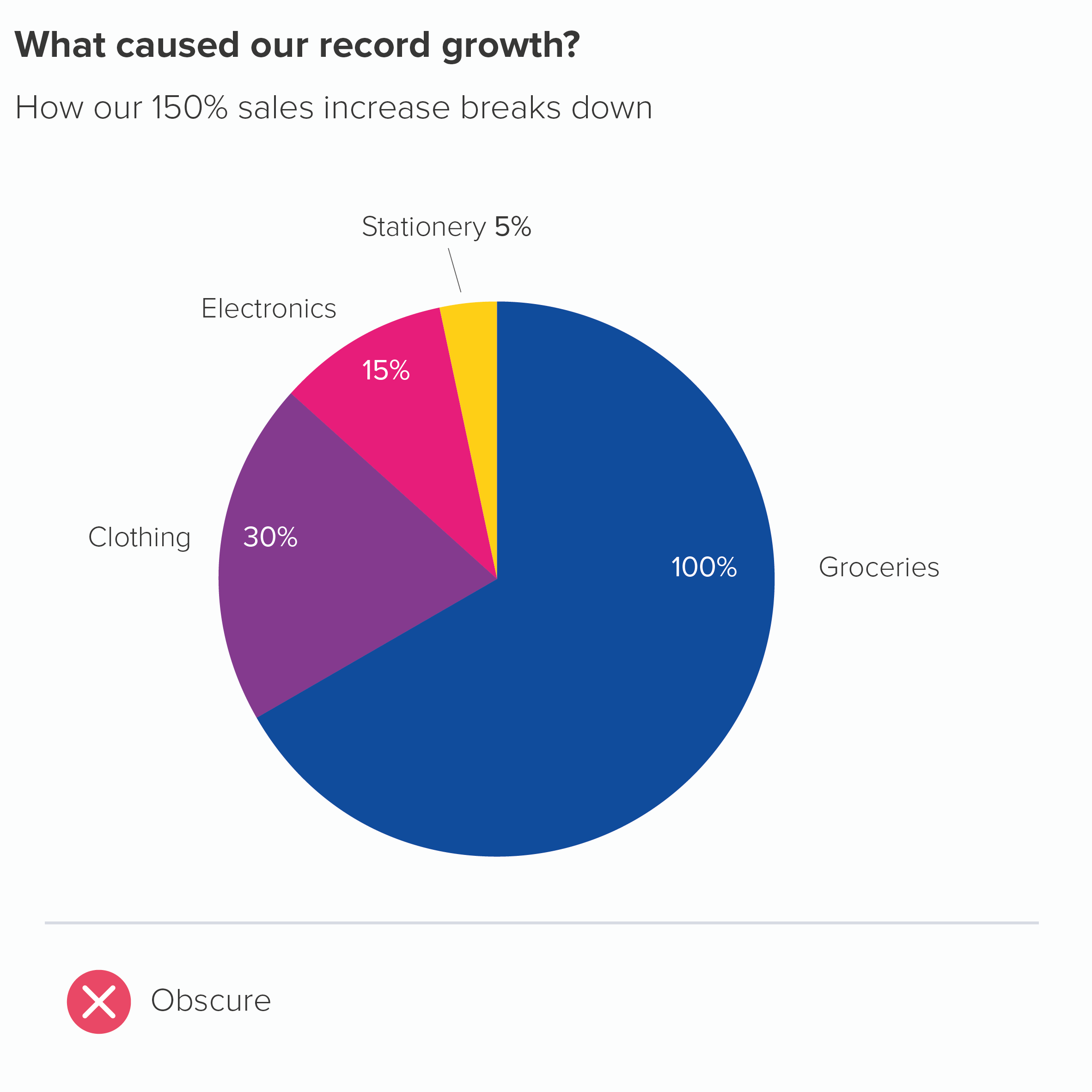
If there aren’t enough colours in your guidelines to make these kinds of charts, the first question to ask is: does my pie have too many wedges? (See rule 3). But if your story does justify lots of distinct wedges, then you will inevitably need to build on some of the colours in your brand guidelines and hope that the brand police are too busy arresting real criminals to notice.

Remember that if you’re not a designer, be cautious whenever you’re selecting colours. Choosing a new colour to sit alongside an existing palette is fiendishly difficult; some designers earn a living from doing this and nothing else. So either ask a designer for advice or at the very least use a tool like Adobe Color or this chroma.js colour picker which should stop you committing too many career-ending mistakes.

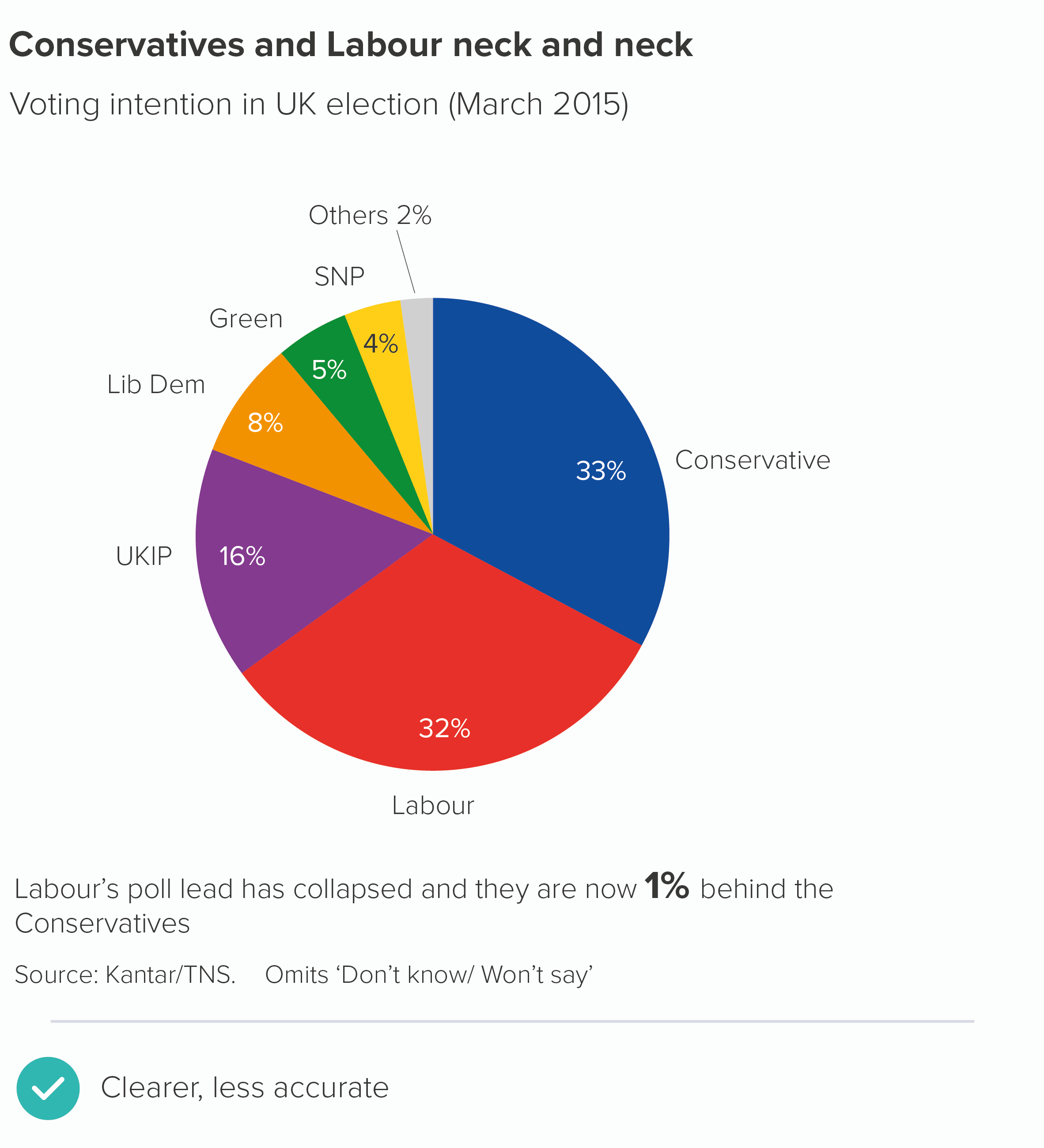
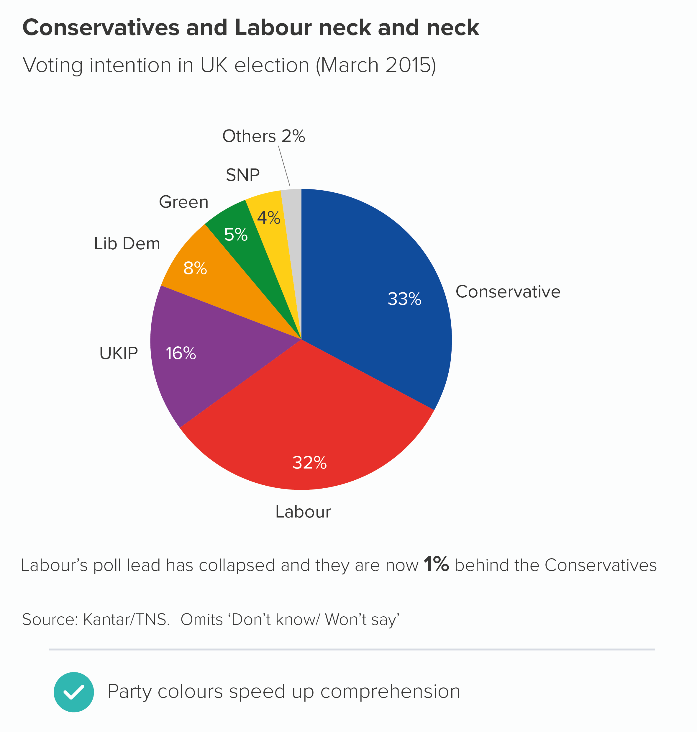
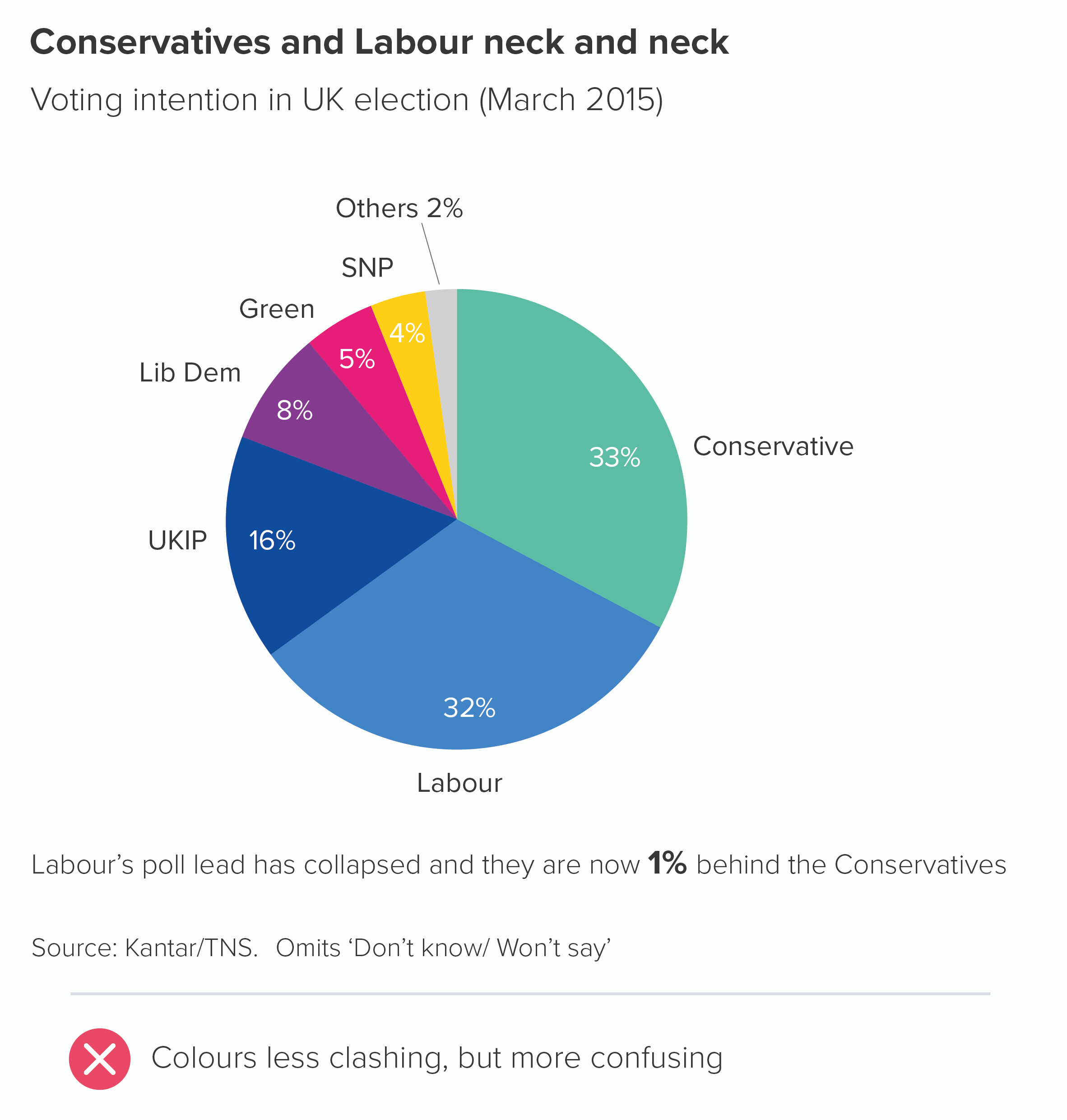
Another important point: sometimes your story will demand the use of certain colours - whether they are in your guidelines or not. For example, a chart showing support for different political parties. This kind of chart will simply look broken if you don’t use the colours associated with each party.

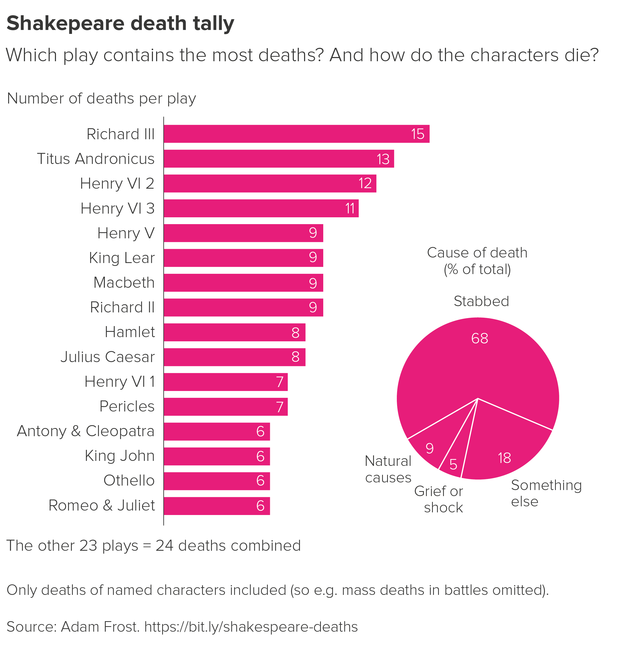
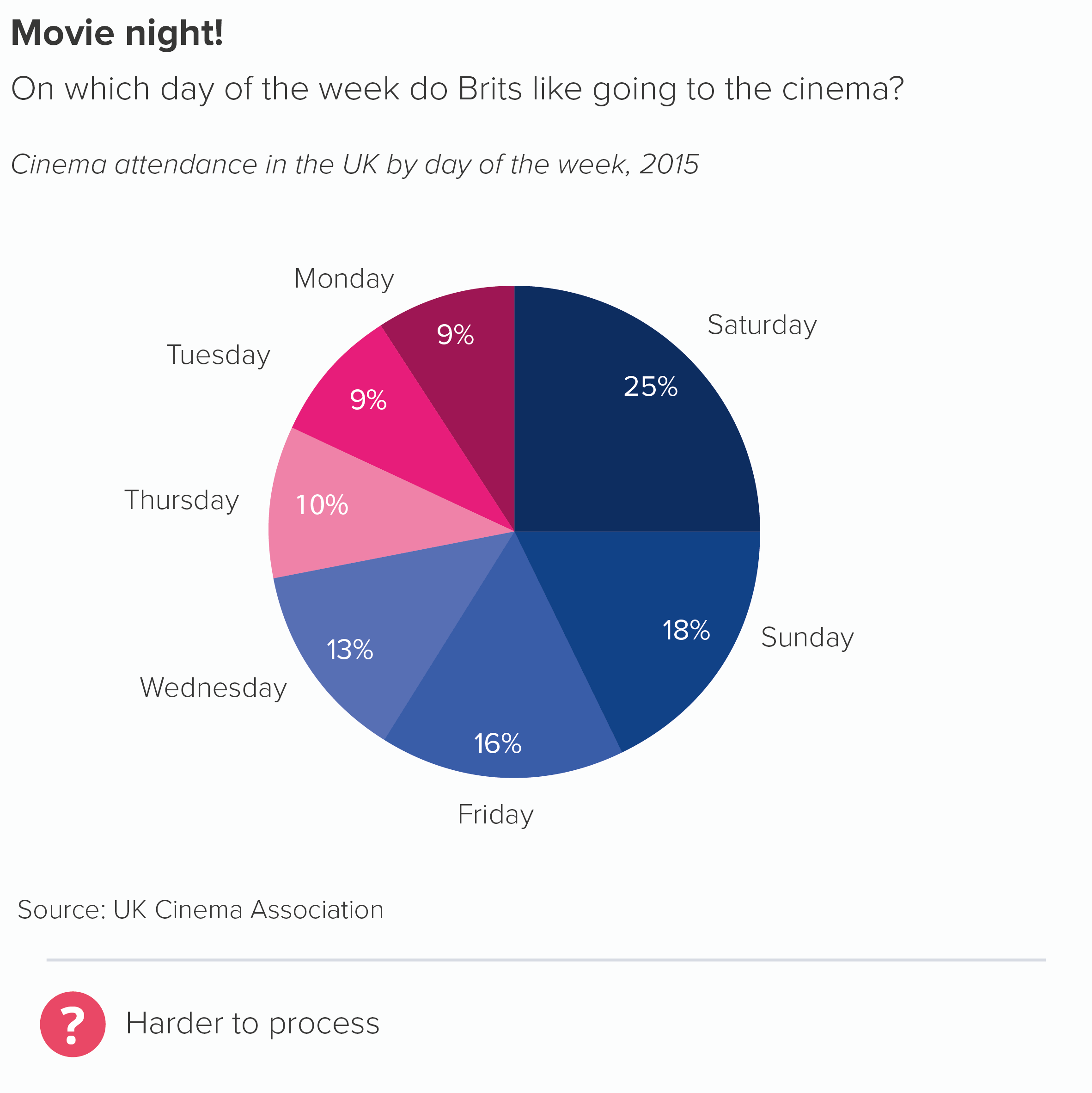
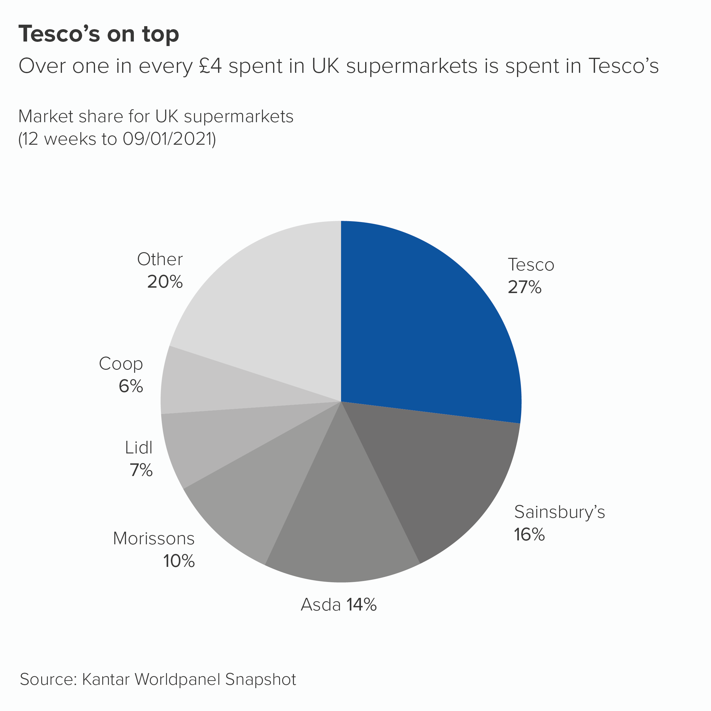
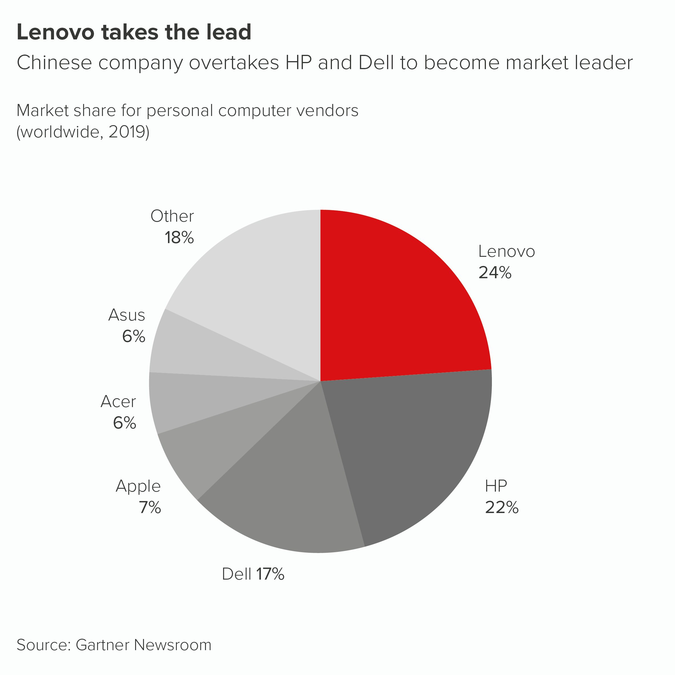
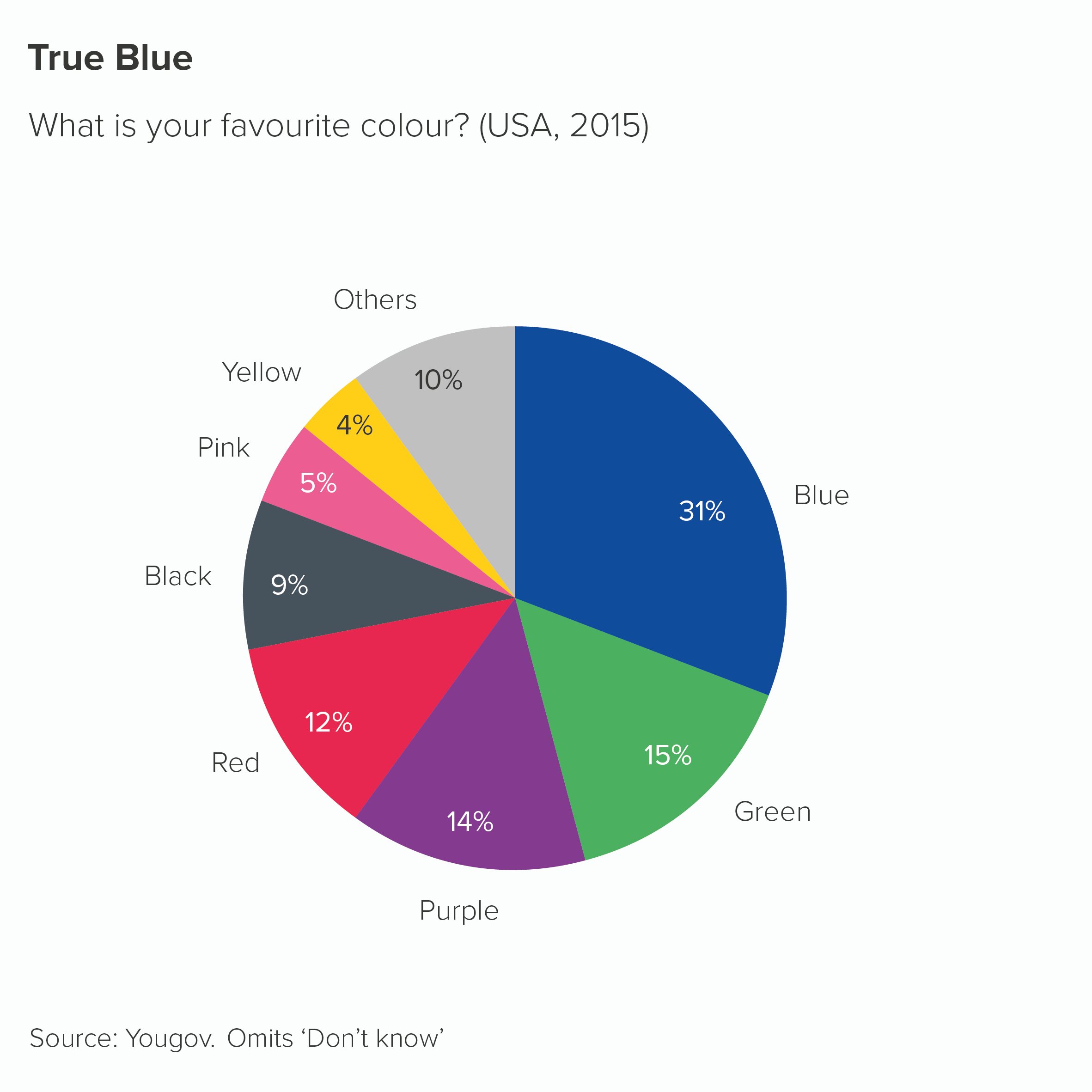
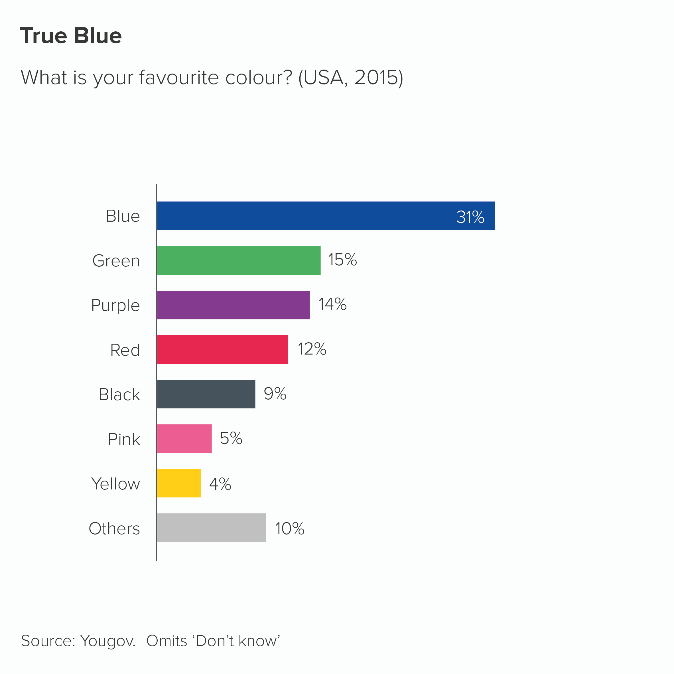
There are plenty of other examples. If you are comparing sales of bananas with sales of other fruit, you might want your banana slice to be yellow. The same applies to comparing football teams or retail brands or anything else where colour is integral to the category’s identity. To use the most literal example, perhaps you have a chart showing the answers to: ‘What’s your favourite colour?’ How else should you colour it? (Respect to Yougov for actually running this survey). Also, I should say, however clashing the colours are, I find them more palatable on a pie chart than a bar chart.

Sometimes you will be lucky and have a colour (or a similar colour) in your brand guidelines, in which case you should absolutely use them. But sometimes you will just have to bite the bullet and use the relevant non-brand colour. 

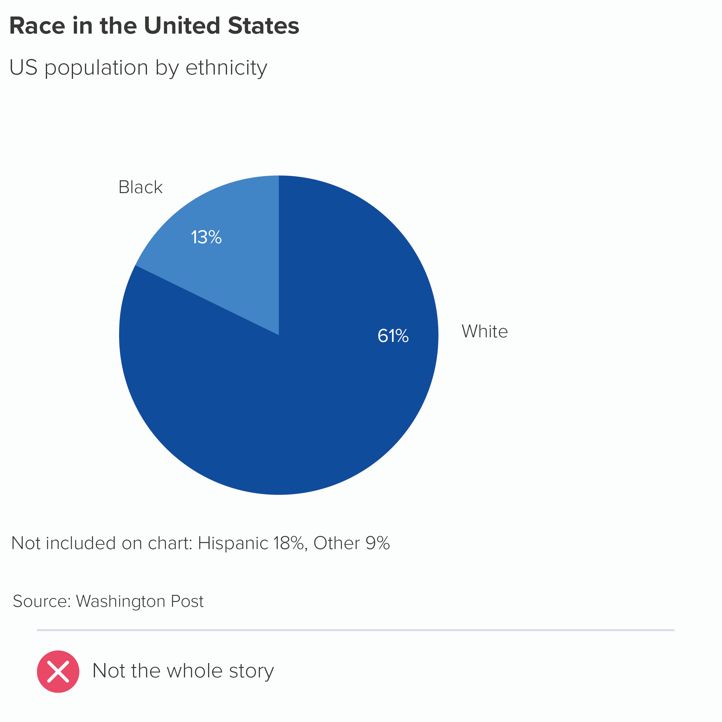
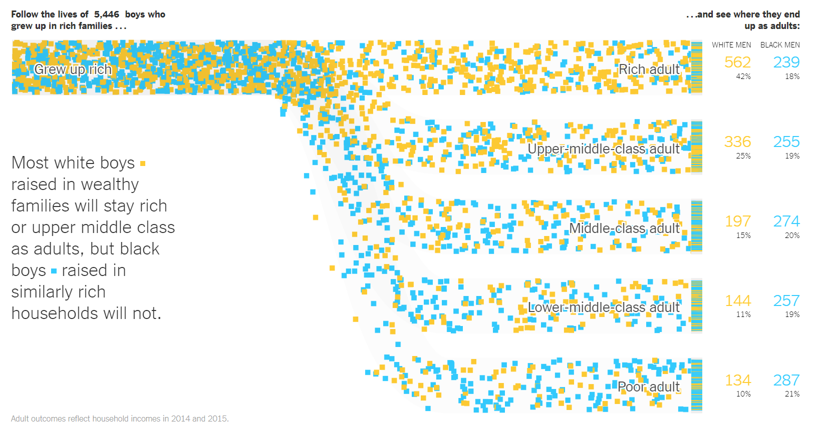
There are also examples where you should consciously not use the colours associated with your categories. For example, if you are representing skin colour. There should be no link - none - between the colours in your chart and your categories in this case. Here is an example from the Washington Post - a stacked bar about US police violence towards black people

rule_8_wpo_stacked_bar_race.PNG

And here’s a masterpiece from the New York Times - a modified Sankey chart this time - about how boys that grow up in rich families have different life chances based on their race. White boys are orange squares; black boys are blue squares. This is a static screengrab, the original is animated.

rule_8_nyt_race.PNG

Finally, the colours you choose need to be accessible. This is another good reason to use brand guidelines because - if they have been designed properly - the authors will have tested that any colours are colour-blind safe and use colours with a sufficient degree of contrast. That said, it’s always good to doublecheck that any chart you make is accessible - brand guidelines are not infallible. Most tools have colour-blindness checkers, or allow you to see your work in grayscale. More fundamentally, it’s always good to ‘get it right in black and white’ - for the sake of all your users. Charts are often printed out on black-and-white printers. Projectors can do bizarre things with colours, washing them out completely. Colour should support your story, but never be critical to understanding it.   

OK, back to the rule. ‘Limit the number of colours in your pie chart’. Yes, if you can. Your brand guidelines should be encouraging you to do this anyway. Colours provoke deep emotional responses, and audiences latch on to them, so they need to be handled with care. Every colour you include on your chart adds a wealth of cultural, political and personal signifiers. Too many colours is like playing several songs at once, all from different musical styles, all with the volume turned up to 11. 

However, as I’ve mentioned above, sometimes a limited palette undermines your message. The important thing to remember is that any colours you add should be clearly motivated by your story. Colour in data visualisation should never just be decorative. Any colour should have a clear meaning, and that meaning should still be clear even if all the colours get switched off, leaving only shades of grey.

VERDICT: Follow this rule most of the time

Sources: Kantar Grocery Snapshot, Gartner Newsroom, World Bank air passenger data, Department for Transport travel survey 2017, UK Cinema Association box office data, Hitchcock data from Guardian graphic by Adam Frost and Zhenia Vasiliev, Yougov favourite colour data

More data viz advice and best practice examples in our book- Communicating with Data Visualisation: A Practical Guide

Rule 7: No exploding pies

In this blog series, we look at 99 common data viz rules and why it’s usually OK to break them.

by Adam Frost

You typically change the design of a chart for one of three reasons:

  • to make it easier to read

  • to strengthen the story

  • to make it more visually appealing

An exploding wedge appears to satisfy none of these criteria. By breaking a pie chart’s clockface shape, exploding one or more wedges makes the chart difficult to read. As for the story, the pie slices in themselves tell the story of dividing up a whole; pulling out one slice smacks of desperation, as if you were drawing a big ‘Notice this!’ arrow next to it. If you colour and label your wedges intelligently (we’ll cover this in rules 9 and 10), you shouldn’t need to signal so blatantly.

Finally, and I realise this may be just my personal taste, but I think exploding pies look gruesome. As I mentioned in the first rule, circles are the perfect shape; humans are hard-wired to love them. You had the chance to use this beautiful shape in your visualisation and you blew it. Or rather, you blew it up.

So I would say there is almost never a good reason for an exploding pie. Almost. The trouble is, some stories are about brokenness and breaking a perfect shape is a great way of making your audience see this. My favourite example: in 2012, Guardian designer Jenny Ridley took two halves of a circle to represent government incoming and outgoings. A red wedge juts outs to represent government borrowing. Its positioning and colour are perfect: it looks like something that has been clumsily hammered in to prevent the shape’s collapse: the keystone in a particularly rickety bridge. The system isn’t a stable one, so the chart isn’t either.

(And yes, I know this is a doughnut, not a pie chart, but the same principles apply in this instance).

Another example: sometimes you might want to suggest that one of the sections of your pie is no longer integrated into the whole.

In the Syria example, we want the pie chart to represent a country that has been fractured. Many of those refugees will, after all, never return. In the Brazilian Amazon chart, we want to give a clear sense of the forest being ripped out of where it belongs. 

Such stories aren’t common, but they do exist. And only when there is this perfect alignment of subject and chart would I risk a (controlled) explosion.

To be frank, even in these situations, I would always experiment with other visualisations too, because you might find that other visualisation types convey the idea of fracture in a more effective way than a pie. Here are some alternative versions.

One additional note: a slightly less extreme alternative to exploding out a slice is leaving prominent gaps between your slices. You may have noticed that most of the good practice examples on this blog keep the wedges snug against each other. I have a slight preference for it on aesthetic grounds, and it’s more accurate too. Particularly when you have a bunch of smaller slices, a thick border can eat into the size of the wedge’s fill, leaving you with just slivers.

However, there can be valid reasons for adding a border. If you have a small number of categories, and they’re reasonably large values, then adding a border accentuates the fact that these are clear and distinct categories. This approach can work particularly well with doughnut charts. Likewise, a border can be a good way of signalling that there is a subgroup within your pie chart wedges.

Furthermore, sometimes you might want all but one of your slices to be the same colour. Take another look at the Guardian public spending example above - lots of yellow wedges for incomings, lots of blue wedges for outgoings. A subtle white border is crucial for distinguishing between the slices.

In fact, occasionally you might want all your slices to be the same colour. This is usually when the pie is showing a second-level composition story or it is part of a more detailed infographic where the same colour is used throughout to create narrative consistency and visual harmony. In these cases, a white border between the pie slices is, of course, essential.

VERDICT: Only explode a pie if the story absolutely requires it

Sources: Yougov data on who should succeed Queen Elizabeth II?, Pew Research data on Syrian refugees, Amazon data from INPE/FAO, global land distribution data from FAO via land use page on Our World in Data, income distribution data from NatCen BSA 37, Shakespeare class and death data compiled by Adam Frost

More data viz advice and best practice examples in our book- Communicating with Data Visualisation: A Practical Guide

Rule 6: Arrange your pie slices from largest to smallest

In this blog series, we look at 99 common data viz rules and why it’s usually OK to break them.

by Adam Frost

If you want your audience to compare the sizes of shapes, then sorting any chart from the largest to smallest value is helpful.

This is particularly advisable with pie charts because of everything we’ve mentioned in previous rules: it can be hard to compare similar-sized wedges, hard to read wedges that don’t start at 12 o’clock, hard to read lots of wedges. If your categories don’t need to go in a particular order, if your story doesn’t require a set arrangement of slices, then sorting by value is a wise approach.

The trouble is, your story sometimes will require the slices to be in a set order. As with bars, bubbles, treemap or any other chart type, there are several reasons why you might not want to put the largest value first. For a start, we’ve mentioned in Rule 3 that you will often group the smaller values into an ‘other’ wedge. This is often your largest wedge but you would, of course, put this last. (Another instance of rules contradicting each other). 

Likewise, your wedges might represent linked categories: not following their natural order can make your chart look broken. Take the example of time categories. You might want to divide a variable (e.g. sales) by days of the week.

Another example would be where you are mentioning strength of feeling or anywhere else where emotions or opinions are on a continuum.

Sometimes you might be leaning into your pie chart as a visual metaphor and want the wedges to represent something spatial or geographical. (This example also breaks at least three of the other rules we’ve mentioned. Kapow!)

At other times, you might not want to suggest that it is better or worse for a category or country to be the highest value. So you might use alphabetical or a random order instead. 

I’m not saying a pie chart is the best choice in all these instances, I’m just saying that if you do decide (or are made) to use one, then you might conclude that breaking the arrange highest to lowest rule is the best way of protecting your story. Because, after all, protect your story is the most important rule. 

Verdict: Follow this rule sometimes

Sources: German energy data from BDEW (preliminary), UK cinema attendance data from UK Cinema Assocation, US wealth tax data from Yougov, North London data from London Datastore

More data viz advice and best practice examples in our book- Communicating with Data Visualisation: A Practical Guide

Rule 5: Start a pie chart at 12 o’clock and go clockwise

In this blog series, we look at 99 common data viz rules and why it’s usually OK to break them.

by Adam Frost

This rule takes considerable effort to break. If you generate a pie chart in a modern software application (e.g. PowerPoint, Illustrator, Power BI) it will automatically position the first wedge at 12 o’clock and move round in a clockwise direction. If you want to offset the first wedge, you will need to make a conscious decision to open the chart settings and change the starting angle of the first wedge from 0°. Software defaults aren’t always sensible, but in this case, they are.

Pie charts didn’t always look like this. In arguably the first ever pie chart, designed by William Playfair in 1805, the United States was divided up into what were then its constituent parts. He started with his largest wedge at roughly 8 o’clock and moved round in an anti-clockwise direction.

However, this Playfair chart also demonstrates perfectly why we have moved to our current model. It is hard to immediately see that the Western territory is just over half of the United States or that Kentucky, Georgia and Virginia are just under a quarter.

If we start our pies at 12, we tap into our facility at reading clock faces. If our wedges are close to (or exactly) 25%, 50% or 75%, this is even better, as we are used to dividing time into quarter and half past the hour. When our 12 o’clock start is offset, we are slowed down.

So this feels like another unbreakable rule. It’s true that our ability to read analogue clocks is declining, and it’s true that there’s nothing particularly intuitive about time going clockwise: it’s just an arbitrary byproduct of sundial design and the movement of shadows in the northern hemisphere. Indeed, if most of us are asked to draw a circle, we will intuitively go anti-clockwise.

But having said this, I’d still urge you to draw on clock design and clockwise movements when you create pie charts. We all get taught to read clocks at an early age - it’s as hard-wired as learning to read text for many of us. Furthermore, the notion of ‘clockwise’ meaning ‘go’ or ‘on’ or ‘more’ is baked into many of the dials we twist, the screws we screw in, the volume knobs we turn up and the speedometer needles we scrutinise. 

You can break this convention, of course, but you need an extremely compelling reason. I used to struggle to think of one. But then I did keep finding examples of pie charts not starting at 12 that I liked. For example, in Simon Rogers’ classic book, Facts are Sacred, there are loads. Some of them go backwards too.

Our designers would sometimes sneak them into corporate presentations and social media campaigns. I liked some of these as well.

Sometimes being different is interesting, ignoring a convention is eye-catching, or it helps with the overall composition of the graphic. 

Here’s another one from Facts are Sacred: look at how the orientation and colour of the doughnut chart acts as a pointer to the next section of content, where the non-UK worker wedge is broken down.

I'm not a fan of the sized icons - we'll cover those in a later rule - but the doughnut chart works just fine.

You often see less subtle versions of this tactic in business presentations with the pie wedge leading to a bar chart or stacked bar. Once more, I’m not against it.

I still wouldn’t make a habit of creating pie charts or doughnut charts like this. Their novelty appeal can quickly become grating. Bear in mind too that for more data-literate audiences, the charts will look broken, or vacuously decorative. But it does show that there are exceptions to every rule, even a rule as sensible as ‘start at 12, and work clockwise’.

Verdict: Follow this rule 24-7 (almost)

Sources: William Playfair, Statistical Representation of the United States of America (1805), Facts are Sacred by Simon Rogers (2013), Kantar Grocery Snapshot, May They Stay image from London First EU campaign, Energy data from BEIS, US diet data from FAO, also visualised by Our World in Data

More data viz advice and best practice examples in our book- Communicating with Data Visualisation: A Practical Guide

Rule 4: A pie chart should add up to 100%

In this blog series, we look at 99 common data viz rules and why it’s usually OK to break them.

by Adam Frost

In his comprehensive guide to the field, Andy Kirk writes of pie charts: ‘The total of all sector values must be 100% [...] otherwise the chart will be corrupted’ (Data Visualisation, Sage, 2016). Robert Kosara writes that using pie charts when the values add up to less or more than 100% is a ‘common mistake.’ ‘Corrupted’, ‘a mistake’ - these are strong words, but deserved, I think.

By using a pie chart, you are drawing on the fact that circles are a universal metaphor for completeness, wholeness, perfection. Before you have even read the labels, they say: This is everything. Now let’s divide it up. If you are not including all the values in your dataset (or you are combining datasets), then you are mixing your metaphors - it’s the visual equivalent of ‘let’s iron out the bottlenecks’ or ‘we’ve opened a can of worms in a minefield’. Your audience just gets confused.

We see this mistake most commonly when people are allowed to choose multiple options from a list (as in the pizza chart above - where people in the survey could choose multiple toppings). Or when, say, a business has enjoyed growth of 150%, and wants to break down where that growth has come from. The problem is, a circle by itself does not suggest growth or increase, its visual power lies in its stillness and self-containment, so bars would be a better choice of metaphor for this story.

So we have our first unbreakable rule, don’t we?

Well, almost. The fact is there may be reasons where you don’t convert your numbers to percentages, as in the Shakespeare chart we showed you in rule 3. There are a couple of other examples below. (Also, check out William Playfair’s original pie chart in the next rule). They aren’t quite as intuitive as pie charts showing percentages, but you might decide that using the original numbers gives the audience valuable information.

Secondly, we are big fans of rounding. This means both 9.5% and 10.49% become 10% and inevitably means that pie charts can add up to 98% or 102% or anything in between. One good rule breaks another. (When this happens, it’s a good idea to mention it in a footnote e.g. ‘Numbers are rounded so the percentages may not add up to 100%.’)

Finally, following this rule can create other problems. If pie charts should show 100% or a ‘meaningful whole’, then how do you define this whole? For example, I worked for a UK market research firm for a few years and we would sometimes have to show pie charts of voting intention. What should be included in this ‘whole’? Everyone who intends to vote, you might think. But in fact, the convention (and it seems to be global) is not just to exclude people who aren’t going to vote, but also to leave out people who intend to vote, but who won’t tell the company what they’ve decided. Also people who haven’t reached a decision yet. Only people who express a clear choice at that moment are included in the ‘100%’. 

I’m not saying the first chart here is wrong. These charts are designed for the media, and journalists prioritise clarity and drama. Including the ‘don’t knows’ (the second chart) creates a fuzzier message. But it’s emblematic of the wider problem: even a statement as superficially straightforward as ‘pie charts should add up to 100%’ can involve tough subjective choices. It’s like opening a can of worms in a minefield.

VERDICT: Follow this rule between 98% and 102% of the time

Sources: Yougov data on pizza; Washington Post data on race; Hamlet data from Open Source Shakespeare; Hitchcock data from Guardian graphic by Adam Frost and Zhenia Vasiliev; Kantar/TNS data from March 2015 now taken offline

More data viz advice and best practice examples in our book- Communicating with Data Visualisation: A Practical Guide