Rule 27: No unnecessary lines on bar charts

In this blog series, we look at 99 common data viz rules and why it’s usually OK to break them. Here are all the rules so far.

by Adam Frost

By definition, an unnecessary line is one that you don’t need. So of course, you should delete it. The hard part is defining unnecessary.

Let’s go through the line types you tend to find on bar charts, and work out whether they should stay or go.

The line types I’ll look at are:

i) chart borders
ii) gridlines
iii) axis lines
iv) axis tick marks
v) annotation lines

i) Chart borders

If you’re just creating a single chart on a single page or slide, then a border is rarely a good idea. You already have a frame - the edge of the page.

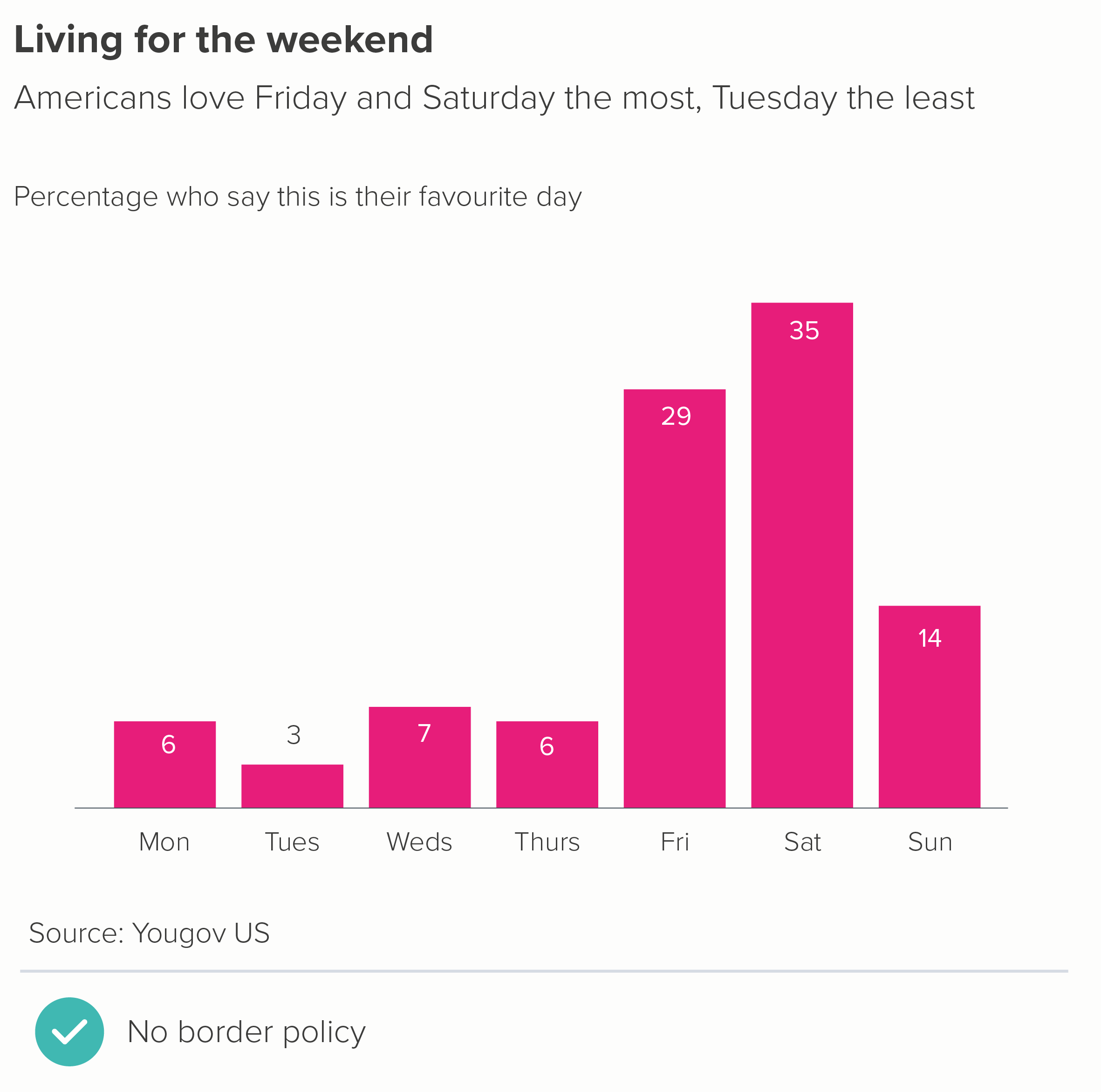
But sometimes your chart is one of several: perhaps it’s a panel in a larger infographic, or one section of a dashboard - so a container is a good idea. However, putting thick border lines around your charts - like you’ve dumped them in Word text boxes - doesn’t exactly show your audience that you care. Drawing lines around your chart distracts from the lines in your chart. Instead I’d recommend experimenting with a subtle background fill - usually a shade of grey (on a white background) or a darker shade of your background colour (if it’s a dark background).

Another option is to just use a border on one or two sides of the chart (the second chart below).

If you have lots of bar charts - perhaps it’s a small multiples story - I’d lose any kind of frame and let white space work its magic, as in this wonderful example from Nathan Yau about the quality of movie sequels.

Source: Flowing Data
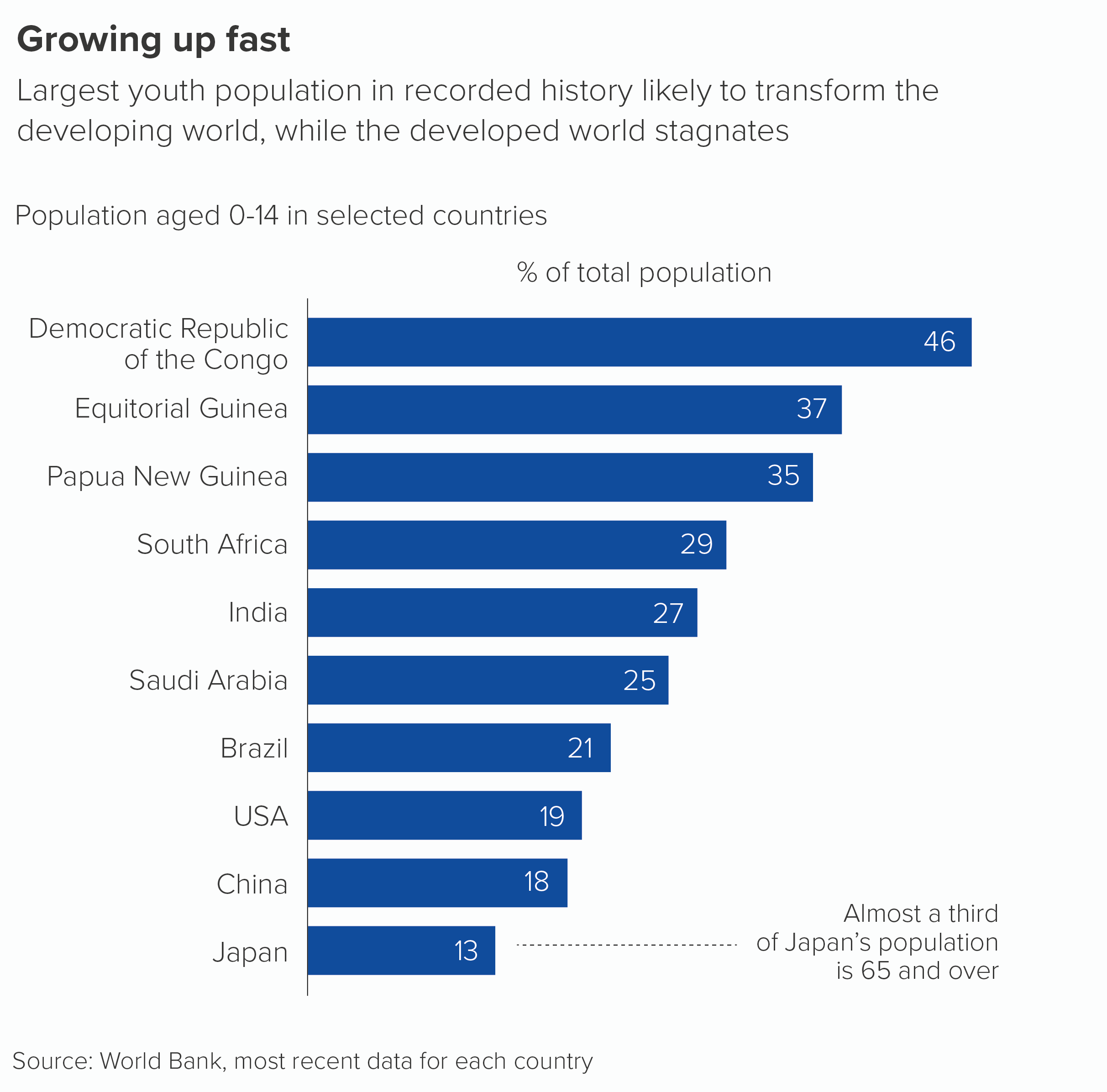
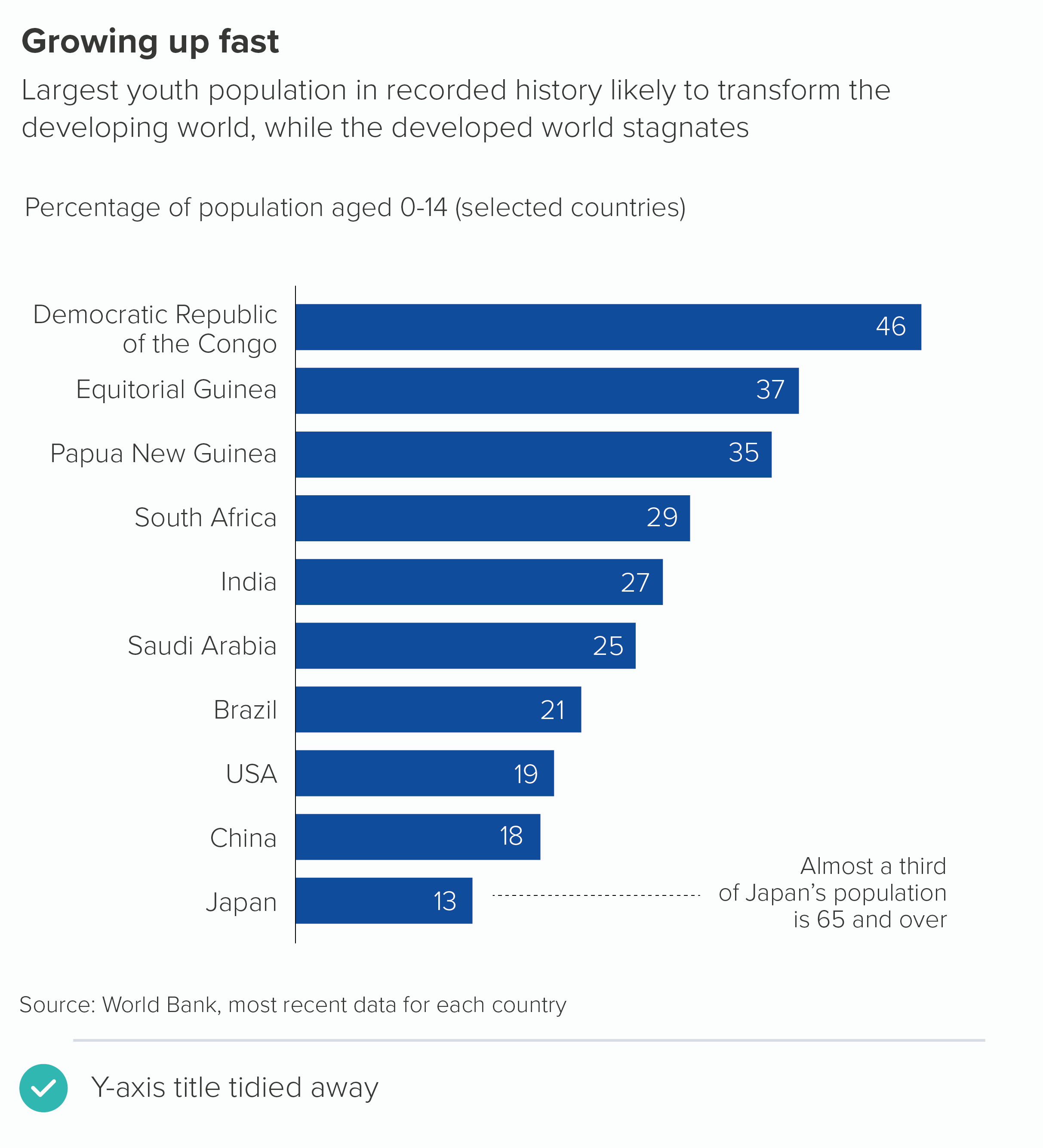
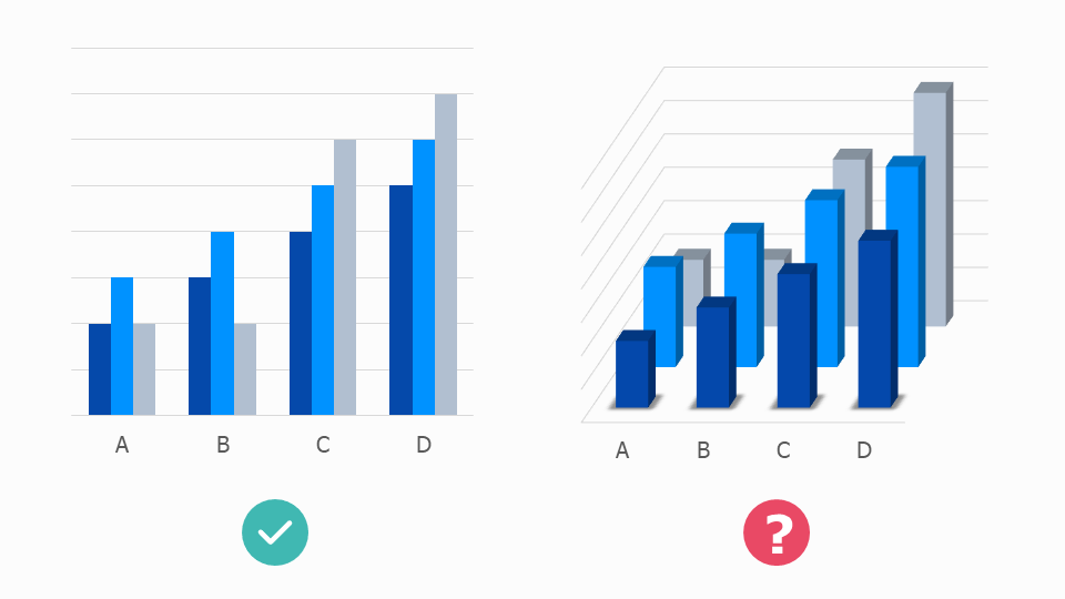
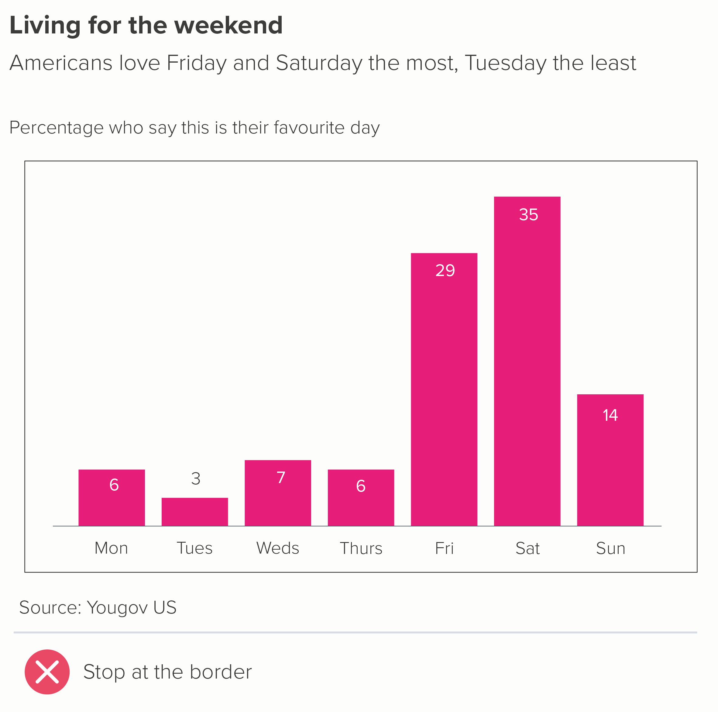
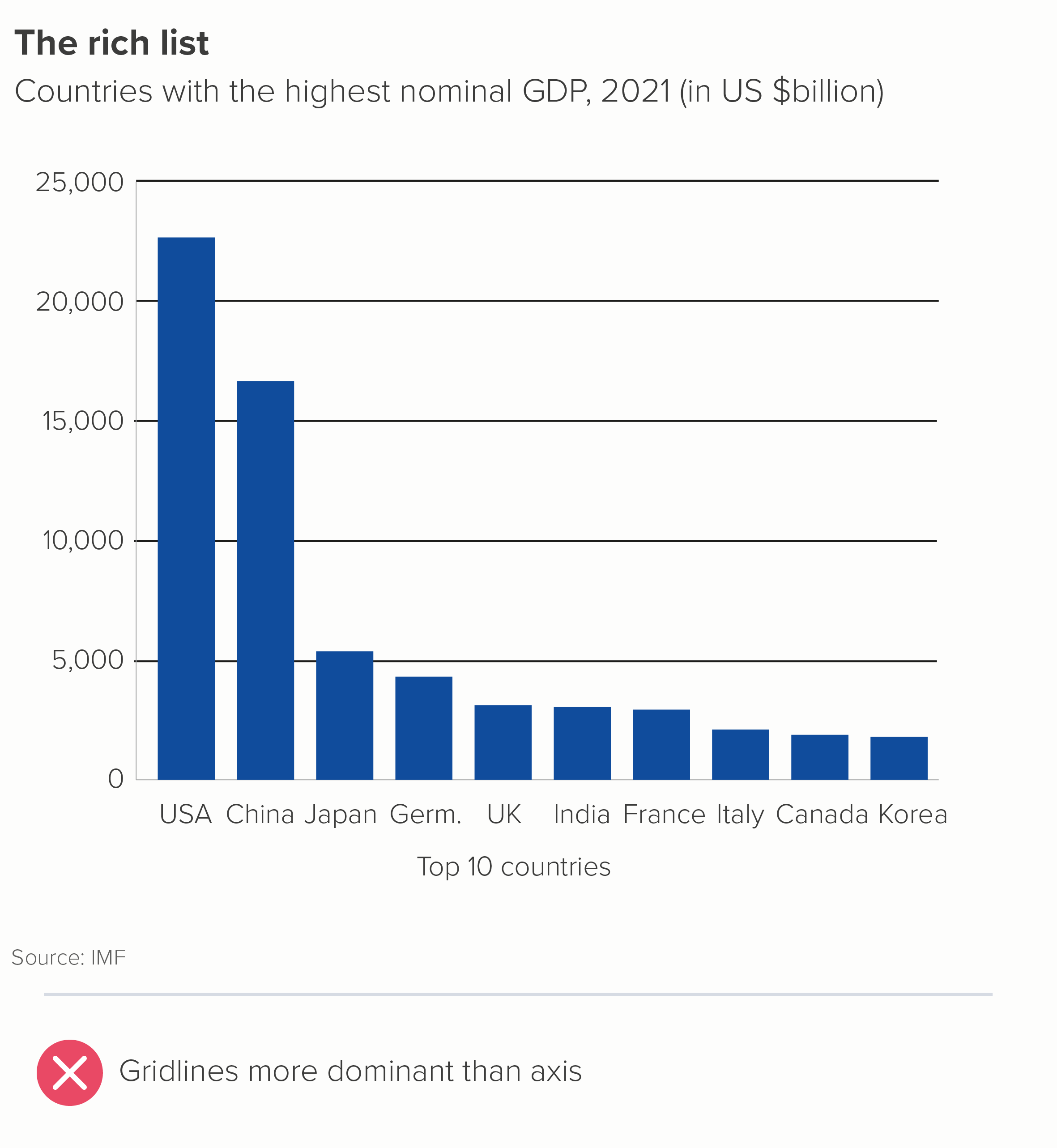
ii) Gridlines

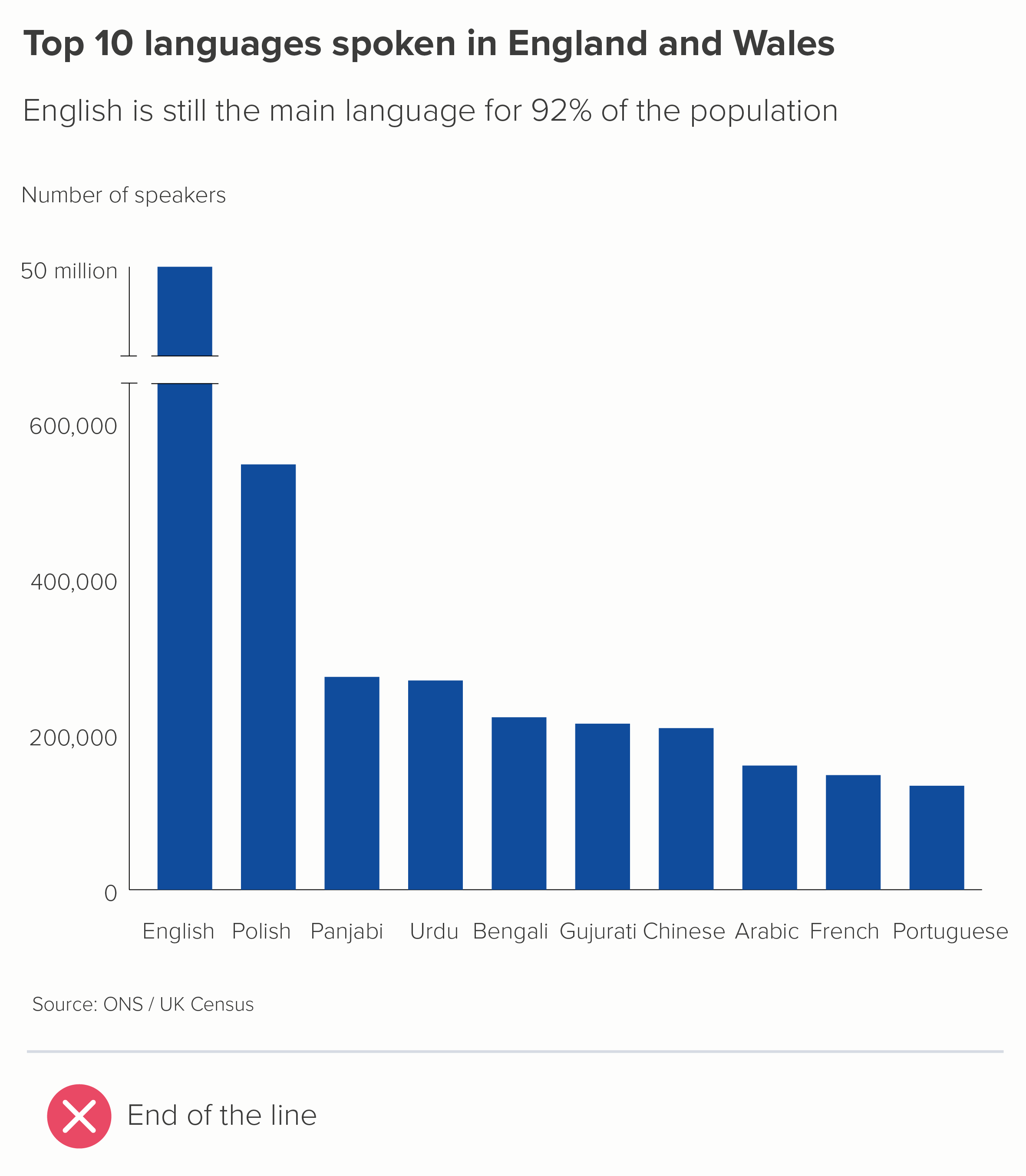
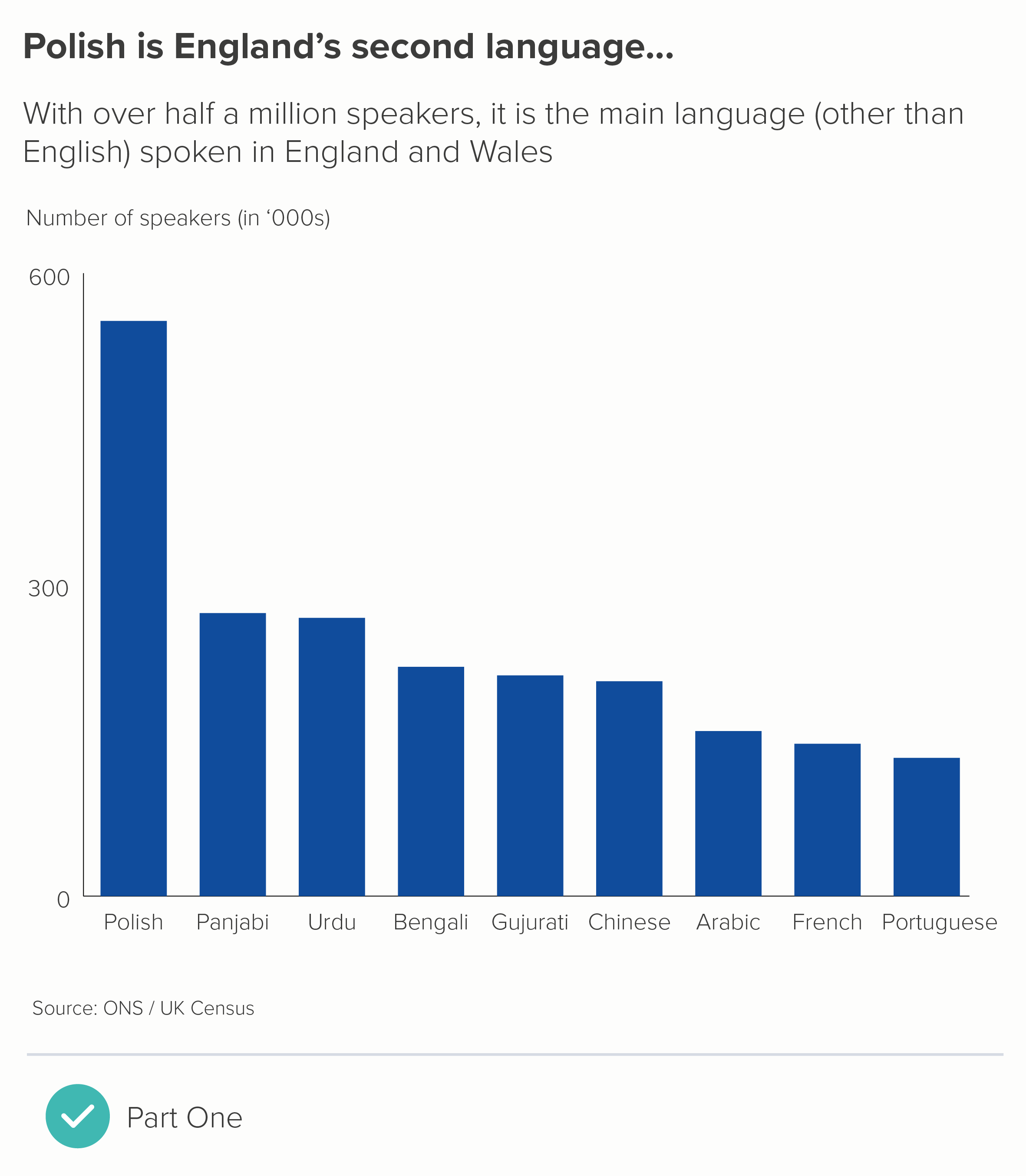
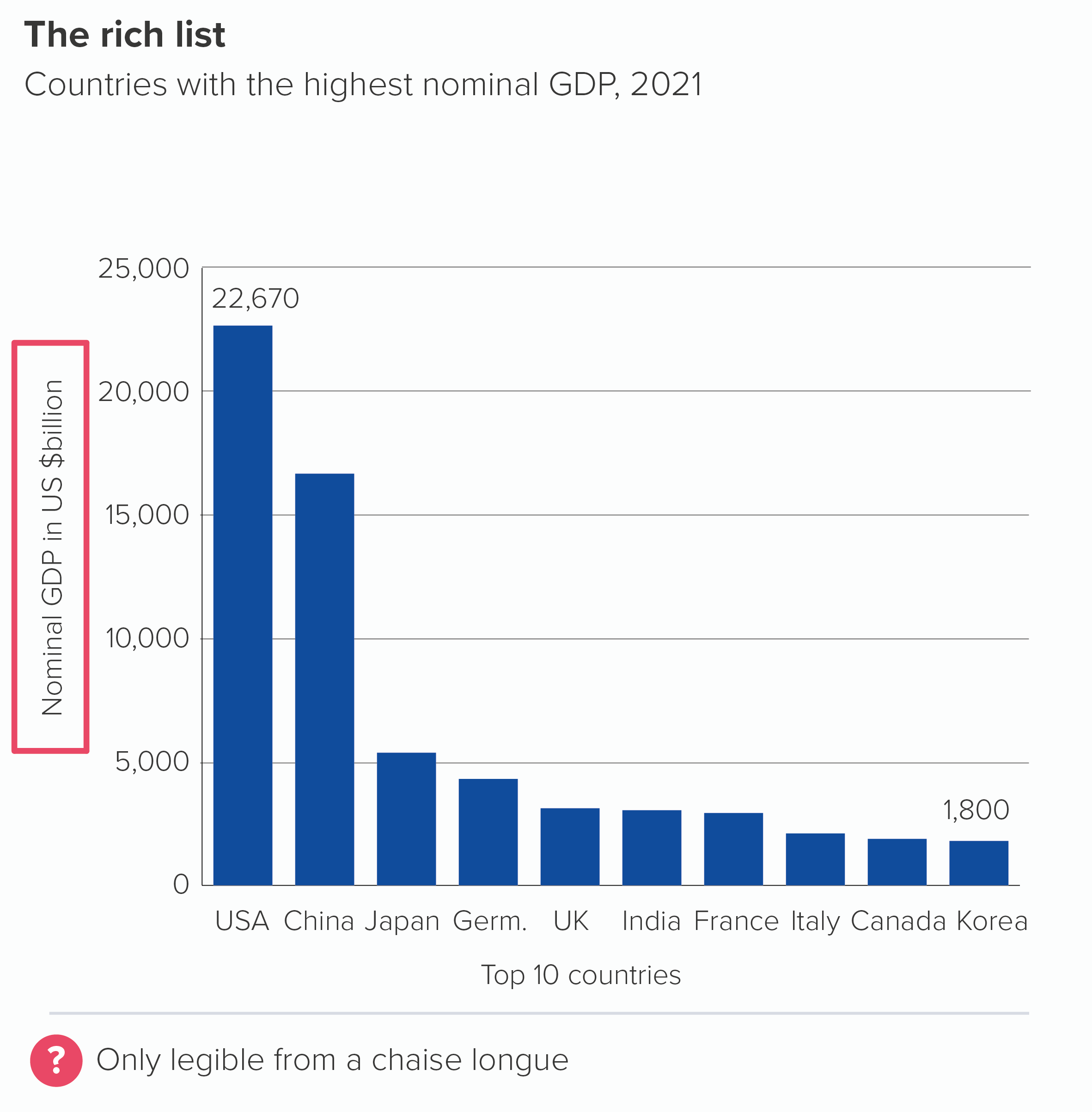
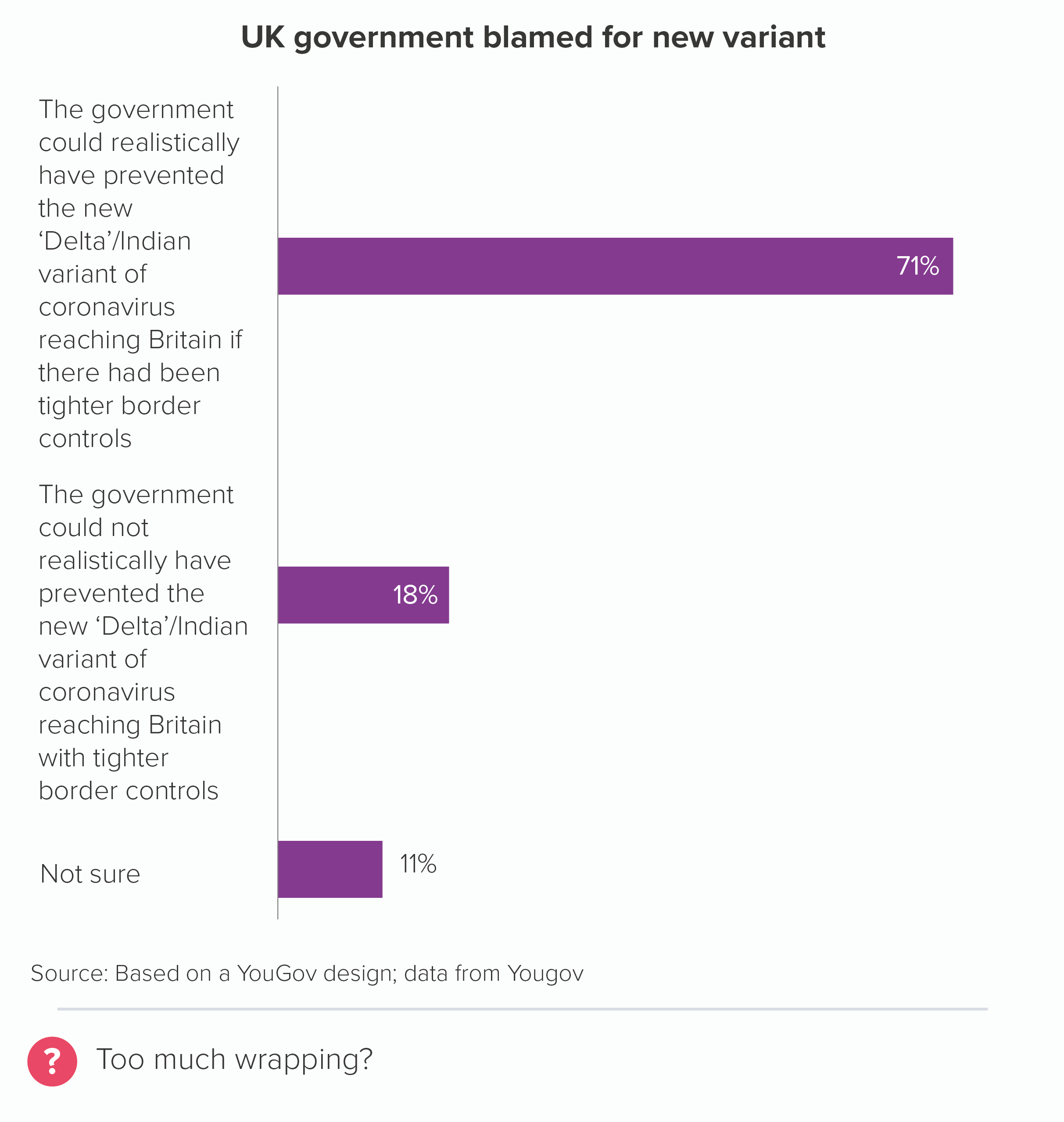
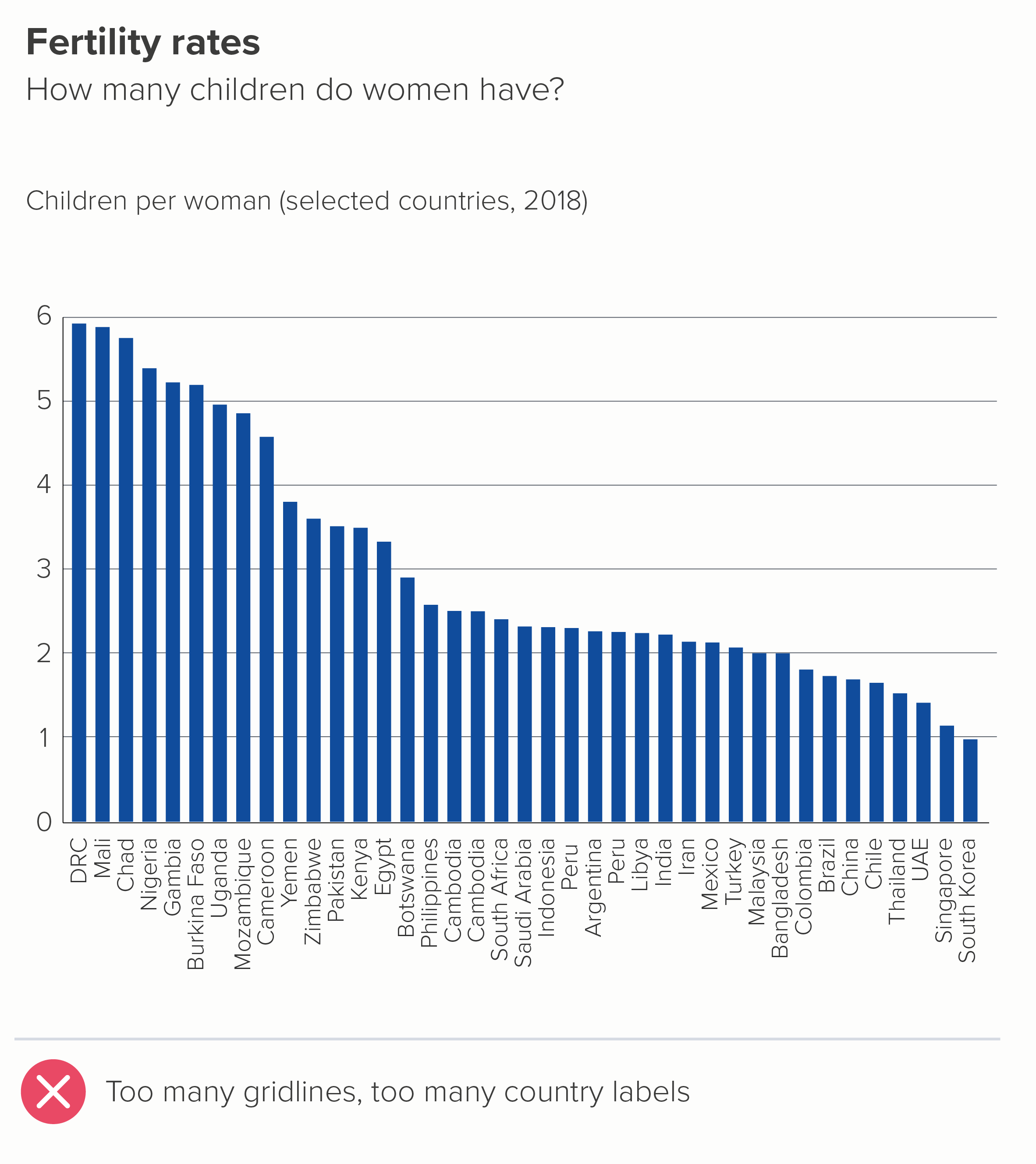
Edward Tufte argues that gridlines ‘should be muted or completely suppressed.’ Stephen Few states that ‘gridlines in graphs are rarely useful’. They were talking about all chart types, but with bars, I think we can go further. In an ideal world, you’d never need gridlines on a bar chart: they shouldn’t be ‘muted’, or ‘used rarely’, they should just be eliminated.

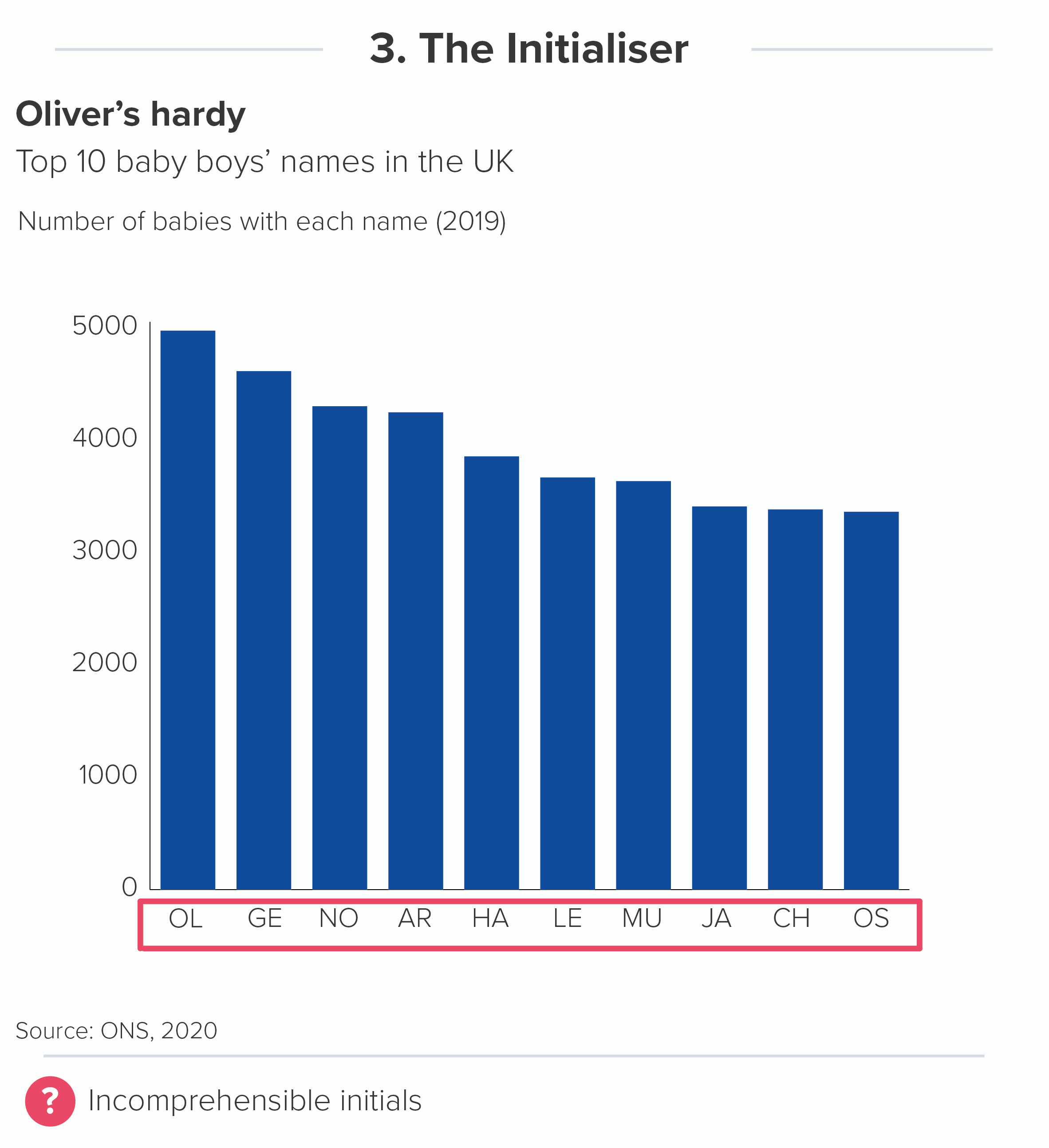
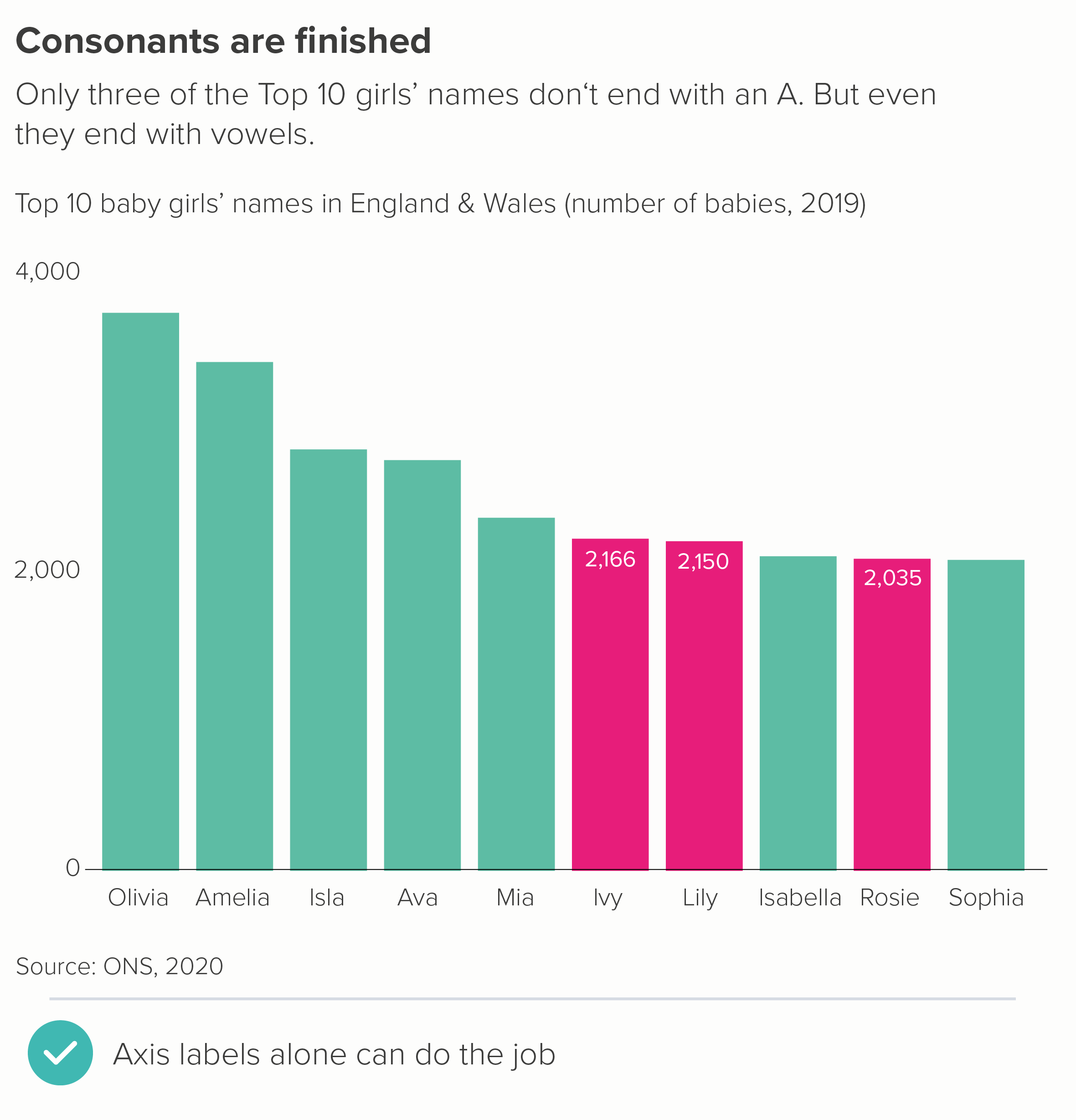
Gridlines are there to help an audience estimate the values in your bars. If you keep the number of bars low (say, 10 max - as outlined in rule 17), they should be wide enough to incorporate data labels. Data labels mean no gridlines. And you can usually get rid of your value axis too (y-axis for vertical bars, x-axis for horizontal). 

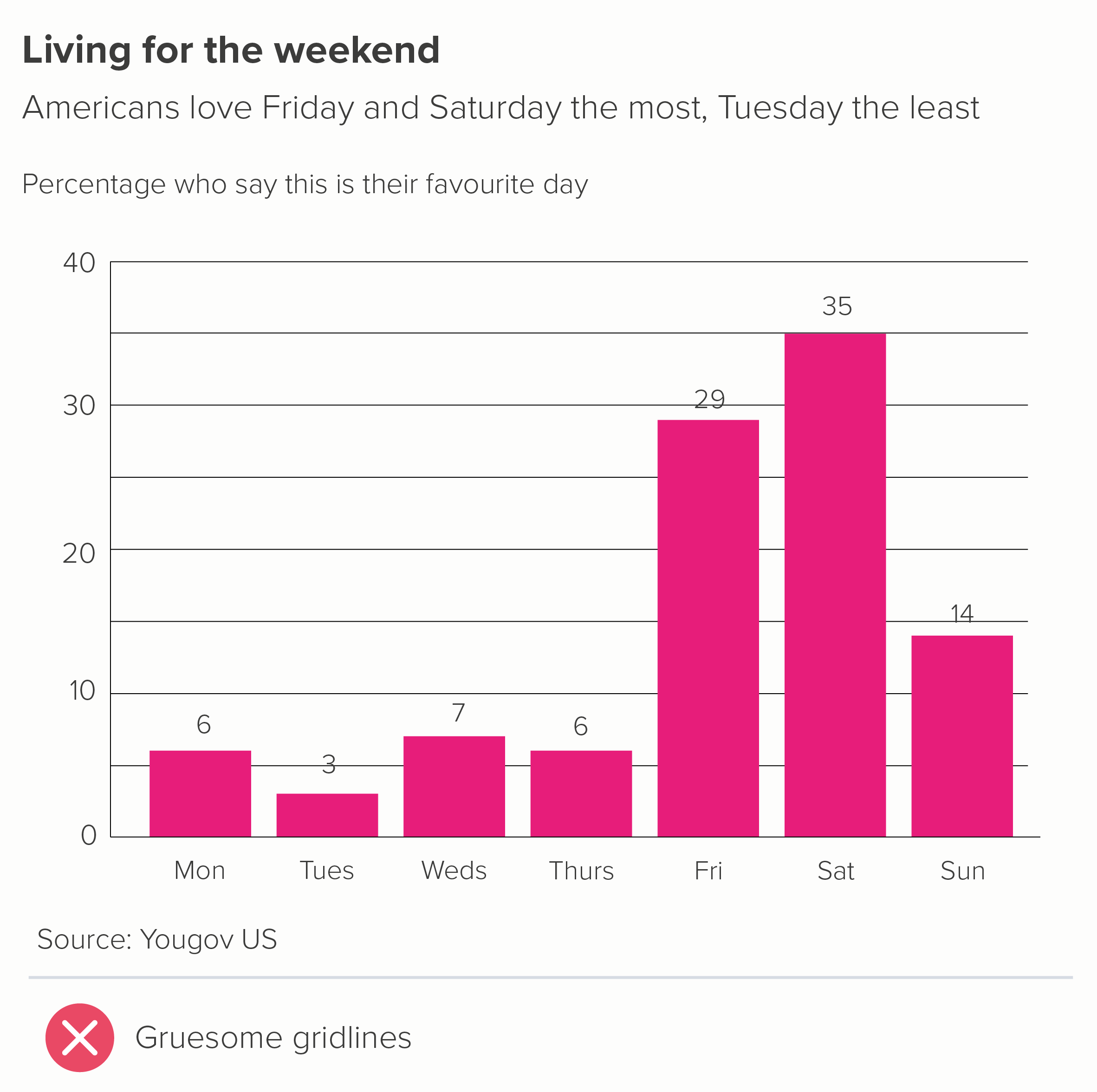
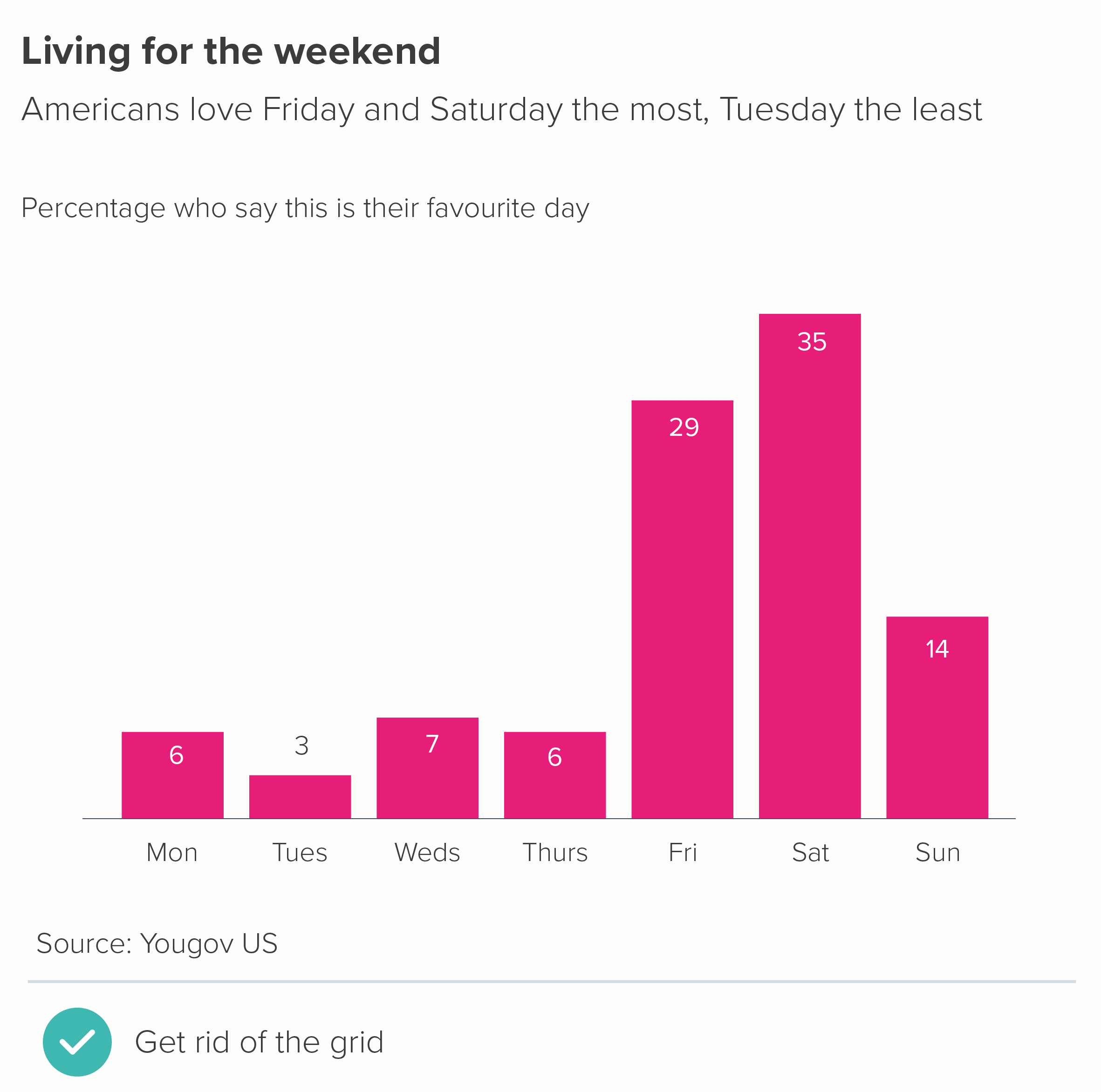
Look at the first chart - not only are the gridlines redundant but they fight with the labels, slicing through some of them.

Gridlines are only required if your story makes data labels impossible - perhaps they would be too wide for the bars, or you have dozens of bars, and adding numbers would look cluttered.

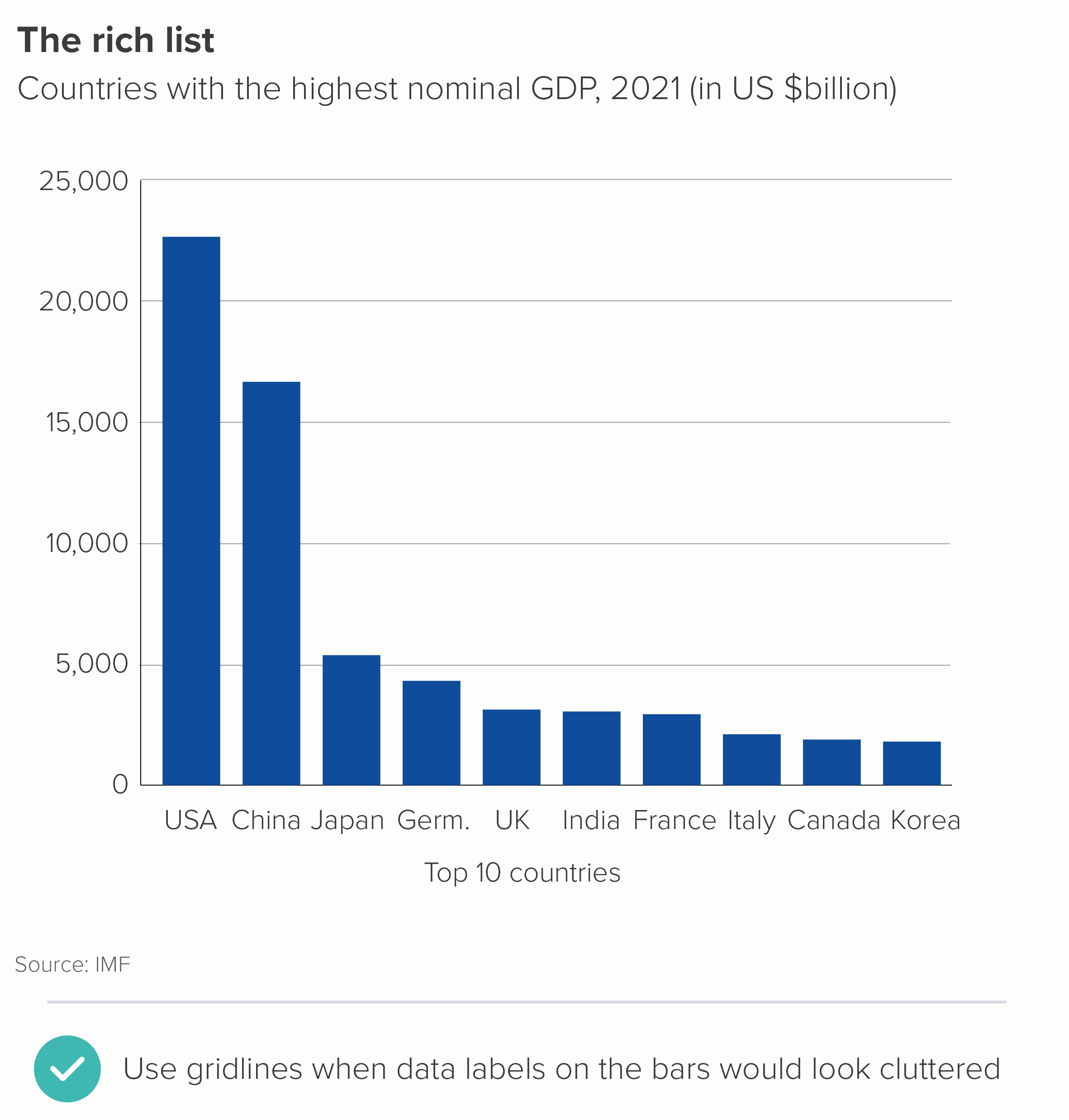
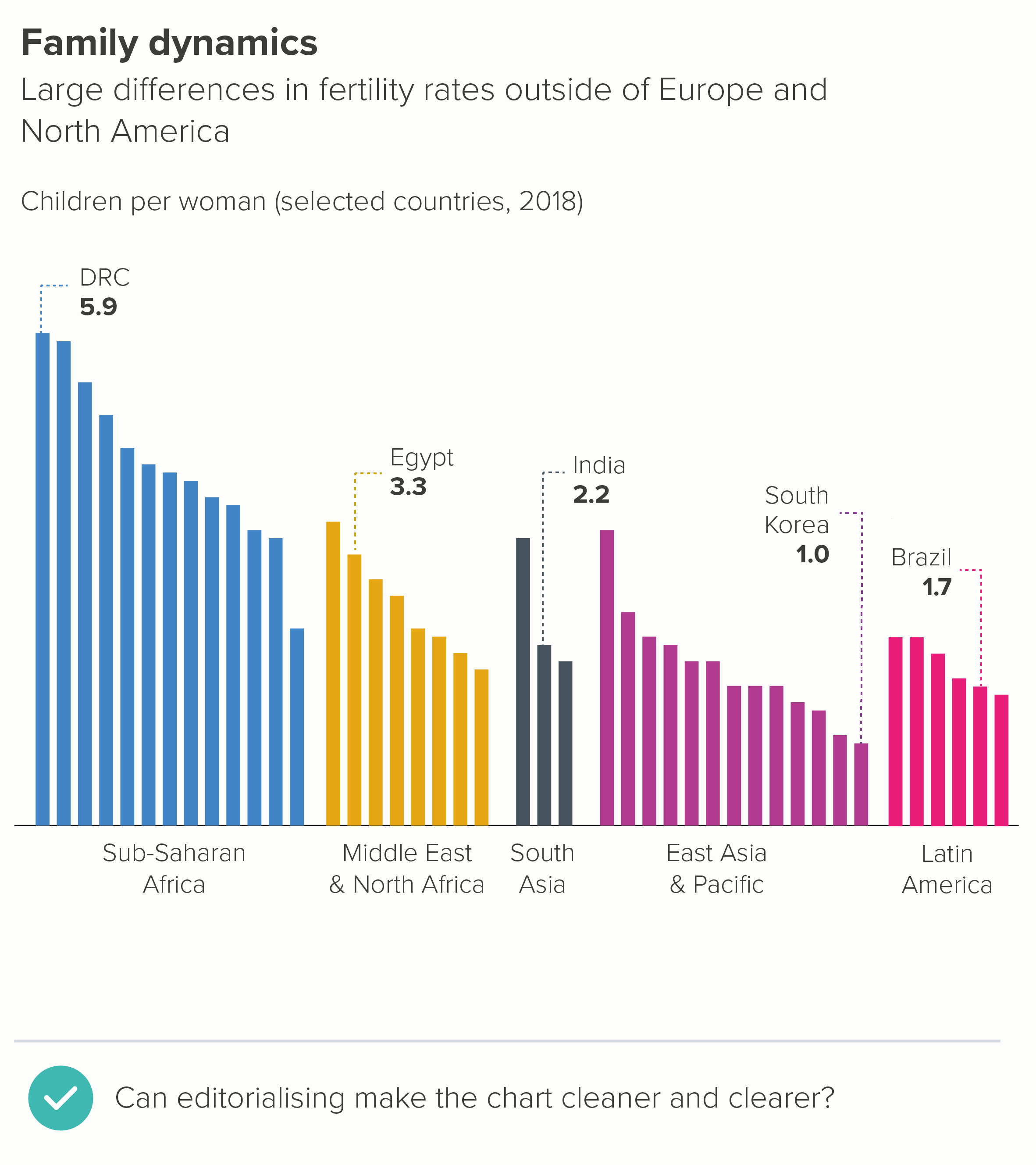
Even then, the presence of gridlines is often a warning sign that you have more story work to do. The primary job of a bar chart is rarely to give an audience a precise value (that’s what tables are for). Can a judicious use of text tease the story out and make any gridlines redundant? Is it possible for a handful of bars to be labelled, thereby acting as a kind of ‘axis’ for the others?

If you do have to use gridlines, make them as subtle as possible; they should always be less conspicuous than your axis lines.
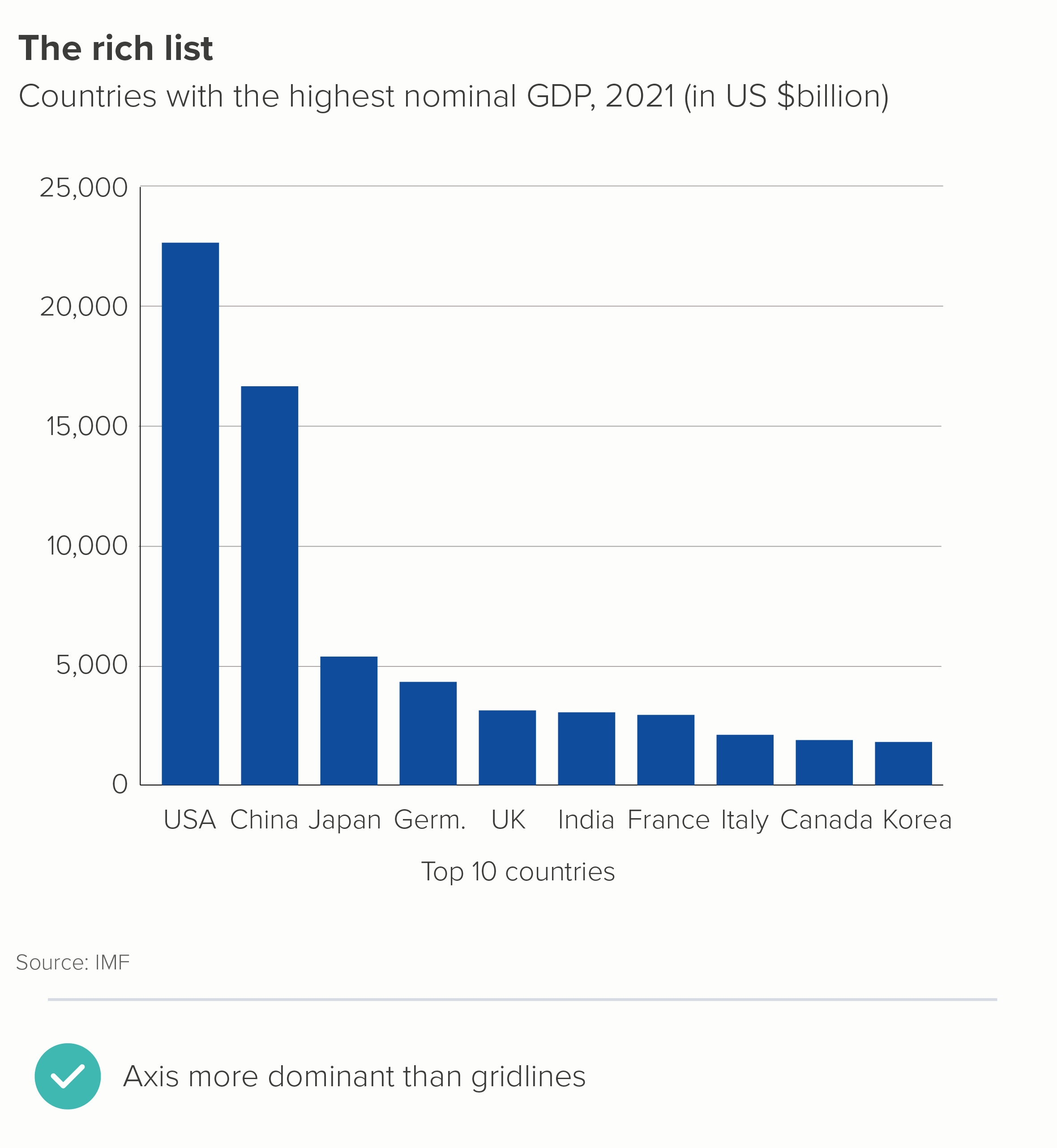
iii) Axis lines

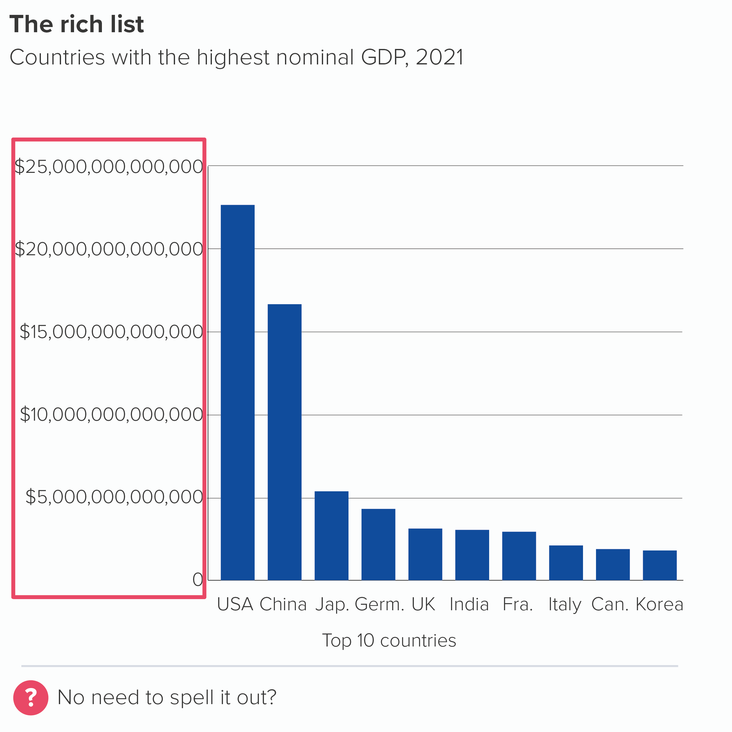
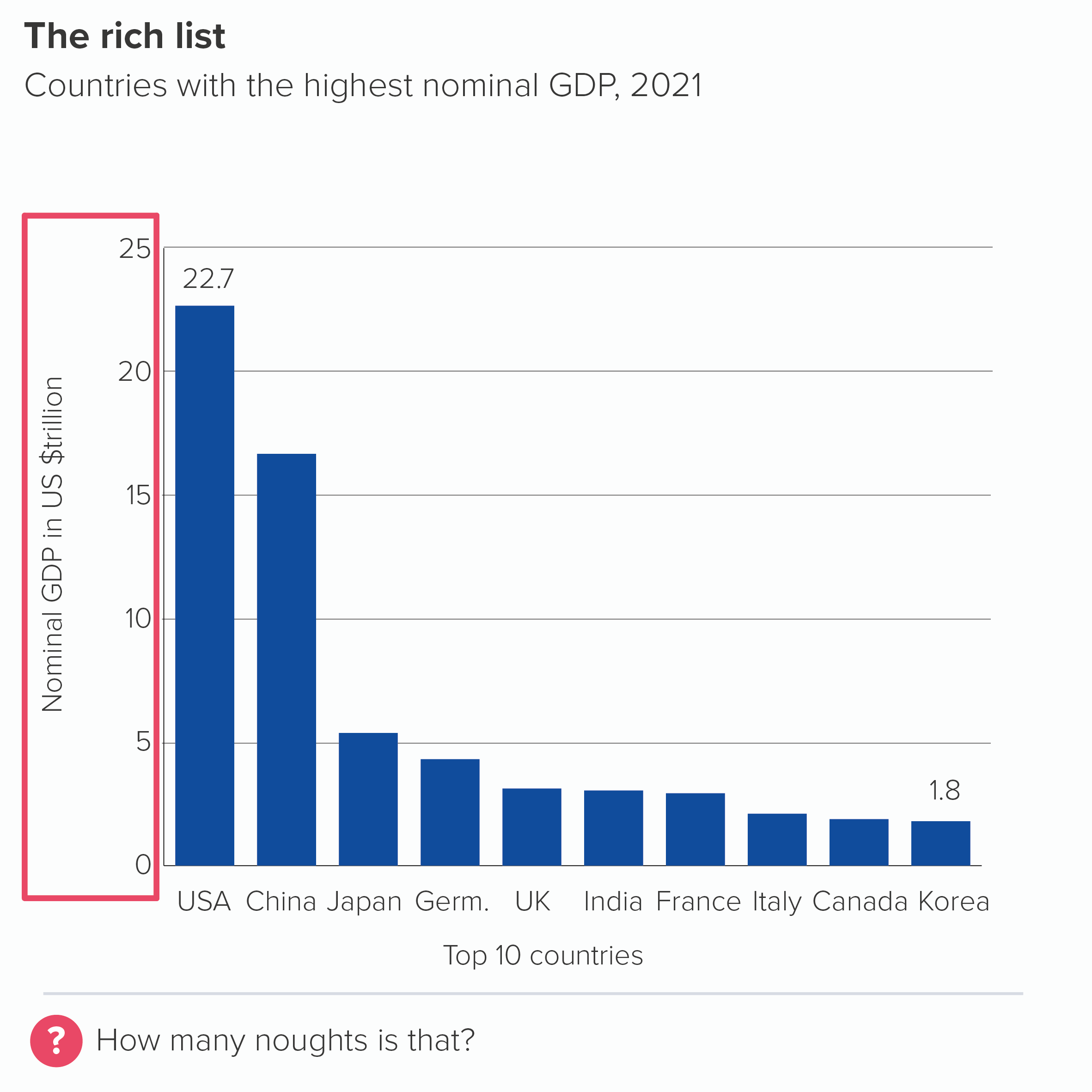
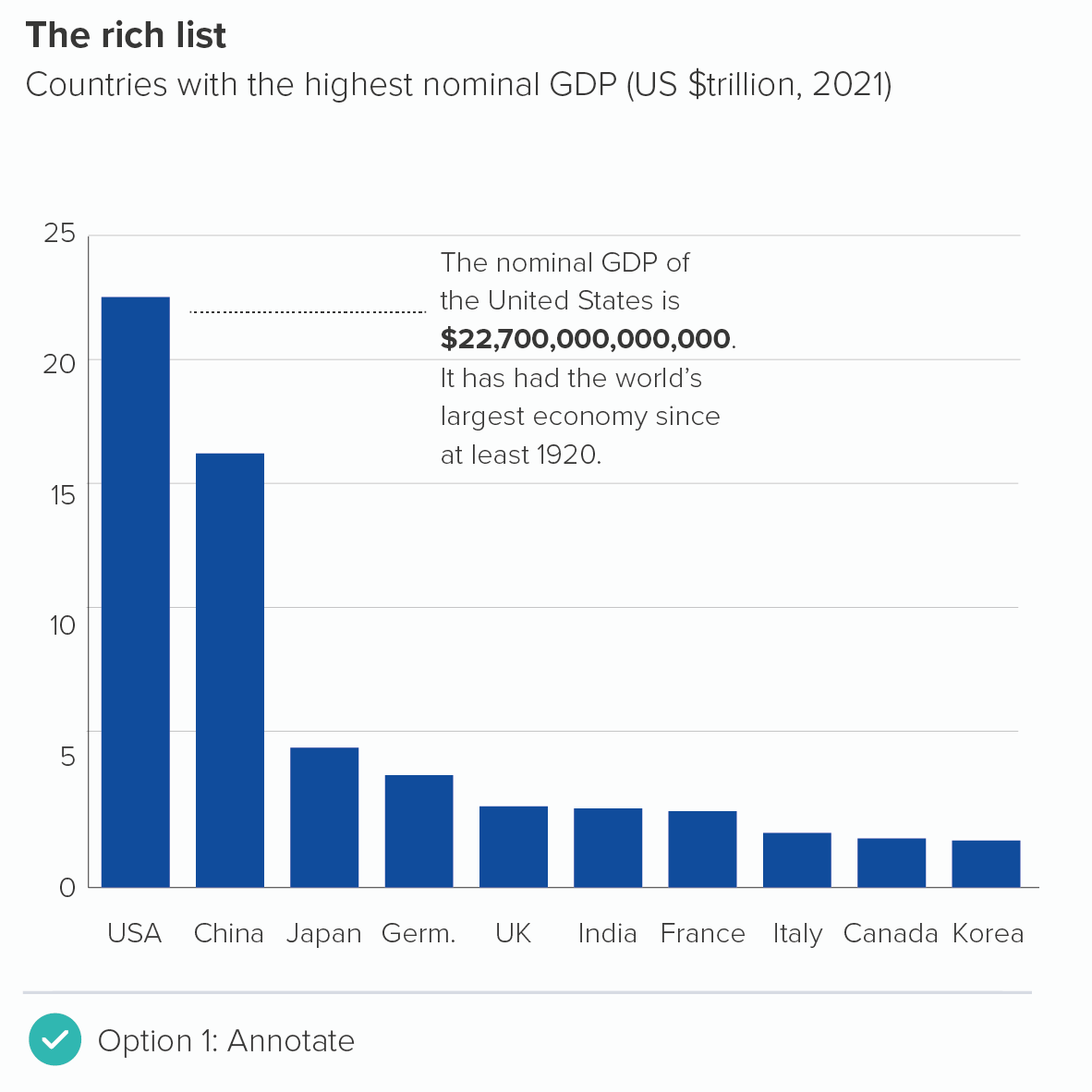
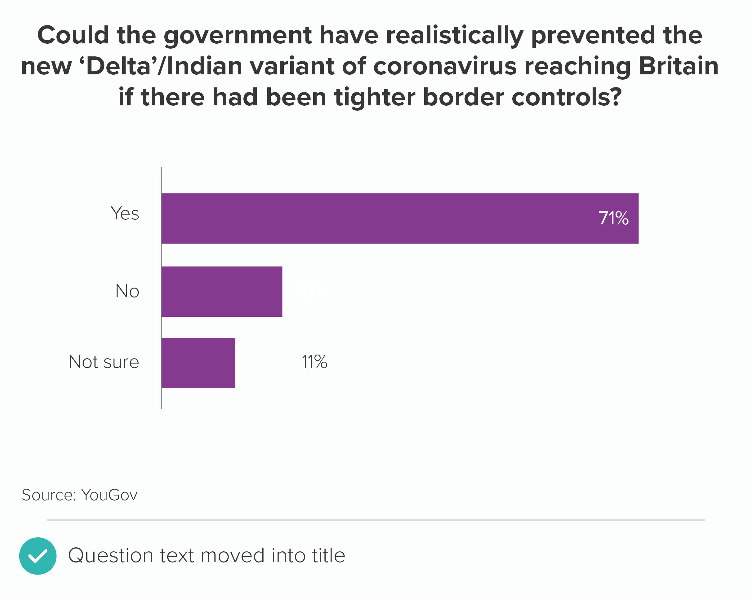
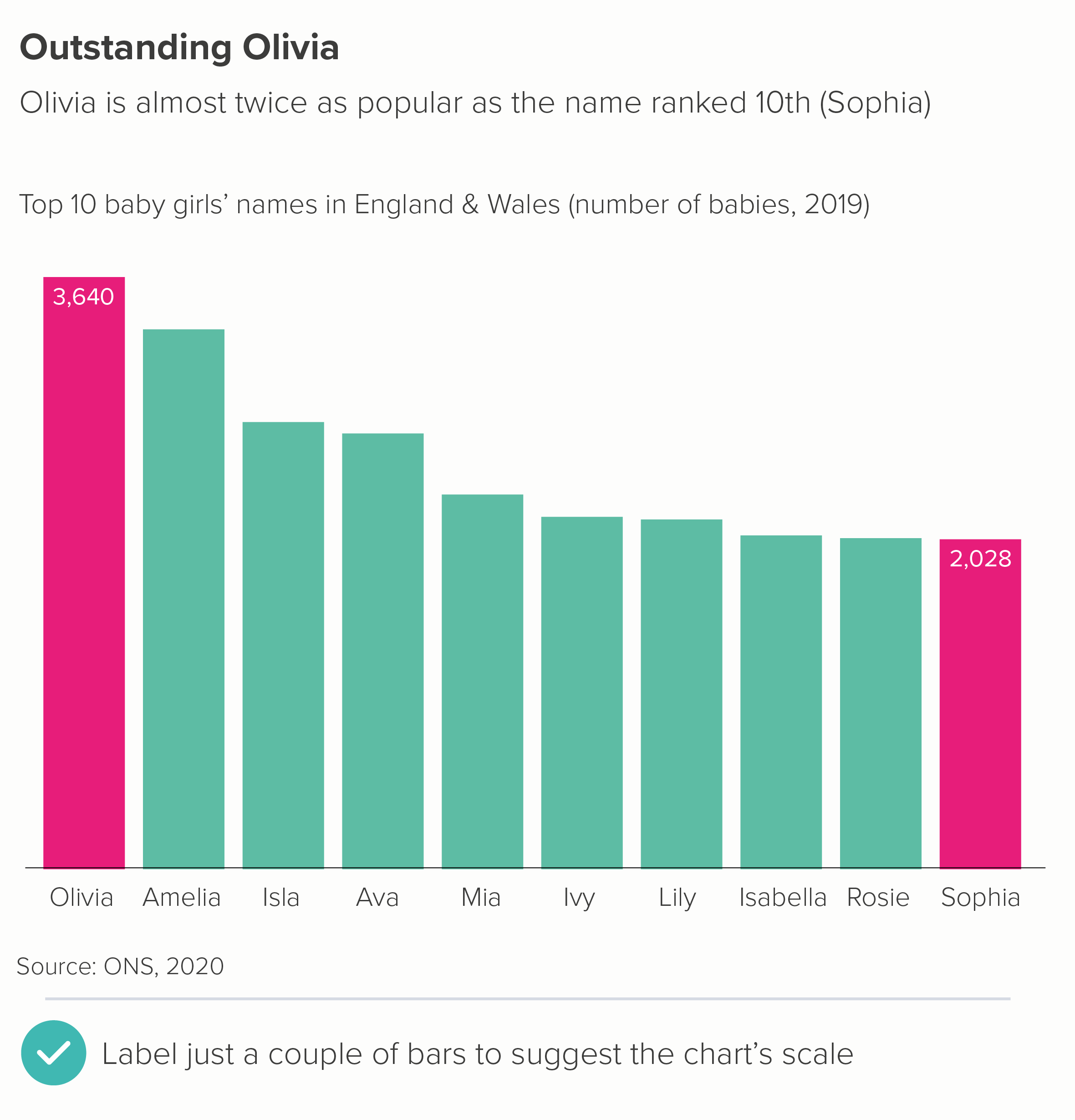
Above, I suggested that you could delete your value axis if your bars have data labels.

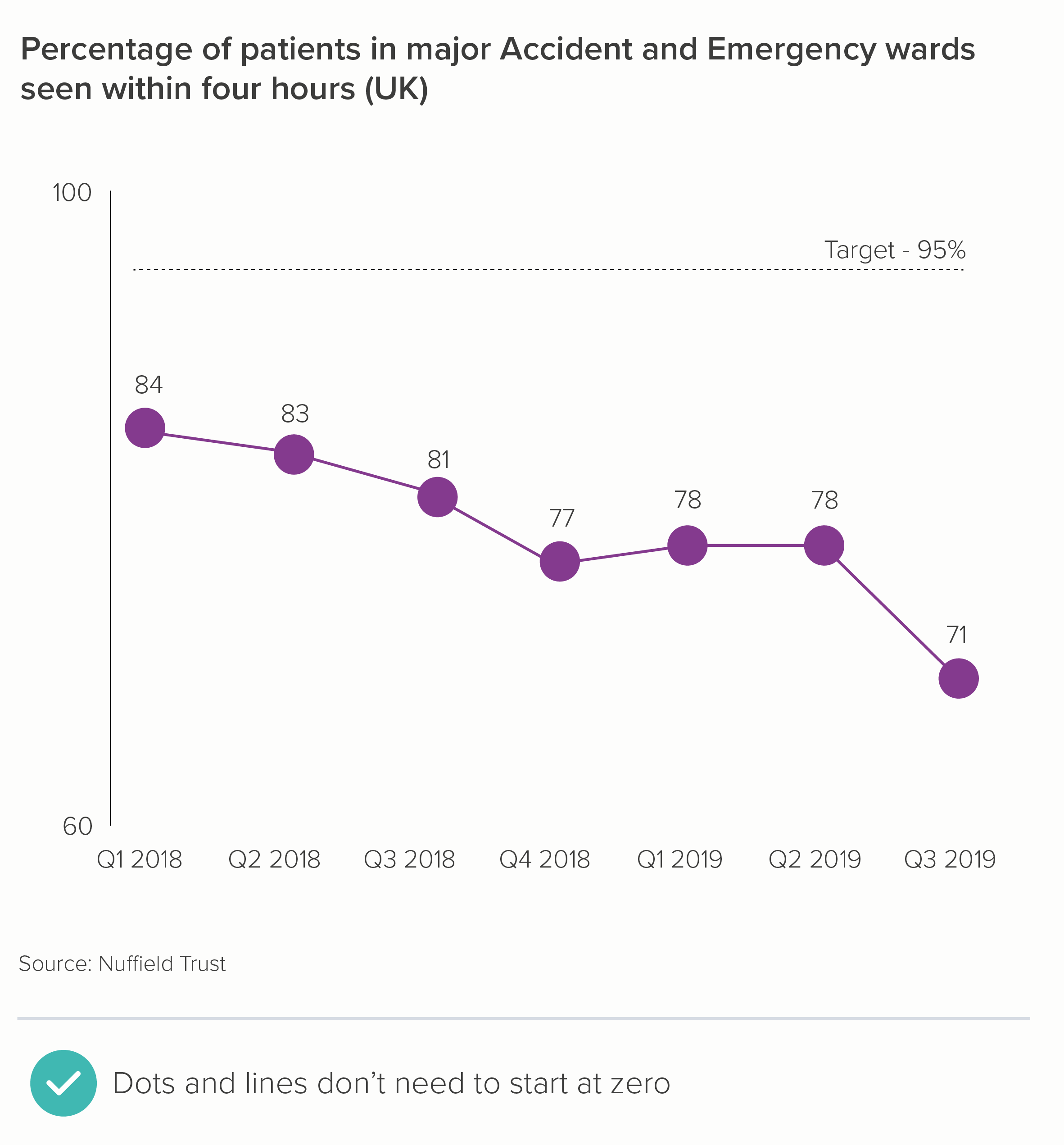
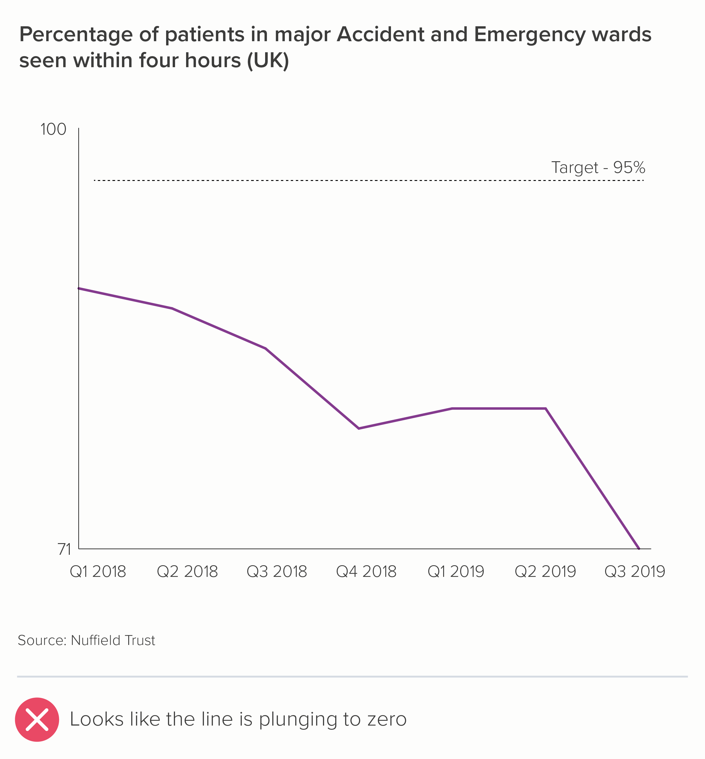
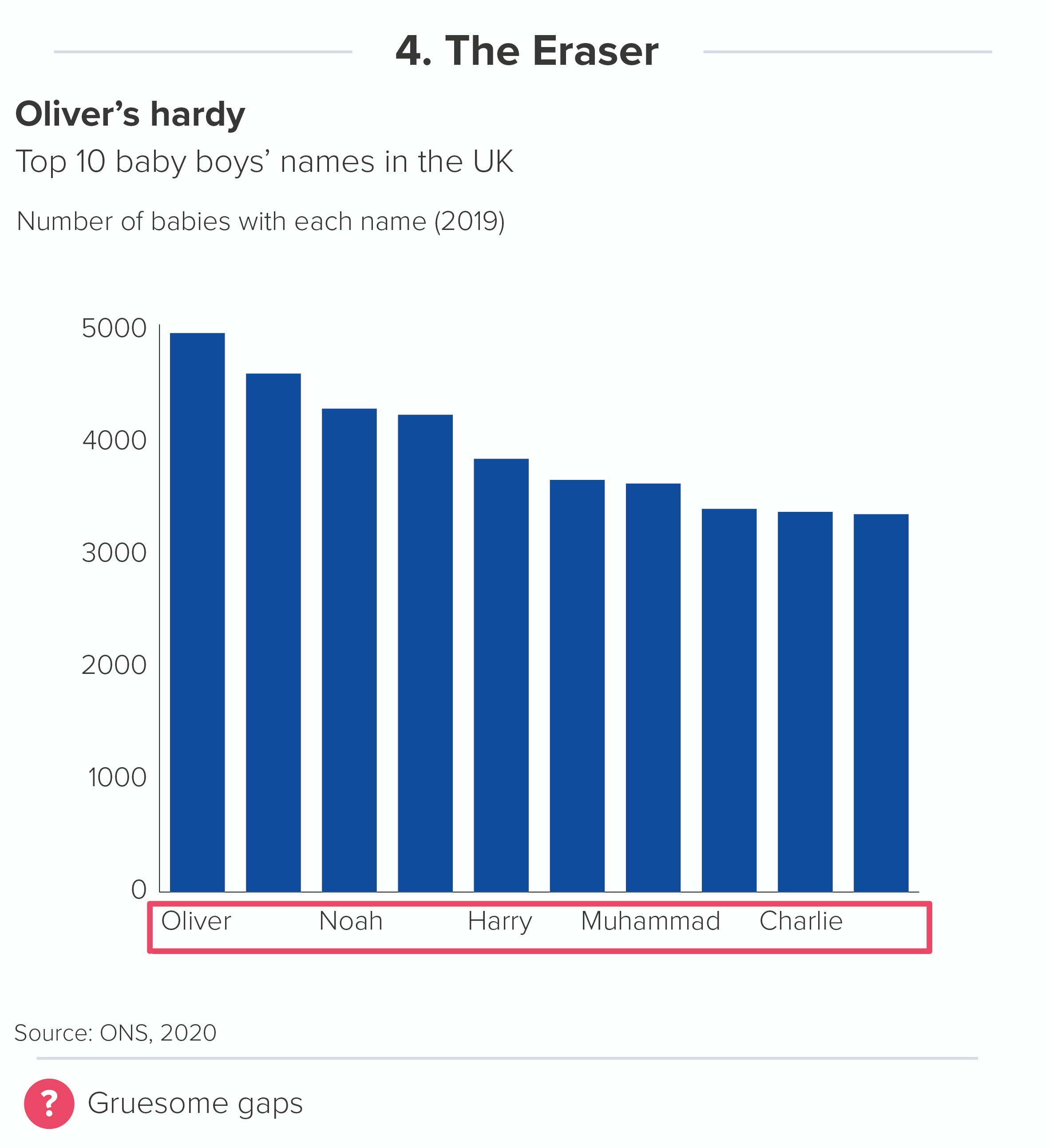
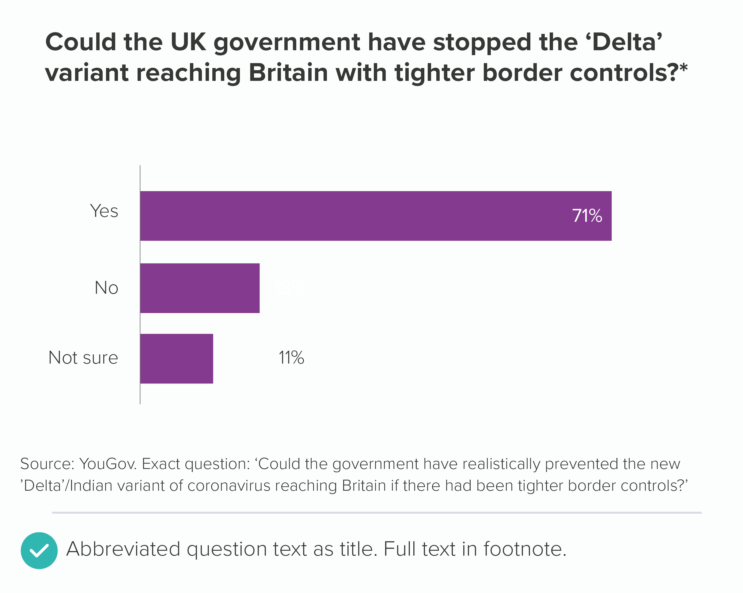
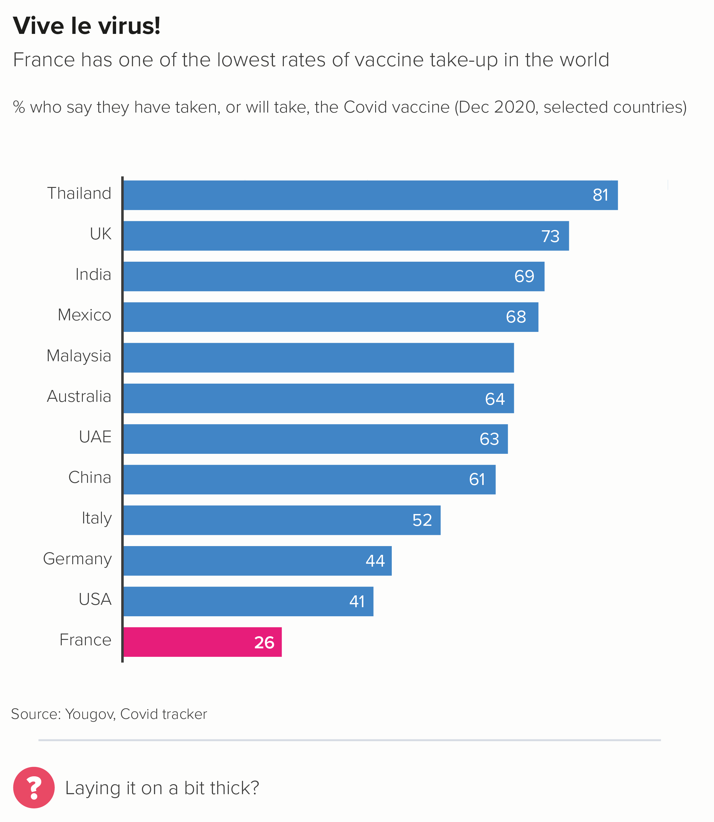
Sometimes you can delete the value axis, even if you only have a couple of data labels. The rough value of the unlabelled bars is perfectly clear from the two that are labelled (the first chart below). Or sometimes you might want to delete the value axis but leave the numbers to unobtrusively indicate the chart’s boundaries (and to reassure people you’ve started your chart at zero) - as in the second chart below.

What about the category axis line? (The x-axis for vertical bars, the y-axis for horizontal bars). In most cases, it’s helpful. 

  • Vertical bars work as a metaphor because they are separate shapes sharing common ground, like houses or fenceposts or people standing side by side. Your x-axis is the ground beneath their feet.

  • Horizontal bars work because those shapes are running a race, and your y-axis is the starting line. In both cases, the category axis indicates clearly: I’m starting to measure all of these things from exactly the same point, although they will end in different places.

That said, most software makes the category axis way too prominent. You almost always need to knock it back. 0.5 pt is usually plenty, especially if it’s a dark line on a white background.
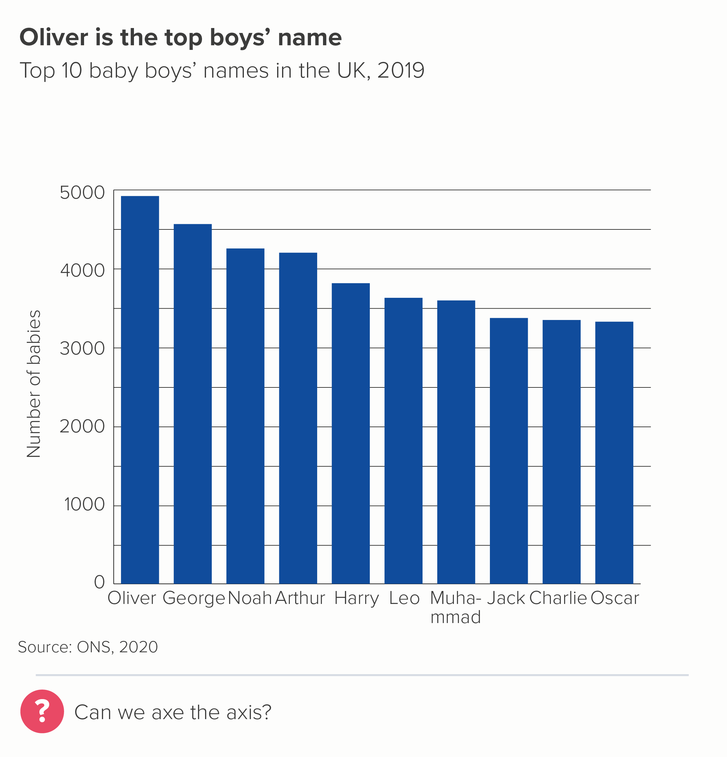
iv) Axis tick marks

I’m genuinely stumped as to why axis tick marks are ever required. They look busy and they don’t help you read or understand the chart.

On a category axis, I’d say never use them. Look at the first chart above - what are those tick marks on the category axis doing? On the value axis, if you absolutely need that level of precision, I’d favour gridlines over tick marks, as they are easier to incorporate subtly, and they actually help you to tie value to bar. 

v) Annotation lines

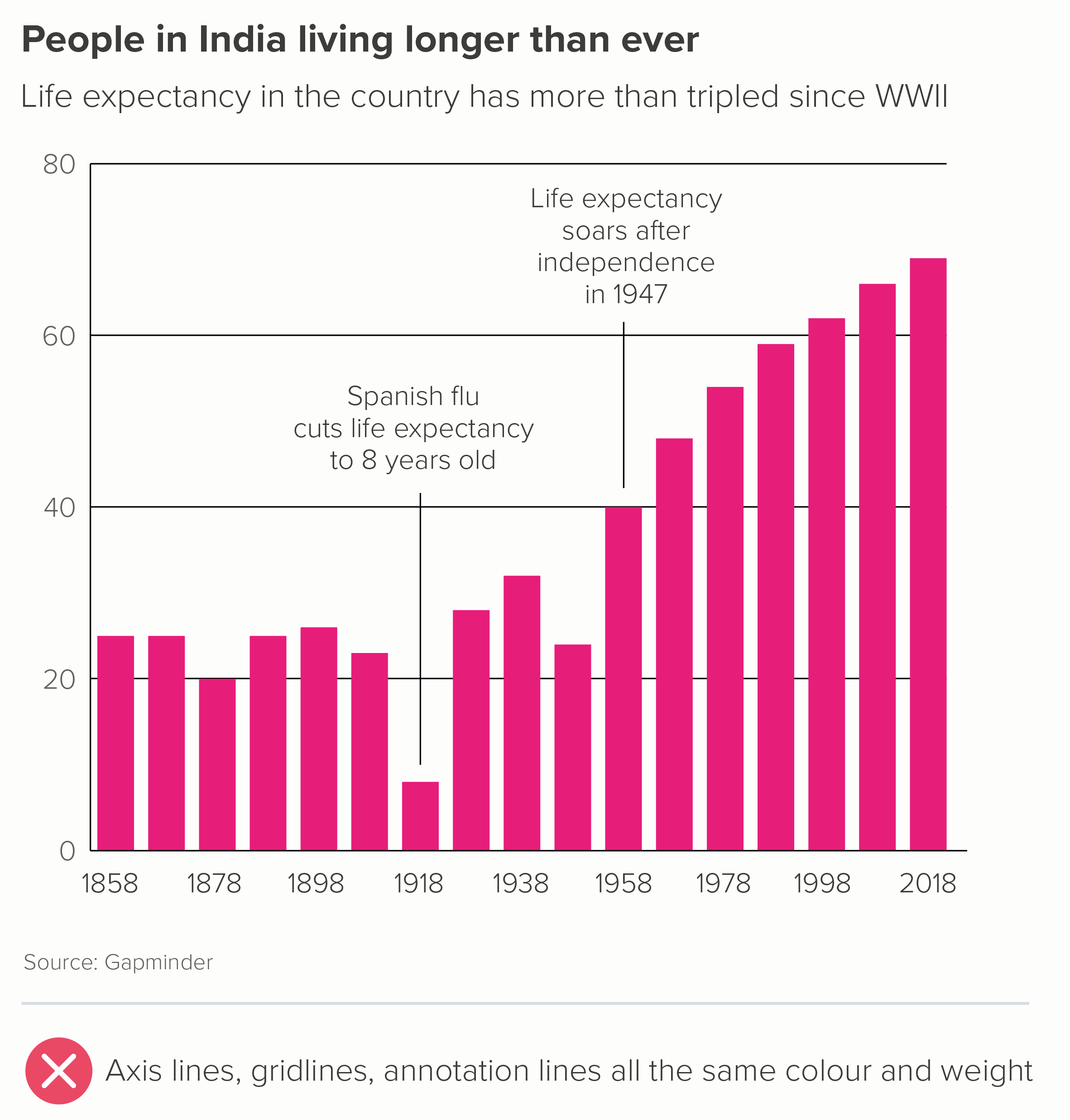
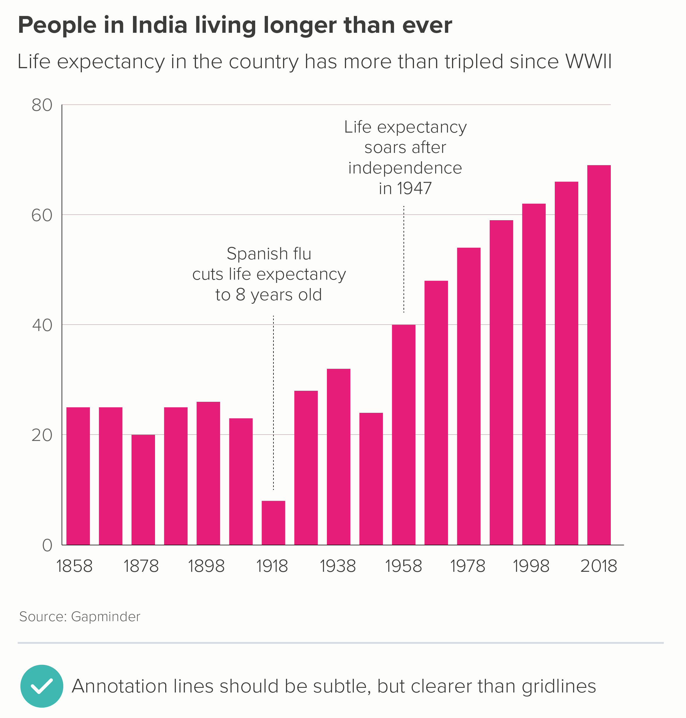
Sometimes a (restrained) use of annotation can help to add depth to your story. The important thing to remember is that this is adding to your story, so the story has to be established first. For this reason, annotation lines tend to be either thin or dotted, to clearly indicate that they are lower down the narrative hierarchy. 

However, note that annotation lines should still be more prominent than any gridlines. Annotations are still part of your story, whereas gridlines are just scaffolding. 

Exceptional academics

The rules above apply to most audiences. However, when we have worked with academic institutions, we are sometimes asked to put all of this ‘chartjunk’ back in again. So, as I’ve said all along, you do have to be attuned to what your audience expects a credible bar chart to look like. Some academics seem to find crap design reassuring, or good design suspicious, or both.

Three awful charts - the right-hand bar chart has tick marks, confidence intervals, four axes - all drowning out the chart
A terrible chart from an academic journal, full of unnecessary lines

Source: https://journals.asm.org/doi/10.1128/CMR.00028-20 

These examples are from Nature and the American Society of Microbiology - published in 2018 and 2020, respectively. 

In the bar chart in the first example, we have:

  • a chart border

  • tick marks on four sides of the chart

  • crowded axis labels

  • a scientific formula as a y-axis title, which would be hard enough to understand even if it wasn’t rotated 90 degrees

  • confidence interval lines, which are the same colour (jet black) and line thickness as the border, axes and tick marks. 

The content is not differentiated at all.

In the second bar chart, we have:

  • thick axis lines

  • tick marks on the x-axis

  • gridlines

  • x-axis labels and data labels

  • a gradient background fill

There are of course other problems with this second example: there are too many bars, they are not ranked largest to smallest, the bars have the strangest fill pattern I’ve ever seen and there are no comma separators to help us read any of the numbers. But the clutter isn’t helping.

The fact that these charts weren’t published in the 1970s, but recently, and the fact they were weren’t self-published by a marginalised crank, but in high-profile peer-reviewed journals tells you all you need to know about the accepted house style of scientific charts. It needs to look like a computer did it, perhaps because it feels more unbiased (though it isn’t, of course) and perhaps because it shows that the author has more important things to worry about than making a chart look ‘pretty’. Whatever the reason, the audience is always right, I’m afraid.

So it’s worth remembering that the clean, clear chart you’ve made for a general audience - with as many lines removed as possible - might look too slick for scientists. Those axis lines and gridlines also signal a concern for precision and exactitude, which is often prioritised over clarity in academic research. All those lines are also a warning sign: this is difficult, this is complicated, this is definitely not for everyone.

So even though I’ve railed against unnecessary lines, it’s worth remembering that your audience always defines what unnecessary means. In most circumstances, you should remove as much as possible, so your title, your bars and any category and data labels can punch out. But for some expert audiences, all those extra grids and glyphs can calm the nerves. You’re walking a fine line.   

Verdict: Follow this rule almost all of the time

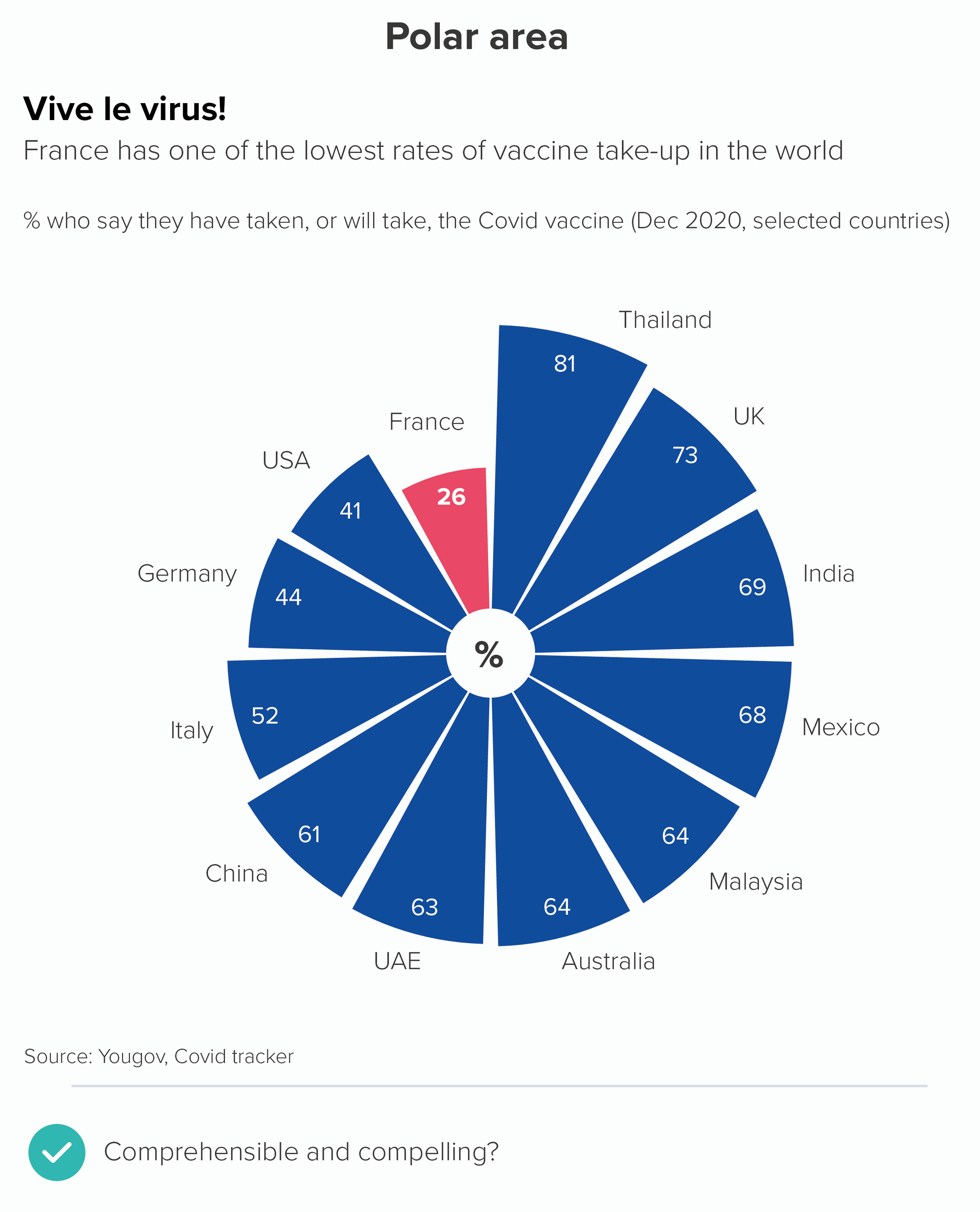
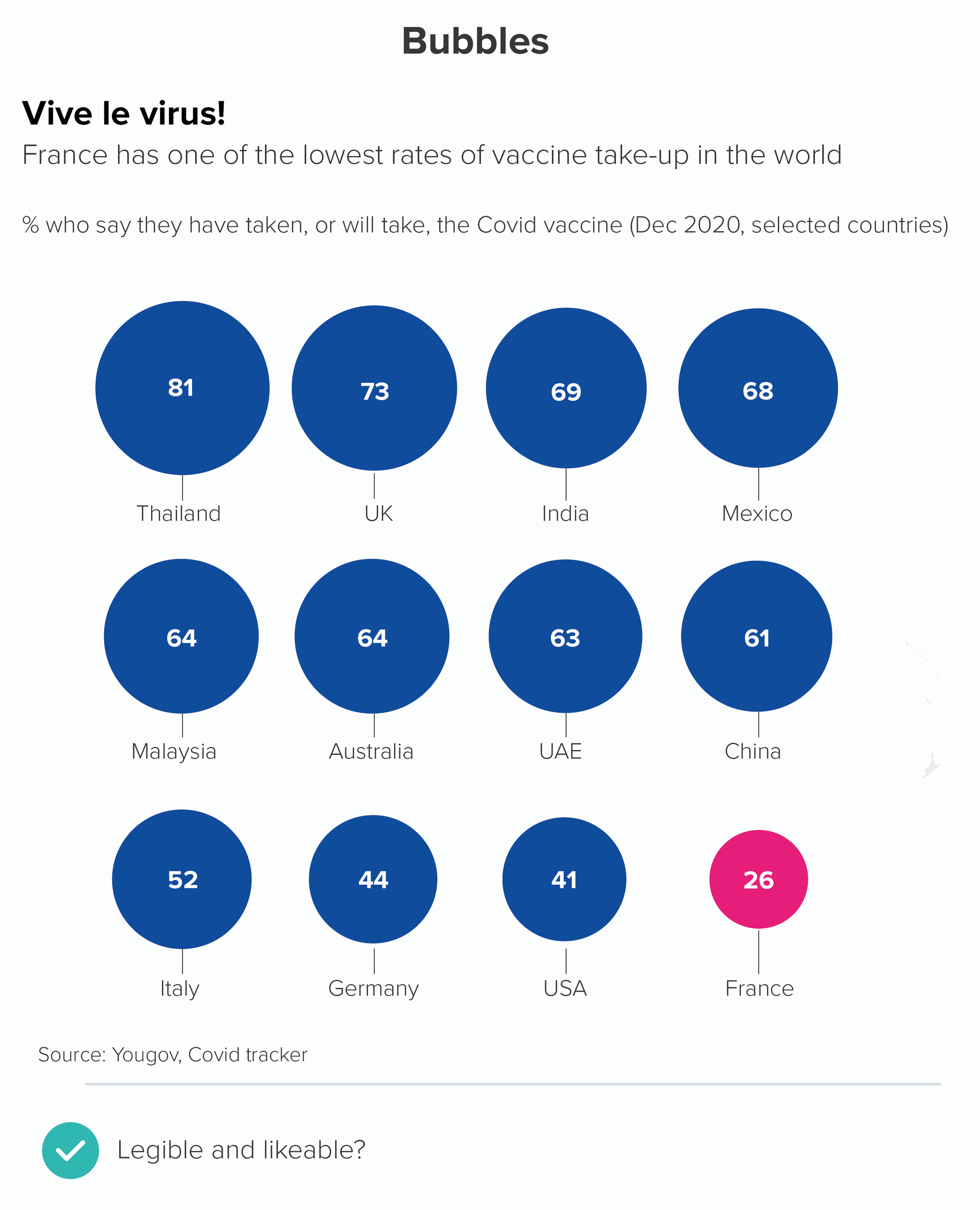
Data sources: Favourite day of the week - Yougov US; Uruguay is best - World Bank, Our World in Data, Baby names in the UK - ONS, India life expectancy - Gapminder, French vaccination - Yougov Covid tracker

More data viz advice and best practice examples in our book- Communicating with Data Visualisation: A Practical Guide

Rule 26: Don't use broken axes or bars

In this blog series, we look at 99 common data viz rules and why it’s usually OK to break them. Here are all the rules so far.

by Adam Frost

In her classic guide to Information Graphics, Dona Wong advises ‘Use broken bars sparingly’ (2010, p69). Rosamund Pearce of the Economist says never use them: ‘because it breaks the relationship between the rectangle’s dimensions and the data.’

I agree: they are usually a big mistake.

These charts show two of the most common ways of representing an axis break. The first uses two parallel lines - like an electrical circuit diagram. The second uses a zigzag or lightning bolt. Both are bad for similar reasons.

  • They are crude, unattractive shapes 

  • Read order is disrupted. We notice the break point first, when we should be looking at the title or the chart first. 

  • It hijacks the story. We might think that this is about broken data, or incomplete data.

  • It defeats the purpose of the chart. We cannot compare the size of the largest bar to the others. Are we supposed to imagine what’s in that gap in the largest bar?

  • It smacks of desperation, like the designer couldn't think of another way of fitting all the shapes on the same canvas. So they have just disembowelled the biggest shape and stuck the two ends together, like a conjurer trying to fix a magic trick that’s gone horribly wrong.

When faced with this kind of story, it's much better to go back to the data and work out what you need to chart and why. Axes and bars usually get broken when you have one or more outliers, and if you charted the data accurately, you'd lose the ability to distinguish between the other values. Here's the chart above, with the 'English' bar represented correctly. I’ve also included a chart about Covid - the UK’s wretched performance makes it harder to see the important differences between other European countries.

In both of these charts, you can see how the largest bar becomes the whole story. If this is what you want - and sometimes it is - then job done. But if you still want your audience to distinguish between those lower values, how do you achieve this without resorting to the slasher-movie methods above?

1. Turn one chart into two

There's no law that says you have to put all those bars on to one chart. You can walk your audience through a series of charts: showing them first the chart with the outlier(s) removed and then a second chart with the outlier included (or vice versa). 

2. Merge bars together

If your story is about the size of the biggest bar, or how much bigger it is than the other bars, then lean into this. Add all the other bars together, and show how the largest bar still dwarfs all of them combined.

You do lose the ability to compare the other values, so if this is important, you can explode out that second bar, or include a data table (the second chart above). A table is a good choice if you want to knock the secondary story further back.

3. Use a different chart type?

It's worth saying that other chart types can be better than bars at telling outlier stories. Especially those that don’t have an axis to break, like bubble charts (the first chart below). Bubbles also work better when you have an ‘off the charts’ story as well. With a disappearing bar, you have no idea where that bar might end, but with a bubble, the curve gives you a better sense of how large that partly-visible shape is.  

Circles also work well when you want to nest the smaller datapoints inside your giant outlier datapoint (circle packing). And treemaps can be a better use of the available space (the second chart below). 

4. Play with format

Another approach that can work is to play with format. If your largest datapoint is off the scale, then show it disappearing off the scale or breaking out of its container. The most celebrated recent examples are from New York Times, when they were attempting to make their readers aware of the unprecedented impact of Covid.

Image credit: New York Times

I like this approach with Powerpoint presentations, because your audience almost forgets the bar or illustration or shape that is persisting at the bottom of the presentation, until it ends several slides later, and they are surprised back into the story. Of course, if your data is deadly serious, or your audience is deadly serious, this sort of playful approach won’t be appropriate, but most audiences appreciate the fresh perspective.

A related approach is to have a graphic going on for too long, far longer than you would normally expect, as in Earth Temperature Timeline from Randall Munroe, or The Depth of the Problem from the Washington Post, or Gross Miscalculation from Melanie Patrick. The datapoint is huge, it goes on forever, so the chart lasts forever.

5. Don’t use a chart at all

If a number is large enough to cause a rift in your axis, then it’s probably important enough to warrant your audience’s full attention. Consider isolating that number and then focus on putting it into context for your audience, using icons, illustrations, analogies and real-world comparators. This is sometimes more helpful than a bar chart.

Look at how the the vast size of a condor’s home range is dwarfed in the first chart, because of the polar bear outlier. Even a giraffe’s 157km2 - which is invisible on our chart - is about three times the size of Manhattan. But we’re not going to solve this problem by breaking our axis: as we’ve seen, this introduces even bigger problems. Instead, in the second chart, we make our outlier the whole story. 

I hope all of the above convinces you that breaking your axis and your bars is almost always a sign that something is rotten. You’ve got too much data, or too little space, or the wrong chart type, or you’ve not thought about how best to serve the story.

Never say never

So am I saying that you should never break your axis? I quoted Dona Wong at the start: ‘Use broken bars sparingly’. And sparingly is not never. I’m going to conclude then by taking another look at the David McCandless chart I mentioned in rule 21.

Image credit: David McCandless/ Information is Beautiful

It’s a masterpiece for many reasons. The fascinating story, the clear information hierarchy, the engaging copy, the excellent design. But right now, I want to point out the y-axis. Did you even notice the two breaks in it? One at 8 metres, one at 20 metres. 

Let’s consider how important and necessary those two breaks are, and then move on to looking at how they are incorporated into the design.

So why are they necessary? McCandless made this chart for his book Information is Beautiful and then published it on the Guardian’s Datablog. His audience was primarily US/UK. This meant that he had to include cities with the most emotional relevance for his audience - we have Venice and Amsterdam first (for US/UK audiences, they are the most famous ‘close-to-sea-level’ cities). Then US and UK cities are overrepresented on the rest of the chart: Edinburgh, Los Angeles, San Francisco, New Orleans. Plus New York and London are depicted twice: there is London and South London, there is New York and Lower Manhattan. 

Having intelligently chosen cities that would mean the most to his audience, McCandless then faces a quandary. This is the chart above with a standard linear y-axis. Brace yourself - this lasts a while.

Oh dear. This is now a chart about how much ice there is in the Antarctic ice sheet and how we will all be long dead before it all melts. The differences between the cities become invisible and irrelevant - there’s no chart left really. This is (sort of) an interesting story, but not as interesting as getting people to think about how soon their city might flood if they don’t take action.

So let’s put in the first of McCandless’s axis breaks - at the 20 metre point.

This is better, but our story is still distorted. Now it looks like it’s a chart showing how smug people in Taipei, London and New York can feel, because their cities will be above ground in 400 years, while the other 10 cities will be submerged. Not only is this unhelpful, it’s also untrue, because the exponential nature of sea level rises means that there are only a few hundred years between Edinburgh flooding and New York flooding, not to mention the fact that any cities still above sea level at this point will almost certainly be inundated with climate refugees and stricken with resource shortages. McCandless’s theme is ‘When Sea Levels Attack!’: how the sea will attack every city, one by one, making steady, relentless, lethal progress. So he needs to break his axis again.

Now his story is clear. We are all going to be living in Atlantis soon. This is reinforced by his other design choices - locking the bars together, so they share the same ground: they are a single entity with a common destiny. And the bands of blue for the levels of sea get lighter gradually - they do not dramatically leap shades to match those axis breaks. 

If you are from an analytical background, it might make you uncomfortable to see so much authorial manipulation. Perhaps you’d be more in favour of a scientifically-sanctioned form of visual trickery like using a log scale (we’ll discuss those cognitive atrocities in a later rule). But even though I am usually against breaking a y-axis in this way, I am strongly in favour of it here.

McCandless understood that an unbroken axis would have painted an untruthful picture, foregrounding secondary aspects of his story (how much ice there is in Antarctica), or giving people in New York, London and Taipei a false sense of security. This would be a dishonest depiction of what the data shows.

So, as always, the story needs to come first. What can we learn from McCandless about how to represent axis/bar breaks, on those rare occasions when we need to use them?

  • Be discrete. Notice how subtle the breaks they are. No lighting bolts, no parallel lines. They are just white space. They serve the story, they do not become the story. 

  • Be true to the story. The breaks are entirely motivated by making the message clearer. They do not solve a logistical issue (the bars don’t fit!), they solve a narrative issue (the bars don’t make sense!)

  • Use design strategically. McCandless uses other design techniques to further draw our eye into the main story and away from those axis breaks. The blue strips - representing the different levels of the sea - effectively camouflage the breakpoints, while also adding drama and depth to our story.

I’m aware that all of this is easier said than done. David McCandless pulls it off, but he is a world-class designer. Not all of us are. So I still think the rule is useful - don’t break your y-axis. Or at least, don’t break it until you have exhausted all the other options. But if your story insists on it, give yourself enough time to experiment, to figure out how to paper over the crack in your chart, because it’s all too easy for a broken axis to break everything else too.

VERDICT: BREAK THIS RULE RARELY.

Sources: Languages in England and Wales, UK Census and ONS; Covid data, Our World in Data; Home ranges data from Encyclopedia Britannica, San Diego Zoo, New York Times, various books and websites.

More data viz advice and best practice examples in our book- Communicating with Data Visualisation: A Practical Guide

Rule 25: Always start your bar charts at zero

In an excellent blogpost, Nathan Yau writes about the importance of always starting your bar charts at zero. He concludes: ‘Every rule has its exception. It’s just that with this particular rule, I haven’t seen a worthwhile reason to bend it yet.’

Nathan Yau is usually right. So is this to be our second unbreakable rule, after no 3D pie charts? Is there ever a good reason for starting a bar chart above zero?

There are certainly plenty of bad reasons. Chopping off the bottom of your value axis is at best an error and, in this notorious Fox News example, actively deceptive. It’s typically used by people who want to make bad things look good or vice versa.

Here’s an example of my own, based on a recent UK news story, in which the Conservative government trumpeted an ‘increase’ in police officer numbers.

Notice how the story changes when I give the chart a y-axis starting at zero. I’ve also begun the story earlier, to further emphasise the deceitfulness of the first chart. 

In fact, the only justification I can think of for not starting a standard bar chart at zero is if the lowest value in your dataset is less than zero. Even here, I would argue that the chart does actually ‘start’ at zero, you just happen to be reading down from zero as well as up (the first chart below). Or reading up from the bottom towards zero (the second chart). In both cases, zero is clearly shown, and used as a key reference point.

Why is not showing zero on a bar chart so problematic? It’s because those bars are solid, filled shapes, base-aligned and extended in one direction only (length or height) and therefore we instinctively see differences in their size as exactly corresponding to numerical differences in the data.

It is also why they work so well. They are a clear visual metaphor, obviously standing in for piles of money, or buildings side by side, or trees, or mountains, or people. Those bars are all individual things, clearly differentiated, but they share a common patch of ground, so they are also a group. And I’m saying ground deliberately. We perceive those filled shapes as reaching from ground to sky. Truncating the y-axis puts a barrier in front of the shapes, meaning our forest of trees now has a wall in front of it, our row of people have become faces peering over a wall. So how big are those trees now? How tall are those people?

Indeed, it could be seen as worse than this, because those bars are the same width and colour all the way up, so we are likely to miss the wall in front of them, and imagine that the ground is still the ground, and mistake the part of the bar we can see for the whole that we can’t. It’s a masterclass in misdirection.

But hang on. What about when starting a bar chart at zero masks an important change or a vital difference?

It’s true that both of these charts are deceptive. Returning to our bars as objects metaphor, we see that some of these mountains are slightly bigger than the others, but they’re all still mountains.

It’s worth remembering this when anyone tells you that starting a y-axis at zero is objective, and adjusting it is biased. Every visual decision in data visualisation involves bias. In fact, by using a bar chart and starting it at zero in the two instances above, you are discretely arguing that the status quo isn’t too bad, that there isn’t much to see here. China has slightly more baby boys than Malawi; most major emergency patients are still seen within four hours - so can everybody just calm down.

However, the solution to dramatic stories like this is not to chop off half of your bar chart’s y-axis. That is deceptive in the opposite direction. Instead, when a standard bar chart masks a large or important change, the solution is always: switch to a different chart. 

Let’s take a closer look at the first bar chart above: the baby gender ratio. As I’ve said throughout this blog series, whenever you create a visualisation, the first thing to consider is: what’s the story? The original author - starting their y-axis at zero - might have thought that the story is: I’m showing the number of boys born compared to number of girls. It’s a comparison story. But is it? I’d argue that you’re showing to what degree the number of boys is higher or lower than it should be. This is a different story - a story of deviation, not simple comparison.

In other words, what matters here is not the 114 boys born for every 100 girls in China. But the fact that it ought to be 105, and it isn’t, and this means that thousands of girls aren’t born. 

Dot charts are a better choice in these circumstances. They are not a filled shape, they do not imply you are showing a whole, the full count; they are just a marker indicating the end point. So, with dot charts, it is not at all deceptive to leave zero off your value axis; in fact, it is often preferable, because these charts are designed to foreground the level of difference between final values (chart 1). Another option is a flagpole chart - a modified bar chart in which the level of deviation from a benchmark or past value is emphasised (chart 2). 

Note that I’ve rotated the charts too. Dot charts are more effective when they are horizontal - think abacuses. And flagpoles, well, the metaphor is obvious.

As this is geographical data, you also have the option of a heatmap. You can make your colours diverging or sequential. Diverging (map 1) works better in this instance, I think, because it’s clearer to see the countries that hover around the historical average (in green) and then those that skew female (yellow) or male (purple). Diverging colours for a story of divergence.

rule_25_diverging.png

The sequential blues (map 2 below) are elegant, but we really only notice one end of the divergence story (dark blue for too many boys), and we risk losing the story of countries with too many girls (the lightest blue).

rule_25_sequential.png

Note that with heatmaps, we are also able to add more datapoints than with our original bar chart - every country in the world, in fact. Now we can see, on a more profound level, what the desire to have a child of a specific gender is doing to the demographics of the planet.

Let’s look at our second chart now - the A&E data, a change over time story.

Once again, we can see that bars don’t work in this instance (chart one). They have to start at zero, and therefore we lose a story of dramatic change. A better option here is a line chart, which doesn’t need to start at zero (chart two). 

Like dots, lines are not solid, filled shapes, we are not going to assume that the distance of an untethered line from the ‘ground’ represents a value starting at zero. It is more like a kite tail, or a vapour trail, a squiggle in the sky.

This is particularly the case if you drop the x-axis line (the ‘ground’) and just leave the axis labels (Q1 2018, Q2 2018 etc). This emphasises the fact that, in this case, we have zoomed in on the significant trend.

In fact, line charts that don’t start at zero only become problematic if you intersect with the x-axis (chart one below), which suggests a dive to zero, or if you fill in the area under the line (turning it into an area chart - chart two). We’ll cover this in more detail in a later rule, when we consider the proposition: ‘Always start your line charts at zero’. 

If we want to tell a correlation story, the same principles apply. If your bar chart doesn’t make small differences visible, switch to a different chart. In the case of correlation, this almost always means a scatter chart. Because they are floating dots, a scatter plot x and y axis need not start at zero either.

To go back to the start then: should you always start your bar chart at zero? Yes.

However, that doesn’t mean that a bar chart starting at zero is always a good chart. It can be highly misleading. Always remember that your job is to show your audience what the data means, and often that requires starting your value axis at 100 or 1,000 or 1 million and switching to a chart where the shapes are weightless.

A note on maximum values

One final note: I’ve been talking about where your bar should start, but just as important is where your chart ends. Most software automatically positions the maximum value for your value axis just above the highest value in your dataset. Which is usually what you want (the first chart below). Nothing is worse than deliberately putting all possible values on your y-axis (the second chart) - out of a mistaken sense of full disclosure. 

By going from zero to 100% in the second chart, it now looks like we are saying that not that many children are at risk of poverty, after all. In fact, the majority aren’t at risk, so aren’t we doing well?

Furthermore, it doesn’t look like there’s much difference between Italy at the top and Iceland at the bottom. When, of course, there’s a vast difference (30.5% v 12.5%!). So - almost always crop to the top of your dataset.

However, occasionally the story does require you to override the defaults and specify a maximum that is way above your highest value. 

  • Progress. The chart is showing progress towards a target, and we need to keep that target constantly in view. 

  • Rating. There might be a zero to ten rating scale and we need to be continually aware of the lowest and highest possible score.

  • Performance. Perhaps you want to show the performance of someone or something on a dashboard. You can’t know what, for example, a score of 27.4 means, or whether high is good or bad, unless these outer bounds and their meanings are shown on the chart. 

If this is the case, it’s a good idea to subtly indicate the unfilled remainder in your design, rather than just trusting to white space. It’s a bit like the empty four stars in a one-star Amazon review. Here are a couple of examples.

In the first chart, the goal is for (almost) everyone to be vaccinated so it’s helpful to see the gap between the end of the bar and 100%. In the second chart, it’s helpful to know that those ratings are out of 10, rather than, say, five - otherwise the ‘lowest-ranking’ title would make less sense.

These are rare exceptions though. In almost all cases, a bar chart value axis should start at zero and finish just above the maximum value in your dataset. This is what they’re built for: large rectangles, filling the available space, making comparisons easy and obvious. If you’re not telling this kind of story, consider a different kind of chart.

VERDICT: Don’t break this rule (the starting at zero part).

Sources: Number of police officers, UK Home Office/Gov.UK; Mountains from National Geogrpahic; A&E waiting times from Nuffield Trust; Male-female baby ratio from Our World in Data; Age at first marriage (female) from World Bank; Fertility rate (children per woman) from World Bank; Children at risk of poverty and social exclusion from Eurostat, Vaccination rates from Our World in Data; Lowest film ratings from IMDB.

More data viz advice and best practice examples in our book- Communicating with Data Visualisation: A Practical Guide

Rule 24: Label your bars and axes

In this blog series, we look at 99 common data viz rules and why it’s usually OK to break them. Here are all the rules so far.

by Adam Frost

‘Always label your axes’, says the peerless Nathan Yau on his flowingdata blog. Otherwise your audience ‘doesn’t have a clue’ what they’re looking at. Add data labels to your bar whenever your audience ‘needs to know the individual values’, says Dave Paradi. Place these labels ‘inside or just outside’ the bar.

But there are many ways to explain to an audience what your chart contains. Chart labels aren’t always the best tools for the job. 

In this post, I will look at the three types of labels: axis titles, axis labels and data labels. I will look at them in the two main types of bar charts: vertical and horizontal. I will argue that deleting as many labels as possible is the only way to make a bar chart an effective communication tool.

Vertical bars

The first thing to say about vertical bars is how unfailingly they mangle text. Like the scorpion in the parable of the scorpion and the frog, it’s in their nature. Of course they will promise to ferry your story to the other side of the river without rotating or hyphenating or abbreviating your labels, or making everything overlap. But as soon as you trust them with your data, they will sting you again, and drown you both.

Yes, I know vertical bars are the most accurate chart, they deliver pattern perception and table look-up, Cleveland and McGill, yada yada yada. But all of this only applies to the bars. I agree that those shapes are superb at representing distinct, legible values. But the bars are only half the story, and the half that nobody will ever get to if they can’t decipher what any of it means.

Let’s document all the ways that vertical bars mutilate text and see if we can’t pry the story from its cold, dead hands. The y-axis first.

i) y-axis title

The y-axis title tends to get put in one of two places, floating at the top of the axis or, more frequently, rotated and squashed vertically beside the axis values. Neither option is intuitive or easy to read. 

The easiest way of solving this - and this will be our solution for many of the issues below - is to remove it, and bump the key information up into the chart subtitle, where it will be horizontal, legible and hard to miss.

In the example above, the chart subtitle would become: ‘Countries with the highest nominal GDP, 2021 (in US $billion, 2021)’.

ii) y-axis labels

The labels for your y-axis numbers will fit just fine unless you are inconsiderate enough to require large numbers to be visualised (values of 1,000 or more) in which case these labels will need more horizontal space and push everything right, leaving less space for the actual chart. 

Alternatively, you can keep your axis labels short but this will often requires some kind of abbreviation in your chart subtitle, for example, ‘amount in ’000s’ or ‘distance in millions of kilometres’, which can confuse your audience, as they first look at the axis, realise that those numbers look implausible (US GDP is $22.7?), look up at your axis title or chart title, work out what you have done, and then heave a deep sigh as they realise they will mentally have to add ‘000’ or ‘000,000,000’ or whatever it is to all the numbers on your axis.

How many zeroes is a trillion again? Plenty of people have no idea. Is it 12? And is a billion 9? Or hang on, there’s a US and UK billion, isn’t there? And what about when we need to start measuring GDP in quadrillions? How many zeroes is that?

Of course, many charts share this problem (e.g. lines, scatters), but because vertical bars also have other problems on the x-axis (see below) and because there is no space to fit long labels on those narrow bars (also see below), it is more important to solve y-axis problems with vertical bars, or the readability issues can cascade down through the rest of the chart.  

One way of addressing this problem is to keep the y-axis labels short, but to use an annotation to spell out any potentially confusing numbers (the first chart below). Or you can use a call-out box to contextualise one of the key numbers (the second chart below) so even if your audience doesn’t know the number of noughts in a trillion, it doesn’t matter, because at least they have a meaningful comparator. 

(The 6.5 times to the moon stat is true, by the way - assuming a dollar bill is 0.11mm thick).

Naturally, if you are presenting to accountants or bankers or people who know exactly what the abbreviated numbers mean, this won’t be necessary. But other audiences can easily misunderstand the differences between millions, billions and trillions, and it’s a good idea to help them out.

iii) x-axis title

I won’t spend too long discussing x-axis titles on vertical bars because in almost all cases, you should just delete them. If you have the x-axis labels ‘2001’, ‘2002’, ‘2003’, ‘2004’ and you feel the need to put ‘Year’ underneath, or if you have the x-axis labels ‘USA’, ‘China’, ‘Japan’, ‘Germany’ and you feel the need to put ‘Countries’ underneath, then ask yourself: who is that helping - You? Your audience? Why? 

The only possible justification for using an x-axis title is that you feel the x-axis labels are unclear. For example, maybe you’re using two-letter country codes: IE, IT, DE, FR and the like. You want to add the title ‘Countries’ so it’s clear what those cryptic glyphs mean. But if your audience isn’t familiar with two-letter country codes, why are you using them? And if your audience knows what these codes mean, why repeat that they are ‘Countries’?

As we saw with the y-axis, it should be plain from the chart title and the axis labels what your bars are representing. Run a Google Image search for bar charts in the Economist, the Financial Times, the New York Times or any other quality news provider of choice, and you will look for an x-axis title in vain. Good communicators strip out redundant information instinctively, and so should you.

iv) x-axis labels

Here we go. Those of a sensitive disposition should look away now. All of the horrors discussed above pale into insignificance compared to the havoc that is wrought by vertical bar charts on the average x-axis label.

This wouldn’t be such a problem if these labels weren’t the most important part of your chart (after your title). But they are. It’s where readers find the ‘Who’ in your ‘Who What Where When Why’ structure. It’s where the story bites.

There are many creatively sadistic ways in which vertical bars persecute x-axis labels. To differentiate them, I’ve named them after (fictional) medieval torture equipment. Tremble as you look upon the blood-curdling spectacle of The Abbreviator, The Hyphenator, The Initialiser, The Eraser, The Minimiser, The Overlapper, The Spine Cracker and (worst of all) The Rotator!

Sometimes you will be extremely lucky and won’t need to employ any of these methods. All of your x-axis labels will be incredibly short. Or you will have lots of horizontal space and be able to fit more than a few labels in. But in the majority of cases, you will have to use one or more of these forms of textual torture. So are they ever justified, and what do you do when nothing works? 

  • The Truncator: Abbreviation is fine when you have abbreviations that everyone understands (like dates - Mon for Monday or Jan for January) or where the context makes it clear when longer labels have been abbreviated (e.g. China, Japan, Viet., Myan.)

  • The Hyphenator: Hyphenating or text wrapping if OK is this is where a word or phrase would naturally break. E.g. June / 2016, or Coca- / Cola.

  • The Initialiser: This is legitimate if you are confident that your audience will understand the initials or acronyms you are using (e.g. SE for South East, EU for European Union). 

  • The Eraser is fine for time series or other charts where the missing labels can be intuited from the labels that remain. Or when you have so many bars that labelling them all is impractical (see rule 17).

  • The Spine Cracker. This is fine when you have lots of bars and only want to label a few of them. But you don’t have to put all the labels on the x-axis; you can label the bars directly too (see below).

  • A combination: sometimes you might be able to combine a few of these - for example N. Ireland and East Mids would be understood by most UK audiences as Northern Ireland and East Midlands if it was a chart about regional performance. A chart for fans of phase 3 Marvel movies could happily use labels such as ‘SM: Far / from Home’ and ‘Capt. / Marvel’. These examples combine initialising, abbreviation and text wrapping.

Minimised, overlapping or rotated text is never justified under any circumstances. It makes the text harder to read than it would be in a data table, making a mockery of the whole visualisation exercise. 

Sometimes you will try all the methods above, and they will all result in tortured text. The labels are long (or even just a normal length) and can’t be condensed. In these cases, you can switch to a horizontal bar, which we will look at more closely in a second. For now, I’ll just say that this can be a legitimate alternative in one or two specific instances. For example, the Top 10 boys names chart visualised earlier in this blogpost would be better as a horizontal bar.

However, in most cases, rotating the chart raises other narrative issues. More often, it’s best to consider an entirely different chart type (we suggested some in rule 16). We will look into these alternative chart types in later rules.

v) x-axis data labels

To finish with vertical bars, another text issue concerns the data labels - the numbers at the top or inside the top of the bars. Because vertical bars are narrow shapes, these data labels can be too wide to fit inside the bars, and if you put the labels outside, they may overlap with neighbouring labels when the bars are of similar heights, increasing textual clutter. Alternatively, you can leave data labels off, which means you have to cover your chart with gridlines so the values can be estimated, which isn’t ideal either - from a visual or cognitive point of view.

As with the x-axis labels, turning a vertical bar into a horizontal one can occassionally be a good solution for this, which we will look at shortly. However, if vertical bars are the right fit for the story, the ideal way to treat data labels is as follows:

  • first, ensure you don’t have too many bars (see rule 17) so your labels have a fighting chance of actually fitting in

  • contract the numbers as much as you can, e.g. 1,800,000 becomes 1.8 and then you place ‘value in millions’ in the chart title. However, be aware of the common usage guidelines mentioned above, and use common sense to work out whether spelling out the number is required.

  • you can reduce the font size for your labels slightly. Although ideally you shouldn’t use too many different font sizes on a graphic, the exact data values are of secondary importance to most readers, so it’s fine to signal this in the information hierarchy by (consistently) using a smaller size for the datapoints

  • wherever possible, label the bars directly - don’t rely on gridlines. This means you can…

  • remove the y-axis. If the bars have data labels, you don’t need it. This also gives you more horizontal space, which makes it more likely that all your data labels will fit. You can also...

  • remove the gridlines. Again, if the numbers are on the bars, what’s their purpose? (We’ll look at this in more detail in a later rule). All of this deleting gives you a much clearer, cleaner chart.

  • wherever possible, put your data labels inside the ends of the bars. This frees up more vertical space, which means your bar chart can be taller, accentuating the drama, and making the differences between the bars more noticeable. Only very short bars should have labels outside.

As a side benefit, all of this data label tinkering should mean you have more space for your x-axis labels too, meaning that the hacks in section iv) above might just work.

vi) Mobile first? 

There is one final problem. Just as video killed the radio star, so mobile phones killed the vertical bar. Even if you manage to have a vertical bar that overcomes all the legibility issues mentioned above - not too many bars, short x-axis labels, no need for a y-axis, data labels all fitting -  even if you manage to get it looking clear and clean on your 16:9 Powerpoint presentation or laptop screen, someone will open it on their phones and be able to read none of it. Or they might magnanimously agree to rotate their phone, I suppose. (I did see it happen in user testing once). So if it is imperative that your chart is legible on a mobile phone, then consider a different chart type. And one of the chart types that is sometimes considered - a horizontal bar - will be discussed next.

Horizontal bars

Horizontal bars are much more readable on mobile portrait, they can be easily scanned and scrolled through.

In fact, horizontal bars are perhaps the easiest chart to read full stop, overcoming almost all of the legibility challenges listed above. Text labels can be long or wrapped, and it rarely matters; data labels can be long or complex and it rarely matters. They will usually fit and they will be horizontal. 

Compare the reading experience of these two charts. The vertical bar first. Let’s imagine you wanted to find out the name and value of the third-placed bar (Papua New Guinea) and then compare that to the final bar (Japan). This might be your journey through the information.

On a horizontal bar, it is something like this.

Let’s think about the spatial journey too. A vertical bar needs to be composed a bit like a narrative painting, with the designer clearly flagging up the desired read order, defining what art critics call areas of focus so the reader clearly understands that this isn’t going to be read in the usual way, like text, but is a bespoke structure that suits the rhythms of the story: start at the top, then take in the shapes in the chart, maybe look at the y-axis label, move to the bottom, find the country you’re interested in, then maybe glance back at the subtitle, then look at the bar label, up and across to any annotations. Your eye has to rove around the canvas to follow the narrative thread.

A horizontal bar poses none of these compositional challenges. Provided that the designer has ranked the bars from largest to smallest (which is always preferable, as we saw in rule 19), then you read them as you would read a page of text, in a z-order, left-to-right, your eye scanning along and down, along and down. It is much harder to get lost.

So why don’t we use horizontal bars all the time? It makes our rule - always label your bars and axes - so much easier to follow. We seldom need any textual hacks, as we do with vertical bars, there is less call to abbreviate or hyphenate or omit. Just pour in the data and the text usually looks after itself.

However, the ease with which we can label a horizontal bar chart is also indicative of its key weakness. If a vertical bar foregrounds those dramatic shapes, barging the text into the margins, then horizontal bars do the opposite, foregrounding the readability of the text and relegating the shapes to a supporting role.

A rectangle stretching across a page rarely causes the pulse to quicken, it is more like the agonisingly slow progress bar when you are installing new software, or the bar on your phone showing battery life: a factual declaration of current status.

At their best, horizontal bars can evoke the idea of a race, horses galloping towards a finish line, one of them ahead by a nose. For this reason, they are often used to show growth towards a target, or versus an average. 

But for most stories, horizontal bars - flat on their backs - simply do not have the same visual impact as those gravity-defying vertical bars, stretching towards the sky.

More importantly, vertical bars embody how we picture difference in our minds: as bigger, smaller, rising, falling. We don’t think of growth as wider, further to the right, inching along a flat surface. Higher up is also understood as more important, more interesting, more visible. Moving something left or right does not imply that it is more or less worthy of our attention. (In fact, if things are going sideways, it means something else entirely).

For me, vertical bars also signal more clearly that these shapes are grouped, a family, all representing the same thing. Perhaps because they suggest buildings side by side, or wooden poles in a fence, or even people standing shoulder to shoulder. The shapes share the same patch of ground. Horizontal bars, arranged one above the other, are clearly separate, like different country flags on the same pole. (Or a row of beds in a dorm, each containing a separate sleeper).

There is also the accuracy issue. In rule 16, we mentioned that bars are the most accurate chart. However, if accuracy is your religion, then technically the vertical bar should be your holy of holies. As Tamara Munzner explains in her excellent study, Visualization Analysis and Design, it is easier for us to compare the tops of vertical shapes, than the ends of horizontal ones. (AK Peters, 2014, p118). 

I’m digressing here. But what I’m trying to emphasise is: it’s easy to think when you have a vertical bar with unreadable labels that you can simply rotate it - et voilà! - you get the same chart with more readable labels. But a horizontal bar is an entirely different chart: as different from a vertical bar as a line chart or a pie chart would be. You have made the text readable, but at a potentially fatal narrative cost.

Because of the meanings baked into the shapes, vertical bars excel at telling specific stories - comparison, change over time, distribution, waterfalls.

Horizontal bars excel at others - ranking, distribution, funnels, timelines. (See rule 16 for more on this).

Which story are you trying to tell? By rotating your vertical bar by 90 degrees, you might have got readable labels, but will anyone understand them if the shapes and the story don’t match?

The truth is, the solution to a vertical bar with unreadable text is only occasionally a horizontal bar. Perhaps if you have a ranking story - but otherwise, unlikely. 

Instead, try the hacks outlined in the first part of this article and if these don’t work, drop the vertical bar and choose a chart type that actually suits your story. 

Finally, I’ve been extolling the text-friendly properties of horizontal bars, but it’s worth mentioning the rare occasions when the rule ‘Always label your bars and axes’ doesn’t work for this chart type, and how we might address these issues.

i) y-axis title

As with vertical bars, there is no real reason to ever include a y-axis title on a horizontal bar. Certainly if you feel, for the sake of clarity, you have to include it, never rotate it and wedge it behind the axis labels. Put the axis title above the labels. Even better, remove it and make it clear using the title or subtitle what those labels represent

ii) y-axis labels and data labels

Just as the amount of horizontal space available to you can mangle the x-axis labels on your vertical bar, so it can do the same with horizontal bars if the labels are too long. This is particularly the case where the labels represent statements or opinions. You will need to wrap or abbreviate the sentences or there will be no space for the actual shapes.

This is based on a 2021 graphic by Yougov (the first design was the one they published). In a vertical bar, the text here would be beaten to a pulp, but even in a horizontal bar, you can see they’ve ended up in trouble. 

In this case, it might have been important for YouGov to keep the full text of the statement, so there was no ambiguity about what 71% of people had concurred with. So wrapping was the only option. However, when the labels get this long, it’s always worth trying to bump text up into the title or down into footnotes. 

Now for the difficulty spike. Because when horizontal space is limited, horizontal bar labels usually survive intact - you can wrap your way out of trouble. But when vertical space is limited, horizontal bar labels suffer horribly. Just as portrait format (especially mobile portrait) deforms vertical bars, so a rigid 16:9 landscape format plays havoc with horizontal bars.

This is particularly because you rarely have the full height of your 16:9 canvas. A computer screen usually has tabs, address bars, titles, menus, toolbars, search boxes, notifications and other UI detritus up at the top and sometimes status messages, software shortcuts, time and date information and other clutter down at the bottom. With a Powerpoint slide, you lose space to the title and subtitle and possibly chart title at the top. Down the bottom, there are usually statistical caveats, logos, slide numbers and other unnecessary slidejunk. This tends to leave you with a slim letterbox of white space for your chart in the middle. 

When your canvas is restricted in this way, your horizontal bar labels can start to look mashed together. More than about a dozen, and you have to start reducing font size, or you risk having them overlap. Here’s an example of a squished slide.

The text is getting far too snug here.

In Powerpoint slides or any other 16:9 canvas, horizontal bars are often best used in combination with other charts. Or placed in columns. That way, you effectively gerrymander more vertical space for each block of bars, and they look less distended. Here are a couple of possible fixes for the chart above.

Be careful though, too many columns of horizontal bars and it becomes harder to compare the shapes (defeating the point of the chart) and your labels become more dominant, making it more text than chart (as we saw in rule 17).

In these cases, it’s best to stop and think about whether your audience really needs all this information at once, and if they do, whether PowerPoint (or indeed a chart) is the right tool for the job. 

I am bar chart, destroyer of words

I hope I’ve done enough to persuade you that bar charts do not deserve their reputation as top chart. Yes, they are an invaluable analytical tool. But when it comes to showing others what you have discovered, they are one of many viable options and if text is a critical part of your story (which it should be), they can be the wrong choice. Too often, they are like a leaf blower, blasting text out of the way, leaving it dead and shrivelled up in dark corners.

If you decide a bar chart is going to work best for your story, then remember that the rule ‘Always label your bars and axes’ is unlikely to be helpful. Instead:

  • Arrange as much text as you can horizontally (push information into titles, subtitles, chart titles).

  • Limit the number of bars in your chart, so when you use axis or data labels, everything fits.

  • Consider your canvas size and your dominant narrative metaphor - comparison, ranking, distribution, change over time, something else? - and make sure you haven’t sacrificed narrative integrity for the sake of readability, or vice versa. 

Bar charts are one of the hardest charts to get right. Don’t be taken in by their popularity and apparent simplicity. The positioning of text in a bar chart usually takes time and often involves reworking the chart multiple times. When it all clicks, wonderful. But if it doesn’t, it’s not you, it’s the chart, and it is perfectly reasonable to decide that a chart type that treats text as an equal partner might give your story a happier ending.

VERDICT: Follow this rule sometimes

Data sources: Data sources: GDP data - IMF, Plastic pollution - Break Free from Plastic 2021 report, Favourite day of the week in the US - Yougov US, Indian life expectancy - Gapminder, London living and working - London Datastore, Home ownership - Resolution Foundation Game of Homes report, Languages spoken in England and Wales - UK Census via ONS, Boys names in England and Wales, ONS, Youth population - UN Population Division via World Bank, Pizza toppings - Yougov, Vaccine hesitancy - Yougov Covid tracker.

More data viz advice and best practice examples in our book- Communicating with Data Visualisation: A Practical Guide

Rule 23: No 3D bars

In this blog series, we look at 99 common data viz rules and why it’s usually OK to break them. Here are all the rules so far.

by Adam Frost

In rule 12, we looked at how spectacularly awful 3D pie charts are. However, most charts are wrecked by 3D, including bars.

You tend to change a chart’s appearance for one of three reasons:

  • to make its values easier to read and compare

  • to increase the visibility and emotional impact of its underlying story

  • to make it look more superficially attractive, so people will pay attention to your story in the first place.

3D bar charts fail on all three counts: they are:

  • hard to read

  • irrelevant to the story (the third dimension doesn’t represent a third dimension in the data) 

  • inelegant. A corporate cliché.

Image credit: wtfviz.net

So that was easy. This rule we can stick to. Except, now and again, great designers come along and make 3D bars work.

rule-23-nyt-foreclosures.jpg

Image credit: New York Times

rule-23-ft-bars.jpg

Image credit: Financial Times

I should say, in these two examples, we are not talking about 3D bar charts as such. They are an extruded map and a manipulated photograph. But they both show you can add a third dimension to a modified columnar shape to make your story more immersive.

In the first example, from the New York Times, the height of each block shows subprime mortgage foreclosures as a percentage of all subprime mortgages in metropolitan areas. It would be much more readable as a standard bar: you’d be able to quickly see the highest bar (24.1% - down in Florida). The 3D effect ruins this.

But how dull would this be as a standard bar chart! Any loss of legibility is more than compensated for by the emotional heft of the storytelling. You can see that the whole of the United States is imbalanced by the subprime crisis. You get drawn into the 3D world; the urge to explore is irresistible; you wend your way through those hollowed-out blocks like a disaster tourist. 

In the second example, the Financial Times designers turn skyscrapers into bars (or vice versa) and thereby draw on all the stories that bars excel at telling - geospatial, comparison, distribution, change over time - and merge them into one composite visual. I love the way that the order in which I noticed elements of this graphic exactly mirrored the order of the questions I had in my mind: ‘Where will these new buildings be in New York? What shape will they be? Which one will be the tallest? When will they be finished?’ And finally, given that most of us will not be floating above Manhattan in a helicopter: ‘What will it actually look like from the ground?’ (This is the final 2D chart, Manhattan viewed from New Jersey).

There are other situations in which 3D bars can work. For example, interactives and motion graphics are more forgiving of 3D effects. Real World Visuals are an organisation that continually use 3D in their motion graphics in order to make their audience think about the environmental impact of consumer choices in their everyday lives. Furthermore, Real World understand that in animations, few people press pause to scrutinise a chart in detail; rather, we watch an animation to get a general overview of a subject, and therefore the charts often lean towards the illustrative, so we can more easily connect the data to objects in our environments.

Image credit: Real World Visuals

In this example, Real World Visuals use modified 3D bars to visualise the inequality of water consumption across the world. The USA is the largest bar using 575 litres of water per person per day; Mozambique is the shortest bar, using four litres of water per person per day. The fact that the bars are rendered as stacks of bottled water - like you would see in a supermarket - helps us to think both of the grossly unfair distribution of resources and of the stack-em-high consumer culture that fuels this inequality of access.

To conclude then, 3D bars are usually a multi-dimensional mistake. However, they can be the right choice if:

  • you are trying to emphasise the real-world context of your data

  •  the objects you are visualising (skyscrapers, bottles of water) are vaguely column-shaped

  • you have the skills and the software to create 3D visuals that make the real-world connection obvious

If these three conditions don’t apply, stick to two dimensions.

VERDICT: Only break this rule in exceptional circumstances

More data viz advice and best practice examples in our book- Communicating with Data Visualisation: A Practical Guide